Modal Web Design Guide & Inspiration for Designers
Facebook
Twitter
LinkedIn
Dec 17, 2021202414
Modal windows are important UI design elements that pop out when you browse a website, click on an action button, or even attempt to leave that website. They are great tools to get visitors' attention and swiftly show warnings, discounts, signups, or free download information to encourage visitors to interact with the window, before returning to the main page.
To help you get your own modal window right, in this article, we'll learn about everything you want to know about model web design, including what a modal window is, when to use a modal window, how to design your own with a prototyping tool, and more.
You can also read about the best practices and examples to get inspiration to create your own.
Table of Contents
What is a modal window in web design
Why do you need to use modal windows
What should you know before designing a modal window
When to use modal windows
How to create & test your modal windows
Best modal window examples for your inspiration
Best practices that you should know
Modal windows vs popups
What is a modal in web design
Modals, modal boxes, modal dialogs, or typically modal windows, no matter what you call it, often refer to a window overlay just upon the main web page, aiming to grab visitors' focus and present special or important information, like alters, warnings, subscription forms, price discounts, signup forms and so on.
When modal windows pop up, in order not to mix the content, elements on the main page are often temporarily disabled and become accessible again only when visitors finish interacting with the modal window either through completing an action or directly closing the window.
As this is a design that actually interrupts visitors' workflows, this might sound like a modal popup might annoy visitors but there are good UX use cases. Modal windows can improve the UX and generate more leads if they are designed right.
Why do you need a modal window?
A good modal window is simple, easy-to-understand, and serves only one purpose. It grabs visitors' attention, and helps you:
invite visitors to subscribe to the newsletter
promote upcoming offers
warn visitors not to do something
encourage visitors to sign up or sign in
hook users in to fill in any information you need
offer a better way for visitors to view a video or image without distraction from other elements
A good modal window pops up at the right moment and presents important information, such as offers, signup information, and more.
What should you know before designing a modal?
Before you start to create a modal window for your project, you should know some of the problems that they may cause:
Modal windows interrupt visitors' workflow
Modal window UIs can appear at any time when a visitor is scrolling through the page, stopping them from what they are doing and showing them a new window. Whether or not this modal is important or not, visitors have to close the window to go back to what they were originally doing.
Modals may cause confusions
Let's imagine: you are reading something on a website's homepage and evaluating whether it is valuable to you, a window just pops out all of sudden, warning you not to do something. What will you be thinking? Feeling confused or just trying to go through what you've done until now to see if you've done something wrong? This kind of reaction is very common when modal windows appear.
Modals disable the main page content
In order to spotlight the modal content, designers use a different background color to separate the modal window with the main page as well as blocking out all elements on the main page. This makes all of the main page content inaccessible and forces users to dismiss the modal first if they still want to continue completing their task.
Modal windows require visitors to click to dismiss
Modal windows are often made to present specific information, requiring visitors to follow the guide to complete an action or task. Even when they are not interested in the modal information, they may also need to first dismiss the modal to go on what they are doing before. For visitors, that is bad UX.
Modal windows have their own pros and cons. You should always evaluate the benefits and drawbacks carefully and see how you can balance them perfectly before you determine to build a model for your project.
When should you use modal windows?
Designers use modal windows instead of common popups when they need to:
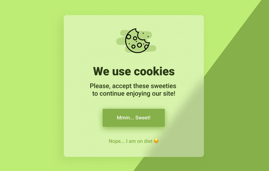
provide important warnings and updates- when serious usage or functional problems occur, a modal window that compulsorily draws users' attention to the modal content explains what's going on and guides users to fix the possible issue, and helps avoid any horrible damage or data loss problems effectively.
collect more user data and leads - when new visitors come to a website or mobile app, some models are designed to collect their emails, names, locations, preferences, and other information so that web or app owners and marketers can quickly craft a custom plan for them all.
gather more signups, followers, or users - modals are also widely used to gather signups, followers, emails, or potential users by providing special offers or enticing resources (discounts, ebooks, and more).
confirm something with users - modals can also help confirm something with users so that they can smoothly move to the next step or achieve their goals on your web or app.
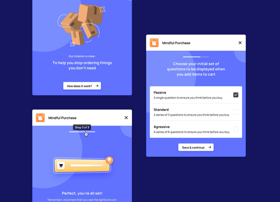
break a complicated process into simpler steps - when users need to follow a complicated process to achieve a goal, to encourage them all to complete the process from start to finish, some designers also use modals to guide them all step by step.
An example of how to guide users to stop ordering things they don't need using different modal designs.
How to create & test your modals?
To create a modal that really works, you and your team should always focus on every detail of modals, such as window size, background color, title, signup form, trigger, and so on. Every detail should be fully iterated and tested.
At this stage, a prototyping tool like Mockplus would help you visualize your ideas and see whether all details work as well as you imagine, saving you lots of time and effort. A single link is all you need to share your modals with your teammates and collect feedback.
Let's see how you can use Mockplus to create modals and popups step by step:
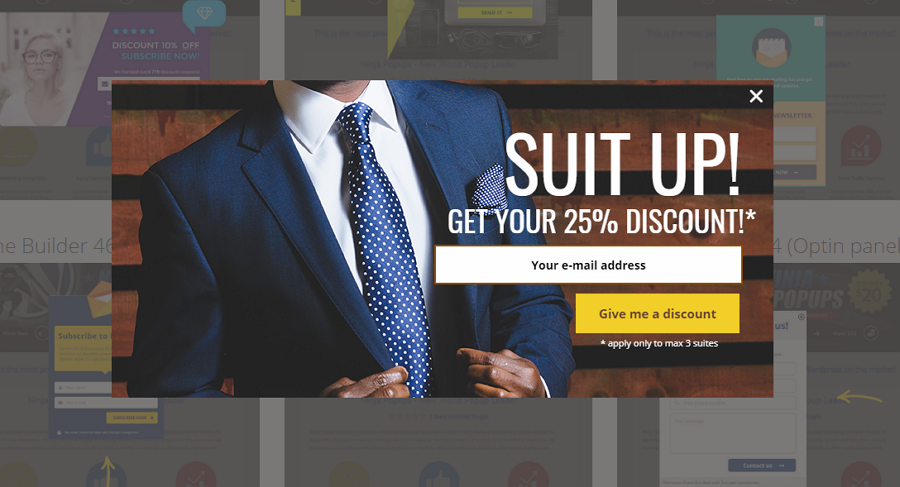
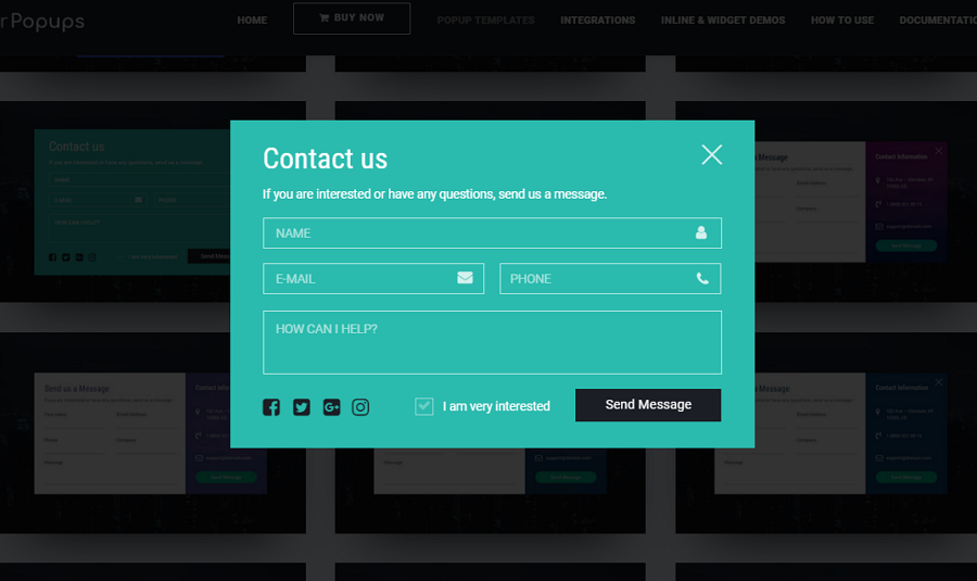
To increase brand awareness, the modal window uses the whole left side to give details about the company, not only asking visitors to sign up, but doing so in a trustworthy and light-hearted manner with animations. In addition, there are bright colors and no other distractions, helping users understand exactly what is going on.
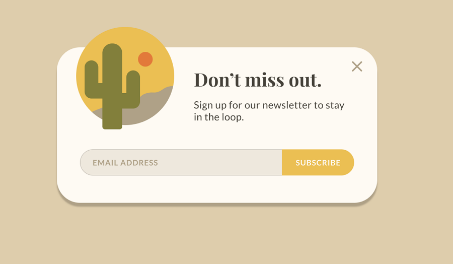
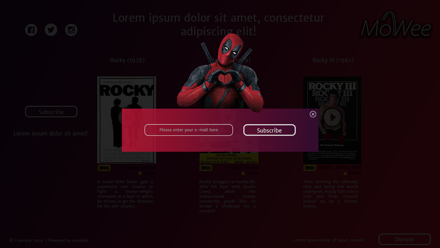
2.Subscribe Modal
This subscribe modal window is the perfect example of how to attract visitors to sign up with stunning visuals. The design elements are minimal but very specific to the interests of the visitor and likely help them decide to sign up. The addition of a single email input field and button also helps visitors not be overwhelmed with several fields. Great for simply getting visitors of the brand to sign up with the effective design.
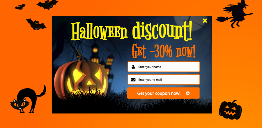
3.Signup Modal for Halloween
Halloween is an important sale season and this signup modal for Halloween sale is a perfect way for you to collect more signups for your website or mobile app. The unique fonts, color schemes and decorations give a very immersive Halloween vibe and help push visitors to make a purchase.
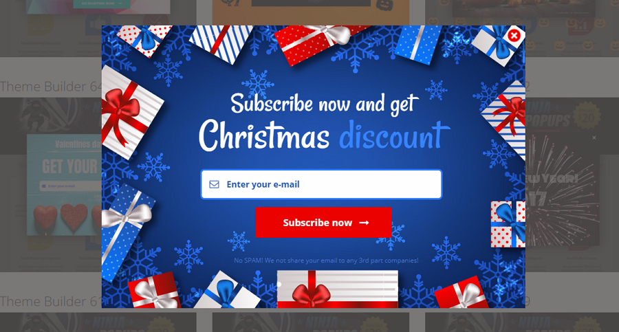
4.Discount Modal
This is a modern subscription modal for the upcoming Christmas sale. Forgetting the Christmas format for a moment, the modal includes a highlighted title, email input field, and a large CTA button. Simple and straight to the point. The visuals then help to emphasize the point of the modal - together, the whole modal attracts the user right away and is clear in its message.
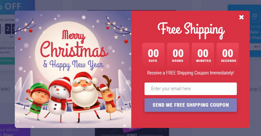
5.Christmas Countdown Modal
When the Chiristmas sale is nearing its end in a couple of days, some online stores create countdown modals to encourage users to place an order and enjoy the special offer before it's too late. This modal example is made for that purpose and has a countdown timer to attract users to enjoy the Christmas offer.
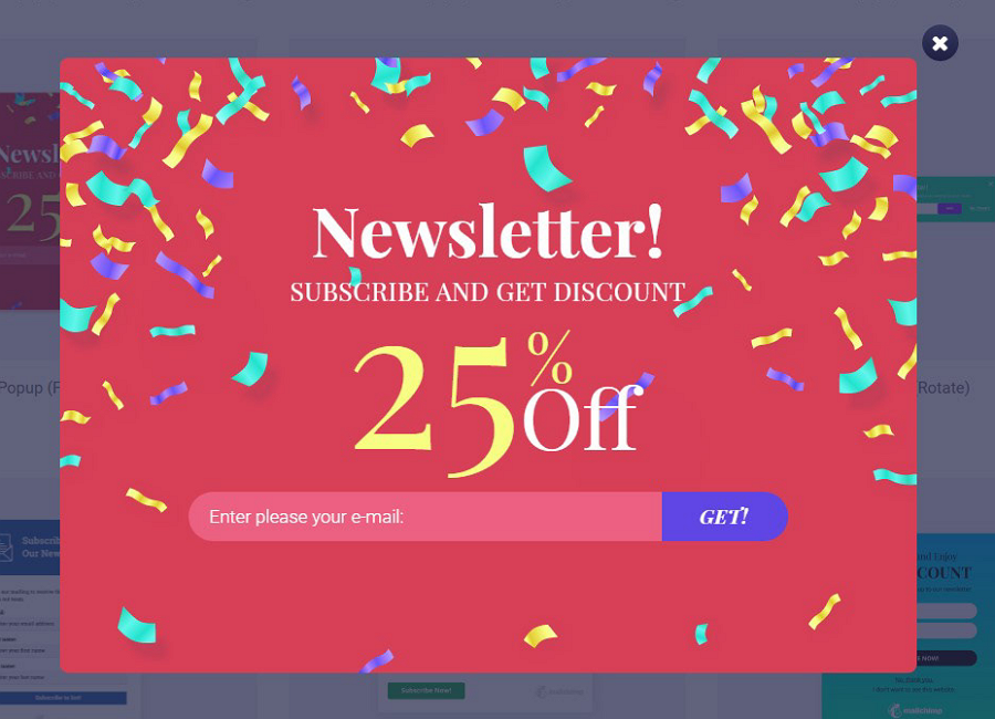
5.Newsletter Modal
This newsletter modal uses big hero typography to spotlight the special offer that visitors can get when they enter their email. The bright colors grab users' attention right away and create an exciting and encouraging vibe, helping with the goal of getting new subscribers and potential leads.
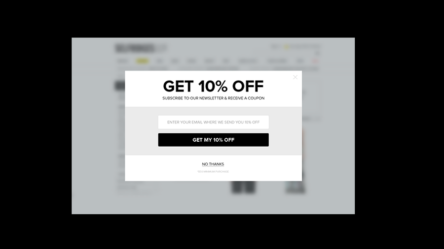
6.Offer Modal
When designing a discount modal, you can include the offer directly in the title. This bold title will quickly grab visitors' attention, like the modal shown here. As soon as it pops up, you see the discount and know what to do.
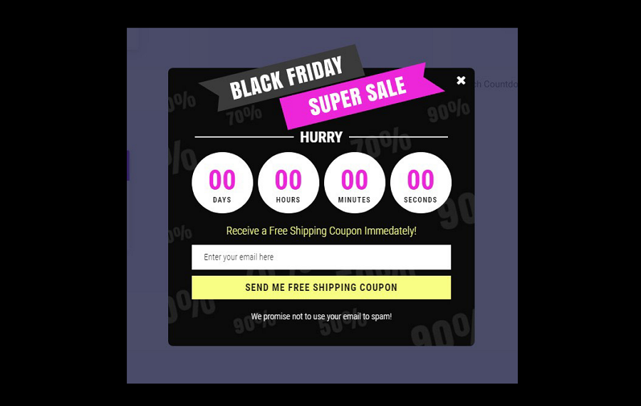
7.Black Friday Countdown Modal Alert
Black Friday sales are one of the most important promotional activities for companies and businesses. This countdown modal concept for a Black Friday modal would help guide you in the right direction and generate more revenue.
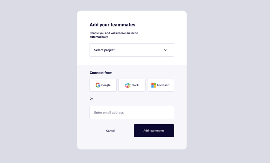
8.Invite Teammate UI Design
This modal example for a collaboration tool is made to help users invite teammates to the same team quickly and easily. They can easily invite any desired person through the common 3rd party platforms, like Google, Slack, and Microsoft, or directly enter their email addresses. More options are also offered. The design is also two-tone to help differentiate the project selection and login section. Unlike other modals using a close icon to dismiss the modal, this example adds a more noticeable "Cancel" button to remove the modal. Much better than you can copy in your modal design.
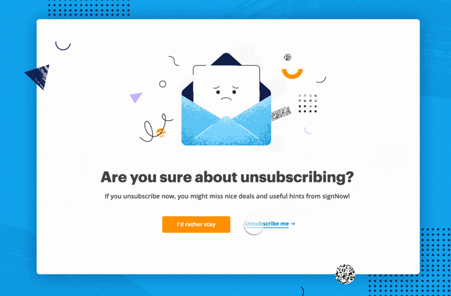
9.Unsubscribe Page
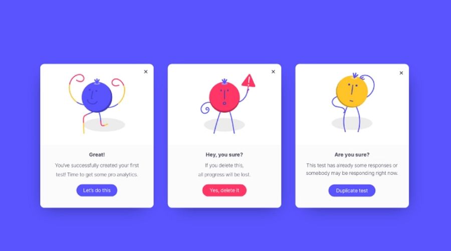
This modal is fully interactive and uses emojis to persuade visitors to stay there. When you click "I'd rather stay'', a big cute smile shows up to visually tell you that you've made a good decision. If you click "Unsubscribe me", a near crying emoji would pop out, trying to persuade you to undo your decision. A more humanistic and immersive experience is created with such emoji designs.
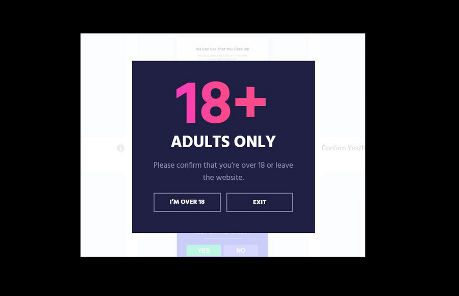
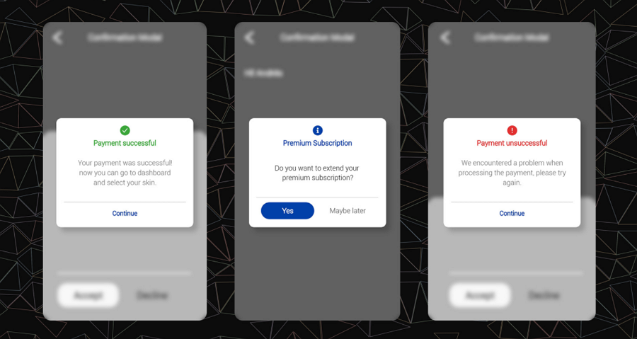
10.Confirmation Modal
As more countries with alcohol restrictions are starting to regulate the online alcohol industry, many online brands have to add an age confirmation modal window to their website, both to view and purchase the products.
This modal window has a purpose and quickly gets the message across with a bold attention-grabbing title, detailed subtitle, and two obvious CTA buttons to choose from.
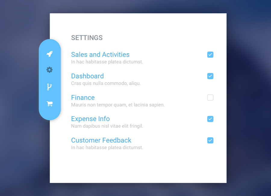
11.Settings Checkbox Modal
This modal window is different from the above examples because it gives visitors options on customizing the website for how they want to use it.
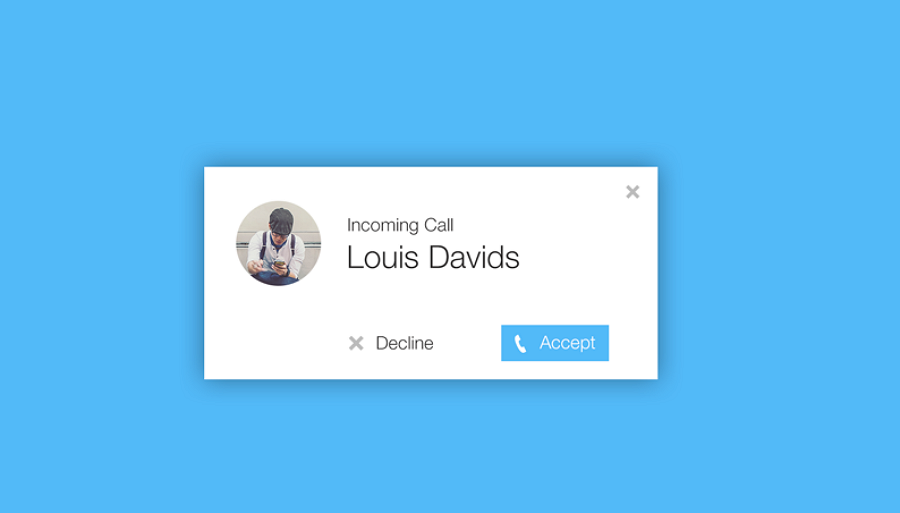
12.Incoming Call Modal
Online calls are one of the essential features of some online communication and collaboration tools. To notify users to accept the incoming call as soon as possible, a modal design is perfect. This incoming call modal is a good example that you may take as a reference. It takes attention away from the rest of the screen and quickly grabs your attention, simple and effective.
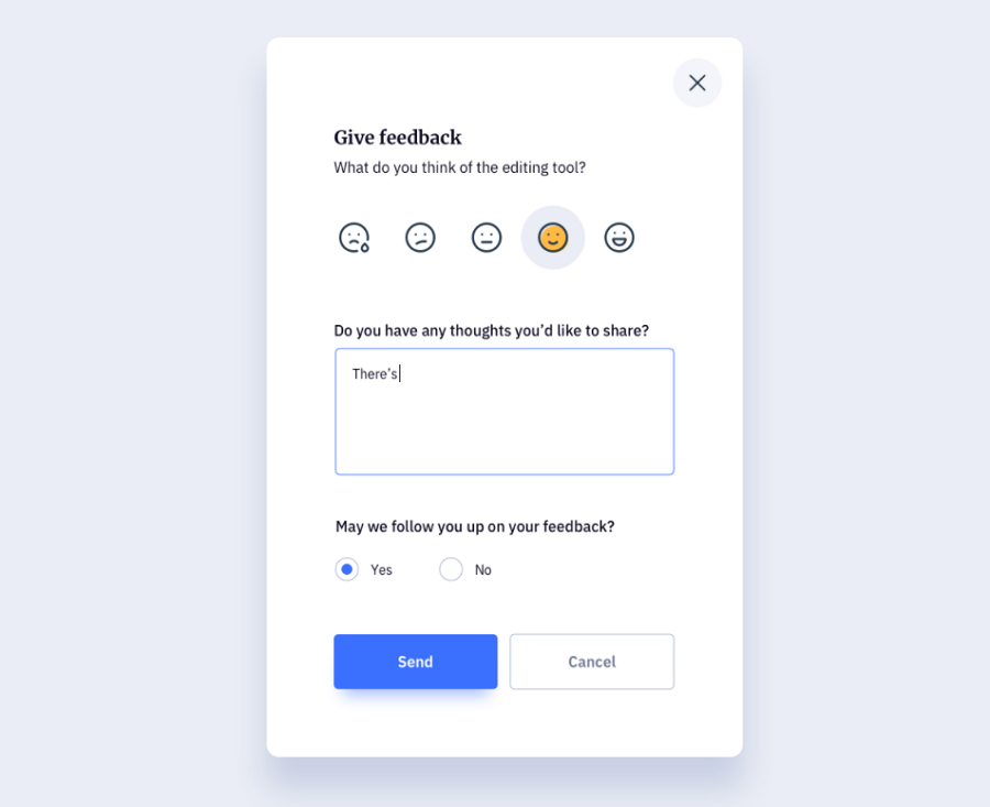
13.Feedback Modal
User feedback is an important mechanism for product teams to get information from the user about the product. It can be valuable information and that is why feedback modals are widely used over the web.
If you also consider designing feedback modal for your project, this example can inspire you. And the emoji design is innovative and user-friendly.
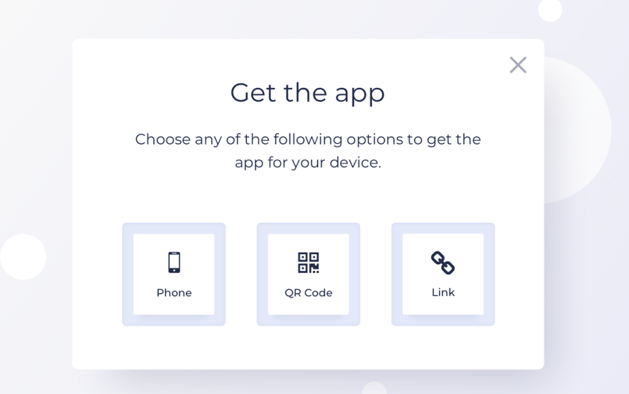
14.Get App Modal
This modal window offers three options for visitors to download the app. Each option consists of simple words and an icon button, making it easy for visitors to understand the option and quickly choose an option to download the app.
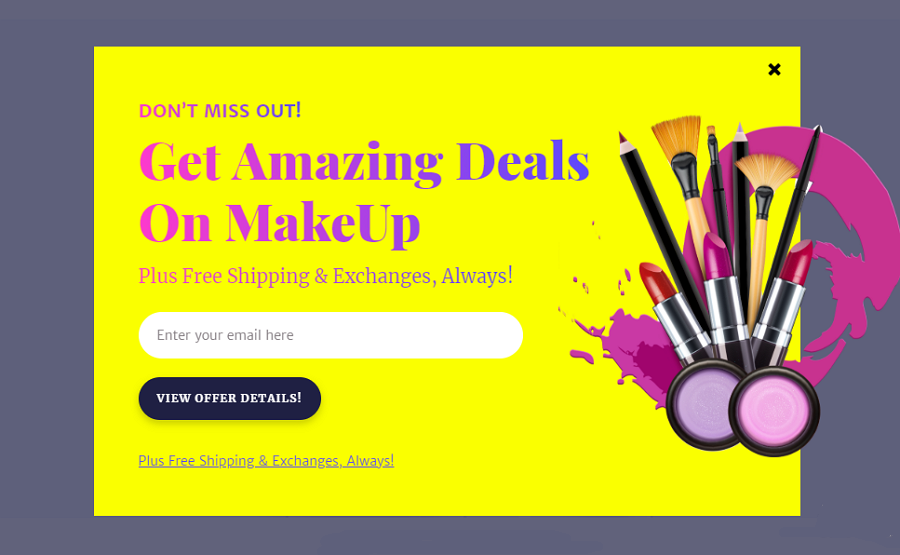
15.Subscription Form
This subscription form modal is made for online makeup websites and uses eye-catching colors and product images to attract visitors as soon as the modal opens. Along with the user-centric design, the dark CTA button contrasts with the yellow background, encouraging users to enter their emails to get the offer details.
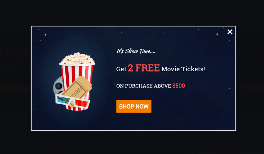
16.Lead Form Modal
This lead form modal is designed to encourage visitors to buy more tickets. Designers use different colors and word sizes to emphasize the special offer. A good modal example that all sites with offers can copy to increase sales.
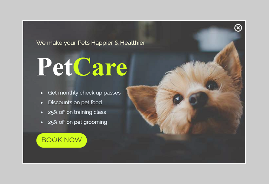
17.Promotion Modal
This promotion modal is made to show all benefits and offers that customers can get from the pet care center in an emphasized, easy-to-read format. The modal uses large typography to highlight the pet care brand, aiming to leave a deeper brand impression on visitors. The bulleted offer list also makes it easy for visitors to scan and understand all benefits and offers at a quick glance.
An effective promotional modal that you can use in your project.
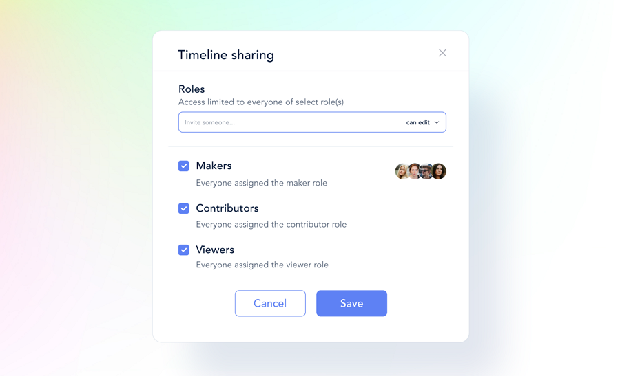
18.Role Modal Window
Does your website have different access and permissions for different roles? If it does, you need a modal that gets users setting up roles for their teammates. This role modal window is a great example of an access and permissions window, allowing users to set up roles from three options before they can share the project.
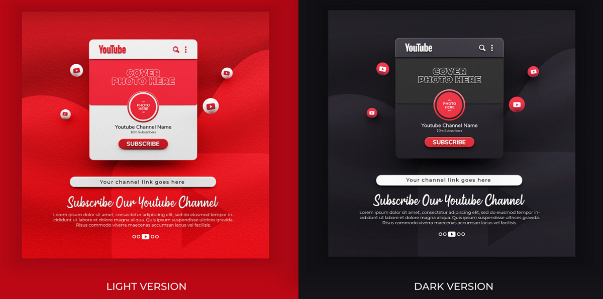
20. Subscribe Youtube Channel Mockup Template
This is a modal window mockup template from Freepick. With this template, you can freely choose the desired color, import a channel photo, and customize the copy according to your needs.
Best practices that you should know
We've also summed up best practices to improve your modal designs:
Create user-initiated, not system-initiated modals
When designing a modal window, you should first decide on the modal type. Based on different triggers, you may create two modal types: user-initiated modals and system-initiated modals.
User-initiated modals are triggered by visitors, like clicking a button. They know why a modal pops out because they made it popup. This type is user-friendly and tends to bring visitors a better experience.
System-initiated modals appear when visitors enter, scroll to a specific position or even leave the web or mobile app. Since no sign or notification is given in advance, this type interrupts visitors' workflow and often brings confusion.
So, if you tend to deliver a better user experience, user-initialed modals are much better than the system-initialized ones. In some cases, designers also use system-initiated modals to present some promotional information or offer important warnings or alerts to avoid bad user experiences (product recalls for example). Be careful with system-initialized modals.
Make your modals as simple as possible
No matter which type of modals you finally use, you should make your words and elements as simple as possible to avoid any confusion.
Use simple and humanistic words to explain the details.
Make the "close" button noticeable
Modal windows require instant action and attention. The best resolution for this is to add a noticeable "Close" or "Dismiss" button to leave this, especially when visitors are not interested in your modal proposals.
Of course, you may also try to use more humanistic buttons to guide users to dismiss the modal.
Pay attention to the modal size and focus
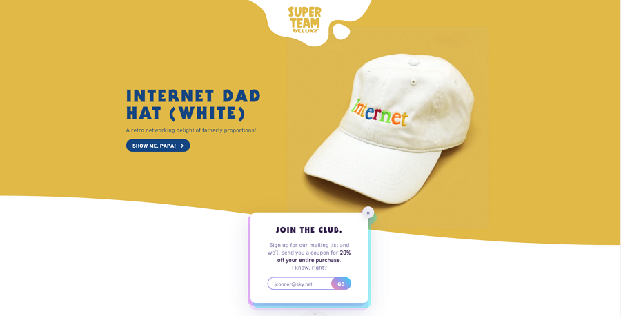
Modal windows are box overlays on the top of the main page. Too large or small a size may directly affect user experience. To make visitors see the modal content as soon as the modal opens, you should also put modals in visitors' line of sight. Make sure not to use any scroll bar in your modal window. If you really need one to present a large amount of content and need a scroll bar, try to use a whole web page, not a modal window.
This example from Super Team Deluxe is floating at the bottom of the visitors' viewport. For me, it would be better to move it up a little to make it centered there. So, visitors can directly view or access it without scrolling.
Use visual design to stand out your content
First, to highlight your promotion or warning information on your modal window, you may try to use a different background color or mask design to separate it from the main page.
Second, to encourage users to interact with your modal window, use a different color, font, gif, or other visual designs to spotlight your price offers or benefits.
And third, use different visual designs to make your CTA buttons stand out.
Modals vs popups
Popups come in different types. Most popups open in a new window and have been used as a great tool to show product advertisements, intro videos, or other promotional information. Even when being designed inside the main page, popups also do not have an impact on visitor behaviors. They can just interact with the popups or keep doing what they are doing on the main page. Most importantly, designers can also add as many popups as possible to achieve their goals on one page.
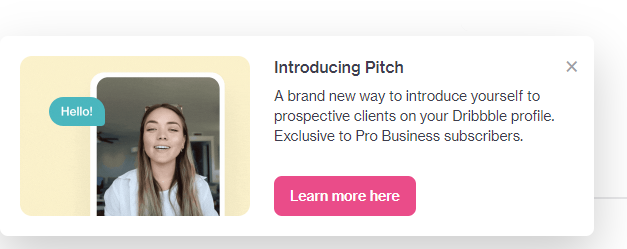
A new feature popup from Dribbble explains its new introducing pitch. It appears when you scroll up the page and has no impact on what you are doing on the main page.
Modal windows are much stricter and designed inside the main page. When a modal opens, unless you close the modal, you may only interact with the modal content. The content of the main pages cannot be accessed or used as before. Ensuring the user first interacts with the window before carrying on. When you close the modals and return to the main page, some of your page content or data could be lost at the same time.
Conclusion
This is a risk when you choose to use modals since modal UI designs pop out without warning and force visitors to interact with it to remove it. However, as long as you design and use it right, modals also help share promotional news, collect emails and signups, and even provide other important content. The benefits can outweigh the drawbacks.
We hope this guide is helpful for you to read more about modals and learn when and how to use it right. The following modal design examples are good inspirations for you to find some fresh ideas to create your own.