User experience design is a concept with many dimensions, and it includes a lot of different disciplines, and information architecture is one of them. Even though the IA itself isn't visible to users, how information is organized in a product can make a significant difference. A well-designed IA creates a solid foundation for a great UX.
This article will explore the key concepts of information architecture in UX design. We will discuss the principles of IA, the role it plays in UX design and provide practical tips for creating effective information architectures.
Information architecture refers to the way information is organized and presented to users. When the information is presented in an intuitive and effective way, it increases the chances of having a positive user experience. Information architecture is not a new discipline; it existed before the first digital products were created. The ancient librarians were the first information architects. They had to organize a massive number of manuscripts in a way that helped readers access the knowledge.

Artistic Rendering of the Library of Alexandria, based on some archaeological evidence. Image by Tolzmann, Don Heinrich; Alfred Hessel and Reuben Peiss.
But as a field, information architecture emerged only in the 19th century. The Dewey Decimal System, developed by Melvil Dewey in the late 1800s, was an early attempt to organize knowledge in a logical and systematic way.

A library book shelf in Hong Kong is classified using the New Classification Scheme for Chinese Libraries, an adaptation of the Dewey Classification scheme. Image by Skwanem.
In the second half of the 20th century, as information became more widely available through electronic means, new challenges arose in organizing and accessing it. The field of information science emerged in the 1970s as a response to the growing need for established practices for information organization. Back then, the field wasn't called "information architecture" but combined many practices that strongly focused on the study of information systems and their use.
The term "information architecture" was coined only in the 1990s by Richard Saul Wurman, an American architect and graphic designer, who used the term to describe the organization and presentation of information in physical spaces. The concept was later adapted to digital environments, particularly the World Wide Web.

Arngren.net is an excellent example of a website created in the early 2000s visual and functional style. It might be hard to understand what's going on on this website for first-time visitors because so many different things are competing for the user's attention.
In the early days of the web, the information on many websites was poorly organized, and it was difficult for visitors to find what they were looking for. IA emerged as a critical discipline for improving the user experience and making digital information more accessible. Information architects worked to create logical and intuitive structures for websites.
This is the most common type of information architecture, where the content is organized in a tree-like structure with general categories at the top and specific subcategories as you go deeper. This type of architecture is helpful for organizing content that has a clear hierarchy and is best suited for websites or apps with a large amount of content.
In sequential information architecture, the content is organized in a linear or chronological order. This architecture is useful for guiding users through a process or a series of steps, such as a checkout process on an e-commerce site or an onboarding tutorial.
In matrix information architecture, the content is organized in a grid-like structure with multiple categories and subcategories intersecting each other. This type of architecture is useful for organizing complex content with multiple dimensions or attributes, such as a product catalog.
Network information architecture is a more complex type of architecture that is used to organize content that has multiple connections and relationships between different pieces of information. This type of architecture is useful for organizing social networks or other complex information systems.
Information architecture is equally essential on macro and micro levels. Regarding the global picture, the importance of information architecture has grown in recent years as the amount of digital information has exploded. There are 2.5 quintillion bytes of data created daily at our current pace. The Internet would quickly become a massive mess if large companies didn't set rules for organizing and accessing information.
When it comes to a micro level, every business wants to offer its target audience the best possible user experience to maximize the chances that users/visitors will continue using their products/visit their websites. A well-designed information architecture can improve the overall usability of a website or application. That's why when product designers create a new product, whether a mobile app or a website, information architecture design is one of the first things they do.
Here are some specific reasons why IA is important in web and app design:
Navigation: IA defines the structure and hierarchy of content, affecting how users navigate a website or app. A well-designed IA ensures that users can easily find what they are looking for and move seamlessly from one part of an app/website to another.
Usability: A clear and organized IA can improve the usability of a website or app by reducing the user's cognitive load (amount of working memory resources used when interacting with a product). If information is well-organized and easy to find, users can complete tasks more quickly and efficiently.
Search engine optimization (SEO): Well-organized and labeled content makes it easier for search engines to crawl and index it, leading to higher rankings in search results.
Content strategy: IA plays a critical role in content strategy by helping content creators to determine what content to include, how it should be organized, and how it should be presented.
Consistency: Good design is consistent design. IA ensures consistency in content presentation across different pages and sections of a website or app. Consistency makes it easier for users to understand how information is related and where to find it.
Information architecture and sitemaps are related but distinct concepts. The critical difference between IA and a sitemap is that IA is a set of practices focusing on organizing content. In contrast, a sitemap is an artifact created as an outcome of information architecture design.
A sitemap serves as a visual representation of the product's structure, showing the hierarchy of pages and how they are connected. Typically a sitemap has a very simple visual representation— a hierarchical diagram or a list. The great thing about a sitemap is that it can be used to communicate the structure to clients or stakeholders so that they can understand how content is organized right now or will be organized in the future.
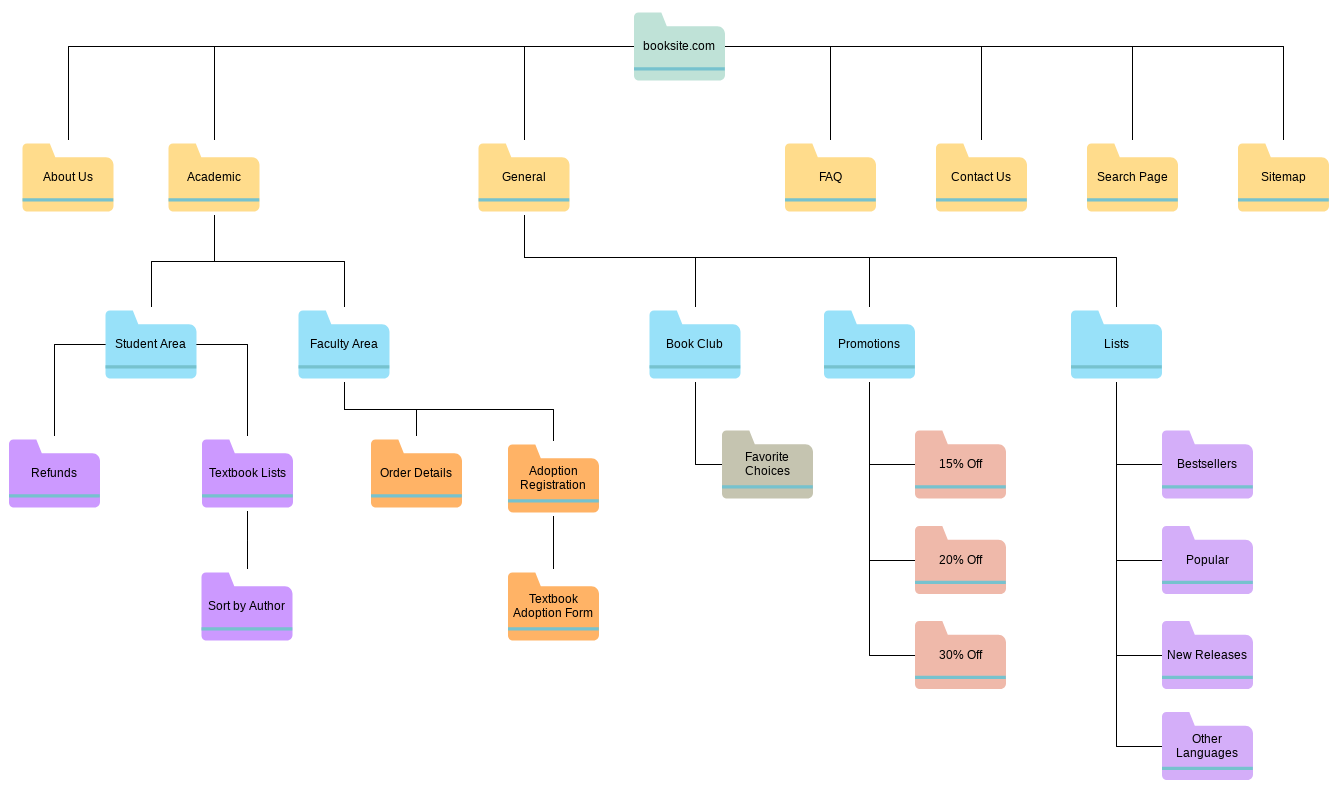
A sitemap of the online bookstore. It provides an overview of the website's structure, showing the relationships between individual pages and helping readers to identify gaps and redundancies in this structure. Image by Visual Paradigm.
Even though data and information sound like the same things, they are two different concepts. Data architecture refers to the design and organization of the data used by a system. It includes the data models, data storage, and data management processes used to manage and process the data. Data architecture focuses on the technical aspects of data management and seeks to ensure that data is accurate, consistent, and accessible when needed.
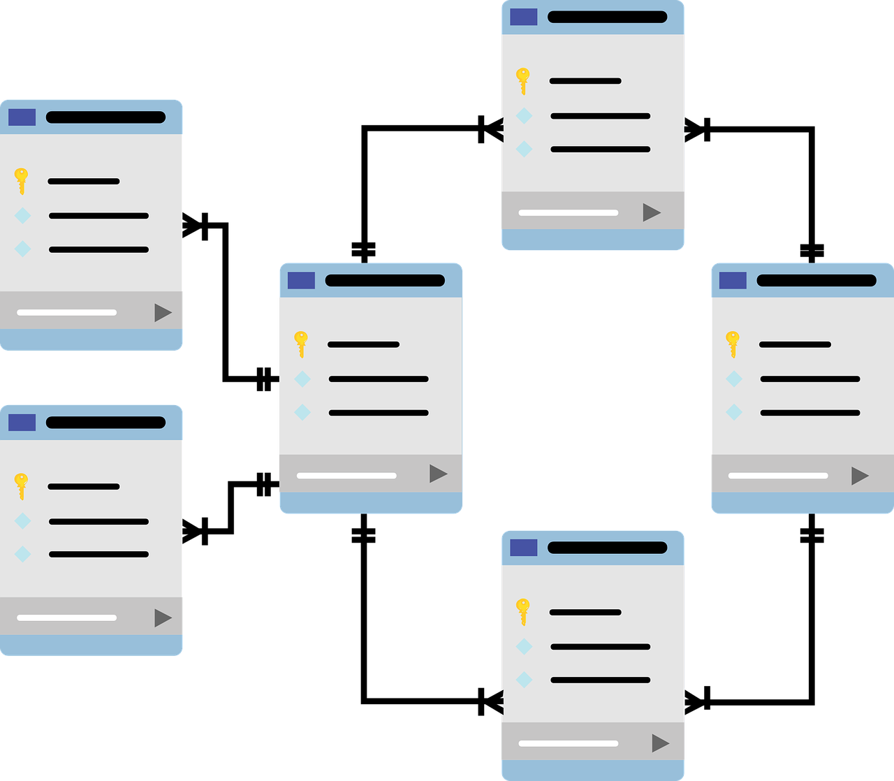
Database schema that shows relationships between data stored in different tables. Image by Pixabay.
Information architecture, on the other hand, refers to the design and organization of the content and information presented to users. It includes the structure, labeling, and navigation of websites, applications, and other digital interfaces. While data architecture is primarily concerned with the technical aspects of data management, information architecture is concerned with the user experience of accessing and interacting with information.
Information architecture design of the new product typically involves the following 5 steps:
"Who are our users? What do they need? How will they use our product?" Those are three key questions that product designers need to answer before starting to create an architecture. User research helps the team to find the answers to the questions. That's why the first step in IA is to conduct research to collect insights about the user's needs and the content that needs to be organized.
Research typically includes gathering information about the target audience, their goals, and the tasks they will perform on the website or app. Research also involves content inventory and content analysis. A content inventory is typically conducted by information architects together with content writers. The goal of the inventory is to collect all content used in a product right now (if it's an existing product) or will be used in a product in the future (if it's a new product). IA creates a list of information objects (content blocks used in a product) and classifies them by topics.
The information architecture design should be created based on insights about the users and business objectives. That's why once the research is finished, the next step is to analyze the collected information to identify patterns and relationships.
Based on the information collected during user research, information architects create user personas (archetypes of ideal users) and user journeys (common pathways in which users interact with a product). After the content inventory, the team starts a content audit—they analyze the content to identify patterns, gaps, and redundancies. The usefulness of content is evaluated in terms of the value it provides to potential or actual users.
Once the architect has identified what their users need, it's time to discover what the stakeholders need. The goal of IA design is to come up with a structure that balances the users' needs with business objectives. IA talks to stakeholders to get a clear understanding of what the key business requirements are and then lists them with the appropriate metrics and key performance indicators (KPIs).
After the research and analysis are finished, the next step is to design the IA. The design phase includes creating a labeling system and defining the navigation system. During this step, IA practitioners determine the categories, labels, and tags that will be used to organize the content. IA practitioners typically create sitemaps and process flows that are used to communicate architecture to team members and stakeholders. Process flows (sometimes referred to as user flows or process maps) are flowcharts that explain a process within a product.
Once the IA is designed, the next step is to implement it. But implementation doesn't mean the team must create a finished product. It's recommended to start with wireframes and low-fidelity prototypes that allow testing the IA and work with developers to evaluate the feasibility of a solution (i.e., ensure that the proposed design can be easily turned into code).
Wireframes are low-fidelity visualizations of future screens that will help you communicate what needs to be shown on a page/screen and what priority it should have.
Low-fidelity prototypes are interactive versions of the design that allow anyone to interact with a proposed solution.
IA practitioners work together with UX and UI designers to create a tangible version of their design. Design teams use UX team tools to collaborate on proposed designs and identify areas of improvement.
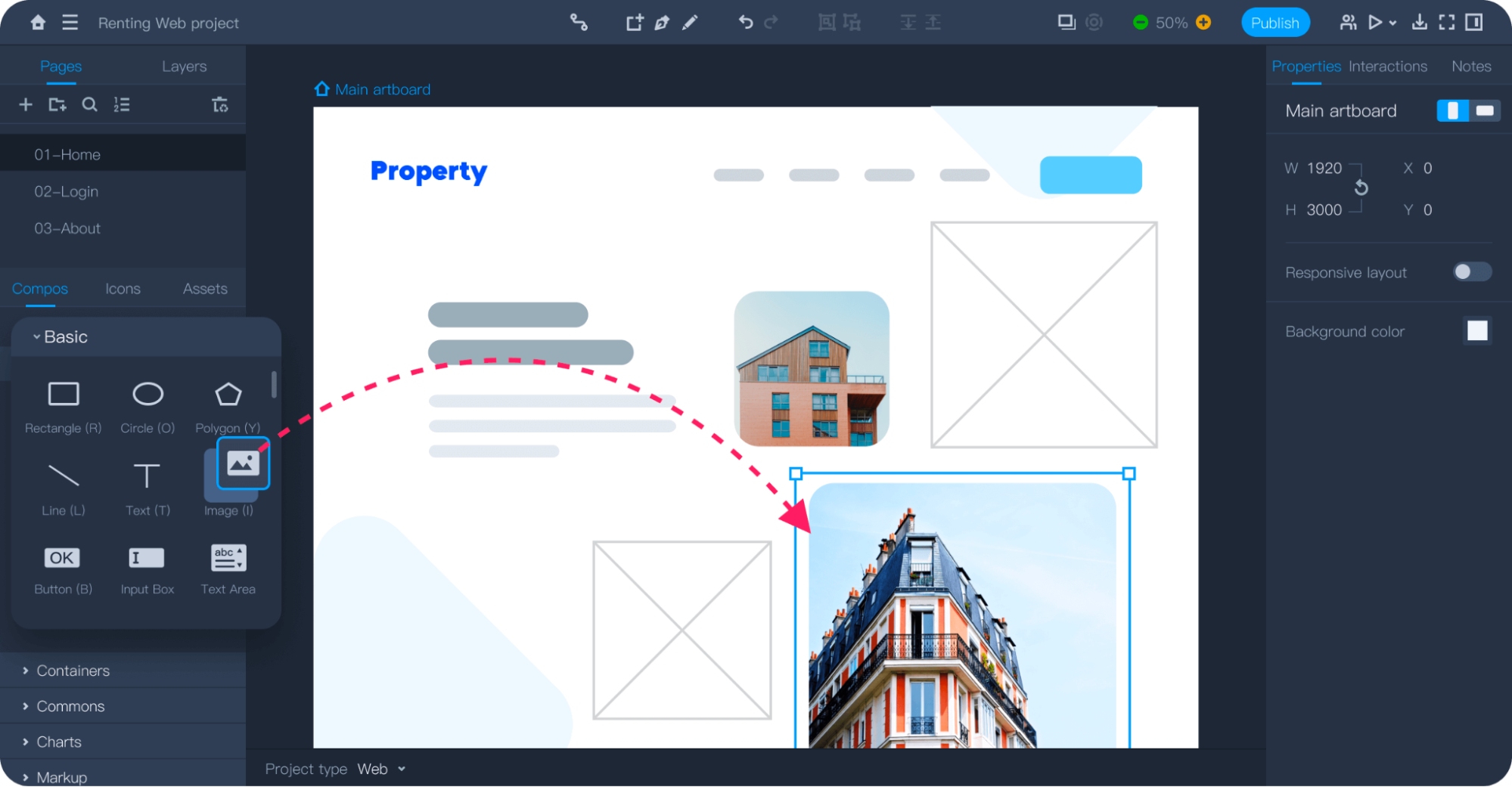
Creating a low-fidelity design in Mockplus.
The final step in IA is to evaluate the effectiveness of created architecture. It involves testing a product created according to the architecture to determine whether it meets the user's needs, and making adjustments as needed. The design process never ends; that's why it's prevalent when a team continues to perfect a product after releasing it to the market. IA practitioners might use analytics tools to monitor the solution in the market and introduce appropriate changes.
An information architect is a professional responsible for organizing and structuring information in a clear and logical way to make it easily accessible to all groups of users.
“Good information architecture makes users less alienated and suppressed by technology. It simultaneously increases human satisfaction and your company's profits. Very few jobs allow you to do both at the same time, so enjoy.” (Jakob Nielsen on Information Architecture)
The responsibilities of IA practitioners can vary depending on the organization, but the most common tasks of information architects are
Conducting user research to understand the needs and goals of the target audience.
Creating information models and developing taxonomies (organizing and categorizing information).
Designing navigation systems and information hierarchies to make it easy for users to find what they need.
Collaborating with team members (designers, developers, and content creators) to ensure that the information architecture aligns with a product's overall design and functionality.
Testing and iterating on the information architecture to ensure that it meets the needs of users.
The salary of an information architect can vary depending on factors such as their location, experience, education, and the industry in which they work. According to Glassdoor, the average base salary for an information architect in the United States in 2023 is around $126k per year. The salary ranges from $100k to $161k.
Information architecture templates are pre-designed structures or frameworks that can be used as a starting point for organizing content and designing navigation systems. These templates typically include common elements that can help guide the creation of a cohesive and effective information architecture. For this article, we've selected two versatile templates that can be used in any project.
Nick Finck created this collection of stencils to aid information architecture design. The stencils will help you to design wireframes, sitemaps, and process flows.
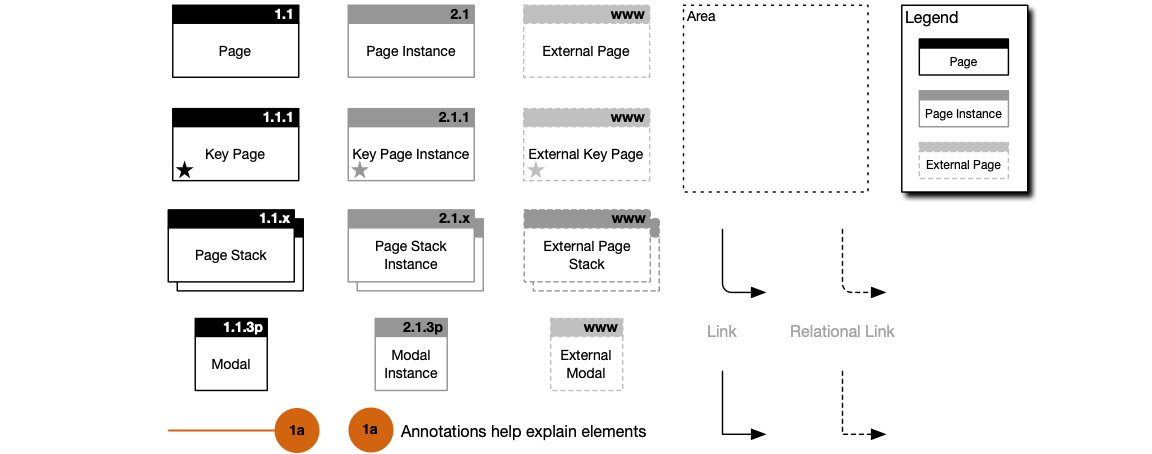
Visio stencils for information architects. Image by Nick Finck.
This easy-to-use IA template contains basic blocks that help the product team to showcase their web app/site structure. The template was created initially for Figma but can be easily imported into Mockplus by following this guide.
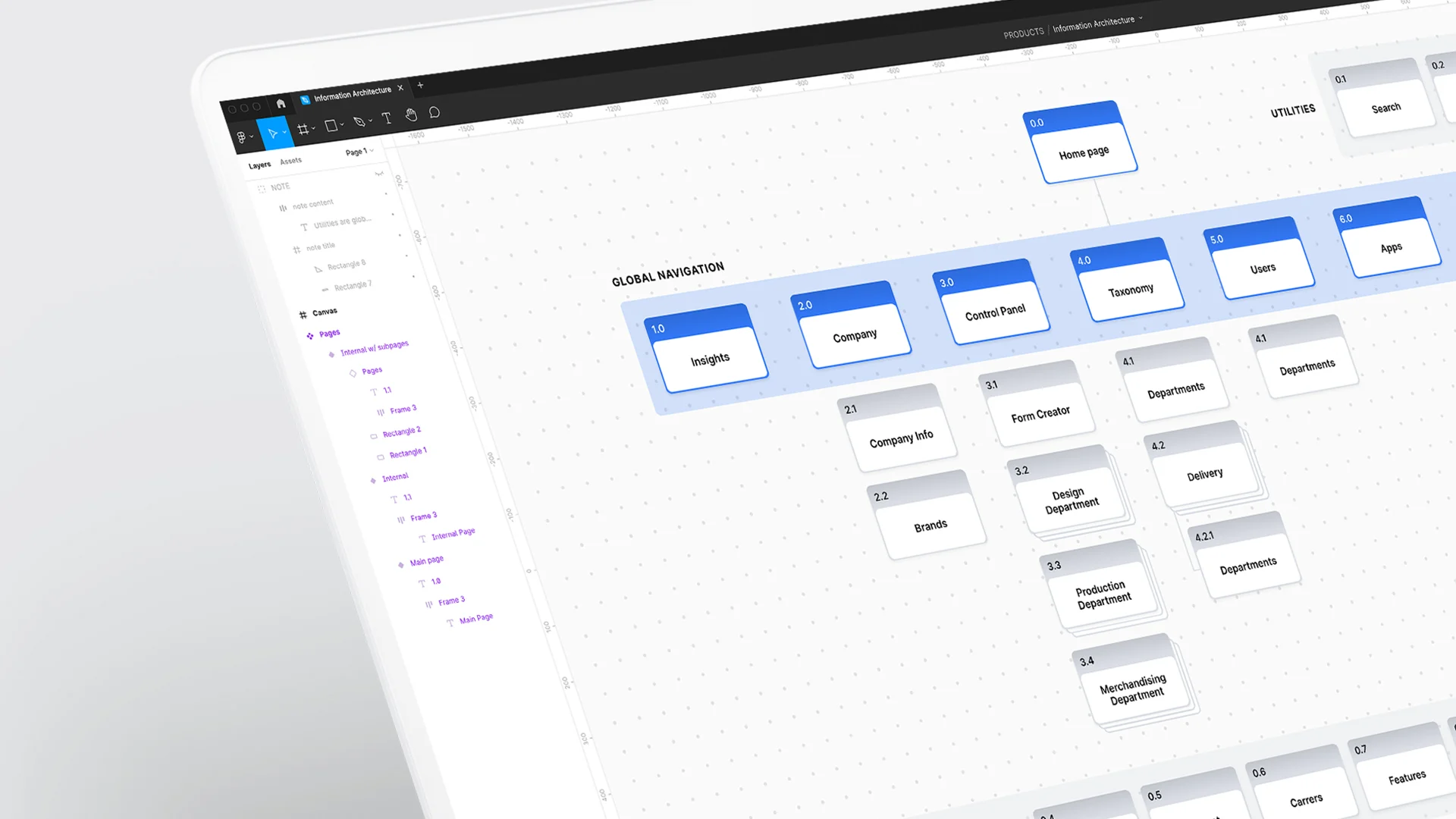
Sitemap from the Information architecture template
There are a variety of information architecture tools available to help information architects and designers create, organize, and visualize information architecture. Here are some of the most common:
Mind mapping is a technique used to map out the structure and hierarchy of information visually. Mind map uses nodes and branches to represent categories and subcategories of information and relationships between them. Popular mind-mapping tools are Miro, MindMeister, and XMind.
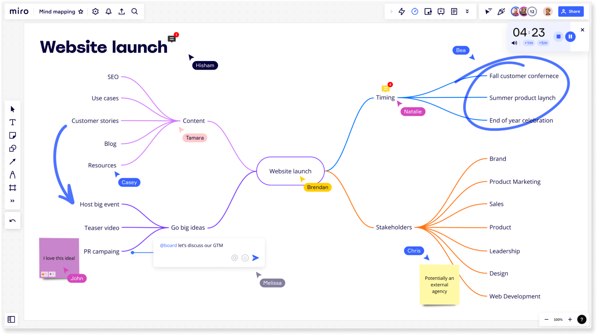
Example of a mind map created in Miro.
Card sorting is a user-centered design technique that helps information architects and designers understand how users categorize information. The basic idea of card sorting is to write information on individual cards, such as topics or categories, and ask users to group the cards in a way that makes sense to them. This process can be done in person or online, and can be moderated or unmoderated. Popular online card sorting tools are Optimal Workshop, Maze, and UserZoom.
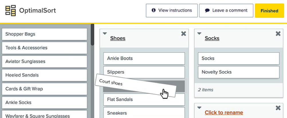
Card sorting using OptimalSort. Image by Optimal Workshop.
Sitemap helps information architects visually map out the structure and hierarchy of a website or application. Map is a hierarchical diagram of pages and navigation elements. While a sitemap can be created in almost any design tool, it's recommended to use the same tool the UI design team uses (for example, Mockplus RP) to make it easier to share the map with team members.
Wireframes are low-fidelity designs that help information architects to conceptualize and plan the layout of a website or application. Wireframe templates typically include a grid system for organizing content, as well as common interactive elements such as buttons, forms, and menus. Just like creating sitemaps, creating wireframes should be done in your favorite UI design tool.
A quick tip: If you want to learn how to create terrific wireframes, consider the course Draw an interactive wireframe in Mockplus. Coursera offers this course, and you can enroll for free.
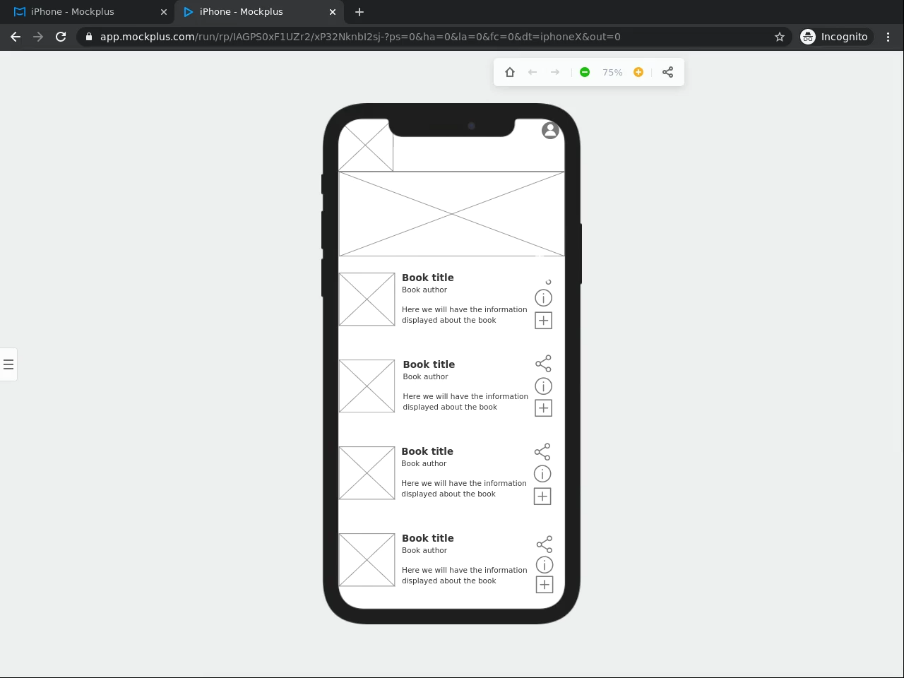
Wireframe of mobile app screen created in Mockplus. Image by Coursera.
Conclusion
Information architecture is one of the fields that evolve all the time. With the amount of information available on the web increasing all the time, IA practitioners always try to find new practices that help optimize the process of analyzing and organizing information. The good thing is that despite all the changes, the core principles of IA remain the same. They are focused on creating effective and efficient systems for organizing and accessing information.
No, information architecture and user experience are not the same things, but they are closely related. Information architecture is the process of organizing and structuring information to make it easy to find, navigate, and understand. It involves creating categories, labels, and hierarchies that help users locate the necessary information.
User experience, on the other hand, encompasses all aspects of a user's interaction with a product or service. It includes factors such as usability, accessibility, visual design, and content. Since content represents a significant part of a product, information architecture design directly impacts user experience. It's possible to say that IA and the product's functionality together form a foundation for the user experience.
The three pillars of information architecture are content organization, navigation, and search.
Organization: Content organization is about how information is structured and categorized, such as grouping related information together into categories, organizing information hierarchically, or using tags and labels to help users find what they need.
Navigation: Navigation is about how users move through the product—how they use menus, links, and other navigational tools. Good navigation should make it easy for users to find the information they need and understand where they are within the overall structure.
Search: Search is about the tools users use to search for particular information within the system. It includes both the search functionality and how search results are displayed to users. A good search experience should return relevant results quickly.
There are several principles of information architecture that guide the design of effective information structures. Here are a few of the most important ones:
Principle of organization of information: Information should be organized in a way that is clear, logical, and meaningful to the target audience.
Principle of labeling: Labels should be chosen carefully to accurately reflect the content they represent.
Principle of findability: Users should be able to easily find the information they need, whether through navigation or search.
Principle of hierarchy: Information should be structured hierarchically to show relationships between different pieces of content and help users understand the system's overall structure.
Principle of consistency: The information architecture should be consistent across different pages and sections of the system to avoid confusing users.
Principle of simplicity: The information architecture should be as simple as possible, avoiding unnecessary nesting of content or duplication of information.
Principle of flexibility: The information architecture should be flexible enough to adapt to changing needs and user feedback.
A good information architecture allows the creation of user-friendly products that help users find the information they need quickly and easily. Here are some key characteristics of a good information architecture:
User-centered: The information architecture should be designed with the user in mind, considering their needs, goals, and preferences. User testing and feedback should be used to refine the design and ensure effectiveness.
Consistent: The information architecture should be consistent throughout the system, with consistent labeling, navigation, and page layout. It helps users understand the system's overall structure and makes it easier to use.
Scalability: The information architecture should be designed with future growth in mind, with the ability to add new content or features as needed without disrupting the existing structure.