New to the world of UI design and feeling a bit overwhelmed with the vast knowledge? Unsure about how to effectively organize interface elements and interactions to create better UI and UX for your future web or app products?
No need to fret! We've rounded up 15 tried-and-true UI design principles that are perfect for beginners, being accompanied by real-world examples for better understanding. As you learn these key design rules, also do not forget to apply them to your projects using our UI design tool to practice and improve your design skills
Anyway, let's start now!
Principle 1: Make your design as simple as possible
As the well-known design principle "KISS" indicates, you should always "Keep It Simple, Stupid". In other words, whenever you are working on a web or design project, you are supposed to make your interfaces, including interface copies, visual elements, and interactions, as simple as possible, so that all users visiting your website or app can easily understand your interfaces and seamlessly navigate to other pages for resolving their problems.
One of the best practices is to allow users to rely on their previous experiences with similar digital products. Designers can achieve this by integrating familiar design concepts, metaphors, user flows, or even habits.
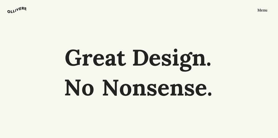
A simple interface design from Olliverse UI/UX design agency
This Olliverse design agency websites adopts a super simple and minimal design style, streamlining copies and elements to facilitate easy navigation for users. This serves as an excellent example of how you can design interfaces and copies in a way that eliminates user confusion.
Just remember: Never let the users think!!!
Principle 2: Use clear and hierarchical layout
The layout serves as the backbone of your website or mobile app UIs. To enable users to quickly scan through your interface and quickly get the most valuable information from the rest elements, it's essential to adopt a clear and hierarchical layout.
Actually, while designing UI projects, there are many widely-used UI layouts, such as the one-column layouts, featured image layouts, UI card layouts, and the trendy grid layouts, split screen layouts and more. Well, no matter which layout you are choosing, while crafting the layout of your project, keep the following tips in mind:
Create a clear information hierarchy - simply put, you tend to organize text content based on importance using different headline types, titles, and subtitles. Place visual emphasis on crucial titles and content.
Pay attention to the size and photography - apart from the headlines, and title types, you may try to use varied text sizes or photography to create a hierarchical structure within your interfaces.
Create clear hierarchy with colors and shadows - other visual factors, like colors and shadows, are also good tools for you to establish a clear hierarchical layout.
For example, as the below example shows, you can easily use different types of headlines, titles and subtitles to create a clear visual hierarchical layout:

A typographic hierarchy design concept made by Stig Melón-Bratvold
Or you can directly choose a straightforward layout, such as a split layout, for creating a more clear and hierarchical interface design:

A visual hierarchy design example made with a split screen a layout
We also have far more gold tips and examples for you to create clear visual hierarchy.
Principle 3: Always create user-centered design
User-centered design is all about creating web or app products by taking users' needs as the top priority during the whole product design lifecycle. While working on a UI project, designers should also adhere to this principle.
Generally speaking, in order to create a real user-centric design, designers can follow several key practices:
First, conduct thorough user research - UI designers should always start a project with a in-depth user research to gain profound insights into user behaviors, needs, and pain points. This forms the cornerstone for all design decisions.
Second, always think from the aspect of users - while encountering any design challenges, problems or disputes, always consider and make a decision from the viewpoint of the real users. Decisions should align seamlessly with user needs and preferences.
Third, test and collect feedback from real users - get the real target users to test the design timely and collect their first-hand feedback to adjust and improve the details.
And there are far more user-centered design principles. Well, no matter what happens, always prioritize the needs and interests of the target user.
Principle 4: Keep everything consistent
The consistent design creates a good impression on the user’s mind. Consistent navigation can guide users to find their most needed information quickly and effectively. Consistent operation design can make users quickly learn various product features.
Lack of consistency can mislead the users and cause bad user experience. Of course, the consistency principle does not mean that you need to follow it in all areas of your design. Intentional inconsistency can be good for user experience.

Webshocker design from Dribbble
As the above flower website design concept shows that, try to incorporate consistent fonts, color palettes, and images to establish a strong brand identity and make a lasting impression on users.
Principle 5: Make your interface readable
Make your content legible and readable is vital. Users will not read your content if it doesn't look clear and digestible. Designers should always put the readability of the content in the first place, and look for styles that make the interface both usable and visually appealing.
A lot of factors can influence readability, including background color, visual hierarchy, white space, context, typography, etc. But the font selection is a crucial factor among them. Designers should use different fonts for different types of websites or applications. For example, a serif is easier to read for long content.
Principle 6: Color also matters
Color, a dynamic element in your interface, possesses the ability to communicate as strongly as any other design element. Humans are inherently drawn to visually appealing aesthetics, making color a key factor in setting the tone and mood of interfaces. Therefore, always use color wisely in UI design.
For instance, as seen in the portfolio website below, employing bright colors to construct a clear grid layout, alongside strategic color contrasts, effectively highlights important content.

Interface design image from Kelsey Dake portfolio website
Color has the potential to reflect a brand's personality and even sway purchasing decisions. A meticulously crafted color scheme is not just visually pleasing but also a crucial component of creating an effective and aesthetically pleasing interface.
To guide you in this endeavor, here are 7 essential tips for crafting a compelling UI color scheme.
Principle 7: Provide prompt feedback
Every time the user performs an action, the interface should promptly respond to them and give clear feedback visually or literally. Never let them wait or guess, because this will cause anxiety and frustration, perhaps, eventually forcing them to leave your website soon.
So, designers and developers should prioritize creating interfaces that acknowledge and address user input promptly, fostering a sense of engagement and reliability. Whether through feedback messages, loading indicators, or real-time updates, a responsive interface enhances the overall user experience.

A typical mobile UI app example of showing how you can give users prompt feedback whenever they take an action.
Principle 8: Make your design responsive
In today's digital landscape, a multitude of devices, such as computers, mobile phones, and tablets, are utilized to access your website and mobile apps.
To guarantee an optimal experience for all your target users, it is crucial to ensure that your apps are accessible across diverse devices. Creating fully responsive UI designs becomes imperative for delivering the best possible experience regardless of the device your users prefer.
And while designing, you are supposed to use the responsive layout and also try to thoroughly test your responsive designs in advance on all possible digital devices.
Principle 9: Take fully advantage of contrast
In UI design, "contrast" refers to the strategic utilization of stark differences between text and background, varied sizes of text, and diverse color palettes to emphasize important content and improve the readability and accessibility of interfaces.
By leveraging contrast effectively, designers can draw attention to key elements, enhance visual hierarchy, and ensure that information is easily discernible and comprehensible to users.
For example, designers often use black text against a white background to create a strong contrast and make text content stand out, as shown below:
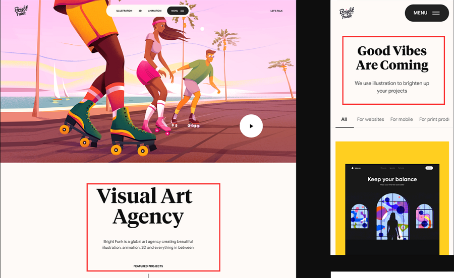
Black texts against the white background from Bright Funk website design
Or directly use bright color contrasts to engage users and stand out the important content.
A website example that uses color contrasts
Principle 10: Wisely use negative space to create minimal design
These days, minimalistic UI design has surged in popularity among designers. This approach leverages negative space, also known as white space, to create a clean and clear layout that highlights essential content. By sparing users from a cluttered interface, minimal design enables them to swiftly locate the information they seek.
The rise of simple and user-friendly Apply style interfaces, such as those seen in popular apps today, underscores the effectiveness of this approach. Whether you're a novice or seasoned UI designer, embracing negative space and minimal design can elevate the quality of your interface designs, enhancing user experience and engagement.
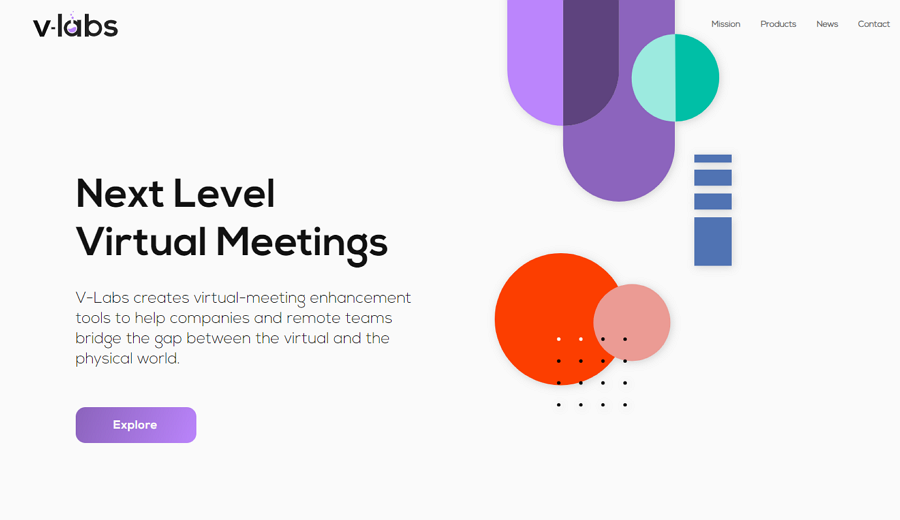
v-labs minimal website example
These days, many minimalist-style websites utilize ample negative space, high-quality hero images, and bold typography to simplify the web interface, ultimately highlighting text content and attracting a larger audience more effectively.
Principle 11: Error prevention and recovery
Even the most seasoned users can make mistakes when navigating web or mobile products without clear guidance. To preempt such issues, interface designers should incorporate error messages, interactions, and strategies to steer users away from potential pitfalls.
Even when they do have made some mistakes, also providing timely solutions to rectify the issue and restore data or similar elements can effectively mitigate user frustration and maintain a seamless user experience.

A form error and success example from Dribbble
Before or after taking an action, you should always provide users with guidance to avoid mistakes.
Principle 12: Select typography aligned with brand mood
When choosing typography for your UI project, consider not only enhancing readability with different fonts, sizes, and styles, but also reflecting your brand's mood or personality through color and style.
Let's use the humanity website concept below as an example. To align the interface with a futuristic style, designers opt for a straightforward and bold typography to establish a cohesive brand impression.
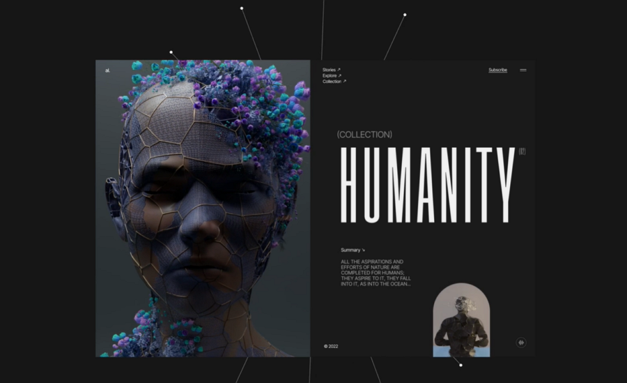
A typography example from Dribbble
Principle 13: Add natural micro-interactions and animations
In contrast to static elements and interfaces, web or app interfaces featuring natural and immersive interactions and animations engage a significantly larger audience and effectively make it fun to navigate around there. By adding dynamic elements that mimic real-world interactions, designers can create interfaces that feel intuitive and responsive, leading to greater user engagement and satisfaction.

A website example that uses micro-interactions and animations to attract users.
Principle 14: Adopt storytelling style
Utilize storytelling techniques in your UI design to captivate users and convey information effectively. By crafting narratives within your interface, you guide users through their experience, making it more engaging and memorable.
Incorporate interactive elements and visual cues to create a compelling story that resonates with users, fostering a stronger connection with your brand or product. Simplifying your message through storytelling enhances the overall user experience and leaves a lasting impression.
You may also check more storytelling websites and examples to glean insights on how to effectively integrate this technique into your UI design project.
Principe 15: Never forget user testing
Throughout the UI design or product design lifecycle, never underestimate the importance of continuous user testing. While refining the visual aspects of interfaces is crucial, it's equally essential to regularly test them with real users.
Why? Despite collecting extensive data during the user research phase, your ideas remain subjective until validated by real users. By involving users in testing, you can uncover usability issues, gather invaluable feedback, and refine your designs accordingly. Effective user testing not only improves the user experience but also saves time and costs in the long run.
FAQs
1.What is UI design?
UI design (user interface design) is the process of designing the visual layouts, elements and interactions that allows visitors to quickly navigate within different pages of a web or mobile app, and achieve their goals or find a solution as soon as possible. It focuses on creating interfaces that are intuitive, visually appealing, and easy for users to navigate.
2.What is a good UI design?
A good UI design always brings a good user experience and comes with:
A easy-to-use navigation system
A clear visual hierarchy
A consistent design style, tone and mood
Fun and interesting interactions and animations
Enticing CTA buttons
And far more
Simply put, a good UI design combines appealing visuals with effective functions, ensuring a positive and engaging user experience.
3.UI design vs UX design?
UI designers focus on arranging the visual elements of interfaces to decide how a website or app will look and work for users.
UX designers concentrate on making interfaces, interactions, and features easier to use, aiming to create a product that makes users feel good.
They do have different focuses.
4.Does UI design require coding?
No. UI design typically does not require coding, but having some understanding of front-end development languages such as HTML, CSS, and JavaScript can be beneficial for UI designers. While UI designers focus primarily on the visual aspects of interfaces, knowing how to code can help them communicate effectively with developers and ensure that their designs are implemented correctly.
5.How to create a UI design?
Apart from the key UI design principles illustrated above, you may also need some professional UI design tools, like Mockplus DT, Adobe XD and Sketch.
Conclusion
All of these 15 key UI design principles and rules serve as invaluable resources for enriching your design knowledge and honing your skills. By incorporating these principles into your practice, you can cultivate a deeper understanding of user interface design and elevate the quality of your work. So, embrace these principles, experiment with them, and allow them to guide you toward creating exceptional user experiences that leave a lasting impression.


 Join our Discord community
 support@mockplusapp.com