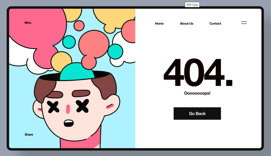
Encountering a "404 Page Not Found" error while browsing a website or app can be frustrating, especially when you’re clicking on something that piqued your interest. But not all 404 error pages have to be a disappointment for visitors. With the right copy, design, and interactive elements, these pages can actually enhance the user experience, leaving a lasting positive impression.
So, what should you do to turn annoying 404 errors into UX wins? What should you include when crafting it in your design and prototyping tool? Here, we'll cover the fundamentals of 404 page design and showcase 30 standout examples, templates, and practical design tips to inspire you.
A 404 page, also known as "404 error page" or "404 page not found", is an error landing page that appears when a requested web page won't load, doesn’t exist, or has a broken link. It is often taken as a backup solution by designers or developers to handle unexpected loading errors or dead links gracefully.
Generally, a well-designed 404 error page not only informs visitors that the page or link they tried to access isn’t available. It usually includes a CTA button or link, such as "Back to Home" or "Return to Main Page," to guide users back to the main site.
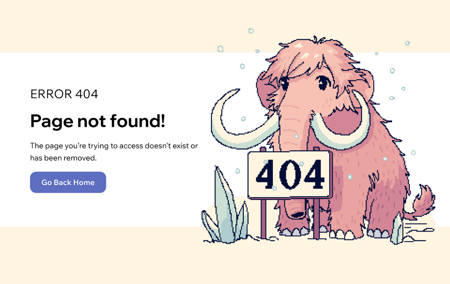
So, this thoughtful error page can absolutely turn potential frustration into a positive experience.
A 404 page typically appears when users encounter the following situations:
A web page cannot load due to server or technical issues
A page has been moved without a proper redirect
A page has been deleted or never existed
The URL is dead or broken
A sales URL or promotional link has expired
A URL is entered incorrectly or contains typos
These are the main situations where you might get a 404 error.
Here are the main benefits of having a good 404 error page:
Imagine clicking “Buy Now” on a T-shirt site, only to end up on a blank page with a blunt “404. Page not found” message. How would you feel? Pretty bad, right?
Now, let’s reimagine that experience. Instead of a dead end, what if the 404 page greeted you with a fun image—or even a short video—to lighten the mood? What if it offered friendly suggestions to guide you to similar products or popular sections? And what if it had a clear button to smoothly direct you back to other parts of the website? Not so bad, right?
That shift from frustration to engagement is why a well-designed 404 page matters.
While stuck with a 404 page not found error, an unfriendly design might make the visitors leave immediately. However, a well-designed 404 page will encourage them to stay on and also continuously explore the other part of the website.
A custom 404 page design is a perfect space to show brand voice and personality. A positive, helpful or even humorous message and page design can surely create a positive, long-lasting impression on users.
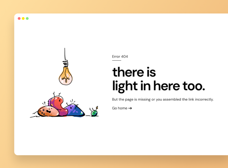
Show a brand personality
This example uses thoughtful wording to effortlessly convey the brand's optimistic personality.
If website issues like broken links, server problems, or loading errors cannot be avoided, a user-friendly 404 page can serve as an efficient backup solution to handle these issues smoothly and keep the user experience positive.
A well-designed 404 page with helpful guidance can quickly clear up confusion when visitors encounter errors. By providing clear directions and options, it eases their frustration, allowing them to continue browsing smoothly without interruption.
In one sentence, a good 404 page design can help to turn a potential bad experience into an opportunity to keep visitors engaged with your website.
Since a well-designed 404 page matters a lot for your website's UX, here are the key elements that a good 404 error page should include:
A clear and user-friendly error message - a friendly error message, such as “Oops! We can’t seem to find the page you’re looking for,” helps to reduce confusion and frustration. It’s much more approachable than the harsh “404 Page Not Found” message.
A consistent brand design - while designing a 404 page, also include your brand visuals, like brand colors, logos, slogans and fonts, to ensure that your 404 page is in accordance with your brand style.
A personalized brand tune - incorporating your brand’s tone — such as humor, positivity, or other brand characteristics—into the design, copy, images, and animations of your 404 page can make the experience more engaging. This personal touch helps to reinforce your brand identity and turn an error page into an opportunity to connect with users in a lighthearted or memorable way.
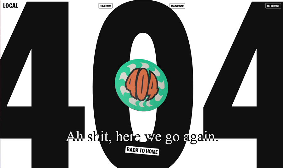
A 404 page design example which has a much casual, playful style, which is made by a Local studio. The rotating 404 bandage also engages users efficiently.
A clear call-to-action (CTA) button - a button like “Back to Home” is sort of a must-have element to guide users back on track.
This 404 error page includes a clear "Live Support" button, allowing visitors to quickly access assistance in such situations.
Clear guides or links to other site parts - also provide links or guides for users to smoothly navigate to other parts of your website.
If possible, you might also leave your team or company's support information, which allows users to directly reach your team if needed.
Of course, these are the basic things that a 404 error page might have. If necessary, you can also add far more to make it better for your case.
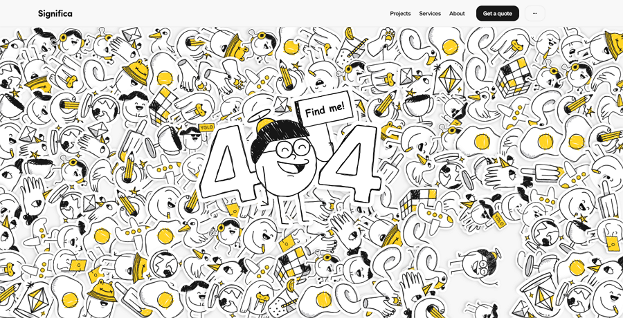
Designer: Significa
Highlight: Incorporate a fun game
At first glance, you might find this Significa 404 design example a bit overwhelming with its clustered design. We admit this aspect has sparked some debate among users and designers alike. However, its standout feature manages to win over the hearts of many visitors.
Like most 404 pages, this example includes the essential elements: a clear 404 error message, navigation links, and a call-to-action (CTA) button. While these basics are common, the real charm lies in its unique twist — an interactive game!
The page invites visitors to "Find me!" by searching for a hidden cartoon character within the seemingly chaotic design. This simple yet engaging game transforms a potentially frustrating situation into a delightful experience. By encouraging users to explore the page, it not only alleviates negative emotions but also keeps visitors engaged longer.
Delight user experiences in a fun way
Incorporating a playful, interactive element like a mini-game can turn a 404 error into an opportunity to surprise and delight users, leaving a positive impression.
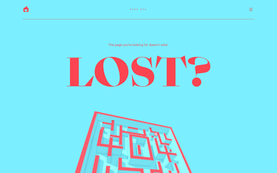
Designer: EPIC Agency
Highlight: Incorporate a classic maze game
EPIC Agency offers an inspiring 404 page design that truly stands out by incorporating a classic maze game. Visitors can scroll their mouse to guide a pink rabbit through various paths to collect carrots—simple, nostalgic, and undeniably fun! Honestly, if there were no time limits, it would be tempting to stay and play forever.
Add classic games to your inspiration list
This example demonstrates how classic games, like a maze, can breathe life into a 404 page. Beyond mazes, there are countless other timeless games that could serve as inspiration for your designs.

Designer: Baqemono
Highlights: Embrace a trendy brutalism style
Breaking away from the clean and minimalist norm, this 404 page by Baqemono takes a bold step in the opposite direction with a brutalist design approach. Featuring oversized, bold typography, quirky rotating animations, and amusing emojis, the interface feels chaotic yet unexpectedly engaging. This daring style transforms the 404 page into a visually striking and memorable experience.
Incorporate the brutalism style
The brutalist design style has become increasingly popular for its unconventional, almost geeky aesthetic. It often includes large, bold fonts, repetitive or exaggerated animations (like rotations, jumps, or shakes), and eccentric elements like wacky emojis. While visually unconventional—even bizarre—this approach can surprise users and keep them engaged, offering a fresh alternative to traditional design norms.
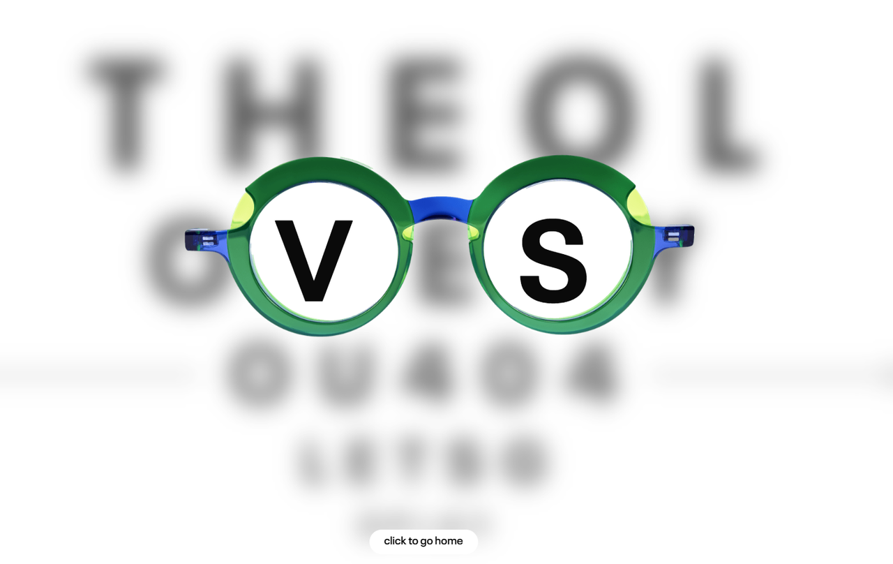
Designer: Theo
Highlight: Interactive design perfectly aligned with their eyewear business
Theo's 404 page is a brilliant example of creativity tailored to an eyewear brand. The design mimics a real-time eye test, where visitors can move the displayed eyewear to see the blurring of letters. This interactive experience not only engages users but also makes the brand more memorable by seamlessly tying the 404 page to its core business.
Wisely incorporate your business or band elements
Take inspiration from this example and infuse your 404 page with elements that resonate with your business or brand. For instance:
A clothing store could feature interactive clothing items.
An online bookstore might use creative visuals of books or bookshelves.
A travel company could display maps or travel-themed games.
Aligning the design with your brand identity not only enhances user experience but also reinforces brand recall.
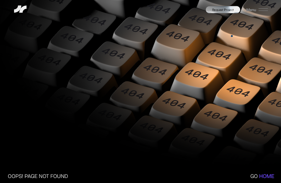
Designer: Julian Fella
Highlight: Engaging animations and interactions
This creative 404 error page comes from a portfolio website. Visitors can easily navigate to other pages by expanding the mega menus located in the upper-right corner. Beyond its user-friendly navigation, this example shines due to its captivating animations and interactive elements. Users can move their cursor to illuminate the screen, revealing the "404" message in a dark, immersive environment.
Animate your 404 page
Static and dull 404 pages can increase the likelihood of visitors leaving your site. However, incorporating engaging animations or micro-interaction designs can create a more enjoyable user experience, even encouraging visitors to stay longer.
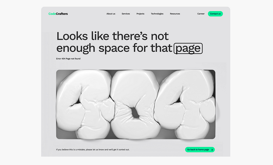
Designer: Damian Patkowski
Highlight: Harmonious texts and visuals
This 404 error page example effectively combines text and visuals to communicate the situation clearly and creatively. The message, "Looks like there's not enough space for that page," helps eliminate user confusion. Below the text, a squeezed, balloon-like texture visually reinforces the idea of limited space, creating a cohesive and memorable experience.
The clever synchronization between words and imagery makes this design both inspiring and delightful.
Make the words, images, and visuals echo one another
Ensure your text, visuals, and design elements work in harmony. When these elements echo one another, the 404 page becomes more engaging and leaves a lasting impression on visitors.

Designer: Flayks
Highlight: Creative balloon-style texture
Interesting and eye-catching visuals on a 404 error page can do more than just make it stand out—they can also redirect visitors' attention, helping them focus on the design rather than the inconvenience of the missing page. Flayks demonstrates this perfectly by incorporating nearly touchable balloon-style font animations. These playful visuals help ease the tension and confusion users might feel, creating a more positive experience.
Try unique textures for words, images or even backgrounds
Incorporating unique, touchable textures into your design is a growing trend that not only creates a distinct visual style but also enhances user engagement. Consider animating these textures to add an extra layer of interactivity and take your 404 page design to the next level.
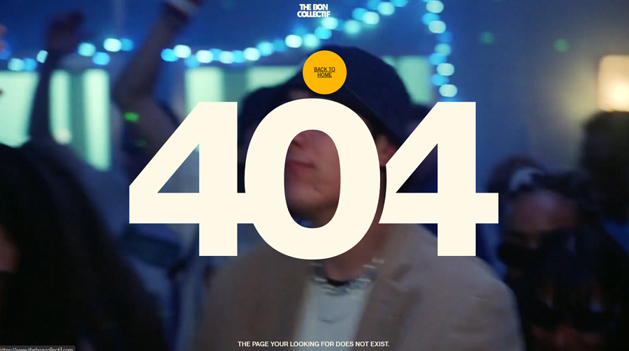
Designer: The Bon Collectif
Highlight: A video background
In addition to including the essential elements of a 404 page, this example takes it a step further by incorporating a video background to captivate users. Adding to the convenience, the "Back to Home" button follows the mouse cursor, allowing visitors to return easily without searching for navigation options like on other 404 pages. Isn’t that thoughtful?
Enhance your page with multimedia, like audios and videos
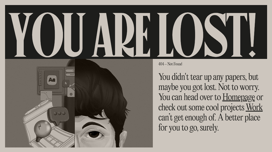
Designer: Niccolò Miranda
Highlight: Creative magazine style design
This award-winning 404 page stands out with its striking magazine-inspired visuals. Featuring vintage fonts, a black-and-white image, old-style typography, and other retro design elements, it creates a unique and sophisticated aesthetic that leaves a lasting impression on visitors.
Choose a vintage visual style
A vintage design style can evoke nostalgia and charm, helping your 404 page stand out. Incorporating elements like retro fonts, monochromatic images, and old-style layouts can make your page memorable and engaging.
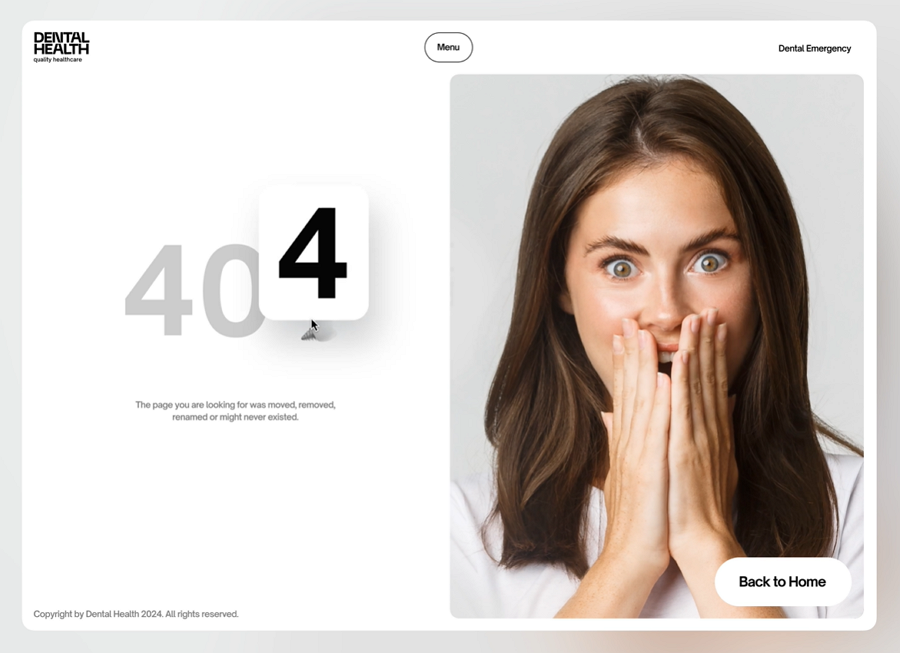
Designer: Bogdan Nikitin
Highlight: Infectious emotional images
This 404 page for a dental health website incorporates a heartwarming image of a smiling young girl, designed to reflect the emotions visitors might feel upon encountering the page. This clever design approach resonates with users and naturally elicits a smile, creating a memorable and delightful experience.
Enhance your interface with emotional designs
Emotional design patterns —such as infectious emojis, humorous visuals, or heartwarming images—can engage visitors on a deeper level. By evoking positive feelings, these designs help ease frustration and keep users immersed in the experience.
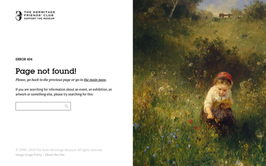
Designer: Anton Borzenkov
Highlight: Use-friendly search bar
Typically, 404 pages feature a "Back to Home" button or basic navigation to guide users elsewhere on the site. But why not allow visitors to directly search for what they need instead? This innovative approach is exactly what this 404 page offers—a clean, user-friendly search bar that empowers users to find their desired content quickly and easily. It’s a smart and practical solution for an otherwise awkward situation.
Include a search bar as well
Adding a search bar to your 404 page provides users with a direct way to locate what they’re looking for, improving their experience and reducing frustration. This feature makes your site more functional and user-focused, even when things go wrong.
You might also add the related links as below:
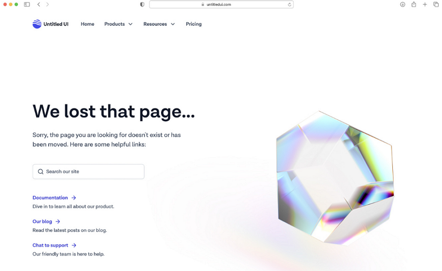
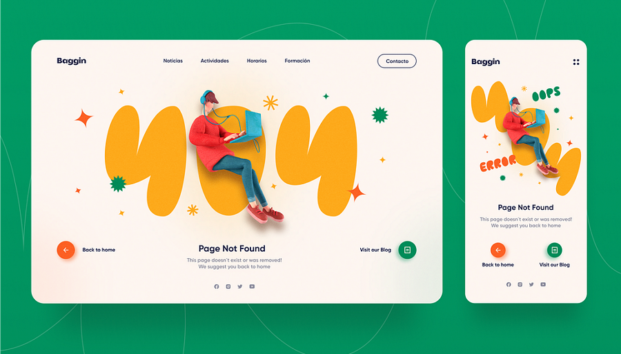
Designer: Pesto
Highlight: Responsive design for both websites and mobiles
A 404 page is an essential part of any website, and making it user-friendly means ensuring it’s responsive across all devices. Pesto provides an excellent example of how to effectively design a 404 page that adapts seamlessly to both desktop and mobile screens, maintaining usability and visual appeal no matter where it’s viewed.
Design for Responsiveness
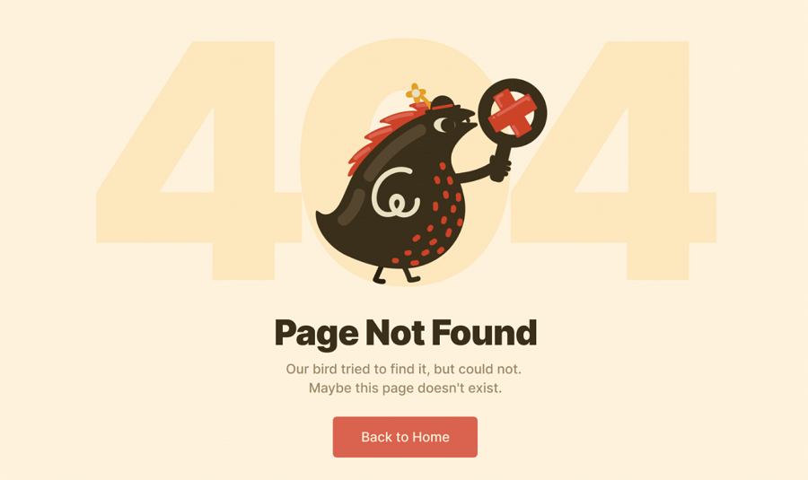
Designer: Eugene Vysotsky
Highlight: Tell a fun story
This example uses a trendy illustration style and incorporates custom, engaging copy that humorously informs users that their bird has tried to locate the target page but failed. The storytelling approach feels like a casual, personal conversation, effectively reducing the distance between users and the website. This technique not only enhances user engagement but also makes the experience more relatable and enjoyable.
Elevate your page design by incorporating a storytelling style
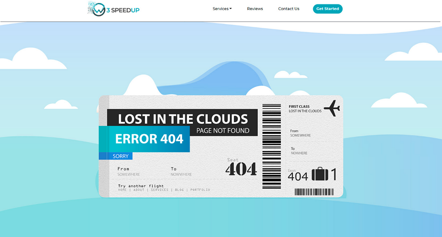
Designer: Akash S
Highlight: A ticket style aligned with your brand
This 404 error page for an airline ticket website creatively uses a ticket-style frame to present the error message. The design is both familiar and relevant to visitors, perfectly aligning with the airline's brand and theme. This approach makes it easier for users to understand and accept the inconvenience, as it feels natural within the context of the website.
Choose a style or design that aligns with your brand or product theme
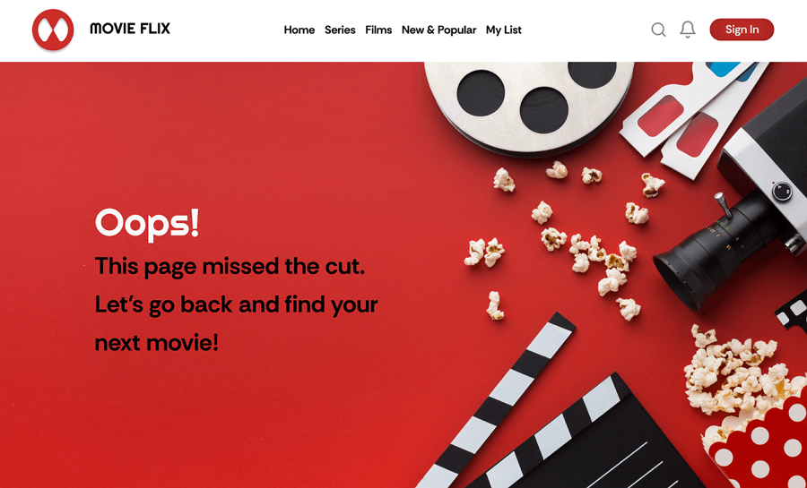
Designer: Reshav Pratap Singh
Highlight: A creative design with a great color combination
How would a professional UI designer craft a 404 page for a movie website? Adding iconic movie elements like popcorn, cameras, and film reels would be a fantastic idea! This designer embraced that concept and presented it in a visually engaging and direct way. The standout feature of this example is the excellent use of color combinations, which enhances the overall appeal and resonates with the entertainment theme.
Use a trendy color scheme
Beyond brand logos and thematic elements, colors play a crucial role in retaining users. Selecting a trendy color palette is a quick way to grab users' attention and create a memorable experience.
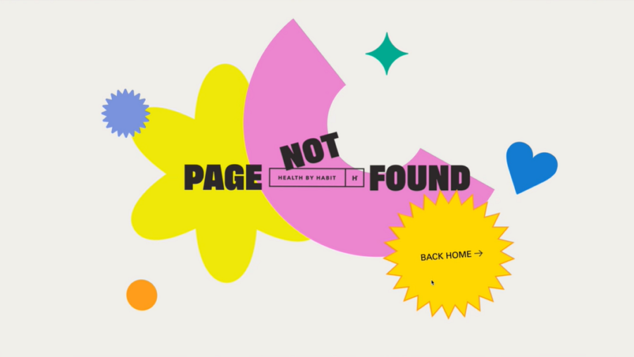
Designer: Synchronized
Highlight: Wisely use simple shapes to create a modern feel
Unlike other 404 page clustered with colors, elements, illustrations and visuals, the Health By Habit 404 interface takes a refreshingly minimalist approach. The designer relies on basic shapes in bright colors to craft a sleek, modern look. This is a perfect example of the golden rule of minimalism: "Less is more." The result is both visually striking and highly effective.
Create a minimalist and appealing 404 page
This example demonstrates how simple shapes can work beautifully. You could also experiment with minimal imagery, color blocks, photography, or other subtle design elements. The possibilities are endless—get creative and make your 404 page stand out!
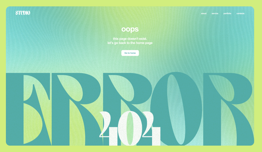
Designer: Arina Smirnova
Highlight: Striking custom large, bold typography
Instead of using simple geometric shapes, this page tries to use a large, bold typography. Obviously, this result is quite good, right? The carefully chosen color palette and distinctive background texture further enhance the design, making the page both visually appealing and memorable.
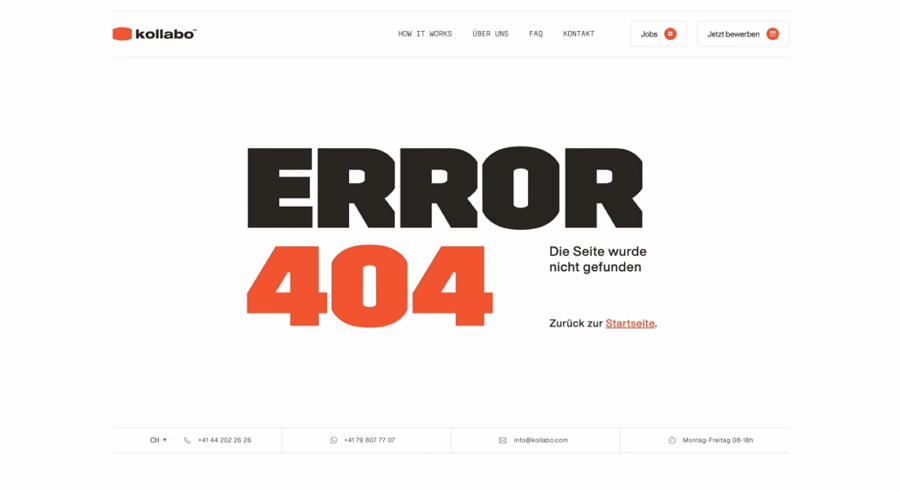
Designer: FIFTYSEVEN
Highlight: Minimalist design using only texts
Kollabo’s 404 error page is a great example of how to create impact with just words and thoughtful typography. The clean grid layout at the top and bottom enhances navigation, while drawing attention to the central content. It’s minimal, yet far from simplistic—a testament to the power of refined design choices.
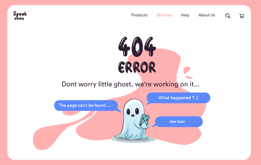
Designer: MD.NADIM MAHMUD
Highlight: A brilliant illustration that speaks without voices
Using illustrations is a common approach to crafting impactful 404 pages, but not every illustration can convey meaning without words or voices. This example stands out by doing just that. The clever and engaging design communicates effectively, making it both inspiring and memorable.
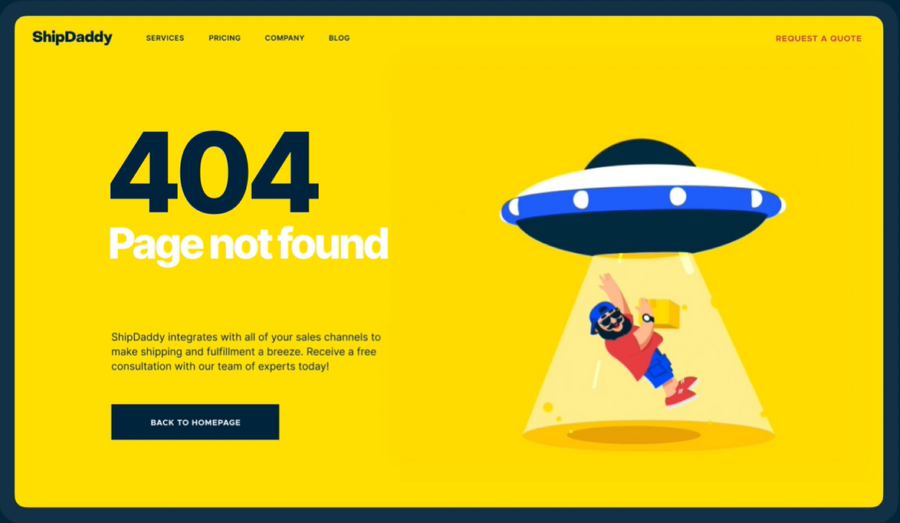
Designer: Tubik
Highlight: Fun mascot animation perfectly aligned with the brand
This 404 page, designed for ShipDaddy, a customer-focused warehousing and fulfillment company, is a prime example of integrating brand identity into error pages. The design team cleverly uses the company mascot in a playful animation, while seamlessly incorporating brand elements like colors and visual details. The result is a design that not only entertains but also reinforces the brand's impression on users.
Integrate your brand identity
Make your 404 page more memorable by incorporating brand elements such as mascots, logos, and signature colors. It’s a great way to keep users engaged while strengthening your brand presence.
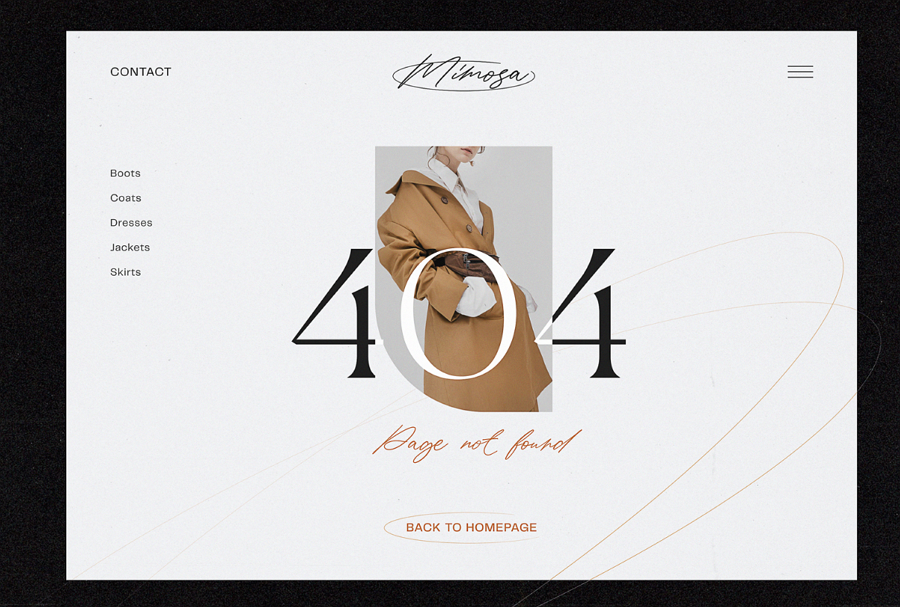
Designer: Tubik
Highlight: User-friendly sidebar, a minimalist and airy layout
Looking for inspiration for fashion brand design? This example can surely inspire you. The designer uses a minimalist and airy layout to naturally direct the users' attention to the error message and the fashionable coat (one of the hot product of the fashion brand) in the middle, making them knowing the general style of the brand.
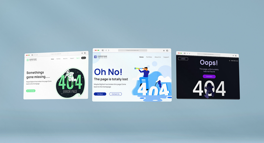
Designer: Joinal Abedin
Highlight: Five stylish 404 page templates with flat design and illustrations
This designer showcases five examples of 404 error page templates, each featuring unique and stylish flat design elements with engaging illustrations. If you’re in search of creative flat design templates for inspiration, these examples are definitely worth exploring.
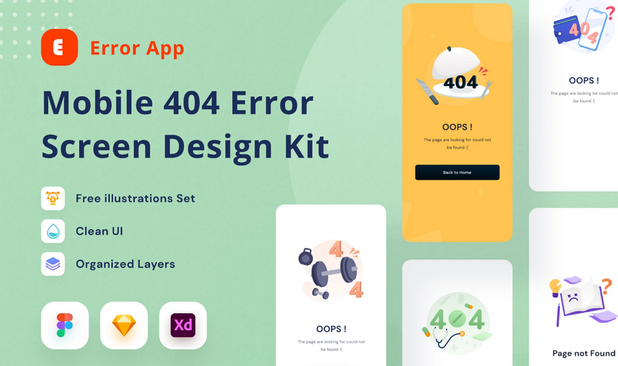
Designer: DimoGraphic
Highlight: Free illustration set, clean UI
This 404 error page kit is designed specifically for mobile apps, offering four unique templates featuring varied colors and illustrations. It’s versatile and user-friendly, providing three file format options—Figma, Sketch, and Adobe XD—so you can easily customize it to suit your needs.
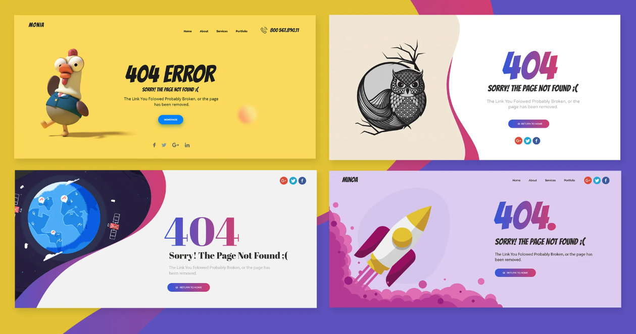
Designer: mexopixel
Highlight: Four templates, smart layers
This collection offers four 404 error page templates featuring trendy colors and a variety of design elements, including unique illustrations, photography, content, and CTA buttons. Each template is crafted to fit different branding needs, allowing you to select the one that best aligns with your brand’s identity.
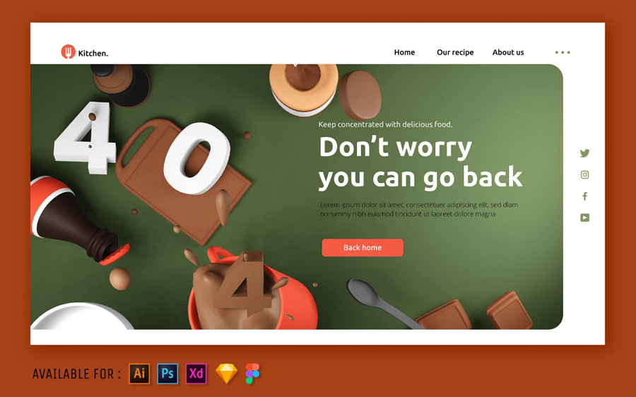
Designer: SlideFactory
Highlight: 3D illustrations, extensive file formats available
This template stands out with its striking 3D illustration of a messy kitchen, making it ideal for food-related themes such as restaurants, beverage brands, or food delivery websites. It also offers extensive file format compatibility, including Sketch, Figma, Photoshop, and Illustrator, ensuring flexibility for your design needs.
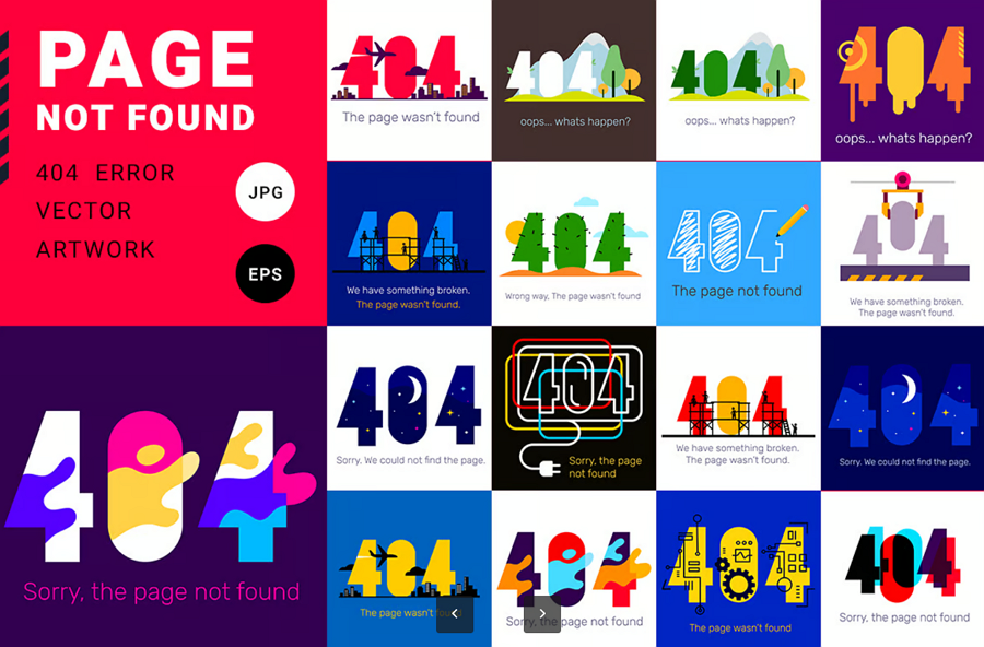
Designer: wowomnom
Highlight: Simplified stroke design style, bright colors
This template collection uses a set of simplified stroke style images and features for its bright, eye-catching colors. Its minimalistic approach makes it versatile, suitable for a wide range of website themes, from e-commerce to personal blogs and more.
After doing some user research, you might have a good understanding of users needs, and behaviors. A free wireframing and prototyping tool like Mockplus RP would help you quickly visualize your design solutions, including the interface layout, interactions and user flows.
Its pre-made UI/UX design components and asset libraries, easy-making interactions, and drag-and-drop interfaces help you to present every possible ideas hitting you in just seconds or minutes.
When you've decided on the macro design directions like the key pages, framework and layouts, you might need a professional UI design tool like Mockplus DT to design and collaborate every super tiny detail with your team together in just one place, and also at the same time.
It covers all the core features of tools like Figma, and excels for its cost-effective pricing.
For now, when you've finalized your design file, you might need to hand over all deliverables to developers for the page development.
Mockplus Cloud, which comes with developer-friendly features, would help you to hand over all deliverables to developers via a single link. All design specs, assets and code snippets are automatically generated once when you import your design files from Photoshop, Figma, Sketch, Adobe XD and Axure.
Overall, Mockplus provides all the tools that you might need from early design ideas to developer handoff. Your whole design workflow is connected in just one platform.
A good 404 page design offers an approach to turn frustrating errors into UX wins, helping to retain visitors on your website for a longer time. We hope these 30 creative design examples, templates and best practices would give you helpful clues to create a better 404 error page design!
 Mockplus RP
A free prototyping tool to create wireframes or interactive prototypes in minutes.
 Mockplus DT
A free UI design tool to design, animate, collaborate and handoff right in the browser.
