With the dawn of mobile/PC devices and iPads, we are truly living in fully electronic time. We cannot live without our devices and the internet, which provide us the resources we need to get through our day-to-day life. All these different sized digital screens resulted in the growth of responsive website design.
Since Ethan Marcotte introduced the term in 2010 for the first time, responsive design has been on an upward trend. With the popularization of mobile Internet, the need for responsive web design has also increased, responsive design is failing mobile UX.
As the name implies, the design of these pages is responsive. Therefore, it changes depending on the characteristics of the device’s screen size. Devices all read the same Web pages. The design of these pages, however, is no longer static. The bottom navigation, the arrangement, and presentation of individual elements such as bar images and hero images can all vary, enabling an optimized display and device-independent communication on each terminal.
Based within the technical standards of HTML5, CSS3 and JavaScript, a feature called Media Queries (CSS3) is the foundation of modern responsive Web design whereby the device’s screen size is used as a unit of measure for the associated code. This means that CSS can be applied to different devices effortlessly. Depending on the resolution, you can adjust the page layout and the size of the elements, fonts, as well as the navigation. You don't have to rely heavily on Javascript or HTML code.
Conclusion: Responsive web design is a required and essential strategy for supporting multiple devices.
We've picked out 20 of the most inspiring responsive web design examples for 2019. Let’s have a look!
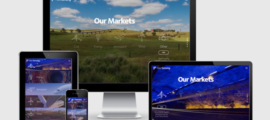
HBM FiberSensing is famous for having addressed hundreds of different monitoring projects around the world and delivered thousands of sensors and measurement units throughout the years. It’s also an excellent responsive website example.
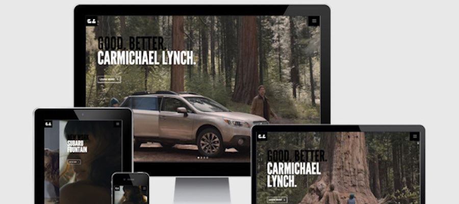
Carmichael Lynch creates unfair ideas that give clients an unfair advantage. Sometimes they give great ideas that can transform entire organizations. Unfair ideas let us do more with less. Unfair ideas used to be impractical, but now in marketing environments with the ceaseless competition, they’re unique and utterly, wonderfully unfair.
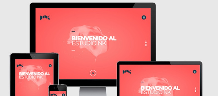
Estudio NK was the only Latin American agency nominated for the best responsive web design of the year award by Awwwards. They have also been nominated for the CSS Design Awards. Estudio KN advocates for good, human-oriented products over brand-oriented alternatives.
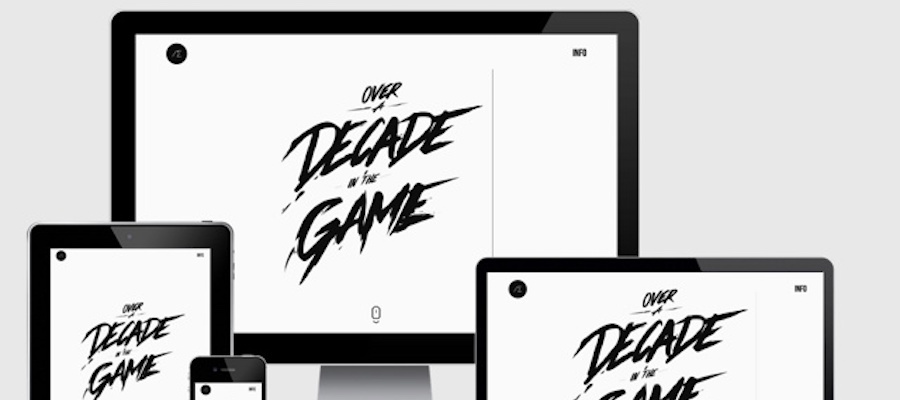
Alexander Engzell is a Swedish design studio. It helps to change companies’ image and people’s daily lives. The era of old men making business decisions behind closed doors is over. Any business that wants to succeed in this digital-first landscape needs to adapt to it.
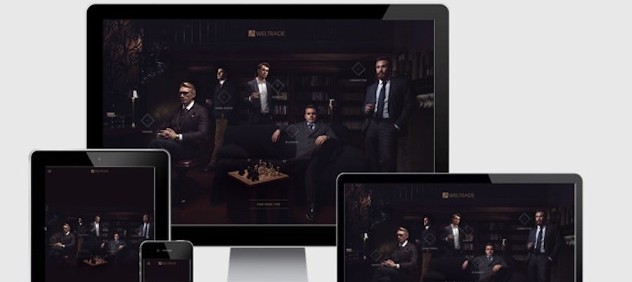
Weltrade is a trade website for business. You can choose your business type with a card playing in 4 forms. The whole website is fully responsive and includes a video.
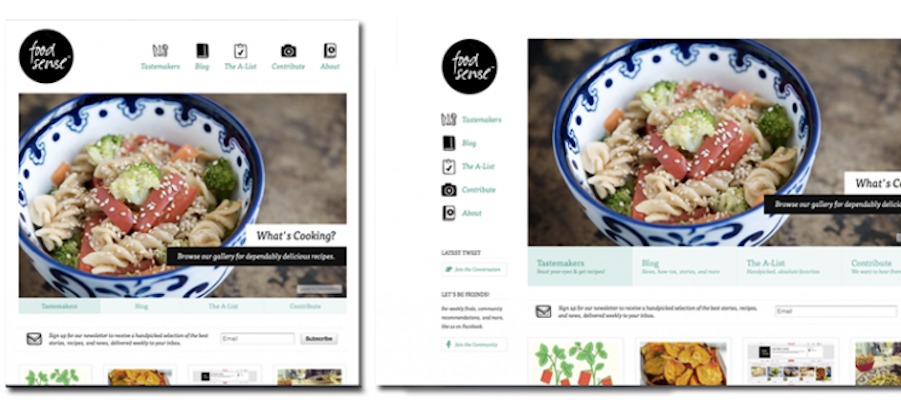
Food Sense is a unique resource for people to provide thoughtful and creative plant-eating plans. When the site displays on mobile devices, the original navigation bar on the left side will suspend on the top of the hero image. The layout of the responsive web design changes based on the device being used to view it.
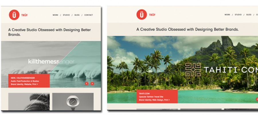
Trufcreative is a website for modernist illustrations and fine art prints. It's not only a great example of responsive web design but also of minimalist design.
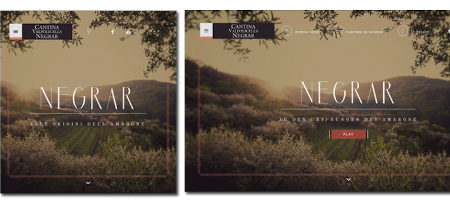
If you like drinking and want to buy some red wine online, Cantinanegrar is the place to visit. With its dynamic background, it showcases how the grapes become a cup of red wine for you.
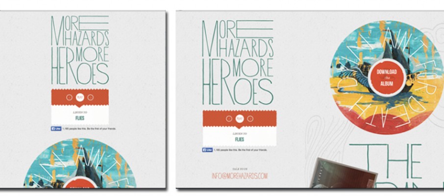
Morehazards is a music website. It is designed to promote an album. It features a disk that rotates and plays music when clicked, making it a playful, responsive website.
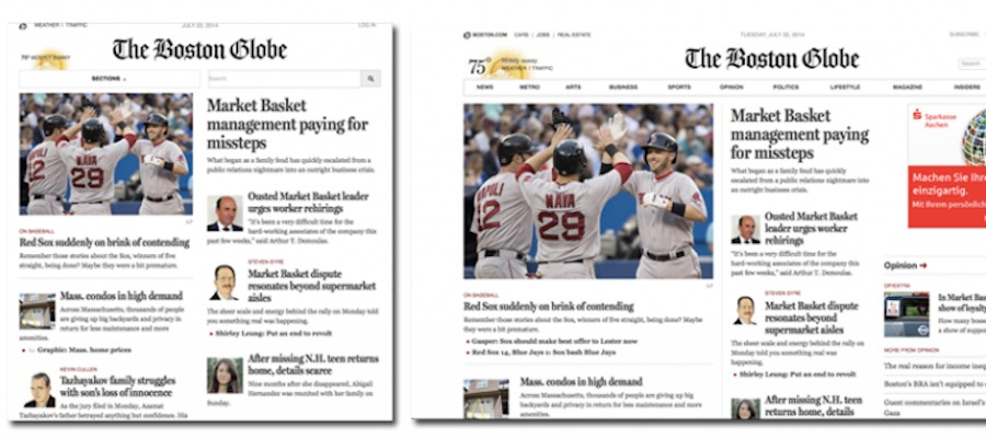
BostonGlobe is a comprehensive news website covering topics such as politics, business, sports, lifestyle, and arts, etc. People now are likely to read the news on mobile devices rather than rely on newspapers, so it's necessary to design responsively.
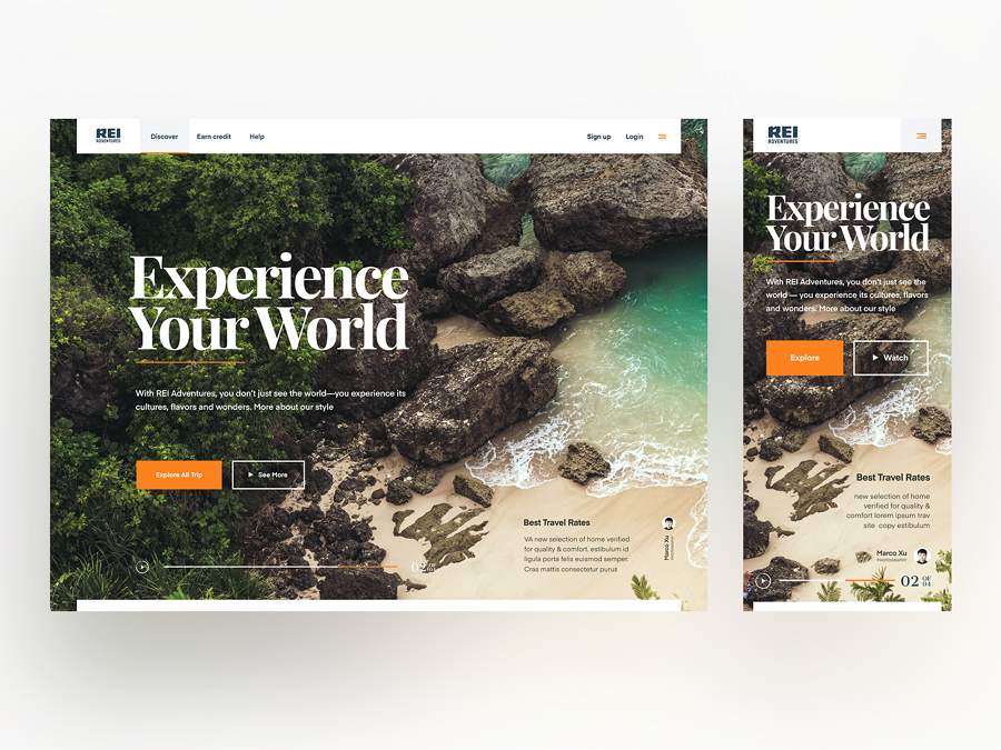
Rei is a responsive solution that features a hero photo example. It adopts a brilliant treatment and use of background photo which avoids visual noise.
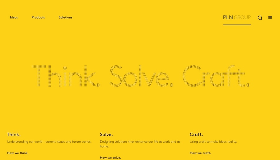
PLN Group is a place for people to think, solve, and craft, in order to enhance their life. The website skirts the edges of industry convention, powerfully positioning PLN as global design innovators.
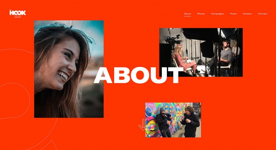
The Hook is a website created for entertainment and social media. It produces a lot of original interesting content on Youtube. Now it has over 10 million fans.
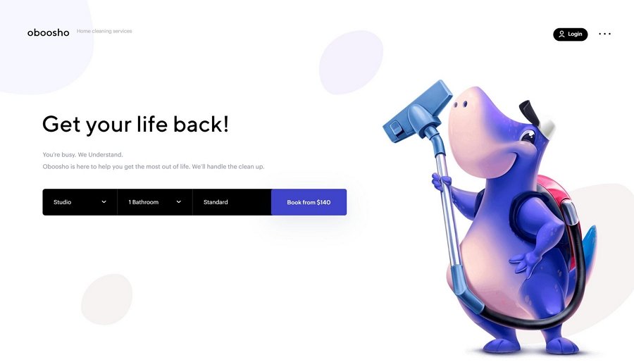
Oboosho is a cute responsive website created in order to offer cleaning services to the residents in New York. It features a simple UI design with a popular illustration element. Full responsive design gives it a great visual aesthetics even on small screen devices.
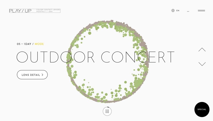
Playup is a brand site created for color contact lenses. In order to help represent its product in its design, the site uses animated colored dots to form irises of different colors in the background of the site. Mouse interaction is not new but is used very creatively here.
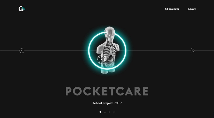
The common portfolio website is based on the Card UI design. Gaetanlefebvre is far more creative than normal! Combined with responsive interaction design and graphic design, the designer displays his work quite creatively.
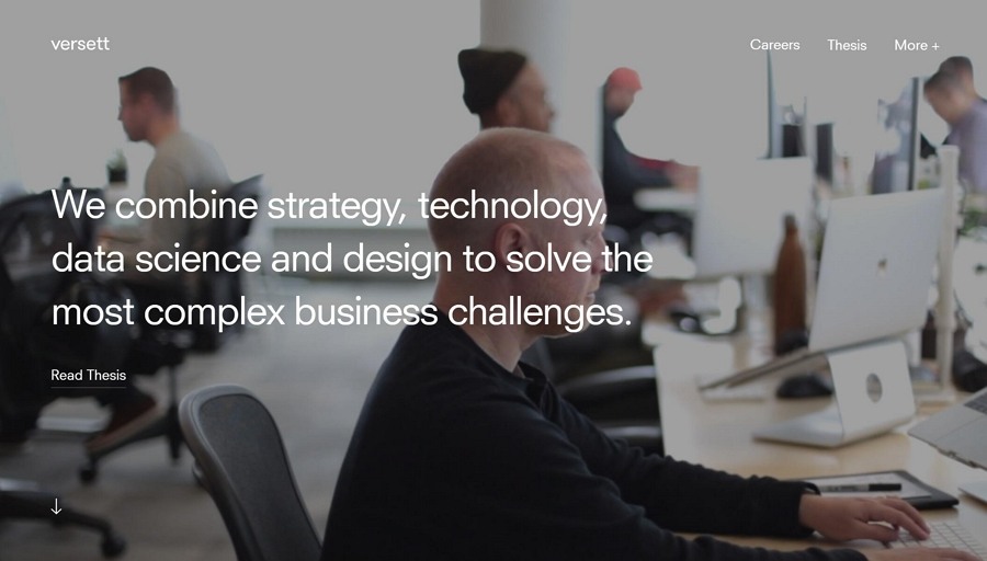
Versett is A product design and engineering consultancy in Toronto, Calgary and New York.
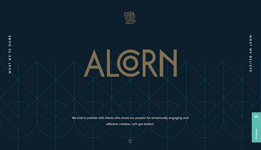
Alcorn is an advertising agency that provides effective and engaging creative solutions for clients and startups.
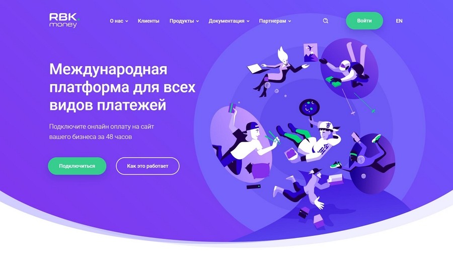
RBK.money is the global payment platform for online businesses and individuals.

Another portfolio web site created by Nam Insik, a designer and developer who lives in South Korea.
We hope these 20 responsive web design examples help to stimulate your inspiration.
 Mockplus RP
A free prototyping tool to create wireframes or interactive prototypes in minutes.
 Mockplus DT
A free UI design tool to design, animate, collaborate and handoff right in the browser.
