A unified, scalable design system helps teams, even distributed in different countries and regions, speak the same visual language, design together and create consistent brand identity and personality. It closes the gap between design and development and streamlines the entire product design workflow.
That's why many famous companies like Google, IBM, Microsoft, Apple, Airbnb, and Uber invest time and effort in creating and polishing their design systems. With the help of design systems, the products they create can provide a positive user experience and be compatible with more platforms.
Table of Contents
What is a UI design system?
Why does a team need a UI design system?
How to create a design system from scratch?
Best design system examples & templates
A UI design system is a comprehensive collection of UI design components, principles, and best practices that allow product teams to use the same language and create a consistent design.
A good UI design system is well-documented, reusable, and shareable so that everyone in a team has access to the up-to-date version and can start designing quickly no matter which type of products they want to create.
Let's first check the example of a UI design system:
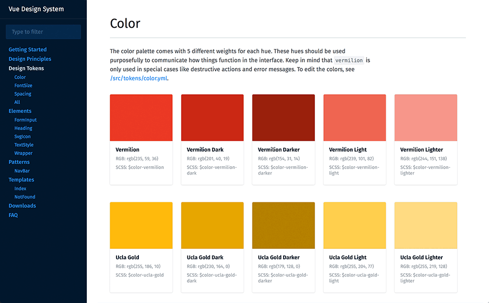
Most UI design systems share the following three attributes:
Reusable UI components, libraries & resources: A well-crafted design system works more like a UI kit and provides product teams an extensive collection of reusable UI elements, such as buttons, logos, forms, drop-down menus, popups and so on.
Design principles, style guides & other standards: An effective design contains interface and brand design principles, style guides and other standards. Team members can easily understand when and how to properly use different components and resources in various situations and scenarios.
Development resources: A scalable design system offers code-based components and styles so that developers can use code snippets (such as CSS) during implementation.
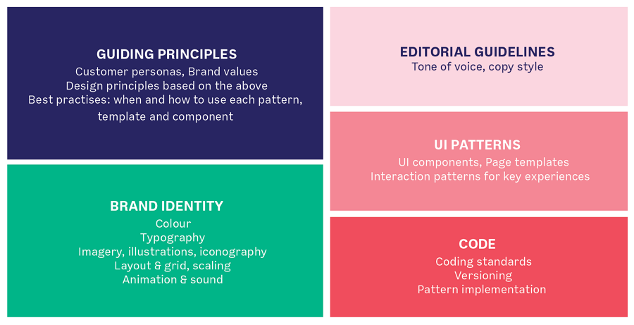
Here are several features that good UI design systems should have:
Well-structured. A good UI design system is often organized in a clear tree-like structure so that every component and rule can be viewed and shared easily.
Easy to update. User needs are changing all the time and design systems need to be updated based on new needs. The design system should allow the entire product team to participate in, add, delete, or manage the details with ease.
Easy to share. A good UI design system helps all teams involved in product design create consistent interfaces and products. It should be easy to share it across your teams, departments, and companies.
Well-documented. Since a good design system is updated frequently, it should be well-documented so that everyone in a team can check and trace the changes across different versions.
Easy to scale. To keep brand consistency, all the same company's products and services should follow the same UI techniques. It means that a good design system should also be scalable and can be easily used to all products and services.
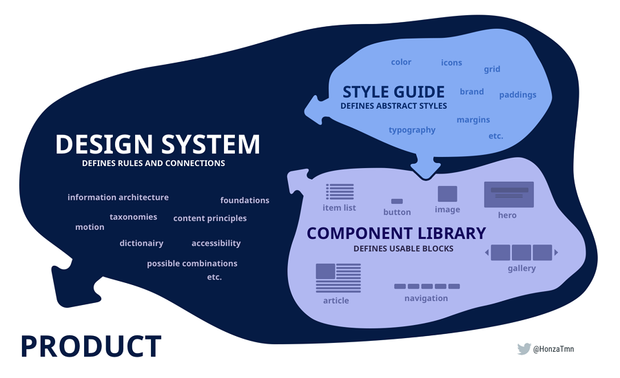
"Design system" is an abstract term and is often used interchangeably with other similar terms like "pattern libraries", "style guides", "guidelines" and even "UI kits". Let's check the differences between them:
Design systems are complete documentation of all design principles, best practices, UI components, code snippets and other design resources that can help your entire team build consistent products. It includes pattern libraries, style guides and guidelines, etc.
Pattern libraries refer to component libraries that your team can reuse, including the logos, icons, fonts, headers, footers, menus and other UI assets.
Style guides present a set of standards, rules and principles that designers and developers can follow to bring cohesion to their digital products. Style guide includes colors, typography, product branding guidelines and more. It also helps define the tone of voice for your products.
UI guidelines gather a series of design principles to guide designers on how to design logos, choose brand colors and other parts of interfaces. UI guidelines help product teams provide a more pleasant and positive user experience. Along with style guides, they enrich the design system.
UI kits are collections of UI components like buttons, navigation menus, checkboxes, radio buttons, etc. Designers use them to create wireframes, mockups, and prototypes for their projects. But UI kits are only a part of design systems.
In short, the design system includes design pattern libraries, style guides, guidelines and even UI kits to let product teams create cohesive and consistent products.
In large companies, a few different teams work on product creation simultaneously. Keeping all interfaces consistent while building a unique and memorable brand identity can be a tough task. Design systems come with unified and shared libraries and design components and rules, helping product teams solve this problem easily.
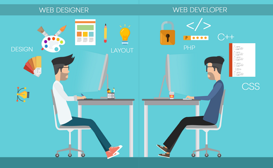
An effective design system defines how designers can build an interface, brand logo, product or service. It serves as a common knowledge base for developers and helps them understand designs better. As a result, it makes it easy for designers and developers to communicate and collaborate more effectively.
When a team or company needs to release a new product or service, a scalable design system can work as a template that enables them to reuse the components and rules. No need to start from scratch.
The biggest advantage of using a unified design system is a more efficient product design process. A reusable design system with all pre-made components, libraries and rules helps you save much effort and time.
Building a unified and shareable design system has become an essential step for teams that want to keep brand consistency, deliver the best UX and create a memorable brand identity.
To ensure brand consistency and deliver a better UX, nearly all teams and departments in your company should be involved in the process of creation of a unified design system. Include:
Product teams
Development teams
Marketing teams
Stakeholders, clients and others
During the entire design lifecycle, you and your product teams should always consider feedback and suggestions from all teams and departments because it will increase the chance that the newly created UI design system will meet all their needs.
Different teams and departments in your company can have different needs for the design system. So, before you start building a design system, you should always remember to interview all team representatives one by one and collect their wants and needs.
Try to document them so that you can check the details at any time later.
Discuss the basic elements and structures that your UI design system should have. Here are several simple tips that can help you with that:
Discuss the basic design elements first
Most design systems gather several types of foundational elements, such as colors, icons, typography, images, icons, components and so on. Add them to your design system.
Decide on the main structure
A tree-like structure is a perfect option to showcase a hierarchy of elements. It allows you to first group elements into different categories, and then, every category can be split into several smaller groups.
Draw out the structure and fill in details gradually
Visualize your future design system's structure on paper or using a handy UI design system tool, and then add all details, such as the styles, color values, and other properties.
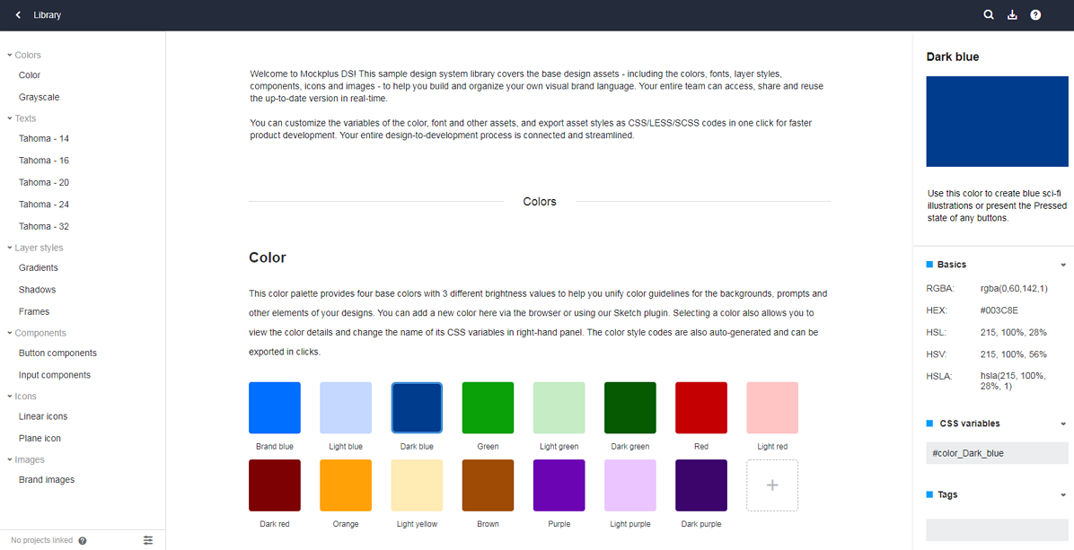
At this stage, a handy design system tool like Mockplus is a must-have tool that can help you create a unified, reusable and scalable design system.
It brings all your developers, designers, product managers and other team members on the same page, helps you collect elements online, add element details and description, share and maintain all assets.
Developers can join with a link, view element details and export them to images, PDF and even CSS. Design and coding are perfectly connected in one place.
Mockplus makes it a breeze to build, manage, and iterate a design system together.
You can now start adding a simple description to every element, category or group, so that other team members can easily know when and how to use those elements.
Document all your design thinking and best practices for elements, components, pattern libraries, and rules you’ve defined. A PDF, DOC, DOCX or online document is an excellent option to share your version across your entire organization and iterate it together quickly.
Enrich your design system by adding other essential design resources, such as color palettes, typographic scales and other graphic design assets.
Discuss your design system with your team again and see whether there is anything left or special info that should be added at the same time.
To keep a design system scalable and reusable, you and your team should update it on a regular basis.
Check popular design systems for inspiration
Before you start creating a helpful design system, you should always remember to browse a series of existing design systems to get inspiration.
Get started with existing design systems when designing a new project
When you need to release a new product or service, start with an existing design system created by your company or product team.
Review all elements and adjust the styles or properties to create a new design system for your team.
We've picked a list of 20 best design system examples and templates for you:
(Note that the design system examples from Google, IBM, Microsoft, Apple, Airbnb, and Uber are covered)
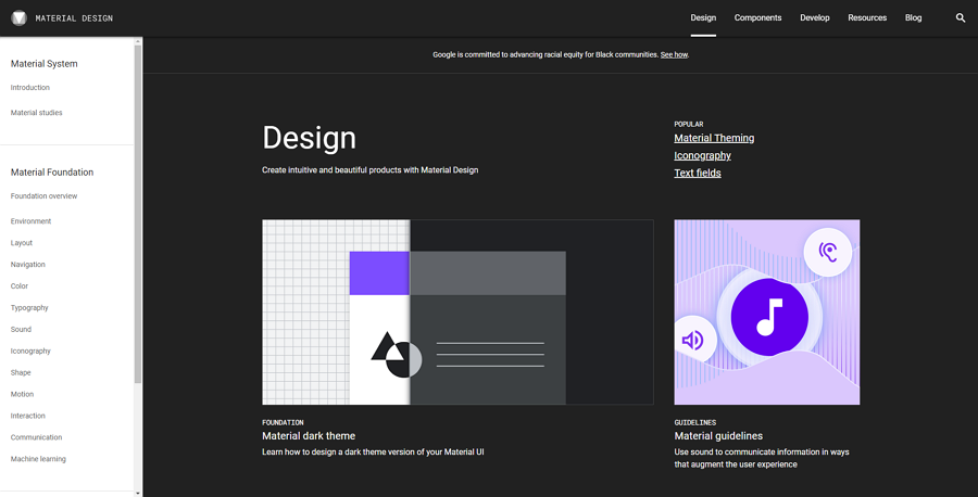
Material Design is an open-source design system released by Google. It evolved into an adaptable system of guidelines, components and tools to help designers create the best user interface design.
As one of the most popular design systems online, many designers rely on it to offer a clean and simple visual style in their products. It is always the top option for designers who work on a Google extension or plugin project.
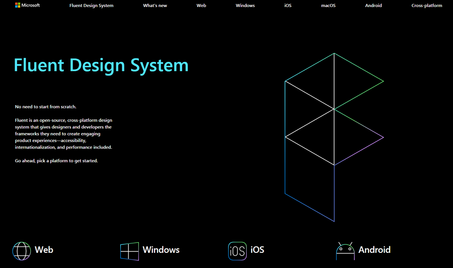
Fluent is an open-source, cross-platform design system released by Microsoft in 2017. It introduces many great design and interaction guidelines for designers and teams to create brilliant software for the Microsoft ecosystem.
As a cross-platform design language, it can be easily applied to nearly all popular platforms and devices, including the Web, Windows, iOS, Android, Mac and so on. It is a good tool to create a Microsoft-style website or mobile app.
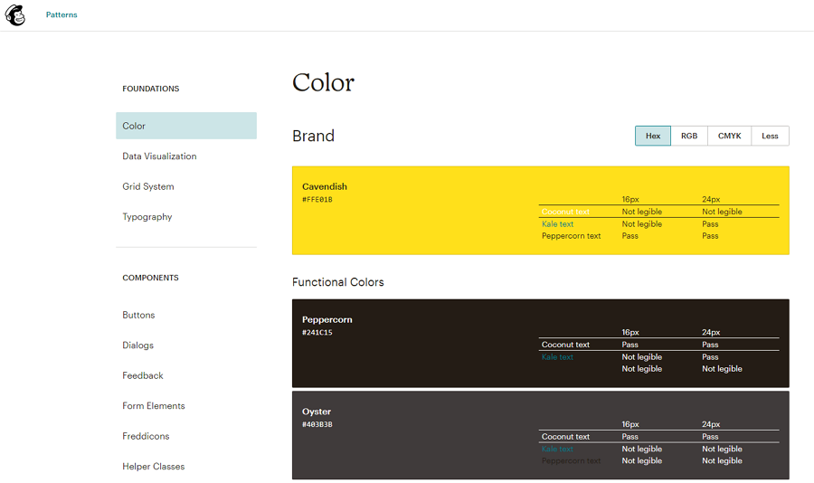
Mailchimp Design System is a simple and user-friendly design system. It covers a full set of design resources and standards, such as colors, data visualization, grid systems, typography and components. It is a perfect design tool to improve a project in the realm of email, marketing, business, strategy or ads.
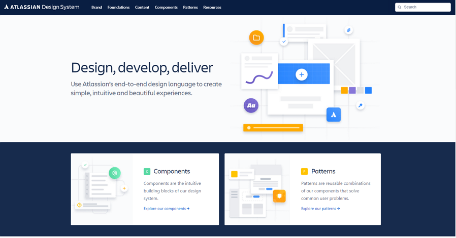
Are you working on a collaboration or management tool recently? if the answer is Yes, then you should check Atlassian Design System for inspiration. It was developed by Atlassian, an Australian software company that has released the best known Jira, Trello, Confluence and other design collaboration and management tools. It is based on a user-friendly design language, and it is a good tool to help you create simple, intuitive and beautiful experiences.
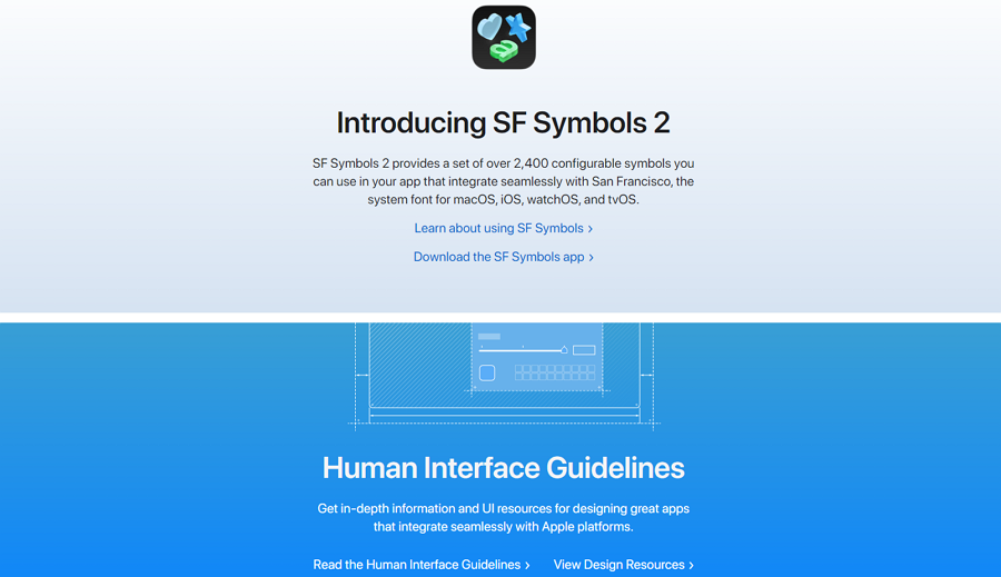
Apple Design Language provides in-depth information and UI resources for designing great apps that are easily compatible with the Apple ecosystem.
Whether you are a designer, developer or product manager, you can easily find your desired best practices, guidelines and resources, such as the interactions, buttons, themes, visual index, and so on. If you are working on a macOS, iOS, watchOS or vOS project, this design language will save you a lot of time and effort.
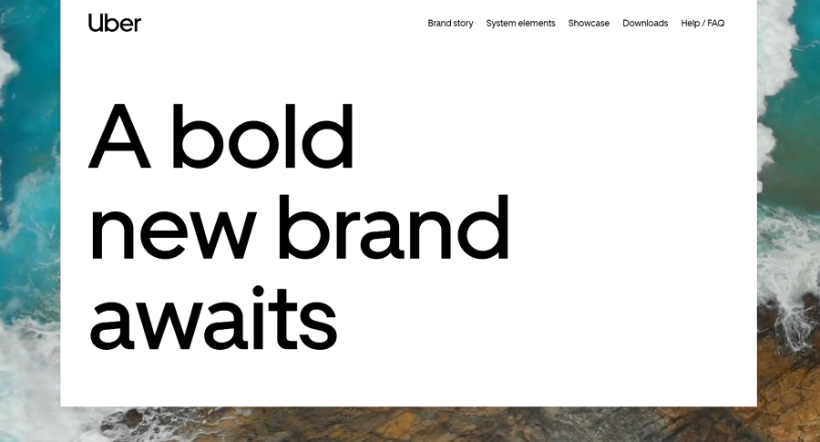
Uber, a famous American company, offers ridesharing, food delivery, package delivery, and other transportation needs. Billions of people worldwide are using their products.
The Uber design system also follows the style of their hottest products and covers 9 core design elements and guidelines, including the logo, color, iconography, illustration, motion and so on.
If you also want to create projects with the style of Uber's products, this design system language is a must-have for you.
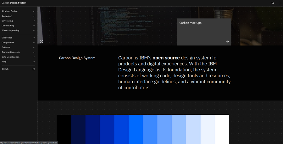
Carbon IBM Design System was firstly gathered for IBM websites and products. Now, it has been evolved into an open-source design language and is accessible to everyone worldwide. Along with an IBM foundation, it provides a set of working code, design tools and resources, human interface guidelines and other resources for both designers and developers.
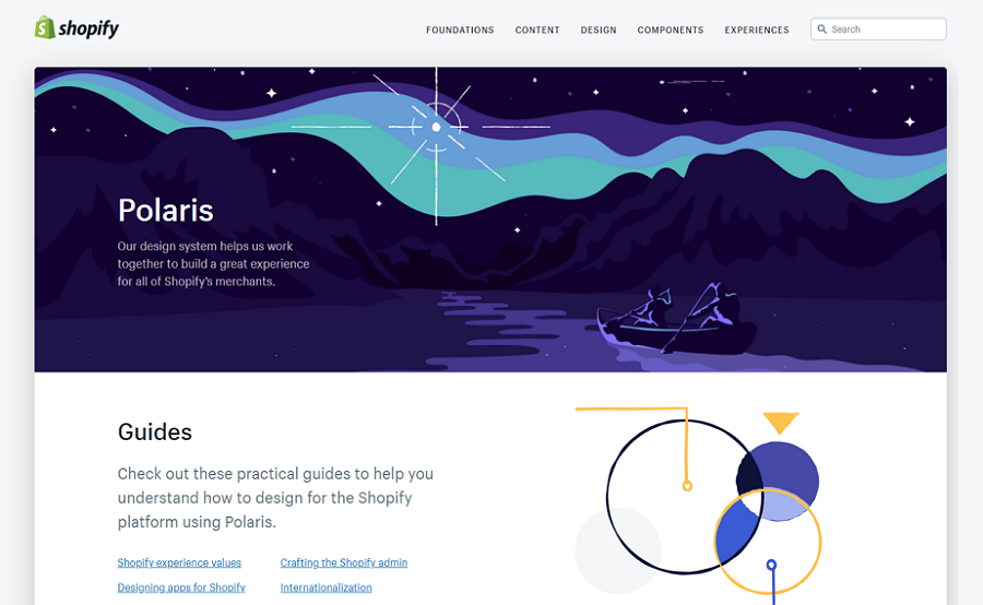
Shopify is an online eCommerce platform for people who run online stores. The Polaris Shopify Design System is made based on this Shopify business platform, allowing designers and developers to easily and quickly create a project for the Shopify platform.
With a large number of components, buttons, colors, product content and other design resources shared, this design language is also a good tool to help you get inspiration on how to design an effective ecommerce website.
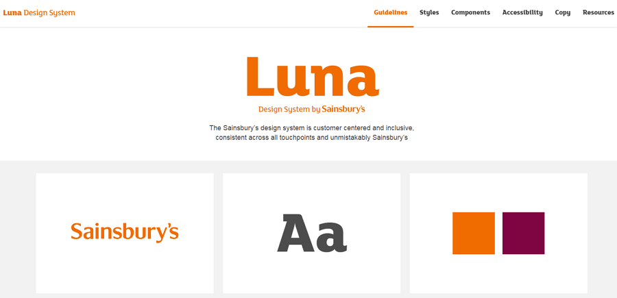
Luna Design System is a design language created by Sainsbury's, the second-largest chain of supermarkets in the UK. It shares inclusive design guidelines, styles, components and other free downloadable design resources. It is a good inspiration for you to create compelling and user-centered online shop projects.
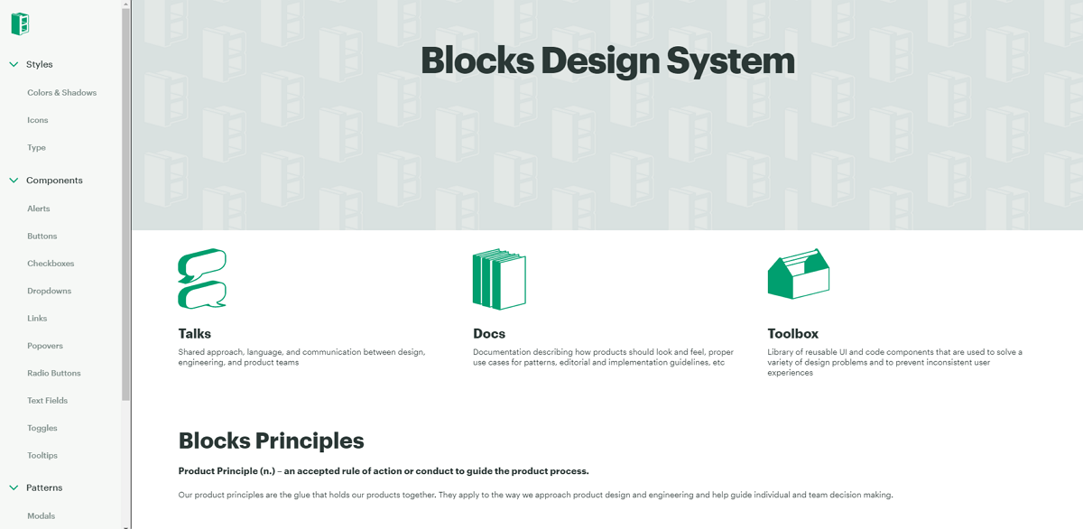
Block Design System is shared by CBRE build, one of the best known commercial real estate companies. It provides users with reusable design styles, components, patterns and other resources, allowing designers and developers to create brilliant real estate websites or mobile app projects.
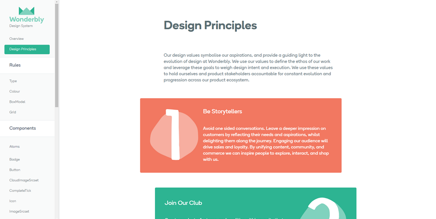
Wonderbly is an award-winning company that sells products in the fields of storytelling, engineering, digital, and print. The Wonderbly design system shares its design rules, principles, and frontend components. It is a good tool to familiarize yourself with the Wonderbly style and use it for your products.
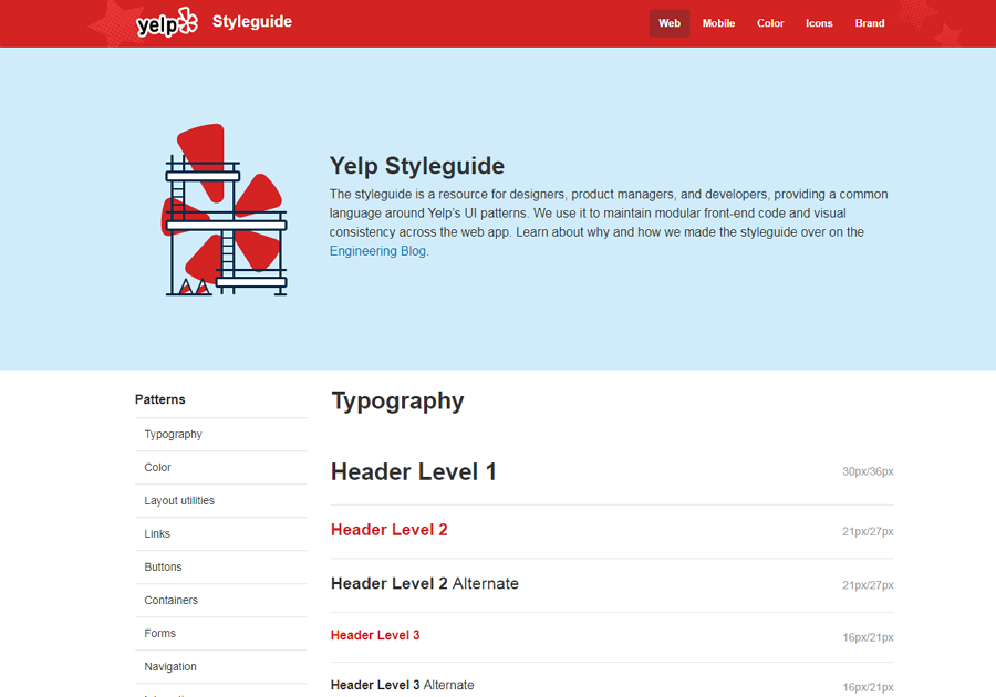
Yelp Design System is a design language based on Yelp's UI patterns. It introduces a full set of design resources, such as the typography, colors, layout utilities, containers and even some front-end code.
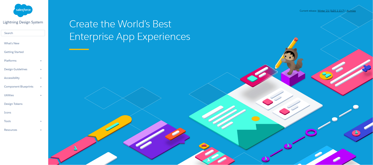
Lightning Design System provides a flexible, scalable and efficient design language for you and your team to create the best possible user experience. You can find inspiring design guidelines, components, utilities, tokens and more resources to streamline your design process.
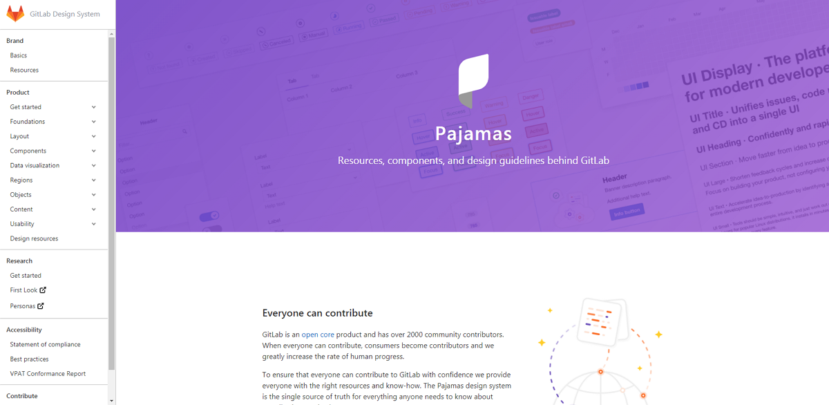
Pajamas GitLab Design System is a design language for GitLab, an open-source product that has gathered over 2000 community contributors. It is specially made for all these community contributors so that they can contribute their info to GitLab.
If you are also planning to contribute something to GitLab, this design system is one of the essential tools that you should check in advance.
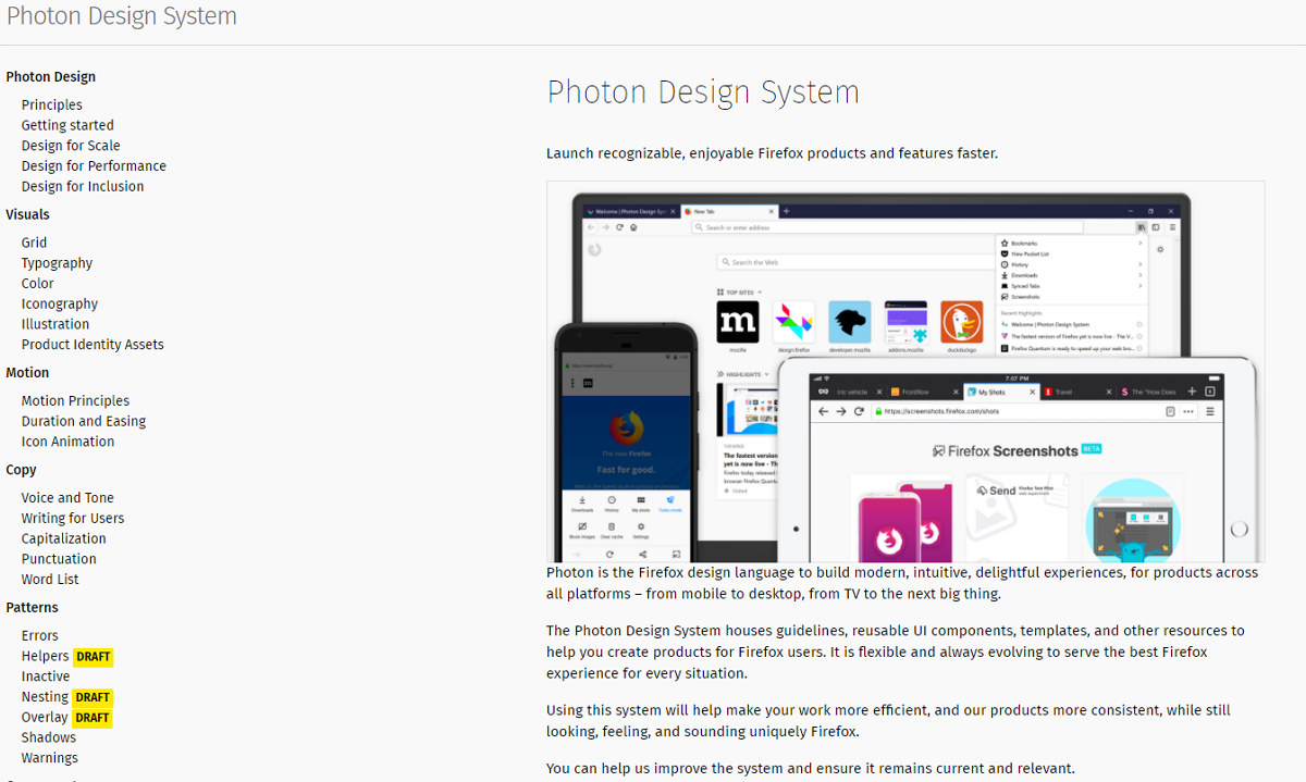
Photon Design System is the well-known Firefox design language that shares reusable guidelines, UI components, templates and other resources. It is a good tool to help you create great extensions, plugins and other products for Firefox users.
Wrap Up
A good design system is a unified language that allows designers and developers to collaborate better and solve problems consistently. It provides product teams with the same visual design principles, style guides and components and helps them maintain visual and functional consistency in all their digital products. Design systems are one of the factors that helped big companies like Google, IBM, Microsoft, Apple, Airbnb, and Uber to succeed on the market.
Build a scalable, reusable, dynamic and shareable design system before starting to design a website or mobile project. We hope this comprehensive guide will help you with that.
 Mockplus RP
A free prototyping tool to create wireframes or interactive prototypes in minutes.
 Mockplus DT
A free UI design tool to design, animate, collaborate and handoff right in the browser.
