The trendy bento box design, inspired by the traditional Japanese lunchbox, arranges content in a clean, grid-like format, transforming mundane information into eye-catching displays. This bento design style brings a way for designers in all levels to quickly release their potential and create something unique and brilliant with ease.
In this article, we'll delve into the fundamentals of bento box design, share key best practices, and showcase inspirational examples and templates to spark your creativity.
While learning this, also use our online design and prototyping tool to quickly adjust the bento grid layouts for your next project.
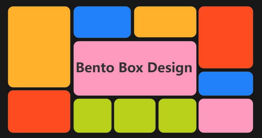
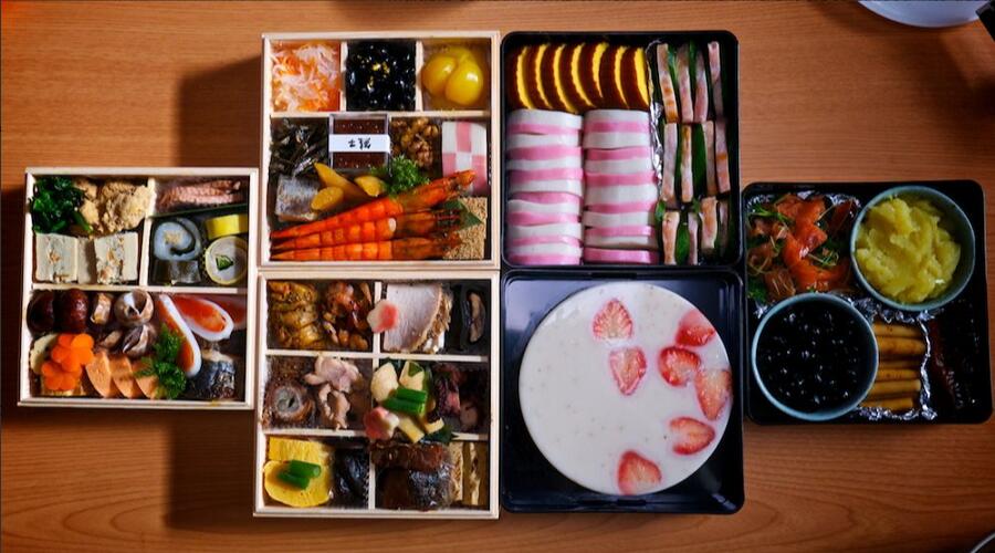
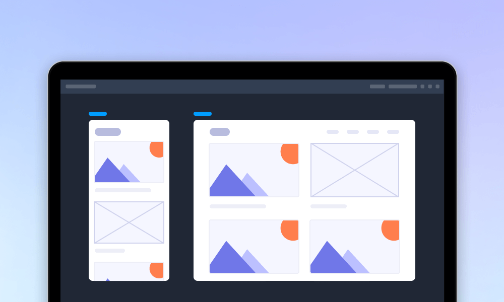
A bento box in UI/UX design draws inspiration from traditional Japanese lunchboxes, which use multiple compartments to neatly separate different types of food into aesthetically pleasing portions. Similarly, designers use this concept by employing rounded rectangles or grids to present product information in an organized and visually appealing layout. This ensures smooth navigation across all screens.
Since Apple first applied this bento design layout to present promotional videos, it has become widely adopted. Today, you can find this design style in various forms across UI/UX design, enhancing both functionality and aesthetics.
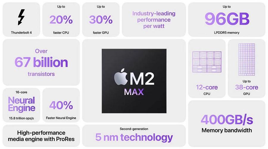
Apple's promotional videos listed in a bento box layout
Why did the bento box layout become so popular once it was first used? Answers are quite simples: it brings numerous benefits for UI/UX designers, including:
Here are the do's and don'ts of using bento grid design:
Here are simple steps that you may follow:
List out all content that you want to present with a bento box and assign them into different groups.
Based on the different content groups and set up a workable grid system. Also consider the responsiveness.
Visualize your bento grid ideas and create clear wireframes or prototypes to first check whether these grids can work as you need.
Share your bento layout design with your team, collect feedback and iterate with them together.
By following these steps, you can create a functional and visually appealing bento box layout for your web design projects.
Hungry for more bento grid design inspiration? We've handpicked 20 of the best and latest examples for you:
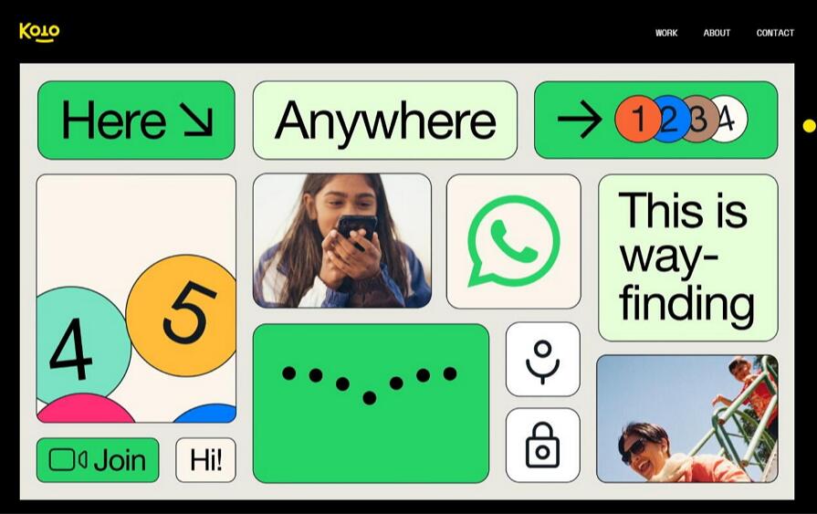
Koto Studio's WhatsApp design project utilizes a bento grid system to showcase the brand's design elements, such as text, images, colors, and icons. This specially crafted layout organizes elements clearly and cohesively, while micro-animations enhance user engagement upon entering the project page.
Provide a good example of how to integrate different content types cohesively within a grid.
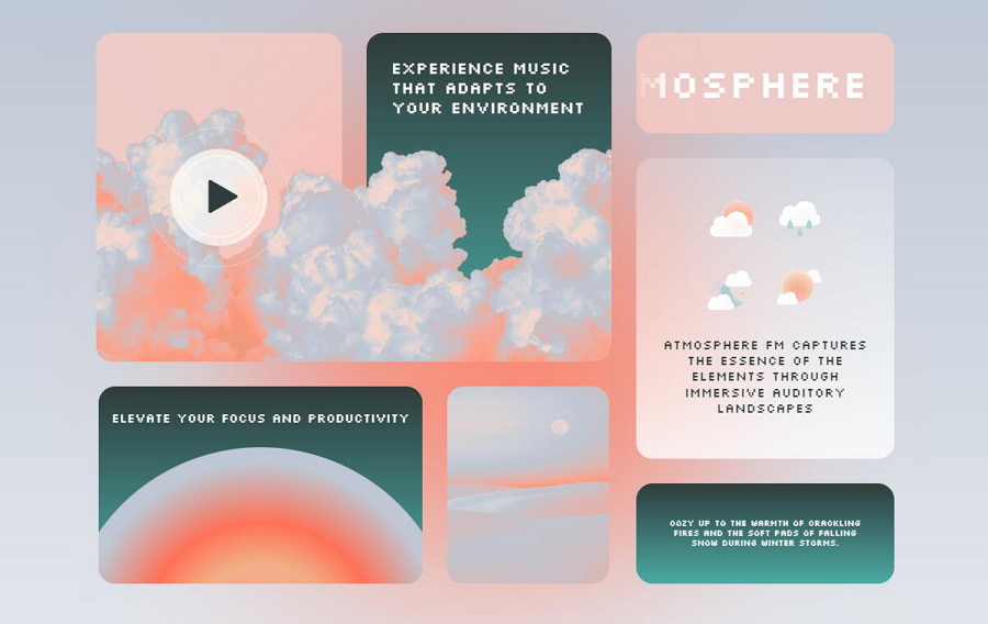
Atmosphere FM is a web concept design for a music streaming tool that uses a comfortable bento box layout to introduce and guide users through its music streaming services. What makes this design standout is its unique concept: the tool generates soundscapes synced to your local weather, which is truly inspiring.
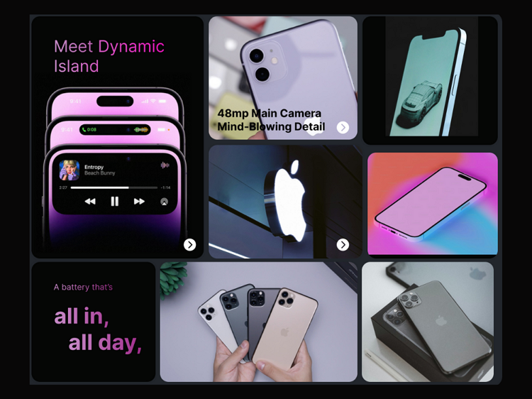
This Apple design uses various bento grids to showcase the iPhone from different angles. It's a great example of incorporating bento boxes to present products or services in 360 degrees.
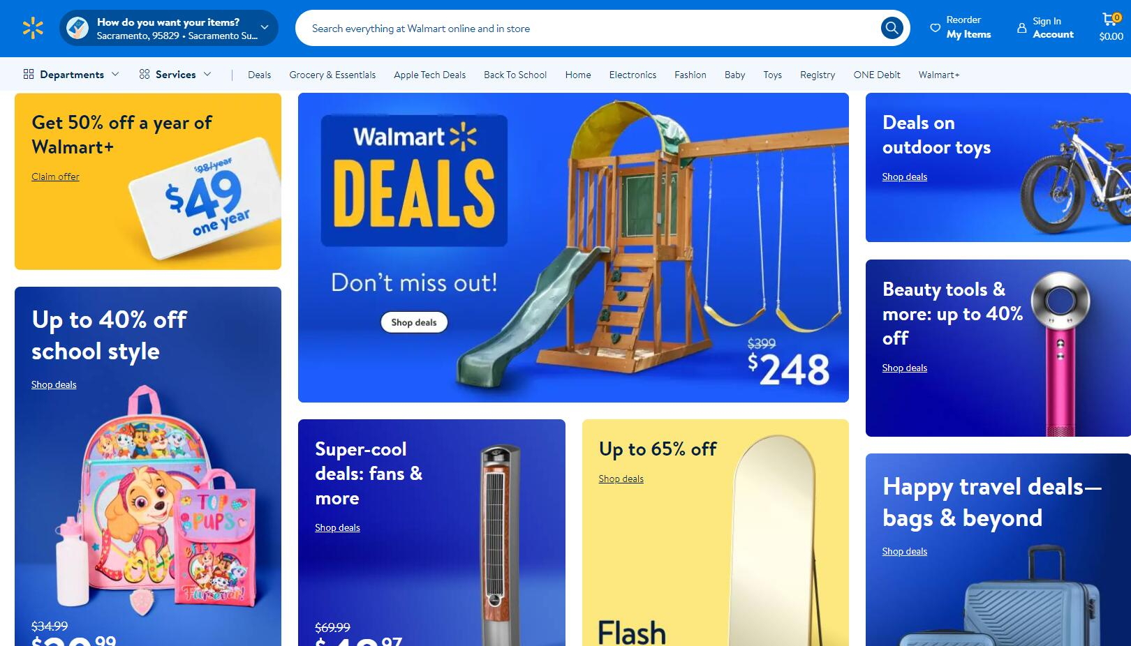
Walmart, the renowned retail corporation, employs a bento layout style on its landing page to showcase its product offerings. Each product is presented in its own compartment, featuring details like discounts, text copy, images, and more. This clear and organized layout allows for easy scanning at a glance without affecting others.
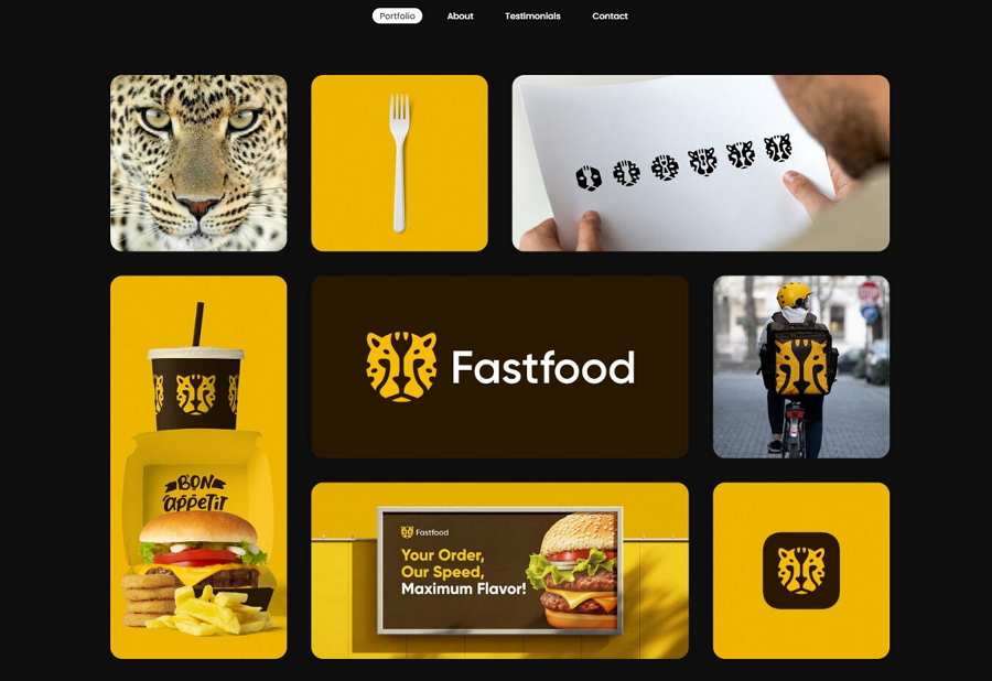
Logorado's online portfolio website cleverly integrates a bento layout to showcase their fast food logo design project. This layout effectively highlights scenes of food delivery while delivering the brand's messages clearly.
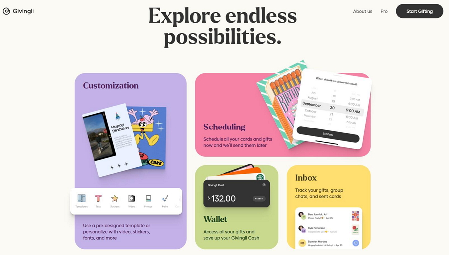
Givingli is an online platform that facilitates seamless sending of cards and gifts. Its website utilizes a custom bento box layout to visually showcase its key features. The use of different colors, rounded corners, and images effectively separates and harmonizes these elements, creating a visually cohesive presentation.
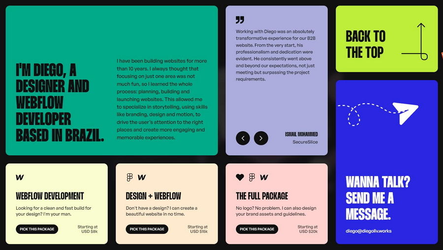
Similarly, Diegolive Works' designer incorporates a bento box design style on its landing page slider. This layout seamlessly blends rectangle cards, effectively conveying the website's messages. Hover effects further enhance the exploration experience. The color combination is also a nice try!
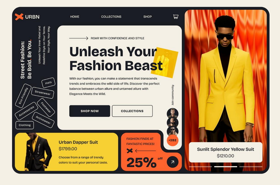
The Fashion Store Website is a great example of incorporating a bento layout across its entire page. The website is divided into sections, each presenting diverse information while effectively guiding visitors to deeper content. The design also utilizes color contrasts effectively to enhance visual appeal and clarity.
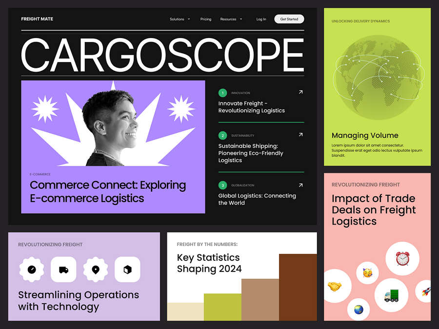
Magazine Style Bento seamlessly combines the bento layout with a magazine-style presentation, effectively showcasing its content. Though it is a design concept, it is sure that it would inspire new ideas to evolve your bento layout design.
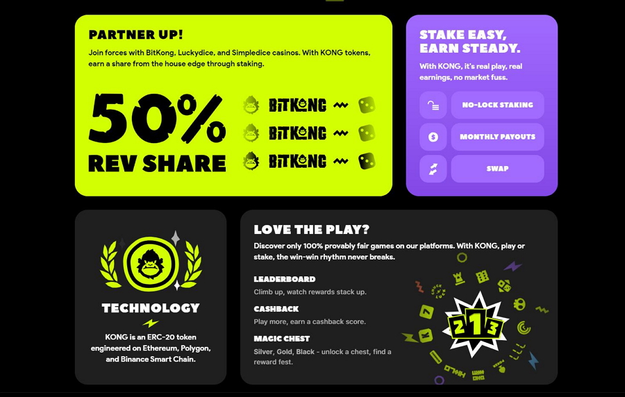
Kong Fund is a game website that utilizes a bento box layout to present game information and services. The bento content blocks are arranged horizontally and vertically on the web page, blending seamlessly with the dark and sleek theme.
Atomize Design is another dark-themed website that employs a bento layout to showcase its services and features. Unlike the previous example, which arranges content blocks horizontally or vertically, this website uses bright colors to make the content stand out.
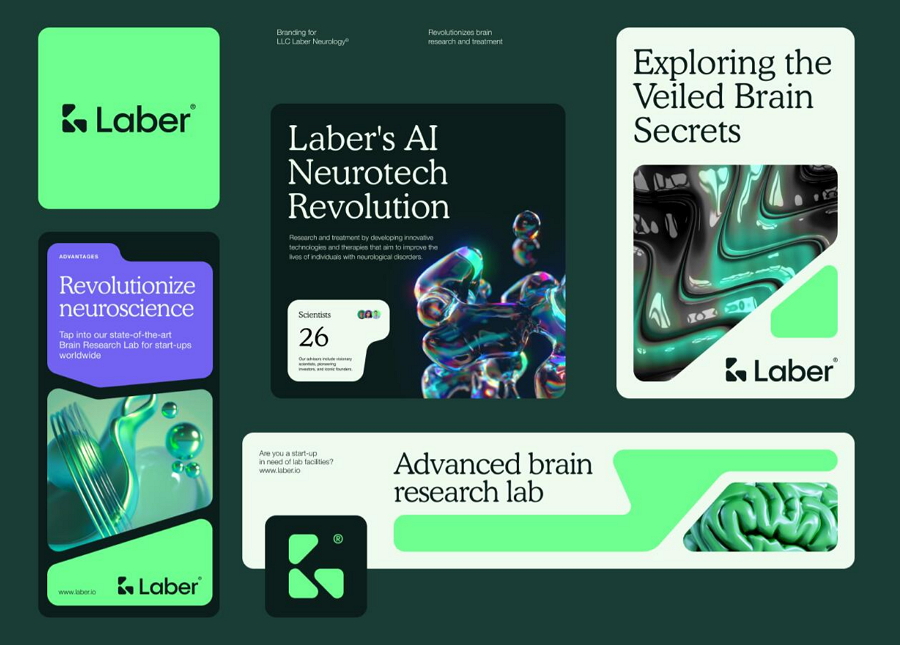
Laber AI Neurotech Branding is another inspirational example of bento style UI design. This project utilizes unusually shaped content blocks along with 3D effects and images to create a modern, fresh website. These elements add depth and dimension, making the website visually intriguing and engaging.
The innovative use of the bento grid system in this design showcases the versatility and creative potential of this layout style.
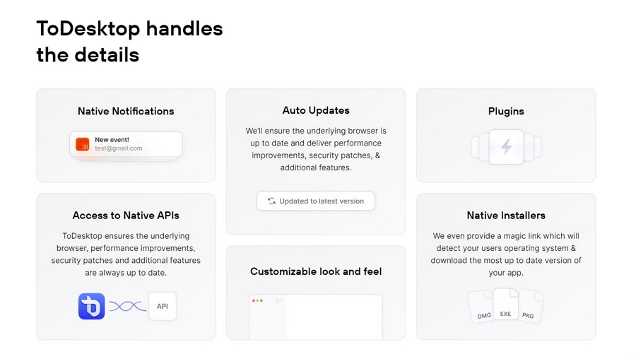
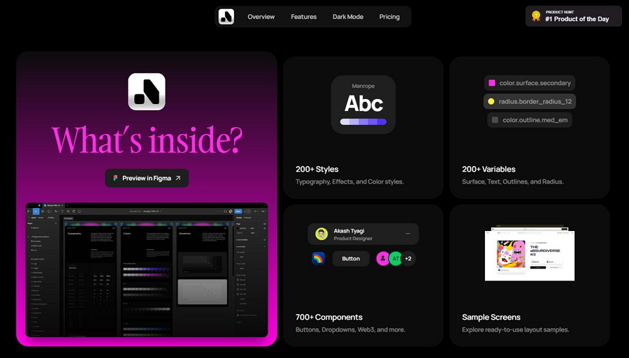
ToDesktop employs a minimalistic bento grid layout to present its features in a clean and organized manner. This approach emphasizes simplicity and clarity, making it easy for users to understand and navigate the information. The well-structured sections ensure that each feature is highlighted effectively without overwhelming the viewer, demonstrating the power of minimalism in bento grid design.
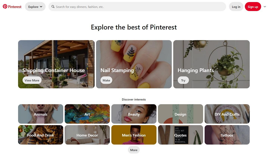
The famous image resource website, Pinterest, also uses the bento layout to help users find their desired image resources quickly.
The grid-like arrangement of pins allows for a visually appealing and efficient browsing experience, making it easy for users to discover and save images that interest them. This bento style design not only enhances usability but also keeps the interface organized and engaging.
Bento Cloud is a design concept that explores the power of the bento layout by adhering to principles of balance, aesthetics, and culinary craftsmanship. By mirroring the thoughtful and artful presentation found in traditional bento boxes, Bento Cloud aims to create visually harmonious and functionally efficient web interfaces.
This concept emphasizes the careful arrangement of elements to achieve a seamless and engaging user experience, blending beauty with usability in a unique and innovative way.
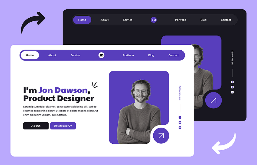
This portfolio website design example organizes all its home page content into various bento grids, making the entire home page clean and easy to scan. Additionally, there is a mobile version that sets an example of how you can shrink these grids to create a responsive website design.
The Dash Bento Showcase Template Kit is a powerful website template designed for creating effective product pages online. Utilizing the bento layout, it presents product or service information in a clear and visually appealing manner.
It features 10 page template options, clean and minimal design, fast loading, customizable fonts and colors, and many more.
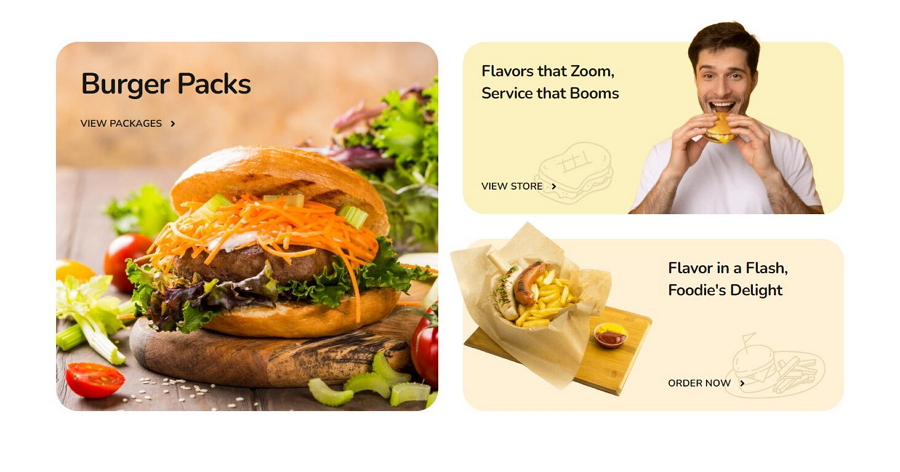
Spice, as its name indicates, is perfect for designers or companies to create a food, restaurant or delivery website online. It wisely uses different style of bento layouts to showcase food or dish information.
As a must-have template kit, it brings tens of page templates, fully responsive design and customizable fonts and colors.
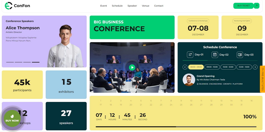
Bento Web is a versatile web template perfect for a wide range of themes, including beauty salons, conferences, car repair services, startups, cafes, and more. It comes with over 17 creative home page templates with brilliant bento style layouts. You can simply choose the desired on upon your design theme and contents.
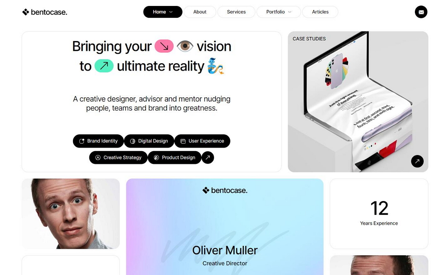
The Bento layout is ideal for presenting personal works or design projects. This Bentocase template with bento grid layouts is perfect for designers or artists to create personal portfolios or resumes. It offers three home page templates and four column layout options, making it a great choice for designers or anyone without programming skills.
There are many must-see websites that adopt the bento layout design for inspiration, including Pinterest, Spotify, Instagram, YouTube, Netflix, Microsoft, and more.
Bento grid style design offers a clear and neat way to present content, effectively delivering product services. This innovative approach has sparked a design revolution, becoming an irresistible trend in web and app interface design since its inception.
We hope this article, filled with bento box design basics, best practices, and examples, inspires you and helps you seamlessly join the bento grid design revolution.
 Mockplus RP
A free prototyping tool to create wireframes or interactive prototypes in minutes.
 Mockplus DT
A free UI design tool to design, animate, collaborate and handoff right in the browser.


 Sign up with Google