Web design is more than just a buzz phrase; it is actually a complex topic that can be divided into several parts. To have any chance of a good career in web design, it is essential to keep up to date with—and be inspired by—the latest and best web design trends.
To provide you with a steady stream of inspiration, the Mockplus team continues to scan the internet and collect the best examples of website design on Dribbble for August 2019.
Table of Contents:
Okay, now let’s look at these designs one by one!
By Outcrowd
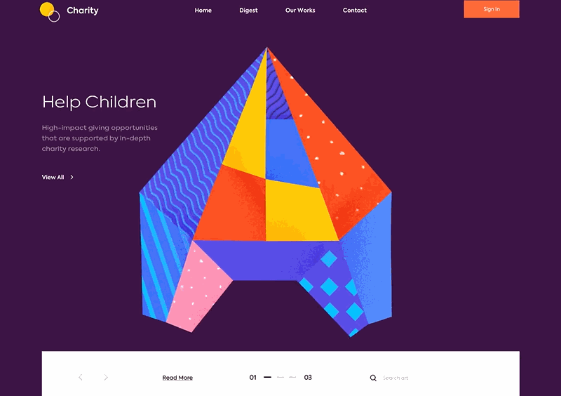
This is the landing page of a charity. The page seeks to promote the charity, raise awareness, and encourage people to support its work helping children, groups facing water crisis, and other groups in need.
This landing page scores well with its combination of attractive illustration and smooth animation. At the same time, the bright colors and other elements make the website elegant and well crafted. The way the jigsaw puzzle is integrated into the design is eye-catching. The ever-changing graphics link together the site’s themes and text seamlessly.
By Outcrowd
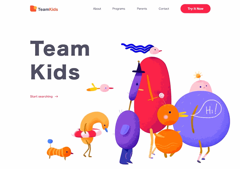
TeamKids, another great project from Outcrowd, is a child-hosted website that aims to enrich children’s lives by providing entertainment and learning services for their after-school hours. The website design has a cute and naive style, seen especially in the bright colors and adorable animation on the landing page, beautifully designed to be attractive to children.
The use of illustrations and animations on the landing page gives the site's themes an effective visual fit, improving the interaction and user experience.
By Pawel Kontek
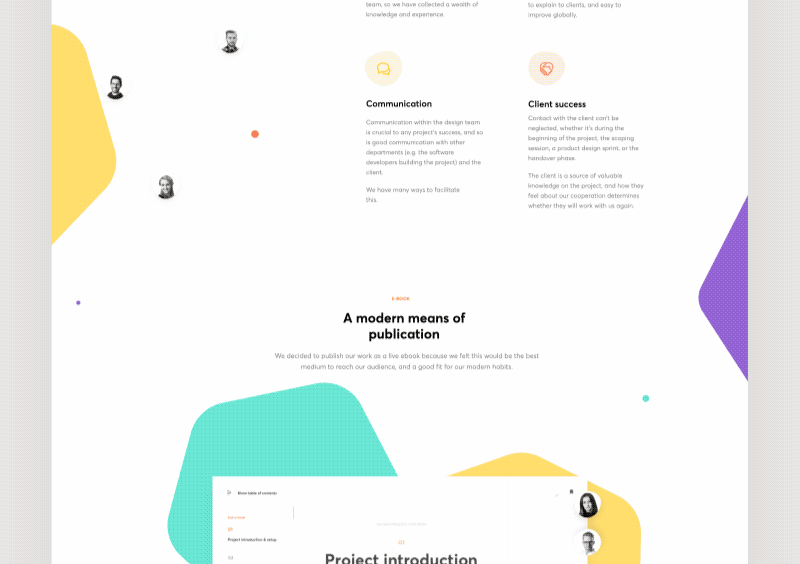
This is a free design resource which has gathered together experienced designers to share their knowledge. It aims to help designers understand the design process and improve the quality of their work. You can start learning with the bookmarks in the book itself and enjoy special interactions.
This page shows an ideal combination of flat design and minimalism. The unique interaction in the bookmarks and catalogs adds a touch of fun to the experience and enriches the reader’s experience.
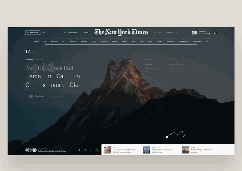
This is a conceptual design based on existing news sites. Compared to traditional static news websites, the 3D animation design and full-screen background grab the viewer’s attention and focus it on the news content from the moment they land on the page.
High-quality3D animation makes the website unique. With the full-screen website background design, the whole website looks professional and elegant. The combination of the two elements in this way is an innovative approach to landing page design.
By Walid Beno
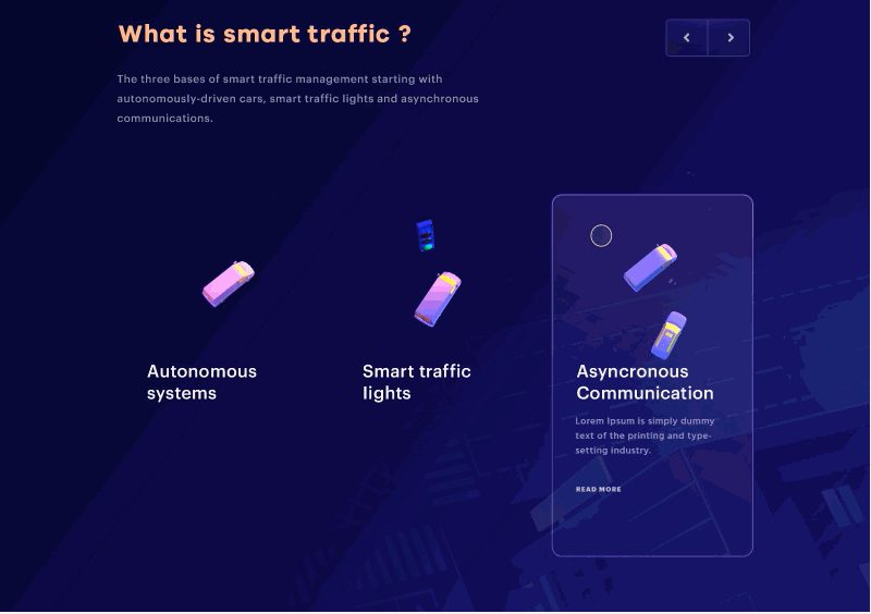
Rapid advances in technology have changed people's lives. Have you ever imagined what the traffic will look like in the future? Designer Walid’s conceptual design shows us the future, with an intelligent and automated transportation system.
The bold combination of blue-violet gradients and lines give the page a mysterious, hi-tech, futuristic feeling.
By CRI$$
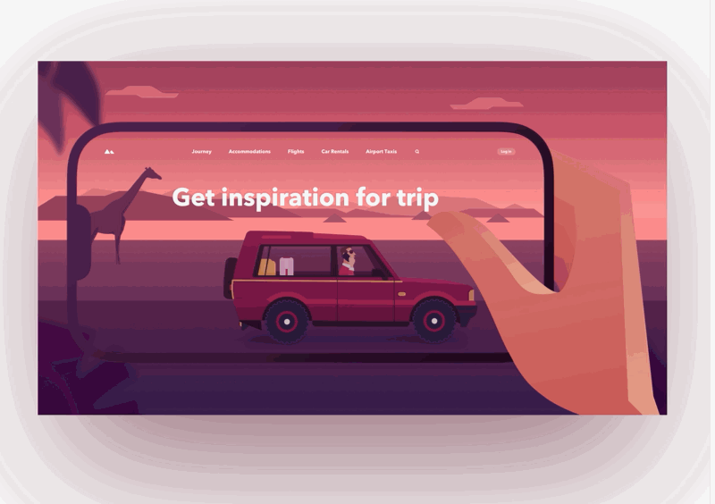
If you are a travel enthusiast, you must be passionate about sitting down and making detailed plans for your next journey. This website offers a complete range of travel options, including accommodation, flights, car rentals, etc., all laid out to maximize convenience for visitors.
Unlike other gradient designs, the large area gradient takes up the entire environment and atmosphere. It is a creative and innovative idea.
By ◒ Unfold
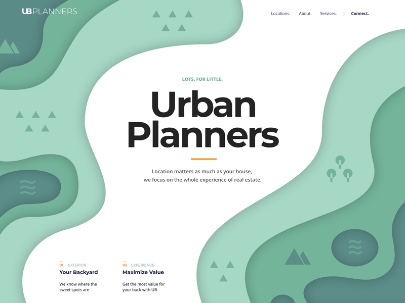
A good living environment relies on careful urban planning. So it is no wonder that companies have emerged specializing in a range of urban planning services. Urban Planning is a service provider offering planning and construction for real estate. The site displays different environmental plans in different depths of gradient color.
Layered gradient design and flat 3D shadow effects make the design more structural and layered.
By TyheReading
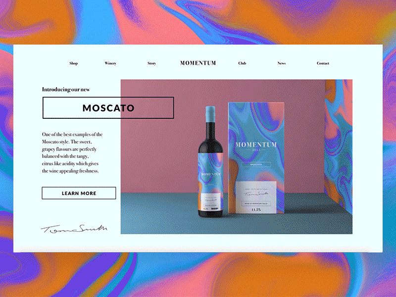
MomentumWines offer a range of glamorous wines from the vineyards of South Australia. Each wine has been carefully crafted to satisfy the most discerning palate. The brand combines a unique marble background with a traditional serif logo, giving the product an elegant and individual feel.
Art comes from life. This site shows what can be achieved by applying a natural marble gradient to the design
By Cuberto
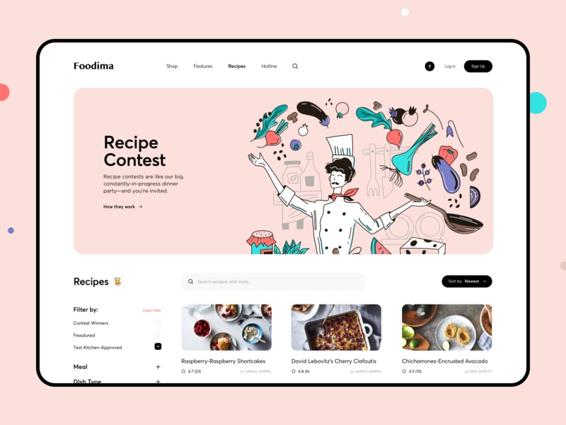
This is a gourmet website providing recommendations on food buying and recipes. The flat UI design incorporates a small cute illustration, making the entire website look clean, fresh, and simple. The finishing touch is the piggy-pink background color.
Skills:
This shows that you don’t need a large pattern illustration. Sometimes, small attractive illustrations can achieve surprising results.
by tubik
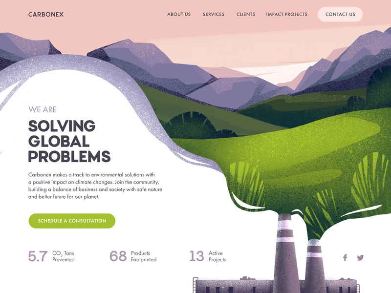
Tackling environmental issues is key to mankind’s very survival. Fortunately, we have grasped the seriousness of the problem and are already taking measures to prevent the worst effects. This is a website designed by the Tubik team for eco-environmental consulting. It is dedicated to the establishment and implementation of projects that will help protect the environment.
Hero image illustrations enhance the instant emotional appeal of the site and create instant interest in the topic. Also, the combination of the visual level and the CTA design creates a good user experience. This is a good reference point for anyone wanting to learn how to combine different elements in the design of a website.
by Afterglow
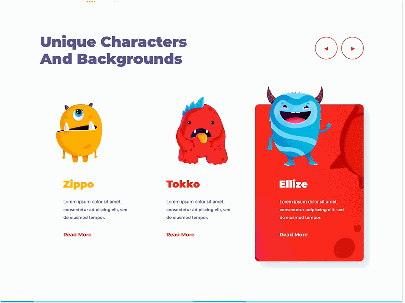
This is a game site that uses small monster illustration elements throughout the UI design to match the games theme. Animated illustrations make the website design more lively and appealing.
The entire website is made up of elements of illustration. The appealing interaction makes the illustrations come to life.
By Cuberto
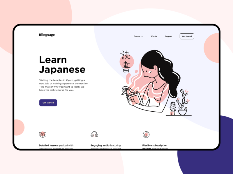
This is a magical illustration. The design is intended to bring a sense of calm to the user. It is a powerful design, conveying strength and a range of emotions to the user through illustration. Highly recommended.
There is impressive versatility in the application of illustration design; it can be both static and animated. But it is still important to have a sense of balance to match the website’s overall theme.
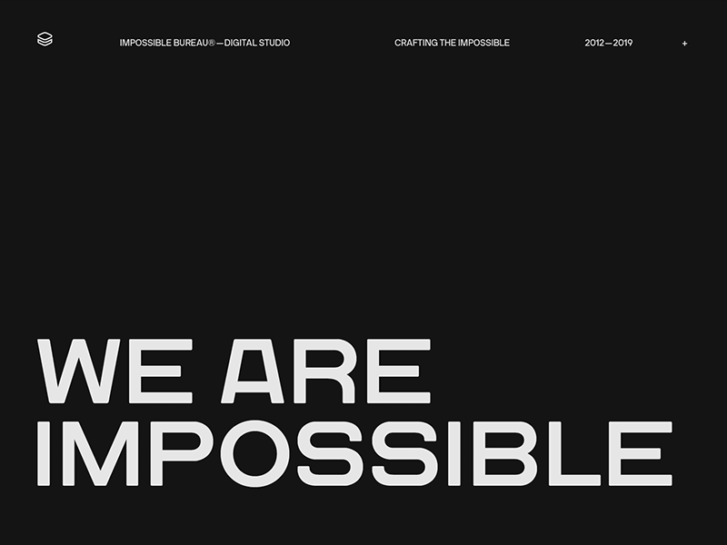
Are you confused by the huge variety of typographical choices available? Do you feel you lack the skill to make the most of them? Well, help is at hand. The designs here will help you learn a few typographic design tips. The website features black and white tones, shows how to achieve a good typographic design by simply adjusting the font size, layout, and icon embellishment. You will be surprised by how simple it can be.
The background, font size, and layout can greatly affect typography. You need to use contrasting colors in design, balanced by a large area of background, especially on personal portfolios or resumé website design.
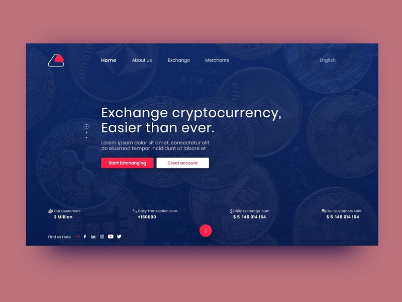
This is a website for an encrypted currency exchange, which needs to convey stability and professionalism. The regular layout and the dark background are accented with bright colors, making the site atmospheric but not dull. There is no complicated design on the interface; it is simple and clear. This is the work of an experienced designer who knows how to combine white space and dark website design to make the website look advanced and professional.
White space helps to expand the page. Without it, the compact design would make users feel enclosed.
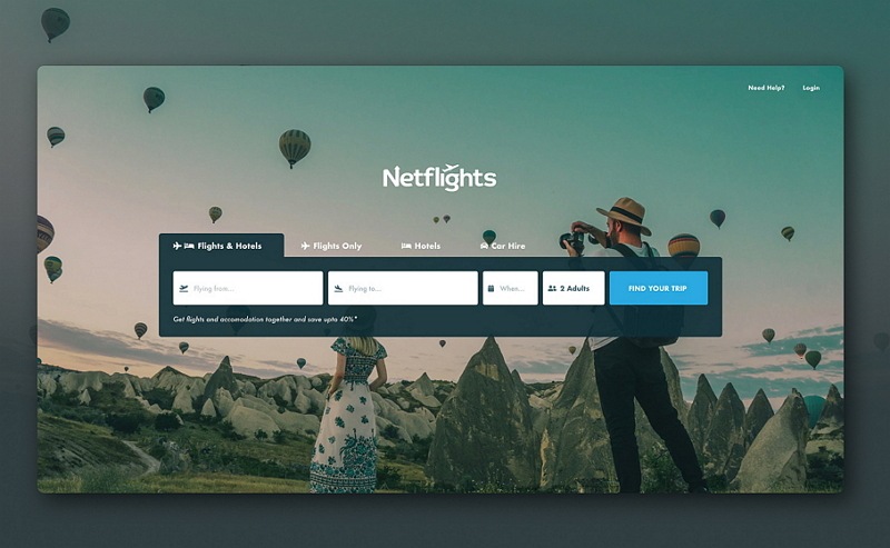
If you like to travel, you know the value of good up-to-date flight information. This is a conceptual design for a route query website. The elements used are very simple: color blocks, buttons, and tabs. The home page automatically centers the composition, and the super imposed color blocks highlight the key points.
If you've read The Non-Designer's Design Book, you can see that the alignment and intimacy principles are used to great effect in this design; it has centered design and tight information units. Also, the white space design adds a sense of quality to the website.
1. MaterialUp:Great material design examples
2. FLTDSGN:Cool flat web and APP UI design
3.Site Inspire:A web design site sure to inspire you
4.UI Cloud:The largest UI design database in the world
5.Land-Book:Product landing-page gallery
6.Mockplus: More than just a prototype design tool: a richly resourced design library as well.
7.Dribbble:High quality designer community sharing great designs
8.Behance: Excellent online creative portfolio
9.FlatUI Design:Flat UI design resources
10.Awwwards:Selecting the most creative and innovative examples of excellent web design
More on website design inspiration:
Best Website Design Inspiration of Month#1 in 2019
Best Website Design Inspiration of Month#2 in 2019
 Mockplus RP
A free prototyping tool to create wireframes or interactive prototypes in minutes.
 Mockplus DT
A free UI design tool to design, animate, collaborate and handoff right in the browser.
