In a world saturated with visual noise, bold minimalism emerges as a powerful design philosophy for 2025, blending the timeless elegance of minimalism with modern, daring elements. This approach transforms "less is more" into "less is impactful"Its versatility across mediums, from branding to web design, makes it a favorite for cutting through the clutter of social media and digital landscapes.
In this article, we'll explores bold minimalism in depth, uncovering its essence, advantages, contrasts with maximalism, and practical tips for implementation. Moreover, we’ll also showcase 20 stunning bold minimalism design examples to spark your creativity and inspire your next project. Let’s dive into this bold new take on simplicity!
Bold minimalism is a design approach that combines the simplicity of minimalism with striking, vibrant elements to create visually compelling graphics. It gained traction in the 2010s alongside the rise of digital platforms and social media, where attention-grabbing yet simple designs became essential. Its popularity continues to grow as brands and designers look for ways to combine clarity with visual impact.
Unlike traditional minimalism, which often utilizes muted colors and subtle details, bold minimalism embraces high-contrast colors, dynamic compositions, and impactful typography. This style emphasizes clean lines, ample negative space, and purposeful design choices, ensuring that every element serves a specific function and contributes to the overall message. By stripping away unnecessary details and focusing on core components, bold minimalism achieves clarity and immediacy, making designs both aesthetically pleasing and highly functional.
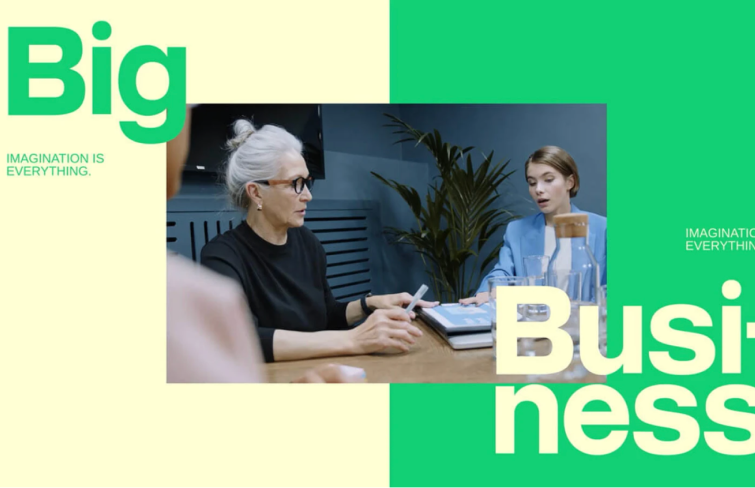
Bold minimalism has numerous advantages, making it an appealing choice for designers and brands aiming to create impactful and effective visual communications. Here are some key benefits:
Bold minimalism and Maximalism represent two distinct philosophies, each with its unique approach to visual communication.
As we discussed above, bold minimalism, featuring clean lines, ample negative space, and bold color palette, emphasizes simplicity and functionality, focusing on essential elements to convey a clear message. It is particularly effective in industries where clarity and sophistication are paramount, such as technology and luxury goods.
In contrast, maximalism embraces complexity and abundance. Characterized by bold colors, intricate patterns, and a plethora of visual elements, it creates immersive and dramatic experiences. Maximalism works particularly well in industries where creativity, vibrancy, and self-expression are celebrated, such as fashion, entertainment, and hospitality. This approach allows for a rich tapestry of self-expression, making it a popular choice among those who seek to stand out and make a statement.
Both bold minimalism and maximalism offer distinct advantages, and the choice between them should be guided by the target audience, cultural context, and the desired emotional response.
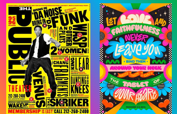
Here are some best practices for effective and appealing bold minimalism design:

Here are 20 of the best examples that showcase how bold minimalism can create striking, memorable, and effective visuals across various industries.
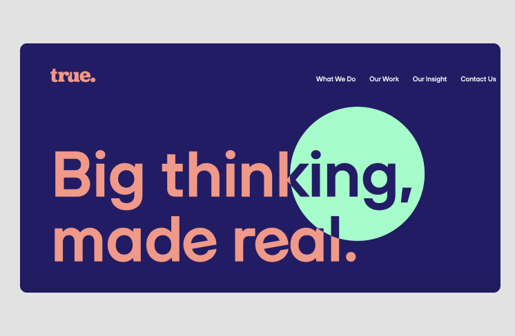
True Digital's website stands out through its bold use of color, oversized lettering, and a unique typeface, creating an engaging and dynamic design. The unexpected color choices complement the message, adding an intriguing touch without overwhelming the viewer. The site is free from unnecessary design elements or complicated navigation, maintaining a clean and focused layout.
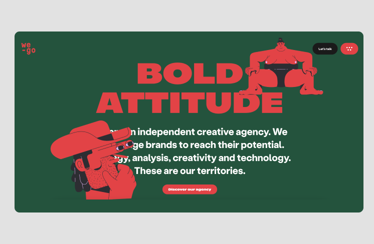
We-Go, an independent creative agency, exemplifies bold minimalism with a website design that seamlessly blends modern creativity with functionality. By using large fonts, vibrant colors and illustrations, We-Go ensures that the message is clear, direct and the overall design is visually appealing.
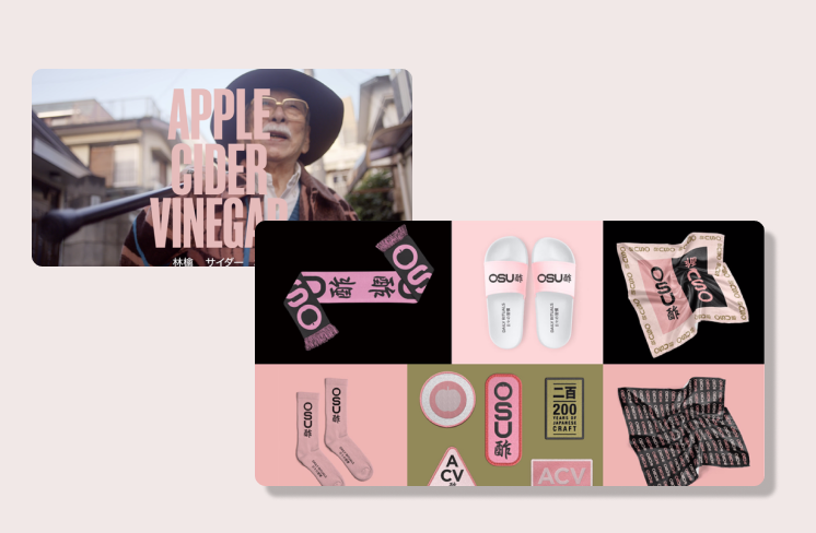
OSU's website effectively merges minimalist design with bold messaging. It uses direct, two- to three-word phrases paired with a simple pink color palette, ensuring clarity and impact. The portrait photography is juxtaposed with minimal typographic messaging, drawing the viewer’s focus to the product.
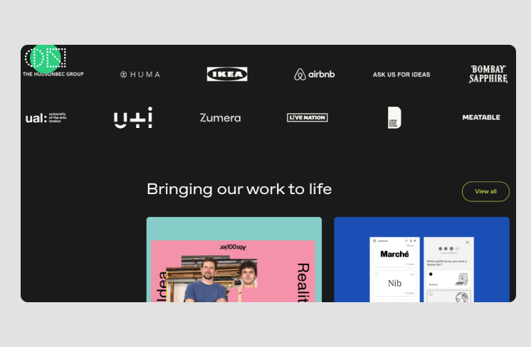
Made by ON's website immediately captures attention with an animated hero section that blends a minimalist color palette with bold patterns. The design incorporates hover and load animations, adding a dynamic, interactive layer to the otherwise clean and simple layout. This balance between simplicity and striking visual elements creates an engaging experience, allowing the design to remain fresh and modern.
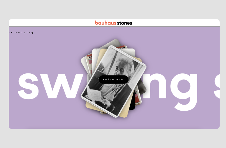
The Museum für Gestaltung's website for their Bauhaus-Archiv research project is a prime example of bold minimalism, especially in its stories page. In the 'Stories' section of the website, bold typography comes to life with animations as users scroll, drawing attention to key content. This dynamic effect adds visual emphasis and energy to its minimalist design.
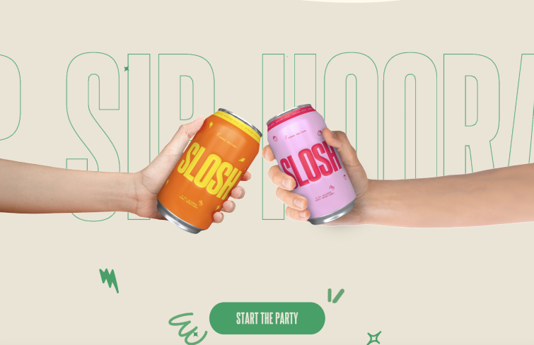
Slosh Seltzer's website perfectly showcases bold minimalism, featuring a generous use of negative space that allows the design to breathe. The high-contrast color palette and large, bold typography make a powerful statement, ensuring the brand’s message stands out. Moreover, the web design makes use of hover animation, morphing the typography into liquid-like forms as you scroll.
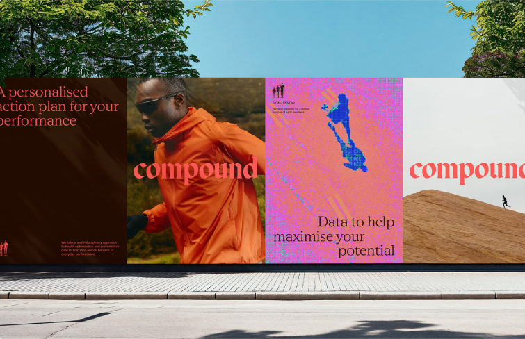
Compound, an Australian digital healthcare company, exemplifies bold minimalism by using a striking color palette, ample white space, and photography that centers around a key focal point. Compound creates a strong, cohesive identity that communicates effectively with users.
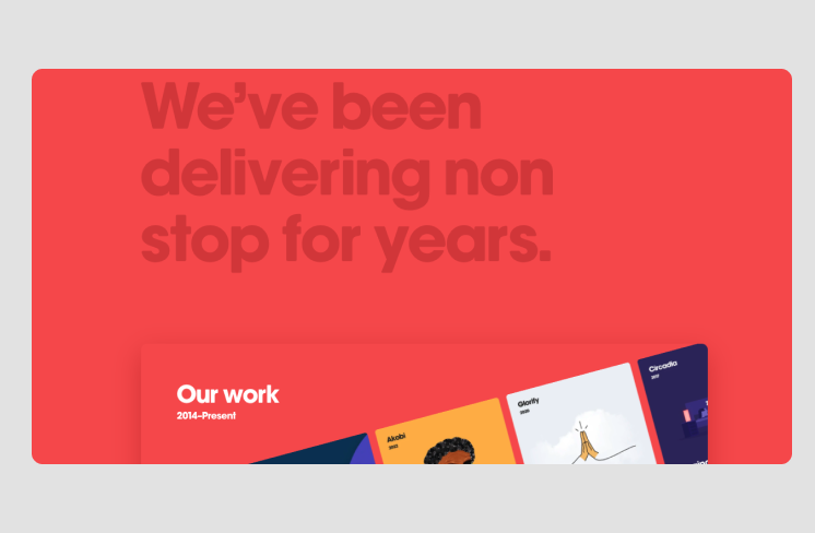
Kickpush, a product development company, uses a solid red background and bold, large headings to emphasize content and communicate key messages. The design features ample negative space, with visuals strategically placed across sections to create balance. Consistent typography throughout the site adds cohesion, while subtle animations provide an element of engagement.
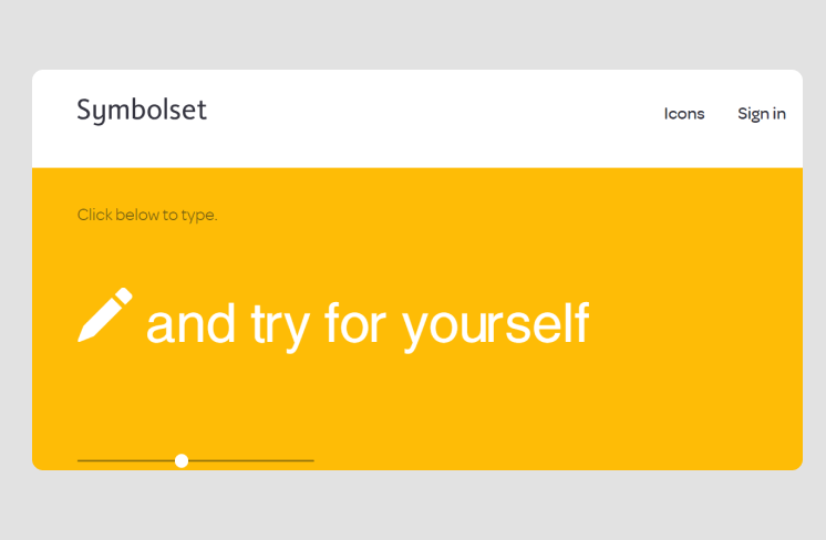
Symbolset's website exemplifies minimalist design with its ample white space, allowing users to focus on key elements. The clean layout and impactful typography highlight important details, such as the number of keywords and symbols, ensuring clarity and a user-friendly experience while maintaining a sleek aesthetic.
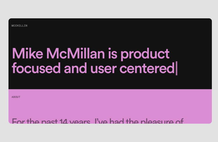
Mike McMillan’s portfolio website stands out with its clean, minimalist design that emphasizes simplicity and ease of navigation. A solid background paired with animated text introduces visitors to the owner, services, and past achievements in a smooth, engaging way. The large navigation links are visually comfortable and lead directly to the projects, ensuring a user-friendly experience. Ample white space further enhances readability, allowing the content to breathe and remain uncluttered.
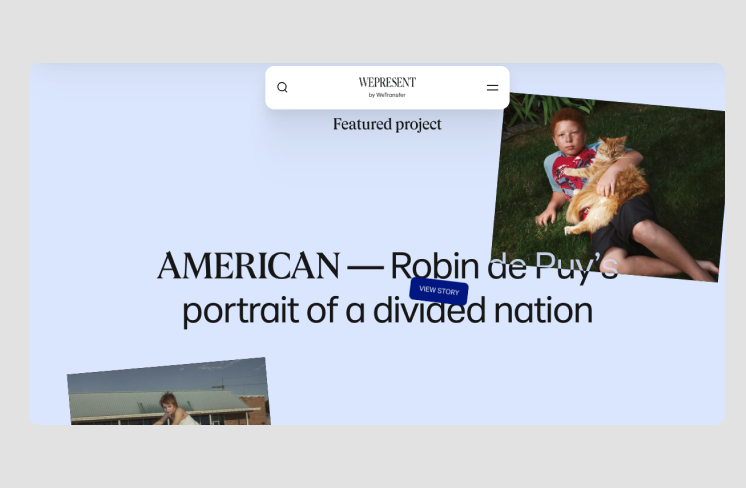
WePresent’s website design combines softness and vibrancy through a minimalist approach that allows the content to take center stage. Its pastel color palette fosters a calm and inviting atmosphere. Meanwhile, the playful typography adds personality and character to the design without overpowering it. This balanced use of color and typography enhances the overall user experience
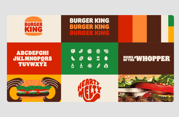
Burger King embraces bold minimalism with a simple, yet striking color palette. The large typography emphasizes key messages, while the minimalistic layout allows the products to take center stage. Bold imagery and clean lines direct the user's attention, creating an impactful, no-frills user experience that highlights the brand's core values.
Jazz FM Romania's website uses bold minimalism to create a striking visual experience. The contrast between black and yellow immediately draws attention, making the design dynamic yet clean.

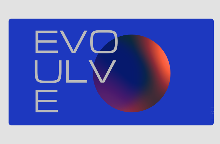
Evoulve's website uses bold minimalism to highlight the company's innovative approach to technology. The design is simple yet captivating, with a rotating globe and starry sky as the focal point. The minimal use of elements, paired with a dark background and subtle animations, creates a sense of discovery.
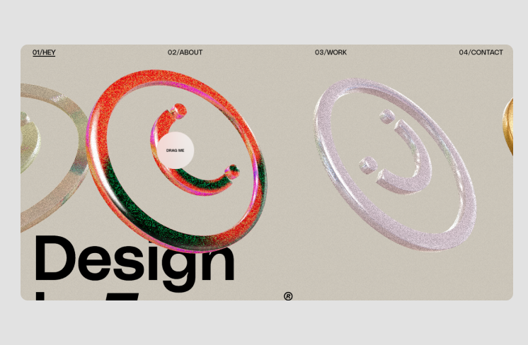
Design is Funny's website perfectly embodies the playful and bold minimalism of Daniele Buffa’s creative vision. With vibrant colors and engaging visuals, the site stands out while maintaining a simple and clean layout. Bold typography and minimalistic design elements guide users' attention to key content.
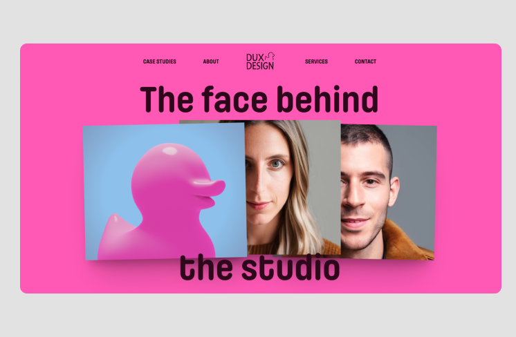
Dux Design's website epitomizes bold minimalism through its unapologetically vibrant pink background and oversized, playful typography. The use of bold color creates instant visual impact, while the clean layout maintains clarity. Layered visuals add a touch of personality, making the design both striking and approachable.
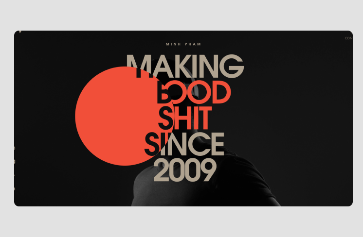
Minh Pham's website showcases bold minimalism with its dramatic use of black and beige, accentuated by a dynamic red circle. This interactive element reacts to mouse hover, creating an engaging experience. The oversized, clean typography emphasizes clarity while delivering a modern aesthetic. The balance between minimal design and bold interactive features captivates users instantly.
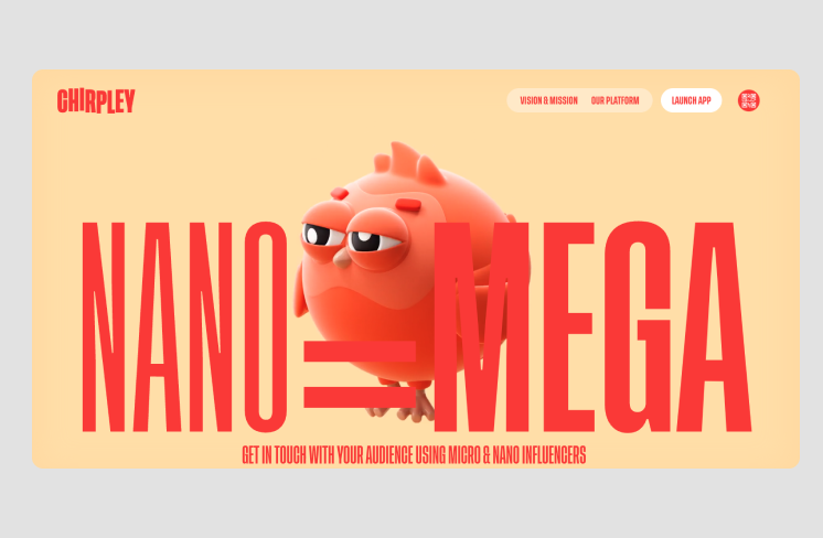
Chirpley's clean yet vibrant layout effectively balances simplicity with boldness. The oversized red typography contrasts sharply with the soft beige background, commanding attention. An animated quirky 3D bird character adds personality and visual intrigue.
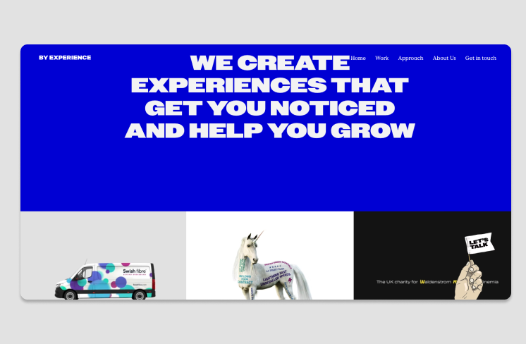
By Experience, a UK-based creative design agency, features a bold minimalist website with a striking cobalt blue, cyan, and white color scheme. The homepage showcases a large looping animation with concise, impactful imagery and text. This dynamic visual introduction effectively grabs attention while succinctly communicating the agency's essence and services.
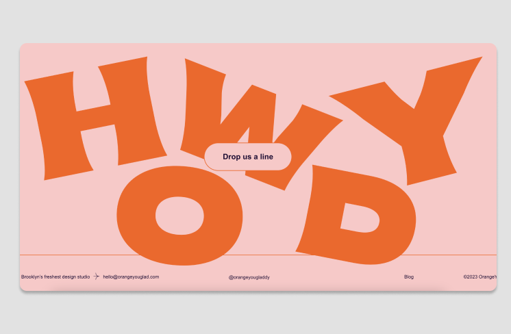
OrangeYouGlad embraces bold minimalism with creative animated details that make its website captivating. A standout feature is the playful hover effect on the “drop us a line” button, where the “howdy” sign shakes dynamically. This approach balances simplicity with fun, proving minimalist designs can incorporate lively animations for added personality.
In today's fast-paced and information-rich environment, incorporating bold minimalism into design strategies not only enhances visual appeal but also improves functionality and user engagement. The 20 best bold minimalism design examples featured in the article demonstrate the diverse ways this style can be applied across different industries, showcasing its timeless appeal and functional beauty. I hope this article has provided valuable insights into how bold minimalism can elevate your design work and inspire your future projects.
 Mockplus RP
A free prototyping tool to create wireframes or interactive prototypes in minutes.
 Mockplus DT
A free UI design tool to design, animate, collaborate and handoff right in the browser.
