A navigation bar is a map of a website. It could guide users in a clear and logical structure to get information in a quick way. While taking advantage of the navigation bar template is also a quick method on websites and apps building.
When designing a website, you should always keep the prototyping tool in hand to start your easy navigation bar creating, and help the user find their way faster and better.
Here are 40 best Bootstrap navbar templates, hoping to help you with quick and effective website building in 2024.

Designer: Jacob Lett
Code: HTML/CSS
If you want to feature both text and image content in the navigation bar. This is it. This template customizes the navbar to have a full width dropdown menu for certain nav items with images, which can present even more content and make navigation more powerful.

Designer: Ettrics
Code: HTML/CSS
This simple and clean navigation bar has been placed under the header section instead of placing it on the top, which makes it different from others. When scrolling down the page, you will notice that the Navbar automatically moves to the top to become a sticky bar on the top.

Designer: MrPirrera
Code: HTML/CSS
This navigation bar menu adopts a gradually translucent effect, and the text is designed with hollow transparency, which gives a clean and concise feeling as a whole. At the same time, when hovering over the menu, hover effects will also appear, allowing users to more clearly know the selected items.

Designer: Arjan Jassal
Code: HTML/CSS
This navigation bar adopts a unique side design, and when users hover over an icon on the menu, a rotating effect will appear, and the icons will rotate and transform into text. The overall design and animation are very advanced and unique.

Designer: Krishandeep Singh
Code: HTML/CSS
This navigation bar adopts a hidden design, and by default, the navigation bar is not displayed, making the design very simple and clean. When users click on the menu icon in the upper right corner, the navigation bar will slide in from the left side. It is a very unique design.

Designer: Andrej Sharapov
Code: HTML/CSS
This navigation design is very simple, with selected and deselected effects appearing when the mouse hovers over and leaves the menu, respectively. Overall, the animated details and purple color tone give a sense of luxury.

Designer: Tony Hill
Code: HTML/CSS
This navigation bar features a striking yellow color on the first screen, with a large logo on the left side. When scrolling down, the large logo transforms into a smaller one, and the yellow background color changes to blue, making the page more vibrant and interesting, and drawing users' attention.

Designer: Kevin
Code: HTML/CSS
This navigation bar has a simple design and animation. The background is solid color with simple text. When the mouse hovers over the text, a selected line animation appears at the top.

Designer: Vincent Durand
Code: HTML/CSS
This navigation bar adopts a side design. When the mouse hovers over an icon, there is a selected effect, and corresponding tags with text appears simultaneously to explain the selected icon. The design and information presentation are both simple and efficient.

Designer: Julie Park
Code: HTML/CSS
This navigation bar is initially hidden and fixed to the left side of the page. When the user clicks on the menu icon, a full-height navigation bar slides in from the left side. This design is an effective way to give the the website a clean look while also offers the necessary guide map when users need it.

Designer: Tam710562
Code: HTML/CSS
This Bootstrap 4 navbar template features on icons with top bubble tips. It contains three kinds of visual elements, including icons with text, search bar, and drop-down menu. With a black background, the white texts, icons, and bubbles with gradient colors are quite impressive for users.

Designer: Priyanshu28696
Code: HTML/CSS/JS
Navbar with social icon & dropdown is a Bootstrap template with Facebook, Twitter, and Instagram icons on the right side. Users could custom and add a hyperlink of your own social platform links to expand promotion channels.

Designer: Fontenele
Code: HTML/CSS/JS
This navigation bar with a drop-down menu is built by Bootstrap 4.1.1. If you want a navigation bar with multiple layers of sub-menus, this one could be a good choice. Nested layers structured in a clear and logical level to show information in a gradient descent method.

Source: Startbootstrap
Code: HTML/CSS/JavaScript
Resource: jquery.slim.min.js, bootstrap.min.css, bootstrap.bundle.min.js
Bootstrap 5 navbar with logo image is a classical template for a brand website with a logo area on the left side. The other text links are arranged averagely, closing the right side.

Designer: Fontenele
Code: HTML/CSS/JS
This navigation bar with a drop-down menu is built by Bootstrap 4.1.1. If you want a navigation bar with multiple layers of sub-menus, this one could be a good choice. Nested layers structured in a clear and logical level to show information in a gradient descent method.

Designer: demonguru18
Code: HTML/CSS
Basing on a yellow background, this Bootstrap 4 navbar is created in right align to concentrate users for signing in and registration buttons. Plus the CTA elements, this navigation bar involves more interactions with users.

Designer: Erickkf600
Code: HTML/CSS/JS
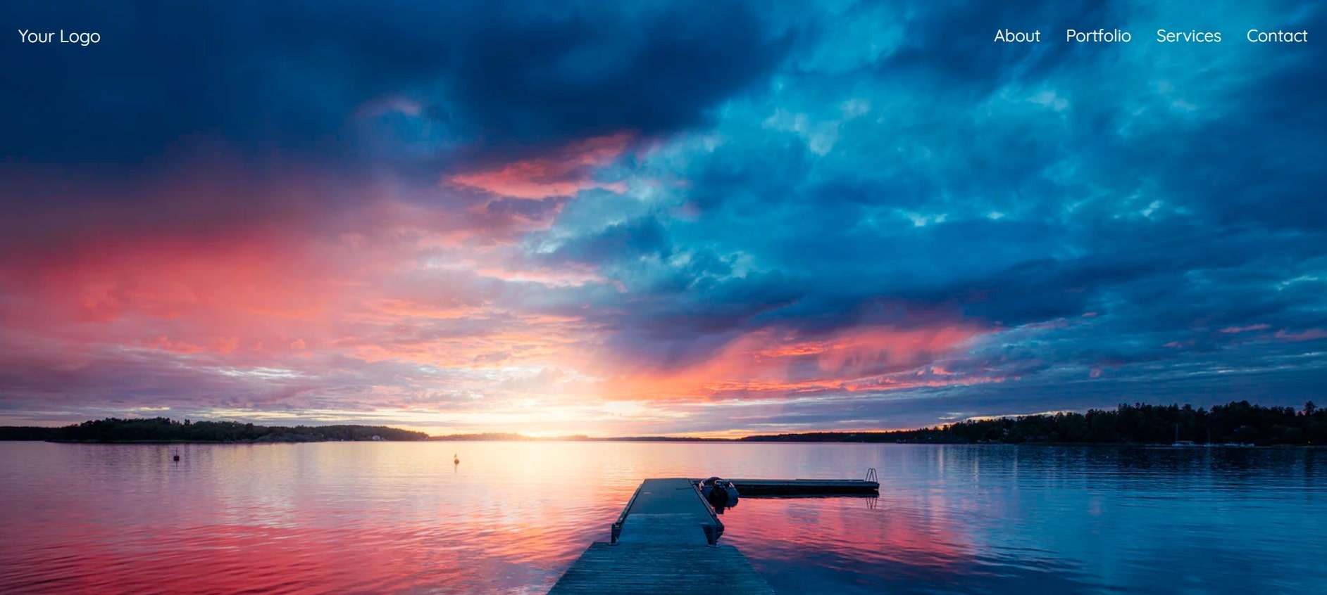
Lots of websites now adopt this kind of transparent sticky navigation bar, which could seamlessly integrate with the background image. All the navigation elements are simplified to present a clear UI. But it will automatically be presented with a dark background when scrolling down the page.

Designer: Abdullah TÜREL
Code: HTML/CSS/JS
This Bootstrap 4 navbar provides both the header and footer navigation bar. So you can use it directly for your website building. The top navigation bar arranged in a right align and highlights the website logo. While the footer navigation layouts averagely in three columns including address, contact, and social media. All elements could interact with the mouse moving.

Designer: ReeZh Design
Code: HTML/CSS/SCSS/JS
With this Bootstrap navigation bar template, you will learn how a navigation bar works under the default, static, and sticky states. Coded with responsive CSS and HTML, it could suit for devices in different devices. If you want to see the difference between the static and sticky fixed navigation, just scrolling down the page.

Designer: John Smith
Code: HTML/CSS/JS
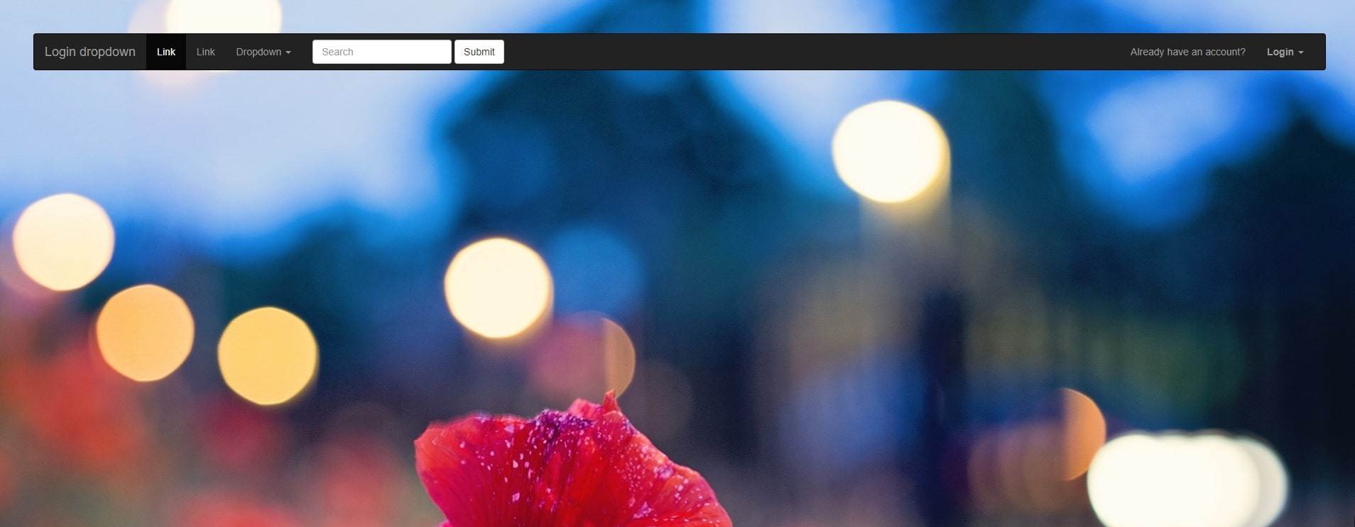
Login and register buttons are one of the most important design elements of a web page. This template provides an idea on how to embed the login and registration buttons in the navigation bar. The login and register panel gets hidden in a drop-down menu to save space on the top bar.

Designer: Michael Ward
Code: HTML/CSS/SCSS/JS
How to learn where you are on the web page? Just refer to this Bootstrap hovering navbar. Based on Hover.css, users can make quick judgments by hovering the mouse over the navigation text. Then, users can get feedback from the micro animation and saves clicking steps for users.

Designer: Leith
Code: HTML/CSS/SCSS/JS
More and more websites prefer to set multiple screens with different colors now. So designers and developers create a template to suit this kind of website design. Transparent background and the sticky fixed bar make users can always get clear navigation to switch to other pages.

Designer: Stanley Louis
Code: HTML/CSS/JS
A very simple Bootstrap navigation bar with website title and right-aligned navigation texts in minimalism style. Simple elements can always provide easier access for users.

Designer: Stefan Omerovic
Code: HTML/CSS/JS
This Bootstrap animated navigation bar template looks neat and simple. It has a blue background that you can custom from the CSS code. The width of the bar is variable with a zooming animation when you scrolling down the web page.

Designer: Scanfcode
Code: HTML/CSS/JS
Shortly, this Bootstrap navigation bar is completely a minimalist design. On the white bar, only three elements presented: Logo, drop-down list, sign in and sign up buttons. Extra navigation texts are collected in the drop-down list. That's the key point to building such a clean bar. Also, it could be customized in its CSS code library.

Designer: Md. Rejaul Karim
Code: HTML/CSS/JS
Different from other Bootstrap navbar templates above, this one designed with a full set of necessary information sections, such as homepage, about us, welcome, service, and more. It is worth mentioning that the search box comes with a feature of the pre-entered text.

Designer: Albi
Code: HTML/CSS/JS
Another transparent navigation bar differs from the template 7 with a responsive design. The pre-set animation will appear when you scroll down the page, and the navigation bar will turn to a fixed bar with a dark background simultaneously. It is suitable for business, education, and personal profile website.

Designer: David Cochran
Code: HTML/CSS/LESS/JS
This Bootstrap navigation bar is a very simple and modern navbar template, due to the font style of the logo. The big logo is located above the navbar and centered on the page. The links on the navbar can be fully customized by modifying the code.

Designer: Sandra Marie
Code: HTML/CSS/JS
This is a basic navigation bar with anchor features. It could help you quickly judge which part of the page you are scrolling down. Also, you can click the navigation texts to turn to other pages. Usually, this kind of navigation bar is more suitable for the single-page website.

Designer: Muluneh Awoke
Code: HTML/CSS/JS
This Bootstrap 4 navbar is a template with a center align. The bar is built with three elements, including a logo, navigation links, and a search box. All elements arranged logically and neatly. The space area on the bar makes it looks very clean. Except for the navigation, it also has a horizontal thumbnail library for product presentation. So, it could be used for business and personal agent website building.

Designer: Divinector
Code: HTML/CSS/JS
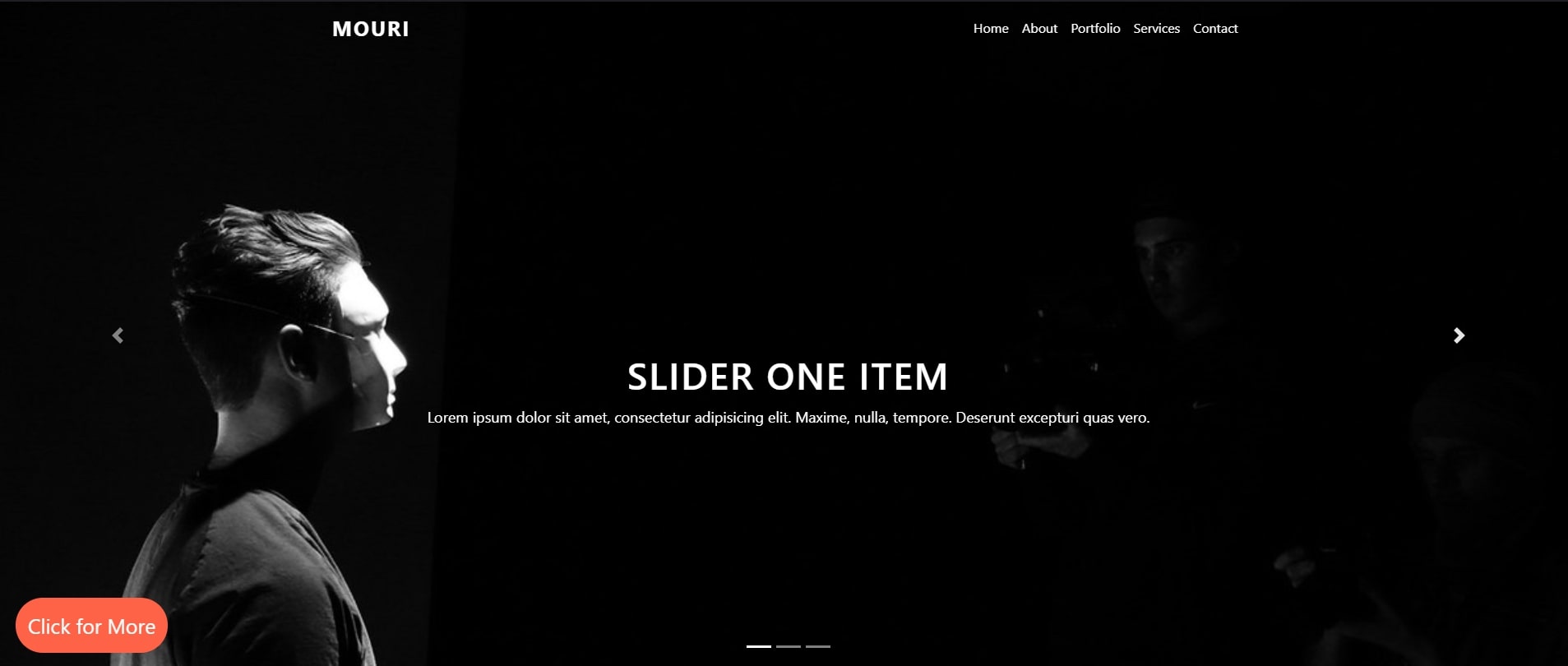
This Bootstrap 4 navbar template with slider is not only a great navbar design, but also a landing page design. It makes a well combination of navigation bar and landing page. The navigation bar fixed on the top of the webpage, while the sliders are centered on the page below the bar, which is also a navigation for visitors. The slider elements could be changed according to your needs by modifying the codes provided.

Designer: Piyush
Code: HTML/CSS/JS
This Bootstrap 4 navbar is a creative design with animations. Just move your mouse to check and view the animated navigation texts with a shape changing of the texts. It's also a reponsive design that you can apply it on multiple devices.

Designer: Gilles Migliori
Code: HTML/CSS/JS
Usually we saw short and concise drop-down menus on a navigation bar. That saves space for the bar, and also avoid blocking of the other areas on the web page. However, this Bootstrap navigation bar designed intentionally with long drop-down lists. But, with a pre-designed clickable button, the drop-down lists could be aligned to left/right, or center. You can customize it according to your real needs to avoid overlapping.

Designer: ts-de
Code: HTML/CSS/JS
Double navigation bars design provided by designer ts-de. Here you could directly make a visual comparison of the right and center navbar. Besides that, the two navigation bars are designed with black and white background. By adding your own creative elements, the navigation bars allow you to get different visual experience and focus.

Designer: ReeZh Design
Code: HTML/CSS/SCSS/JS
This Bootstrap 4 navbar template is designed to show you how to display submenu on hover. When you hovering on the navigation links, it will drop-down a submenu with more detailed information and lists for you to go to other pages faster. On the website of Mockplus, it also used submenu to display and divide products and features. Moreover, the contents and UI design of the submenu is customizable by modifying the CSS code.

Designer: ReeZh Design
Code: HTML/CSS/JS
Another Bootstrap 4 navbar with a logo image. But this one looks more fashionable and modern. Because it has a light yellow background and a rounded search box. The search box is animated when you moving your mouse on it. If you want to design a website with more interactive animations with users, this one is a good choice for learning.

Designer: Oleh Novakovskyi
Code: HTML/CSS/JS
What makes me impressive is the double rows of this Bootstrap 4 navbar. Also, the colorful carousel is an extra point. The 2 rows are separated by functions. The top one is mainly listing the company information such as an address, and contact. The second one is a static bar that will fix on the top of the website when you scrolling down the page.

Source: Startbootstrap
This is a scrolling navigation bar template with a simple style. It' purposefully unstyled, so you can customize it as any style for a landing page. The clickable links allow a smooth scroll, and the scroll spy feature can highlight where you are on the navbar. Also, as a responsive one-page design, it could perfectly fit on any device with different sizes.

Designer: Nikola Seke
Code: HTML/CSS/JS
The advent of the burger menu gives the navigation bar more style. In this Bootstrap 4 navbar template, the designer has assembled two vertical burger menu navigation designs and five different styles of horizontal navigation designs, which are convenient for users to preview and compare in real time to determine their desired navigation style.

Designer: Oskar Borowski
Code: HTML/CSS/JS
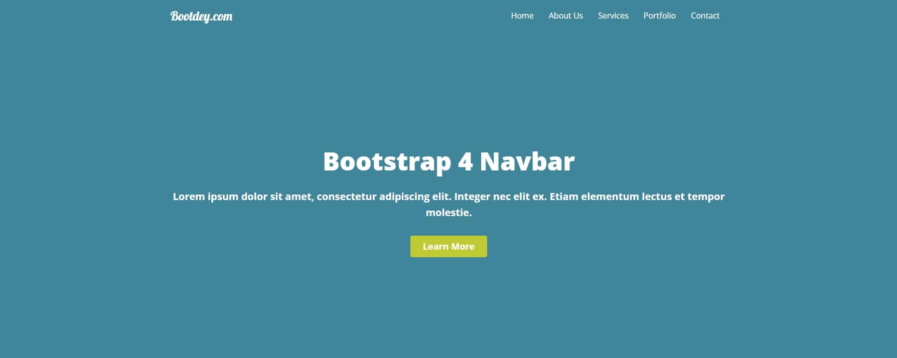
The design of Bootdey's navigation bar is designed to use mouse hover to trigger the label animation and drop-down menu. In this method, users could quickly obtain effective information with minimal steps.
Incorporating components into a Bootstrap navbar is easy and flexible. Basically, you can add a logo, links, dropdown menus, forms, search forms, user menus, brand names, badges, alerts, and tabs. Remember to use the appropriate HTML tags and apply the necessary Bootstrap classes to style your components and make them fit seamlessly into the navbar design.
Customizing the Navbar in Bootstrap can greatly enhance the user experience of your website or application. Basically, when customizing your Navbar, you should consider best practices, such as choosing the right color scheme, using responsive classes, adding navigation links, using icons, using custom CSS and more.
Okay, that's all for the 40 best Bootstrap navbar templates we'd like to share with you. You can learn and apply the templates above more quickly if you know HTML/CSS/JS. I hope it would be helpful and useful for you.
 Mockplus RP
A free prototyping tool to create wireframes or interactive prototypes in minutes.
 Mockplus DT
A free UI design tool to design, animate, collaborate and handoff right in the browser.
