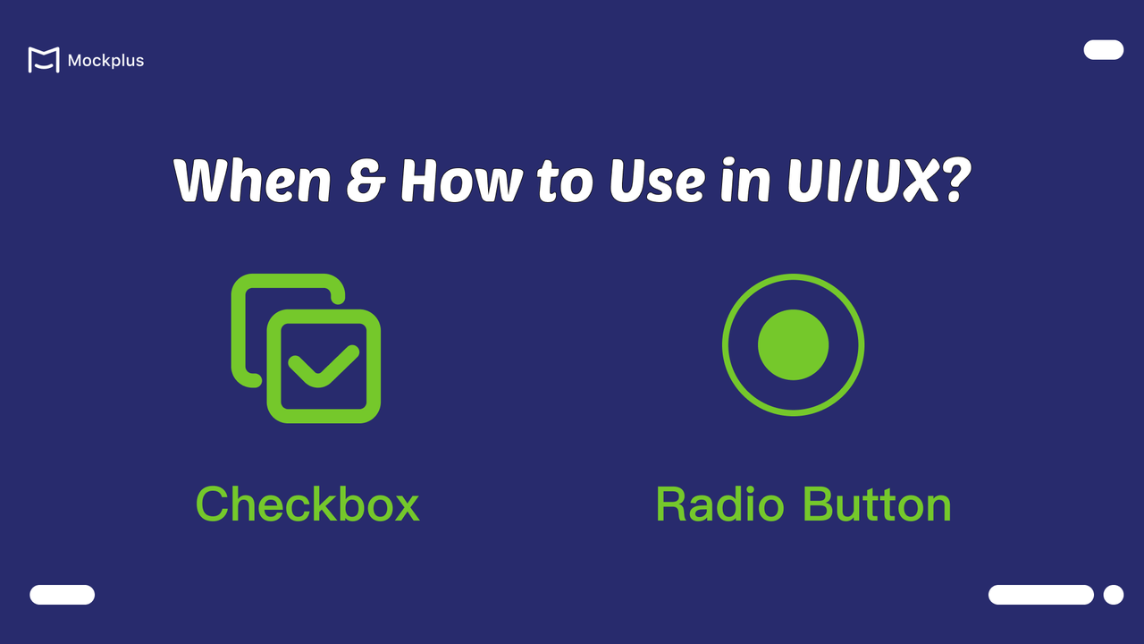
In web and app design, choosing between checkboxes and radio buttons can often be confusing. These two components might seem interchangeable in some contexts, leading designers to wonder which is more appropriate. Whether you’re designing a simple form or a complex application, knowing when to use checkboxes versus radio buttons can enhance usability and accessibility, ultimately leading to better engagement and satisfaction for your users.
This article will delve into the nuances of checkboxes and radio buttons, exploring their distinct features, functionalities and appropriate use cases. Moreover, we also handpicked some free UI Kits with checkbox and radio button design. By the end, you’ll have a clearer understanding of how to implement these components effectively.
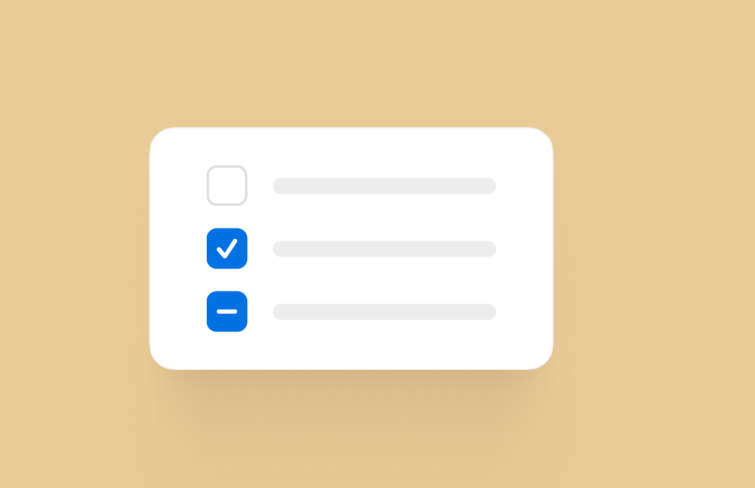
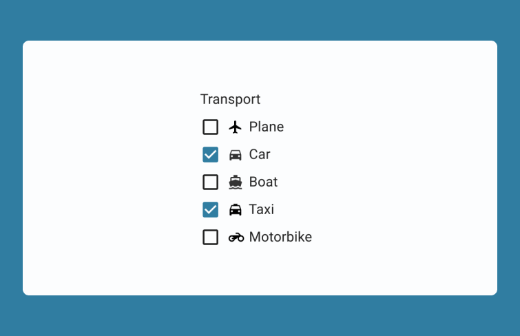
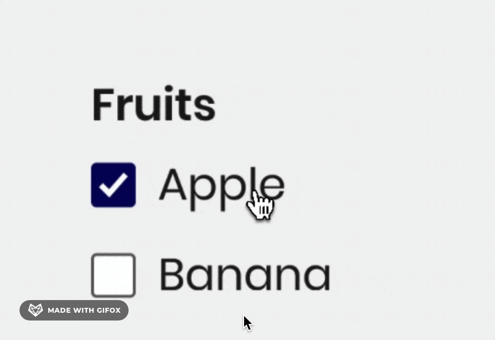
If you search for "Checkbox" in Google, you can see Google defines it as a graphical widget that allows the user to make a binary choice. We can defines it more simply as a UI element that allow users to make multiple selections from a set of options, typically represented by a small box that can be checked or unchecked. When checked, the small box will be filled with a check mark.
They are commonly found in forms, dialog boxes, and settings panels where users might need to choose several options simultaneously, providing a straightforward way to gather diverse input or preferences without limiting choices. Their intuitive design, characterized by simplicity and clarity, makes it easy for users to understand and interact with.
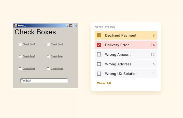
Checkboxes emerged with the advent of graphical user interfaces (GUIs) in early 1980s. Over time, they have evolved from basic functional elements into versatile and aesthetically pleasing components that enhance modern user interfaces, which reflects the growing emphasis on user experience and design aesthetics.
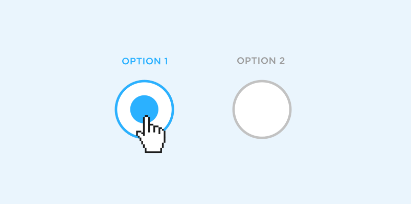
A radio button is a UI component that allows users to select only one option from a set of choices, typically represented as a small circle that fills with a solid color when selected. Typically, when you select a radio button, any other button in the same group gets automatically deselected. They are commonly found in scenarios like choosing a payment method, selecting a subscription plan, or answering survey questions.
The earliest design model for radio buttons was inspired by radio channel selectors. When one button is pressed, the others pop out, indicating that the selected button is active.
In UI/UX design, the history of radio buttons dates back to the early days of user interface design, primarily with the advent of graphical user interfaces (GUIs) in the 1980s. In recent years, radio buttons have seen design innovations, including more stylized versions that align with contemporary aesthetics.

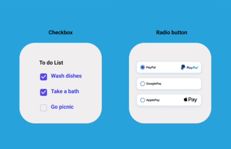
Checkboxes and radio buttons are both essential UI elements for making selections, but they serve different purposes and operate under distinct rules. The primary difference between them lies in the selection method: checkboxes allow for multiple selections from a set of choices, while radio buttons facilitate exclusive selection.
You can think of checkboxes as the versatile multitaskers—they enable users to choose one, several, or none of the options available. Each checkbox operates independently, meaning the state of one checkbox (checked or unchecked) does not affect the others. This makes checkboxes ideal for scenarios like creating a to-do list, where users might want to select various tasks to complete.
In contrast, radio buttons are specifically designed for single selections within a defined group. Once a radio button is selected, all other options in that group automatically become unselected, ensuring that only one choice can be active at any time. This design is particularly useful in contexts like selecting a payment method on an e-commerce site. For instance, when a user chooses a credit card option, any previously selected payment methods are automatically deselected.
It's clear now that checkboxes and radio buttons are two commonly used controls in user interface design, each with distinct use cases. Based on our previous analysis of the characteristics and differences between checkboxes and radio buttons, their most common usage scenarios can be summarized as follows:
Multiple Selections: Checkboxes are ideal for scenarios where users can select multiple options from a set. For example, in a survey about favorite snacks, users might be presented with options like chips, cookies, and fruit. Each checkbox allows users to indicate all their preferences without restriction. This flexibility enhances user engagement and ensures that the collected data reflects a range of choices, enabling better insights for survey creators.
Confirmation of Conditions: Checkboxes are frequently employed in forms to confirm user agreements or conditions. For instance, when signing up for a service, users may be required to check a box to acknowledge that they have read and agreed to the terms and conditions.
Feature Toggles: In application settings, checkboxes are commonly used to enable or disable specific features, providing users with greater control over their experience. For example, users might find options to enable email alerts or SMS notifications through checkboxes.
Single Selection: Radio buttons are best utilized when only one option can be selected from a given set. This is crucial in scenarios such as choosing a payment method—options like Credit Card, Alipay, and WeChat Pay must be mutually exclusive. By forcing users to make a clear choice, radio buttons prevent ambiguity, ensuring a smooth transaction process.
Form Completion: When filling out forms, radio buttons excel in situations where a question has multiple potential answers but only one can be chosen. For example, when selecting gender, users may see options like male and female.
Setting Preferences: In applications where user preferences are mutually exclusive, radio buttons help maintain clarity by allowing only one selection. For instance, when users are prompted to choose a preferred system language from options like English, Spanish, or French, radio buttons ensure that only one language can be active at a time.
A checkbox or radio button might seem like a simple UI component. But creating interactive checkboxes and radio buttons from scratch can indeed be a time-consuming task, especially when ensuring they meet usability and design standards. Fortunately, Mockplus RP simplifies this process with its built-in interactive components, allowing designers to focus on crafting the overall user experience rather than getting bogged down in the details.
Mockplus RP provides a range of pre-designed components for checkboxes and radio buttons, which are fully customizable. Simply drag and drop it to your design to use it. You can easily adjust colors, texts, sizes, and styles to fit any design style or project requirement without the need for extensive design tweaks.
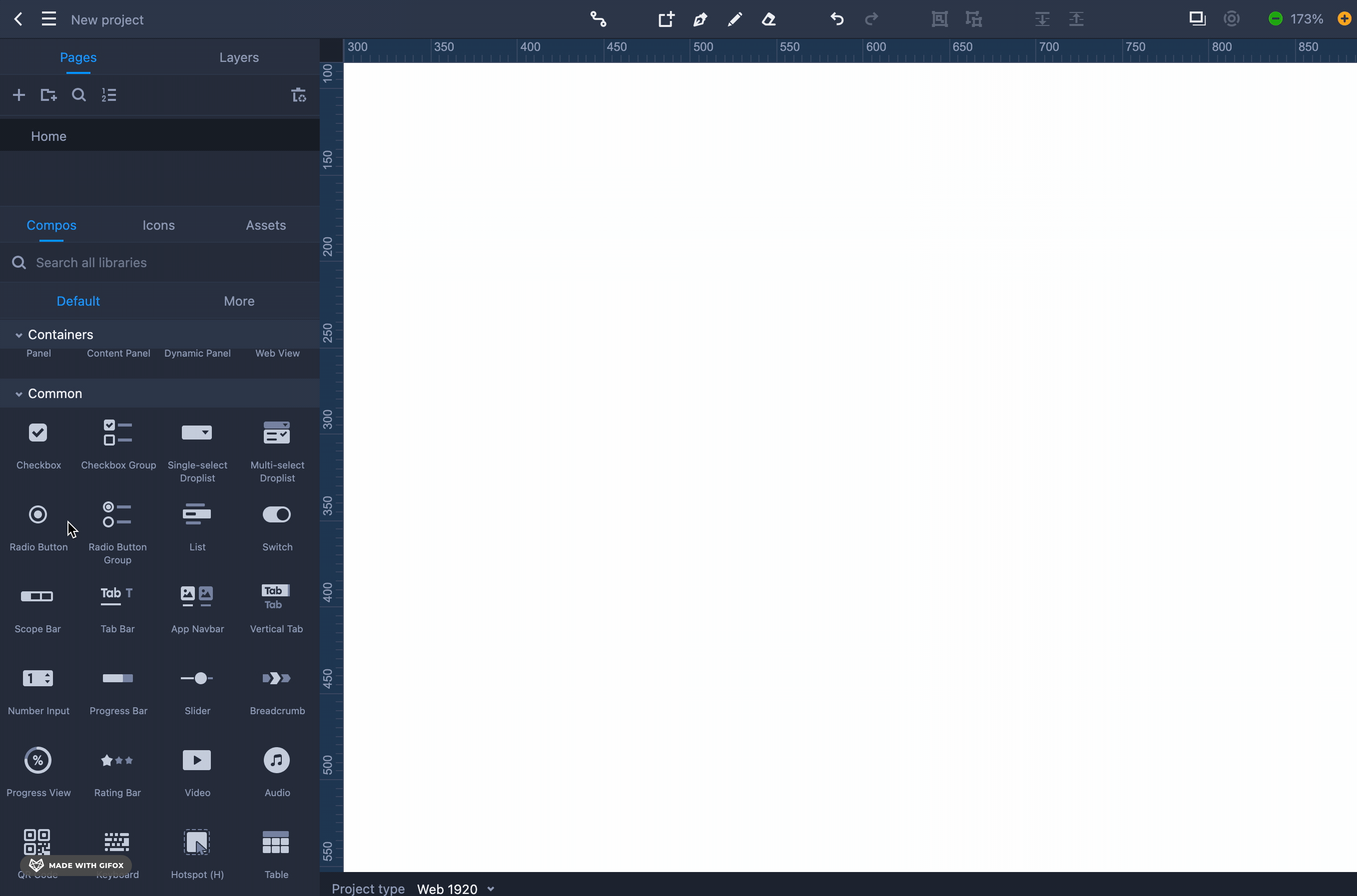
Moreover, the pre-built checkbox and radio buttons components in Mockplus RP all come with interactive nature. You don't need to set up interactions and animations manually. All the checkboxes and radio buttons function like a real thing, allowing for immediate feedback. By using these ready-made components, designers can efficiently produce high-quality, functional UI elements that enhance the overall user experience while reducing the time spent on repetitive tasks.
When designing checkboxes and radio buttons, it’s crucial to consider their usability and visual appeal to enhance user experience. Effective design ensures that these UI elements are not only functional but also intuitive for users. Here are several tips for designing effective checkboxes and radio buttons that can help create a seamless interaction and improve accessibility:
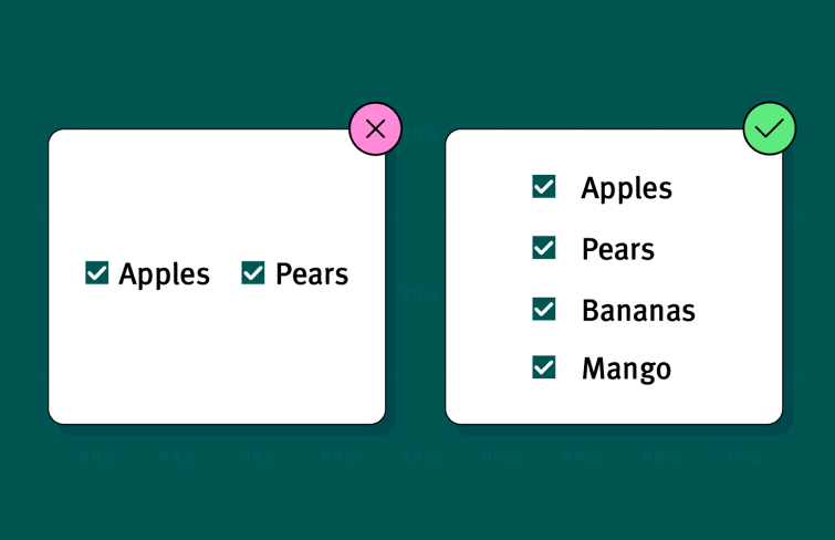
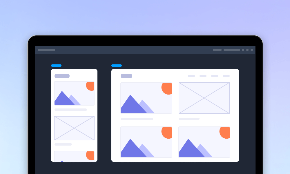
Arranging checkboxes in a vertical direction significantly improves readability and user navigation. This layout allows users to scan through options more efficiently, as they can easily identify and focus on each item without the distraction of horizontal alignment. Additionally, this arrangement provides ample space between checkboxes, reducing the risk of accidental selections.
Designers's goal is often to make elements stand out with innovative approaches. But when it comes to checkboxes and radio buttons, simplicity is key. Since these are familiar components, it's important to keep the design straightforward so users can easily understand and interact with them. Avoid unnecessary visual complexity, which can lead to confusion, to reduce cognitive load and create a seamless user experience
Using concise labels for checkboxes and radio buttons is essential for enhancing user efficiency. Labels that are short and direct—ideally 3 to 4 words—enable users to quickly scan their options and make selections with confidence. Additionally, concise labels help maintain a clean interface, ensuring that the design remains visually appealing while promoting ease of use.
By making the entire label area interactive, users benefit from a larger target for tapping or clicking, which enhances usability, particularly on touch devices. Moreover, a clickable label improves accessibility for all users, including those with motor impairments, fostering a more inclusive design.
Ensure that users receive clear visual cues when they interact with checkboxes. Effective feedback can manifest as color changes, subtle animations, or the appearance of checkmarks, signaling to users that their actions have been registered. These visual cues help users confidently confirm their selections, minimizing any uncertainty or confusion during the interaction process.
As mentioned above, a common use case for checkboxes is confirming conditions, like agreeing to terms and conditions. This free template from Mockplus comes with 10 inspiring login page examples that highlight this typical use of checkboxes. All pages come with interactive components to simulate the real user experience and are fully customizable!
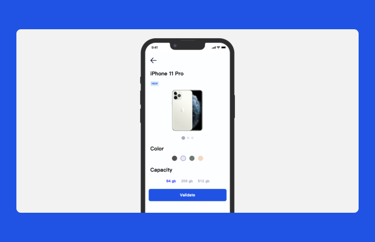
This modern, tech-focused UI kit from Mockplus is tailored for online shopping apps and includes over 15 screens. On the shopping page, when users opt to purchase an iPhone, they can select options for color and capacity, but they can only choose one option for each feature, exemplifying the typical use case for radio buttons—single selection. Also, all pages come with interactive components to simulate the real user experience and are fully customizable!
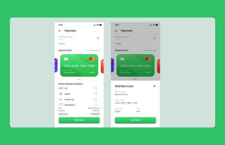
This free iOS UI Kit is tailored for a banking app, featuring radio buttons for payment method selection. It clearly demonstrates the primary function of radio buttons: single selection. When a user chooses one payment option, the previously selected option automatically deselects.
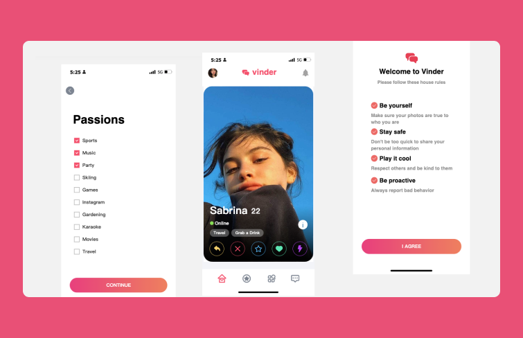
This template is an ideal app UI kit designed to help you create a social media app prototype in just minutes. It features over 15 pages and incorporates checkboxes for users to select their preferred categories of interest and to agree to terms and conditions. The use of checkboxes enables users to choose multiple passions, providing a customizable experience that caters to individual preferences.
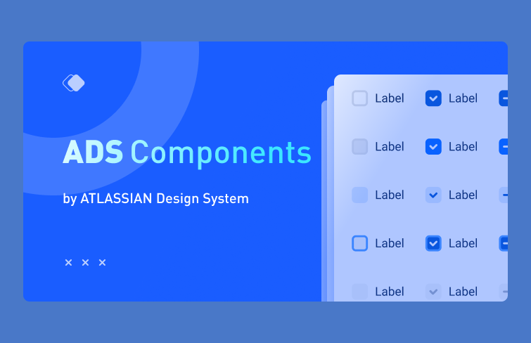
This free ADS component aligns with Atlassian's design system and includes all the essential elements you need to create prototypes for web, desktop, and mobile apps. It features badges, banners, breadcrumbs, date-time pickers, dropdown menus, empty states, and checkboxes and radio buttons as well. All checkboxes and radiao buttons come with different state such as normal, selected, diable and more. They are fully editable and reusable to match all your design needs.
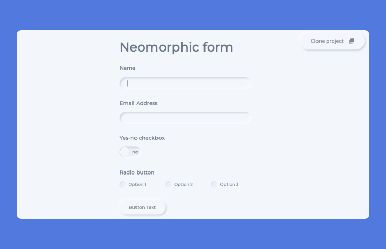
This is a free design UI Kit from webflow. Its radio buttons adhere to the Neomorphic design principle, which blends the best of Skeuomorphism (imitating real-world objects) and Flat Design (cleanliness and simplicity). Its three-dimensional depth effect adds visual interest without overwhelming the user.
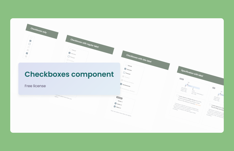
This checkbox UI kit includes a variety of checkbox designs to suit different needs. It features standard checkboxes with regular labels, checkboxes that incorporate title labels, options with both title and captions, and visually engaging checkboxes with images, ensuring versatility for any project.
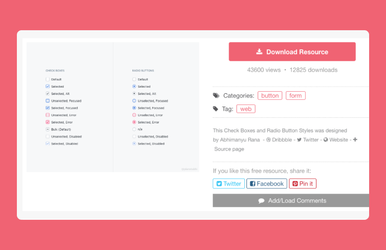
This is a free checkbox and radio button UI kit designed for Sketch. It features the most commonly used styles while offering nearly all possible states for both checkboxes and radio buttons, ensuring you have comprehensive options for creating intuitive and user-friendly interfaces.
No. As we discussed in this article, checkboxes and radio buttons are designed for distinct purposes and should not be used interchangeably. Checkboxes enable users to select multiple options from a group, making them ideal for scenarios like collecting preferences or multi-choice selections, where users can indicate all applicable choices. In contrast, radio buttons are intended for single selections within a group, allowing users to choose one option only, which triggers specific actions, such as submitting or resetting forms. Using them correctly ensures clarity and enhances user experience by providing intuitive interactions tailored to the intended functionality of each component.
The choice between radio buttons and checkboxes is not about which is better, but rather about using the appropriate element for the specific scenario. Each serves its purpose effectively depending on the context of your user interface. Radio buttons are ideal when you want users to select one option from a limited set. In contrast, checkboxes are best suited for situations where multiple selections are required. Consider the user's decision-making process and the specific needs of your form to determine the most suitable option, enhancing overall usability and clarity.
Checkbox and radio button UI kits offer customizable components that streamline the design process while maintaining a polished, professional appearance. Here are a few websites with free downloads to help save you time and effort.
1.Mockplus
URL: https://www.mockplus.com/example/rp
Mockplus offers a massive library of web and mobile app templates to make designers design easier. They all are fully customizable, reusable and scalable.
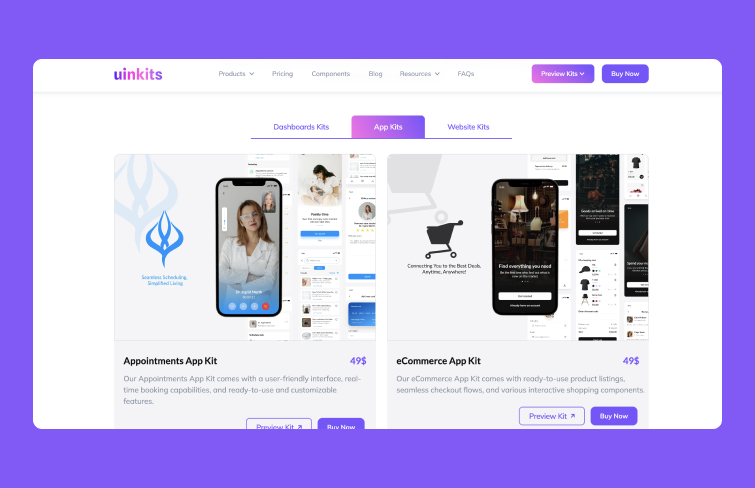
2.Uinkits
Uinkits is UI kits and design system for Figma. It offers Figma UI components for mobile, web, and dashboard UI elements, icons, and more.
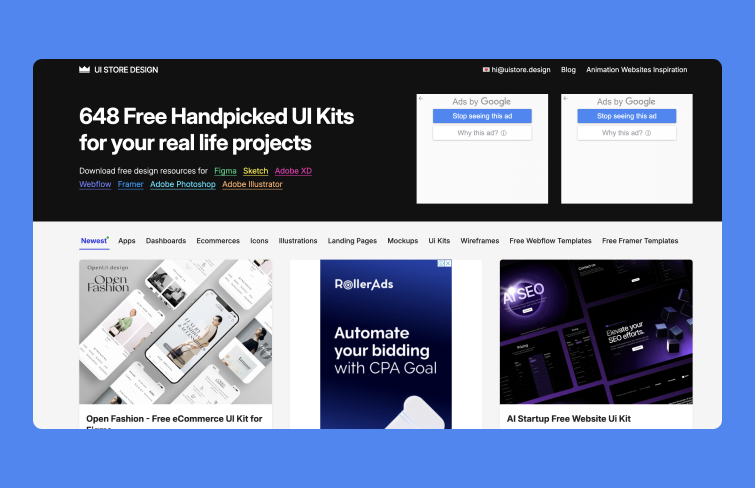
3.UIstore
URL: https://www.uistore.design/
This website offers free download design resources for design resources for Figma, Sketch, Adobe XD, Webflow, Framer, Adobe Photoshop, Adobe Illustrator and more.
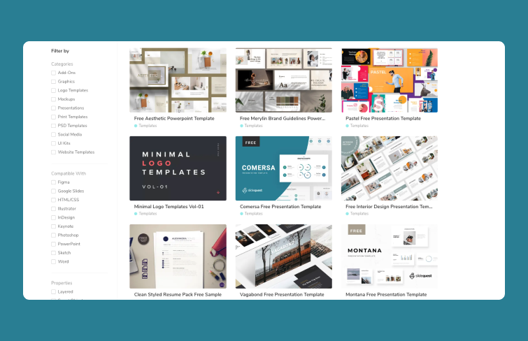
4.Free design resources
This is website offering handpicked free UI Kits to use on your web and mobile application. Ranging from simple to complex.
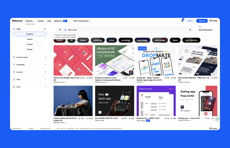
5.Behance
URL:https://www.behance.net/search/projects/free%20ui%20kit
Behance is the largest global platform for showcasing and discovering creative work, including a wide array of free UI kits available for download.
6.Lapa Nina
URL:https://www.lapa.ninja/freebies/ui-kits/
Lapa Nina offers free UI Kits in elegant and modern style and will help you to quickly create your own design. Users can easily customize images, content, and style without any code.
In this article, we explored two fundamental elements in UX design: checkboxes and radio buttons. We examined their differences, appropriate use cases, and design tips to enhance user experience.
To summarize, checkboxes allow users to select one or more options, making them ideal for situations requiring multiple selections. In contrast, radio buttons are best suited for scenarios where a single choice must be made from a group. Understanding these distinctions is crucial for designers, as using the right element not only improves usability but also helps create a more intuitive interface that meets user needs effectively. Hopefully, by applying these insights, you can enhance interaction and satisfaction within your designs.
 Mockplus RP
A free prototyping tool to create wireframes or interactive prototypes in minutes.
 Mockplus DT
A free UI design tool to design, animate, collaborate and handoff right in the browser.


 Sign up with Google
 Join our Discord community
 support@mockplusapp.com