Looking for a collection of flat web design examples that can inspire you and help you create an excellent website?
We've put together a list of 20 flat web design examples and practical principles for your quick reference. This article is split into seven logical parts covering multiple elements of flat web design. You will learn everything from the basics - such as what flat design is & its benefits - to the advanced - such as how to create a flat web design.
On top of this, you will also discover resources where you can find great flat design website templates.
Table of contents:
Flat design is a minimalistic two-dimensional user interface design style that is simple & clean. It uses bright colors and focuses on usability.
It is often contrasted to the skeuomorphic style, which gives the illusion of three dimensions by copying real-life properties.
The goal of flat design is streamlining designs and making websites faster and more functional. Originally, flat design was developed for responsive design to make the content of a website adaptable to the device screen size. Because of simple shapes and minimal elements, this design style allows for fast and smooth loading whether on desktop or mobile.
Google’s Material Design:
Google released material design as a standard for Android app design. It focuses more on clarity and depth with vibrant colors. It's a style with a little bit of skeuomorphism used in the simplest way possible and that makes the product look more intuitive.
Apple’s Flat Design:
Apple uses simple and flat elements so users can focus on valuable content and interactions.
Differences between flat design and material design:
Loading time. Flat design is easier to develop and loads faster than material design.
Target users. Flat design is more suitable for users who prefer interacting with the website, while material design focuses more on users’ real response.
Colors. Material design’s colors are more flat and make the design more communicative.
Demands/needs. Flat design caters to simple needs while material design suits more complex needs.
What makes flat design become popular in recent years? After the researching, here are three most important points I got:
Reduce the hardware requirements of devices and extend the standby time.
The design style called skeuomorphism was the trend for a long time before flat design. It makes digital product look like the real thing, which results in longer loading time.
Reduce cognitive impairment for users.
Compared to skeuomorphism, flat design presents information in a simpler way, which helps reduce cognitive impairment. This is because people process simple visual elements better.
Flat design is simpler, clearer, and most importantly, more adaptable.
With the ever-expanding variety in screen sizes, screen resolutions, and different platforms, creating skeuomorphic designs for websites and applications is cumbersome and time-consuming. This is why the trend is moving towards a more flat design, whereby you can guarantee that the result will look good on all screen sizes.
This principle is the very definition of flat design. Each UI element - such as buttons, images, and icons - of flat web design should be simple, clean, and minimal. The goal is for the UI elements to be easily recognized and understood.
Simple typography and vivid bright color patterns are used to create an impressive flat web UI design. That's because the strong, contrasting colors helps highlight details of icons, fonts, illustrations, etc.
Considering the simple nature of flat design, typography is quite important, because it should match the overall website design style. Sans serif typography is the best choice with multiple variations and weights for better readability.
Due to the two-dimensional style, the visual hierarchy in flat design characteristically doesn’t have any added effects such as drop shadows, bevels, embossing, and gradients.
How do you then recognize the visual hierarchy? It relies on the unique interactions between the website elements. Therefore, the contrast of colors and CTA buttons are the most often used methods to create the necessary effect.
Flat design can be seen everywhere in our daily life, especially for iPhone users. By using angular lines, plus some of Apple's application design interface and monochrome contrast, the resulting design is gorgeous.
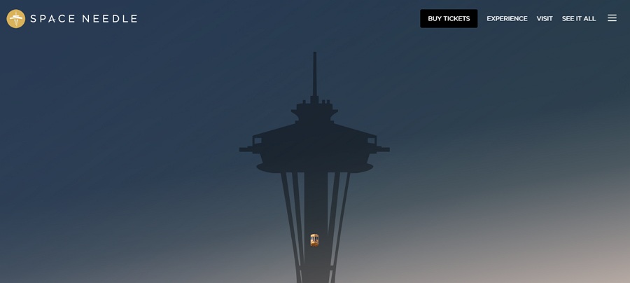
The loading image of Space Needle follows the design principle of minimalism: simple color & background, images, and texts. The whole website background adopts toned down pastel colors, which makes the central image more recognizable.
When hovering over the CTA button, the black color will change to a bright yellow, distinguishing it from the other buttons on the site. This greatly increases the chance of conversion.
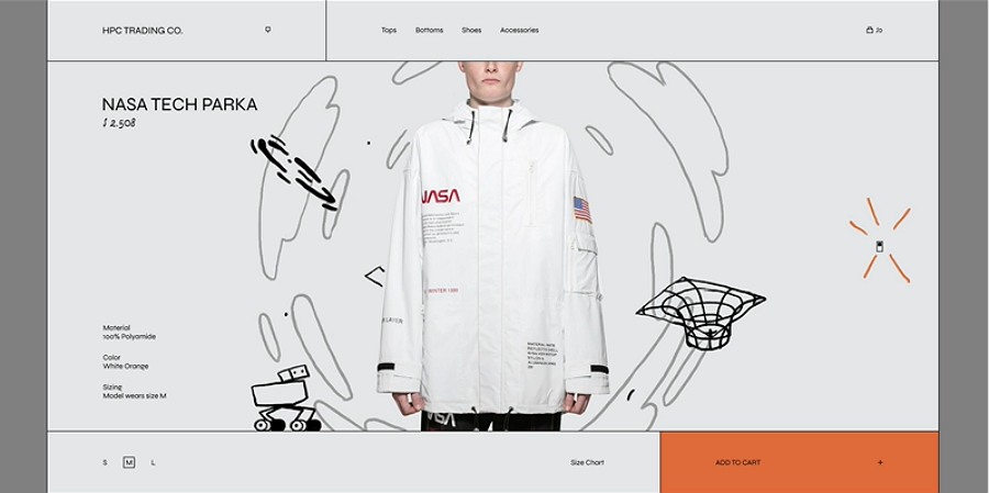
This clothing website combines high fashion with dynamic creative doodling. Simple colors are used for the background and all the buttons.
Aside from using contrasting styles, the designer also added a light switch for two modes: light and dark. This shows off the garments’ reflective features and provides users with a fuller experience.
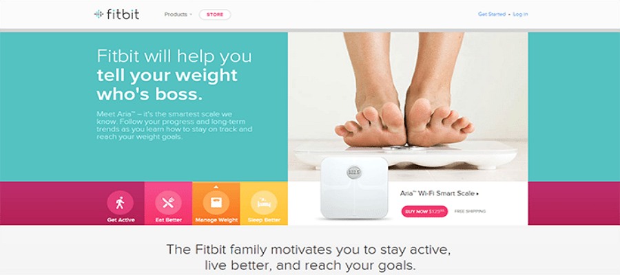
It's obvious that this is a flat web design from the simple and soft colors. The icons lie at the bottom of the homepage and are arranged in a circle, following clean lines. When hovering over the icon, it will change color for easy visual recognition.
Also, the regular layout and simple typography makes it more stylish.
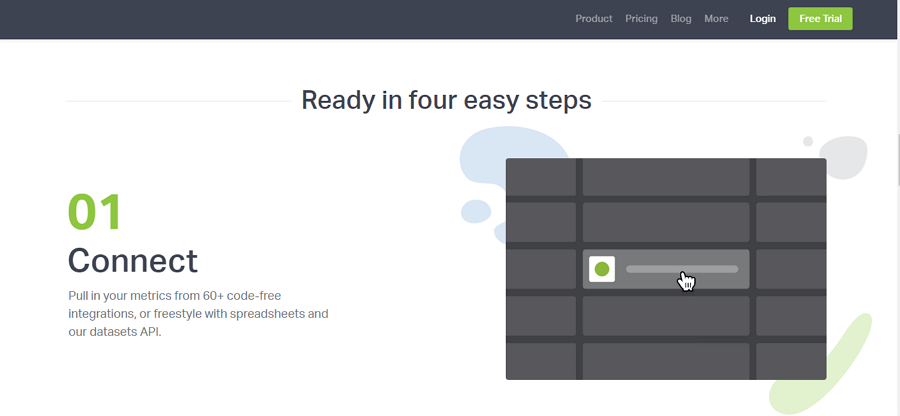
Geckboard is a website focusing on building TV dashboards for KPI data sharing with your team. Both the website and product interface use flat design.
Plain graphics, fonts, icons, and product elements are displayed with a light background. Through the showcases presented on the homepage, interactions are easily recognizable with the changing of numbers using Sans serif typography.
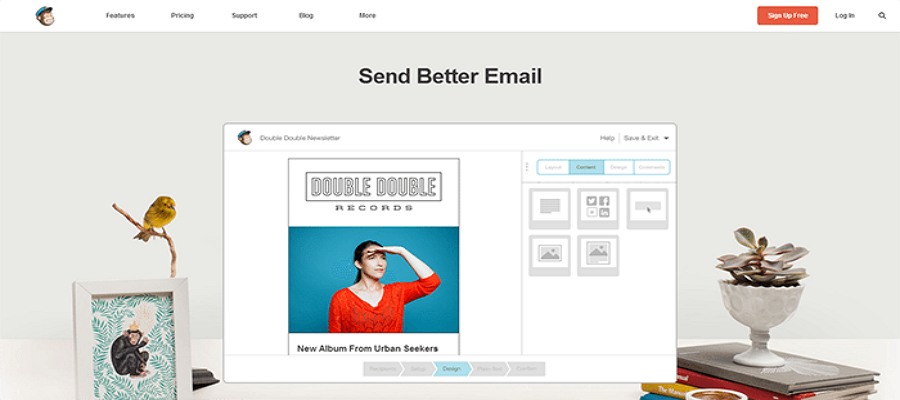
Practically everyone has heard of the popular email marketing tool Mailchimp. It iterates its designs very often. But in this version, its web UI is flat with minimalistic elements.
In the central mockup of the email template, everything needed in an email - such as fonts, texts, images, and buttons - are simplified.
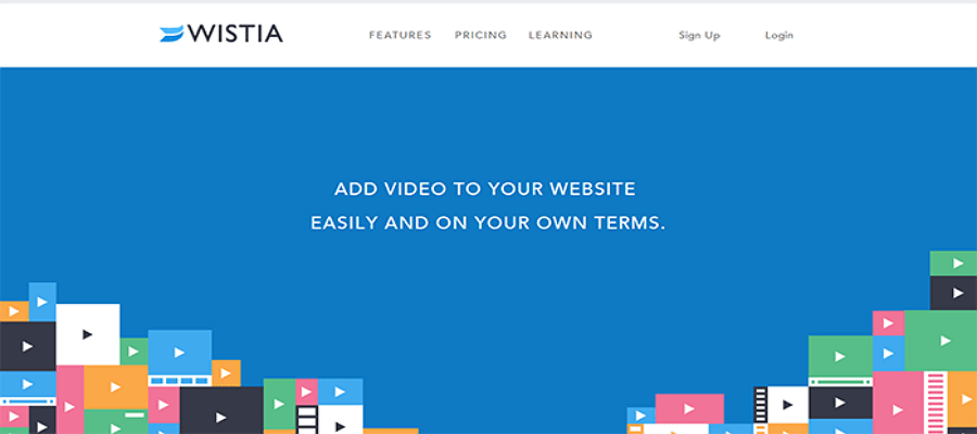
This is a quite straightforward but creative design with only three elements: colors, fonts, and shapes. The large scale color background draws the eye to the video shapes. The sliding blocks of video are quite impressive and help build brand affinity.
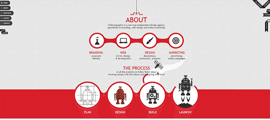
Chilicon Graphic is a unique website that combines flat design and creative animations. Aside from the typical flat design elements, it uses lots of animations and simple interactions.
Each element on the site is guided by lines. The flow is clear from the very start through the end using horizontal mouse interaction. The flat mountains at the end of the page add a nice touch.
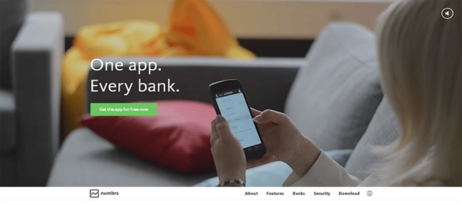
Numbrs is a bank website app. It's a great example of flat design, using recognizably typography to make for an excellent mobile user experience - good readability even on small screens.
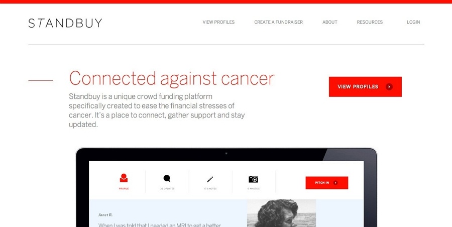
Standbuy is a platform established to ease the financial stress of cancer patients. Only three colors are used in this site. The main color is red, which is used in the CTA button.The platform adopts all of the flat design principles we have listed above.
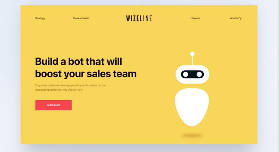
This is a redesign of Wizeline. It makes use of flat design in an adorable style. Cute bot images highlight what the business is all about - various chatbots for customer support, events, and conferences.
The red CTA button on the yellow website background makes for a strong visual contrast to attract users' attention. Interactions happen when you click on simple icons with animations, making the design more vivid and interesting.
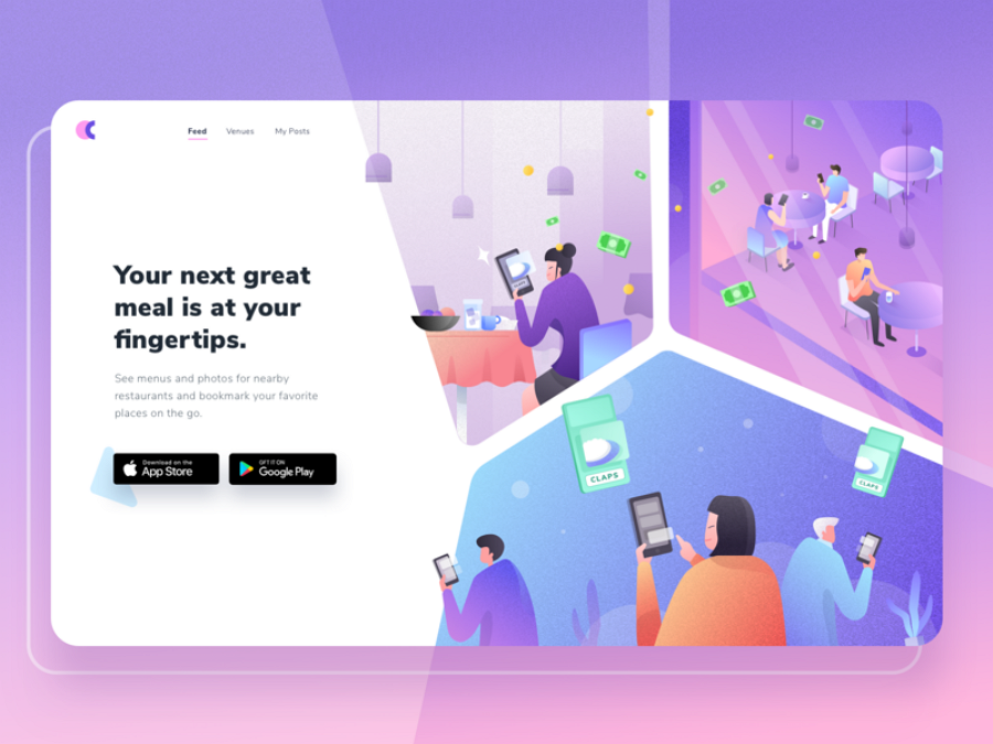
Feed is a website designed for restaurants. You can share menus, prices, or even process payments with family and friends.
This is an example of a flat illustration website. Illustrations of the restaurant environment with different scenarios are used aplenty. The color palettes used are typical for modern fashionable flat design.
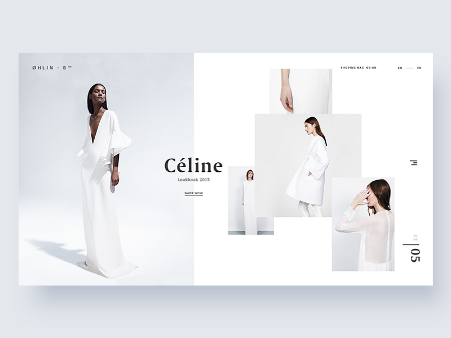
A clean cloth website with a high-fashion edge. With its overlapping layers and light white background, it is easy to see that it follows flat web design principles.
It combines flat design and minimalism creatively, using only images and fonts. There are no complicated elements to distract you.
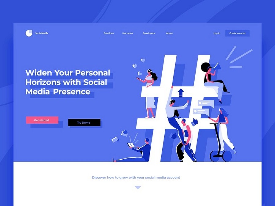
Another example which combines flat design and illustration. The design landscape is a flowing thing, always changing and combining different elements to achieve perfection. This year, the use of illustration is a popular trend, and this site takes advantage of that.

KTE is the homemaker’s online shopping dream. Using a clean white background with nicely designed kitchenware, not to mention excellent product arrangement, the site is heaven for customers. And, the matching soft colors make the flat web design even better.
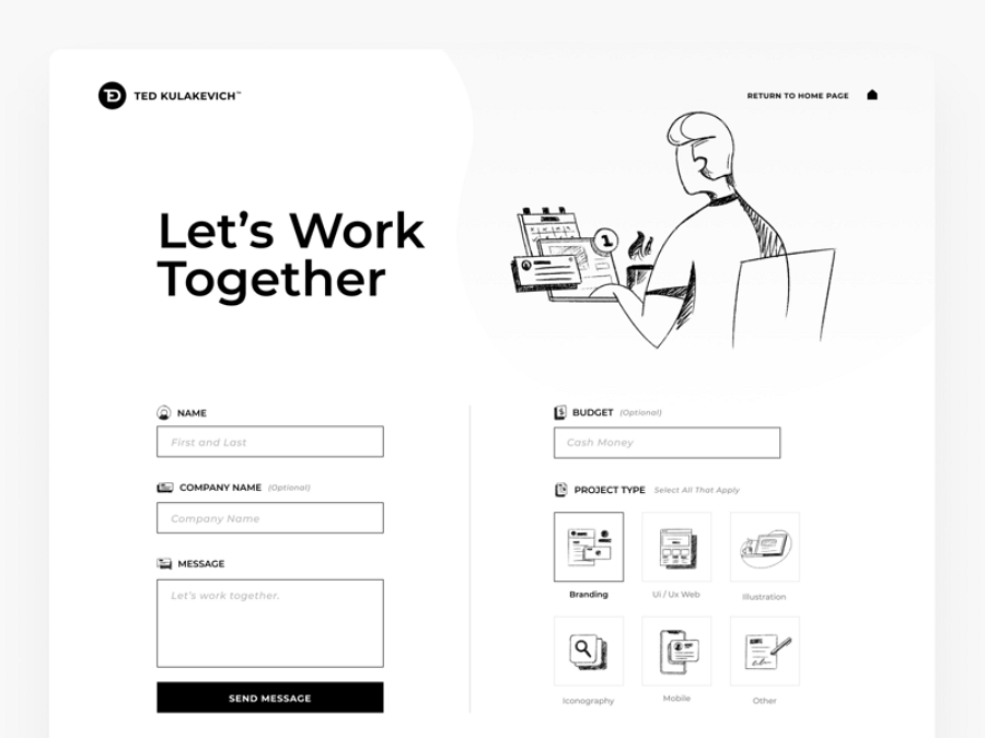
This is a flat web design example in a hand-drawn style using white and black. We have to say, the use of hand-drawn illustrations is quite creative.
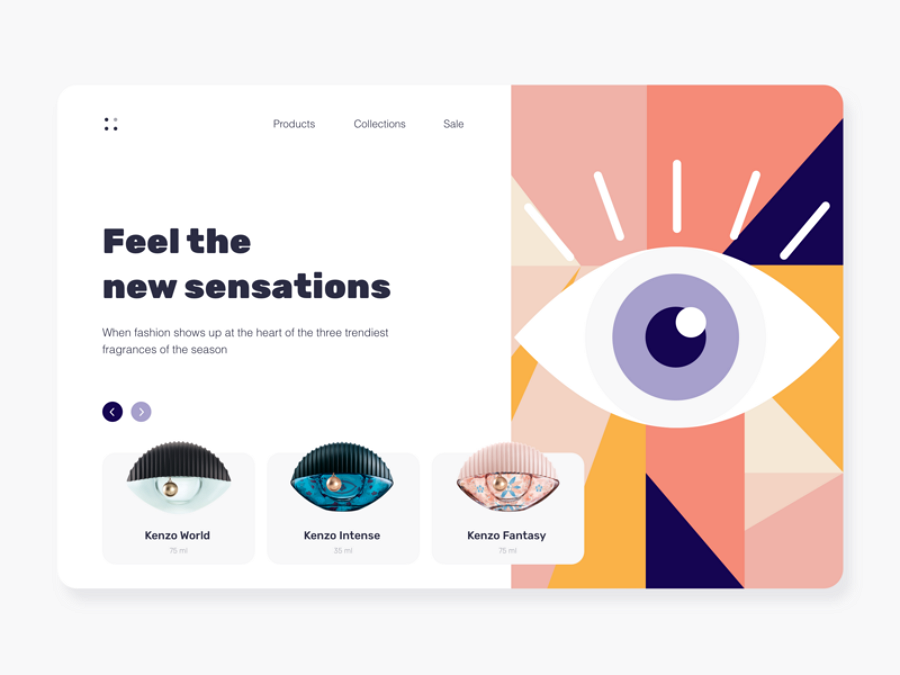
Kenzo was inspired by a fascinating perfume bottle design, with the overall result being impressive. The image of an eye on the right side is formed by multiple flat shapes such as triangles and circles with soft colors.
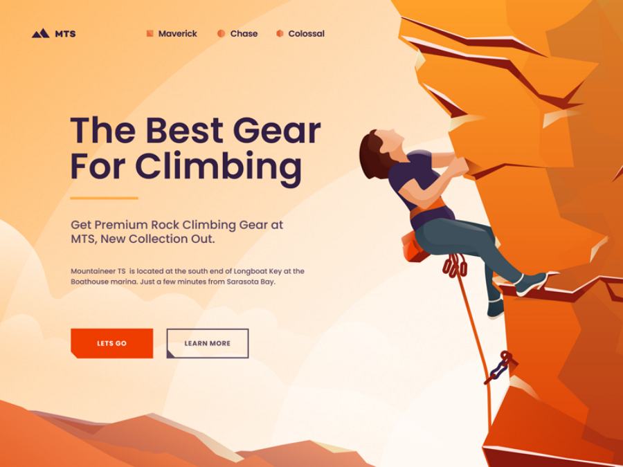
Mountaineer is a great example of visual hierarchy. Here, the visual focus is separated into two parts: on the left, the emphasis lies on the orange CTA button; on the right, the mountain with light yet strong colors is the attention-grabber.
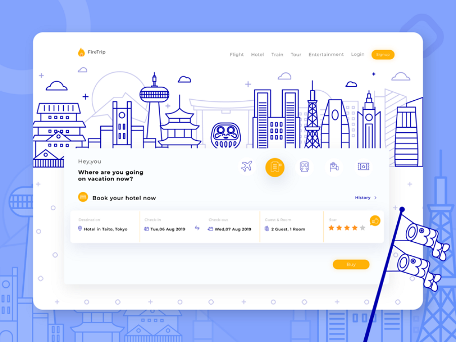
Firetrip is a ticket booking website. It uses line art illustration to create a minimalist effect.
Line-shaped graphics are all created in a hollow style that results in a flat effect.
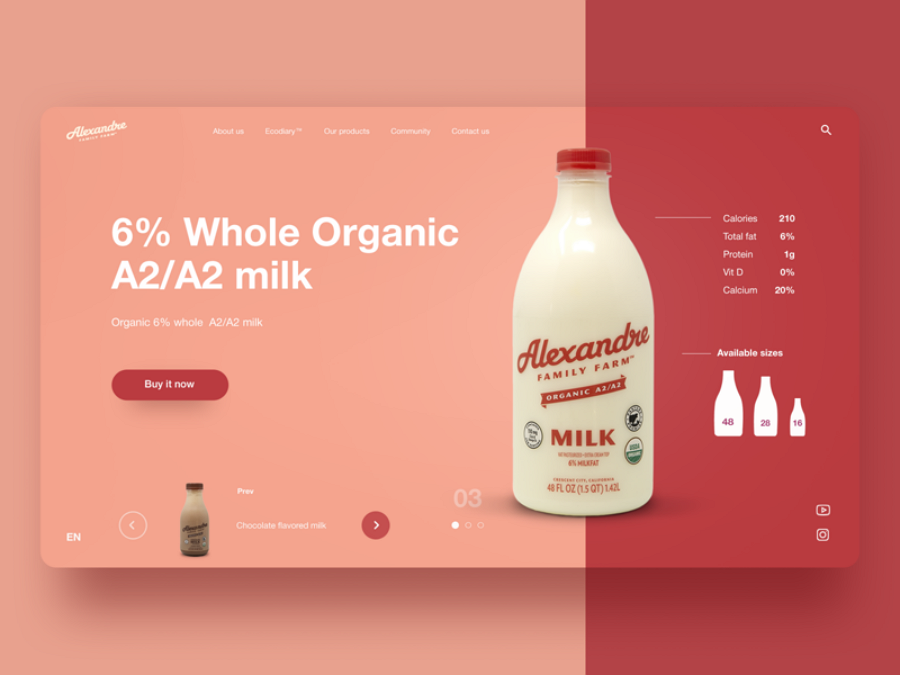
Color contrast is an often used method in flat web design. In this case, the subtle combination of pink and red is quite harmonious.
Red CTA on pink just makes you want to click to buy the product. As you may know, the use of colors on CTA elements is an art, and the designer has clearly mastered it.
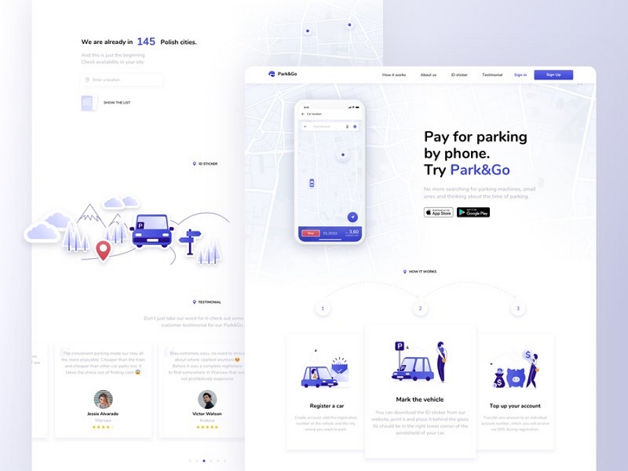
As we mentioned early on, Apple has shifted to flat design. Park & Go’s app is designed to meet Apple’s requirements. The use of car illustrations add a nice touch to the concept.
Here is a list of flat design website templates for your quick reference:
Templatemonster: There are 5000+ templates available here.
Awwwards: You can find the best flat web design templates here.
Template: This site’s collections are of high-quality.
Colorlib: Flat design templates based on WordPress.
Freshdesignweb: Various web templates included.
Wix: A website builder with different styles.
Squarespace: Not only a website builder, but also a template provider.
Themeforest: An extenstive resource of website template.
Pinterest: A free community gathered all kinds of web themes and templates.
Themehunt: A website for free responsive website template.
1. HTML5/CSS3 Flat Responsive Website - Start To Finish Web Design Tutorial
2. Adobe Illustrator CC Tutorial Flat Design
3. Flat Design Tutorial: How To Design A Flat Character
4. 10 Flat Design Tips & Techniques Photoshop Tutorial
5. Graphic Design | Space Illustration | Adobe Illustrator Tutorial
Flat design is easier for accessibility than material design. It’s what we call usability. Digital products today are all based on high usability to win users and markets. Also, the variety of devices requires responsive design more than ever. Flat design is a system that is more suitable for this.
Yes. According to Material. Io: Material is a design system – backed by open-source code – that helps teams build high-quality digital experiences
It’s not easy to create a flat web design by only reading text. So here’s a video tutorial you can watch for step-by-step instructions.
Flat web design will never become outdated due to its responsive features, simple and clean UI, and soft colors. You’ll be doing yourself a favor by mastering its principles. We hope you find this guide useful and inspiring.
 Mockplus RP
A free prototyping tool to create wireframes or interactive prototypes in minutes.
 Mockplus DT
A free UI design tool to design, animate, collaborate and handoff right in the browser.
