Do you know that the total number of worldwide gamers will soar to over 3 billion people by 2023? Do you know that great game UI design not only helps bring players to your PC or mobile game, it also increases online conversation about your game? By learning about popular game UI design trends will also inspire you to create a better website, apps and other projects.
In this article, we'll focus on some web or mobile games, talk about how to make your game UI designs shine, and learn the best design tips, examples and templates.
To create the best game UIs for your projects, make sure to test and optimize your game by using a game UI prototyping tool.
Game UI designs refer to the user interface that game players first see when they enter a web or mobile app game. They work as the bridge to connect the game and the players together, making it easy for players to quickly understand the gameplay mechanics, find the right information, and start playing as soon as possible.
The better the design your game has, including better storytelling, high-quality animations, characters graphics, gameplay mechanics and user experience, the longer players are likely to play. The more immersive your game's UI is, the more likely players will make a purchase.
In total, a game's UI is a major factor for a potential customer and the better the UI, the more likely your revenue will increase.
The goal of a game's UI is to immerse users into the game and incentivize purchases (either of the game or additional content). This goal differs from website or app UIs and is unique in the following ways:
Game UIs use more eye-catching visuals
To attract players and keep them immersed in the game, designers use eye-catching visuals in their game UIs far more often, such as bright, punchy colors, high res images, beautiful illustrations, big, bold fonts and so on.
Game UIs come with more intuitive gestures
To ensure gamers can get up to speed quickly and start playing the game as soon as possible, designers craft simple triggers or gestures to help gamers play. These create easy to use yet complex enough triggers such as swiping, clicking or tapping to help the gamer enjoy the game with only their fingers.
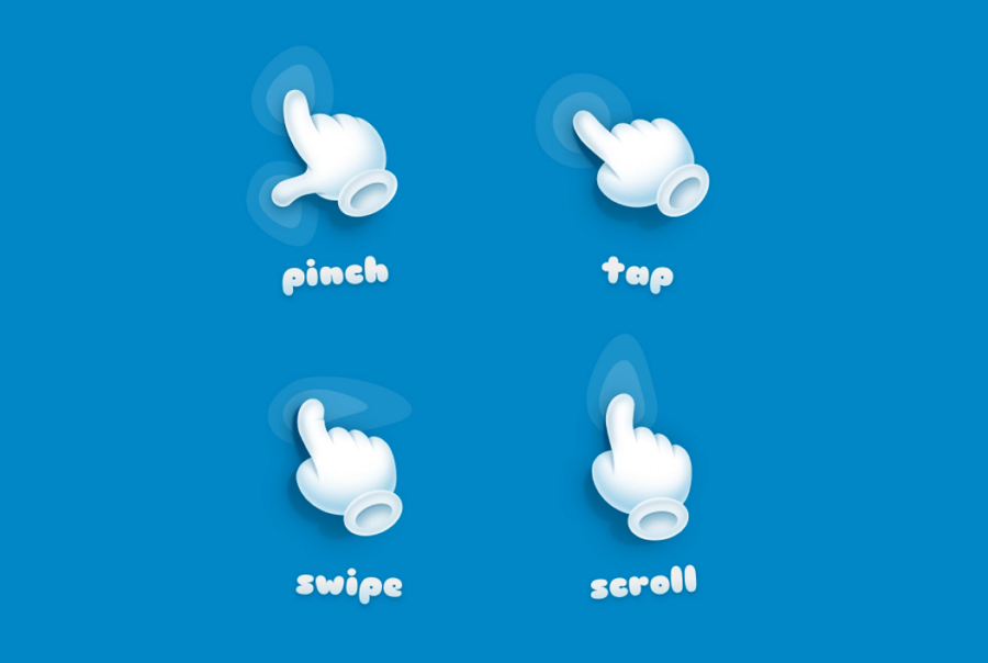
Game UIs give simple guides and tooltips often
Unlike other common website or app UIs that need paragraphs to deliver messages, game UIs more often opt to give simple and short tutorials or tips step by step. The relevant guides show up only when you complete the previous step.
Game UIs reduces elements to make players focus on playing
To reduce all possible distractions, game UIs are designed to be as minimal as possible and let you focus only on the center of the screen.
However, game UIs can create addiction
The longer gamers play, the more likely they are to make additional purchases in the game. This incentivizes designers to do everything possible to make the gamer stay in the game as long as possible. This is seen with attractive visuals, easy-to-grasp gameplay mechanics and immersive storytelling methods. However, if a designer makes these all too good, it can cause players to become addicted to the game, which is currently a huge problem amongst teenagers.
When designing a game’s UI, it is important to remember to ensure that the UI isn’t addictive, and that while it is great to design a game that brings in high amounts of revenue, the welfare of your gamers is also important.
We have summarized 10 of the best practices that can make your game UI designs shine:
The more complicated your game UI is to understand, the more likely players will not get hooked on the first go, and you will likely lose players right away. Follow standard design conventions that gamers are used to, ensuring that new gamers naturally understand the game right away, and enjoy the game without any barriers to play.
When designing a web or mobile game, you don't have to present all the tutorials or tips on a single page or popup at one time as you would do with other common apps UIs. Instead, to guide users at the right time, you need to select the right methods:
Use a brief intro video or popup to explain all the basics when players first enter the game
Use a bubble popup with short sentences to give players a step by step guide
Use a visual path to guide players through the entire playing process step by step
Use big, bold and highlighted arrow icons to point players in the right direction
Use intuitive gifs or videos to teach gamers how to complete a specific step
Use hovering effects and tooltips to ensure gamers understand all buttons or rewards
There are many ways to guide a user and you should always select the right way at the right time.
For example:

As the player starts their first game, bubble popups with short sentences guide the gamer step by step.
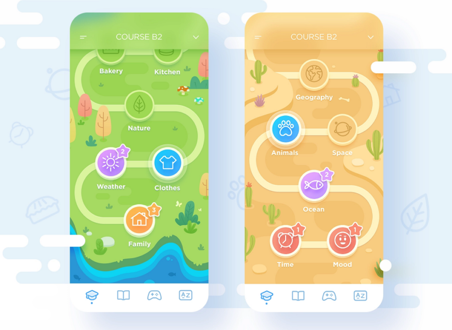
To guide gamers play through a web or mobile game, you can also add a simple linear path or map to clearly guide users forward step by step, and also show all the rewards.
There are also several tips you should keep in mind:
Show the guide or information only when the player needs it, and allow gamers to disable tips.
The guide or tutorials should always be about gamers common interactions with the game
It is a common occurrence that some players have already tried your web or mobile game before and uninstalled it for some reason.
To these players, to go through these tutorials again will be annoying and frustrating, and to deliver a better user experience, allow players to skip these guides and tutorials.
It is important to make your rewards and in-app purchases stand out to increase game revenue. To attract sales, add bold visuals, show off the available objects to buy and why users should buy them.
These can be done in various ways, and many games do this in their own unique way. Create prototypes of the rewards and in-app purchases menus and popups, test them all out on real players and find which works best.
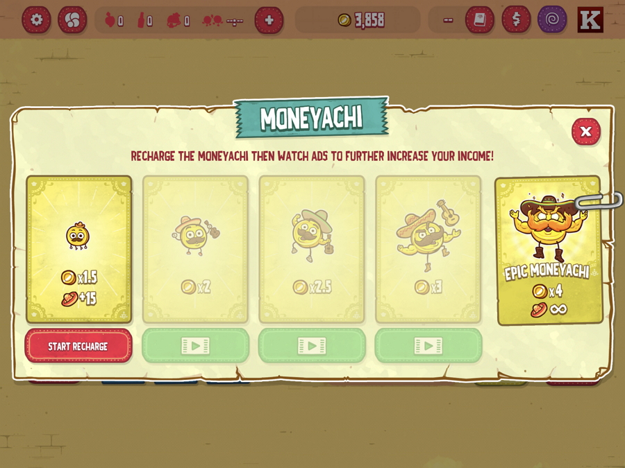
Whether designing a website, app or game UI design, ensuring the UI isn’t cluttered is always the number one design principle to remember. An interface with text and images all over the place negatively affects any messages you are trying to deliver and it creates a bad impact on the user experience. Keep text and images clear, this way gamers will only be focused on what you want them to focus on.
Apart from layouts that provide hierarchy themselves, like popular grid designs, designers should create a clear visual hierarchy by using font sizes, color contrasts, headings, titles and subtitles to indicate the importance and to guide users.
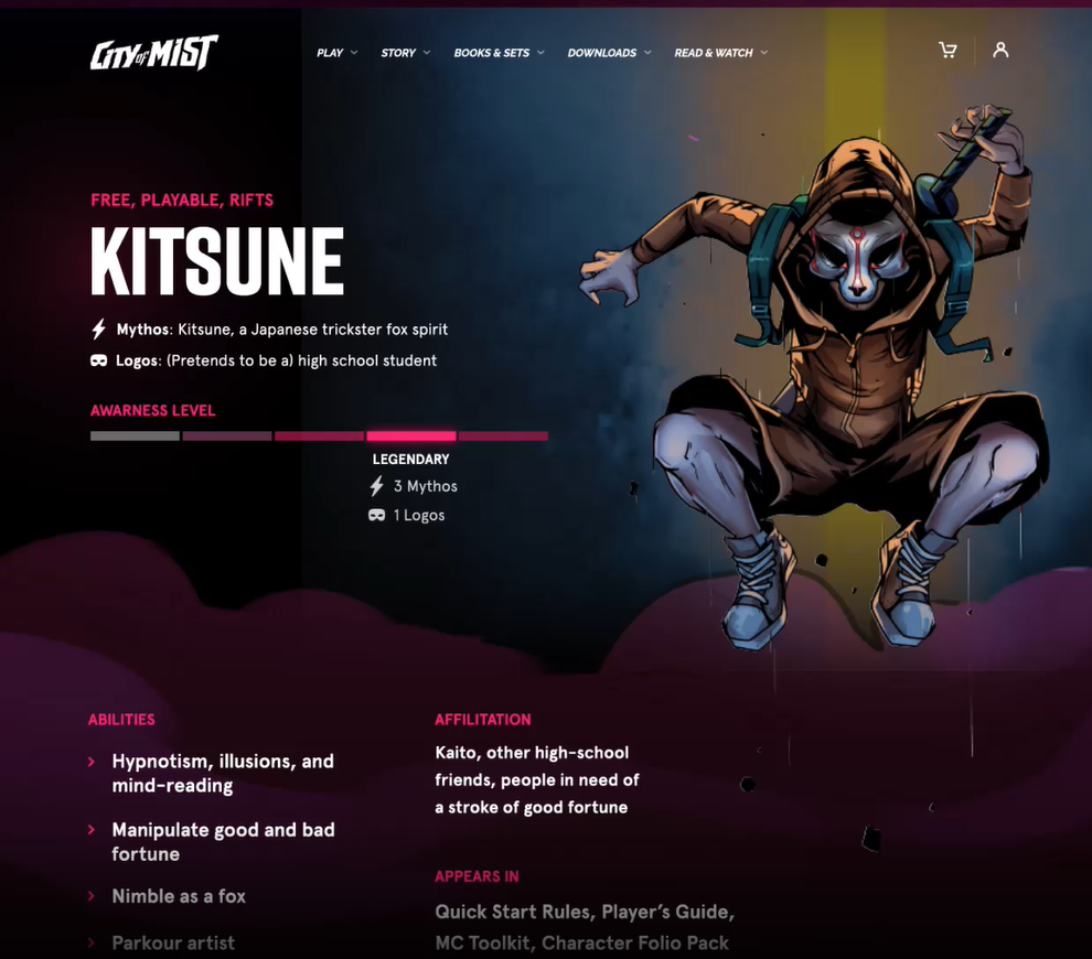
In games, this can be done by using colors, fonts, or animations to indicate information about something in the game world, such as a tool shop or garage.
Every web or mobile app game has limited screen space. To keep players immersed in the game, designers often use all possible ways to extend the screen space, which may not be useful for accessible navigation.
However, this does not mean you can not design accessible navigation for your game. In fact, a simplified sidebar or hamburger navigation helps you avoid many navigation troubles. Enabling players with an easy way of showing or hiding the navigation menus is also another good solution and helps reduce any player annoyances.
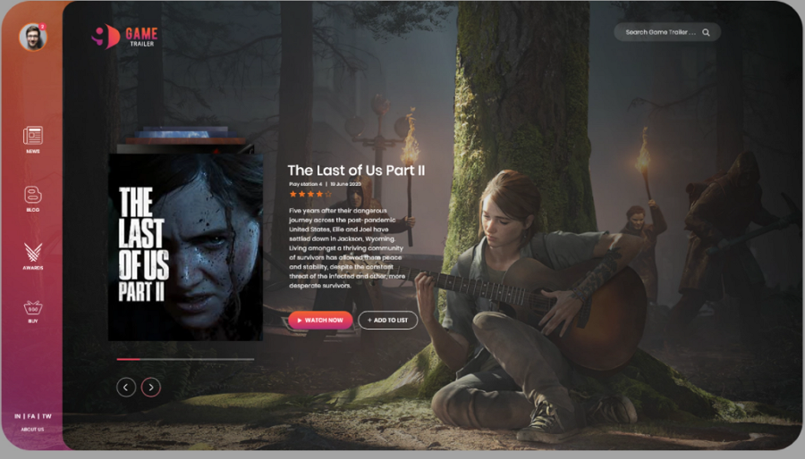
When designing a website game app, you should pay attention to the responsive design, allowing gamers to play the game on different devices that have different properties (aspect ratio, screen size, and so on). Each screen, animation, menu, popup and other game details should be suited to a variety of devices and should load as quickly as possible on every device.
Real user feedback is important for designers or app owners to continually improve the user experience. Make sure a feedback form has been added to your game and also can be accessed whenever they need it, gamers are happy to provide feedback to improve their experience, let them do so easily.
It is also essential to send an auto-notification to the gamer when the feedback has been accepted and resolved.
The Game UI has its own gameplay mechanics and delivers game information in its own ways. To avoid any design mistakes or usage problems, you should always test your game UIs.
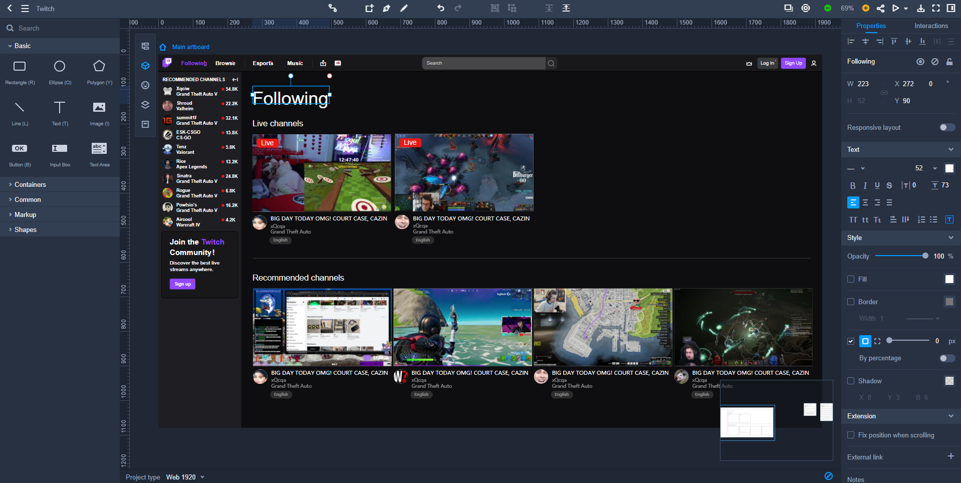
The Live Streaming Platform for Gamers made by Mockplus
A powerful game UI prototyping tool like Mockplus helps you visualize every detail in minutes and fully test your game on all computers and mobile devices. A single link can help you invite partners, co-work in real-time on the same project and share with ease.
We've also handpicked a collection of the best game UI design examples and templates for your inspiration:
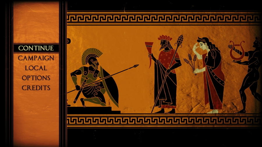
Apotheon is a 2D heroic action game with wonderful adventures and stories based on Ancient Greek mythology. It utilizes a unique black-figure pottery style to present all characters and scenes, putting the game in the style of the just like going back to the ancient times.
The foldable side navigation bar, easy-to-operate weapon selections, step-by-step guides and user-friendly designs successfully create immersive user experiences and make gamers feel like they’re really there
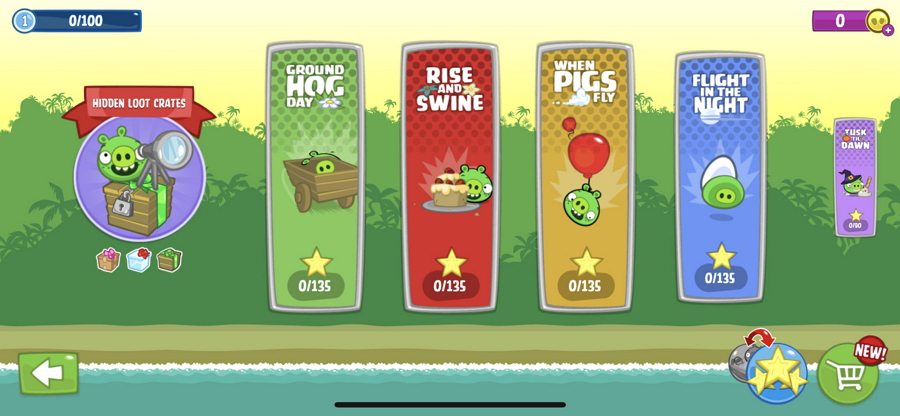
Bad Piggies is a puzzle video game from the Angry Birds series. Every player needs to assist these cute pigs to build contractions to take the eggs away from the Angry Birds. As a game that connects with Angry Birds, its interfaces use the same design style and builds on a popular base.
The level page has a map and shows clearly which levels are unlocked and which are still locked. The tutorials are presented in a notebook-style which shows players a step by step guide that gets players into the game as fast as possible.
This cute design and immersive experience have helped Bad Piggies become a very popular game, suitable for all ages.
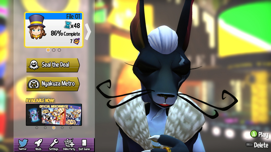
A Hat in Time is a 3D action-adventure game that tells a story of a little girl who starts an adventure to go back home. A great-looking 3D game with high-quality graphics creating a realistic environment for players.
To make users focus on the tutorial, the designer blurs out anything that isn’t related to the popup windows or step-by-step guides. The weapon wheel and friends panel are also hidden but easy to access for players.
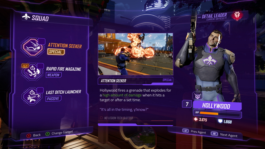
Agents of Mayhem is an open-world action-adventure video game that combines high-tech weapons and gadgets in one. Its UI designs feature a futuristic style and its mechanics are fast.
All popups and menus are centered, making them all good for the eyes of the gamers, especially for gamers who use larger screens.
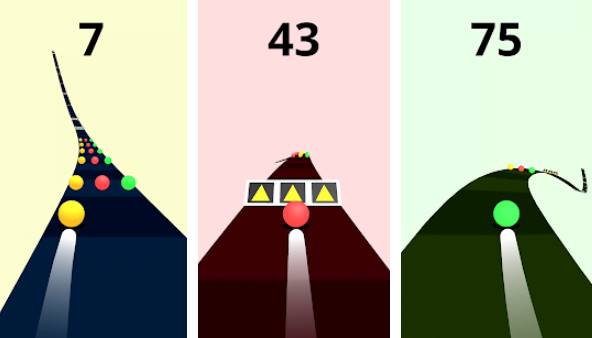
Color Road is an exciting 3D running game where players need to keep the ball continuously rolling and going through balls of the same color, whilst avoiding the other colors.
This game is all about speed and reactions. With a relatively simple concept, the minimal game screen allows a simple tutorial and then only shows the racing path and score only. As a result, the experience is immersive and is a great example of how to create your own immersive game.
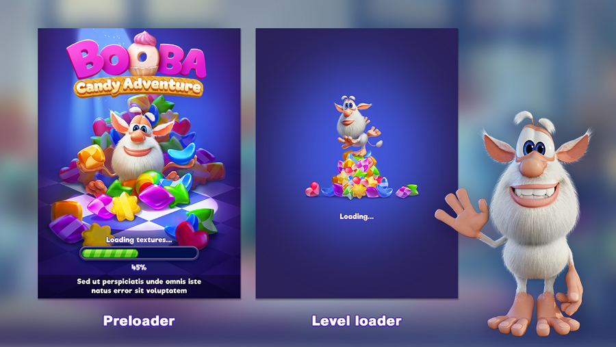
Booba Candy Adventure is a fun puzzle game that allows players to search for candies in a house with a little cute monster. A perfect game for kids older than 3 years old, the game UI uses crystal objects and buttons, cute creatures, bold colors, fat fonts and fun guides to attract new users. A very good example showing you how to create a fun game for children.
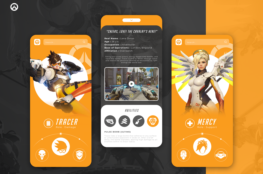
Hero App is a concept blizzard game that has an unusual horizontal scroll to go through all the heroes. The design of the hero's page and their ability are good inspirations that you can copy in your project.
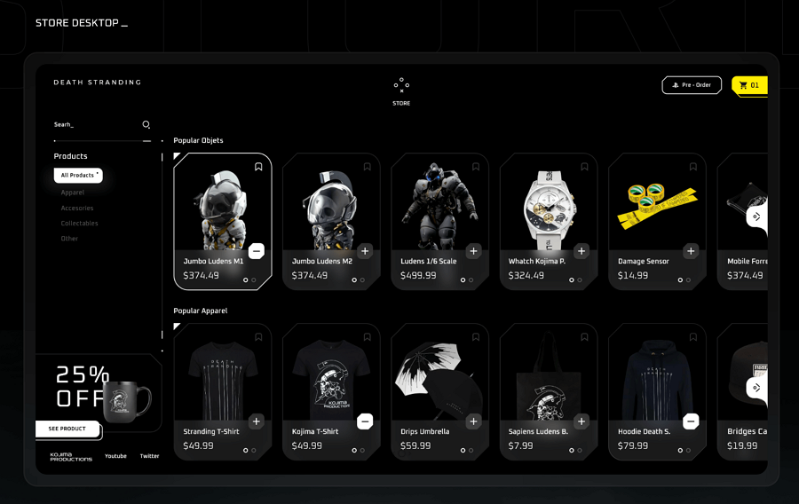
Death Stranding is a dark-themed action game project with in-depth, realistic 3D figures and objects. Its store uses a card design to list out all products in the in-game store and puts the discount info at the left corner to entice purchases. The designer also gives screenshots of how to present the store interface both on the desktop and mobile devices, showing good adaptability for all device types.
Death Stranding is a very good game UI example for designers looking to find inspiration about the responsive design of a game.
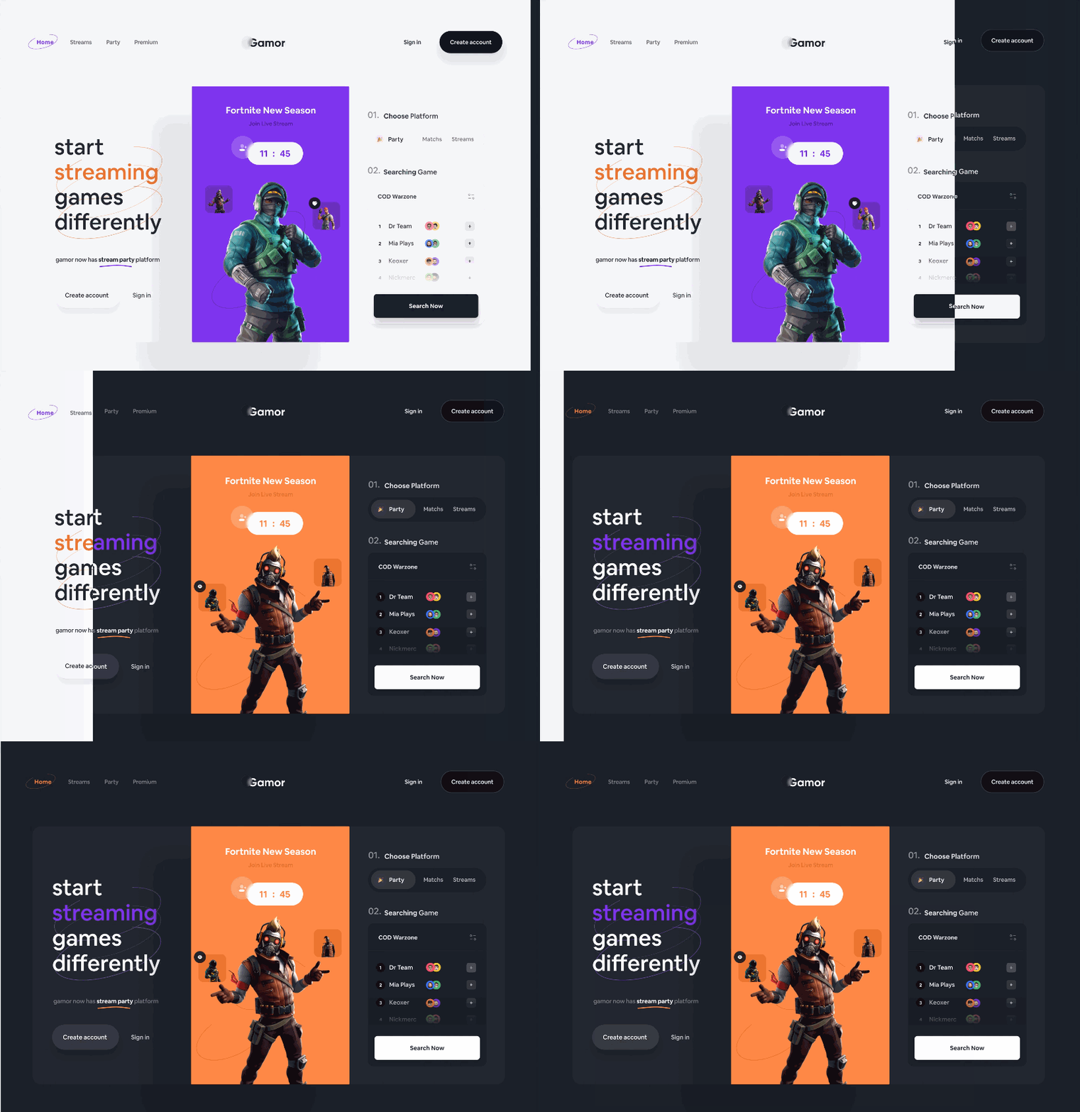
Streaming Platform shows the concept of how to design the light and dark mode for games, using Fortinte as the prime example. The included example also shows how to design a smooth switch between the two modes.
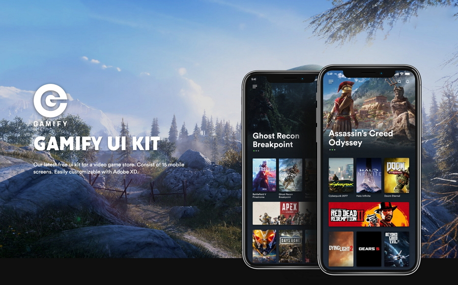
Gamify is a game app UI kit made for iPhone X resolution and brings a total of 15 screens. All elements are well-organized and 100% vector-based. If you are an Adobe XD user, this UI kit will help you get started designing your own games quickly.
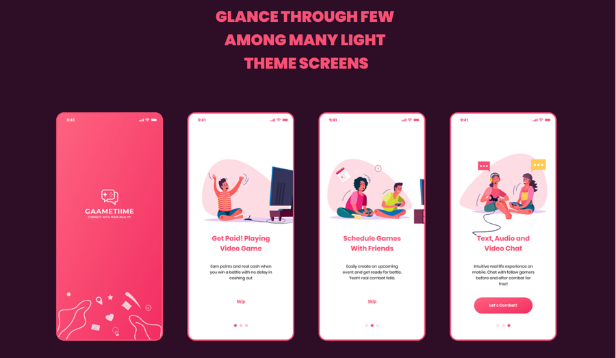
Gaametiime offers a light and dark mode game UI kit for designers. This game UI kit comes with over 65 pages and covers nearly all screen categories: onboarding, login, chat, settings, home and so on. It supports both Sketch and Adobe XD file formats and can help you get set up with your own mobile game in no time.
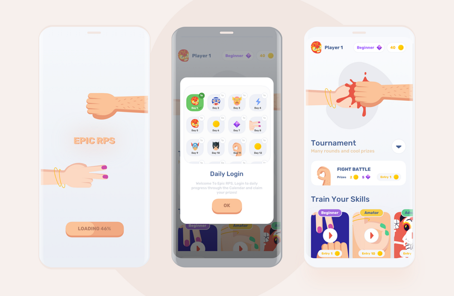
This game UI kit is based around a rock-paper-scissors game and packs over 16 screens including a rating page, splash page, daily login rewards popup page, level page, tournament and more. With fun graphics and a simple interface, this is a great UI kit to start your project.
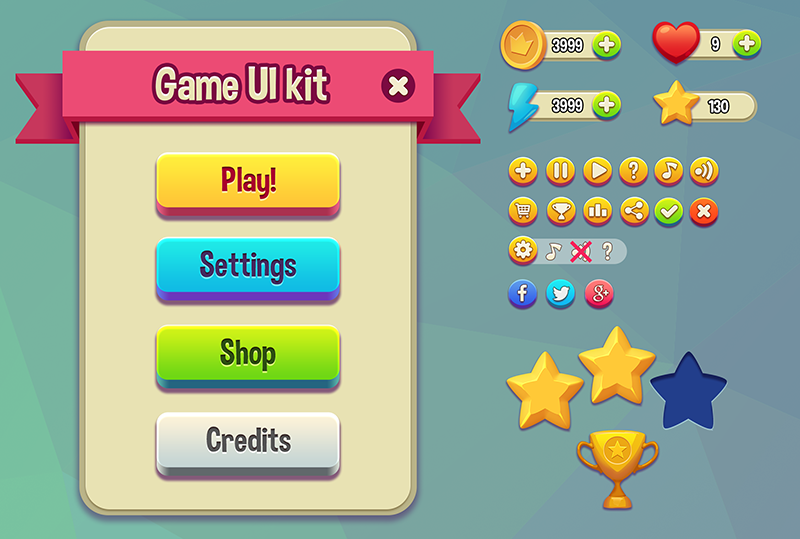
Funtique Game UI Kit is a cartoon game UI kit for Photoshop. With over 30 vector elements, designers can easily change colors, effects and sizes to uniquely match their design. You can use it for commercial purposes, just make sure you credit the designer.
Price: $19
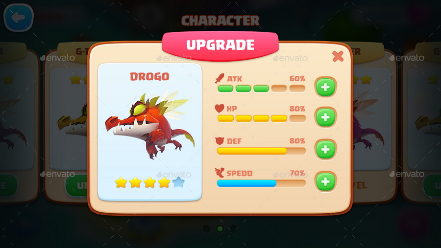
This game UI kit packs a complete set of graphical user interfaces to help you create 2D video game apps for all ages. It brings over 39 icon buttons, 3 button sizes, 6 color options and customizable windows, frames and other elements. Easy to use and adaptable for various types of games, it's a great starting point for anyone trying to design a game's UI.
Price: $19
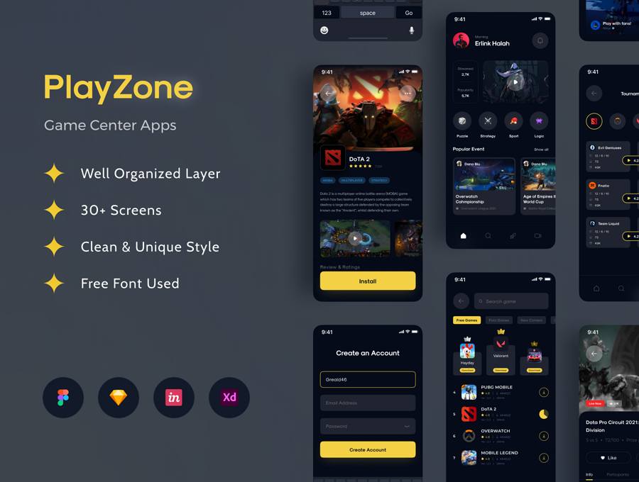
Play Zone is a game center app UI kit that packs 30 vector-based screens with a dark theme. It is fully customizable and resizable. There are Sketch and Adobe XD file formats available for everyone.
 Mockplus RP
A free prototyping tool to create wireframes or interactive prototypes in minutes.
 Mockplus DT
A free UI design tool to design, animate, collaborate and handoff right in the browser.
