High-Fidelity vs Low-Fidelity Prototyping: What's The Difference

Berry
Aug 9, 2017
2698923
5 min read

In fact, the terms, “high fidelity” and “low fidelity”, were first used in rock music to describe the sound and playing skills of rock and roll at the end of the 1980s. Now, they are also applied in web/app design to refer to the different levels of details and functionality built into a prototype.

However, what are the actual differences between them, and how and why should we choose the high or low-fidelity prototype for a better design or user research?

In the following, I will walk you through the basics and differences lying in high fidelity and low fidelity, and explain why and how to choose them to make excellent prototypes for a better design or user research.

Table of Contents:

  • First, what is a prototype
  • What is a low fidelity prototype
  • What is a high fidelity prototype
  • Difference between high fidelity and low fidelity prototype
  • How and why to choose hi-fi or low-fi prototype for a better design
  • Best prototyping tool for your web/app design

First, What Is a Prototype?

"A prototype is an early sample, model, or release of a product built to test a concept or process. It is a term used in a variety of contexts, including semantics, design, electronics, and software programming." ---- from Wikipedia.

When it comes to UI/UX design, a prototype helps designers translate their design ideas into a digital and tangible model. They can direclty test parts or all of the UIs, interactions and UX flows to see whether they are workable and excutable.

Moreover, since the needs of teams vary, they also make the low fidelity prototype or high fidelity prototype to test their design ideas for different purposes.

What Is a Low Fidelity Prototype?

The low-fidelity prototype - known as low-tech, low-fi or lo-fi prototype, is a semi-finished prototype that focuses on function, structure, process, and provides the simplest framework and elements of a web/app. It’s often used to translate design ideas into testable and tangible artifacts for collecting and analyzing the user demands at the early stage.
What Is a Low Fidelity Prototype?

Then, What Is a High Fidelity Prototype?

The high-fidelity prototype - known as high-tech, high-fi or hi-fi prototype, is a comprehensive and interactive prototype that is quite close to the final products with lots of functions, interactions and details. It’s often used in the later usability evaluation to discover the potential issues that a web/app design may still exist.
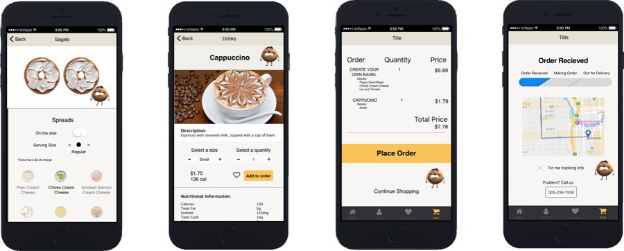
High Fidelity Prototype

Difference Between High Fidelity and Low Fidelity Prototype 

Still don’t know the differences between low-fidelity and high-fidelity prototypes? Don’t worry! Here are 3 real low-fidelity prototype examples to help you learn more about low-fi prototypes:

1. Low Fidelity Motion Prototype Example
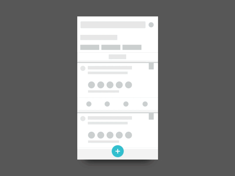
Low Fidelity Motion Prototype Example

This low-fi prototype shows the second menu motions clearly without focusing too much on its UI details.

2. Low Fidelity UX Prototype Example for a Website Builder
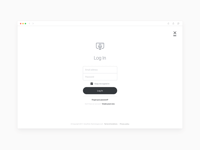
This low fidelity UX prototype presents the page layouts, navigation systems and user flows of interactions clearly without too much UI details. It helps designers test assumptions and find invisible UX issues quickly.

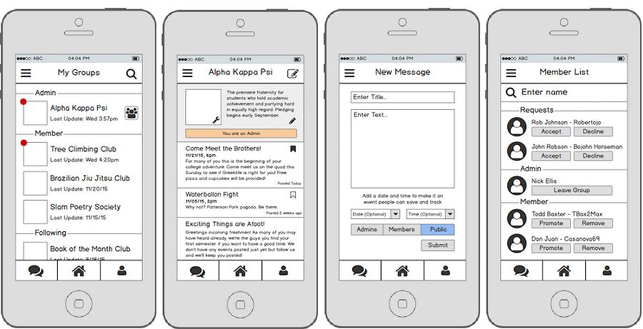
3.Lo-fi Prototype Example Tender
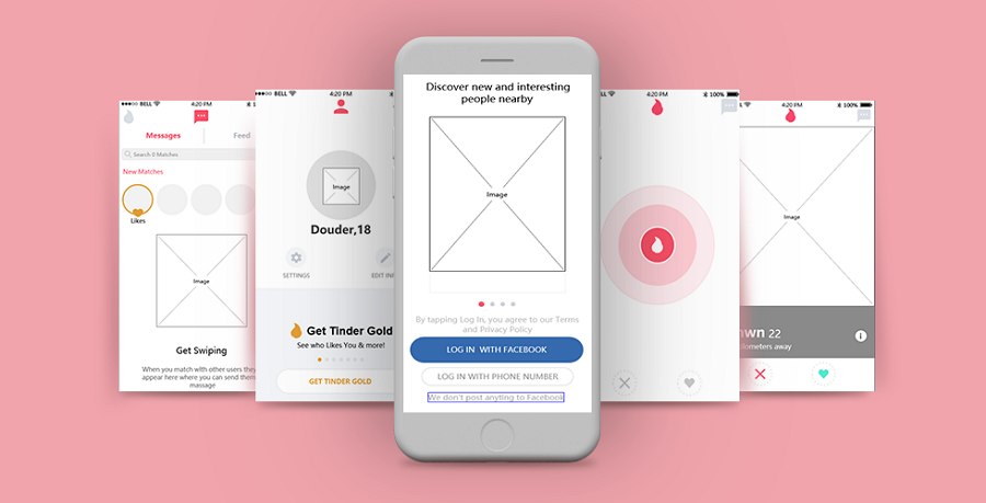
Lo fi Prototype Example Tender

This is another good example (created in Mockplus, an easier faster and smarter prototyping tool) to show the main layouts and element placements of an app. Even without element details, it helps designers detect and tackle potential problems at an earlier stage. 

See it? Even without UI details, the low-fi prototype helps convey design ideas and show the main functions, structures, flows and interactions of a web/app easily. It brings designers lots of benefits.

Advantages of low fidelity prototypes:

  • Low cost. The cost of a low-fidelity prototype is extremely low.
  • Fast. Without focusing on every interface detail, designers can just follow their design ideas and create a simple and testable prototype within a few minutes.
  • Easy to demonstrate, collaborate and iterate. Without too many UI details, a low-fi prototype does not require many professional skills. And more people can join and collaborate on the same project. It is also easy for designers to make changes and iterate the prototype during the collaboration.
  • Easy to get feedback. Since a low-fidelity prototype is easy to carry and demonstrate, designers can also directly share it with other people (including the team members and stakeholders) to collect design feedback.
  • Easy to detect and tackle potential issues. A low-fidelity prototype also allows designers to test user flows, interactions and navigation menus of a web/app easily. It is good for designers to detect and tackle potential UI/UX issues quickly.

Disadvantages of low fidelity prototypes:

  • Limited UI details/animations/interactions. To convey ideas quickly, a low-fidelity prototype is often created with limited UI details, functions, animations and interactions, etc. So, it is not good for other designers or team members to have a full understanding of the web/app design.
  • The testing results are limited and inaccurate. Without enough design details, a low fidelity prototype, to some extent, cannot accurately simulate the real user scenarios. The testing results are also inevitably affected and inaccurate. Needlessly to say, when the prototype are modified dramatically at the later stage, the testing results can be completely different.

So, if you only get some design ideas, want to present them with a simple prototype, discuss and collaborate with other designers or team members before digging in, a low fidelity prototype is perfect for you.
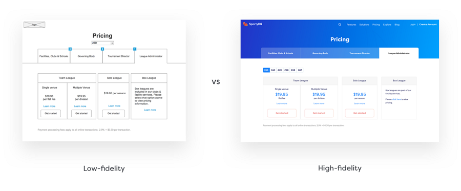
What Is the Difference Between High Fidelity and Low Fidelity Prototype

And then, here are 3 real high-fidelity prototype examples to help you learn more about high-fi prototypes:

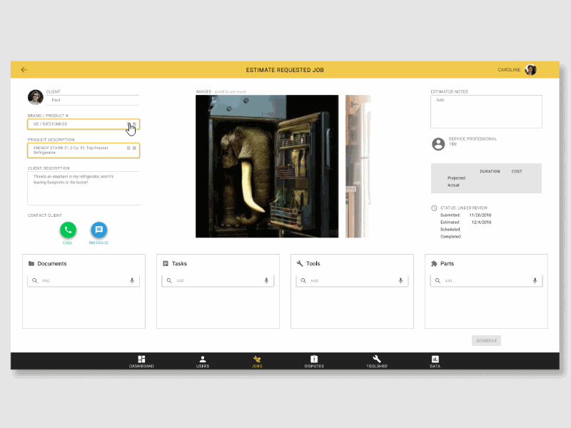
1. Job List High Fidelity Prototype Example
Job List High Fidelity Prototype Example

This high fidelity prototype not only shows the UI details, but also displays user flows and interactions clearly. Designers can easily check and test very tiny detail to see whether there are still some UI/UX problems.

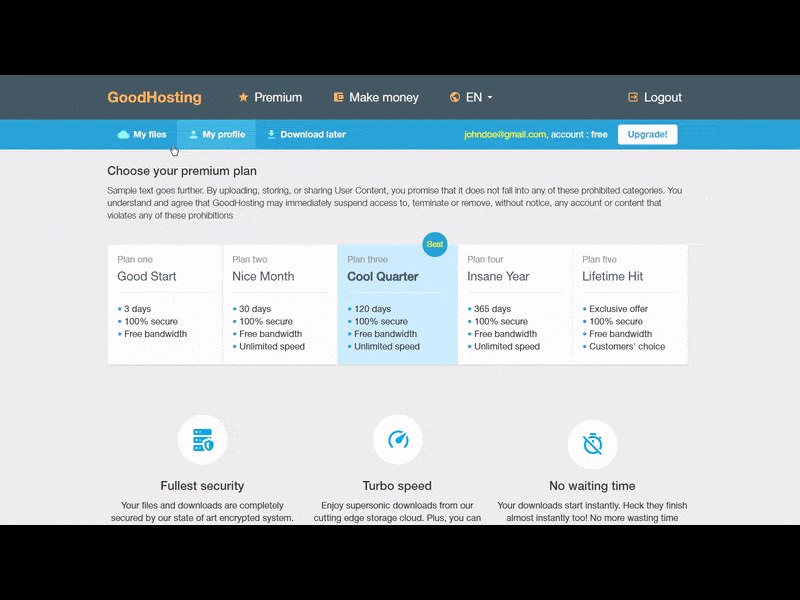
2. High Fidelity Prototype Example
High Fidelity Prototype Example

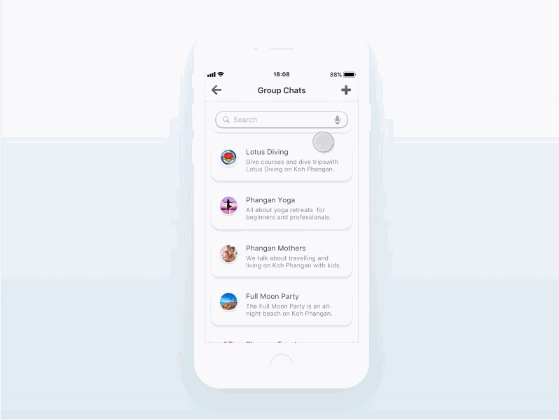
3. Product Design High Fidelity Prototype Example
Product Design High Fidelity Prototype Example

A high-fidelity prototype allows you to convey design ideas with rich colors, buttons, photos, icons, animations, interactions and more details.

Advantages of high-fidelity prototypes:

  • Rich design details. The high-fidelity prototypes are built with more HQ photos, colors, animations, icons, buttons and other elements. Every element is designed exactly as if it were in a real website/app.
  • Better visual effect. With a great color scheme, vivid animations, layouts and more, a high-fidelity prototype also often have better visual effects than a low-fidelity prototype.
  • More accurate testing results. With rich details, a high-fidelity prototype just looks like a real web/app. It is easy for designers to simulate the real user scenarios and test the product from all possible aspects, including the interactions, user flows, element effects and color schemes as well the UX. The testing results are also much more accurate.
  • More effective feedback. Of course, after being shared with other designers and team members, the received feedback is also more effective to tackle the existing problems.
  • More attractive to clients and stakeholders. It is also good for designers to present clearly how the final web/app are supposed to work and help attract more clients, stakeholders and investors.

Disadvantages of high-fidelity prototypes:

  • Higher cost. A high-fidelity prototype often needs to be created with a professional prototyping tool. In comparison with the low-fidelity prototype, the cost of it is surely much higher.
  • Hard to change and iterate. When some changes are made, a series of pages or elements in a high-fidelity prototype also need to be modified at the same time. This can be troublesome and time-consuming.

So, a high-fidelity prototype is highly functional and interactive for you and your team to find and tackle some tiny UI/UX problems, as well as getting more stockholders and clients at the very ending design stage.

How and Why to Choose Hi-fi or Low-fi Prototype for a Better Design?

As we’ve mentioned above, since the high fidelity and low fidelity play a very different role in creating successful designs, you’d better also use them for different purchases or at different design stages:
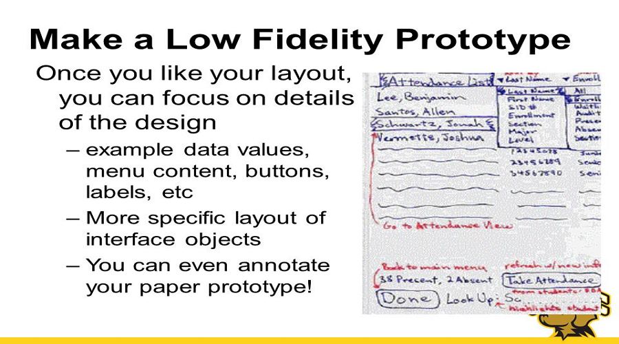
1.Why is a low fidelity prototype better for you at the early design stage?

Why to Choose A Low Fidelity Prototype

Obviously, the low fidelity prototype focuses more on high-level concepts of the final products and help discover the potential issues as well as getting them resolved at the very early stage.

It helps ensure that you and your team have chosen and followed the right design theme and direction before digging in.

So, at the early design stage, when you and your team are aiming at quickly translating ideas into visualized prototypes, shortening iterations and collecting user feedback, a low fidelity prototype is a much better choice.

Briefly speaking, when is the right time to use a low-fi prototype?
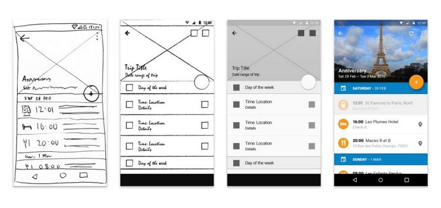
  • When a design idea flashes in your mind and you want to convert it into a tangible model quickly
  • When you want to discuss your design ideas with your partners as soon as possible
  • When you want to test whether the design ideas are feasible and meet the users’ needs
  • When you want to get feedback from other team members

2. Why is high fidelity prototyping better for you at the very ending design stage?

Why to Choose A High Fidelity Prototype

And then, since the high fidelity prototype often pays much attention to the details and functions of a web/app, it is often better for designers to test the feasibility of web/app designs and attract more users/stakeholders at the very ending design stage.

Briefly speaking, when is the best time to use a high-fi prototype?
  • When the visual design of your product has been done
  • When you want to test your web/app details, such as the UI elements, color schemes and page copies, etc
  • When you want to test an interaction, workflow, user flow, transition animation, visual effects or the like design ideas with full UI details
  • When you want to know the feedback from other designers and users

How to Choose a Right Prototyping Tool for a Better Design?

How to Choose A Prototyping Tool

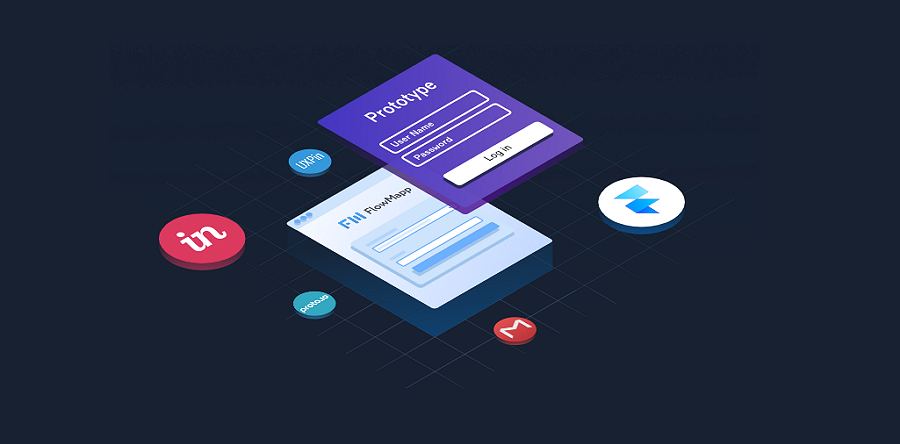
No matter whether you choose a high fidelity or low fidelity prototype, the only purpose is to present your fantastic design ideas more vividly and build excellent web/app prototypes, right? If your answer is “Yes”, the next step for you is to choose a right prototyping tool.

But still don’t know how? Here are several tips for your references:

  • Price. The price is always the most important factor for you to choose a low-fi or high-fi prototyping tool. However, it is not the only factor that you should take into consideration. A cheap or expensive price does not indicate anything. What you need is only the one that suits you best.
  • Learning curve. How long it takes for you and your team to learn a new tool always matters while choosing a right prototyping tool. So, if you do not want to waste time exploring new features of a tool, it is best for you to choose an easier one.
  • Usage. These days, there are lots of prototyping tools out there that provide completely different features. To choose the most suitable one for you and your team, it is best to know what features you will exactly need in your product design process. So, it is necessary for you to find out the real needs of your team members from different departments in advance.
  • Teamwork. To discuss design ideas and get feedback from other team members timely, most designers/design teams prefer to choose a prototyping tool that supports teamwork. Do you also need that? If you do, a tool that allows you and your team to communicate and collaborate freely online is a better option.
  • Fidelity. Well, while choosing a prototyping tool, it is also necessary to take the fidelity into consideration.
  • Integration. Another factor you should consider is to see how well the prototyping tool fits your design process. These days, in case that users have to switch tools frequently while designing, many prototyping tools are integrated with other tools, such as Sketch, PS, Facebook, Slack and more.

Overall, I hope these tips can help you choose a right tool.

3 Best Low Fidelity Prototyping Tools

Here are 3 best low fidelity prototyping tools for your references:
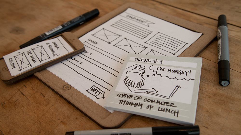
1. Paper and pens

Make Prototypes with Paper and Pens

With the fastest and simple tool, pens and paper will help draw your ideas easily and quickly, and also facilitate the internal discussion between the team members. Even if I sometimes need to use prototyping software to draw, I usually prefer to use pens and paper to clarify my ideas first.

Pros:

  • Completely free
  • Fast
  • Easy to start

Cons:

  • No smart interactions and animations
  • You cannot show all your ideas clearly
  • You cannot discuss and test every detail

2. Mockplus

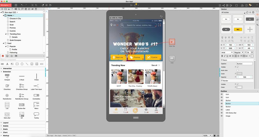
Make Prototypes in Mockplus

Mockplus is a powerful low-fidelity prototyping tool that gets much attention in recent years. It allows you to translate design ideas into interactive prototypes, test, share and iterate them with ease. Its team collaboration and management feature also helps improve your work efficiency effortlessly.

Pros:

  • Provide Over 200 pre-built components and 3000 pre-designed icons
  • Create interactions with simple drag-and-drop
  • Provide many options to export pages and prototypes
  • Provide numerous samples and projects
  • Provide many ways to share and test a prototype online or on mobile
  • Communicate, comment and collaborate a prototype online
  • Integrate with Sketch

Cons:

  • Not completely free

3. Balsamiq mockups

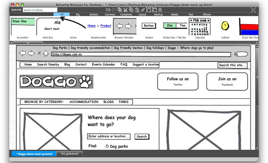
Balsamiq Mockups

Basamiq is a simple low-fidelity prototyping tool that allows you to sketch your design ideas on a whiteboard directly. It is really useful when you only focus on the structures and overall concept of your design.

Cons:

  • Provide a built-in hand-painted UI library
  • Export designs to PNG/PDF images directly

Cons:

  • Lack basic interactions while prototyping designs

2 Best High Fidelity Prototyping Tools

1. Marvel App

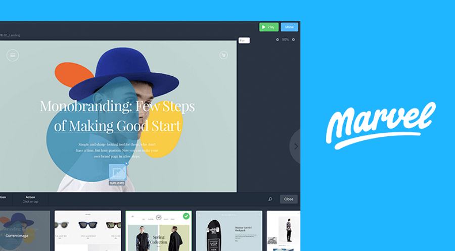
Marvel App

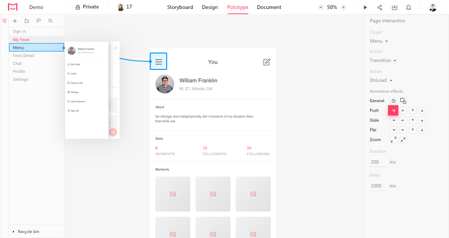
Marvel app is a powerful high-fidelity prototyping tool that supports creating wireframes, prototypes and mockups collaboratively online. It allows you to directly upload images(including the JPF, GIF and PSD) and add animations for them to create interactive prototypes quickly.
2. Mockplus Cloud

Mockplus Cloud

Mockplus Cloud is a professional online design collaboration tool that allows product managers, designers and developers to work together online with auto specs, assets and code snippets.

It is also used as an all-in-one high-fidelity prototyping tool. You can easily upload designs with assets and spec details from Sketch/PS/Adobe XD, and add rich interaction commands to create interactive and high-fidelity prototypes.

For a product team, the newly created prototype can also be shared with one link and get feedback in real-time.

In short, these days, to attract far more users, many prototyping tools are created to meet the needs of users as many as possible. There seems no clear boundary between a low-fi and high-fi prototyping tool.

So, to choose a right prototyping tool, it is best for you and your team to take more tool options for testing.

Wrap Up

No matter what the differences the low fidelity and high fidelity prototyping are, how and why you will choose low fidelity or high fidelity prototyping for a better design or user research, a good prototyping tool, like the easier and faster one, Mockplus, often means a lot for you to create an excellent web/app with beautiful interfaces and good user experiences. Hope this article can inspire you anyway.

Free prototyping tool for web and mobile app design
Get Started for Free
Free prototyping tool for web and mobile app design
Get Started for Free
Free prototyping tool for web and mobile app design
Get Started for Free
What's Mockplus?
Mockplus RP

A free prototyping tool to create wireframes or interactive prototypes in minutes.

Mockplus DT

A free UI design tool to design, animate, collaborate and handoff right in the browser.

Free web & app prototyping tool
Create wireframes or highly interactive prototypes in just minutes.
No time limit Up to 10 users
Get started
No, thanks, i'm good.