Mega menus are a fundamental component of web interface design, guiding users seamlessly to subordinate pages. However, their frequent use can sometimes render them uninspiring and monotonous.
In this article, we've gathered some exemplary mega menu designs. These examples showcase impressive design details and fluid, dynamic interactions. Moreover, we've also listed some FAQs to help you create the best mega menu for your site. Let's explore these excellent mega menus together!
To inspire your next project, we've compiled a list of the 30 best mega menu examples and templates. These excellent designs exemplify innovative layouts, intuitive functionality, and seamless user interactions. Check them out and see how these awesome mega menus can take your website to the next level.
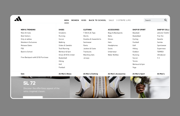
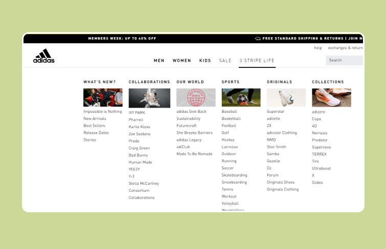
Adidas is a globally famous apparel company. Its website features a straightforward yet efficient mega menu. This menu organizes a wide array of products into easily navigable lists. It is also responsive, adapting to various desktop screen sizes by expanding to fit the full width of the user's screen, ensuring a consistent full-width menu experience across different devices.
Adidas
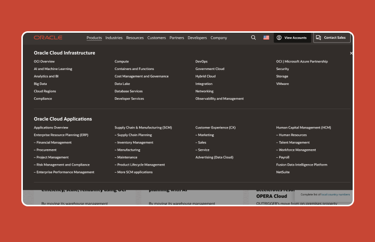
Oracle Database serves as a comprehensive cloud database solution, supporting data marts, data lakes, operational reporting, and batch data processing. The website caters to developers, startups, and students with a vast array of infrastructure, applications, and resources.
Due to its extensive data-centric nature, its mega menu spans the entire page to present numerous options at once, eliminating the need for scrolling and ensuring that deep, otherwise hard-to-find content is easily accessible.
Oracle
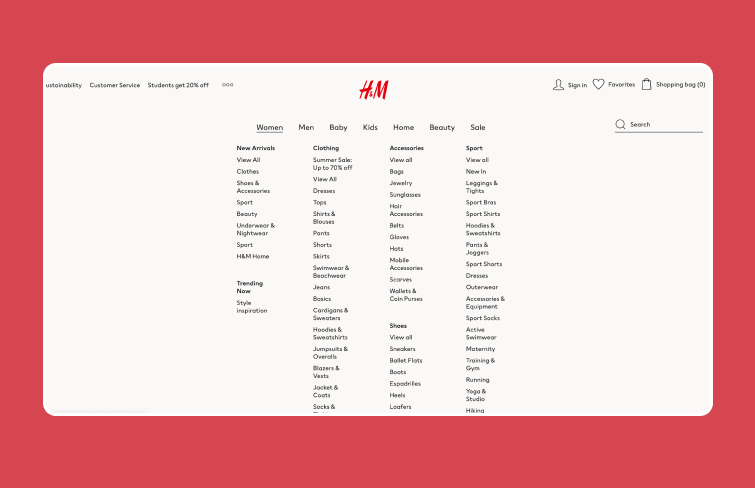
H&M's online store features a user-friendly mega menu where hovering over main categories like Women, Men, Kids, Home, and Beauty reveals detailed subcategories. The layout of its mega menu is clear and concise, with each section neatly divided to avoid clutter.
H&M
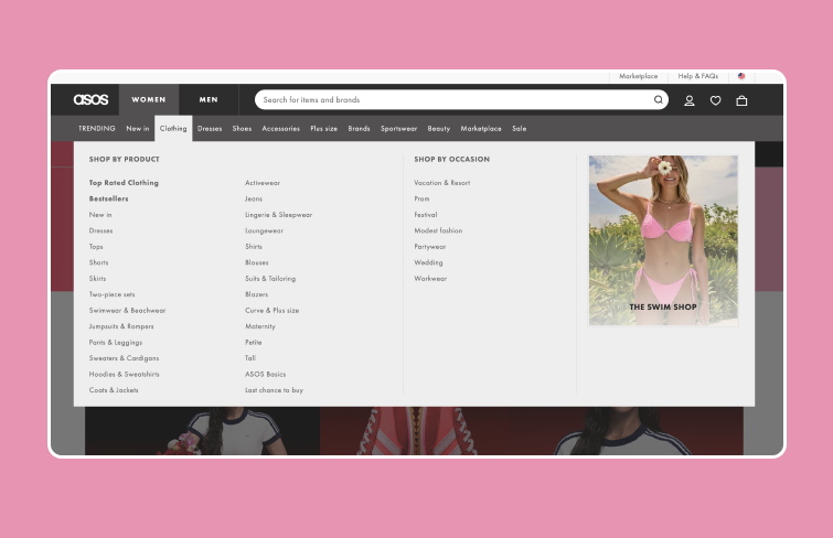
ASOS, a major online fashion retailer, has a vast product catalog, including dresses, shoes, and accessories. Its mega menu excels in design, utilizing ample negative space, clear typography, and well-structured headings to enhance navigation. Additionally, a prominent image on the right side of the menu draws attention to featured collections, making the browsing experience both efficient and visually appealing.
ASOS
Apple's website features a minimalist mega menu that aligns with its brand aesthetic. It offers straightforward navigation to various product lines and services. The clean design, with a white/black background and black/white text, highlights products effectively, ensuring an elegant and user-friendly experience.
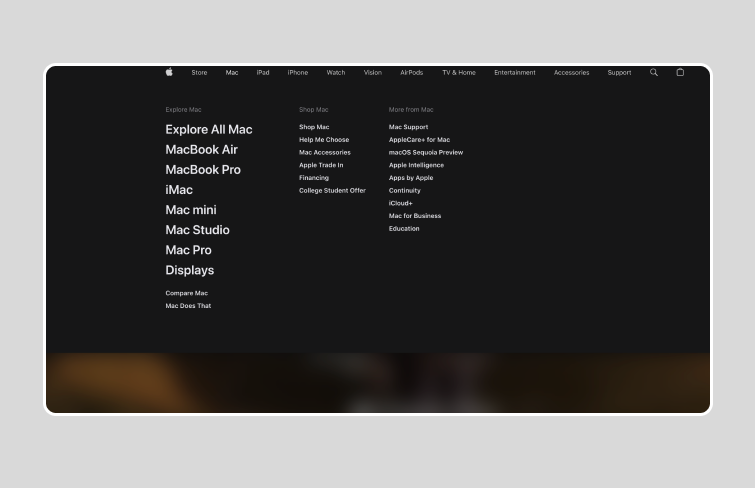
Apple
Walmart's mega menu on their website enhances navigation with a dynamic, visually appealing structure. It utilizes a multi-column layout, presenting a wide range of options and subcategories for easy browsing of products and sections. Visitors can efficiently find what they need without unnecessary clicks.
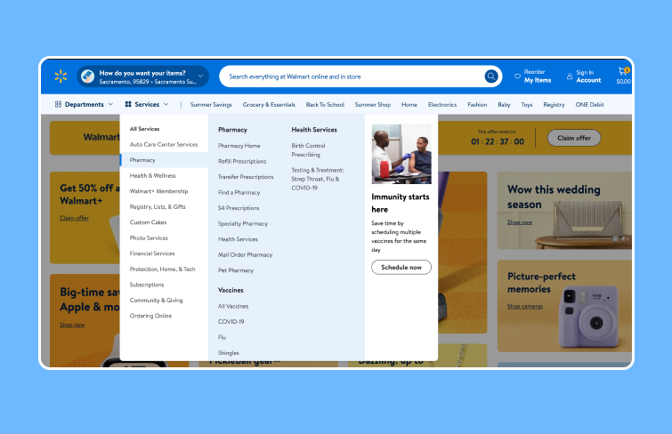
Walmart
Moosejaw.com is an online brick and mortar retailer specializing in outdoor casual wear, snowboarding, rock climbing, hiking and camping gear. Its mega menu is structured into clear sections with subcategories for more detailed browsing. Each category is easy to scan, helping users quickly find items they are looking for. This classic e-commerce design is user-friendly and promotes efficient product discovery.
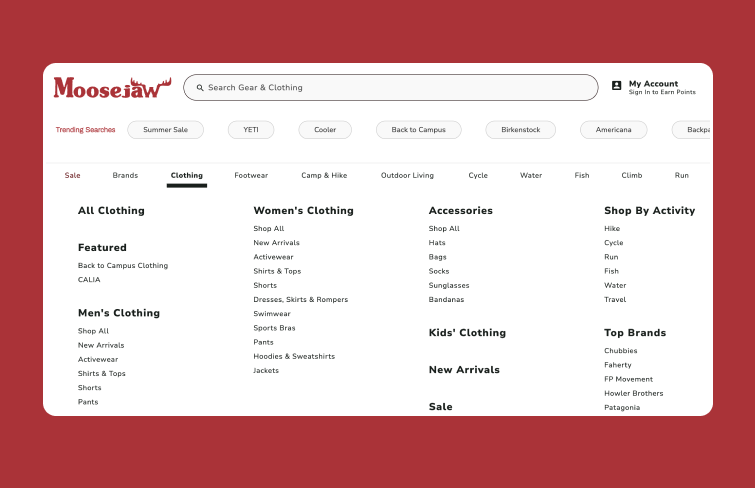
Estee Lauder is a very famous cosmetics brand, and its various cosmetics and skin care products are very popular. Its website features a minimalist design with black text on a white background, complemented by large images. Its mega menu maintains this simplicity, using black font with emphasis achieved through bolding and capitalization. This cohesive design enhances readability and ensures a clean, elegant browsing experience.
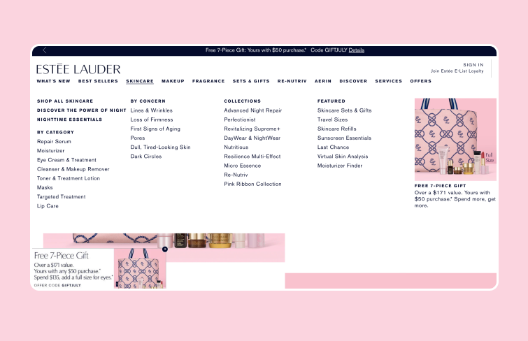
Estee Lauder
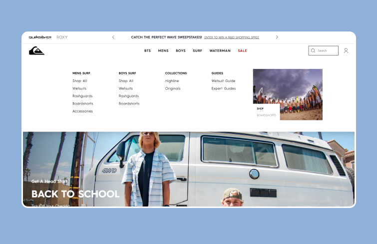
Quiksilver is the Australian retail sports brand and one of the world's largest surfwear and sports-related equipment brands. Its website features black text on a white background paired with large images, adhering to a minimalist aesthetic. The expansive mega menu complements this style with ample white space. The uniform black font emphasizes hierarchy through bolding and capitalization. Moreover, subtle gray highlights appear when interacting with the text, enhancing the clean and refined user experience.
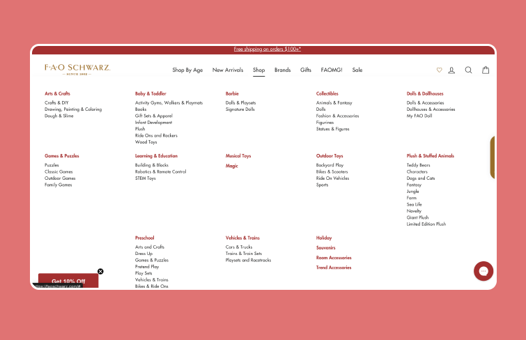
FAO Schwarz is an American toy brand known for its high-end toys, life-size stuffed animals, interactive experiences, brand integration, and games. Its website features an engaging mega menu with dynamic effects that animate from top to bottom and left to right, creating an interactive and captivating user experience.
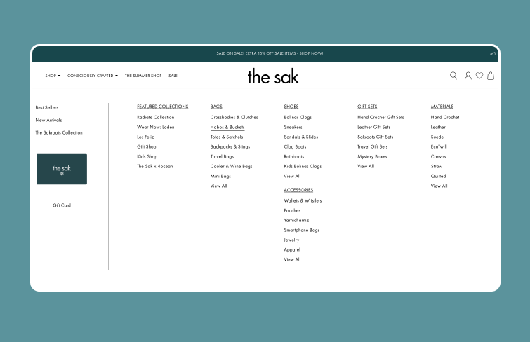
The Sak, an e-commerce site specializing in bags, features a dynamic mega menu. When hovering over an item, the option is highlighted with a smooth underline animation, making navigation intuitive and visually appealing.
The Sak
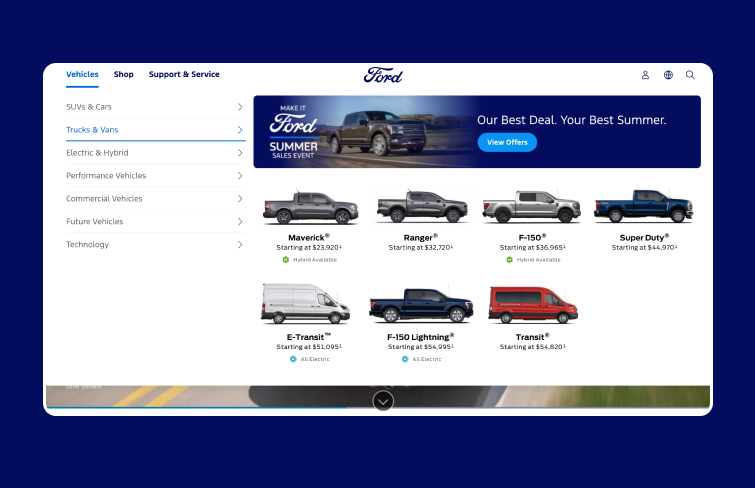
Ford's website has a user-friendly and visually appealing mega menu, enabling seamless navigation. Users can quickly access different sections like vehicle models, financing options, promotions, and customer support by clicking on specific categories, making the browsing experience efficient and straightforward. Moreover, the use of images alongside the text makes the browsing experience more intuitive and visually engaging, ensuring users can effortlessly find the vehicles or information they need.
Fords
eBay's mega menu is designed for effortless navigation, featuring clearly displayed top categories and deeper subcategories. Eye-catching banners provide quick visual references, enhancing the user experience by making it easy to find desired items and explore further options.
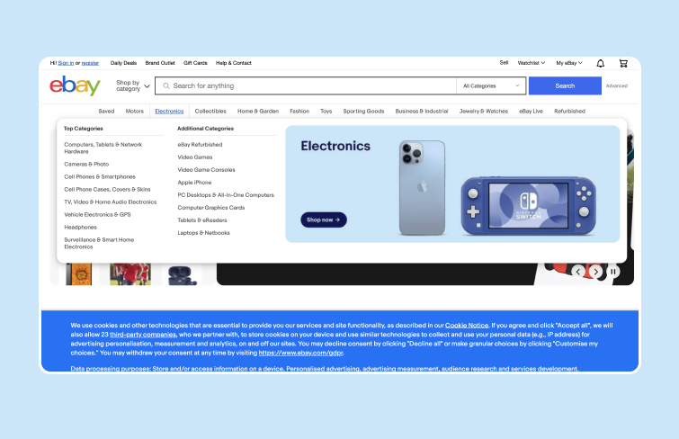
eBay
Nike's website features a sleek and clean mega menu design with a minimalist white and black color scheme. The menu avoids images, focusing on simplicity and ease of use. It clearly categorizes sections such as New & Featured, Men, Women, Kids, and Sale, with subcategories for Shoes, Clothing, Discover Sport, and Accessories and Equipment. This straightforward approach minimizes distractions, allowing users to quickly find what they need without unnecessary clutter.
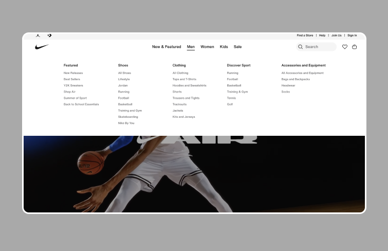
Nike
Espen's mega menu is a sports fan's dream, categorizing fields by leagues and using team symbols as link icons. This clever design choice makes navigation intuitive and efficient, as recognizing symbols is quicker than reading names. Its menu offers a seamless, enjoyable experience, making it a standout feature for sports enthusiasts visiting Espen's site.
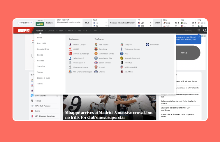
ESPN
Refinery29's mega menu features a newsletter sign-up banner at the top, effectively integrating a call to action without cluttering the design. The menu is clean and minimalist, with well-organized categories. Additionally, it includes a colorful hover effect that changes with each dropdown, enhancing the user experience.
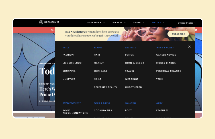
Refinery29
Starbucks' mega menu design excels with ample white space and clear, organized sections by product type, making it effortlessly scannable. Moreover, each top-level product click unveils enticing product photos within its category, ensuring a more intutive experience.
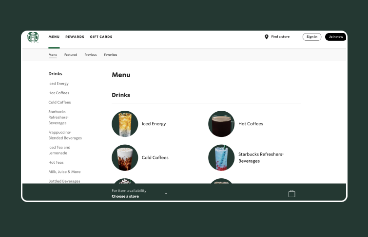
Starbucks
Sunglass Hut's mega menu offers a seamless journey through their extensive sunglasses collection. The menu includes a dedicated price filter for all budgets and features like polarized lenses and smart glasses, easily accessible with a dropdown selection. Whether you're a loyal fan or new to sunglasses shopping, Sunglass Hut's menu ensures you find the ideal pair to complement your style effortlessly.
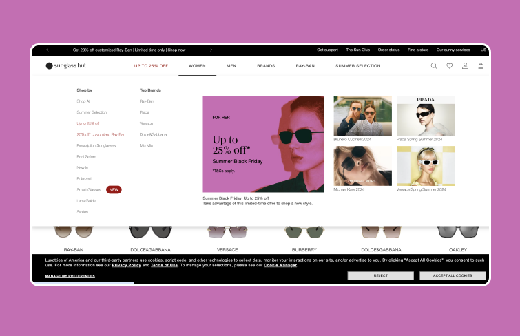
Sunglass Hut
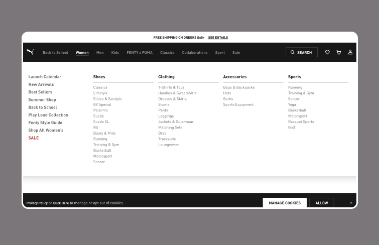
Puma's mega menu is an excellent example of an effective dropdown menu for navigation. It expands to display a well-organized set of links to essential categories and pages, maintaining a clean and modern appearance. Despite the abundance of links, the menu avoids overwhelming users by presenting top-ranking categories in bold, ensuring clarity and ease of use. Its straightforward and clear design efficiently guides users to their desired destinations.
Bobbi Brown Cosmetics showcases an exemplary mega menu design. Their menu effectively handles a wide range of products and uses colors strategically to highlight key information, enhancing the user experience. Its design also exudes sophistication and elegance, reflecting the brand's aesthetic.
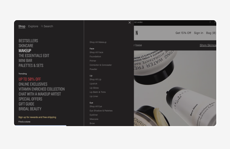
Bobbi Brown
Envelopes' website excels in its mega menu design, offering a comprehensive range of envelopes and mailing materials. The products are neatly categorized by color, size, style, and paper texture, enhancing search efficiency. Each menu title features a down arrow, guiding users to hover for more options. This intuitive layout ensures users can quickly find the best solutions, streamlining the browsing experience.
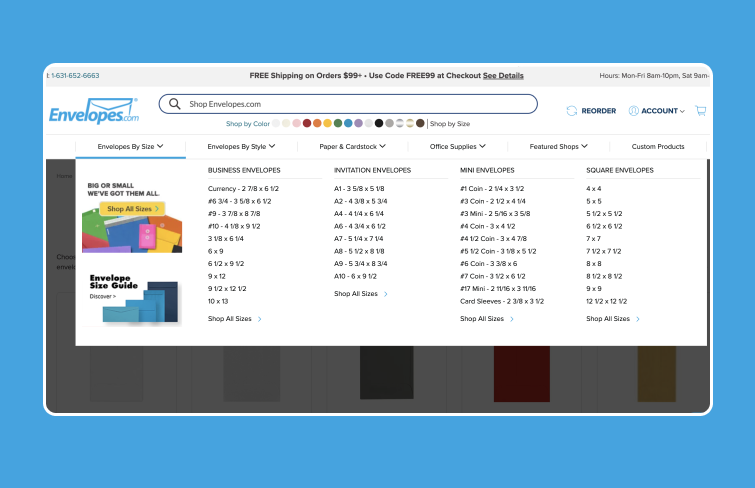
Envelopes
Riad11, a hotel in Marrakesh, Morocco, exemplifies effective mega menu navigation for websites with fewer pages. Clicking the menu icon transforms it into a full-page mega menu with creatively styled icons for the rooms. This design efficiently utilizes functionality without overwhelming the user or disrupting the experience. The hidden menus are perfect for the site's streamlined content, providing a smooth and visually appealing navigation method. Riad11's mega menu showcases how simplicity and elegance can enhance user engagement on smaller websites.
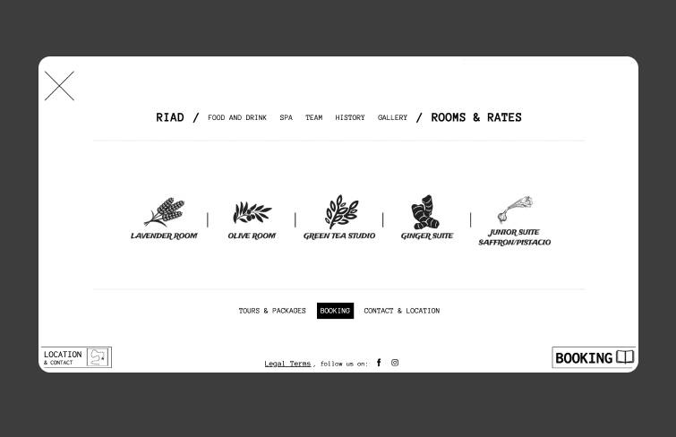
Riad11
Zara's mega menu is a model of optimization and visual appeal. It neatly organizes all product categories and features rotating banners for these categories, adding a dynamic visual element that enhances the user experience.
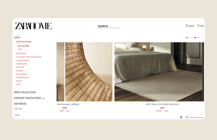
Zara Home
Daniella Draper's eCommerce site excels with its two-level mega menu, organizing a vast product range into clear categories and subcategories. This design, enhanced with images, is both simple and visually appealing, making it easy for users to navigate and find products.
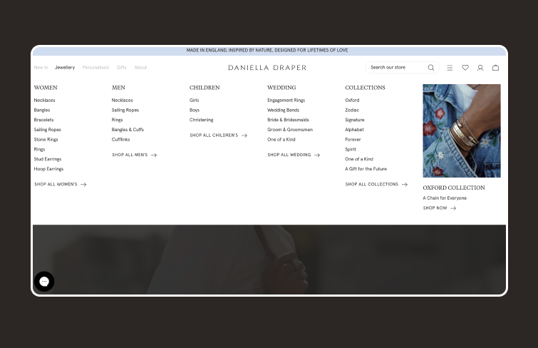
Daniella Draper
If you're a foodie who loves cooking, check out Food Network. Their vibrant, photo-filled mega menu is visually captivating, making it hard to look away. Strategically placed content blogs further entice viewers. This design brilliantly engages users, offering a delightful browsing experience while highlighting the site's culinary content.
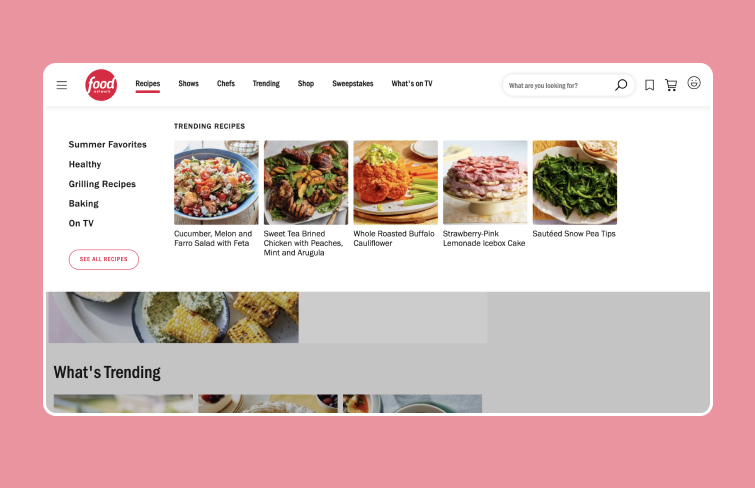
Food Network
Canva is a popular cloud-based graphic design tool. Its extensive mega menu is a key feature, offering seamless navigation to various tools and resources. The menu includes links to the design canvas, ready-made templates, pricing plans, and educational content, along with subcategories under main sections. This well-organized structure allows users to quickly find and utilize the features they need.
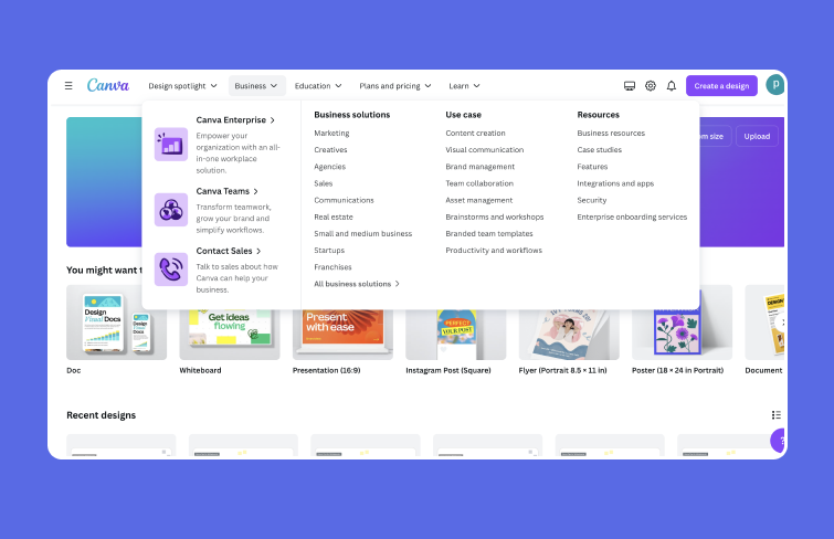
Canva
Visme is also a cloud-based graphic design platform. Its mega menu stands out with a visually appealing design and extensive functionality. Featuring numerous categories and subcategories, the menu effortlessly guides users to explore various design options, templates, and site functionalities. Notably, Visme's mega menu is optimized for seamless navigation on mobile devices and smaller screens, ensuring a user-friendly and consistent experience across platforms.
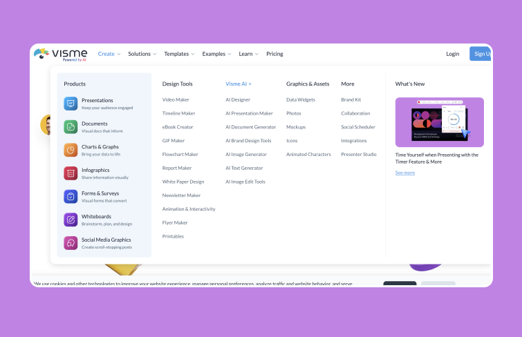
Visme
Fiverr is a leading freelance platform. It has an expansive mega menu tailored to accommodate its vast array of services. From its humble beginnings, Fiverr now hosts a diverse range of freelance gigs, all accessible through its comprehensive mega menu. It effectively organizes numerous freelancing categories and services, ensuring ease of navigation for employers seeking specific talents and freelancers offering their skills.
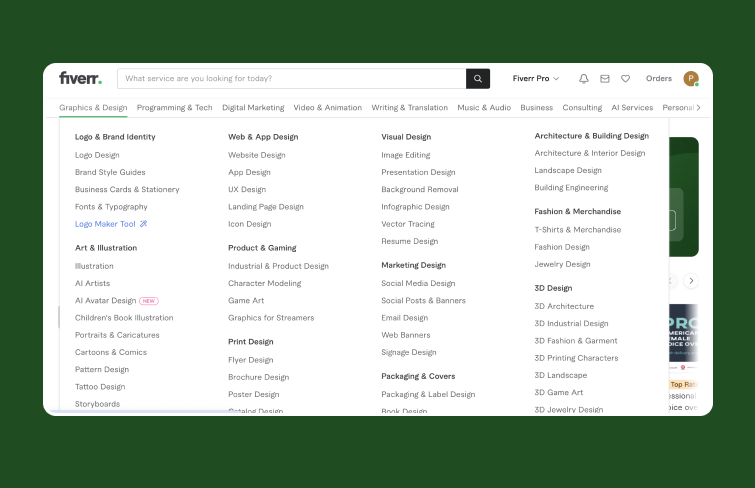
Fiverr
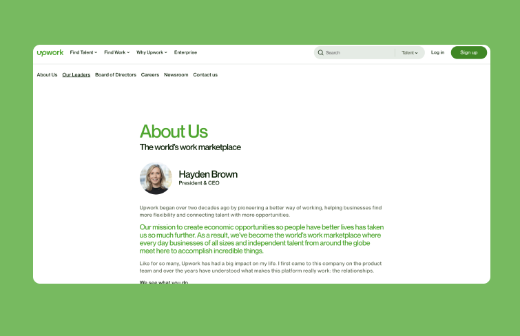
Upwork.com's mega menu excels with its innovative use of remote tabs that dynamically update content on the right. Notably, it integrates image boxes as interactive elements, enhancing both prominence and visual appeal. This thoughtful fusion of functionality and design ensures a seamless and aesthetically pleasing navigation experience.
Upwork
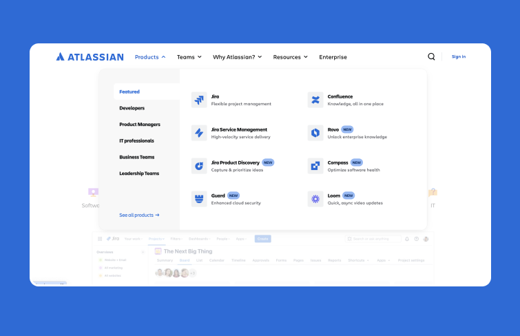
Atlassian's mega menu sets a benchmark with its structured organization of extensive resources. Whether for planning, collaboration, or security tools, their dropdown menu categorizes vast materials into clear sections and subcategories. For websites or platforms with substantial content, adopting a similar template can significantly enhance user experience by simplifying access to diverse resources and tools.
Atlassian
A mega menu is a highly efficient navigation tool used predominantly on large websites and online stores with extensive categories and subcategories. Unlike standard dropdown menus, a mega menu displays all or most of a site's pages in a single, comprehensive view, making it easy for users to navigate through various sections. These menus are typically accessed by hovering over a designated area and can be arranged either vertically or horizontally, divided into clear sections for better organization.
By consolidating the entire website's navigation into one menu, mega menus allow visitors to quickly and easily access different areas of the site, including lower-level pages, directly from the main menu. It not only enhances user experience but also ensures that no part of the website remains hidden or difficult to find.
While mega menus provide extensive navigation options, their design and implementation need careful consideration to ensure a positive user experience. Here are some best practices to follow:
As we mentioned, mega menus allow for grouping content effectively and incorporating visuals like images or videos, which is often not possible with conventional navigation, making it easier for users to find relevant content quickly and efficiently. They are particularly useful for online stores, where visitors expect an intuitive way to navigate multiple categories and subcategories.
Shoppers are accustomed to mega menus on large department store websites and expect the same ease of navigation on large e-commerce platforms. Additionally, when if your dropdown menu is becoming too large and cluttered, a mega menu can enhance the user experience by providing a well-organized and visually appealing alternative.
A dropdown menu is a simpler option, displaying a single column of links that works well for smaller websites with fewer categories. However, as the number of categories grows, it can become cluttered.
Mega menus, on the other hand, are perfect for larger sites with extensive product ranges. They can display multiple columns, section headings, and images, providing a comprehensive view and enhancing user experience.

In this blog, we've showcased 30 excellent mega menu examples to inspire your design. We've also explored the essentials of mega menus, including their best practices, when to use them, and how they differ from dropdown menus. Hopefully, this guide has provided you with a comprehensive understanding of mega menus and how they can enhance your website's navigation and user experience.
 Mockplus RP
A free prototyping tool to create wireframes or interactive prototypes in minutes.
 Mockplus DT
A free UI design tool to design, animate, collaborate and handoff right in the browser.
