Parallax scrolling effects work like magic to bring a website to life, creating seamless and immersive experiences for the audience. This is why websites featuring parallax effects remain popular despite shifting web design trends.
If you're seeking inspiration to create an exceptional parallax scrolling website, look no further! Here are 30 of the best examples of websites with brilliant parallax scrolling effects in 2024.
As you learn from these outstanding websites, remember to visualize and test your own parallax scrolling ideas using our free prototyping tool and UI design tool.
A parallax effect, also known as "parallax scrolling," is a web design technique where the background and foreground content of a website move at different speeds as visitors scroll down the page. This difference in movement creates the illusion of depth and a dynamic 3D effect, enhancing the overall user experience by making the website more engaging and immersive.
Its brilliant visual charm revolutionized web design in 2021 and also continues to be popular due to its ability to captivate users and add a modern touch to websites.
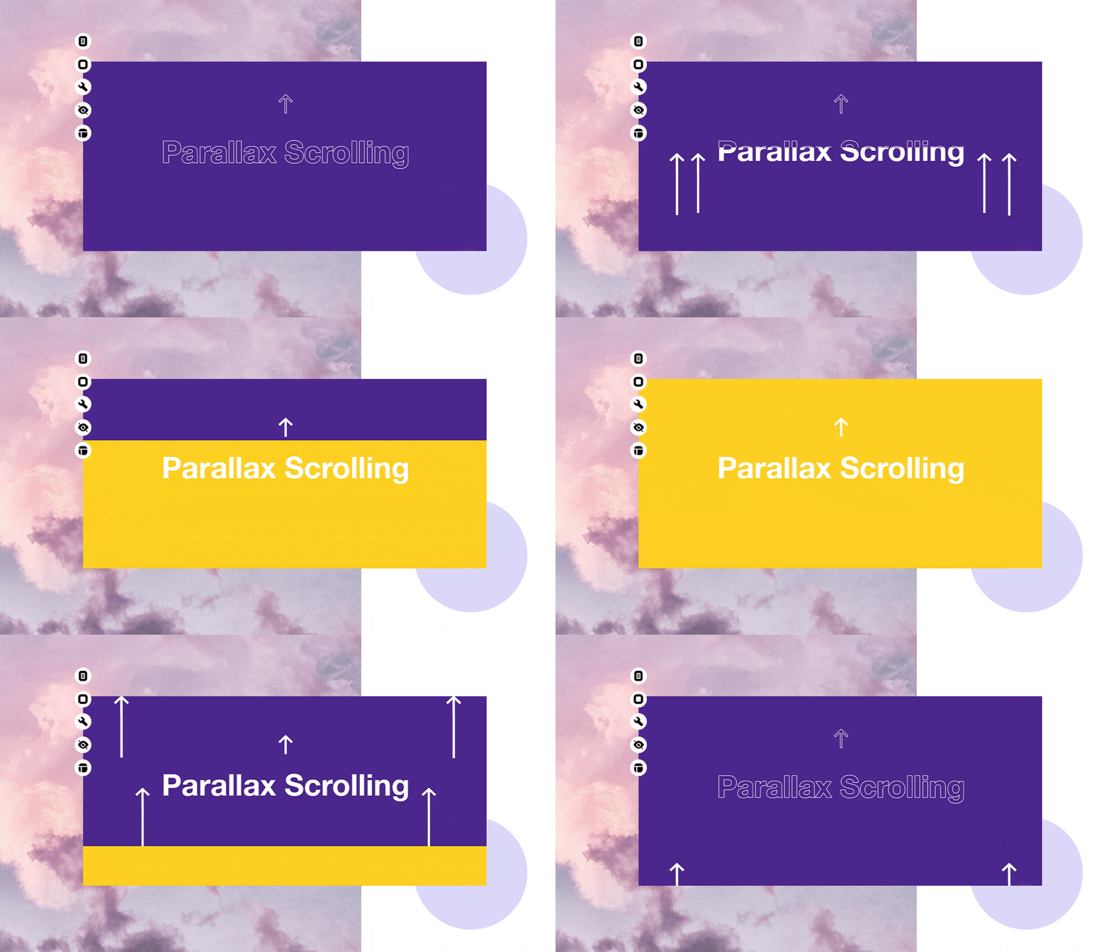
Though parallax scrolling website remain popular within UI/UX designers, it also has its own advantages and disadvantages.
In short, a solid parallax scrolling design can really set your website and products apart from the competition. However, it's crucial to recognize that it might also come with its own set of user experience challenges. So, it's essential to carefully consider both the advantages and disadvantages based on your particular needs and situation.
Parallax websites are known for their distinctive visual effects and engaging user experiences. However, they can sometimes cause issues if not implemented correctly. Here are some tips and tricks to follow when designing a parallax scrolling effect for your website:
The parallax scrolling effects can involve a large number of images, interactions and elements, which may affect the performance and slow down the page loading. So, while working on parallax effect, always take all possible measures to optimize the performance and minimize the page loading time, such as using much smaller images, animations, and videos, optimizing the page design and layout, minimizing the codes and more.
Parallax scrolling effects add a sense of depth and dimension to your website, creating a visually engaging experience. However, adding too many visual elements, animations, and multimedia can make the site feel overcrowded and detract from key information. Keep the design as simple as possible and include only the necessary content and elements to avoid overwhelming experiences.
Parallax scrolling effects can sometimes distract users, exacerbating their experiences. To avoid such issues, strive to make your parallax scrolling both easy and predictable. In other words, aim to employ consistent scrolling patterns to ensure navigation predictability. Additionally, ensure these scrolling patterns align with the common habits of your target users.
Parallax effects can lag when used on mobile devices. Therefore, while implementing parallax scrolling, create separate versions for both mobile and desktop. Remember to keep the parallax effect minimal. If the effect significantly burdens mobile devices, consider disabling it. Ultimately, prioritize user experience above all else.
Parallax scrolling can enhance user immersion and improve the overall experience. However, it's essential not to overdo it. Parallax scrolling is most effective on web pages with fewer elements and content, such as landing pages or one-page websites. However, in scenarios like online purchasing processes, excessive parallax scrolling can prolong the purchase journey and potentially lead users to abandon their purchases.
Determine the layout and content of your website. Consider how you want to incorporate the parallax effect into your design and what elements will be included on each page.
Create the individual sections of your website that will use parallax scrolling. This may include background images, foreground elements, and text content.
Wireframe and prototype any ideas, and evaluate whether your imagination of the parallax effects work as well as you hope. You may use our wireframing and prototyping tool to quickly visualize and test your ideas with just drag-and-drop, all without codes involved.
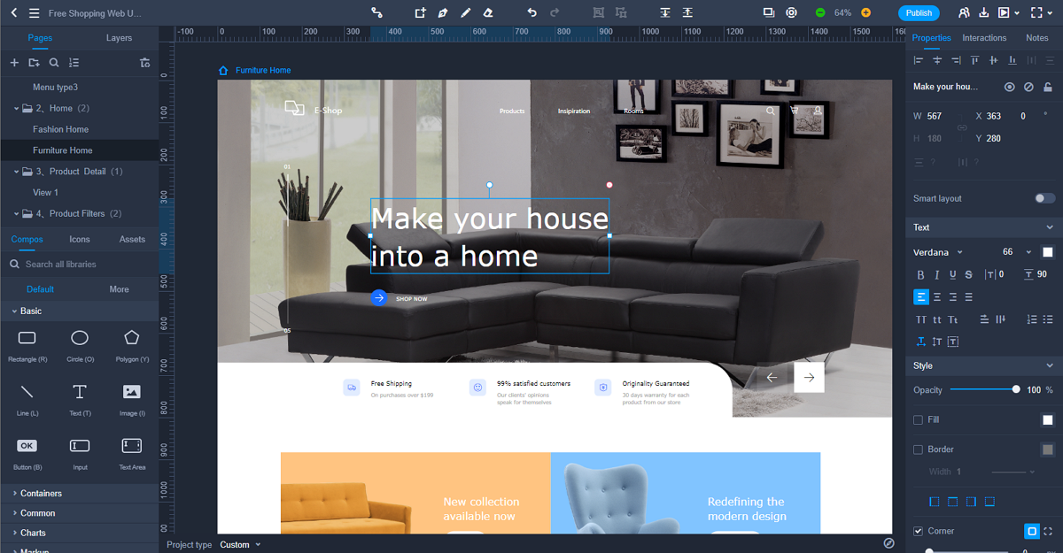
Wireframe and prototype your parallax design in Mockplus
Test your website across different devices and screen sizes to ensure that the parallax effects work correctly and the design is responsive. Make any necessary adjustments to improve compatibility and usability.
Gather feedback from users and stakeholders, and make any necessary refinements to your parallax scrolling website. Continuously iterate on your design to improve the user experience and achieve your goals.
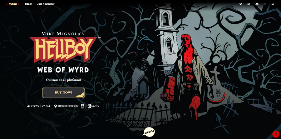
HellBoy is a dark-themed website designed in a graphic comic book style to showcase an adventure game. As visitors scroll, they reveal main scenes, characters, and dialogue, gradually unfolding the game's story.
The smooth parallax scrolling adds depth, making the experience immersive and interactive, drawing users deeper into the roguelike narrative. The storytelling design also stands out it from others easily.
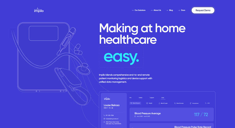
Impilo Health Care's website is designed to help visitors quickly grasp the key points of its healthcare services, including remote monitoring data, quick service introductions, and clear illustrations. The parallax effect smartly showcases one piece of content at a time, allowing visitors to focus on the current information without feeling overwhelmed. This thoughtful design is far more effective than presenting everything at once.
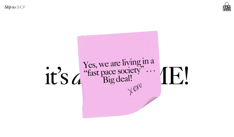
Violet Papers' website uses parallax scrolling to create an immersive and memorable shopping experience. Unlike typical shopping sites that present all products through complex categories, this website introduces the brand's shopping concepts gradually—one word, one sentence at a time. This approach leads visitors through the story before showcasing products in simple, clear categories, offering a unique and engaging experience.
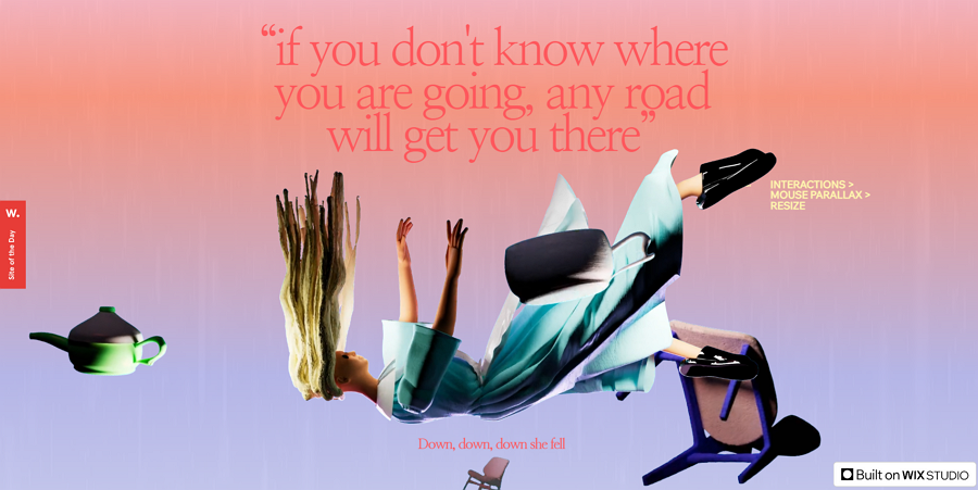
Alt: Parallax Wonderland
This website utilizes parallax scrolling technique to let visitors experience the Alice wonderland simply by scrolling the mouse wheel. The smooth scrolling, flying objects, and interactive characters like card soldiers and rabbits create a sense of falling into Wonderland, just like Alice.
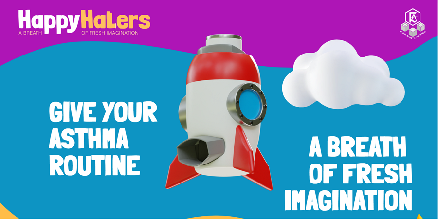
Happy Halers features a functional 3D website design to showcase its snap-on inhaler. The parallax effect adds depth and dimension, making the site more attractive and engaging for users. The bright color combination also serves as an excellent design example for inspiration.
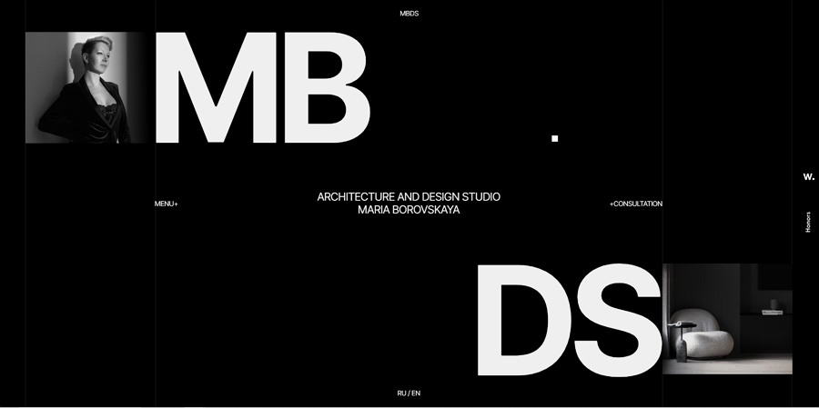
MBDS offers a modern website concept ideal for design studios or personal portfolios. The parallax effect showcases design works or case images one by one as users scroll, allowing visitors to easily understand the design style and talent of the designers or studios behind it.
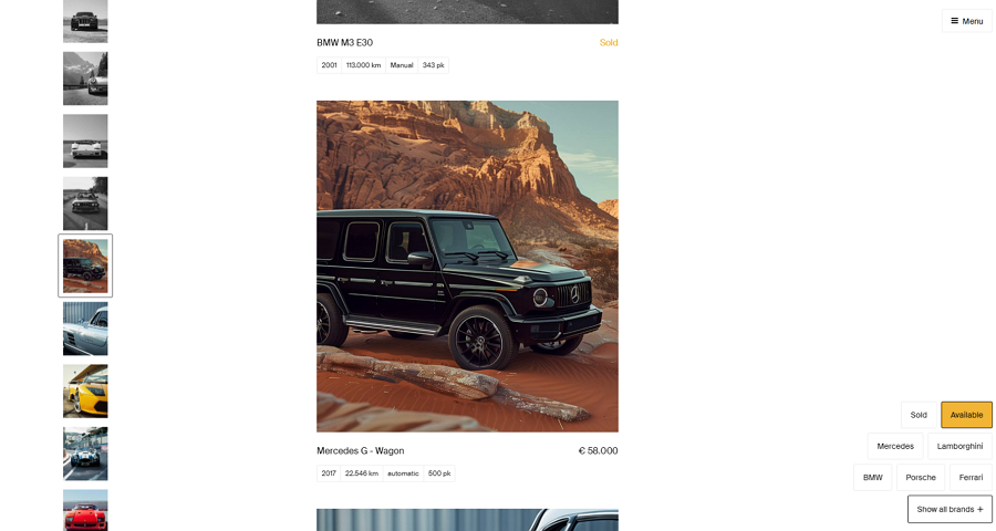
Artificial Garage is an interactive website concept that showcases AI-generated cars. Using parallax scrolling, the site presents a car image gallery in an immersive way. As users scroll down, the website seamlessly transitions to dark mode, displaying car images in black and white. Hovering over an image restores its colors, adding an engaging and dynamic element to the browsing experience.
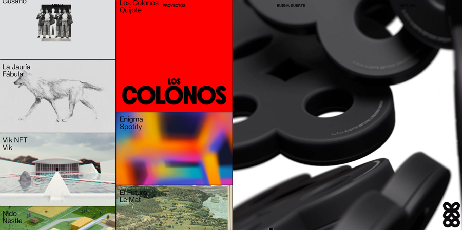
Buena Suerte uses parallax to present three columns of content, each with a different loading speed. This unique design is an excellent inspiration for designer portfolios, creative hubs, or agencies. It adds a dynamic and visually engaging element that showcases creativity and innovation.

Ima Aicha is a travel website offering curated tours across Morocco. Visitors can easily scroll down the page to find detailed information about each trip service. To enhance navigation convenience, the website incorporates a fixed navigation bar, enabling users to book services directly as they explore the offerings.
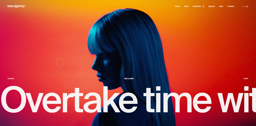
ESE agency's online website employs a captivating parallax design to unveil their culture-driven design concepts gradually, through a combination of videos, images, and text explanations.
The designers use gradient colors, interactive images, patterns, and oversized photography to craft an engaging and dynamic experience that resonates with users.
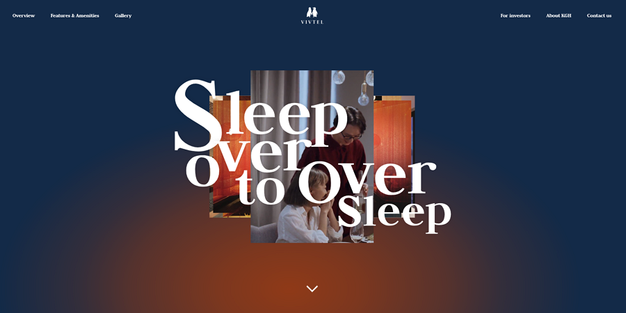
Vivtel is a groundbreaking hotel brand transforming the travel experience for couples. Through its online website, Vivtel utilizes the parallax effect to showcase exclusive services and images capturing the cherished moments couples enjoy during their stay, each at varying speeds.
This creates an irresistibly attractive experience for couples seeking a memorable travel adventure together.

27 Nerds' online website embraces a retro style reminiscent of the 80s and 90s. With parallax scrolling, the site unveils nostalgic elements like zigzag mouse cursors, icons, and images one by one. This deliberate presentation evokes a sense of nostalgia, effortlessly transporting users back in time to experience the charm of yesteryears.
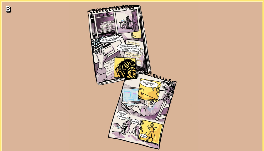
Yellow Faces is a dynamic one-page website that cleverly incorporates parallax scrolling to deliver information in a captivating comic style. As users scroll down, the parallax effect keeps them engaged, providing an interactive experience that surpasses what can be achieved in print.
This innovative approach ensures that readers are thoroughly immersed in the content from start to finish.
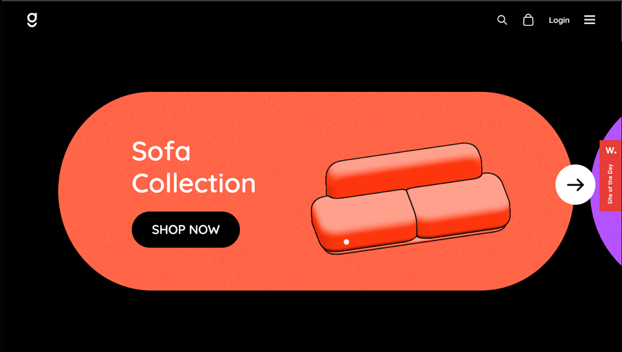
Dope Good is an online furniture website distinguished by its stunning illustration style. Through smooth parallax design, the website showcases furniture pieces one by one, allowing each item to shine.
Against the backdrop of a black background, the light-themed furniture images and introductions effortlessly stand out, creating a visually striking and memorable browsing experience.
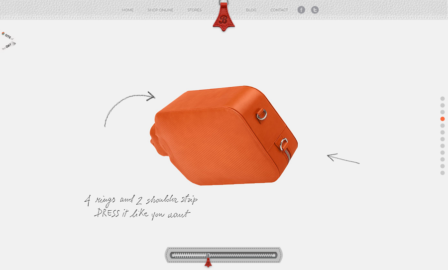
Imagine casually carrying a hot-water bottle under your arm during the winter—a simple act that inspired a designer. As you scroll down the page, the parallax effect elegantly rotates the bag, showcasing its various features from different angles.
Additionally, a zipper at the bottom of the screen moves from left to right in sync with your scrolling, adding to the interactive experience. This captivating presentation ensures that the item is well-displayed and irresistibly appealing to visitors.
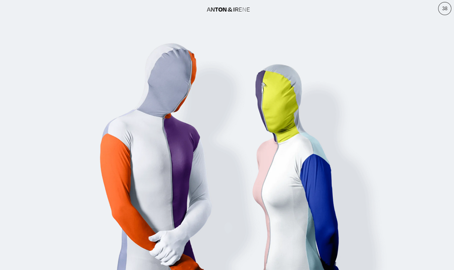
We all love the site's color schemes and warm, clean interface! Anton and Irene indeed look cool in their colorful, modern attire.
As you scroll down, they graciously step back to make room for the essential information you're seeking. The bold typography and vibrant color scheme contribute to a visually stunning experience.
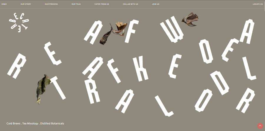
Beta Tea's online website employs the parallax effect to convey the message that their tea is not your grandfather's tea. Through clever parallax techniques, the site dynamically presents tea information and images, while utilizing bright color backgrounds to illuminate relevant sections as users scroll.
The inclusion of rich micro animations and interactions enhances the overall experience, ensuring that visitors are captivated by the site's modern and engaging design.
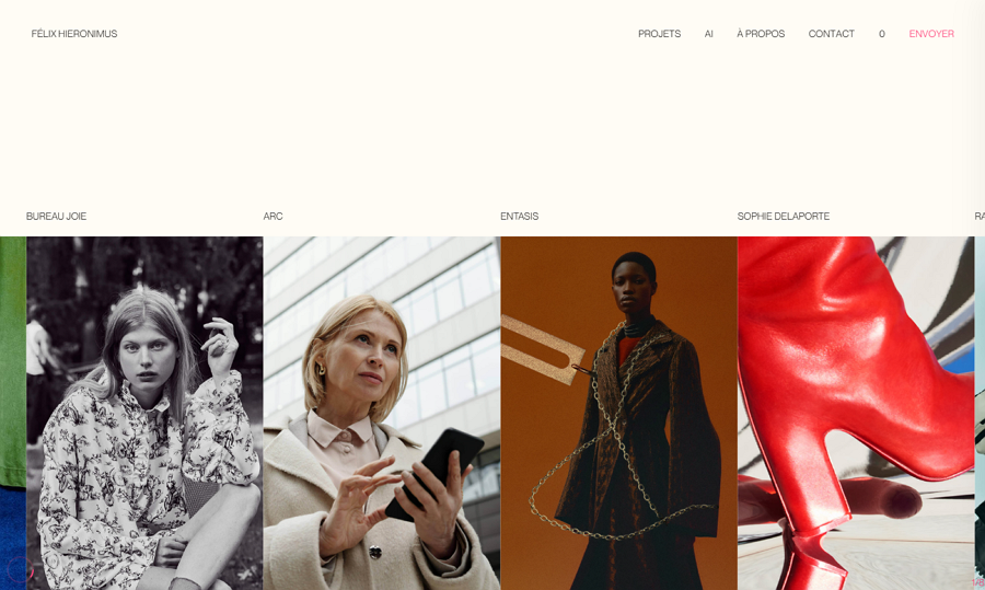
Felix Hieronimus, a designer portfolio website, takes a unique approach to parallax scrolling by adopting a vertical orientation.
This innovative design allows users to preview design cases within a horizontal-scroll gallery, creating a distinctive and memorable browsing experience.
By breaking away from the traditional vertical scrolling, Felix Hieronimus' website offers a fresh perspective that showcases creativity and ingenuity in design presentation.

Pixlogix is an online website design concept for an award-winning website and app development company. This dynamic platform leverages rich micro-interactions and animations to deliver a fun and immersive user experience. Through its parallax design, Pixlogix effectively guides users' focus to the presented content, ensuring an engaging and memorable interaction with the site.

Acclaim offers a compelling online website concept for companies or agencies looking to expand their reach to a broader audience through online platforms. With its parallax design, Acclaim effectively showcases service content in a focused manner, ensuring that visitors can easily understand and engage with the offerings.
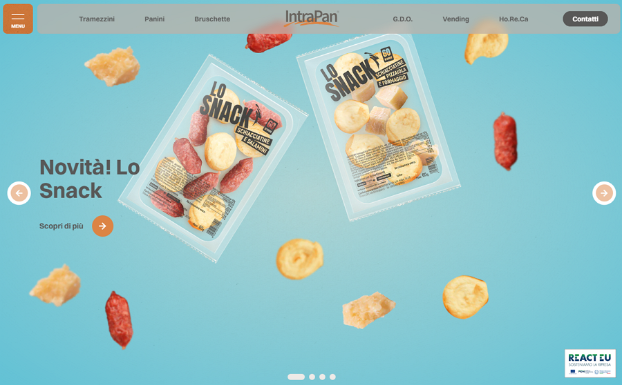
Looking for inspiration to enhance your food website with the parallax effect? Look no further than Intrapan. This exemplary site features an interactive image slider that beautifully presents hot food items one by one. As users scroll down the page, they are treated to more detailed information about each dish, creating a seamless and engaging browsing experience.
Intrapan showcases how the parallax effect can elevate the presentation of food content, making it a must-see example for any food website looking to captivate visitors.
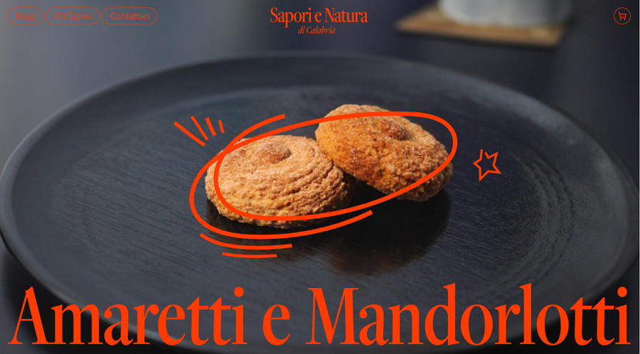
Sapori e Natura stands out as another must-see example of food websites utilizing parallax scrolling. This innovative site not only leverages parallax design to showcase its food in detail but also incorporates trendy grid layouts, oversized typography, horizontal scrolling, and similar design elements to create a visually stunning and memorable experience.

Designly is a free website template that showcases products or services in a parallax style. It's ideal for marketers, agencies, and consultants who want to build an online presence to reach more users and increase revenue. The drag-and-drop page editing feature makes it incredibly easy to match any design requirements.
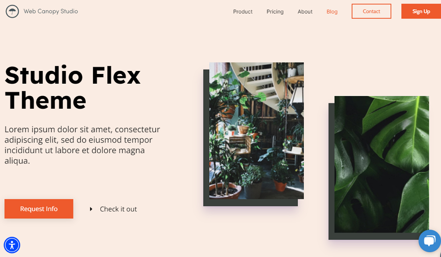
Studio Flex, true to its name, is a free parallax template that's perfect for designers and design studios. With its modern and clean look, it captures users' attention and effectively showcases various design projects or images. It's fully customizable and comes with essential elements like pricing tables, image galleries, content blocks, and more, making it a versatile choice for your design needs.
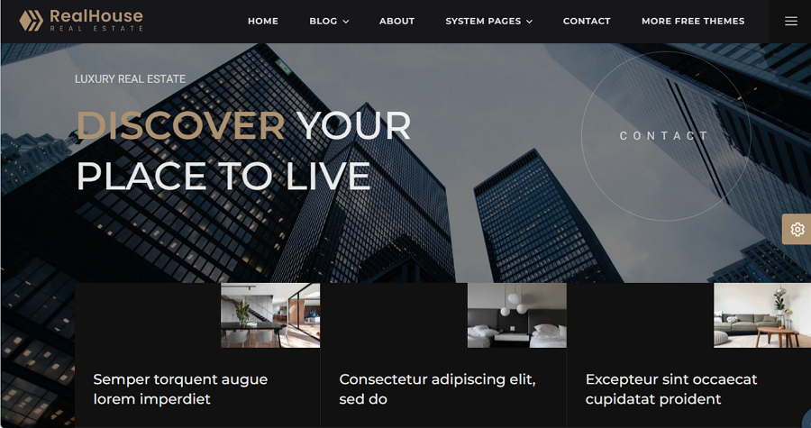
Real House is a parallax template designed specifically for real estate websites. It comes with fully customizable pages and elements essential for a modern real estate site, including hero image sliders, two-column layouts, and image galleries. This template provides all the tools needed to create a visually appealing and functional real estate website.
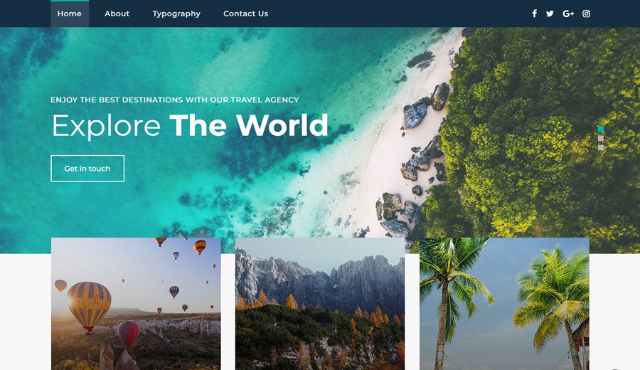
This free HTML5 website template is fully responsive and features smooth parallax scrolling effects to narratively present travel services. Additionally, it includes an advanced UI kit to make your travel website even more attractive and user-friendly.
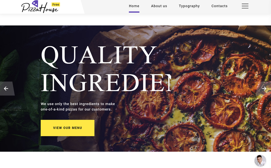
This free ecommerce website theme is specifically designed for pizza restaurants. It boasts a bright and clean design with a cool parallax effect that showcases pizza dishes clearly. Fully editable, it allows you to easily replace text, images, and even categories to fit your restaurant website design. Perfect for any food or restaurant shop looking to enhance their online presence.
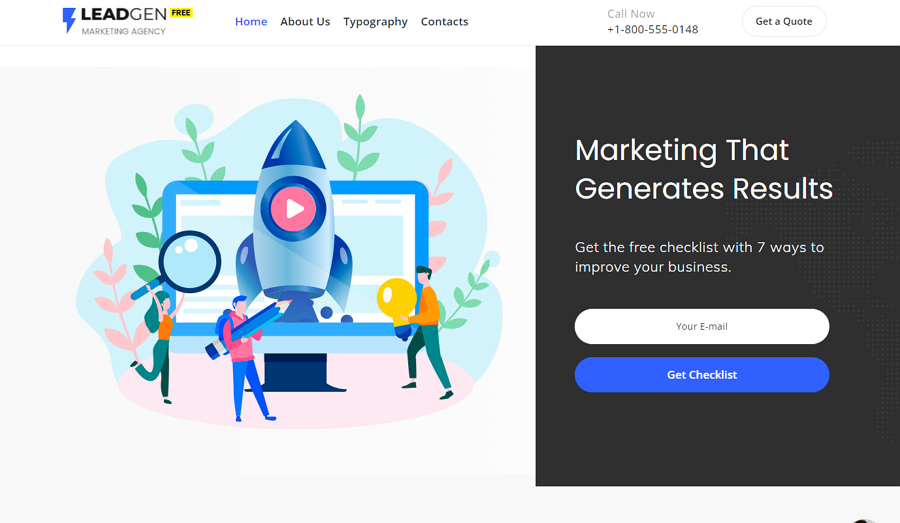
This template is a free theme designed for marketing agencies, SEO agencies, and Internet services websites. It showcases a clean flat design style that enhances user experience. In addition to the parallax effect, which effectively illustrates the services offered, it also includes a sticky navigation panel. This feature allows users to easily navigate between different contents and web pages, ensuring a seamless browsing experience.
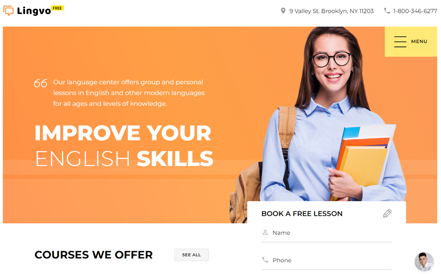
This free template is a functional theme tailored for online learning platforms. It offers various page layouts and fully editable, responsive elements. Perfect for online learning courses or centers, it provides the flexibility and functionality needed to create an engaging and user-friendly educational experience.
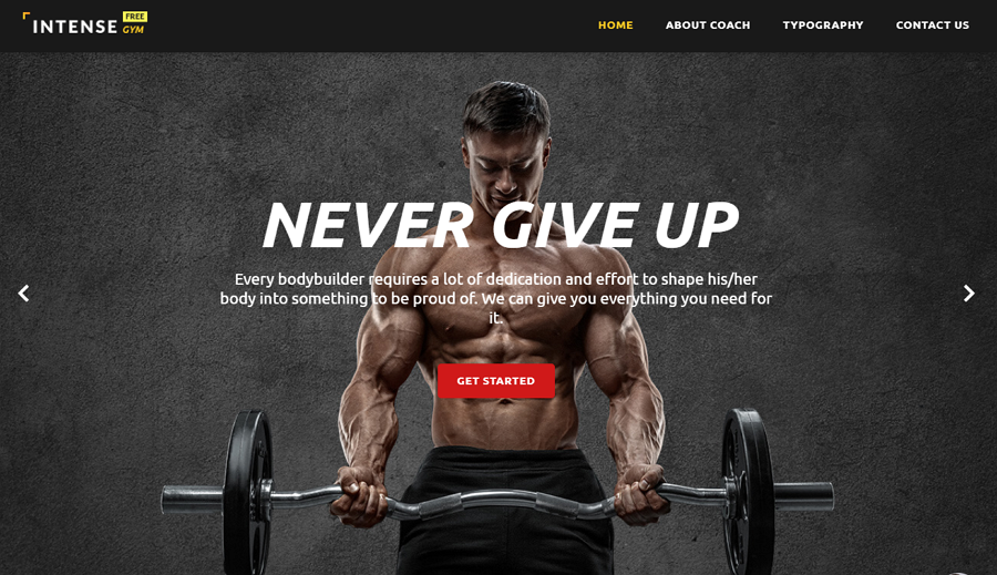
This free template is specifically designed for gym and online sport websites. It comes with 500 HTML templates and 25 different skins, offering a wide range of options to suit various design preferences. Fully customizable and responsive, it ensures that your website looks great and functions smoothly across different devices.
Parallax scrolling effects offer designers a powerful tool to guide users' focus towards important content and create immersive experiences. We sincerely hope that the aforementioned best practices, examples, and templates will aid you in creating your own parallax websites with greater speed and simplicity.
 Mockplus RP
A free prototyping tool to create wireframes or interactive prototypes in minutes.
 Mockplus DT
A free UI design tool to design, animate, collaborate and handoff right in the browser.
