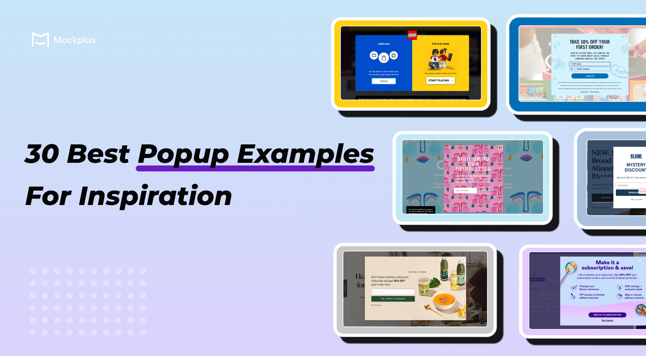
Popups are a powerful tool in both web and app design, capable of boosting conversions, gathering leads, and increasing user interaction. However, if not implemented correctly, they can frustrate users and create a negative experience. This article will help you understand what a popup is and provide inspiration from 30 of the best popup design examples for your own projects.
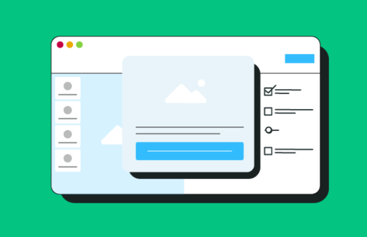
A popup is an interactive window between the user and a website or an app, primarily used to guide user actions, convey important information and provide feedback:
Guiding User Actions: Popups can include tutorials or prompts to help users understand how to navigate and use the product, facilitating a quicker and smoother onboarding experience.
Conveying Information: Popups serve as an interactive means of communication, using text, images, , and videos to share messages with users.
Providing Status Feedback: This involves conveying the system's status to users through feedback loops, helping to control and display the system's internal states.
Popups are widely utilized for marketing activities, feature announcements, and version upgrades.
Popups are highly effective in web and app design, serving as powerful tools to capture user attention, boost engagement, and drive conversions. Here are several key reasons why you should consider incorporating popups into your digital strategy:
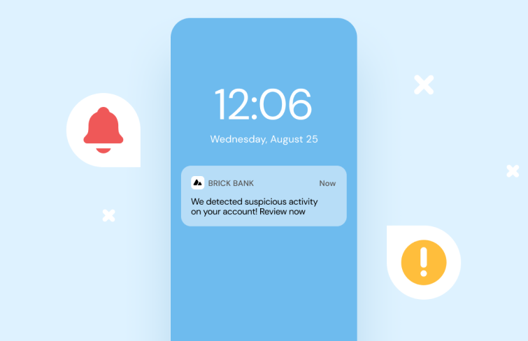
Push notifications and pop-ups serve different purposes in user engagement. Push notifications are sent directly to a user's device outside the app or website, requiring user opt-in and designed to re-engage with timely updates and alerts. They are less intrusive, as they do not disrupt current activity, but can become annoying if overused.
Pop-ups, on the other hand, appear within a website or app during active use, triggered by actions like scrolling or clicking. They do not require prior permission and aim to capture immediate attention for actions like sign-ups or special offers. While effective, they can be more disruptive and may lead to user frustration if poorly implemented.
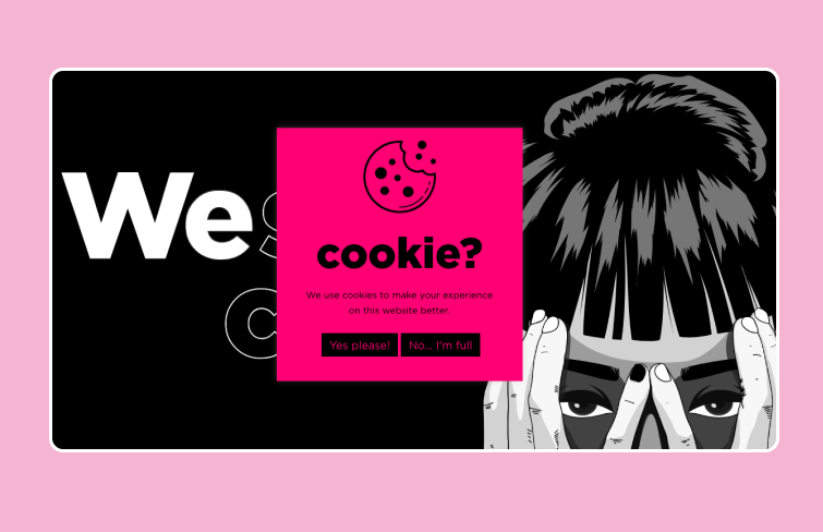
Since GDPR regulations took effect in 2016, cookie notices have become ubiquitous on websites. However, this doesn’t mean they can’t be creative. For instance, the digital agency Proweb adds a humorous twist with their bright pink pop-up that asks, "cookie?" and offers options like "Yes please!" and "No... I’m full." This approach makes the mandatory notice more engaging and fun for users.
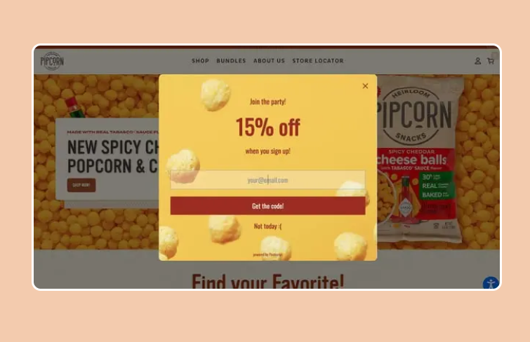
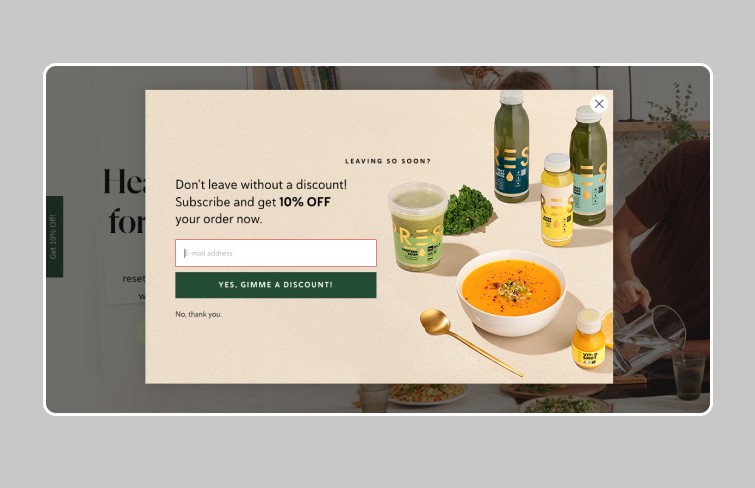
This popup from Pipsnacks is a vibrant and engaging example of effective design and messaging. It is set against a cheerful yellow background adorned with images of popcorn, immediately drawing the user's eye. The bold red "Get the code!" button stands out prominently, making it easy for users to respond to the call-to-action. Additionally, the use of friendly language like "Join the party!" aligns with the brand's voice, creating a welcoming atmosphere that encourages user engagement.
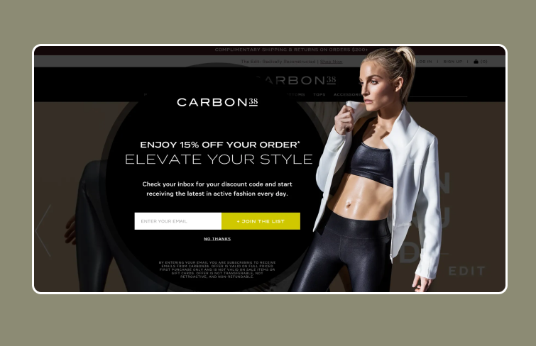
Unlike traditional rectangular or square shapes, it uses a circular format, making it stand out significantly. The model on the right side of the screen helps draw attention to the pop-up, enhancing its visibility. Being a full-screen popup, it effectively captures the visitor's attention without being overly intrusive. It also comes with a eye-cathing CTA in bright color.
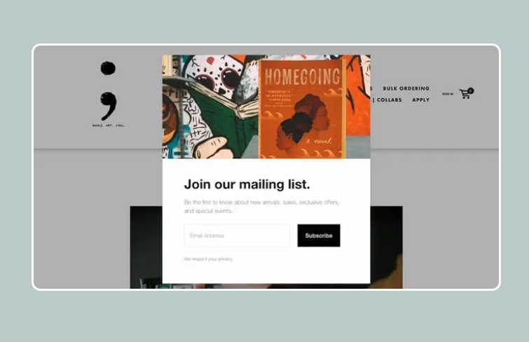
The Semicolon Bookstore website effectively communicates the advantages of joining its email list through its CTA. The text is intentionally grayed out to avoid diverting attention from the form, allowing users the option to read it or proceed directly to sign-up.
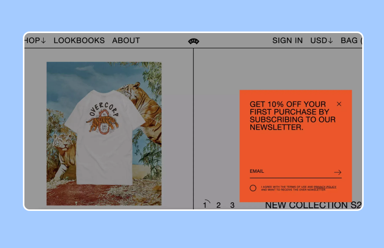
OVER clothing has crafted an exceptionally innovative popup design. The text is minimal, ensuring clarity, while the bold red color sharply contrasts with the rest of the page, making the popup hard to miss. This design is truly one of the most original and eye-catching popups we've come across.
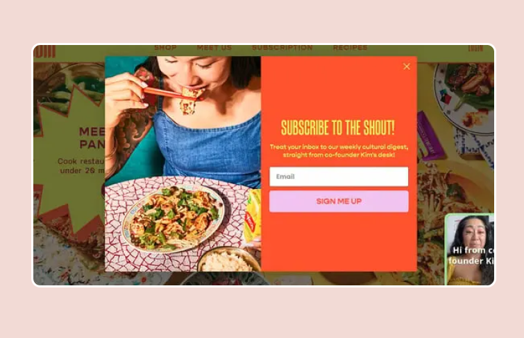
Omsom’s vibrant website features a striking email opt-in pop-up designed to capture attention just before you exit the page. This exit-intent pop-up uses bold, bright text to quickly convey its value proposition during those critical moments before you close the tab or window.
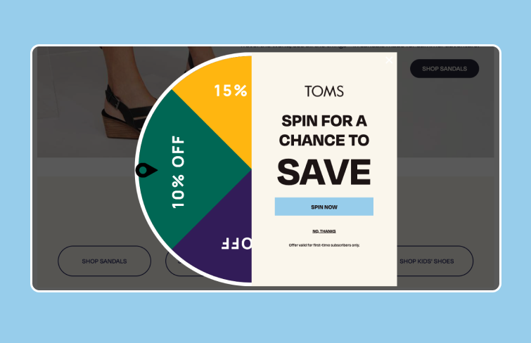
TOMS Shoes incorporates a time-based popup with a gamified twist to enhance their welcome offer. After a few seconds, a "spin-to-save" popup appears, dimming the background and compelling visitors to interact. With minimal effort required—just a fun button to click or a simple "No thanks" option—the click-through rate is likely very high. Once you spin the wheel, a second popup appears with a tailored offer based on the wheel's result, along with a field to enter your email address. This approach is clean, straightforward, and highly effective.
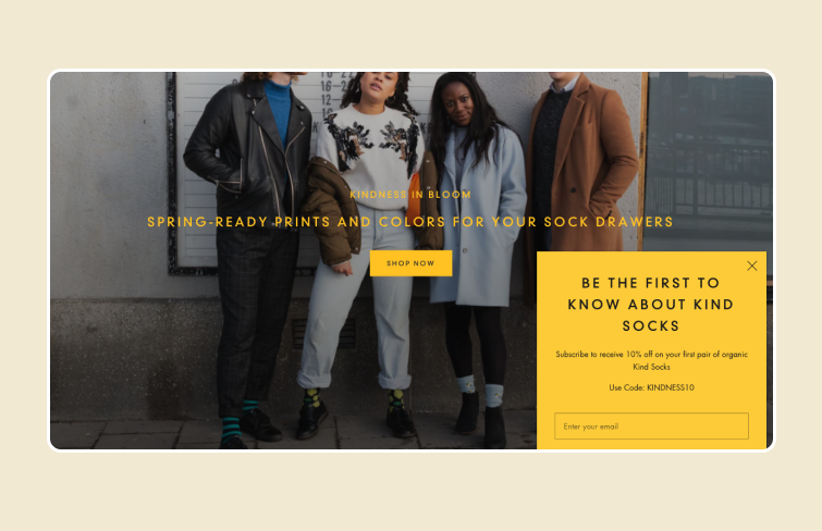
This CTA pop-up features an attractive offer that appears unobtrusively. The promise of being "the first to know" about a new sock collection is enticing enough to persuade many visitors to join the email list, especially with the added incentive of a 10% discount.
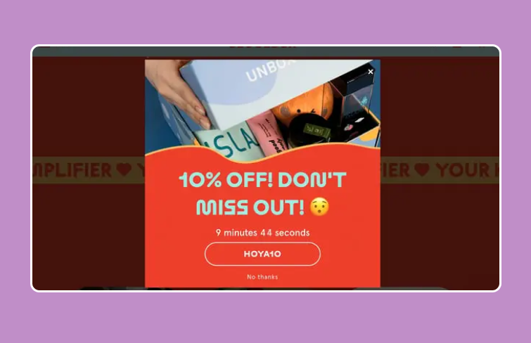
This pop-up, with its vibrant and playful design, incorporates a countdown timer to boost urgency and drive conversions. It offers a 10% discount, but you must use the code within 10 minutes, or the deal will expire. The eye-catching graphics and time-limited offer encourage quick action from visitors.
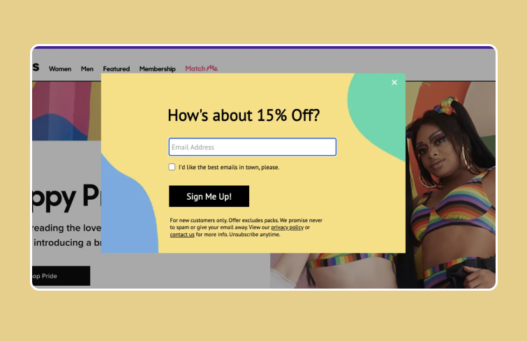
This popup from MeUndies is a perfect example of an effective popup design: it captures attention, is creatively executed, and is highly engaging. The vibrant colors and playful layout immediately draw the eye, while the compelling CTA, offering a 15% discount for signing up with an email address, stands out. The checkbox for receiving the "best emails in town" adds a touch of humor and personalization, making the overall experience enjoyable for visitors.
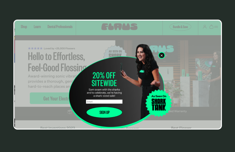
This popup comes in green and black hues, which perfectly align with its brand identity. It features a captivating design with eye-cathing illustration, headline and CTA button, highlighting a 20% sitewide discount. The concise messaging, eye-catching visuals, and seamless user flow make it an effective marketing popup design.
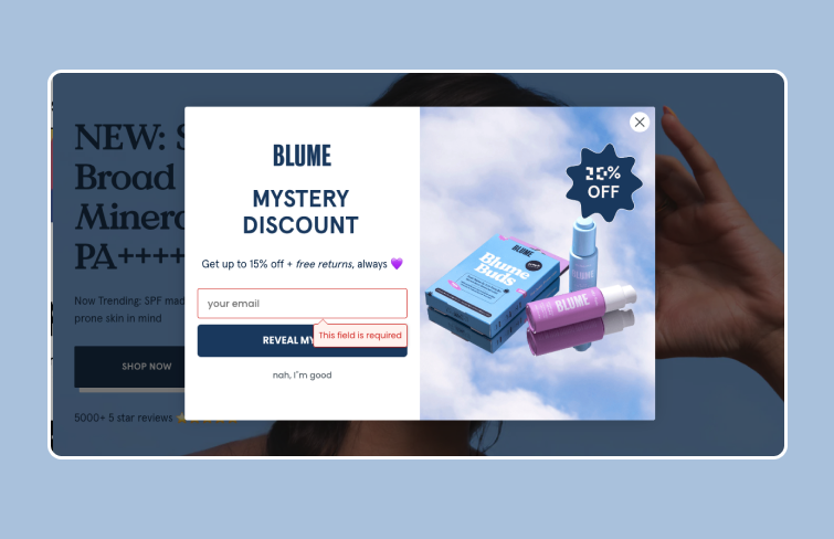
This visually stunning website popup campaign from Blume features a beautiful image with concise text set against the background. The image itself depicts a serene landscape and an appealing product, enhancing the overall allure of the offer. Moreover, there is only a single, quick form field to complete to receive a discount!
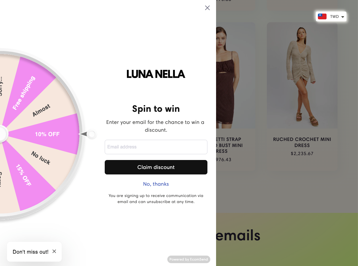
Luna Nella's "Spin to Win" popup is an engaging and effective tool for boosting email list growth. This interactive popup entices visitors by offering the chance to win discounts, free shipping, and other incentives. By entering their email addresses, users get a chance to spin for a prize, adding an element of fun and excitement to the shopping experience.
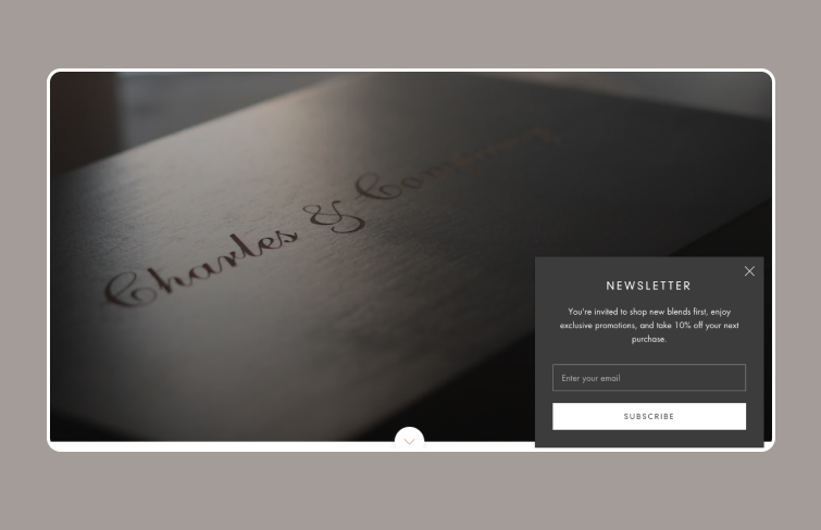
This is a sleek and fashionable website popup example from Charles & Company. Looks very cool + the window does not block the visitor from exploring the store. It also gives users 10% off their next purchase to encourage them to subscribe.
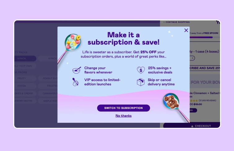
This pop-up from Magic Spon is noteworthy because it triggers when a visitor adds a product to their cart. Instead of promoting a single purchase, it offers a subscription, emphasizing the benefits of the deal. This upsell campaign is interaction-based and aligns directly with the visitor's intent.
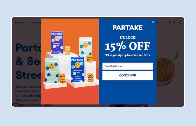
Partake Foods uses vivid and striking colors, along with large text, to align with its brand image. Instead of showcasing a single product, the accompanying image features several of their offerings.
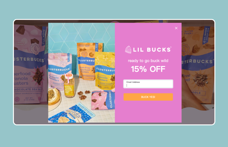
This popup from Lil Bucks remains effortlessly readable due to its clever color scheme, concise information and vibrant visual showcasing well-arranged products.
This popip from PRESS Foods comes with visua-appealing product image and standout CTA button. Serving as an exit-intent popup, this ad is triggered when a visitor attempts to leave the website. Its primary objective is to retain the visitor and encourage conversion by offering a generous bonus.
This popup stands out from the usual formats, demonstrating the brand's willingness to experiment with design. It reflects the designers' commitment to ensuring that every aspect of the site aligns with its aesthetic and provides a cohesive user experience.
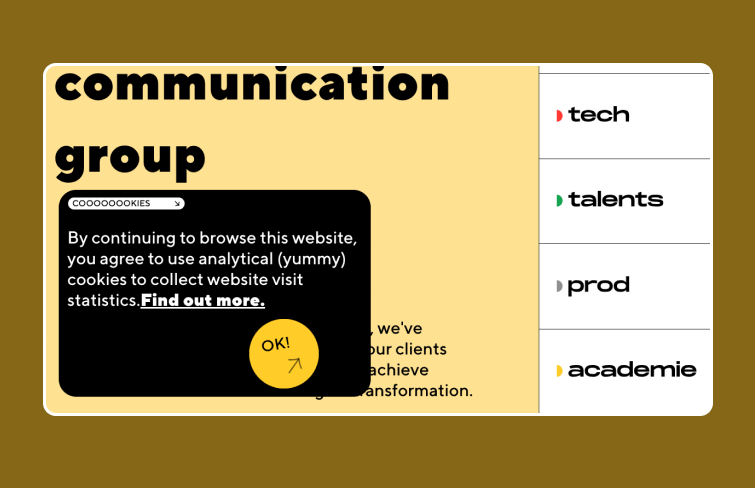
This digital communication group takes a different approach with its cookie notice. The overall design seamlessly blends with the site's vibrant and modern aesthetic. The message is bold and prominent, making it impossible to miss. It’s also easy to acknowledge and close, with a touch of humor injected by referring to the cookies as “yummy.”
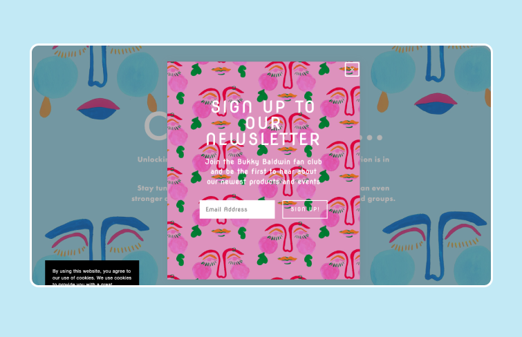
This popup is vibrant and eye-catching, inviting users to join the Bukky Baldwin fan club and stay updated on new products and events. It features a playful background with various colorful, abstract faces, align with the overall aesthetic and making it more engaging for visitors.
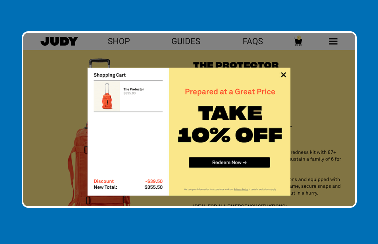
This popup activates when a user intends to exit, but only if they have items in their cart that haven't been checked out. Judy uses various popup images tailored to the specific item left behind. In the shown image, the popup displays the cart item and the discounted price, effectively encouraging users to complete their purchase before leaving.
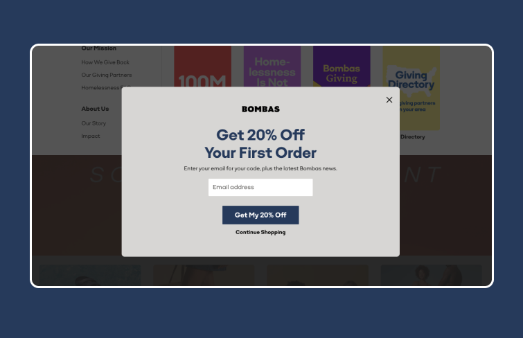
Bombas utilizes a clever two-step popup to minimize user resistance. The first step gathers an email address in return for a discount code. In the second step, it requests a phone number for SMS marketing. This approach effectively reduces friction and increases user engagement. It also gives people a "second chance" to open the popup at the bottom of the page again and easily signup for the discount if they close it when it first showed.
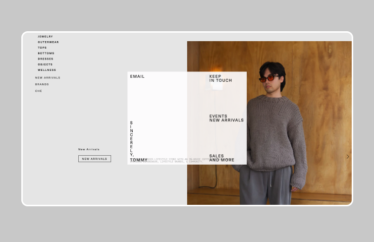
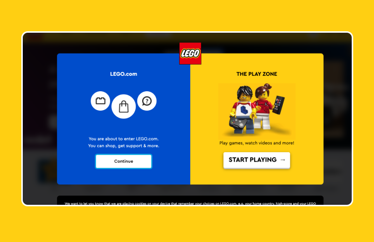
Lego greets visitors with an informative popup outlining the website's structure. It prompts you to choose your preference and seamlessly continue exploring the site, acting as a navigation tool to guide you to your desired destination. The distinct CTA buttons deliver a clear message, making the popup simple yet highly effective.
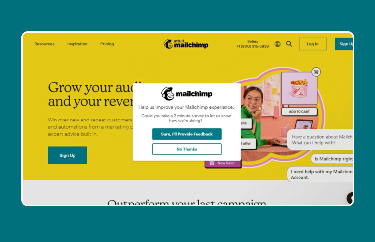
Mailchimp's popup demonstrates the effectiveness of courteous language. It invites users to take a survey and provides options with friendly call-to-action buttons. The design is minimalist, featuring only the logo and a brief message, achieving what many complex pop-ups fail to do.
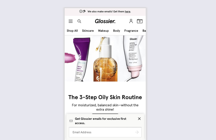
This mobile popup example from Glossier showcases a minimalist popup box that appears at the bottom of the screen. It remains fixed as users scroll through the homepage, ensuring maximum visibility. The design is unobtrusive, allowing visitors to view the full page content behind the popup while still drawing attention to the email sign-up prompt. The sleek and simple design complements Glossier's aesthetic, enhancing the user experience without being intrusive.
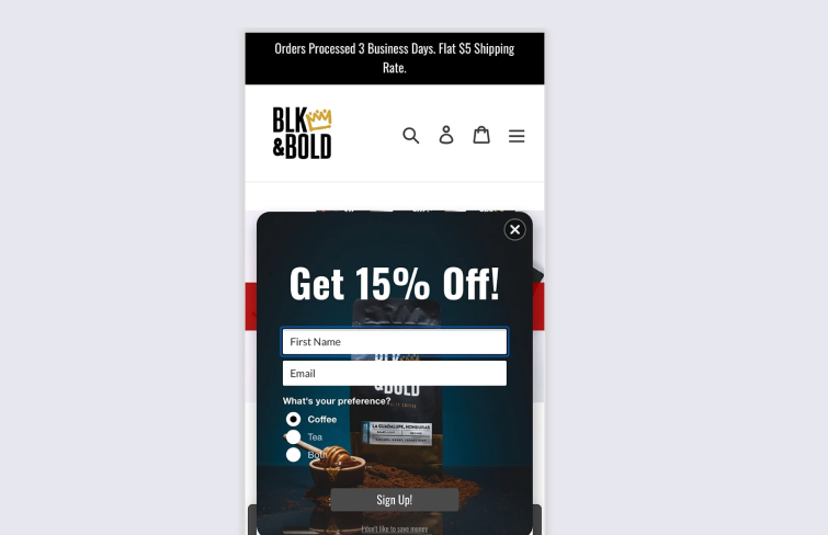
Blk & Bold employs their mobile popup not only to collect customer information but to gather insights that enhance future marketing efforts. Beyond just email addresses, they prompt visitors to specify their product preferences when signing up for a 15% offer. This data is instrumental for personalized email marketing and targeted on-site campaigns, recommending products aligned with each customer's interests.
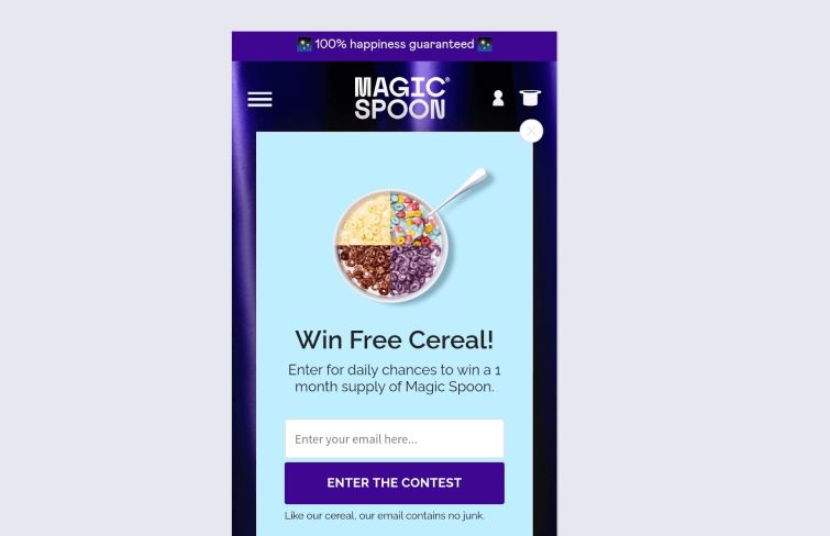
This mobile popup from Magic Spoon is eye-catching and sleek, featuring a non-intrusive image and a single field for email entry. Weighing the benefits as a user, this offer is quite appealing. The clear, enticing message encourages me to share my email to receive a free product, creating a positive and engaging user experience. The layout is user-friendly and effectively balances aesthetics with functionality, making the proposal hard to resist.
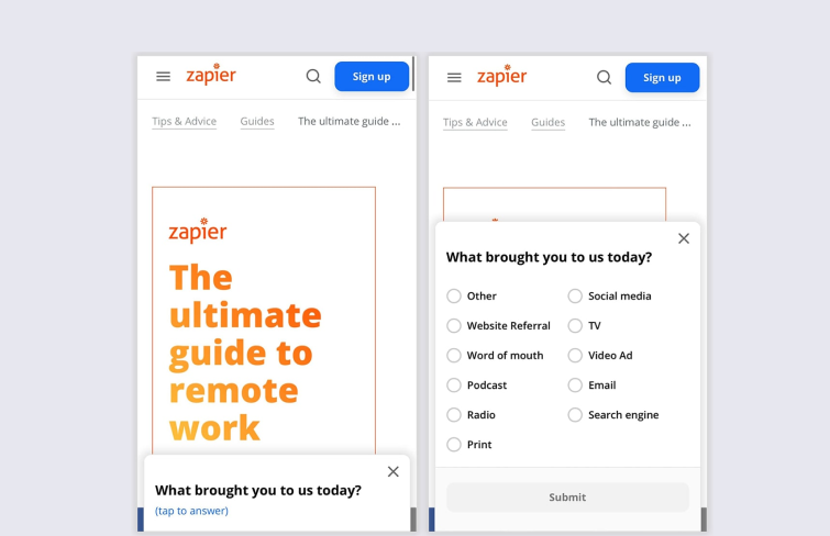
Zapier showcases an excellent approach for B2B brands looking to gather valuable insights through mobile popups. Instead of requesting email addresses or phone numbers, this popup asks visitors how they found the page, providing crucial data for marketers. The popup employs a two-step system: it initially appears unobtrusively at the bottom of the screen and expands to its full form when clicked, ensuring a smooth and user-friendly interaction.
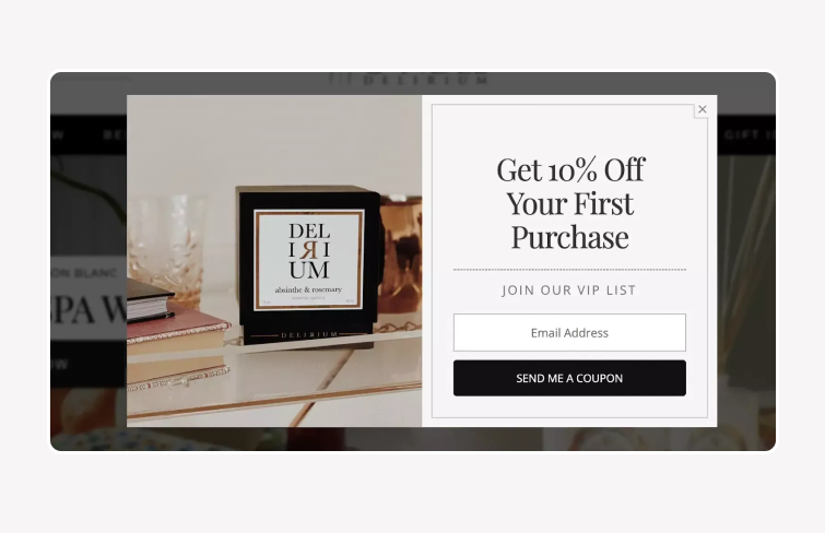
The design of this welcoming popup straightforward yet appealing. It features a clean layout with an attractive product image from Candle Delirium, consistent branding, and a concise message. This particular welcome popup entices new visitors with an exclusive coupon code, making it an excellent strategy to engage and convert first-time users. Additionally, these unique codes enable precise tracking of the campaign's success.
Creating an effective popup involves understanding your goals and audience, choosing the right type, crafting compelling content, and designing with the right tools. Here’s a step-by-step guide on how to create a popup:
1.Define Your Goal: Determine what you want to achieve with your popup. This could be increasing newsletter sign-ups, promoting a special offer, gathering user feedback, or driving traffic to a specific page.
2.Identify Your Target Audience: Understand who your audience is and what will appeal to them. Tailor your popup content and design to their preferences and behaviors.
3.Choose the Right Type of Popup: Decide on the format of your popup. Options include modal popups, slide-ins, fullscreen overlays, and exit-intent popups, among others. The type should align with your goal and audience.
4.Create Compelling Content: Write clear, concise, and compelling copy for your popup. Include a strong call-to-action (CTA) that tells users exactly what you want them to do
5.Design the Layout and Visuals: Focus on a clean, visually appealing design that aligns with your overall brand aesthetics and ensure that the popup is easy to interact with and does not overwhelm the user. To design an engaging and effective popup, tools like Mockplus RP can streamline the process. Mockplus RP simplifies this process with its intuitive design features and collaborative capabilities, making it an ideal choice for creating engaging and interactive popups. It offers a variety of pre-made templates and UI kits to speed up the design process. Besides, with its robust interaction features, you can create a real user experience and test out your popup in real devices without writing any code.
Check out how easy it is to create a popup in Mockplus RP>>>
Overall, when designed and executed well, popups can be a valuable asset to your web or app design strategy. This guide aims to provide you with a better understanding of popups, their importance in web or app design, and fuel your inspiration. Hopefully, inspired by the examples outlined, you can create popups that enhance user experience and achieve your business goals.
 Mockplus RP
A free prototyping tool to create wireframes or interactive prototypes in minutes.
 Mockplus DT
A free UI design tool to design, animate, collaborate and handoff right in the browser.


 Sign up with Google