To increase the conversation rate and get more sales online, an intuitive and effective pricing page is essential for your website/app.
What does a successful pricing page look like? How can you design a perfect price page for your online business?
In this article, we will introduce 40 of the best pricing page design examples and templates to inspire you, and learn how to create an effective price page for your website/app.
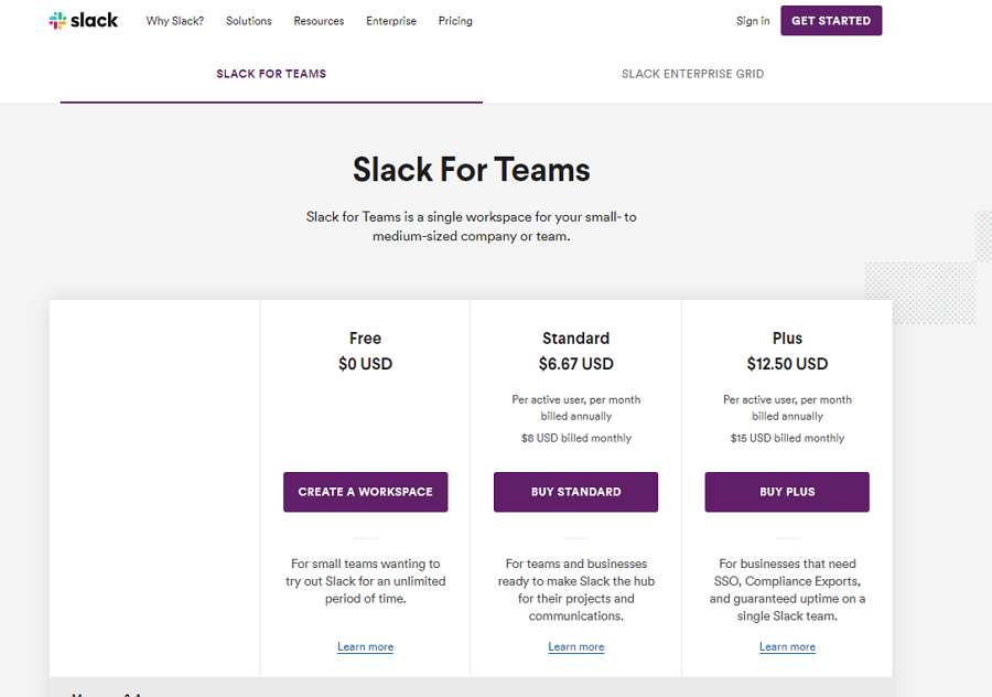
Highlights: Two tabs
Slack is a well-known online workplace for teams to communicate and work together in real-time.
The pricing page of Slack has two tabs for companies and teams, with different scales. Comparing services can be done at a glance.
Each tab has its own style and layout, decreasing the possibility of confusing users. The intuitive feature tables make it easy for users to scan and find the desired features quickly.
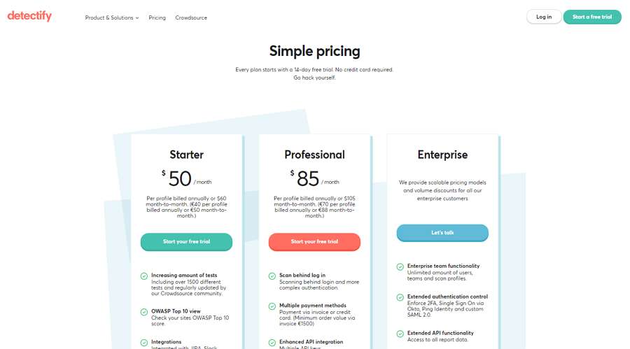
Highlights: Clean layouts; helpful FAQ
Detectify is a smart website vulnerability scanner that allows you to identify potential security issues on your website easily.
Its pricing page has clean and intuitive layouts. The design makes use of a simple subtitle at the top to tell users that a 14-day free trial without credit card required is available. This design encourages users to give it a try.
Apart from the usual prices, buttons, and intuitive feature lists, this pricing page is followed with a helpful FAQ section to provide users with quick answers. This makes everything clear to users and enables them to make a decision quickly.
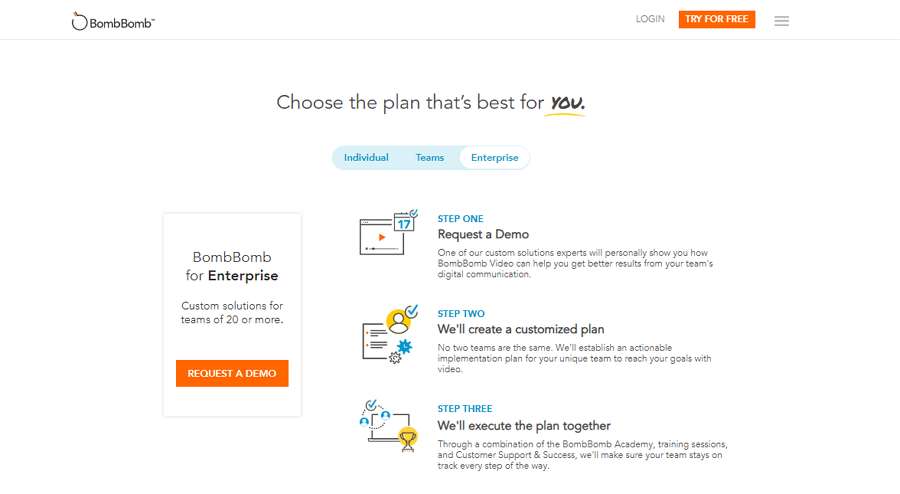
Highlights: Three tabs; a simple step-by-step guide for Enterprise plan
BombBomb is a video communication solution that allows users to communicate face-to-face through simple video emails.
Its pricing page is divided into three tabs based on different team sizes, including the “Individual”, “Teams”, and “Enterprise” tabs.
Every tab has a “most popular” payment plan and detailed feature lists, helping users choose a plan according to their own needs quickly.
Moreover, since the Enterprise plan is completely different and customizable, there are simple steps to guide users. This is a really good UX move to encourage users to place an order.
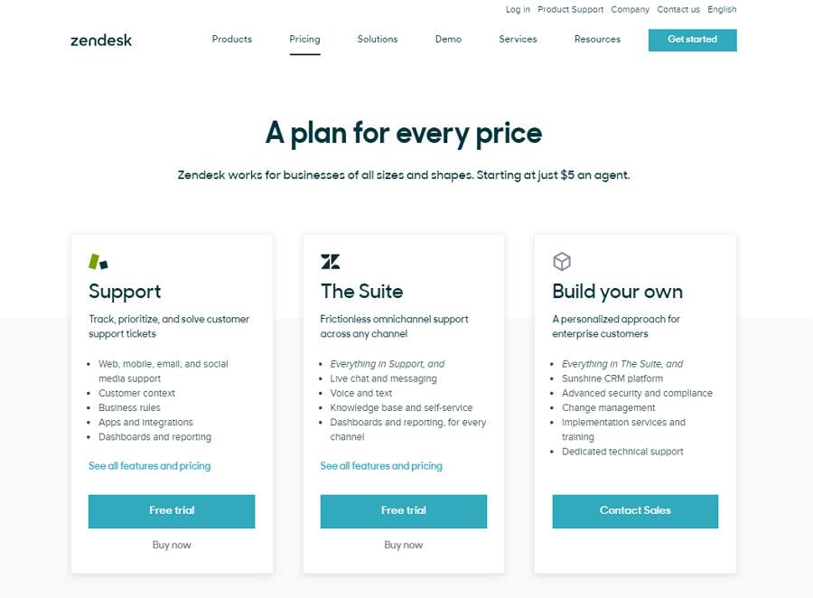
Highlights: Intuitive card designs
Zendesk is a call center tool that allows users to seamlessly integrate with an API connection to their helpdesks.
Its pricing page features intuitive and informative card designs.
The design highlights their cheap price (“Starting at just $5 an agent”) in the subtitle, encouraging users to go on reading.
A full set of intuitive card designs are then used to introduce all payment plans and other products in detail clearly, making it really easy for users to make a choice.
Highlights: Personalized illustrations; discount label; testimonials
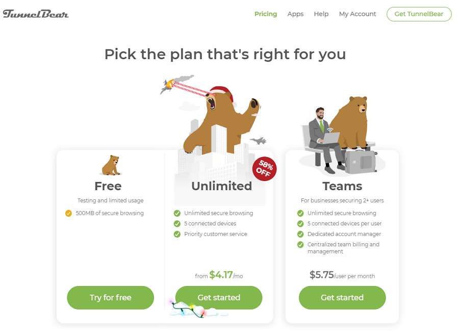
TunnelBear is a simple VPN solution for users to browse the web privately and securely.
Its pricing page is clean, informative, and attractive. Apart from intuitive price card designs, it features interesting illustrations. These illustrations help engage users and personalize the entire page and the brand successfully.
The eye-catching discount label also encourages users to choose the “Unlimited” plan.
A testimonial from the New York Times builds trust, increasing the chances of conversion.
Highlights: Double tab navigation bar; sidebar to switch price unit
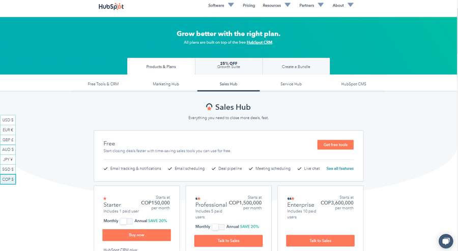
HubSpot is a customer relationship management (CRM) software that offers a full platform of marketing, sales, customer services, and more.
Since HubSpot offers various services, to make it easy to calculate fees, the design features a double tab navigation bar to guide users.
To start, users can decide on a macro payment plan, such as “Products & Plans”, “Growth Suite”, or “Create a Bundle”. And then, they can choose from different services based on their specific needs.
The left sidebar also allows them to switch between different price units, calculating their fees more accurately.
If your business offers many services, this price page is a perfect example for you to calculate different services separately.
Highlights: Special layouts; eye-catching hero image; auto fee calculation design
Ticket Leap is an online ticketing and event marketing platform. It allows users to manage and track sales data, concessions, websites, and promotions with ease.
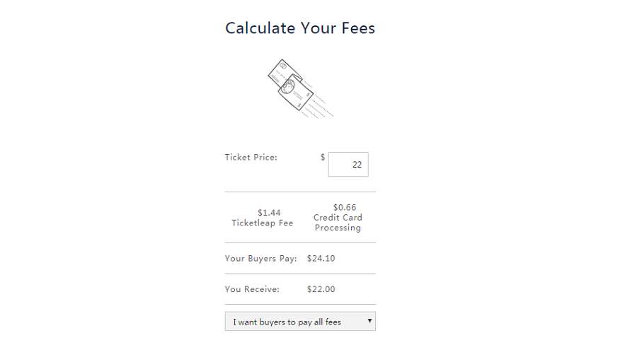
Its pricing page is informative, intuitive, and effective. It makes the complicated fee calculating process simple and easy.
Its header features a big hero image to catch users’ attention quickly. The following text - “No contracts, no fees, no worries” - works to keep users on the page.
In the next section, the designer uses a creative layout to showcase how their service fees are calculated.
To avoid any confusion, the designer also explains clearly why there are “no contracts, no fees, no worries” in detail.
Highlights: Intuitive tab navigation bar; product card design
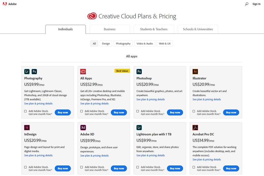
As we all know, Adobe offers a host of web and app design tools. To help users choose and pay for different tools smoothly, its pricing page is designed with an intuitive tab navigation bar and product cards. Each product card introduces the tool briefly and offers links for users to read more details.
Moreover, to help users choose and pay for several tools at a time, the pricing page also allows users to select multiple items and place an order in one go.
The top tag buttons also help users find their desired tools quickly.
Highlights: Clean layouts; eye-catching star icon
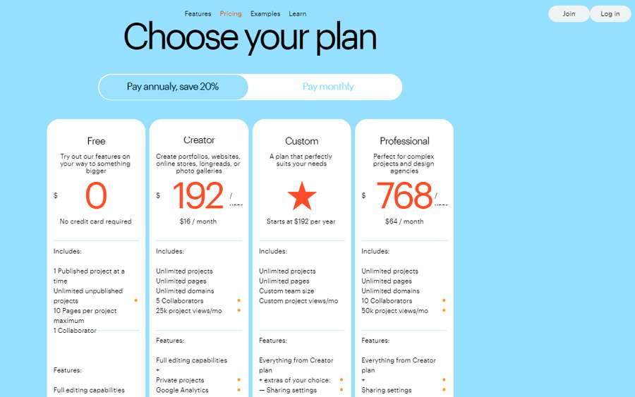
Ready Mag is a website builder that allows users to design websites without much technical knowledge.
Its pricing page has very intuitive card designs. Each card introduces the related features in a clear layout. This makes it easy for users to catch the details of different payment plans, even at a quick glance.
The big start icon also makes users focus on the “Custom” plan and get started on reading the details unconsciously.
If you are planning to highlight a payment plan on your pricing page, customizing a unique and sticky icon is a good idea.
Highlights: Toolbox image; testimonials; selection effects
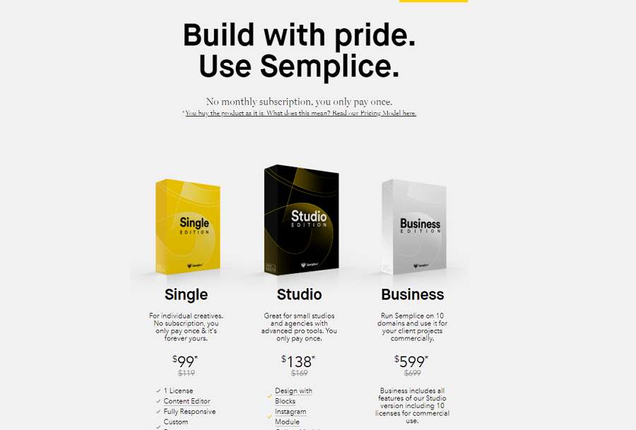
Semplice is an online website builder based on WordPress. To avoid building a boring pricing page with only numbers and texts, its pricing page is designed with toolbox images. The selection effects also allow users to easily know which plan they've chosen and paid for.
Showcased testimonials also help users know more about the products, aiding the decision-making process.
Highlights: Custom image background
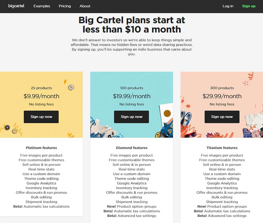
Big Cartel is an online store platform that allows artists and craft makers to create a unique store and sell their works online with convenience.
Its pricing page uses custom image backgrounds to draw visitors in. The text designs overlapped on the custom image background are simple and easy to follow. It is intuitive, effective, and attractive to artists and craft makers.
Highlights: Custom illustrations; beautiful colors
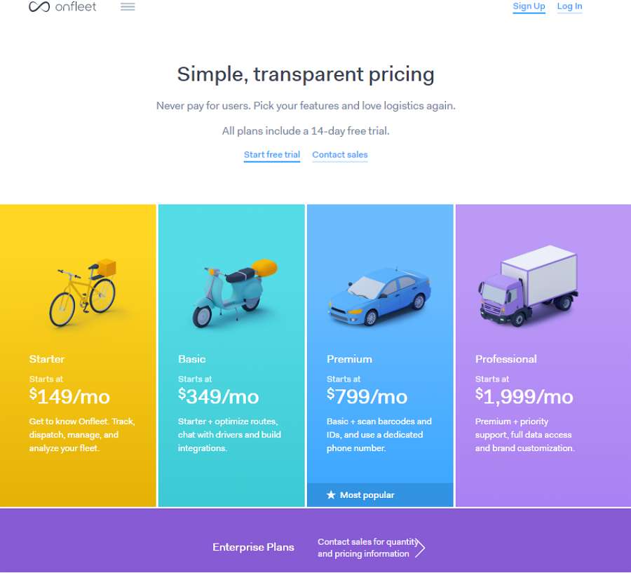
Onfleet is a delivery management software that allows you to manage deliveries efficiently.
Its pricing page features eye-catching custom illustrations. In comparison to the use of rich colors, this pricing page is beautiful, compelling, and effective.
Highlights: Logical and effective method to introduce its premium plan
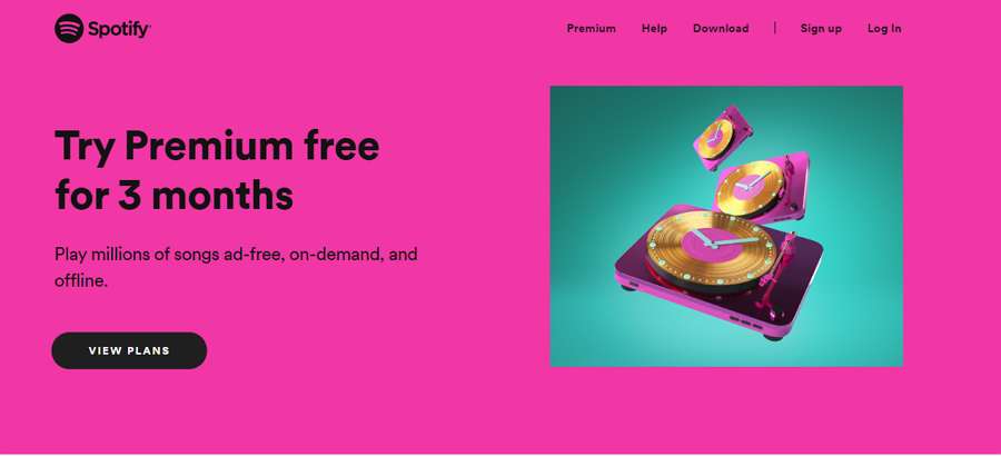
Spotify is a web-based digital music player that gives users access to millions of songs.
Unlike other pricing pages that showcase different payment plans directly, its pricing page first introduces a three-month premium free trial. And then it explains why you should pay for its premium plan. Lastly, its payment plan table is presented. The entire introduction line is reasonable and persuasive.
This way, even if you are not interested in its premium plan, you may want to give it a try. There’s nothing to lose with a 3-month free trial after all.
Highlights: Fresh illustrations and animations
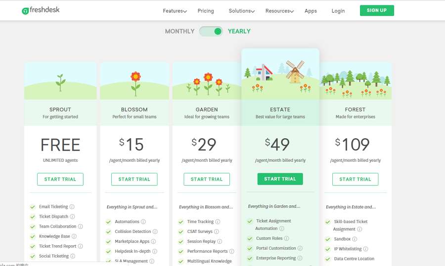
Freshdesk is cloud-based helpdesk software that helps streamline your customer conversations via emails, social media, mobile phones, etc.
Its pricing page is fresh, striking, and easy to follow. Aside from the intuitive feature lists, clear pricing, and CTA buttons, the page features fresh illustrations and animations. Thanks to these, it is very convenient for users to scroll up and down the page.
This is also a good move to avoid a boring pricing page.
Highlights: Interactive form design
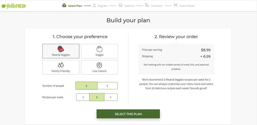
Hello Fresh offers recipe box delivery services.
To help users create a perfect payment plan, its pricing page uses an interactive form design for users to enter their information and customize their plan with ease.
We do love the process to fill the form information. It is enjoyable owing to its ease of use and aesthetic experience.
Highlights: Personalized illustrations; intuitive payment plan table
MailChimp is an email marketing provider. Its pricing page has a very persuasive header saying: "Flexible plans that grow with you".
The intuitive payment plan table allows you to view each plan in detail and choose the right one easily.
The rich illustrations and icons help personalize their brand. This is a great example of business branding.
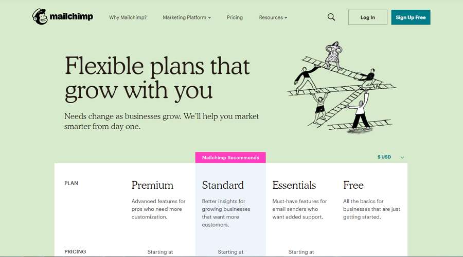
Intercom is a contextual messaging system that allows users to communicate for sales, marketing, and customer support, etc.
Its pricing page uses intuitive tab bars and price cards to showcase payment plans.
To help users choose the right plan quickly, the design makes use of texts, like “Looking for an all-in-one messaging solution?” and “Need Intercom for a specific purpose?” and then directs users to related plans.
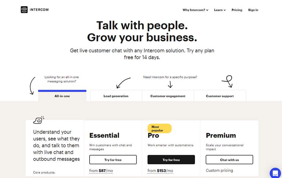
Gradient Responsive Price Tables use gradient colors to create a more beautiful and catchy price table for your online website/app.
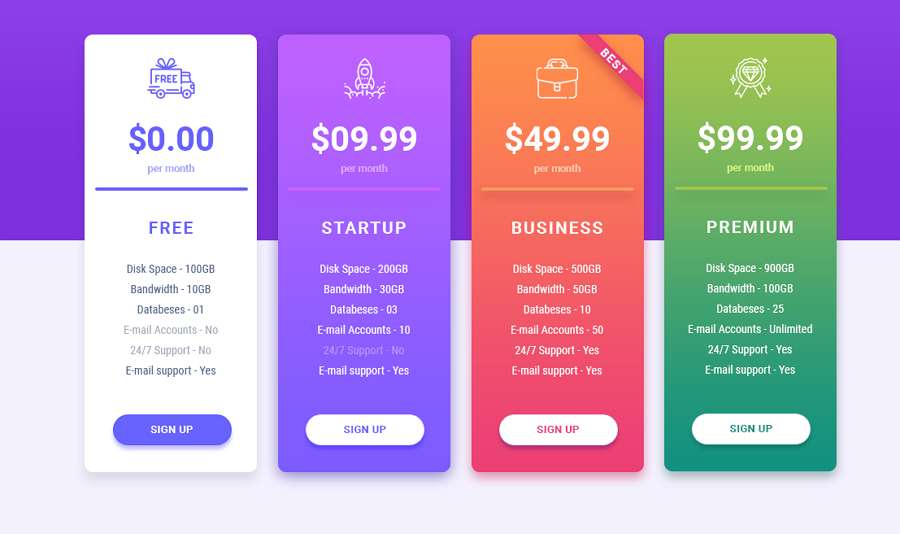
Product images are good elements to improve the visual appeal of your price table.
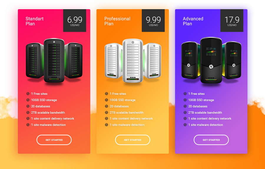
Custom illustrations and clear titles help create an intuitive and easy-to-follow price page.
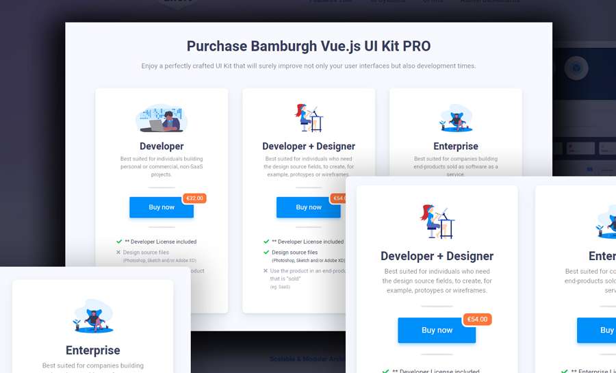
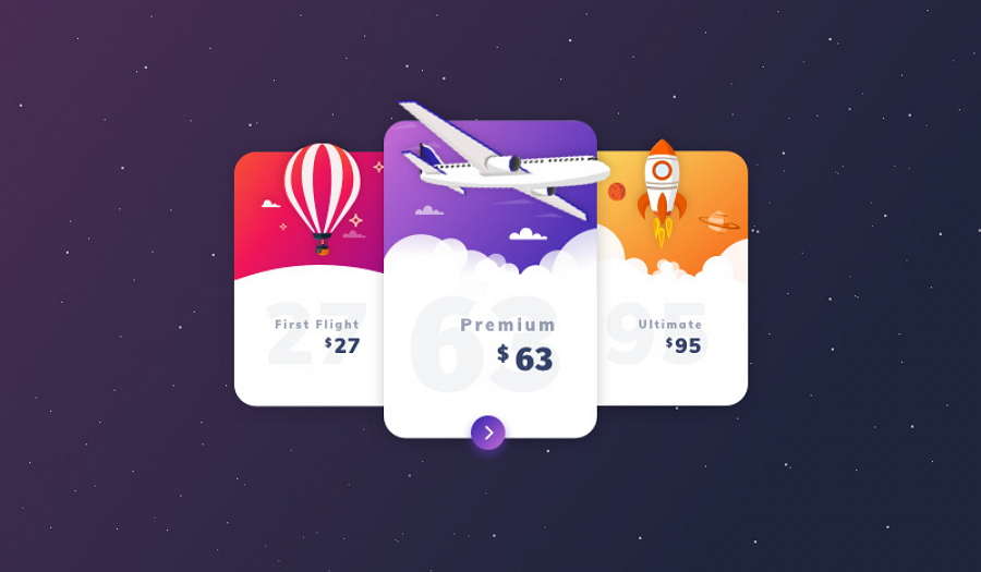
The water paint splashes help create a fresh, modern, and striking price page. You can also follow this and use even more paint brushes to improve your pricing page.
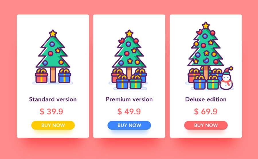
This is a good example of a special pricing page for Christmas sales.
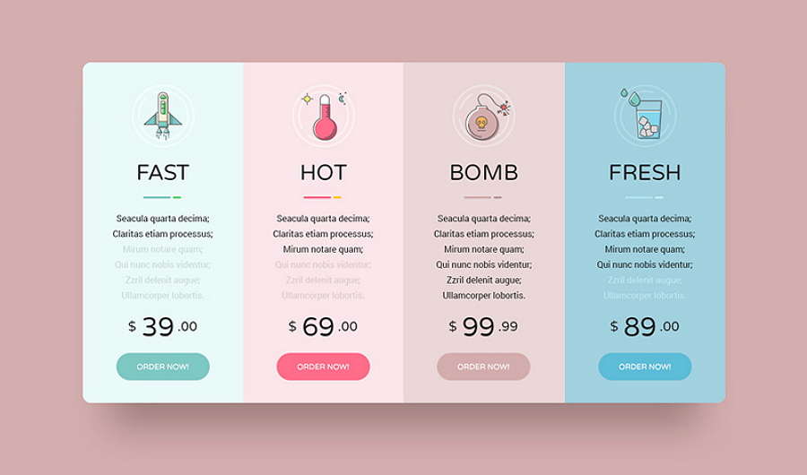
A pricing page does not have to be limited to boring texts, numbers, and buttons only. The use of funny images, icons, or copy make for a distinctive price page design.
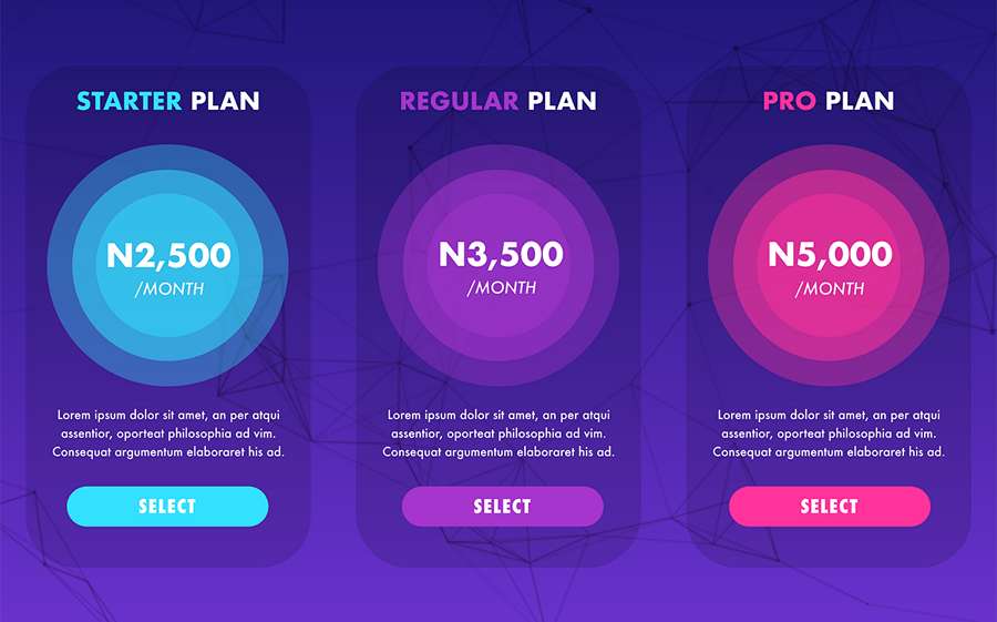
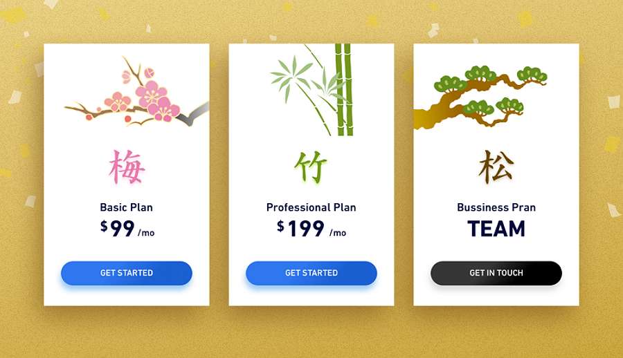
Chinese- style elements help you create a unique price page. If you’re building a Chinese-style website/app, you can’t go wrong with this as an example.
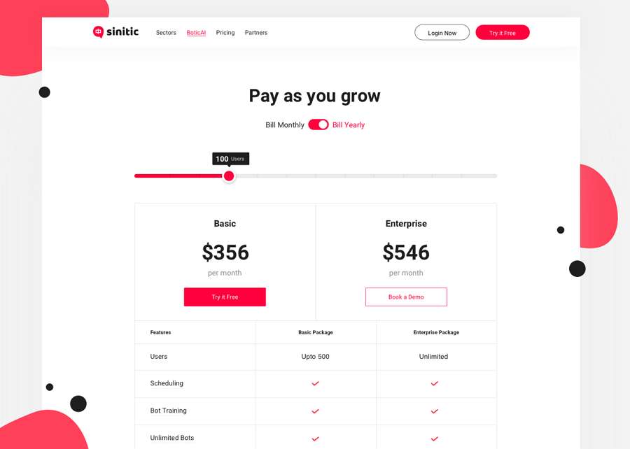
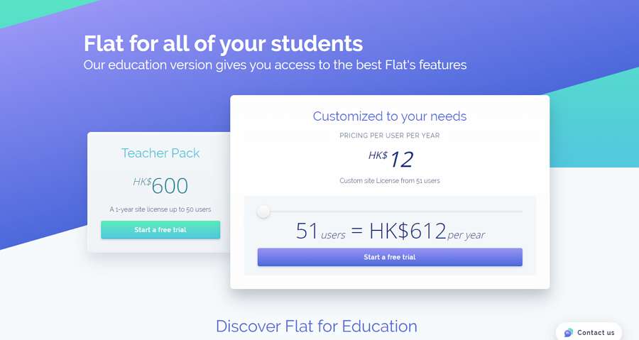
This example has a special progress bar-like price page. When users move the slider to choose the number of users, the price displayed below will change accordingly. This works perfectly for a product whose price depends on the number of users. If you are working on such a product, this pricing page is a good example for you to follow.
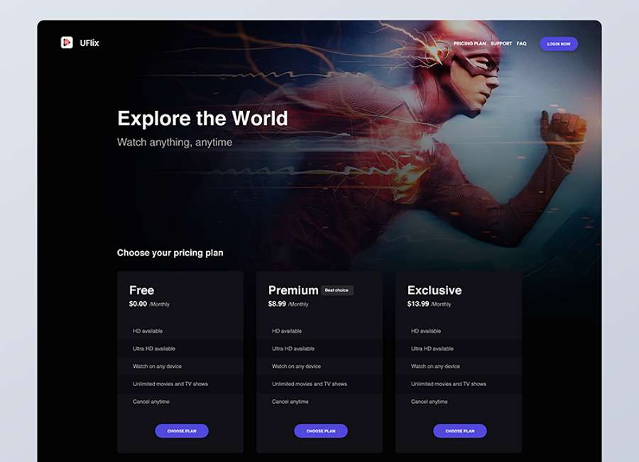
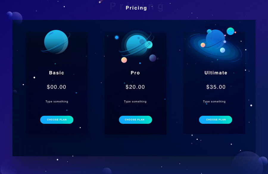
Using a trendy dark-themed price page is a good way to build a fashionable price page.
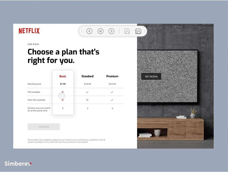
To help you build a perfect pricing page easily, we've also collected 10 of the best free pricing page design templates. They should get you started quickly.
This freebie is a clean and modern price table template. It is created with customizable layers so that you can personalize any element to suit your needs. It also works perfectly with Photoshop. You can download and use it for both personal and commercial purposes.
This freebie is a classic and clean pricing table template with flat design. You can easily customize its colors, texts, and structures to create your own price page. It is perfect for a pricing table for a hosting service.
This freebie is a modern pricing table template with a material design style. It features 10 color styles and unique hover effects. It is ideal for creating a modern and material -design pricing page for your business.
This freebie is a concept pricing page created for a password and credit card generator service. It works perfectly with Adobe XD. You can download and use it for personal projects.
This freebie is a beautiful pricing page template with illustrations and color gradients. It is built in Adobe XD and is about 400KB. You can download to create a distinctive pricing page of your own.
This freebie is a clean pricing page template available in PSD and AI formats. It is created with easy-to-follow texts and fresh illustrations. The entire template is also organized into layers so that you can freely edit it to meet your own needs.
This freebie has a very unique illustration design style. It is intuitive, easy-to-grasp, and effective for users to choose their desired plan. It is available in PSD. If you are planning to create an illustrated price page for your website/app, this is a good template to get started.
This freebie is a minimal and catchy animal pricing page for apps. It is available in AI, PS, and Sketch file formats.
This freebie is a clean pricing table template for card apps. It is designed by Stelian Firez and available in PSD. The designer also builds it with smart layers.
This freebie is a price page card design for your website/app. It is created in Sketch. You can download it to create a great pricing page for an airline or another commercial website/app.
This freebie is a pricing page table design for a music player. It works perfectly with Sketch and can be edited freely into layers.
After viewing all the best practices and templates above, do you find yourself still wanting to know more details about how to create an effective pricing page? Here are 10 of the best pricing page design tips for you:
1). Keep your copy simple and easy to follow
To help users understand every detail of your price plans and features clearly, it is essential for you to keep your page copy simple and easy to follow. Any complicated sentences or ambiguous phrases can cause confusion, which can lead to users leaving immediately.
2). Customize your layout for a clean and neat presentation
If your website/app offers many tools or services, and each tool/service should be paid separately, a pricing page with a clean and neat layout helps avoid confusion.
To customize a clean and neat layout for your pricing page, you can try several methods:
Build an intuitive navigation bar
Designing an intuitive navigation menu or bar is always the first and most important part that you should pay much attention to when building a pricing page.
If the common basic navigation bar is not enough for you to list all prices and features clearly, use a double tab navigation bar instead (such as the above HubSpot pricing page example).
After creating a clear navigation bar, the next thing you should do is to see how you can display all payment options and features intuitively. From all the examples and templates listed above, the intuitive table and card design will help you a lot.
All you need to do is allocate different tools or services to diverse card designs and then list all relevant features.
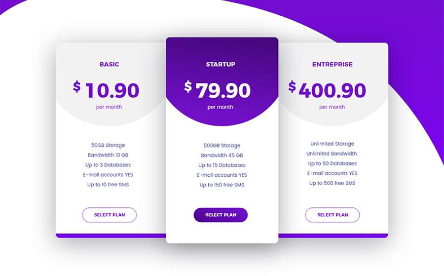
To help users know the differences between different services and payment plans quickly, the “Compare feature” part is necessary for a pricing page. To compare features clearly, do not forget to use table elements.
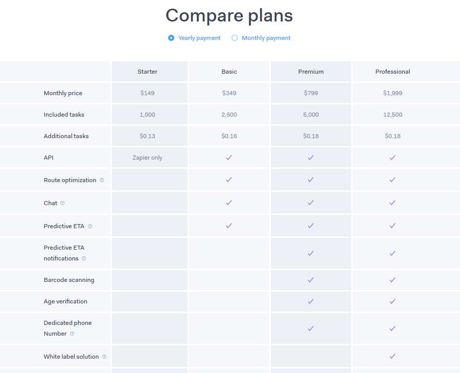
3). Highlight the recommended payment plan visually
To help users make a decision quickly, highlight the recommended payment plan visually. For example, you can add a different discount label, icon, background color, button, hover effect, etc, to emphasize the plan that you really want them to buy.
A different overlapping effect will also help you highlight the desired payment plan
You can also use a different color background to grab users’ attention
4). Add testimonials and trust icons
To gain the trust of users quickly, when designing a pricing page, it is necessary for you to add testimonials and trust icons. It is better to use testimonials from well-known companies in your industry if possible.
5). Highlight a free trial
A free trial sometimes can be an important factor to help you get real users and gain an edge over your competitors. So, also consider adding a free trial to your pricing page.
6). Add custom illustrations, animations, or backgrounds
When building your pricing page, do not forget to add custom illustrations, animations, and backgrounds to attract and engage users.
7). Never forget the CTA buttons
On the pricing page, users need to click a CTA button to read more details or place an order. So, when designing a pricing page, do not forget to add a CTA button and make it visible for every buyer.
You should also pay close attention to the microcopy design of the buttons to avoid confusion.
8). Add a FAQ
Apart from using plain and direct language, you can also add an FAQ section to provide users with all the necessary information. Do user research and list the most common questions you find.
9). Leave contact information
In case users have any questions or concerns about your products, you should give your contact information. Provide an email address, a phone number, and social media accounts. If possible, offer live chats.
10). Keep testing your pricing page
Any mistake or problem in the pricing page can lead to losing customers and lower sales. So, you should keep testing your pricing page regularly. Simply click the CTA buttons and links, and go through the entire purchasing process to make sure everything goes well.
Wrap Up
There you have it - 40 of the best and latest pricing page design examples, templates, and tips. We hope you’ll find them a source of inspiration as you create your own pricing page.
 Mockplus RP
A free prototyping tool to create wireframes or interactive prototypes in minutes.
 Mockplus DT
A free UI design tool to design, animate, collaborate and handoff right in the browser.
