To create excellent user interface when prototyping, we designers usually have to choose appropriate interaction frameworks. Let's take iOS as an example and see the pros and cons of typical UI interaction frameworks of it.
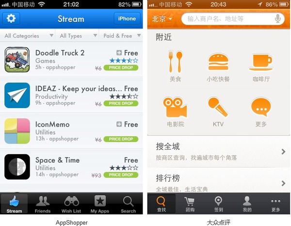
Tab Menu

As one of the great alternatives to the hamburger menu, tab menu has pros and cons as follows:
Pros:
1.It makes it easy to find the current location of entry.
2.It allows designer to jump frequently among all entries without losing direction.
3.It shows directly the contents of the most important entry.
Cons:
When there are too many function entries, it is seemingly cumbersome and unpractical.
Springboard
It's great to use springboard while designing a portfolio, and it has both advantages and disadvantages:
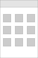
Pros:
1.It displays all entries explicitly.
2.It makes the locations of all entries easy to remember so that they can be found fleetly.
Cons:
1.Designer can’t jump among multiple entries swimmingly. Therefore, it is unfit for multitask operation.
2.It maybe inclined to form a deeper path.
3.It can’t display the contents of entries.
4.It can’t display sufficient secondary contents of entries.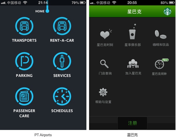
List Menu
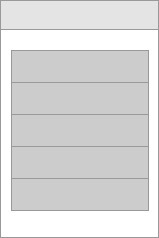
Pros:
1.It is clearly layered.
2.It can display a long headline.
3.It can display the secondary contents of the headline.
Cons:
1.There being too many contents on the same level, users tend to feel tired when browsing.
2.Its layout has a low flexibility.
3.It distinguishes the degree of importance of all entries only by order and color.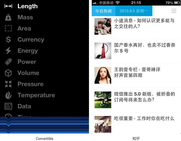
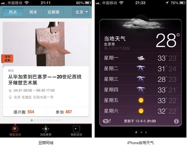
Carousel
As one of the most popular UX design trends in the past year, Carousel has the following Pros and Cons:

Pros:
1.Its single pages have a strong sense of integrity in content.
2.Its linearizing browse mode brings a sense of fluency and direction.
Cons:
1.It’s unsuited to display too many pages.
2.It doesn’t allow designer to view distant pages leapingly so that designer has to look over neighboring pages in sequence.
3.On account of resemblance among pages in content and structure, some contents of pages may be ignored.
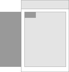
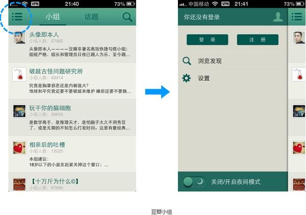
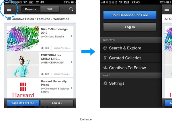
Drawer
Pros:
1.It’s compatible with a variety of patterns.
2.It has a sound expansibility.
Cons:
1.It may hide other entries of the frame.
2.It asks for a high affordance of entries’ interaction.
3.It has a strict requirement on layout.
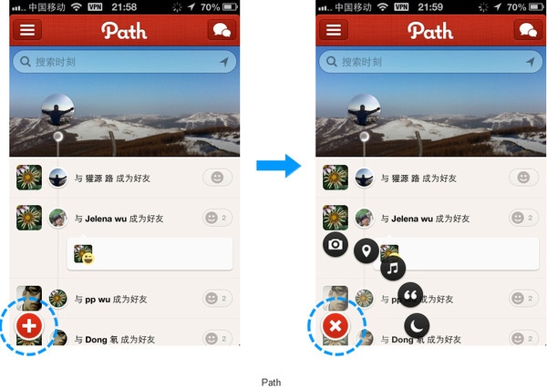
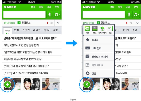
Plus

Pros:
1.It is flexible.
2.It has a interesting way of display.
3.It can widen interface.
Cons:
1.It may hide other entries of the frame.
2. It asks for a high affordance of entries’ interaction.
Gallery
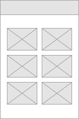
Pros:
1.It can display all contents intuitively.
2.It makes it convenient to browse contents which are updated frequently.
Cons:
1.It is not suitable to display the frame of top-level entry.
2.So many contents may be created that interface looks tanglesome.
3.It may lead to a stiff design style.
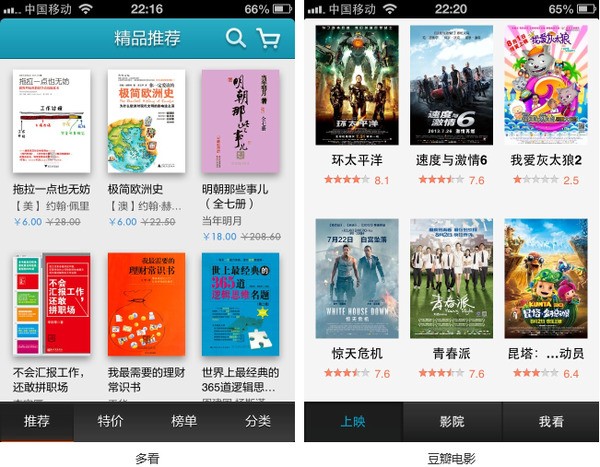
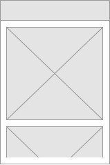
Waterfall
Pros:
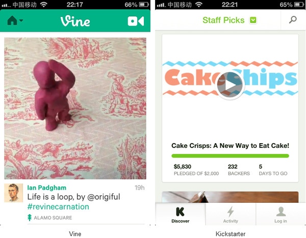
It is good for smooth browsing.
Cons:
1. It lacks a sense of volume of the entire contents so that disorientation of spatial position can occur.
2. Users may get tired after browsing it.
 Mockplus RP
A free prototyping tool to create wireframes or interactive prototypes in minutes.
 Mockplus DT
A free UI design tool to design, animate, collaborate and handoff right in the browser.
