Nowadays, 92% of customers read online reviews before making a purchase. 72% of them say positive testimonials and reviews increase their trust in a completely new product or service. And that makes a testimonial section or page one of the most important parts for an online website or business to quickly gain trust from visitors and persuade them to buy something from a new brand.
Today, to help you create the most convincing testimonial section or page for your website, we've compiled this simple guide to get you started. We'll learn what a testimonial is, why you need a testimonial page, what best practices you should follow and then check 20 of the best examples and templates for your inspirations.
Whether you are designing the testimonial page for the first time or not, you should always prototype and test your ideas in advance to create a better user experience.
Table of Content
What is a testimonial in UI/UX design
Why do you need a testimonial section or page
How to create a convincing testimonial section or page
20 best testimonial page examples & templates
A testimonial is an honest endorsement or review from a customer describing how a product or service met their expectations or resolved their problems. Effective testimonials are about creating trust with new customers, this social proof can help new visitors to quickly make a purchase when they haven’t previously heard about your brand or product.
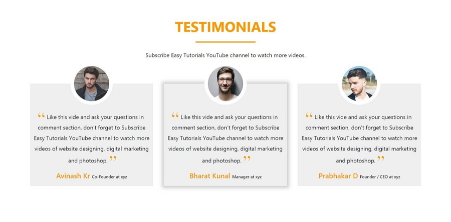
Many web designers and companies use a whole section of the home page or an entire web page to share persuasive testimonials to attain visitors, hoping to generate more sales.
When designing the testimonial page or section of your website, you can use the following testimonial types:
Quote testimonials - As the name suggests, quote testimonials are short and positive quotes or messages written by real customers, sharing their experiences and benefits that they've got from your product or service. This type is the most widely used and can be seen on nearly all commercial websites. These are easy to show off due to their short but direct nature.
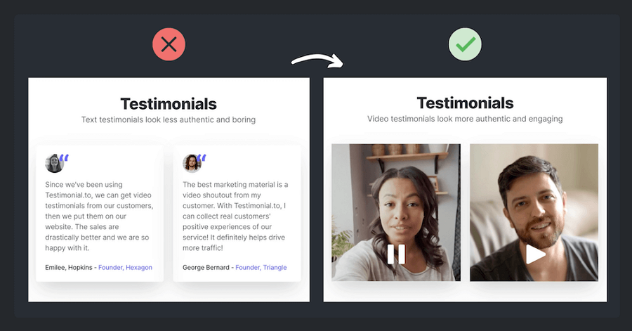
Audio & video testimonials - Audio and video testimonials are another popular way to tell customer stories through vivid audio and video messages. Unlike quote testimonials that tell everything with emotionless words and tones, these types of testimonials work just like talking face-to-face, making it easier to leave a positive brand impact on visitors.
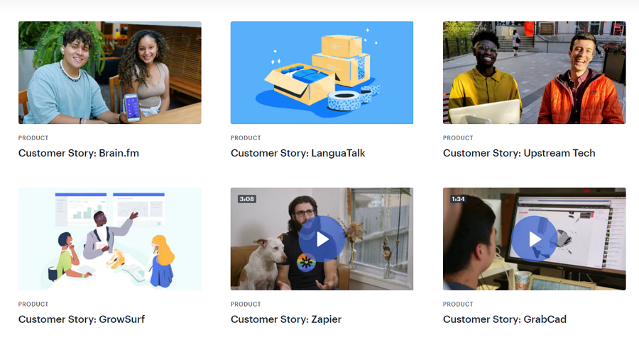
Case studies & stories - With enough page space, some web designers also directly share a whole story or case study of a highly satisfied customer to motivate their web visitors, this is often in long form and shows off in depth why a customer is happy with their product or service.
Social media & influencer testimonials - The stories of renowned or famous persons and companies make your testimonials easy and quick to trust. So, many web designers also directly cite their testimonials from social media experts, industry influencers and renowned companies to encourage potential buyers to take action.
Select the right type of testimonial according to your needs and situation, you can always mix and match to find the right balance.
When focusing on the testimonial design, you may first learn about the differences between the testimonials and reviews:
Testimonials are usually from fans or highly satisfied customers and are collected by the website owners. These are all high in praise and because they’re more personal than a review, often help convert users into real buyers.
Reviews are usually submitted by website users to share their experiences or how they feel about your product or service. And the feelings can be good or bad. The impact they can place on new users can vary. But these are usually written by customers with a rating and curated in a reviews section, for visitors to read the experience from other customers.
When designing a web testimonial page or section, keep in mind that testimonials and reviews are different, try to share the most positive reviews on your web page as more positive and obvious testimonials.
Here are the main reasons why you should include a testimonial section or page:
Most visitors check testimonials before purchasing
According to the demand gen report, 97% of online shoppers and customers cite testimonials and peer recommendations as to the most reliable type of content. Customers do check the testimonials to see whether a product or service works as it advertises before they place an order there, so it is vital for your sales.
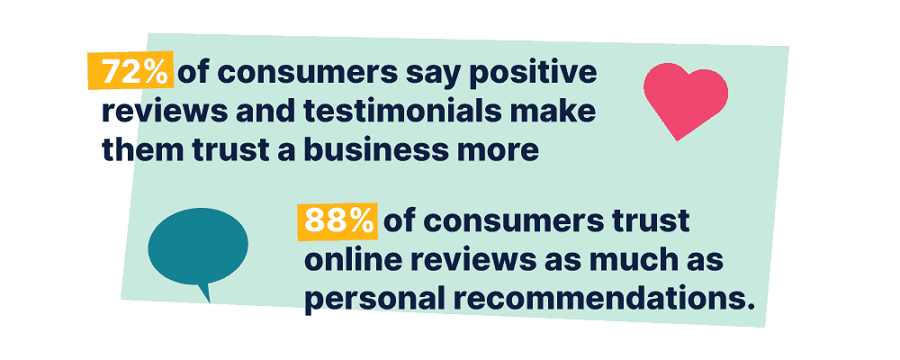
So, no matter what types of products you are trying to sell, share some testimonials on your web pages to let your customers convince the potential buyers.
Testimonials help enrich your web content
Effective testimonials go far beyond giving simple praises, they enrich your content and can be some of the most valuable content on your site. Why? First, they share previous customers' stories from a variety of industries and backgrounds, allowing potential visitors and customers to empathize and get on the same level with someone similar to them. Secondly, placing these testimonials amongst your design and other website content allows them to be market your product for you when you are telling your product or brand story.
Offer real proof to increase sales
For first-time visitors to your website, they are likely not familiar with your brand or product. As a result, they are likely not to make a purchase on their first visit. This is another reason why testimonials are important to a brand, it creates trust by allowing other customers to talk about your product, explain what it is like in the real world, giving real proof to visitors who otherwise would have no way of trusting you.
Whether you are design experts or starters, we've rounded up a list of the best practices to help you create an effective testimonial section or page:
Make your testimonial real and easy-to-read
To make your testimonials more persuasive and trustworthy to visitors, try to collect as much information as possible when communicating or interviewing your customers. Guide your interviews in a way that helps you get testimonial material.
Here is some content that you may want to include in your testimonials:
What product or service the customers have ordered
How easily and quickly it is for them to get what they want
What feature they love the most
Thoughts on customer support
Their names and photos
Plus any other you may think of
The more information you've collected, the more persuasive and real your testimonials can be. If the customers do not want to share their names and photos for privacy, you may try their initials and common avatars.
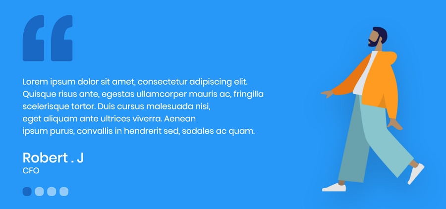
You may use illustrations or cartoon avatars when the customers do not want to share their photos.
Of course, fake testimonials are not recommended if you don't want to cause trouble.
Use high-quality photos, videos and audios
To seem real and authentic, add photos, videos and audio clips to enhance the text testimonials. To let visitors flow through your testimonials in a pleasing manner, keep them short and sweet. Follow the 8-second rule for web page design.
Pay attention to overall visual design
When designing your testimonial page, you and your team may want to not only spend time collecting the positive words from happy customers, you may also want to take time on the overall visual design of your testimonial page, such as:
the layout, defining how to clearly organize and present all testimonials
the aesthetic feeling or emotions that your testimonial page can bring at first sight
the design consistency that your testimonials should follow to build stronger brand impressions on visitors
Here is a layout example. The designer has got some good layout ideas:
One looks like this:
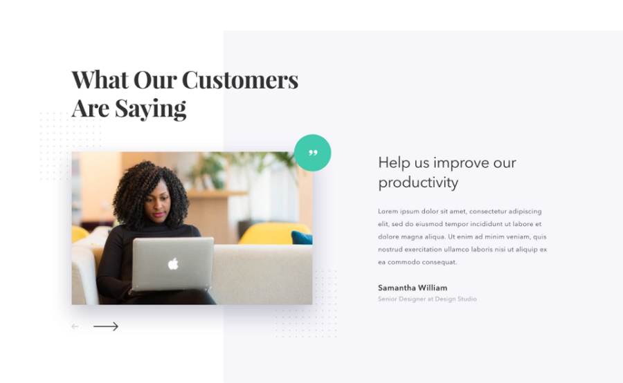
Another one is like this:
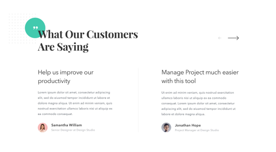
If you were the one to make the decision, which one do you like?
Include testimonials from different roles and industries
When you have multiple groups of target audiences, make sure to share testimonials from different roles and industries. This way, potential customers can always find similar experiences or troubles from their shared words and resonate with your testimonials. This increases the chance for them to quickly place an order and resolve their pain points as the customers have done in their testimonials.
More is not always better
73% of customers read six or fewer testimonials before making a decision. 12% of customers read more than 10 testimonials. So, more is not always better. If you have a whole page for testimonials, 6-10 testimonials would be great. But if you only have a small section of a web page, 3-5 testimonials are OK for visitors to take as references when they make a decision.
Visualize and test your testimonial page
No matter what ideas or inspiration you've drawn, you should always visualize your ideas with a fast, handy design tool and test them all fully to see whether they work as well as you wish.
Just make sure you've prototyped all the fine details and let the real users test them to find all possible problems in advance.
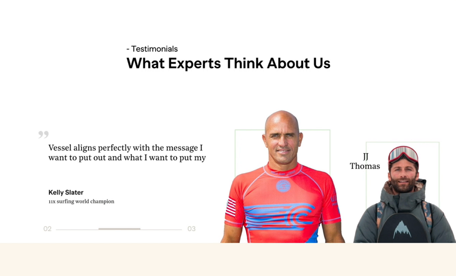
Vessel is an in-home wellness tracking software that helps users have a better and healthier life. Its testimonials are located on the bottom of the home page and have been presented with a splendid auto-playing slider. Three experts' testimonies are rotated through automatically when visitors scroll down to this testimonial section.
With the simple and easy-to-read words, trustable expert photos, clear layout, and smooth switching animations, all of these designs convey a sense of professionalism and trust.
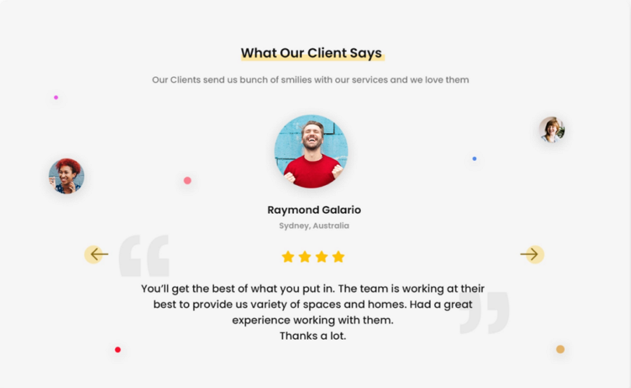
Qupta Testimonial shows you how to present all testimonials with a manually activated slider. The selected customer testimonial is centered and takes up the entire screen, so web visitors can only view one testimonial at a time. This encourages visitors to read through these testimonials one by one. The star rating stands out and helps show how happy these users are with the product, quickly establishing trust.
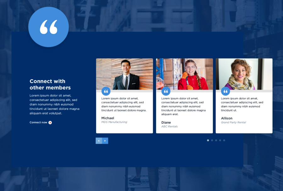
ARA has a great testimonial design section, the website utilizes a card style to showcase several testimonies at once, all with photos of the customers along with their names and company information, creating trust with new visitors. This clean and neat example is a great way of being minimal with testimonials while also including plenty of information and still being eye-catching.
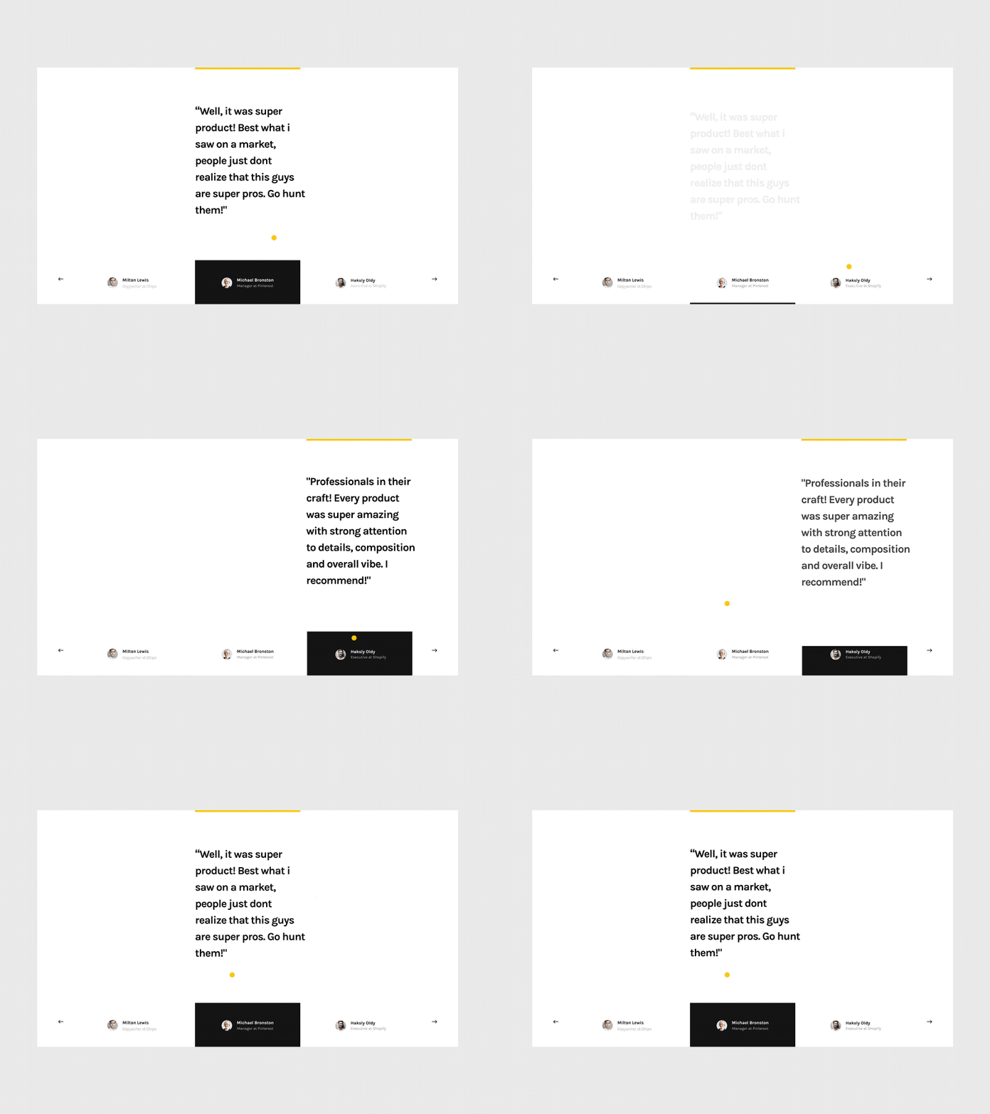
Mishin Testimonial is a testimonial design example when you don't have enough page space to showcase several testimonials at once. The whole testimonial slider is just like a navigation bar stuck to the bottom of your web page, allowing visitors to hover over any testimonial and pop up a small window to read details. This example also includes all the relevant information such as information of the customer and a photo of them while including nice animations and large text.
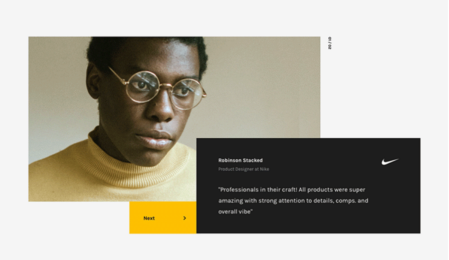
Alt: Anton Testimonial
This Anton Testimonial showcases its testimonial in a more spacious manner, putting a premium on the photo of the user giving the testimonial. This gives a very personal touch on the words in the testimony. In addition, there is a slider button overlapping the text box, giving a distinct visual hierarchy.
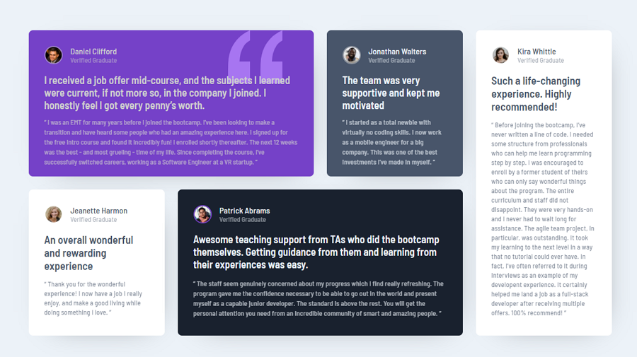
Slider elements are popular but grid layouts are also useful for placing a higher amount of testimonials on a single page. This testimonial example uses asymmetric grids, and the card colors and formats are different, creating an easy to scan and read for visitors.
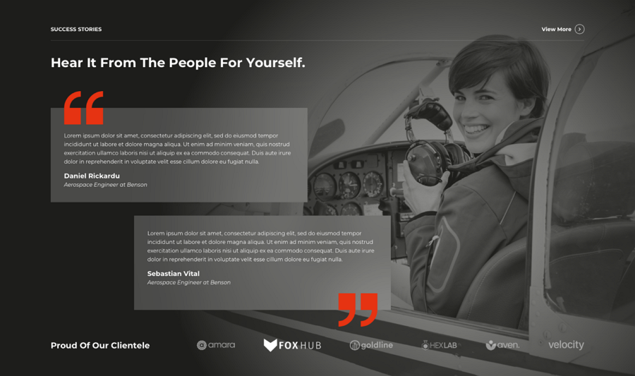
Samm Testimonials features a very natural, easy-to-read layout. The title says "Hear It From The People For Yourself" is much more inspiring and touching for visitors than the common and dry "Testimonials', while also directing users to read the testimonials. The big and warm smile on the background image also strengthens a personal touch.
So, when designing your testimonial page, make sure to personalize your titles and words, and try to make your words resonate with your background.
This is a good example of how to give a personal touch to your testimonial page, giving your brand more trust simply through thoughtful design.
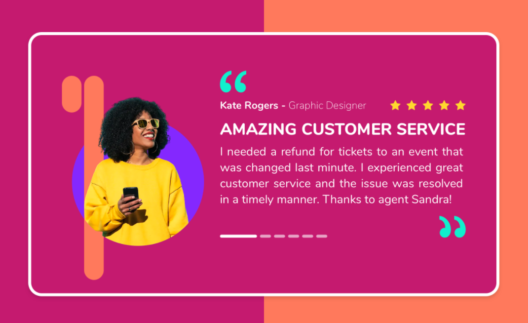
We love sharing this testimonial because of its beautiful visual designs. The vibrant colors, fashionable and personalized photos and minimal styles make it a good example for designers looking to create a colorful modern website.

The Tea Story is an organic tea brand from Singapore. Its homepage has an image gallery to showcase the most positive testimonials. The flower and plant decorations also make the entire section more attractive and help users stay on the testimonial page, reading more positive words about the brand.

Kalpana’s Testimonial page uses a good mix of videos, quotes and photos. The star rating system also makes the testimonials more persuasive. If you want to have photos, videos, quotes and star rating designs all on one page this testimonial example would be a good inspiration.
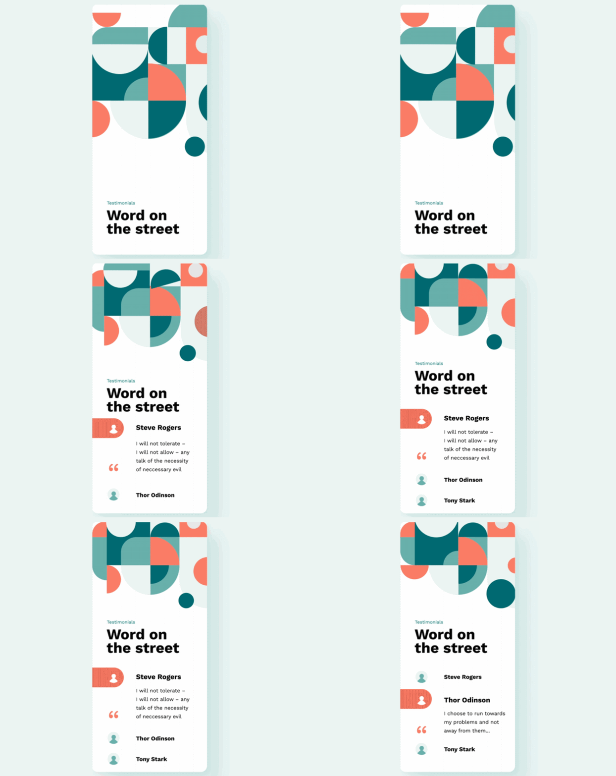
Brent's Testimonial page is located on a page with a vertical tab bar, allowing users to switch between testimonies quickly. The design is also minimal and is suited to pages with lots of white space. If this is similar to your design, this is good inspiration.
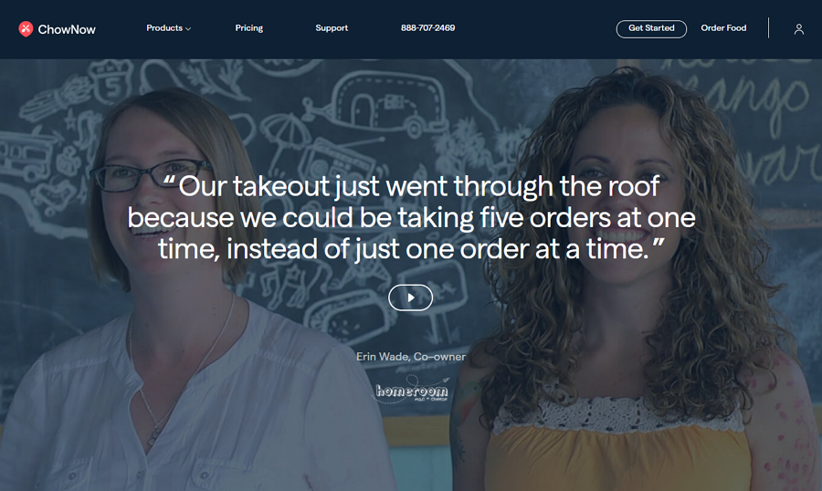
Chow Now utilizes a full-page design to share its testimonials. This is more focused on the main quotes in the center of the page with a background giving the quotes a human voice.
If the quote is enough to attain visitors, you may still click the video button to view the whole story of the customer. If the quotes are attractive to the visitor, they can click through to see a whole video by that customer. This gives the design layers and while simple, also provides effective persuasion to new visitors, whichever media type attracts them - quotes, images, or videos.
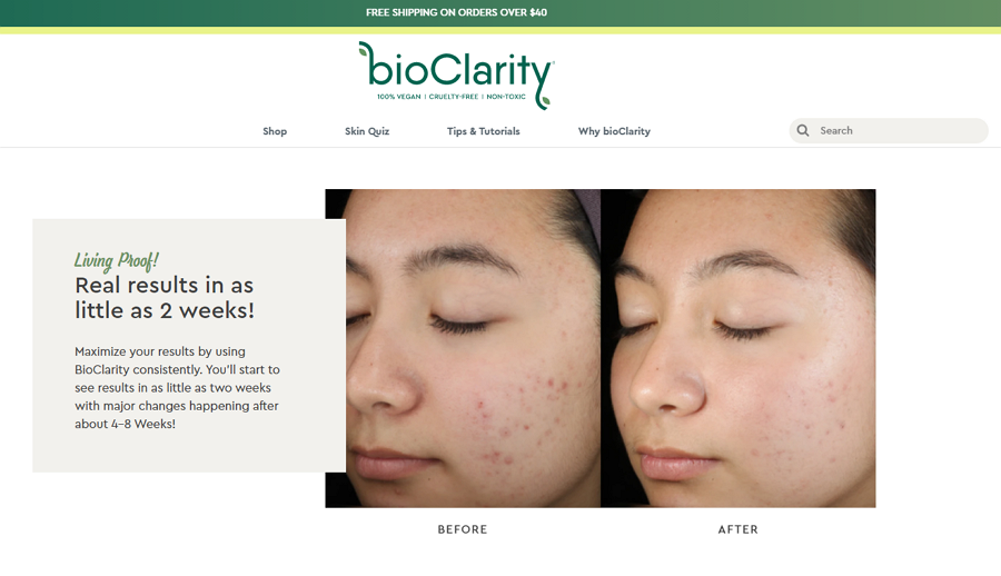
Bio Clarity is a plant-based skincare product. To attract new visitors' attention and make them trust the product quickly, this website uses contrasting photos that give fast evidence of the product working. The photo comparison between the skin states that the customers have used the product before and after make it more persuasive than regular customer quotes.
Harnessed in the right way, this photo contrast design can also be a good inspiration for your next project.
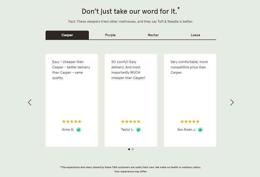
Tuft and Needle is an online shop that sells bed products. Its testimonial section incorporates a slider and a tab design together to share the testimonials of different products. You can just first select a product on the tab and click the arrow buttons of the below slider to view all customer testimonials. The quotes are large and a star rating is obvious but doesn’t detract from the quotes, and as they are product specific they can help personalize the sales pitch to potential customers.
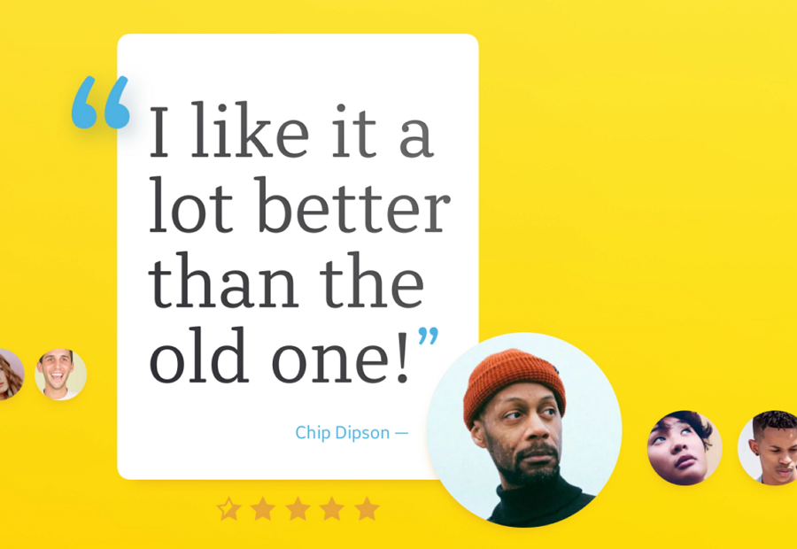
Alex Testimonial features an eye-catching speed bubble to make the quotes stand out. A nice example that uses contrasting size to highlight important content.
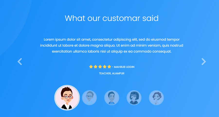
Price: $16
Applan is a modern HTML5/CSS3 app landing page template that has a cartoon-style testimonial carousel. It is fully customizable and well-organized to meet your design needs.
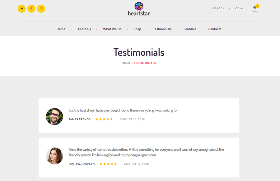
Price: $59
Heart Star is a web template made for online gift stores, party decoration parties, and other event planning shops. This template offers a full testimonial page option to create and share your own testimonials in a clear and easy-to-read format.

This testimonial template features a brilliant flip animation. When you hover over one testimonial, the testimonial card will flip to show you the text quotes from the customers. This is very interesting to spice up your web page.
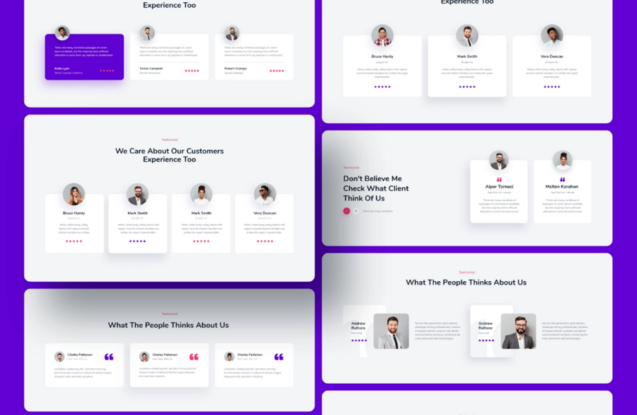
Alt: Filon Web UI Kit
Price: $49
Filon is a modern web UI kit that also has card testimonial templates. You can even choose from a series of card format options to meet your design needs.
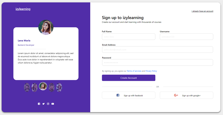
Nowadays, some designers also add testimonial carousels in the signup process to gain trust and encourage them to explore more about the product or service. This template just incorporates a testimonial carousel into the signup form. It would be a nice tool to help you create your own if you get similar design ideas.
Testimonials are often placed on a separate page or a section of your web page, helping visitors quickly know the benefits of your product or service, and convince them to make a purchase. Before you publish your website, always take time to craft an effective testimonial page and fully test them with the right prototyping tool.
 Mockplus RP
A free prototyping tool to create wireframes or interactive prototypes in minutes.
 Mockplus DT
A free UI design tool to design, animate, collaborate and handoff right in the browser.
