Good user onboarding offers practical guides to help quickly give users a good first impression of your product and gets them up and running. It is a key for quickly turning users into happy and loyal customers, thus increasing revenues.
In this guide, we'll first review what user onboarding is, explain why you should pay attention to user onboarding, and learn the best practices about how to design a good user onboarding for your project compared with real examples.
No matter what inspirations or ideas you've drawn from this guide, try to visualize and test them all with the right design tool.
User onboarding is the process in which users first interact with your web or mobile app. Users are shown quickly what they can do with their product and how to do it. Essentially, this is training the users with an interactive introduction, helping users get familiar with product features quickly.
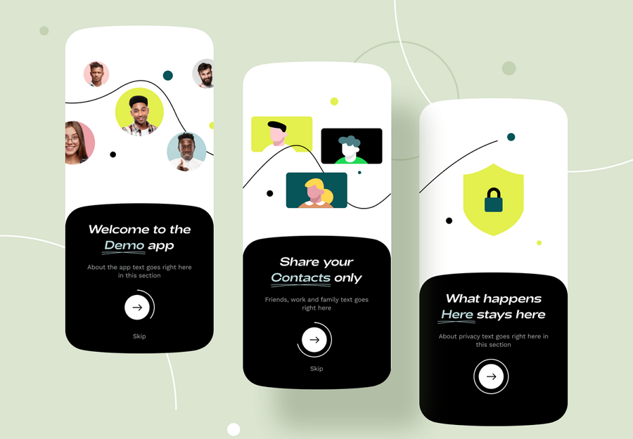
The user onboarding process often consists of several patterns:
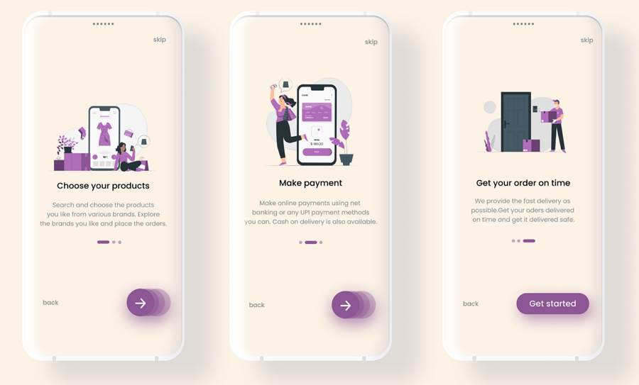
Welcome screens - Welcome screens are one of the most common onboarding patterns that designers use to onboard new users. They often consist of several eye-catching designs that engage the user in different usages of the product or service, helping users quickly interact with the product as fast as possible.
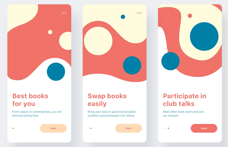
Product tour - All new users need a little guidance to use a web or mobile app when they first come to the app. To resolve that, designers often choose to craft easy-to-understand product tours, such as an interactive video, audio or slideshow, to briefly introduce the main features or information that new users may need.
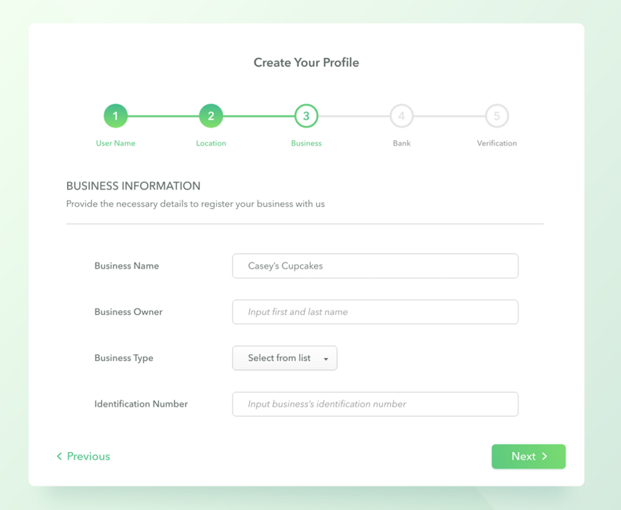
Step progress bar - To encourage users to experience and complete the main user flow of a web or mobile app, some designers also design step progress bars to guide users to complete a purchasing, ordering, registration or delivery flow step by step. Showing the users their progress helps to keep users engaged..
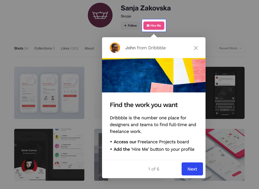
Tooltips or interactive walkthrough - When users first launch an app, popup guides or interactive walkthroughs are also used to introduce the main features and functional sections of the app, and show them how to use these features interactively.
Broadly, almost all designs will teach the users aspects on how to get the most enjoyment or value out of the app or website. This can be seen with warm welcome emails, or greeting popups and more.
User onboarding may have different patterns, but it aims to guide users to quickly get acquainted with your product. Here are the main reasons why user onboarding is so important and valuable:
First impressions matter! The onboarding process starts from the signup and gives users a good first impression with appealing visuals, simple guidance, and easy-to-understand interactions. Let's imagine, when a user sees your product for the first time and doesn’t even like the visual appeal of it, how can you expect them to purchase anything there?
Furthermore, a good first impression also helps your product stand out from competitors.
When users first come to your website or app, users may not know exactly what they gain from your product, even after reading the product page or support documents.
That's where the user onboarding process comes in. A good user onboarding design lets users familiarize themselves with your product quickly and shows them quickly where they can gain value.. This helps them evaluate whether the product or service is valuable for them or not.
User onboarding designs, like the brief video introduction or product slideshow, help users overview the main features quickly and also present how they can use these main features to achieve their goals.
User onboarding may not directly bring in sales. But a warm welcome screen, email or walkthrough can affect users' decisions when using a trial or using the product for the first time and are deciding whether or not to continue using the product. Good user onboarding can be an extra asset in selling your product.
Now you know why user onboarding is so important for your product teams, we’ve also rounded up a list of best practices and insights you can apply to your website or app:
Not all users want the same thing. To regularly turn new users into returning, loyal customers with a great onboarding process, your team needs to do user research to find the real wants and needs of your target audience.
If your target audience can split into multiple groups, research the wants and needs per group.
There are many user research methods you can use, like:
Conduct user interviews
Create user surveys or questionnaires
Embed user feedback form into your website or mobile app
Analyze competitors
Others
User-centered design is the number one principle you should follow.
Once you know the real needs of your target audience, you should then consider how to personalize your onboarding process. Of course, this does not mean you have to create a different onboarding process for each user. You can just analyze the behaviors and likes of a certain group of users and make onboarding plans for this group as well as allowing each of them to make small changes based on their own needs.
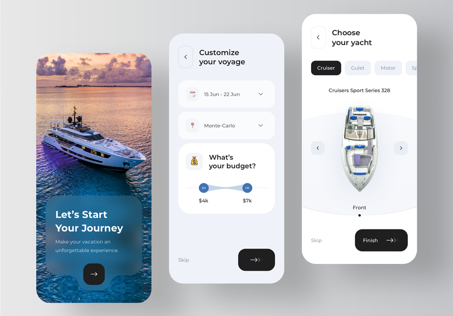
Or you may analyze the user journeys and see whether it is another good point to personalize the onboarding process.
User onboarding is meant to quickly point out the features that let users know either how to use the product or whether one product is worth purchasing or not. It is not a feature list document or page that lists out all features one by one. New users won’t stay on the website or app forever, so make it fast and useful.
To encourage more new users to make a purchase, try to present the most important and valuable features to your users in the onboarding designs. Never overload them with information.
A good user onboarding design is not only a rigid slideshow or presentation, it showcases product information vividly and helps getting new users to interact with your product quickly.
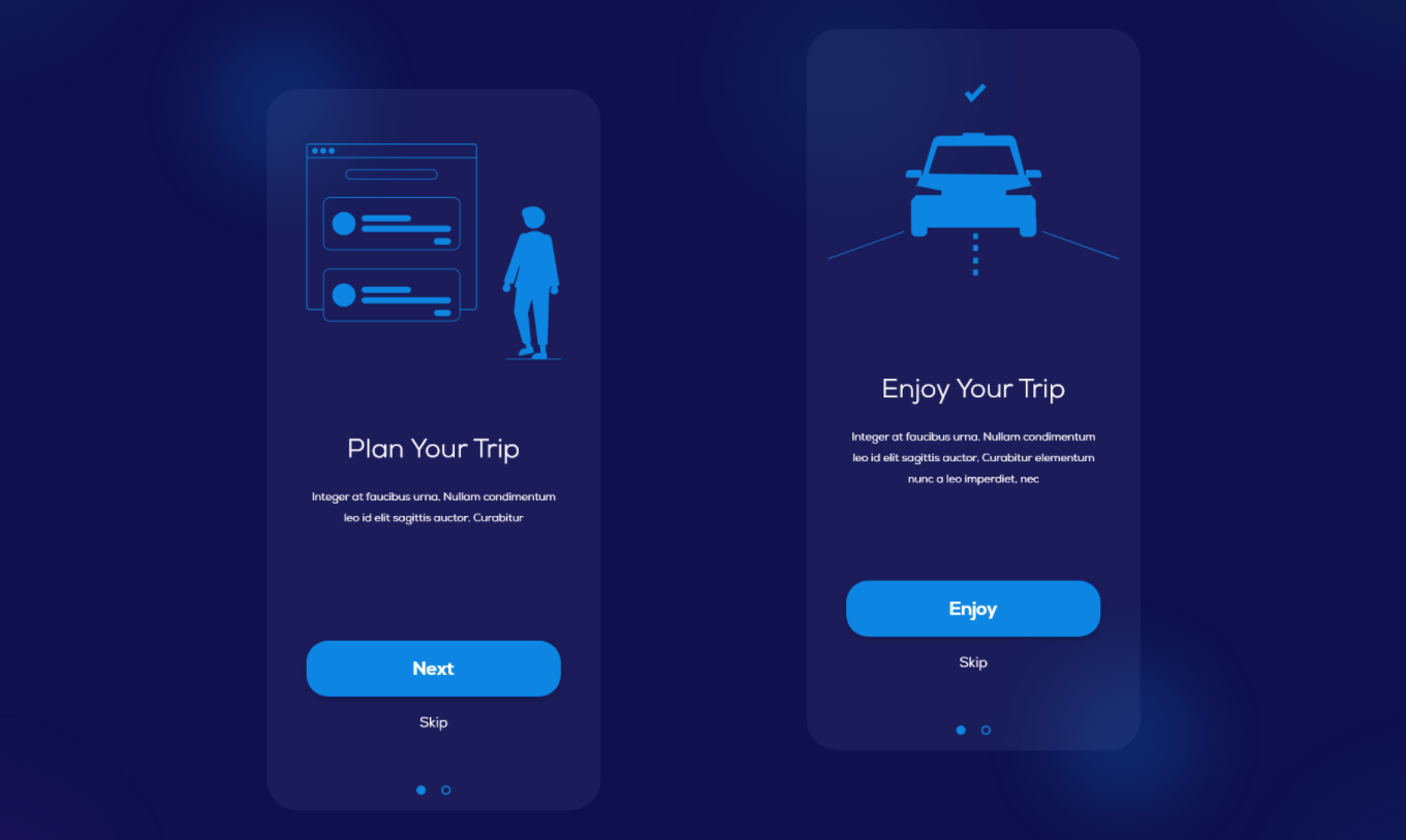
For example, when a new user finds a feature interesting and wants to find out more, they can click on a button to do so. When a user doesn’t find a feature valuable they can skip that feature. Good user onboarding enables the users interaction, allowing them to make changes and personalize the onboarding process as they like.
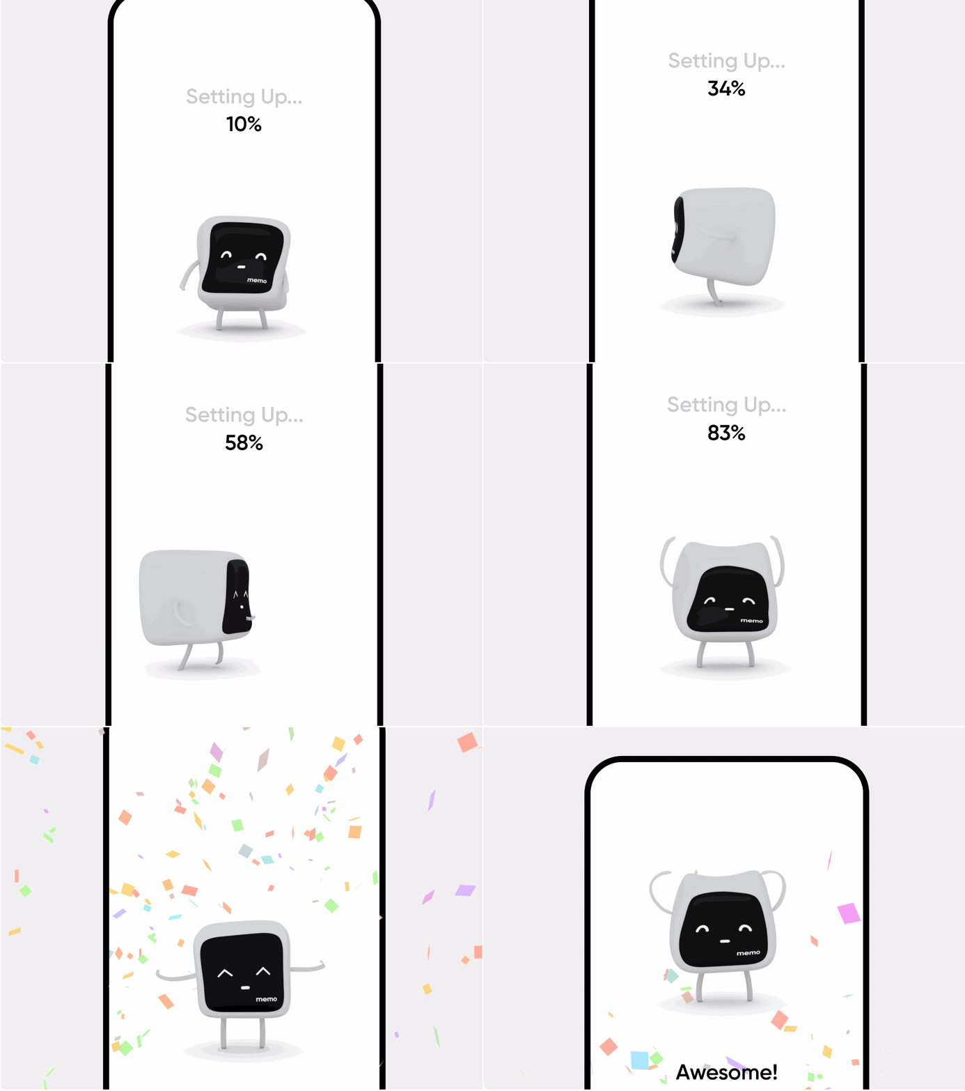
Good onboarding design often wow’s users and as a result helps retain new users. Many designers use fabulous visuals, effects and animations to immerse new users in their product.
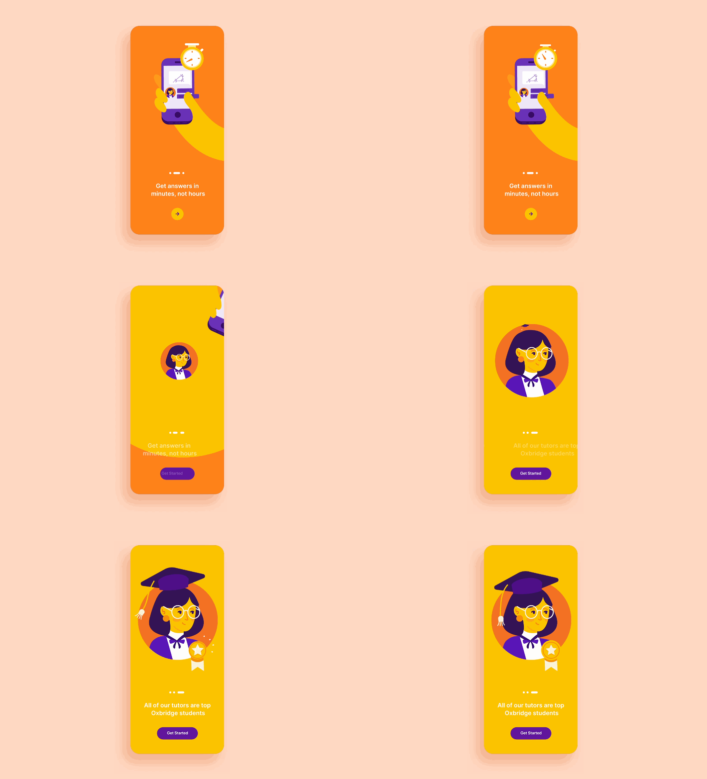
This onboarding design uses simple transitions and animations to immerse new users. The bold colors also contribute a lot to retaining new users.
For instance, when designing welcome screens, some simple and eye-catching transitions or micro-animations, or even fun gifs can help you grasp the eyes of new users at first sight. If you are designing a product walkthrough, a different font or color can stand out from the theme. A simple animation that shows users how to use a specific feature helps immerse users quickly and effectively.
These days, user onboarding starts from the moment a new user tries to sign up and use your product. To create a welcoming user experience, designers often automate their onboarding process with videos and slideshows.
For example, when creating a welcome page slideshow, designers try to make it play automatically. One of the main points here is to test the automated slideshow over again and again and find the best interval time to switch between these welcome pages.
Of course, this does not mean automated onboarding works in all projects or cases. In fact, in some cases, a manually activated onboarding process is better for users. This is dependent on your users, choose the right approach based on real user tests and feedback.
To immerse users, apart from the appealing visuals and effects, you may try to gamify your user onboarding process, making it fun and intriguing.
No one can create a successful user onboarding design in one step. Once you've completed your onboarding design draft, the next step is to visualize, test, and iterate it with your team before developing it.
A handy online design tool like Mockplus is perfect for your team to prototype all onboarding details in minutes, share with others like real users through a single link, test and iterate together on real devices.
A wide range of ready to use, built-in components, icons, and templates speed up your design process. Real users can be invited via a link, test every interactive onboarding step, and leave their feedback directly on your designs.
Now let's dive into some creative user onboarding examples:
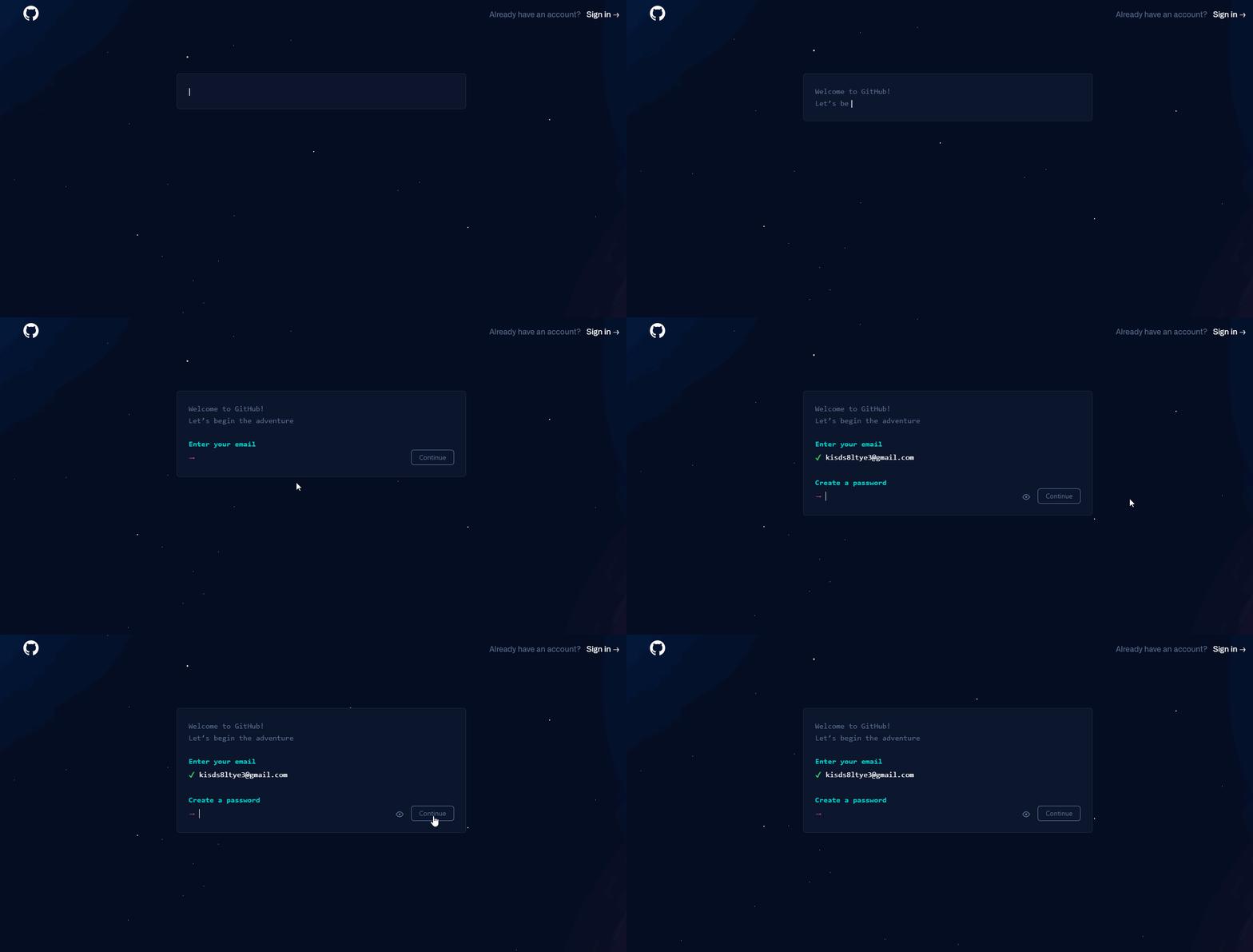
Github is a wonderland for over 65 million developers and companies to write code, command lines, build and maintain their software. It’s signup process is fully interactive, making new users feel like they are writing and running a coding command right away.
This sort of signup design is not only very easy for their target users, developers, to understand and follow, but also helps smoothly onboard all new users into their product, getting users up and running in no time.
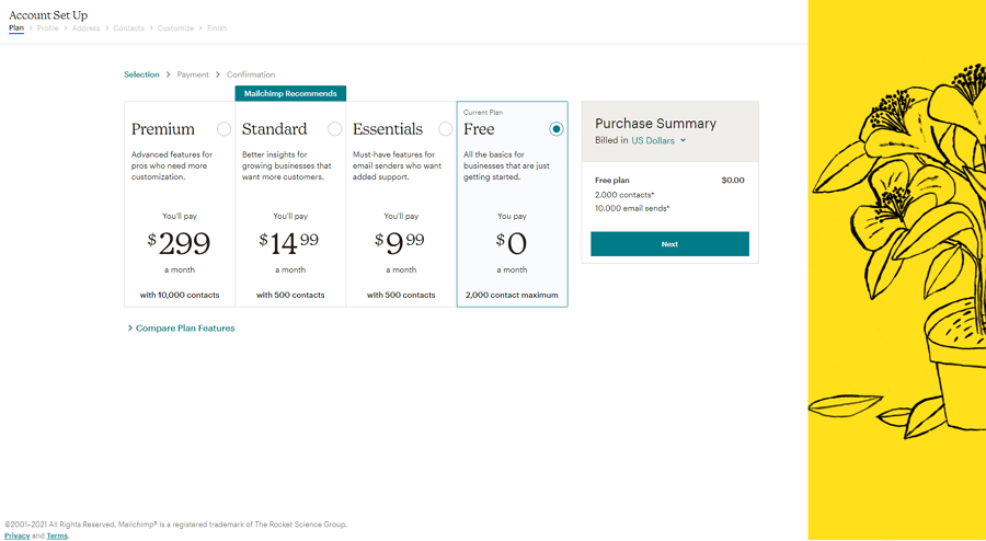
Mailchip is known as one of the most comprehensive email marketing platforms. It’s onboarding process frequently includes the user and provides lots of information throughout the setup. To encourage users to complete the process, there is a nice step-by-step progress bar, helping to reduce any abandoned account setups.
When setting up the first email, there are step-by-step tutorials helping new users easily import contacts, filling in all blank fields, adding a social post, and more.
The user-friendly instructions, clear pricing page, beautiful illustrations, and proper highlights help to onboard any new users effectively.
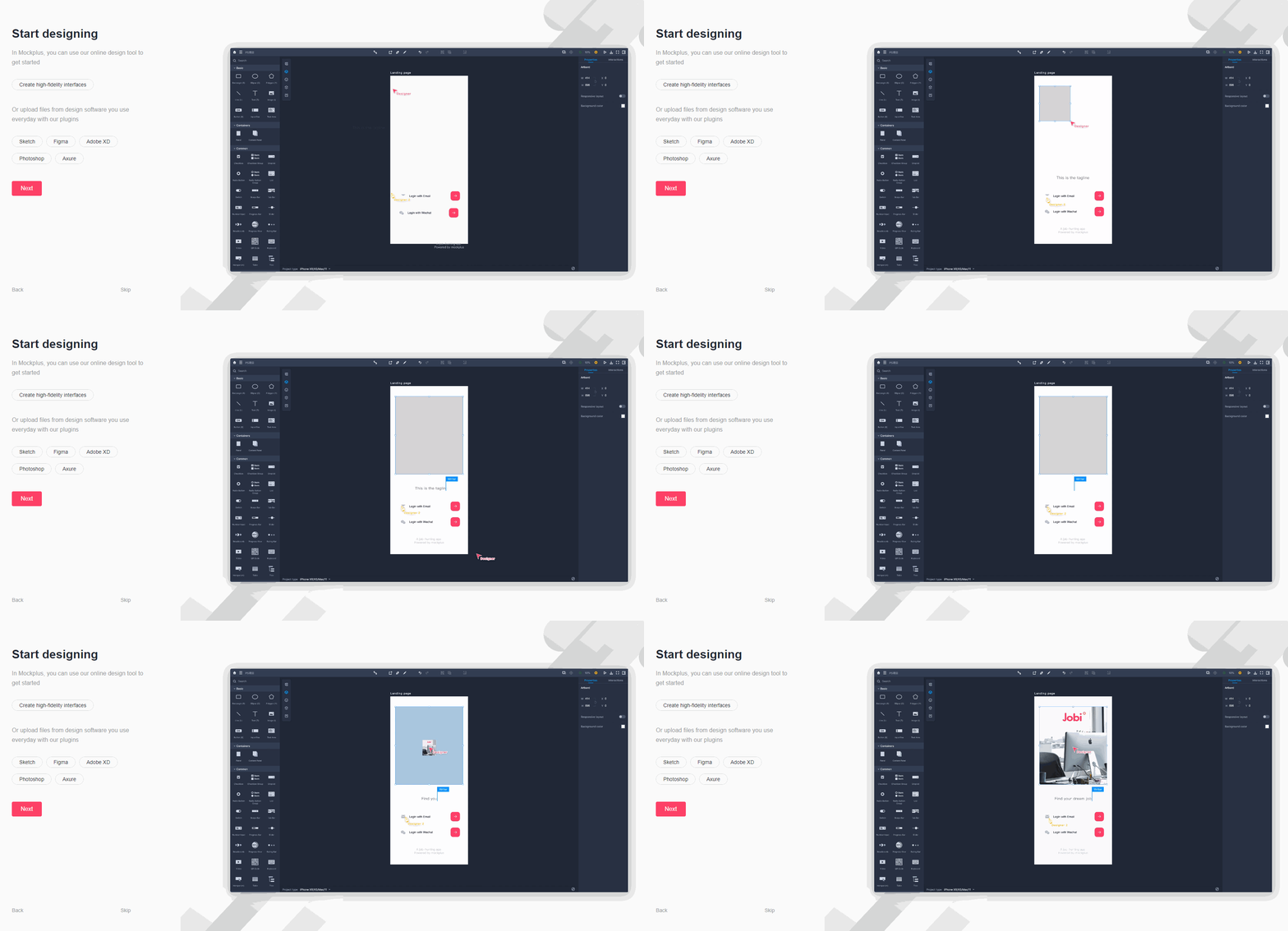
Mockplus is the all-in-one product design platform for design teams to create the best UI/UX.
To better onboard new users, once they've completed the signup, a quick start guide is automated to help them learn and even try key features themselves. There are intuitive images and gifs to make all features more understandable and transferable. It also allows users to skip this quick guide if users wish.
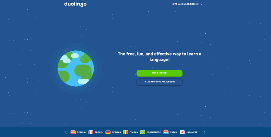
Duolingo is an online language learning website and app with over 30 languages to learn. It’s user onboarding starts from the moment you arrive on the landing page. In a unique onboarding method, Duolingo takes you step-by-step on which language you speak, and which language you would like to learn. Then there are questions about your language level and then a short quiz and lesson.
This sort of onboarding process helps collect new users' information and needs so the website can quickly craft a personalized learning plan for the user. It also helps the new users set up the user account step by step at the same time. A really creative and natural way to onboard the new user.
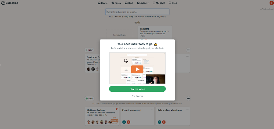
Basesamp is a project management tool that helps you and your team work better together. Its new user onboarding process incorporates not only a step-by-step account setup flow, but also has a 2-minute video to present main features to help get users started quickly.
Once the new user has completed the registration, interactive walkthroughs also pop out at certain times to help users quickly get familiar with the interface.
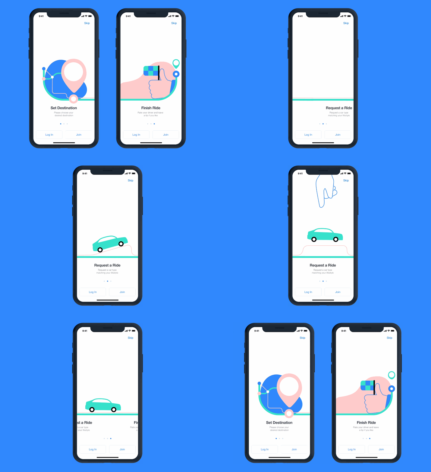
Vett app is a ride-hailing app that connects drivers and passengers. This onboarding example shows you how the hailing app uses custom illustrations and smooth animations to present the app and features of the app to new users effectively.
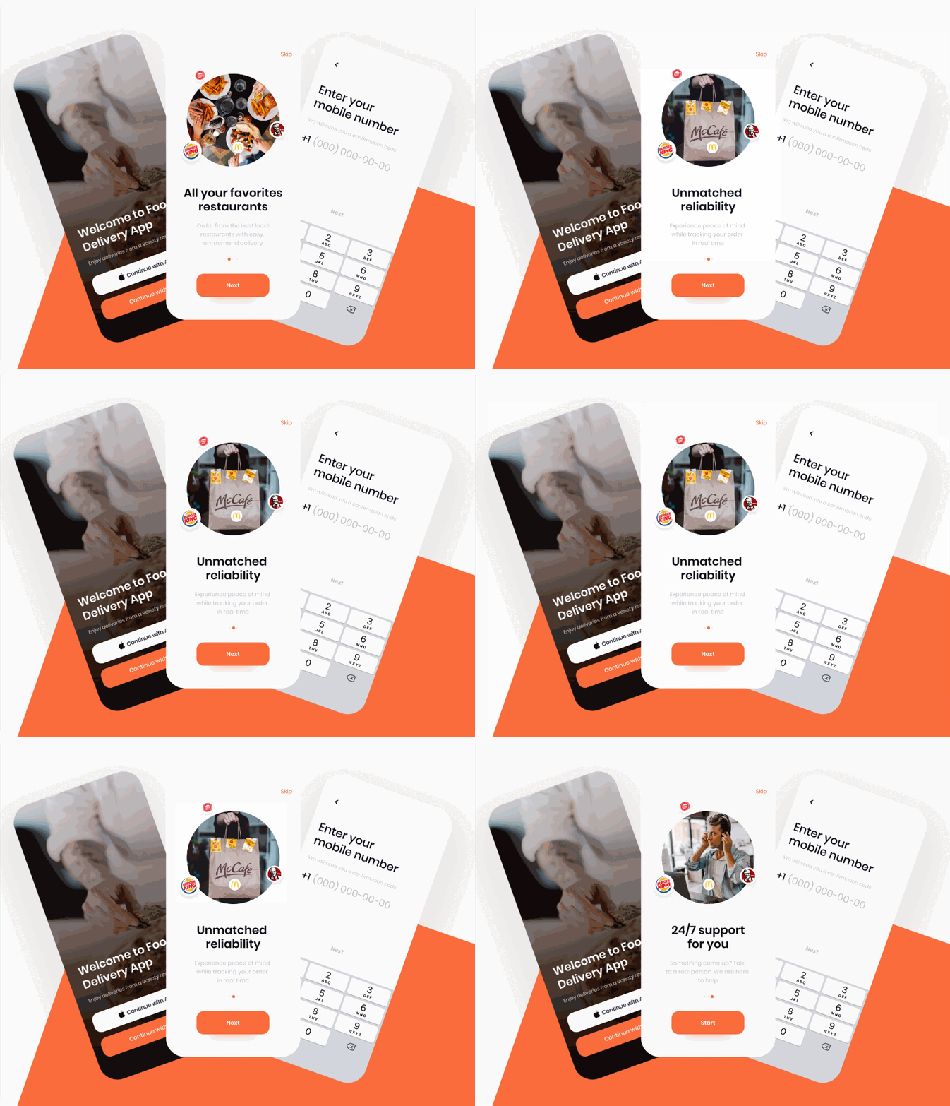
This onboarding UI design is another exploration for delivery apps. This one features unusual rotating animations to switch between different features and immerse the user.
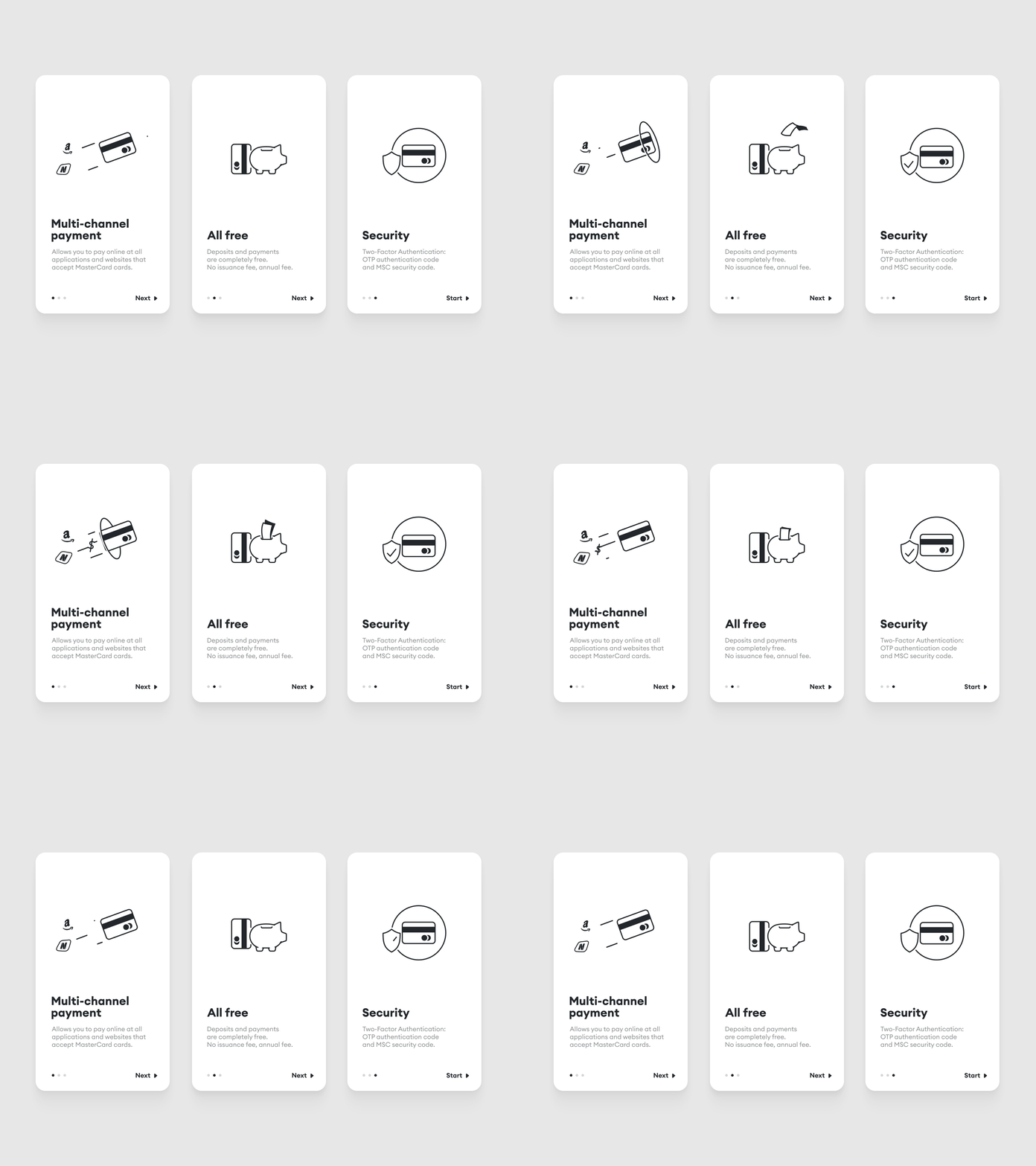
This example is a concept UI onboarding design for Thailand's leading e-wallet app. It uses simple icon animations to show how the animations affect the minimal look and user onboarding experience, along with improving the onboarding process through simple, effective illustrations.
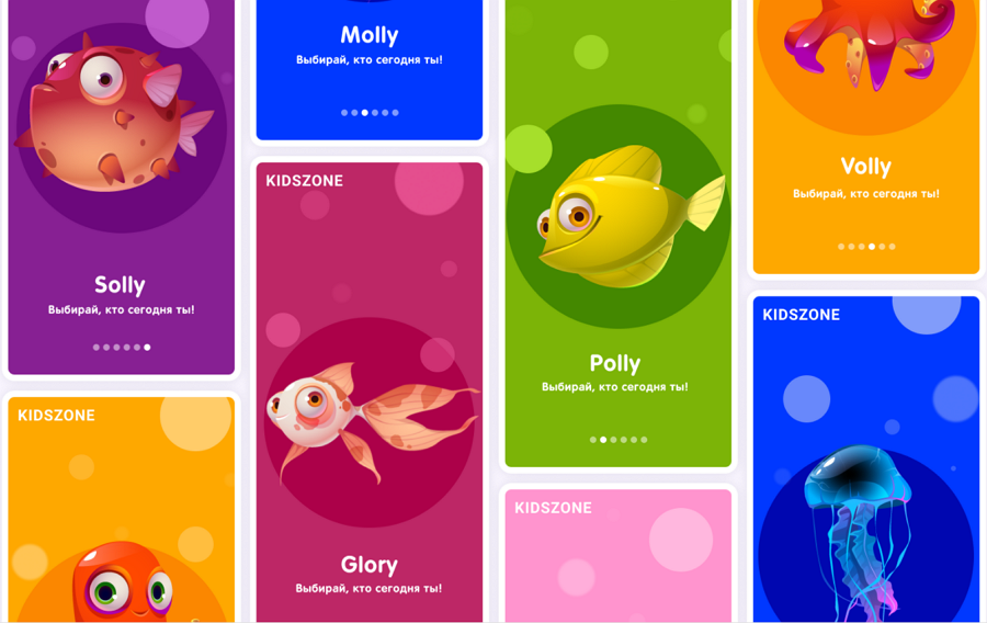
This onboarding example uses eye-catching visuals, such as bright colors and cute animal mascots that children love, to onboard and retain their target users.
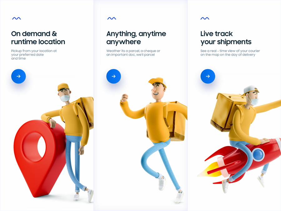
This example is made for delivery apps and all onboarding screens feature a clear layout and 3D-like image effect, using visuals rather than text to get their product message across to users.
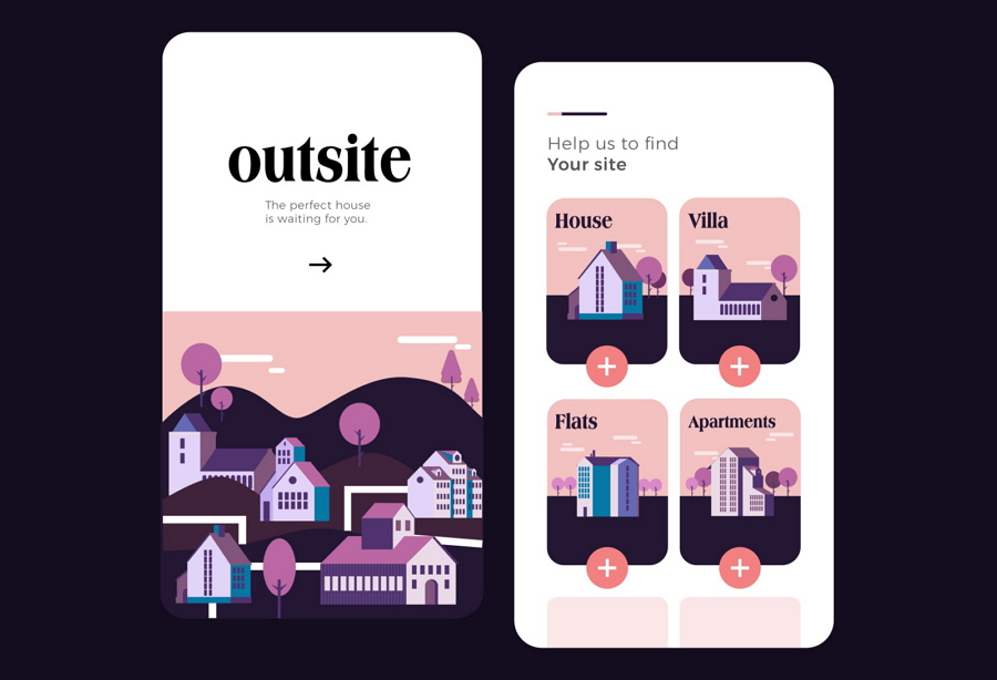
This design example shares the onboarding screens of an app that helps users find their dream house. It offers four options to help new users personalize the onboarding process. The flat design style is also very beautiful and doesn’t distract from the overall brand message.
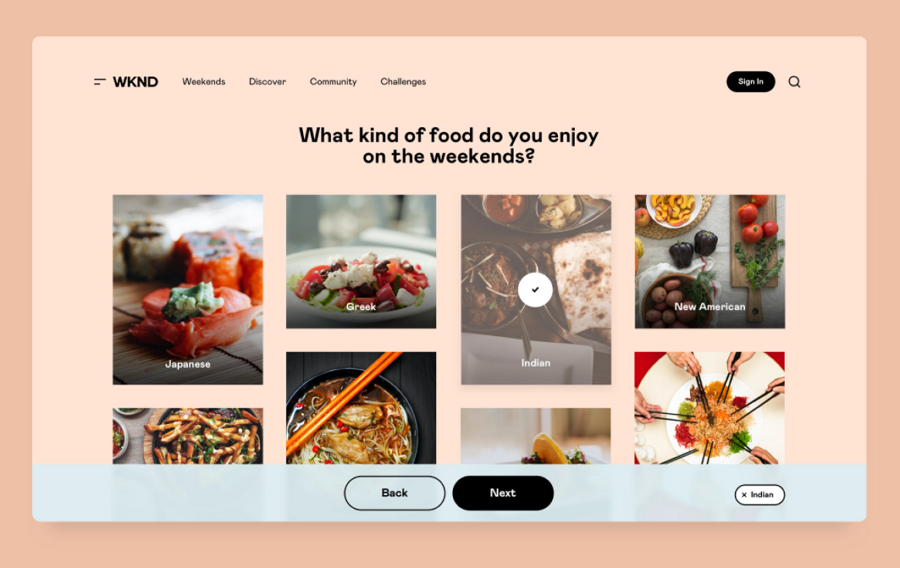
WKND presents their onboarding process for an on-demand travel booking platform. This example shows you a series of customizable onboarding screens that then link into the creation of a users account, giving the user an already set-up account, with the right pricing plans right in front of them straight away.
 Mockplus RP
A free prototyping tool to create wireframes or interactive prototypes in minutes.
 Mockplus DT
A free UI design tool to design, animate, collaborate and handoff right in the browser.
