A good website layout can increase the chances of creating a successful website. For this reason, website designers pay a lot of attention to website elements such as footer, header, the body as well as the navigation bar. This article is dedicated to showcasing one of the website key elements - the website sidebar. You can get inspired from the top 30 creative website sidebar designs.
A website sidebar is a unique, creative, and useful component of website navigation design. In most cases it is a column with typography, color palette, or icons and appears by the side of the main content - either on the left or on the right, depending on the website layout and structure.
Normally, sidebars on the left gain the most attention and guide the users more effectively because of visual habit and user behavior, while sidebars on the right can create a more constructive hierarchy because they are considered secondary. No matter where it is placed, a proper sidebar can be very useful to your website as it can:
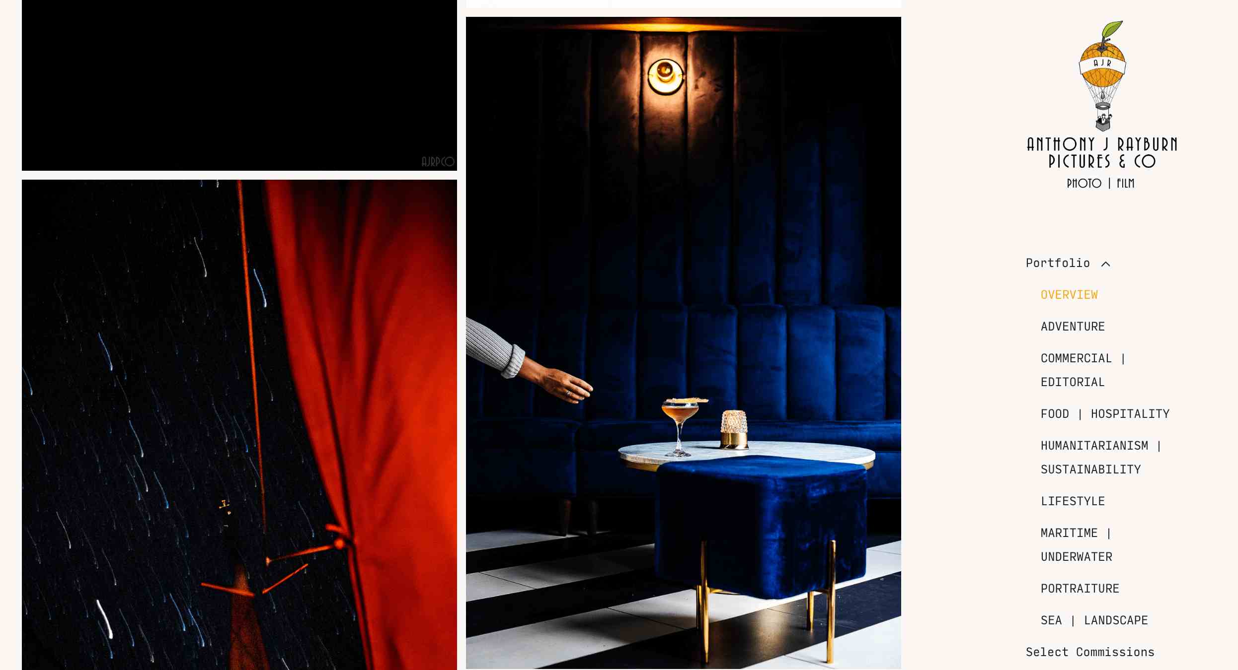
Anthony J Rayburn is a website where you can find many inspiring photographs. It has a sidebar on the right to showcase the logo, links to guide visitors, links to social media pages, and contact details.
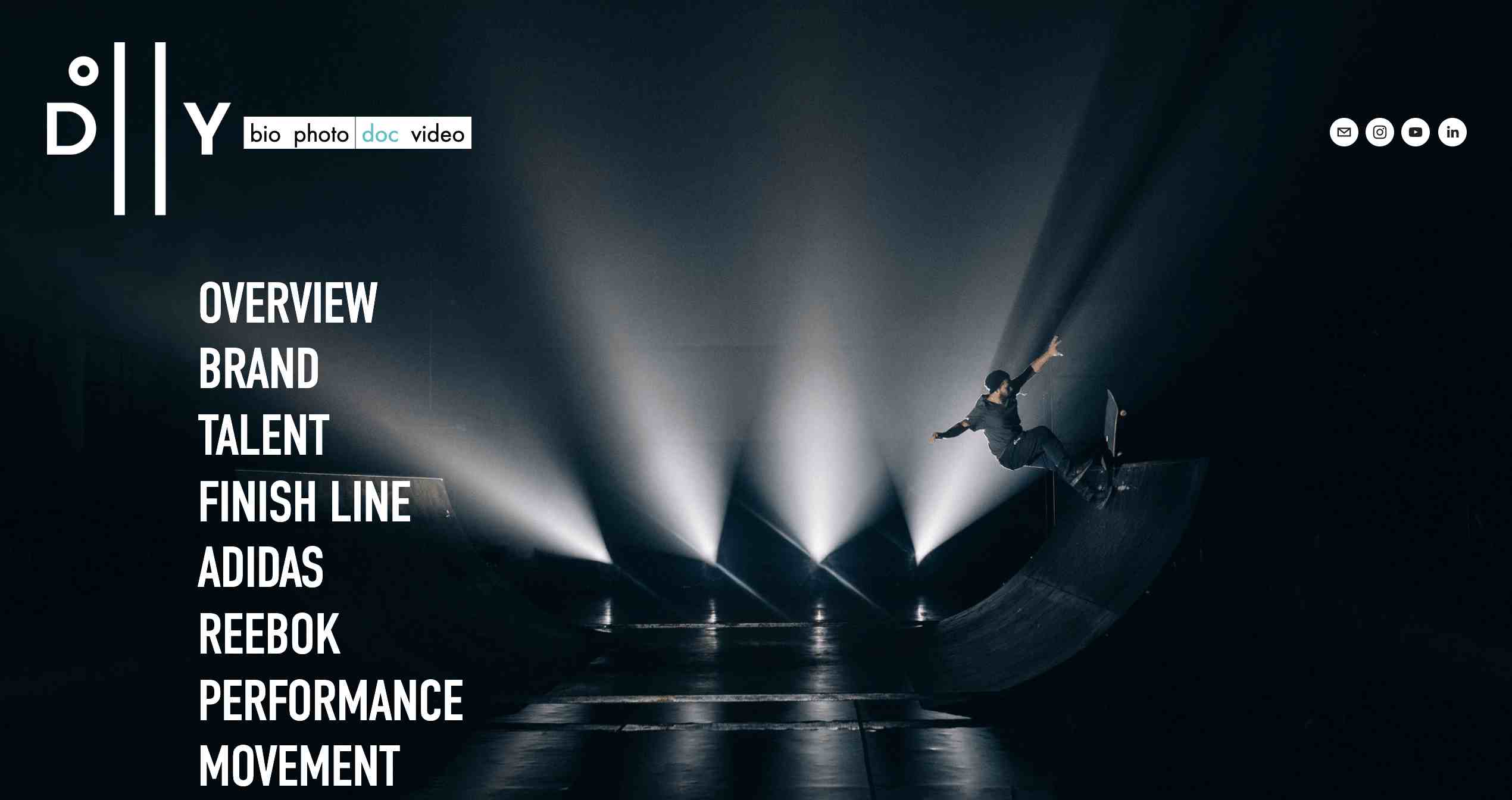
Dollyave is a website related to photos and music. The sidebar uses bold typography, which works perfectly with all the other elements. It is not only visually appealing but can also help visitors to explore the website easily.
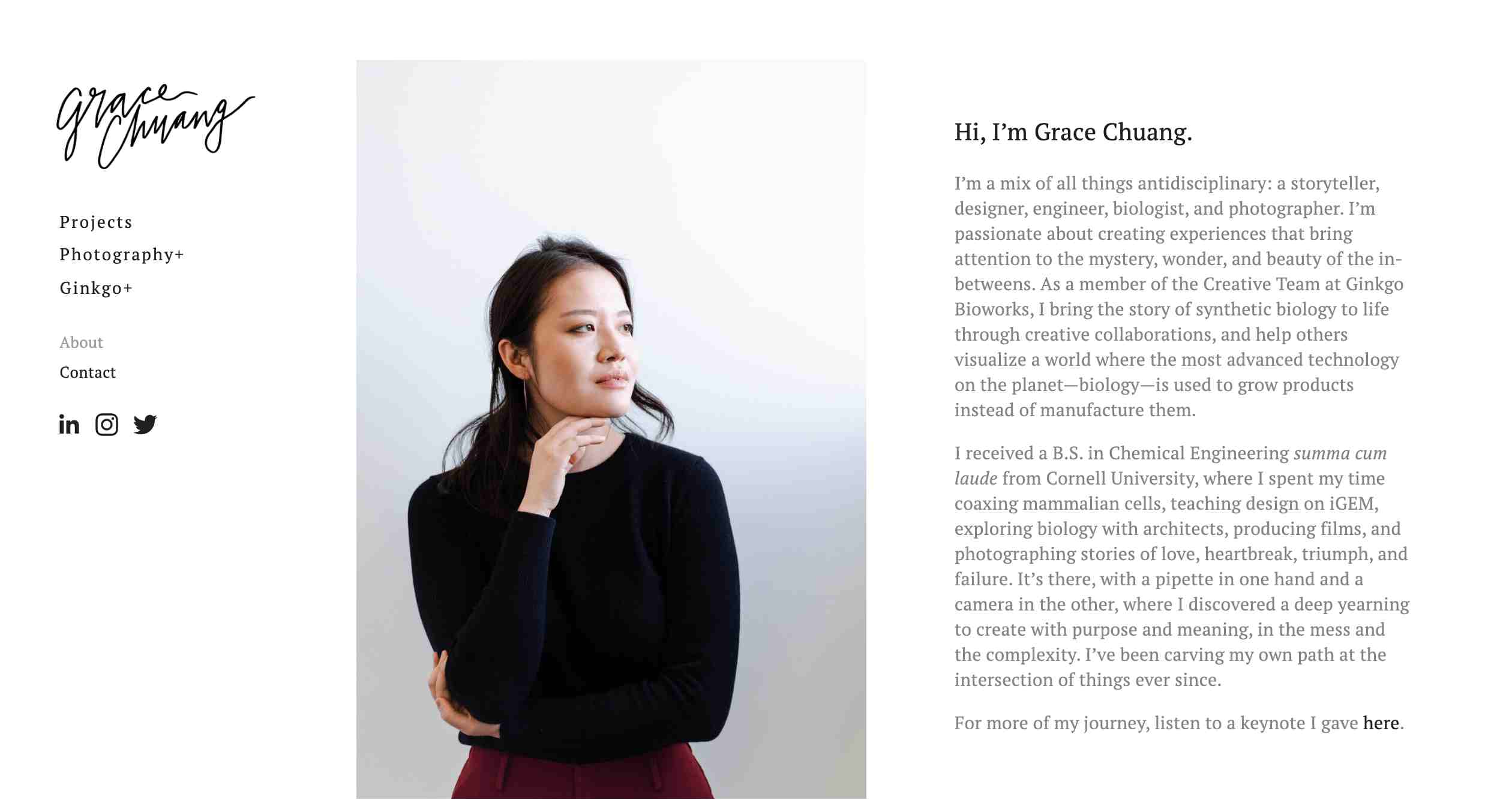
Grace Chuang is a portfolio website that showcases the projects of Grace. This site features a 3-column layout: on the left is the sidebar with the logo, links to guide the visitor to other pages on the website, and links to social media pages at the center is the photo of the designer, and on the right is the designer's introduction.
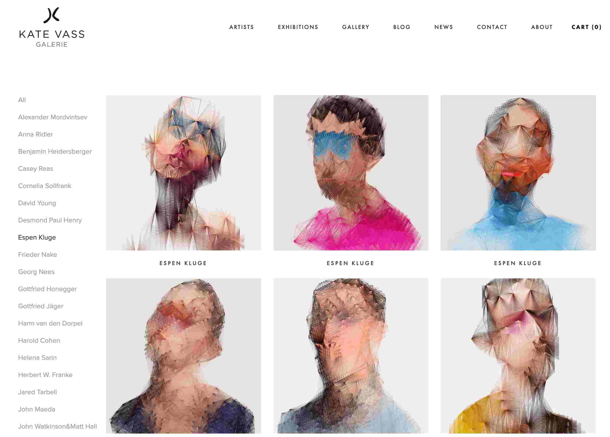
Kate Vass Galerie is a contemporary art gallery working closely with curators and leading art critics to present works of artists. To help visitors explore the artworks effortlessly, there is a sidebar on the left that lists the names of different artists.
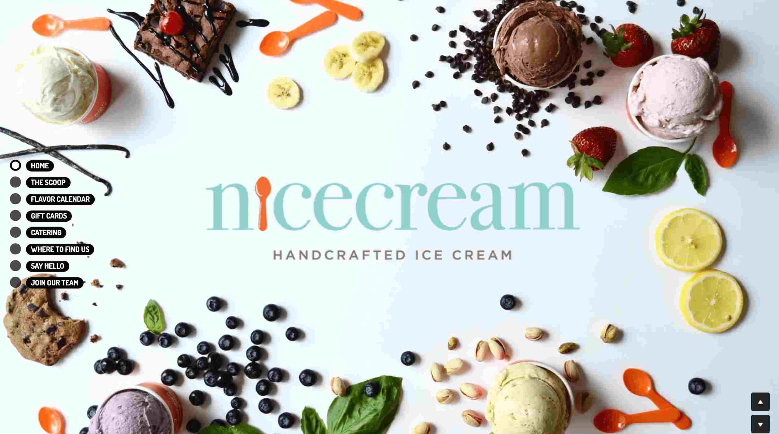
Are you passionate about handcrafted ice cream? Nicecream is a website you shouldn't miss. The sidebar works well with the whole interface. It offers good navigation to the website visitors.
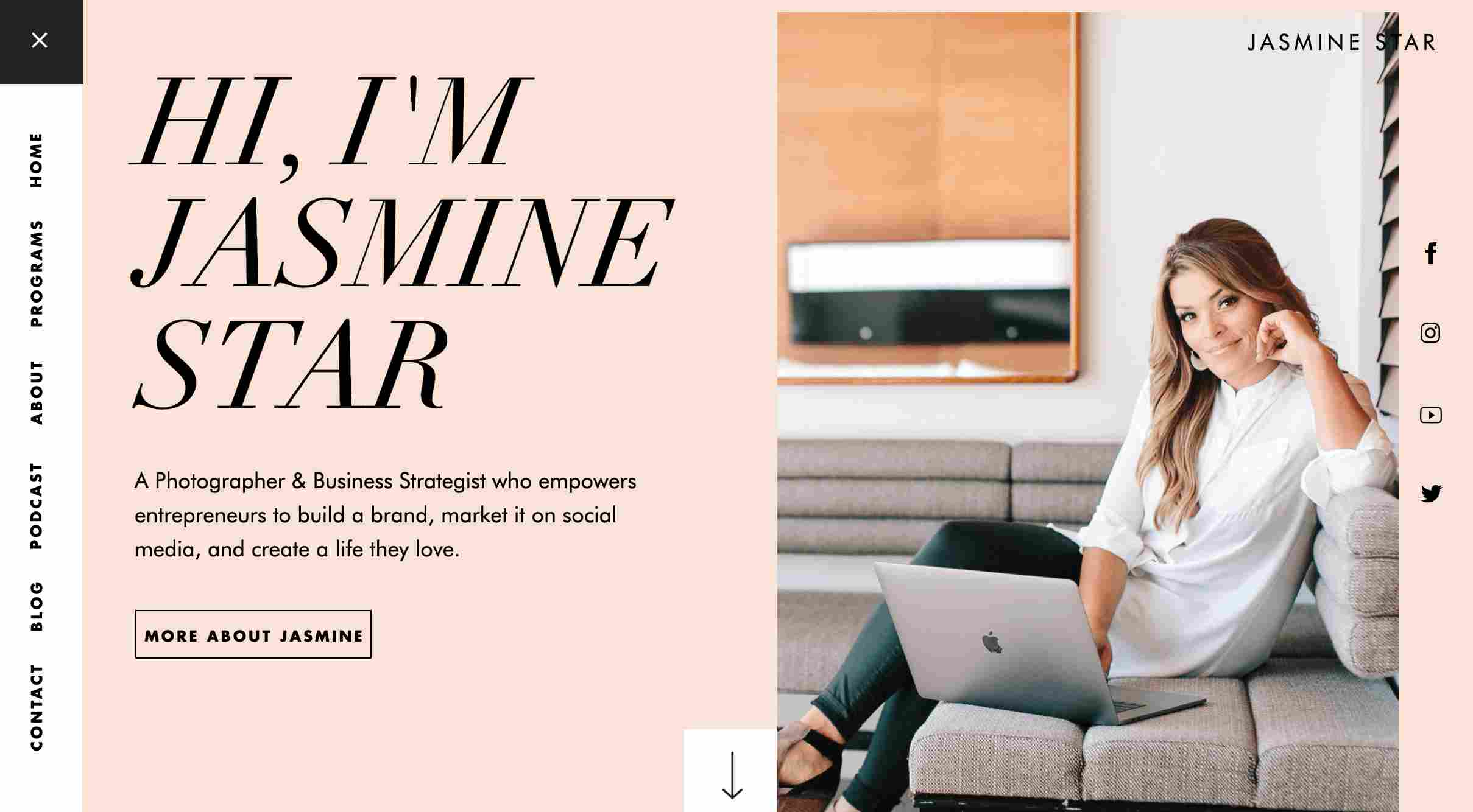
Jasmine Star is a website that empowers entrepreneurs to build successful brands. Its sidebar for navigation is on the left. The position of typography on the sidebar is special. The white background helps in highlighting the sidebar. Besides, there is an option to close it.
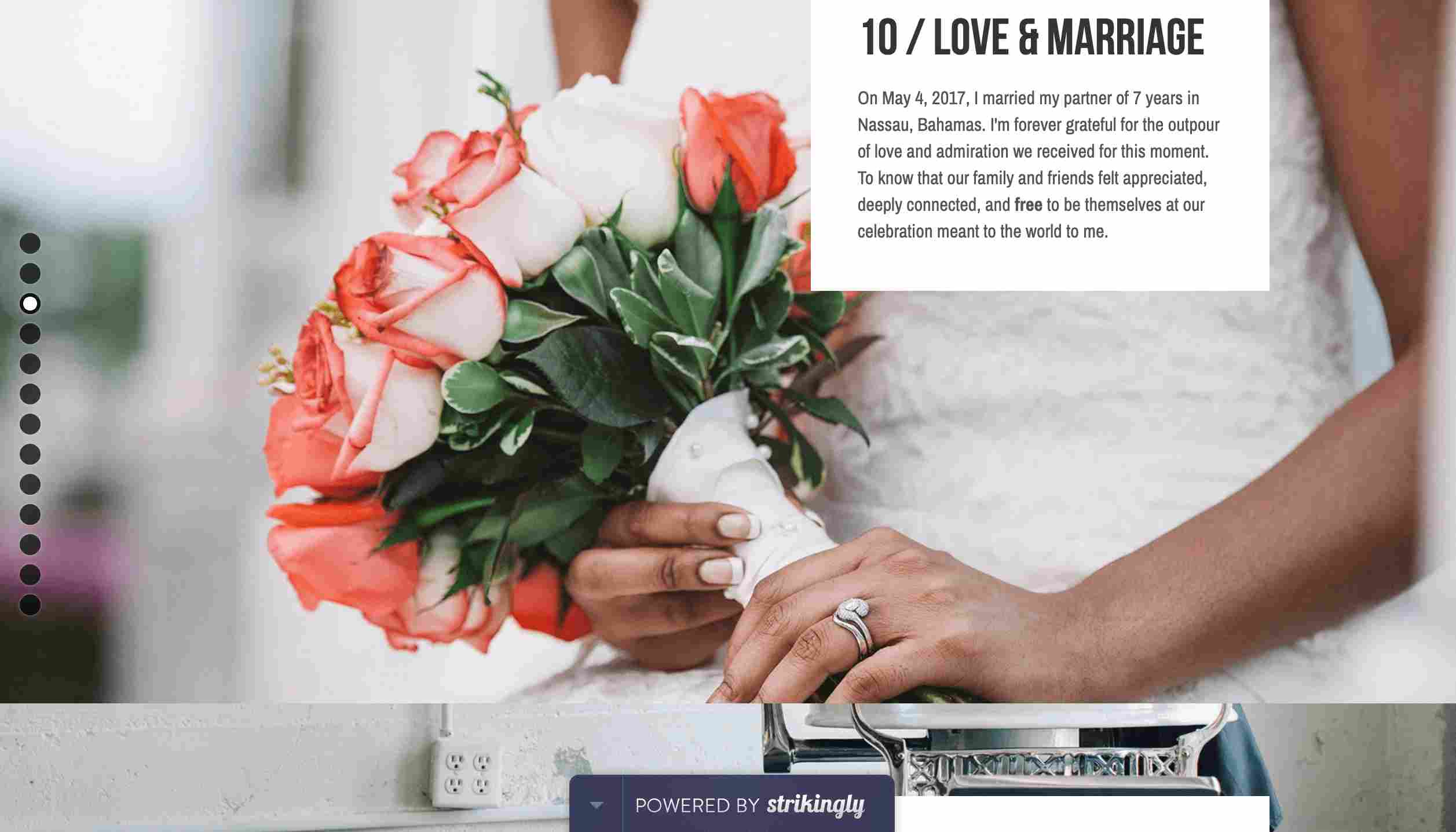
Quinnton Harris is a visually appealing personal website. It showcases the owner's life story with big images and text. It uses dots on the sidebar for navigation.
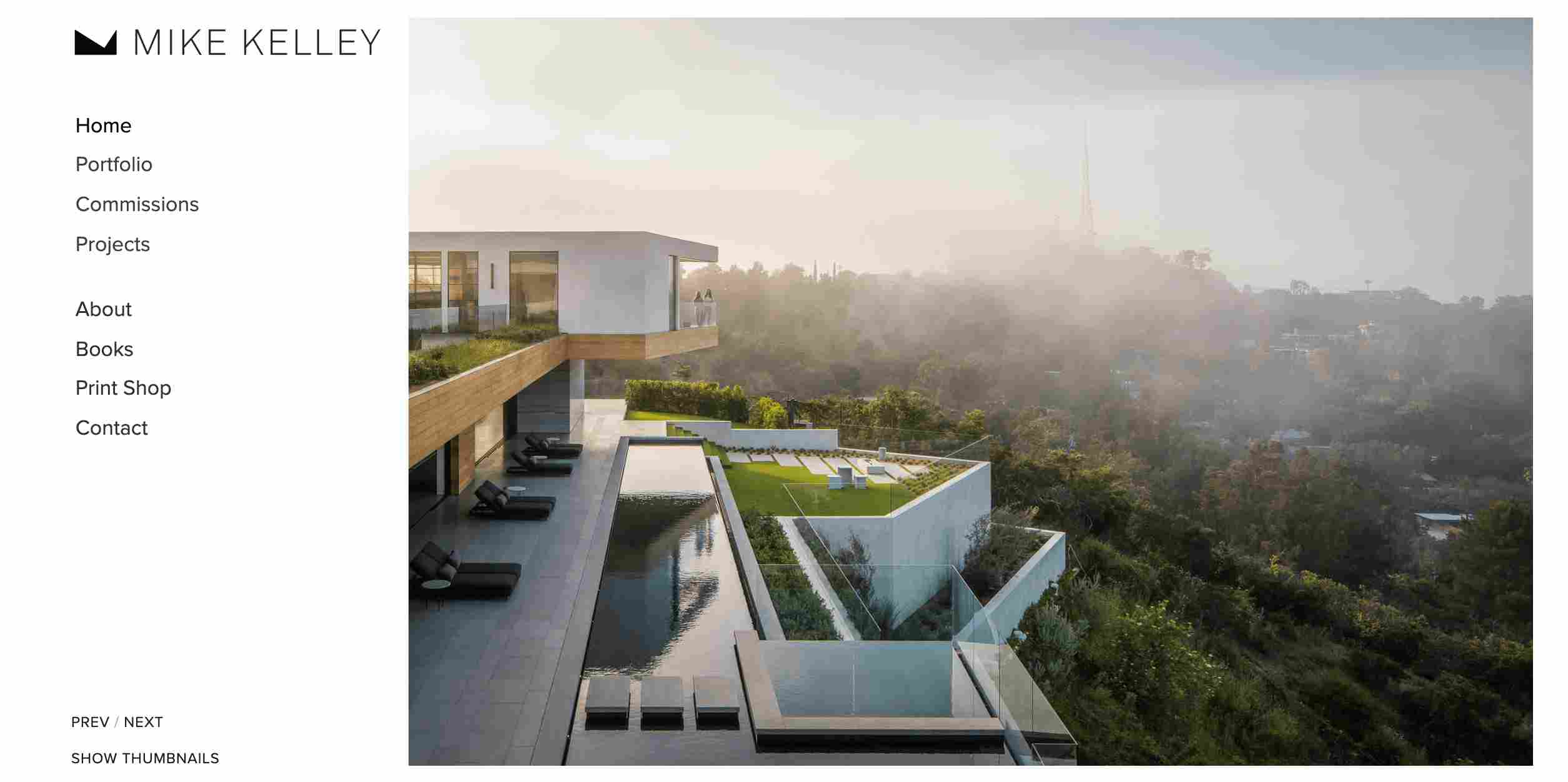
Mike Kelley is a personal website owned by a photographer named Mike. His website features a beautiful hero image and vertical navigation bar, which has a cool logo and overlay effects.
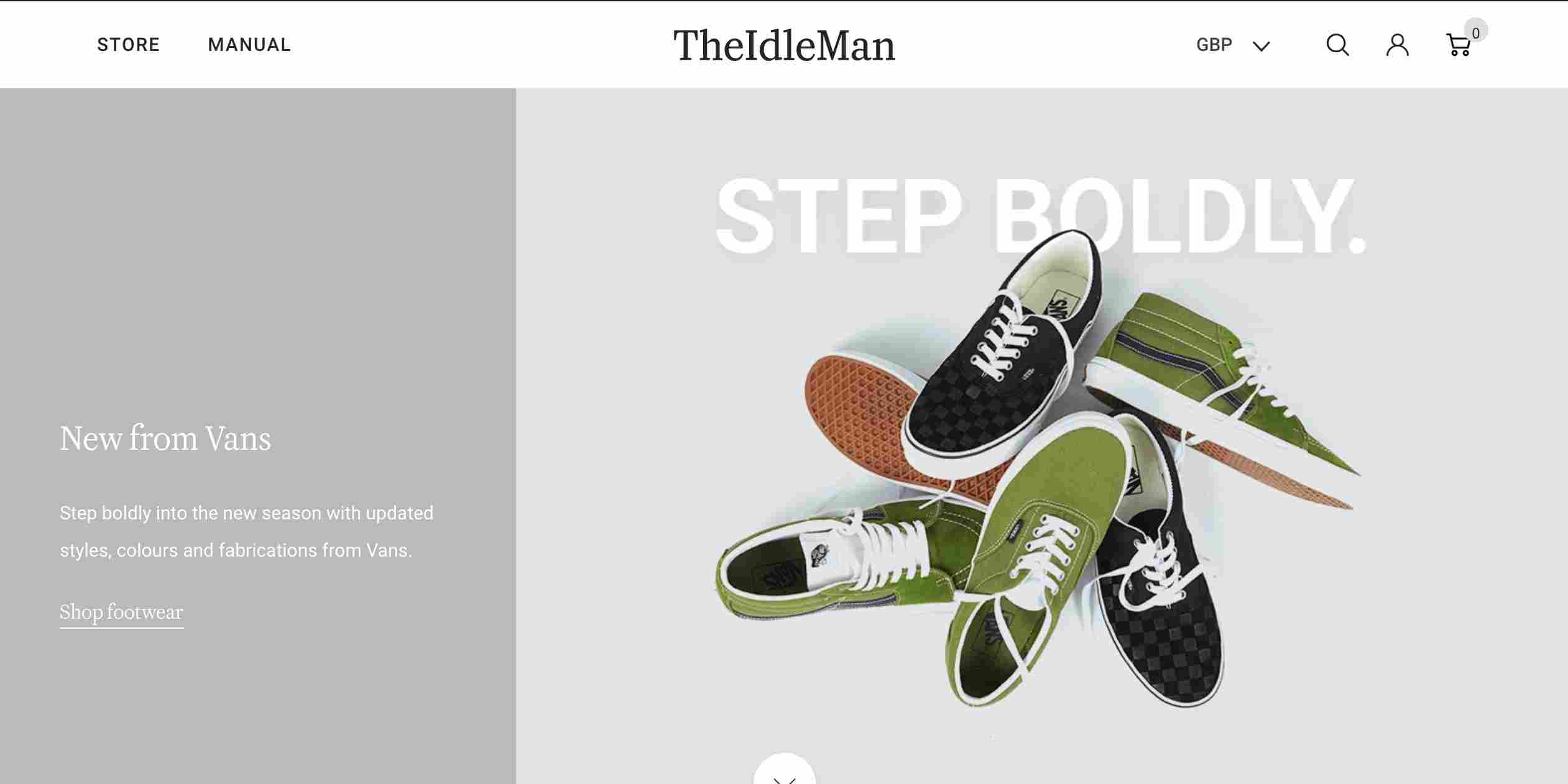
The Idle Man is an online store. It uses a large sidebar on the home page to showcase the best sellers and the hottest items. This is one of the best ways to encourage customers to buy their products.
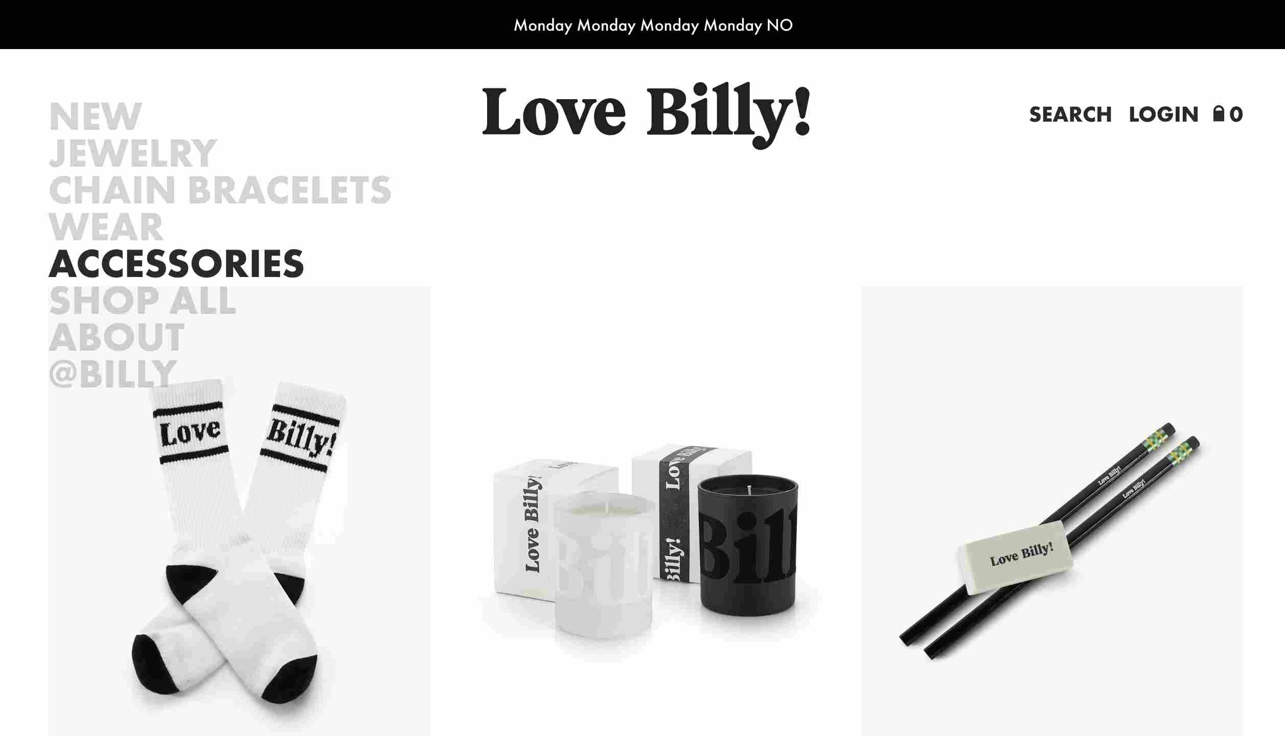
Love Billy uses bold typography in its website’s sidebar. It serves as navigation to guide visitors and gives an overview of the entire interface.
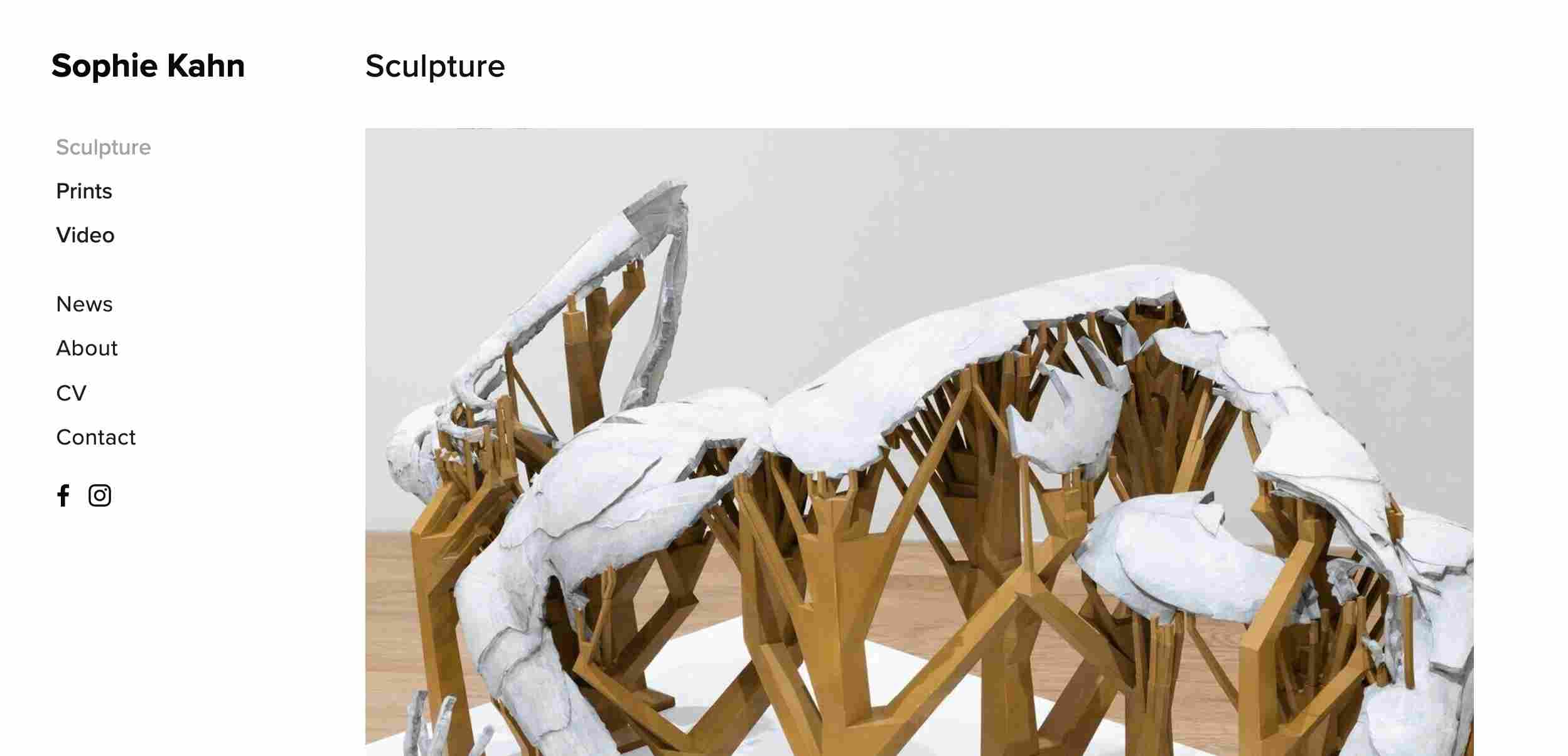
Sophie Kahn is an art website created by Sophie Kahn, who is a digital artist and sculptor. It uses a regular sidebar with links to social media pages.
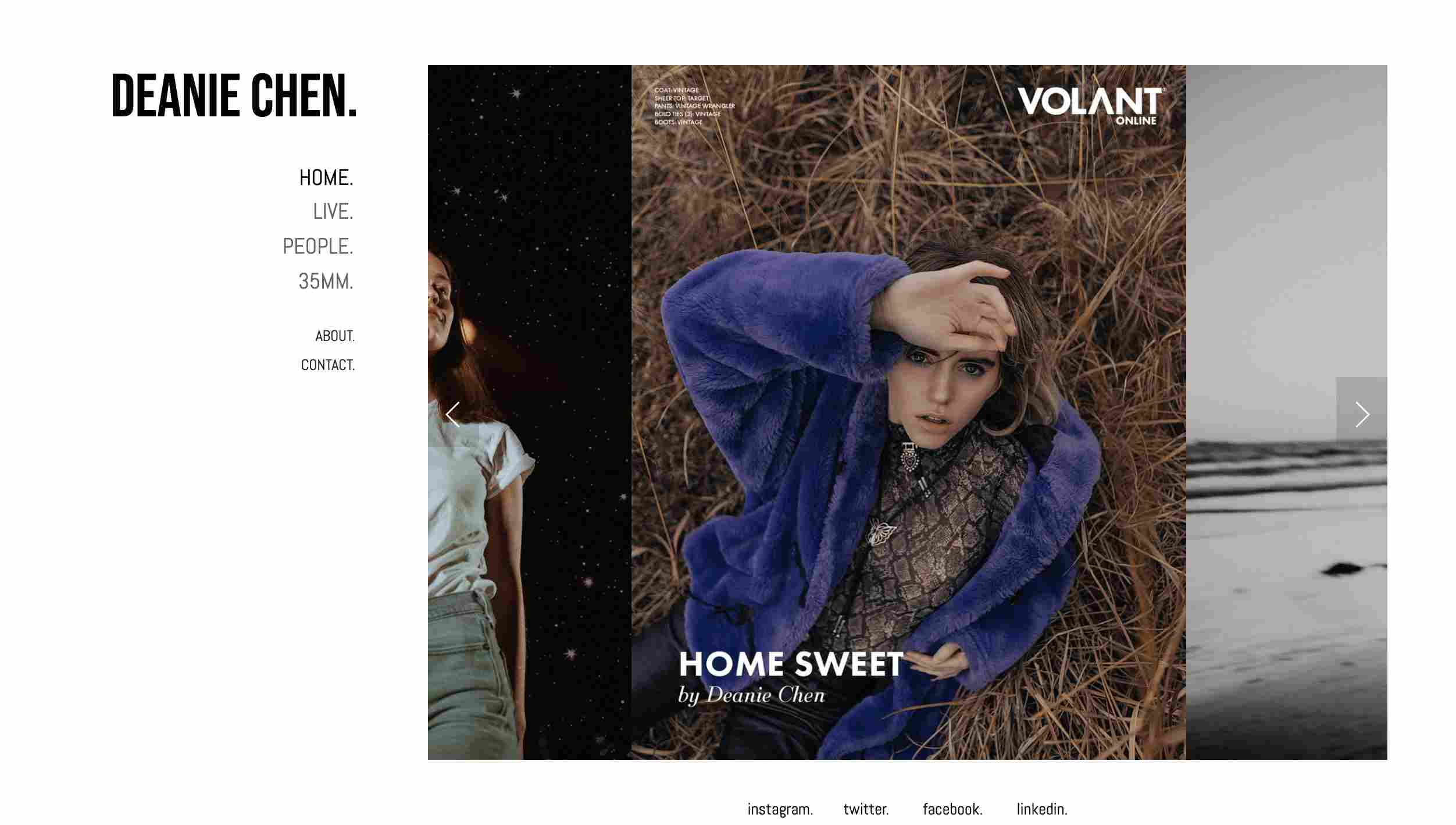
Deanie Chen’s website has a regular sidebar with a lot of white space, which creates a contrast with the beautiful photo galleries.
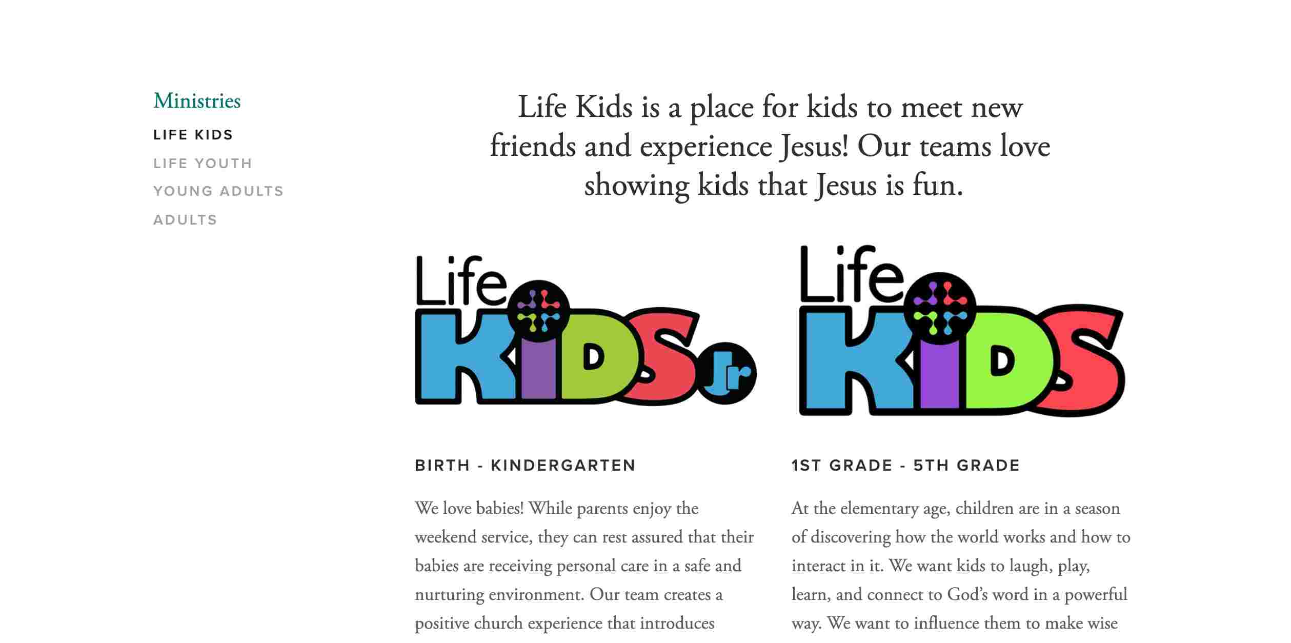
The Life Church Today is a website for kids. It features a regular, simple sidebar. The whole design is clean and lovely.
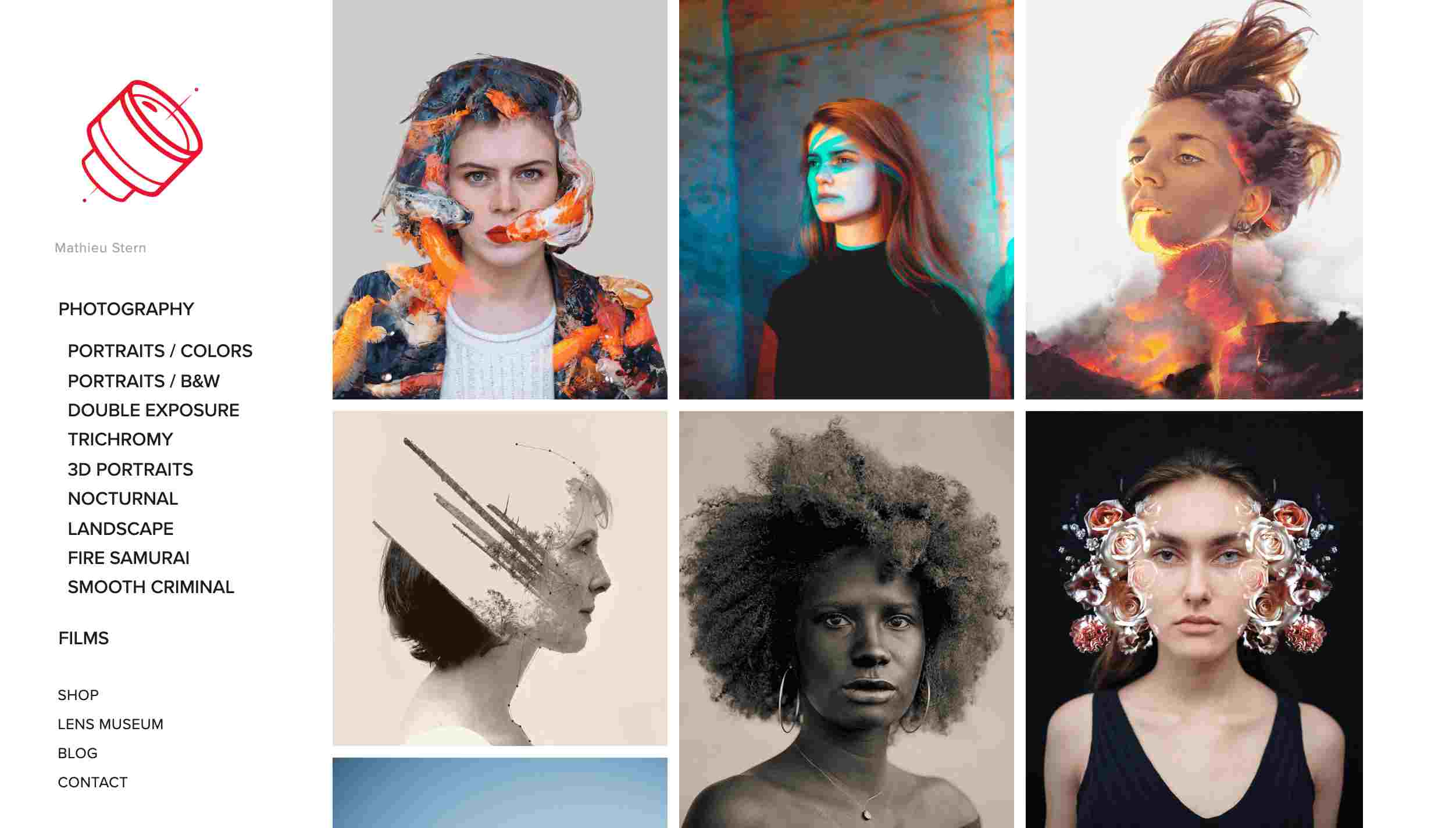
Mathieu Stern is a website for photography and films. Its sidebar has a two-tier structure, which is very helpful for visitors to explore the site.
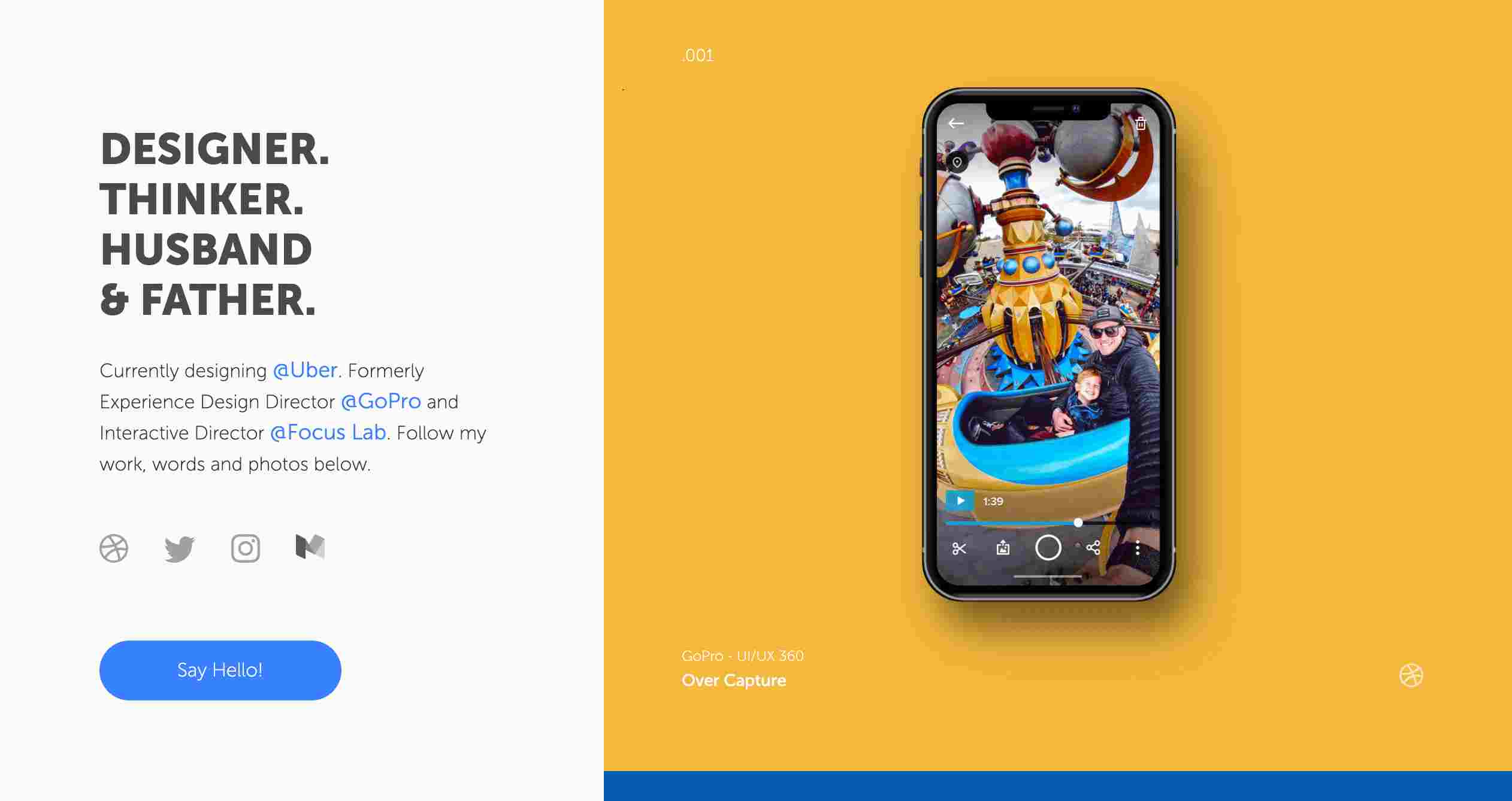
Charlie Waite is a personal website created by the designer Charlie Waite. He uses a big sidebar to introduce himself and greet the website visitors. It also displays links to his social media pages.
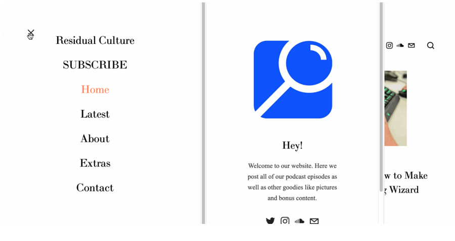
Niche Pod has a hidden sidebar. It consists of the logo, welcome greetings and links to help visitors explore the website.
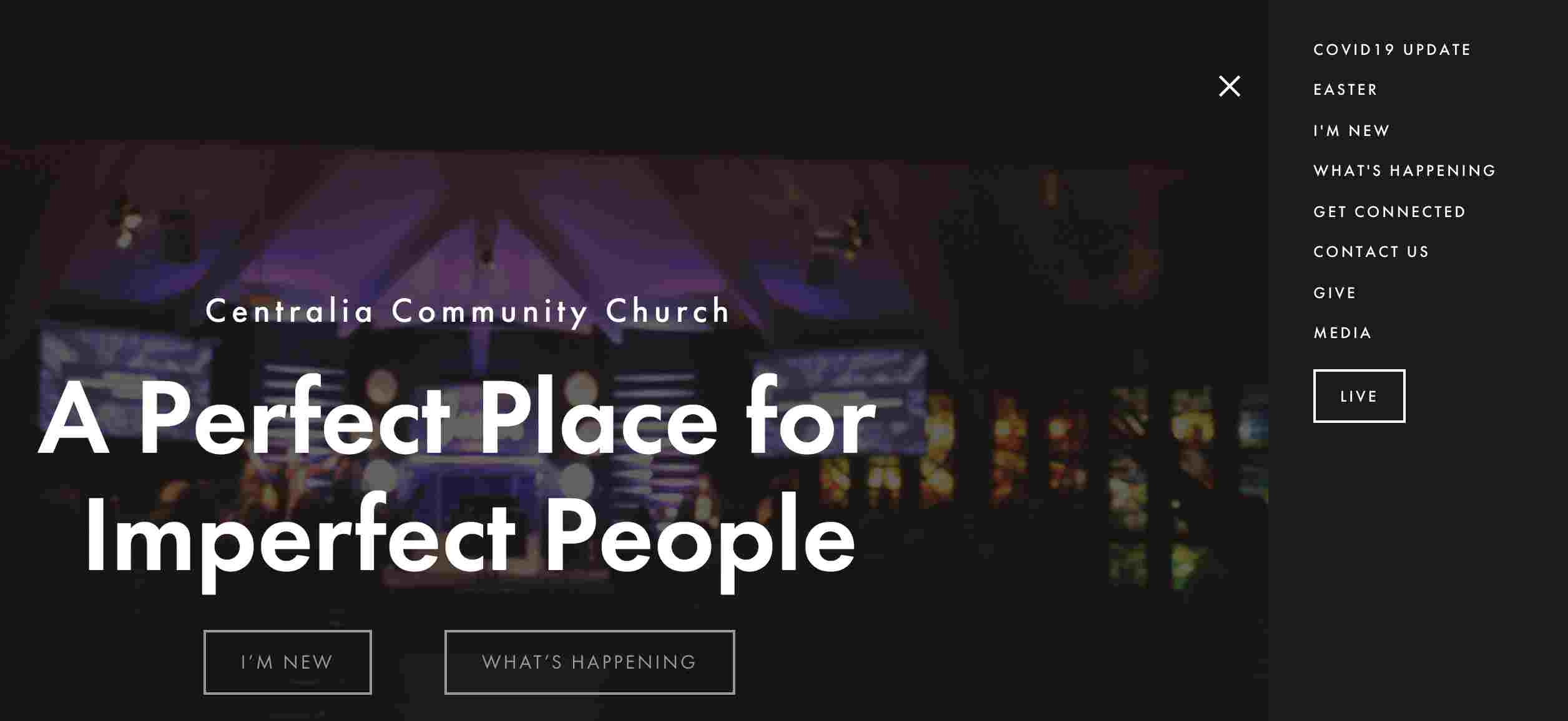
CCCOG also features a hidden sidebar. There is a sharp contrast between the white typography and the black background. It is on the right and you can close it if you wish.
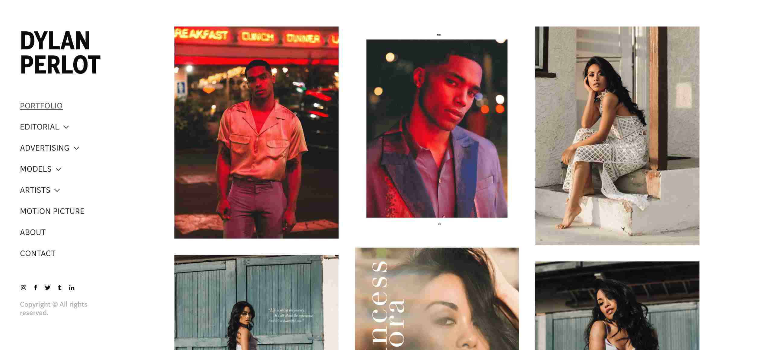
Dylan Perlot showcases many fashion photography projects. Its sidebar is on the left to help visitors. In addition, there are drop-down menus to provide in-depth navigation.
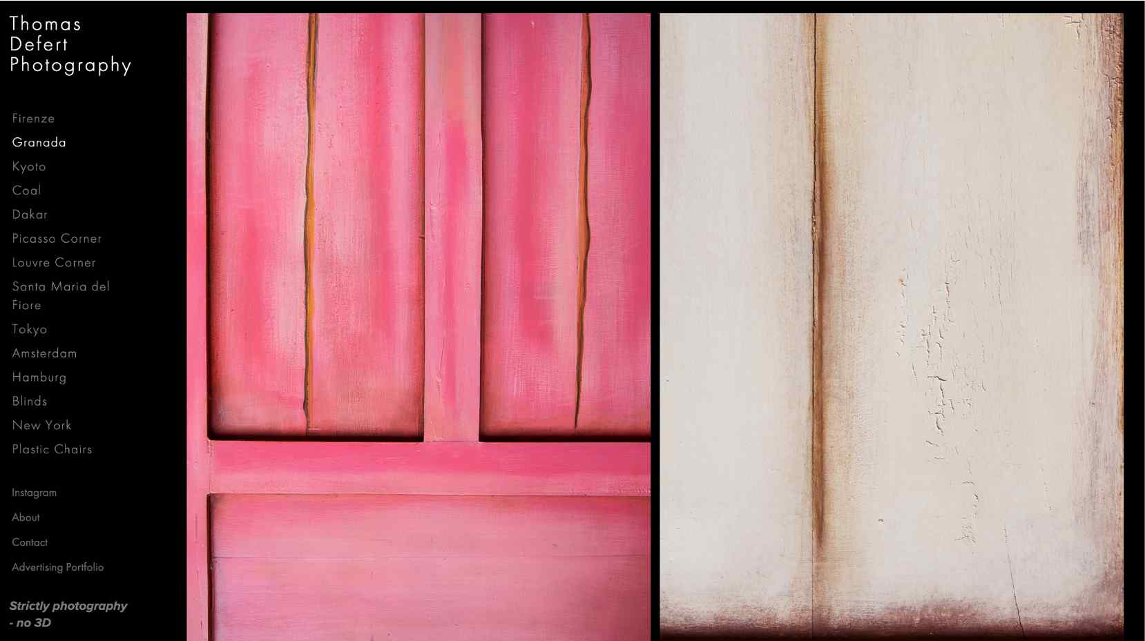
Thomas Defert uses a detailed sidebar to showcase his artwork.
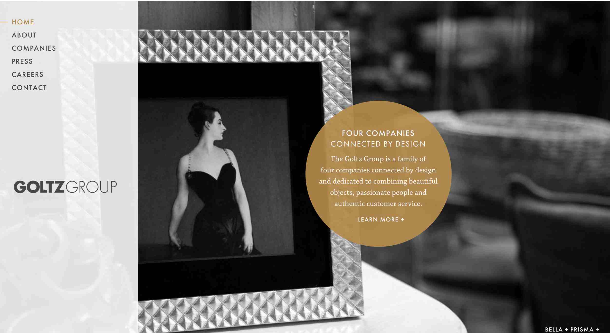
Goltz Group sells high-quality picture frames and provides personalized service. Its sidebar features a slightly transparent effect.
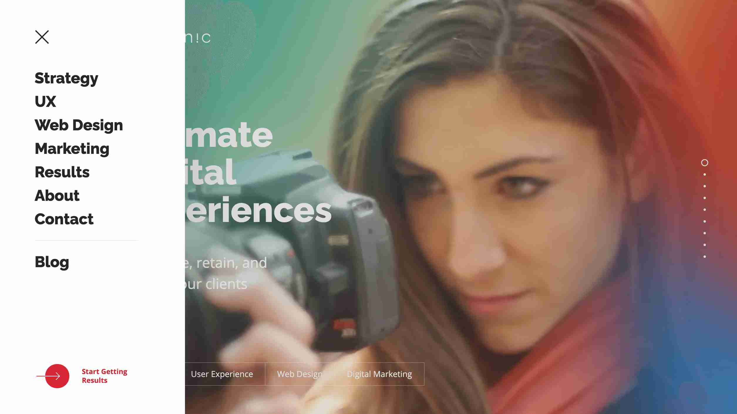
Intechnic is a studio that designs high-performance websites, apps, and software. It has a hidden sidebar.
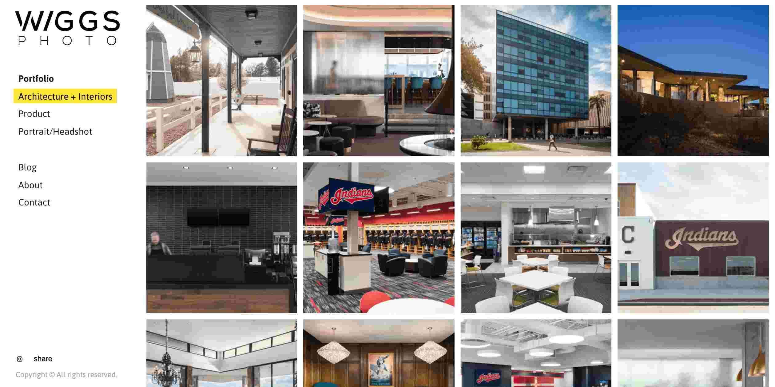
Wiggs Photo is a commercial photography website which deals with architecture, interiors, and product photography. The navigation menu has a logo and the text highlighted in yellow color.
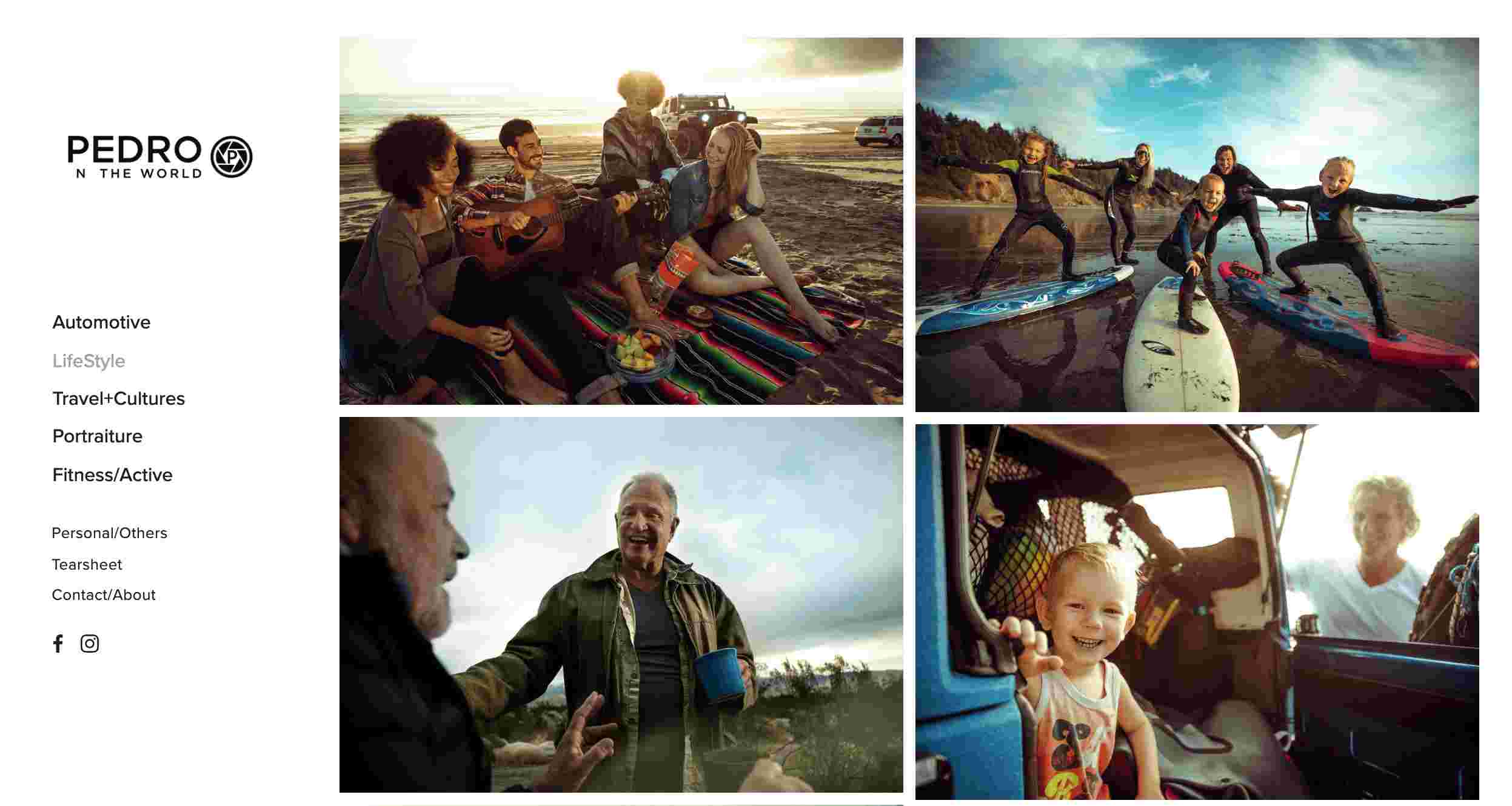
Pedro n The World is a one-page website. It has a menu bar in the center of the interface. The navigation is displayed on the left in all the other detail pages, with the logo on top.
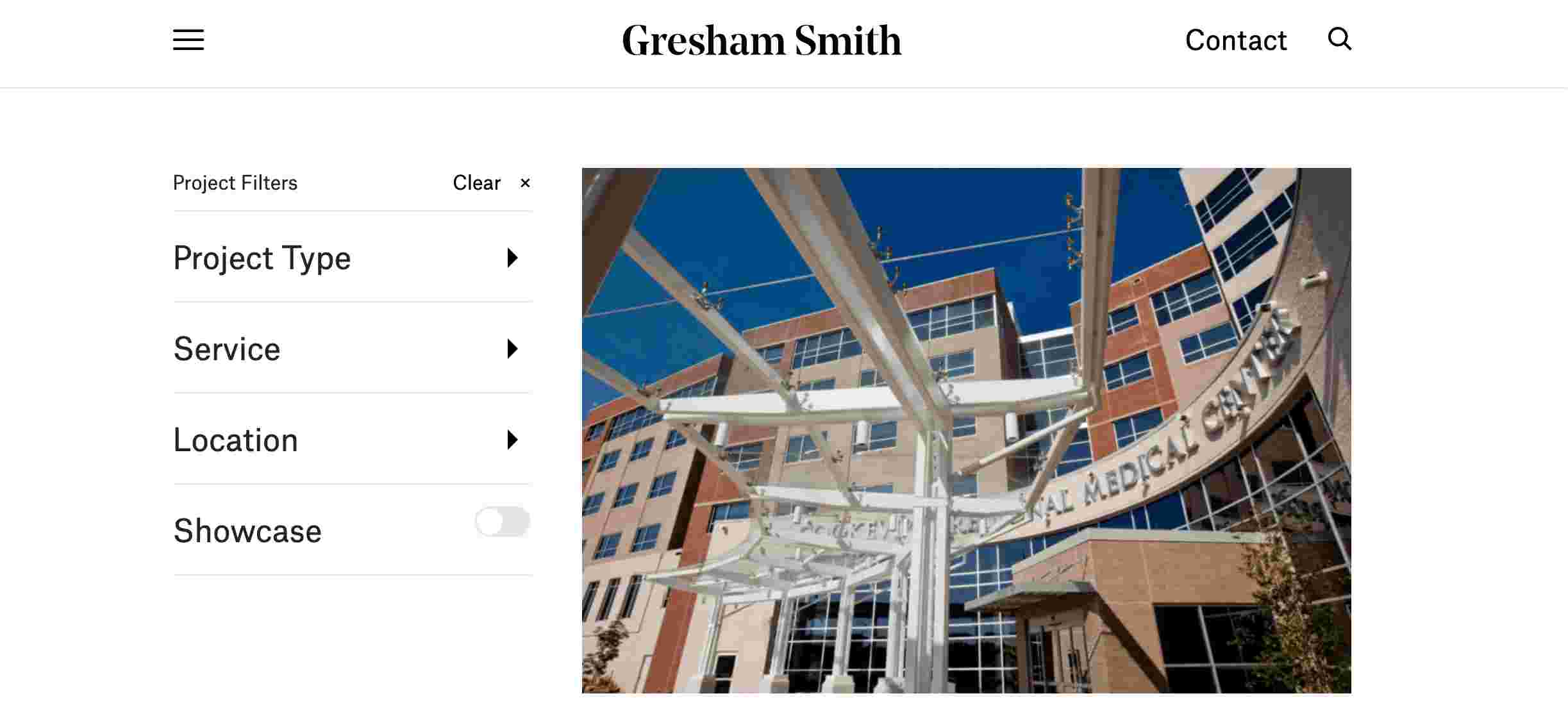
Gresham Smith has a very elaborate sidebar, which contains many levels of drop-down menus. Thus the visitors get in-depth navigation on the site.
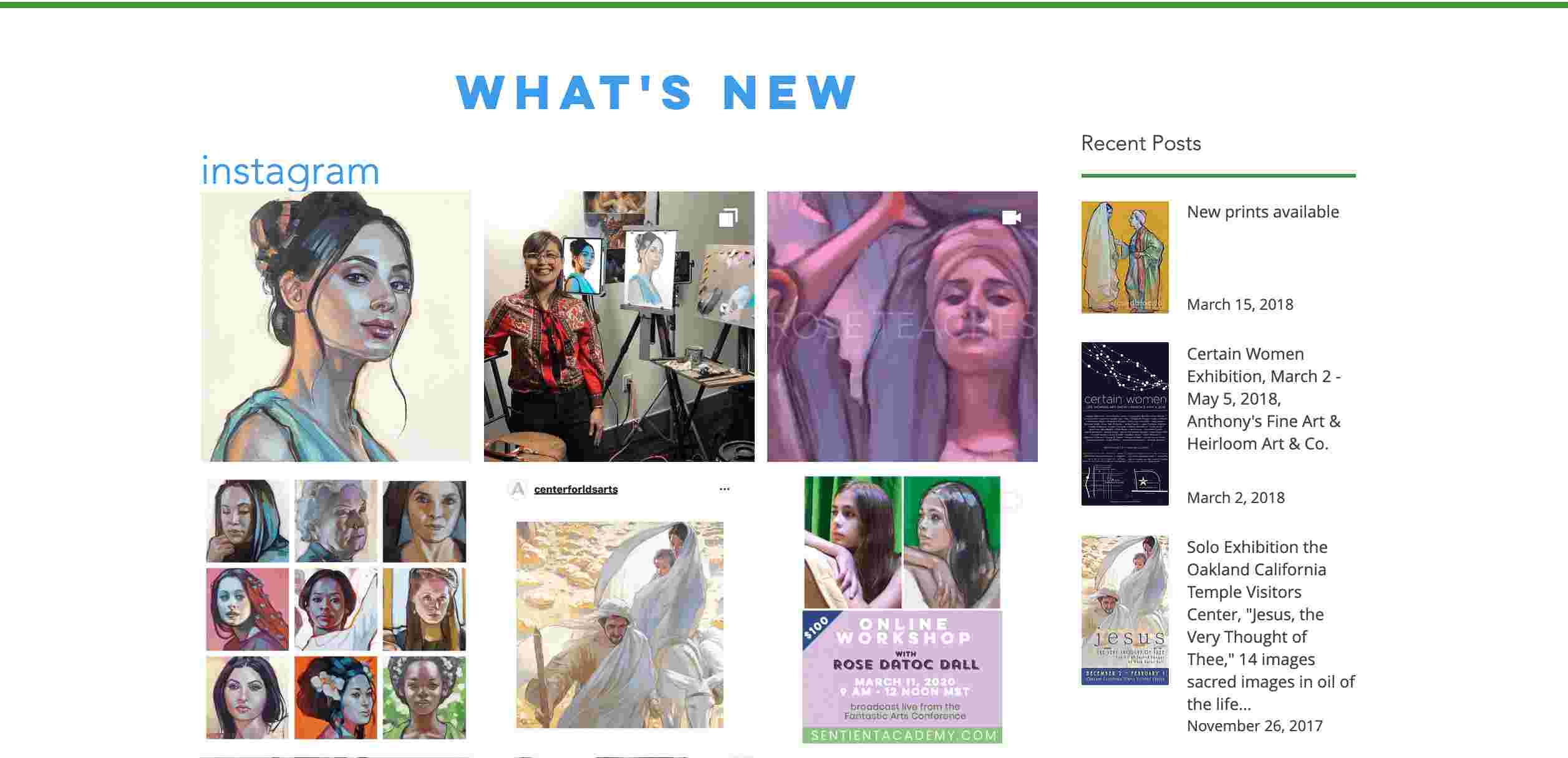
Rose Datoc Dall is a website which showcases art works. The sidebar on the right next to the artworks displays recent posts with t nice-looking thumbnails and typography.
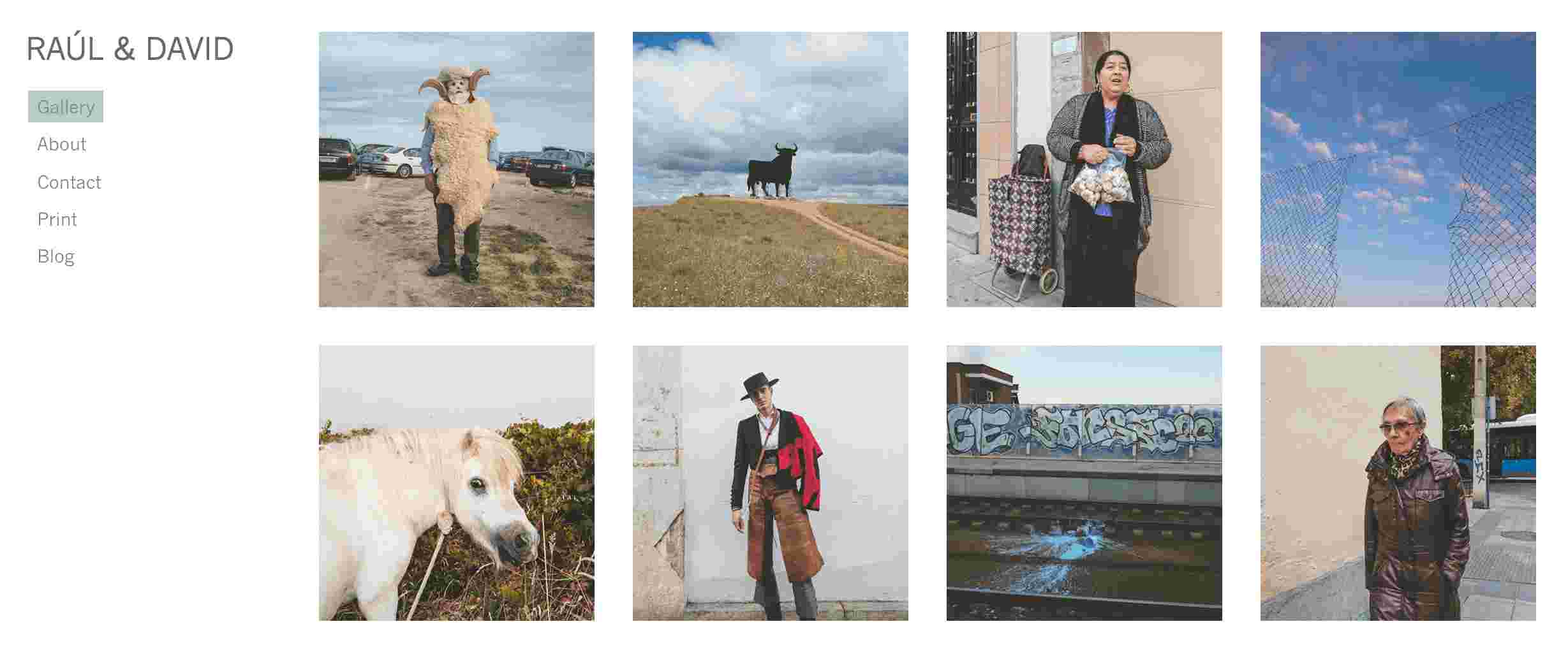
Paul David uses a sidebar on the left to guide the visitors. It has a regular sidebar in which the text is highlighted in green color on hover.
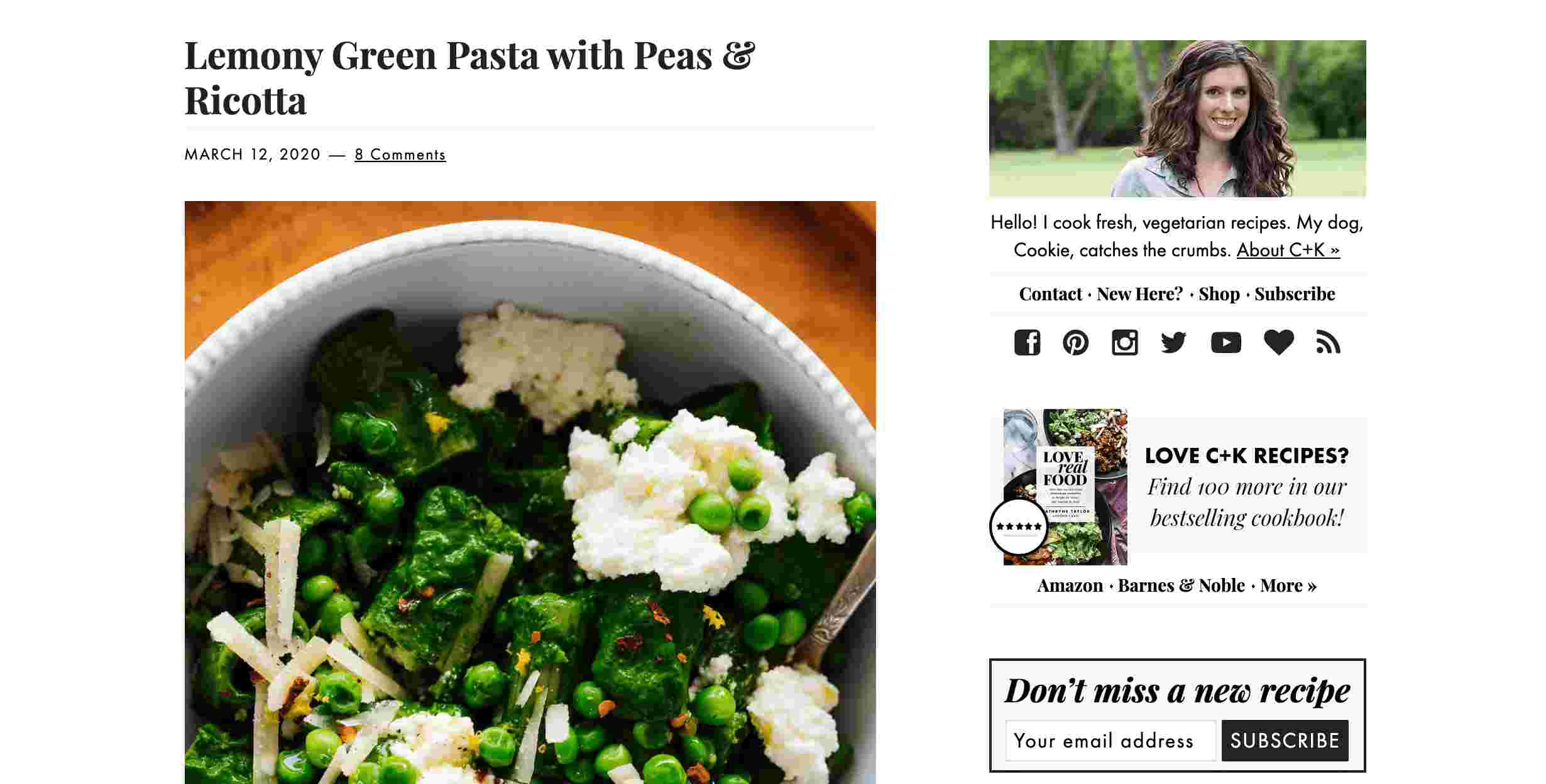
Cookie and Kate is a blog created by Kate, a self-taught photographer and cook from Oklahoma. Her website has a sidebar on the right that has many options such as her profile, links to social media pages, news, and sign up form.

Austin Kleon has two sidebars, one on the left and one on the right. The left one highlights his most popular books and the right one displays his profile. It is smart to use a multiple-column layout with sidebars if you wish to share more information with your visitors.
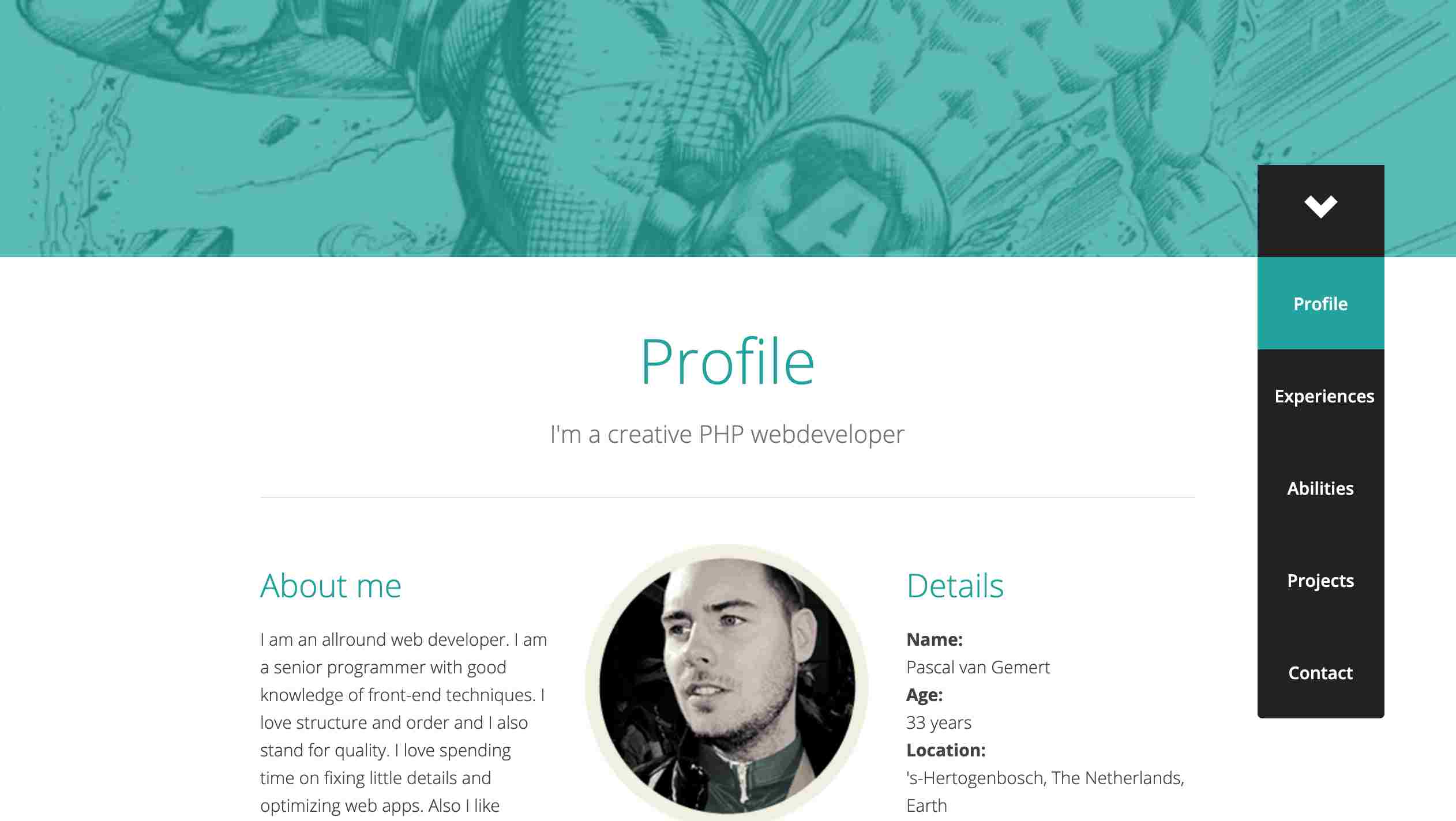
Pascal Van Gemer uses a sidebar on the right to indicate what visitors are looking at. The home screen features an arrow as a directional cue to guide the visitors to scroll down. On scrolling down a vertical navigation bar will appear.
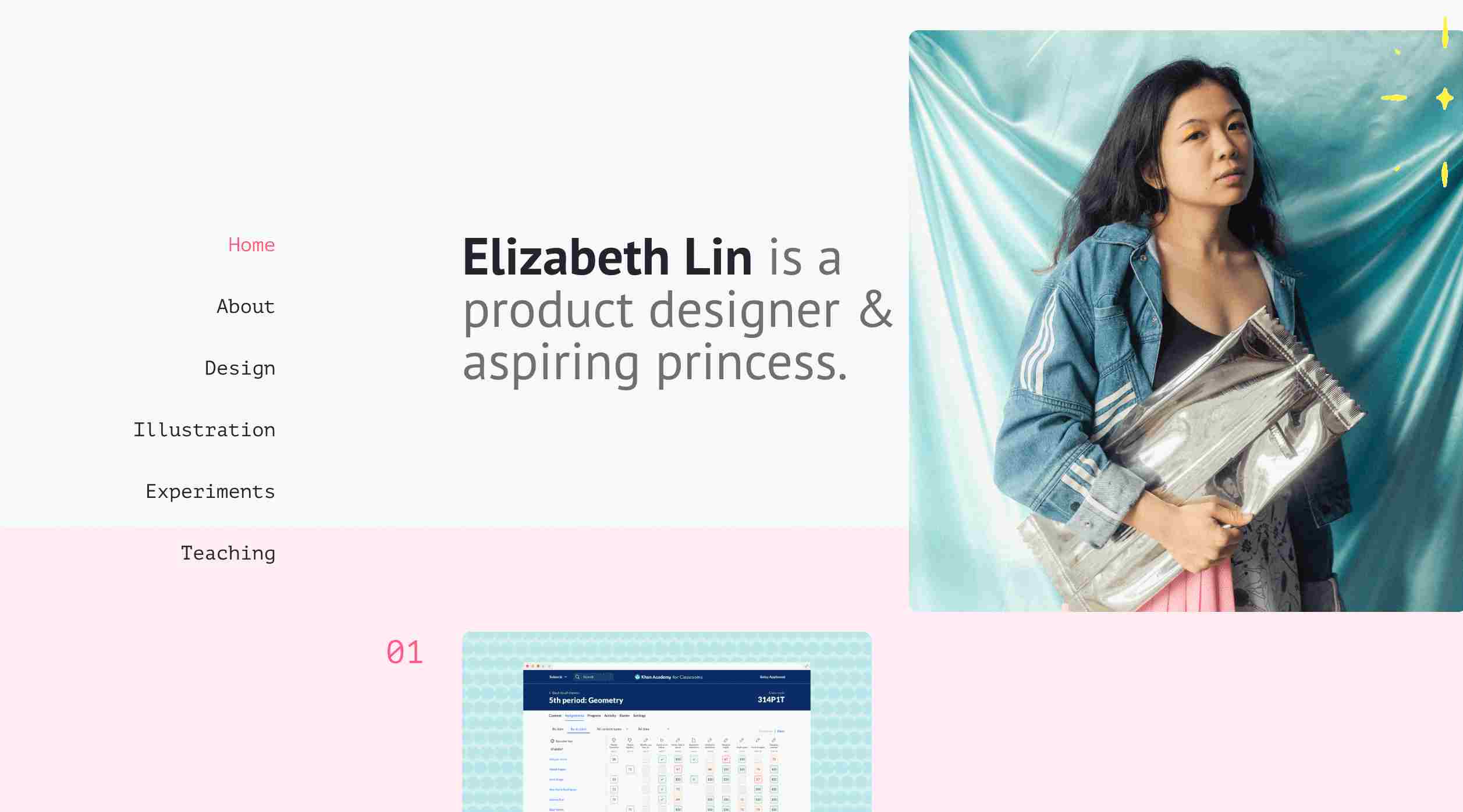
Elizabethy Lin is a very good-looking website. The vertical navigation menu is the only element displayed apart from the showcase of her amazing portfolio. Thus the sidebar becomes the primary navigation to explore her work. This also creates a very clean and simple interface.
Sidebars play an important role in websites, but designing a good sidebar is not an easy task. There are many principles of website navigation menu design and other necessary factors you should take into consideration. This is a YouTube video that teaches you how to create a sidebar using HTML, CSS, and jQuery.
However, if you have no background in any development language, you can still use design tools to create a sidebar from scratch. The prototyping tool Mockplus can be a useful tool for doing so. Besides, navigation bar templates might be helpful as well.
 Mockplus RP
A free prototyping tool to create wireframes or interactive prototypes in minutes.
 Mockplus DT
A free UI design tool to design, animate, collaborate and handoff right in the browser.
