How to quickly present your ideas at the very beginning of a product? Most UX/UI designers tend to do quick wireframing. That’s a really wise choice. But how to do a productive wireframe design? Where do you go for inspiration? You prefer using wireframing tools or just a pen and paper? Those are the questions I’ll answer for you with the 40 Best Mobile App and Website Wireframe Examples.
Wikipedia defines a wireframe as the blueprint of a website that details the site’s layout and framework. The purpose of a wireframe is usually to lay out how the web site's content is arranged and to describe the interface elements and navigation.
All the elements involved are organized carefully so that they work together. Unlike the actual website or mobile app, the wireframe is not much concerned with colors, fonts, graphics, or such things.
Wireframes vary depending on their purpose and their target audience. Developers use wireframes to manage the entire structure of a website; UI designers use them to enhance the UI design, while UX designers see them as a skeleton that connects a site’s pages with buttons and interactions.
So, the level of wireframe fidelity can be created by the wireframe tool, and we can divide wireframes into two main groups: low and high fidelity, depending on the requirements of a given job.
low fidelity wireframe is a rough blueprint for communication between members of a website team. It contains only basic elements like buttons, text, fonts, and pictures; it does not have any typographic style like color or graphics. All its elements are arranged with the main focus on functionality, behavior, and the priority of content on a website.
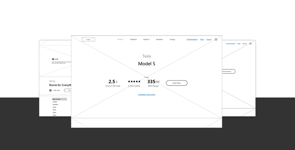
High fidelity wireframe is a more detailed design, closely matching the design of the actual website itself. As such, it usually takes longer for the designers to create. To achieve better documentation, high fidelity wireframes contain more real content such as pictures and interactions. But the color choices are not included; they are simply represented with different grayscales.
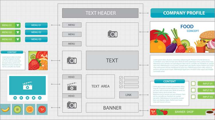
Source: Usabilitygeek
So, now you know what a wireframe is. But you still need to know what elements go into making a good wireframe. Based on the experience of a wide range of designers, we summarize below the key elements of a good wireframe:
For a website, information elements should be arranged logically and intuitively so that users get clear guidance on what to do and what they can expect. So, design elements such as the body content, share buttons, contact information, headers, footers, and so forth should all be included on the website.
The navigation system of a website should be a structure that allows users to move between pages freely and quickly, using simple commands. A website’s navigation design may contain multiple navigation systems, such as global, local, supplementary, contextual, or courtesy navigation. BTW, it’s always a good idea to follow the rules of navigation design if you want your users to have the best experience possible.
Interface design in a wireframe should provide users with the basic visual elements of the site including logo, buttons, pictures, text, drop-down menus, and so forth.
Below I will introduce you to some excellent wireframe templates covering subjects of the profile, weather, music, sports, community, food, etc. I hope you can be inspired by them.
Type: Task management App, Tool
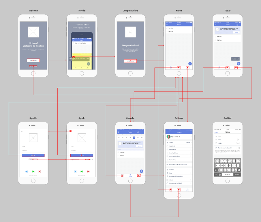
TickTick is a powerful task management app with a particularly excellent animated tutorial. This tutorial adopts the way of interacting with users and adds a real mobile phone interface together to guide them.
Type: App, Weather
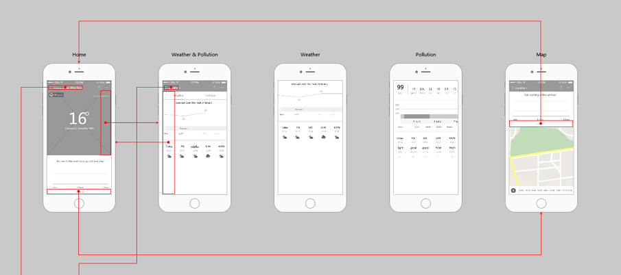
ColorfulCloads is a beautiful weather app that can accurately forecast future rainfall, air pollution, and more weather conditions. The most beautiful part of this app is a flat weather illustration on its Homepage. Pages of this prototype: login, Home, Weather & Pollution, Weather, City, Help, and Settings, etc.
The project file can be downloaded here.
Type: App, Sports
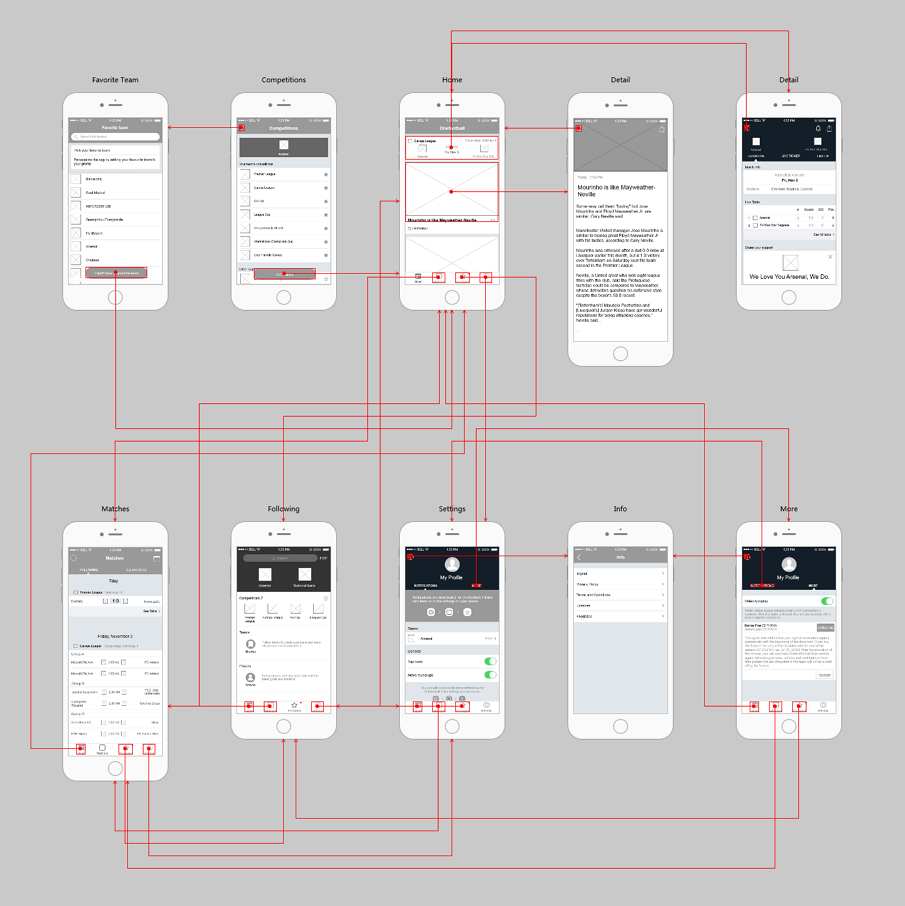
Onefootball is an app for football fans and offers breaking news, statistics, scores and live videos of over 100 international football leagues and competitions. The first page named “Favorite Team” has a floating button that could be easily approached by using a Scroll Box component to set a rolling football team list and then adding a button above the scrolling area.
The project file can be downloaded here.
Type: App, Community
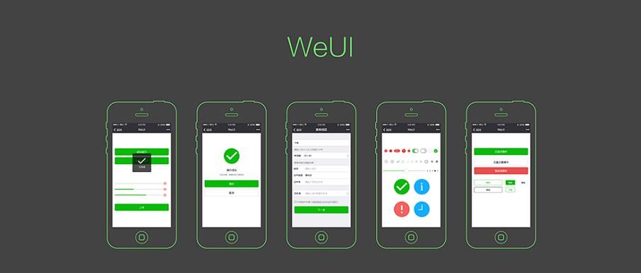
WeUI is an excellent community APP wireframe example. The key features of WeUI are the notification and upload, operation succeeds, form error, etc. The icons and shapes can easily get from the Mockplus icon library.
The project file can be download here.
Type: App, Music
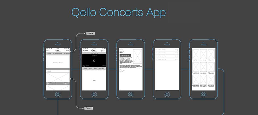
Qello Concerts is a unique Music App wireframe example. The main pages including home, spotlight, top watched concerts, new releases, browse, etc. This work can be done quickly by using a popup panel, sliding drawer and other pre-designed components.
Type: App, Food
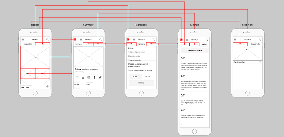
Recipes is an App designed for your delicate life, where you can find the recipes you need quickly. High-quality food images on the first page catch your eyes. The procedures of this food are within reach. In this App, the designer use sliding menu, which can be realized with the Sliding Drawer component in Mockplus. Besides, the auto image fill feature helps you to make such a beautiful prototype quickly.
The project file can be downloaded here.
Type: App, Management
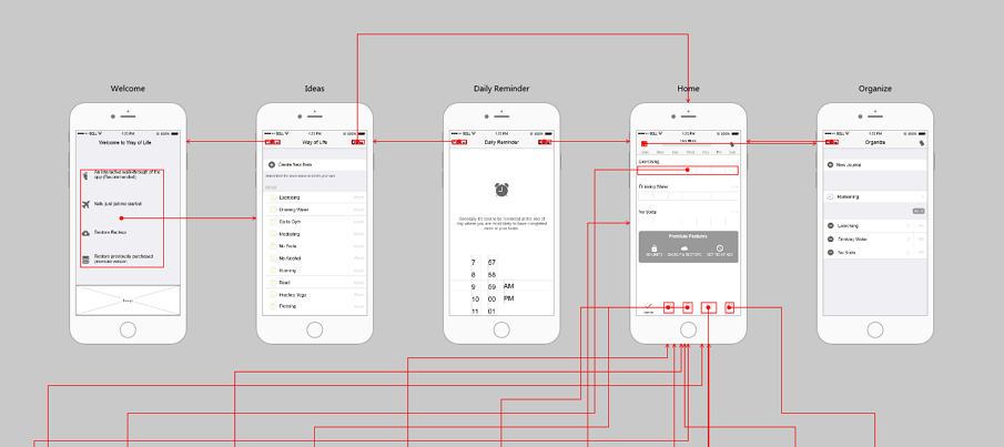
Way of Life, as its name suggests, is an App that helps you record and manage life. For people who are not very good at managing time, such application often works a lot. In this prototype, a time picker is used to set the alarm clock and some scrolling numbers are used to set hours and minutes. And in Mockplus, in order to make such a time picker, you can use the Scroll Box and the Text Area together to have scrolling numbers, set transparent background in Scroll Box and use a line component to box these numbers.
The project file can be downloaded here.
Type: Efficiency tool APP
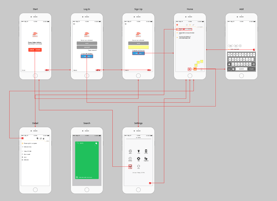
Swipes is an efficiency tool App, which helps you record things and improve work efficiency. The prototype below mainly consists of the Login/Signup page and other essential pages. Usually, we encounter this situation in a Login/Signup page: enter the password and the Login button will change color and turn to clickable.
The project file can be downloaded here.
Type: Service, App
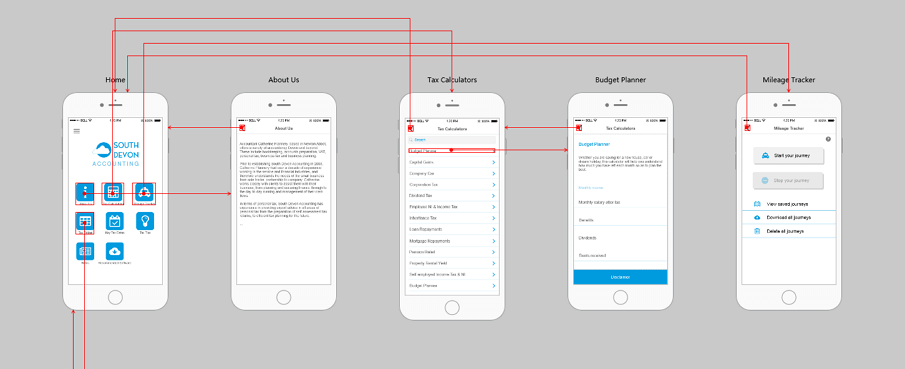
South Devon Accounting is an App which offers accounting and business consulting service. The layout is clear and simple, with the main menu consist of icons and characters. To build this menu I use the icon button component in Mockplus directly since it can edit both icon and text on it. Besides, it has various styles for me to choose. Accompanied by a rich component library, I can build a menu like this easily and quickly.
The project file can be downloaded here.
Type: educational App, Tool
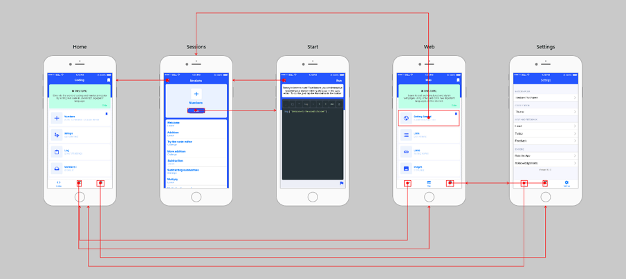
Encode is an educational App, where people can learn coding. The color of this App is system-oriented and the layout is simple and clear. The first page mainly consists of the list and one can make such a list quickly with Repeater in Mockplus. Besides, it is a long page so people can view more information by swiping the screen. This can be achieved in two ways: first is the small red slider on pages in Mockplus, the other is the Scroll Box.
The project file can be downloaded here.
Type: APP, weather
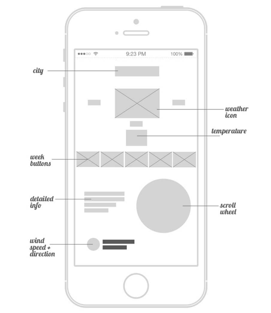
Weather App is made by designer Matt Sclarandis. He did this initial design in Adobe Illustrator and Photoshop. And the actual functioning application was programmed in java.It is a collection of wireframes and design for desktop and iPhone weather application.
Type: Mobile
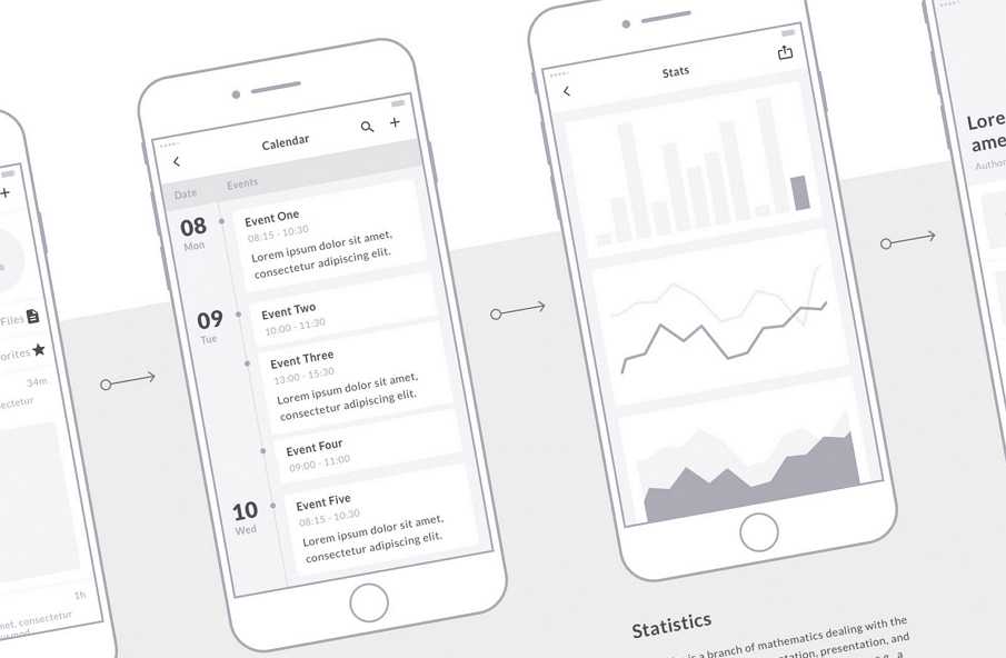
Mobile Wireframe Kit helps you work smarter with symbols to generate mockups with 90+ mobile screens and hundreds of elements . It’s also delivered with flowchart templates, great for UX flows or presentations. And as always, the kit is well-organized. Each individual layer has been meticulously named and all screens are sorted in a collection of 16 categories.
The project file can be download here.
Type: Profile
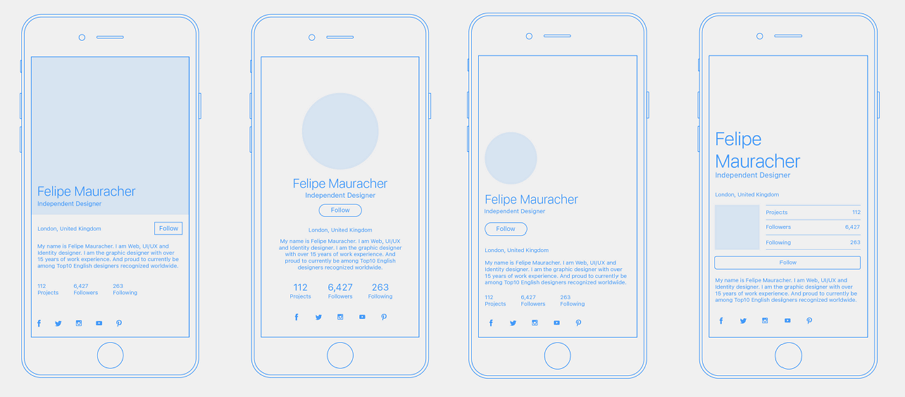
User Profile Concept was made by Tomasz Sochacki, a really talented designer. On the Behance page, you can also find the visual design、the chosen version and the final version of this project.
The project file can be download here.
Type: Sports app
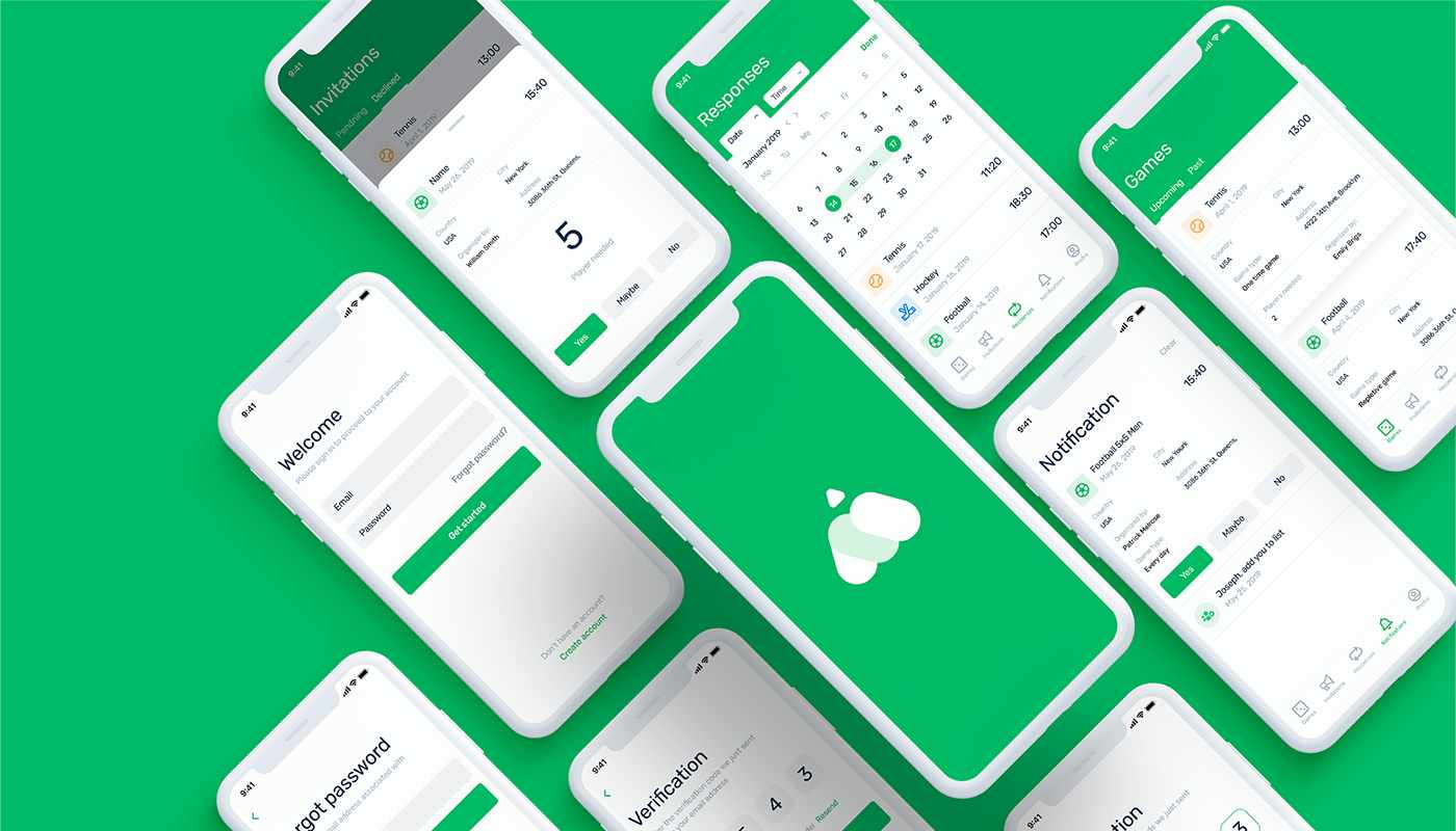
Manrim is an application that helps people organize team sports that require several people. It offers easy communication for the game organizer and players. As a high fidelity wireframe design, it has a good organization in the app structure and UX design, as well as color matching. Every part of the app benefits from clear explanations and presentation.
The project can be downloaded here.
Type: Family app
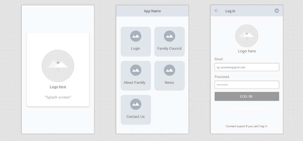
This is a free wireframe UX kit for mobiles. The designer, Ali Omar, has displayed all 46 screens in this app from start to finish. This is not just a great object-lesson in how to make single page design for a mobile app but it also teaches you how to make a structure for a mobile app by creating a flow chart. All files are created using Adobe XD. So you can simply download and disassemble it to see how it works in more detail.
The project can be downloaded here.
Type: Aid app
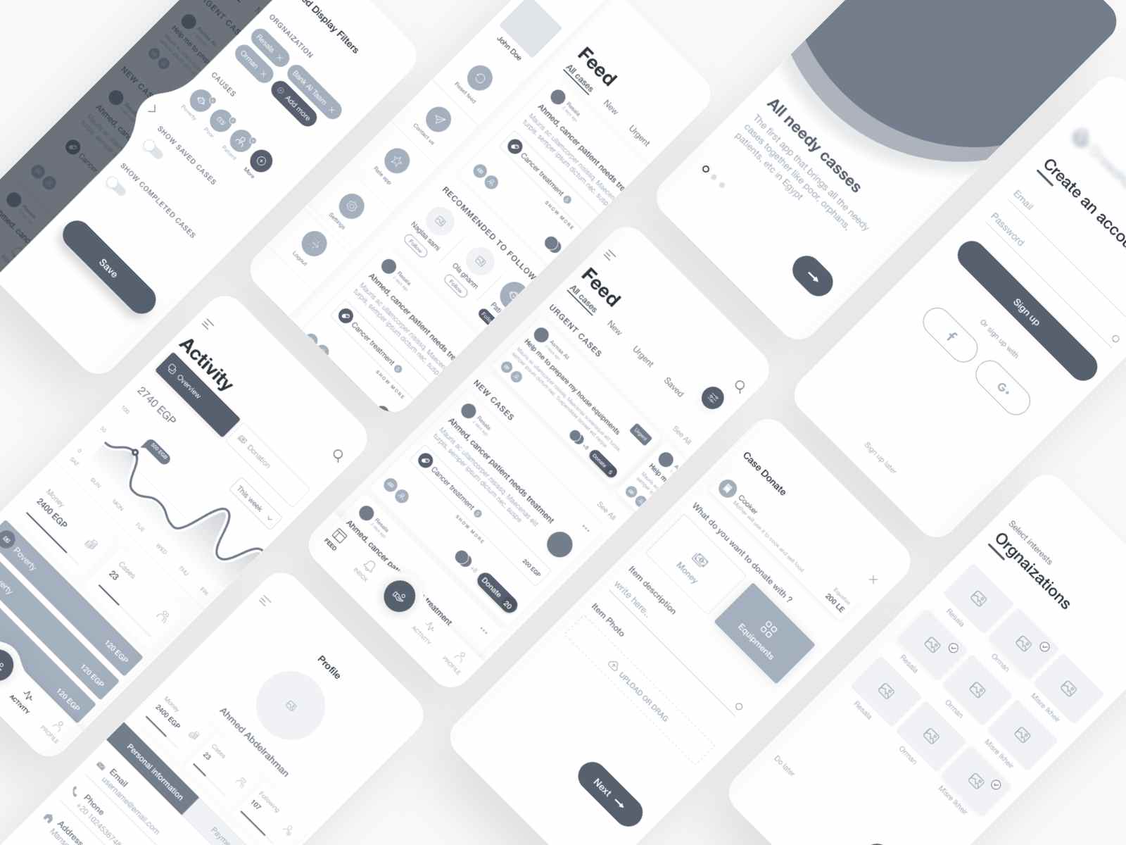
Aid app is a high fidelity wireframe created by Abdallah Mostafa. What is unique about this app is how it displays the UI details of the interaction. For example, on the filter page, it shows the drawer component, which is brought up with a swiping gesture. Moreover, it’s a great example of using different grayscales to distinguish the layers and hierarchy.
The project can be downloaded here.
Type: Personal center
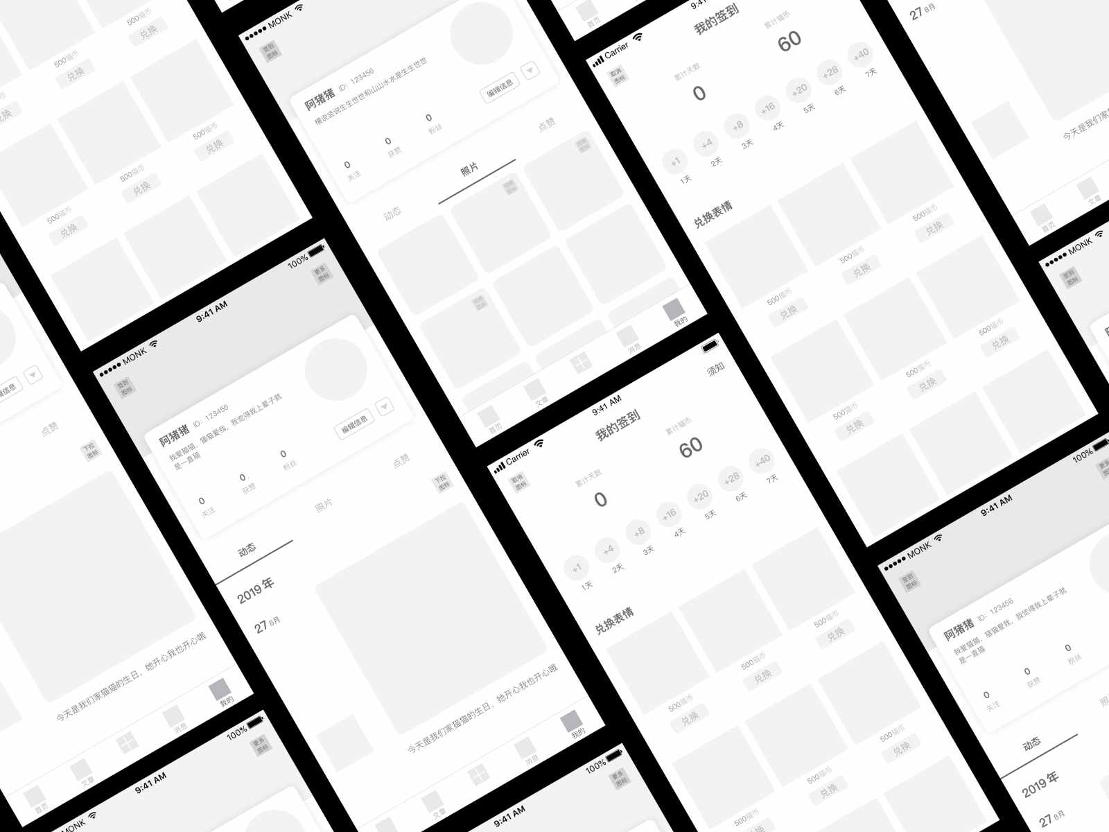
Do you still remember the definition of a low fidelity wireframe? If not, look no further. This is a typical low fidelity wireframe because of its simple gray elements. The gray circle is an avatar, and the gray square is a picture. None of them has any high-level color values.
The project can be downloaded here.
Type: UX wireframe
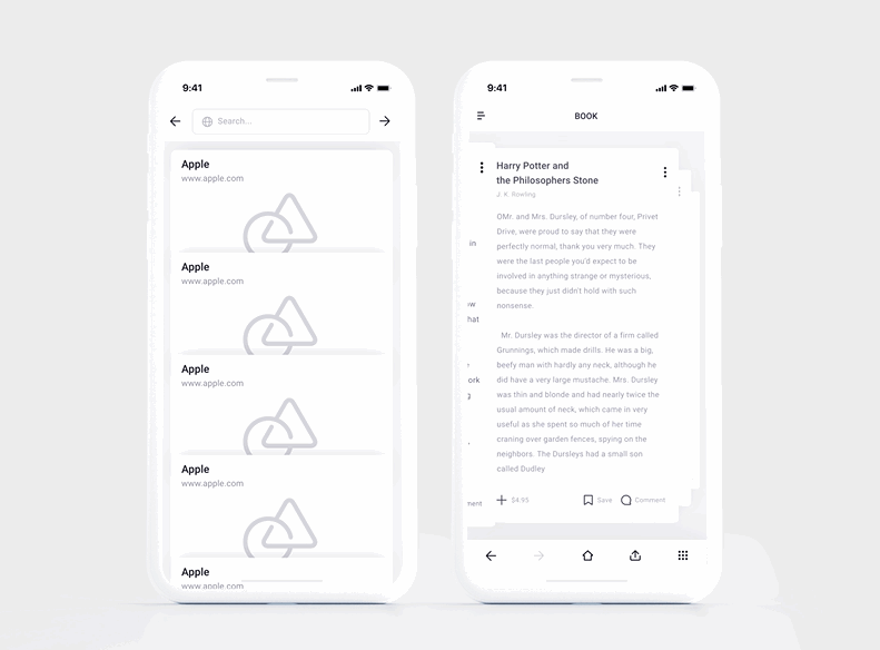
As displayed in this gif, Wireframe System II is a great example of a UX wireframe. Interaction is triggered by scroll down and left swipe. On the left of the scrolling page, it uses repeated elements such as logo, text, and graphic background to represent different things.
Tip: if you want to save time and increase efficiency, we recommend Mockplus’s wireframing and prototyping tool. Its “Repeater” feature will help you do the repeating design very quickly.
The project can be downloaded here.
Type: Workspace app
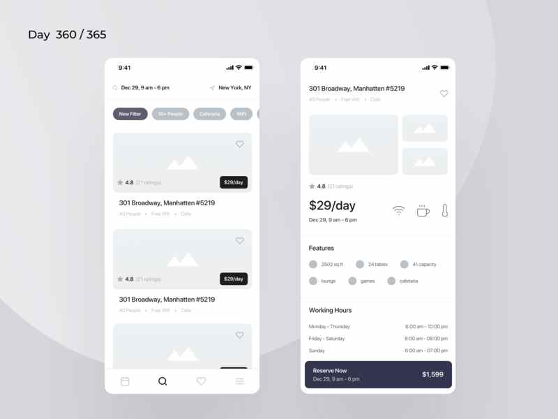
Fun Space is a series of 365 wireframe designs from Kishore. This wireframe is a great example of a job search app. It contains lots of interface elements, including the picture, buttons in various guises, and bottom icons. Below the search bar, you will find some commonly used tags accessed with rounded buttons, enabling a quick search.
On the pictures, the buttons are less rounded which establishes a visual hierarchy between the elements. So, the visual balance between the elements in a wireframe is important for achieving an elegant interface.
The project can be downloaded here.
Type: Heroes app
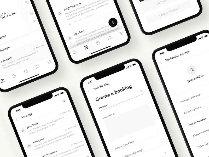
Home care is a high fidelity wireframe designed for the iPhone X with a nice interface. It aims to help people with disabilities to connect with “Heroes.” Here it displays six screens including Heroes, Dashboard, Nearby Missions, Superhero, Messaging, and Bookings.
What makes this wireframe look both professional and attractive is the variety of fonts with different sizes that can be made bold. A good wireframe designer should be an expert in making even the common elements look special.
The project can be downloaded here.
Type: E-commerce
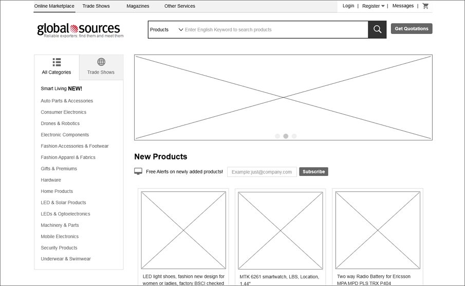
Global Sources is a typical E-commerce website wireframe example. It contains several main pages, including home, categories, login, messages, etc. Every commodity can be displayed in the central area with rich information orderly. The navigation is flexible and useful.
Type: Web, Music
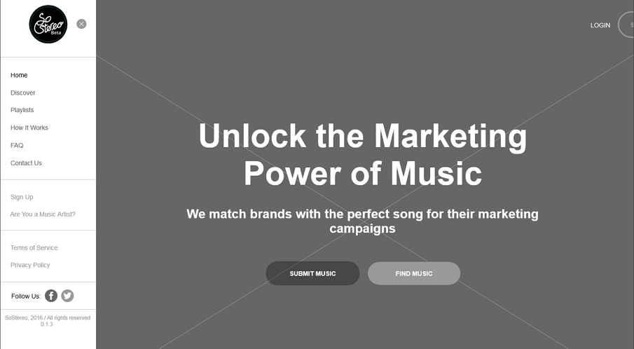
So Stereo is a simple and enjoyable music web wireframe example. It contains pages of home, search, discover, faq, privacy policy, terms of service, etc. The best part is you can submit music you love to it by simply click the“submit music” button.
The project file can be download here
Type: Web, Education
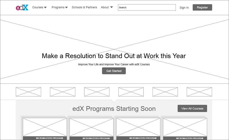
Edx is a quick wireframing example of education. It only wireframes with basic frames and elements. The main pages include entrepreneurship, courses, programs, school & partners, about, etc. A good example of any kind of educational institute or online courses.
The project file can be download here
Type: Web, Fashion
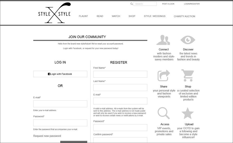
StyleXstyle is a really stylish fashion web wireframe example. It has the basic pages like details, login, charity auction, profile, etc. Each page is well-designed and every element is placed orderly. User can easily navigate to what they want.
The project file can be download here
Type: Web, Enterprise
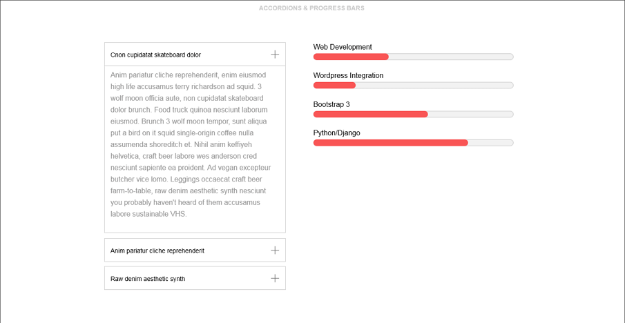
Valet is a general website of enterprises. When designing a web prototype, mouse hover interactions are often used. In Mockplus, you can make these interactions easily with the stateful interaction feature. The only thing you need to do is to click the little “lightning” icon near the color, border, text and so on properties with stateful interactions, and then you can easily set the effect when the cursor passes it or when mouse down.
The project file can be downloaded here.
Type: Web, Software
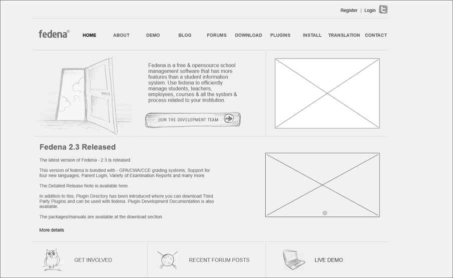
Fedena is all-in-one school management software and school management system with features like the timetable, attendance, parent-teacher-student communication and more. The main pages are the register, login, forums, download, contact, etc in this wireframe example.
The project file can be downloaded here
Type: Web, Official Website
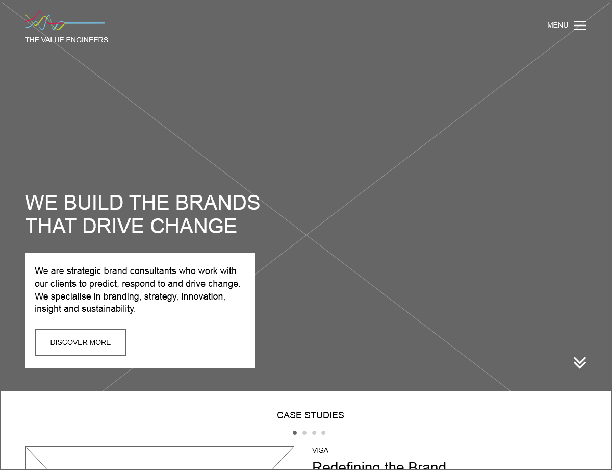
The Value Engineers is a strategic brand consultant with expertise in branding, strategy & innovation, underpinned by insight. The main pages of this wireframe example include home, about us, who we work with, contact, details, etc.
The project file can be download here
Type: Property Listing Website - Branding + Wires
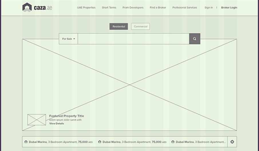
Caza was designed by Waseem Arshad, a designer from Dubai. He holds the opinion that an upcoming property listings website, it's going to be clean, intuitive and responsive. The wireframes are quite detailed and explain the workflow clearly.
The project file can be download here.
Type: Innovation
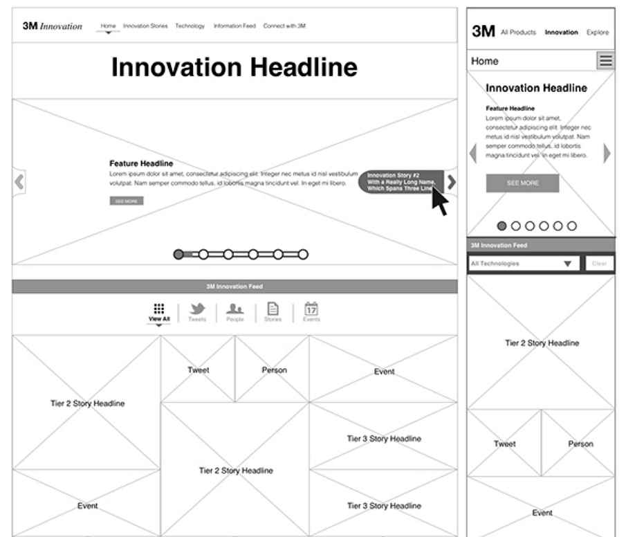
3M Innovation Website attached to, integrated with and shaped a responsive platform for 3M.com. The innovation site represents a digital home to the physical innovation centers across the world. It tells the stories and highlights the technologies that have allowed 3M innovation to advance human growth and potential.
Type: general
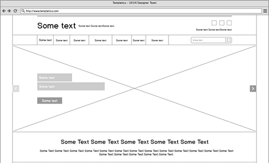
The wireframe for websites example was made by Sanjay Patel. It is a general website wireframe that could be used for kinds of purposes. The layout is quite clean and simple, and all the elements are kept in good check.
Type: Minimal website
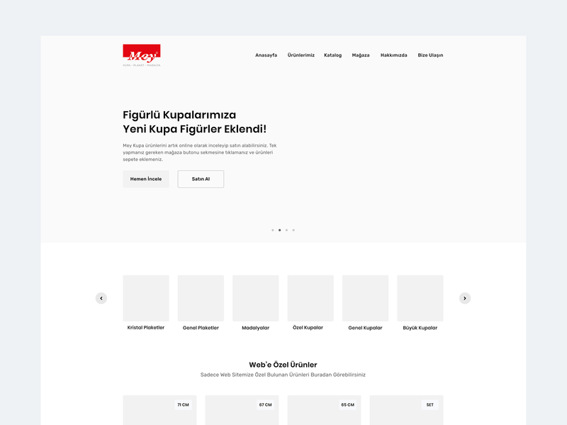
Mey is a low fidelity wireframe design for minimalist websites. Everything is simple and clean. It uses simple indication points to represent the carousel, instead of large graphic elements. It also uses a grid layout to show product pictures or whatever else you want to place here. Its large area of whitespace is a common feature of minimalist design.
The project file can be downloaded here.
Type: Creative industry
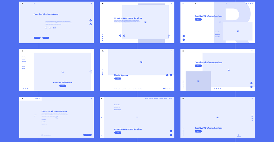
This is a creative wireframe kit with over 200 wireframe cards, sorted into 16 popular categories, such as Header, Content, Portfolio, and others. Each category boasts multiple designs and layouts. All the web pages are customizable, so you can change them to express your own creativity. All the files are available on Sketch.
The project file can be downloaded here.
Type: Business website
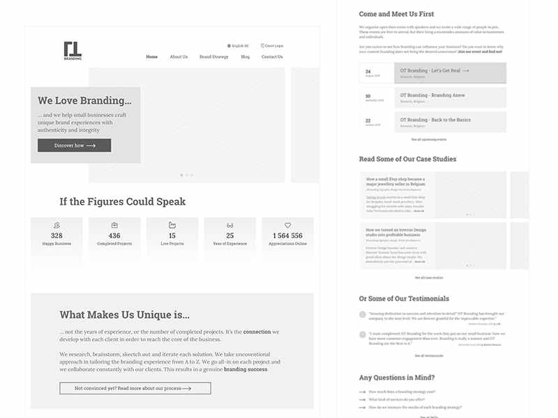
Business website wireframe designed for business websites. On the homepage, you will find a good combination of ‘hero’ images and floating layers. Layers and sections are distinguished by different levels of grayscale. The whole layout is tight and logical.
The project file can be downloaded here.
Type: Web kit
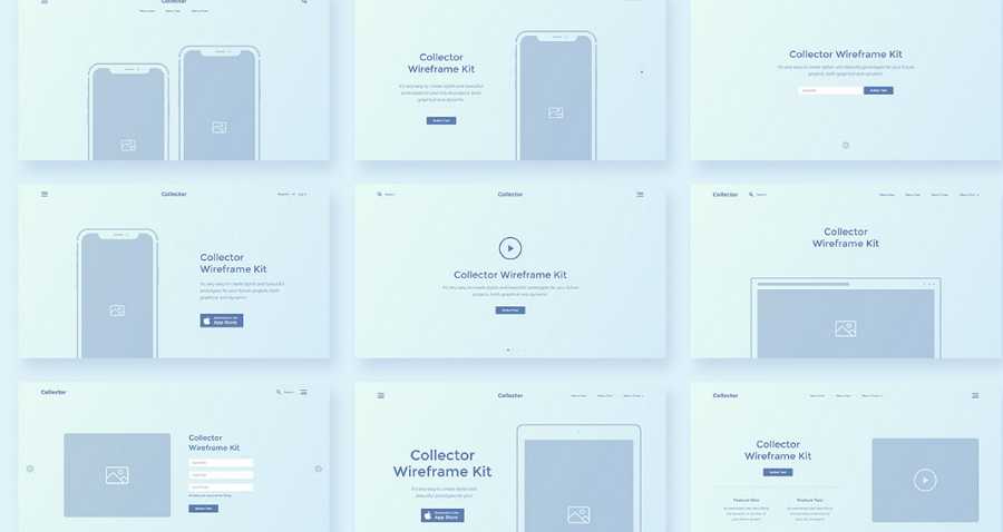
If you want to know the difference between an experienced designer and a newcomer, look no further. A professional designer is always collecting design materials and learning from them. Collector is an Adobe XD wireframe kit to help you create projects quickly and easily. Masses of components are included.
Collector is a stylish wireframe kit with 15 popular categories such as Header, Footer, Price Table, Blog, Sliders, and many more. In this collection, everything is perfectly ordered and easy to customize.
The project file can be downloaded here.
Type: Food website
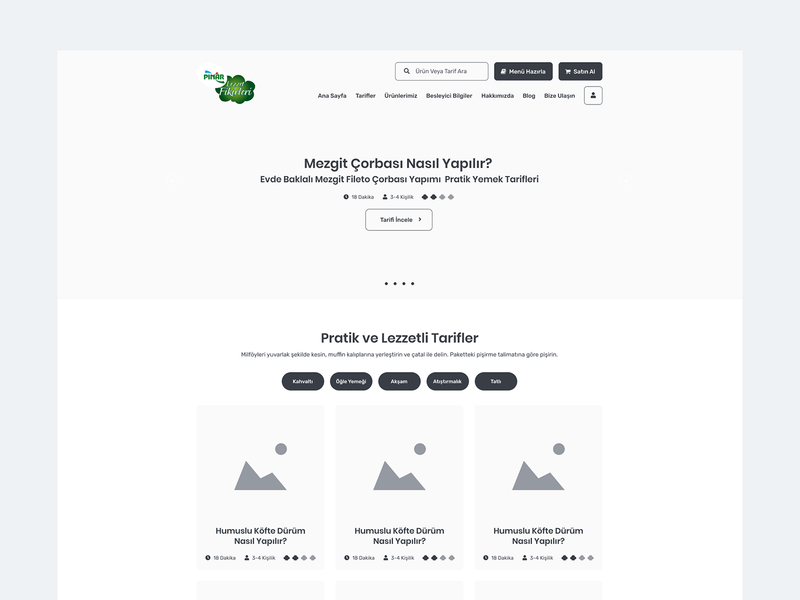
This wireframe was designed for Pınar, one of the largest food companies in Turkey. You can also apply it to recipe websites or websites for sharing information. It has a simple layout with lots of white space. Besides, the card UI is logical and clear in the way it shows information or displays products.
The project file can be downloaded here.
Type: Layout
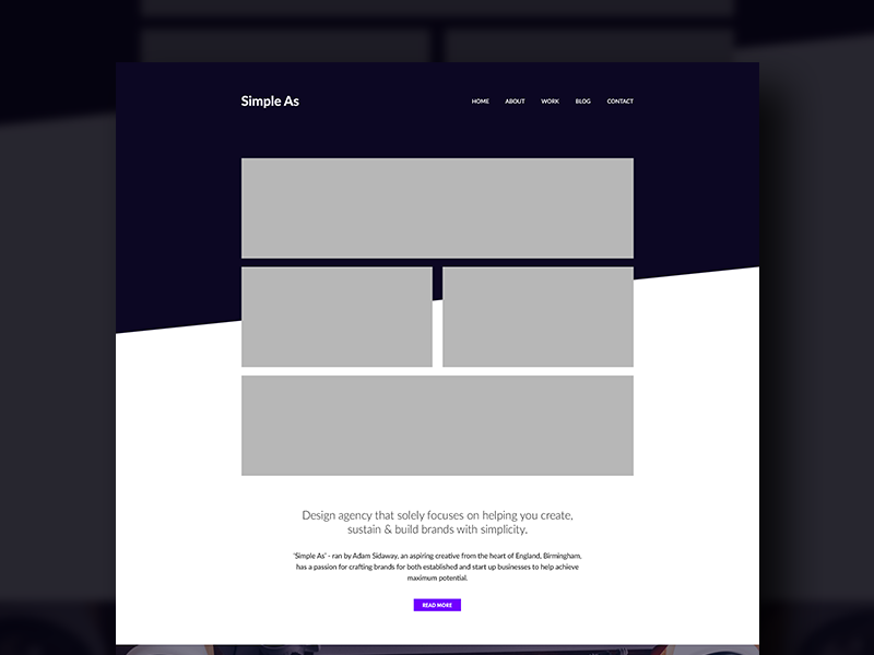
Website layout is a low fidelity wireframe for website homepage design. It uses only four graphics to establish the layout for the whole page. The black-and-white palette makes the website more vibrant.
The project file can be downloaded here.
Type: Wireframe pack
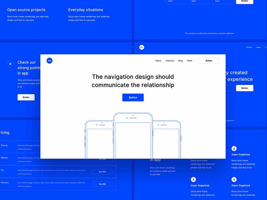
As we know, there are lots of tools that can be used to create wireframes such as Sketch and Photoshop. It can be time-consuming to have to prepare everything from scratch. So, that’s why the wireframe kits and packs have become popular. This UI wireframe pack was designed by multiple designers in Sketch and XD. It can be downloaded and imported into the tools mentioned above where you can customize and create your own wireframes quickly and easily.
The project file can be downloaded here.
Type: Website
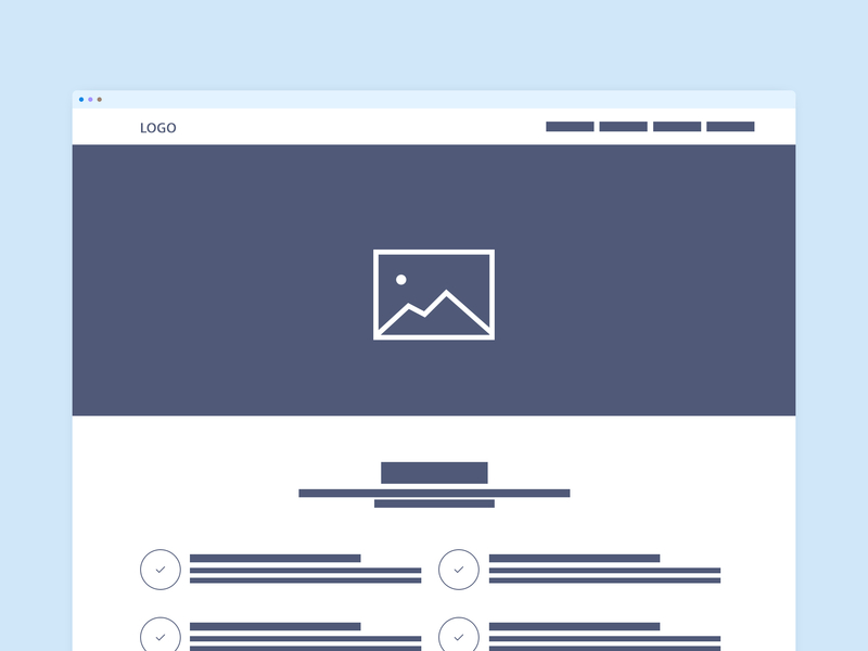
Wireframe Website Kerajaan is a low fidelity wireframe. The simple elements used are a dead give-away! A low-fidelity wireframe is a good thing to have at the start of a project when you just want to lay the foundations that can be optimized later. So, using one like with just the most basic components will really save time.
The project file can be downloaded here.
Type: Booking website
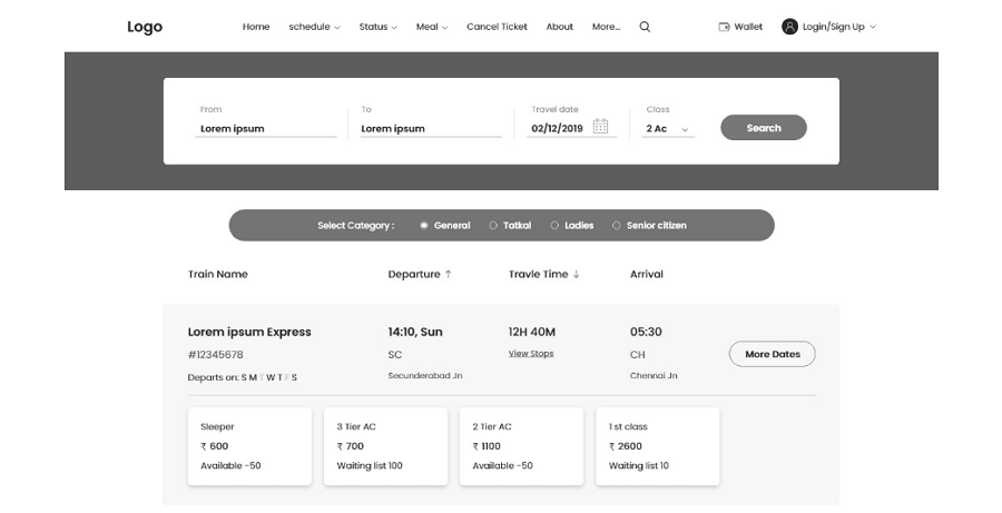
Before we travel, we need to book flights and accommodation. Travel booking is a wireframe designed for booking websites. Even though it’s only a wireframe, it has comprehensive functionality for booking tickets, meals, and payment procedures. The information design here is simple and intuitive so users should find it easy to get the booking they want.
The project file can be downloaded here.
Type: Food website
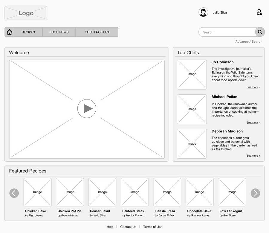
What do you think is the most important element when designing a food website? Pictures, of course! This wireframe helps create a basic picture layout for a website. It uses a grid layout with small pictures to showcase the food. As we know, pictures dominate almost 90% of a user’s attention. Lots of the repeating designs used on this website, especially pictures, do a great job of attracting users.
The project file can be downloaded here
Most of the above wireframe examples are made by prototyping/wireframing tools, and few are just sketches by pen and paper. If you prefer a screen wireframing, you’d better use a quick wireframing tool. And Mockplus maybe the best choice for you. It is a simple & clean tool makes you focus on the design instead of spending time on learning it.
Mockplus has more than 200 components, 3000 SVG icons, abundant templates, and demos. Just drop them into your canvas freely. Mockplus also it supports to export MP file from Sketch directly.
The visualized Format Painter, which can paste style to any content with just one click, the Repeater, which can free you from making the same miscellaneous adjustments, the Auto Data Fill,which can automatically fill all selected images or contents at once with simple clicks, etc.
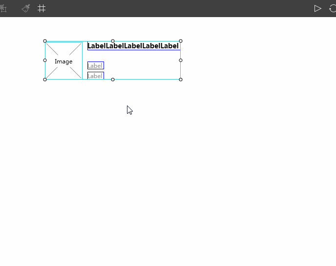
Do fast interaction design? Then you won't miss Mockplus. The whole interaction design is totally visualized, just with a simple drag-and-drop, you can build interactive wireframes and prototypes just right. The interactions in Mockplus include Page Link, Components Interaction and Interaction State. Also, it's auto-recovery can bring you more convenience.
Mockplus has 8 ways to share and test out your wireframes or prototypes. Whether on the mobile, browser or desktop platforms, you are in the freedom of choice. Never be limited to platforms or network anymore.
That’s all of it. Hope the 40 wireframe examples will inspire your innovation and help you to create something beautiful and useful. Thanks for your time.
 Mockplus RP
A free prototyping tool to create wireframes or interactive prototypes in minutes.
 Mockplus DT
A free UI design tool to design, animate, collaborate and handoff right in the browser.
