INSIGHTS OF THE INDUSTRY-LEADING UXERS AND PMS IN CHINA
Interviewer: Martin, Planning Manager at Mockplus
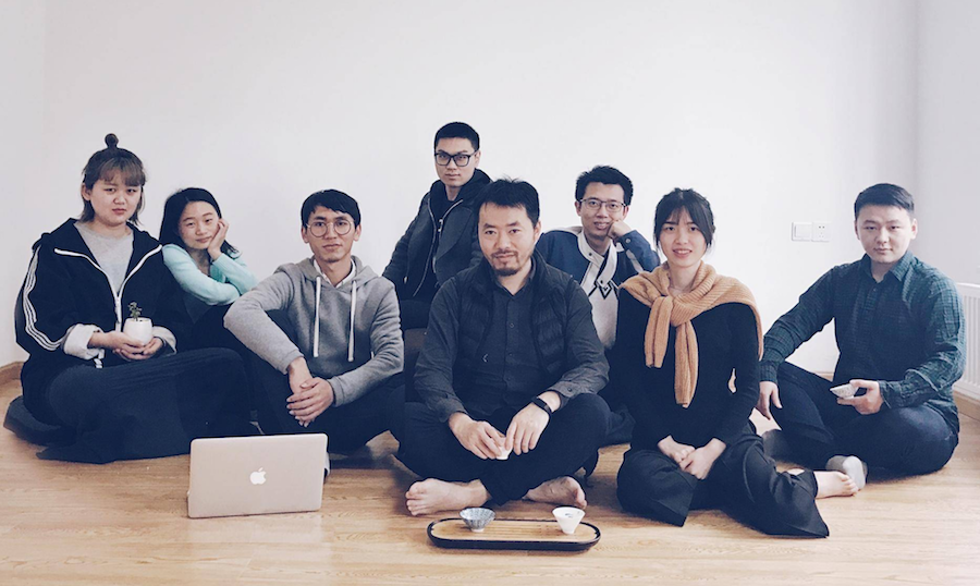
Interviewee: Tian Fei, CEO of Funp.in, together with his team
In this issue, we are honored to have invited Mr. Tian Fei, the creator of two apps, Funp.In and Drop, and his developing team. Funp.In, an elegant and efficient information-collecting app, was recommended by Apple App Store six times in a row, topped the List of Best Paid Tools for several times and won the title of the Best App of App Store in 2016. They have so many loyal fans under the circumstance that all kinds of productivity-promoting and information-collecting applications are continuously springing up and are quickly renewed. In this interview, the creator is going to tell us the story behind it.
In addition to the recommendation of Apple App Store, Funp.In also won the Aurora Award of Vivo and the Perfect App Award of Oppo App Store, won several awards given by Meizu, Pea Pods, MI App Store and Bri Nice App, and even won the national champion of the Maker Contest of Alibaba Computing Conference in 2015. Now firstly let's get to know the backroom boy of the so called masterpiece of information collecting for mobile phones.
"We have a group, composed of a dozen of members, mainly designers and programmers, who are cute and reliable and have strong work abilities. They always place design thinking in a core position and make innovation driven by design, in terms of both design philosophy and working methods.
"Now our teams have moved from traditional modern office buildings to a homey place, where we can sit, lie and be in other free states when working and don't have to worry about what to eat in the lunchtime. All of us are on the way of growing up in a cheerful working ambiance. That's really good." Said Tian Fei.

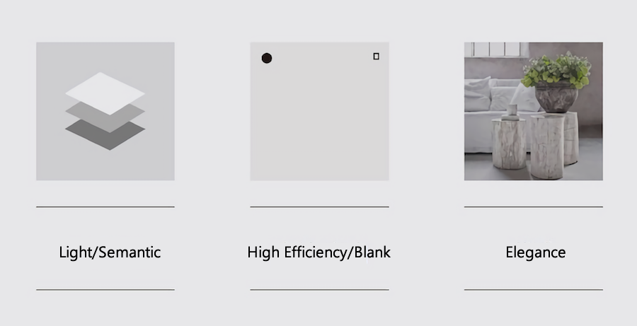
From their icons to interfaces, both Funp.In and Drop insist a style of norm core, which is to some extent against the current popular design trend. Why to use the minimalist design style? What kind of design can be considered as a concise one? How concise should it be?And how to ensure functional integrity during the pursuit of conciseness?Behind all of these are the unremitting thinking and efforts of our group members.
"I hope to present the functions of our products in a simplest and easiest way, so the products developed in recently years adopt a visual effect by using black and white as their main colors.Through a lot of white spaces in the design, their core functions can be highlighted, and the negative effects of secondary information on user's operation can be reduced.

"Funp.In is the product which takes the longest time to be prepared before its development. Its design aims at helping people in this fragmented reading era to quickly collecting links,pictures, texts, videos and other fragmented information. During the whole development process of Funp.In, we always follow the design philosophy of conciseness and strictly adopt the minimalist design style. Funp.In's simplification of the complicated collecting process shows us the benefits of making hard things simple.
On interface settings, the navigation bar is hidden, and the core function button is instead placed at the bottom of the screen. Users, once opening the app, can expand all function buttons by using his or her thumb and trigger core task flows right away. Moreover, all the menus in the editor cling to the keyboard, so as to make all operations capable to be done by thumbs. To make hard things simple is definitely what a productivity-promoting app should pursue."
This group makes deductions not only in its product's interface design but also in the function settings, to strive to perfect the product in its user experience and make its users gain the biggest benefits with the least efforts.
"Firstly, users' needs should be made bases on function settings; then, the product's core function should be settled by the deep exploring of users' needs; next, based on quick identification and small iteration, the product should be continuously improved to be more efficient and easier to use.
Users have varies needs, but they all ask for the same user experience. That is simplicity and ease of use. Therefore, in function settings, we should try our best to be closed with users and understand what they want. For example, we should take into consideration the extreme cases of use, to improve the fault-tolerant ability of the product; we should simplify the product process, to reduce user's usage costs.
When the product came into being, after a vital adjustment, our group decided to cut out all redundant functions except core functions, intensively cultivate a less-but-more-essential product and make its core functions become its distinctive functions, to enhance its competitiveness.
Conciseness and ease of use are not equal to piling up functions. Instead, high usability is usually backed by a vast of elegant design details. It sounds to be too hard on the product that we pay attention to the details of all interactions and even the location of each icon, but it indeed is the way to make the product efficient and easy to use.

Speech input is not a new interactive mode.Several years ago, there have been ads of GPS on auto which features entering the destination through voices. Afterwards, mobile phones add the functions of making calls and sending messages through voices. However, because of the low recognition rate and people's thought that it's strange to talk to a phone,speech input is mostly used in voice chat. But in Funp.In and Drop, speech input is a vital function. So how does the group consider the usage scenario and frequency of speech input when developing the product?
"We think speech input is a featured function catering to market needs based on the following points of judgement. As long as users can experience the convenience brought by speech input, they will repeatedly use this function.
1. Judgement on user's needs: the theories of Knowledge Anxiousness and Gross National Time reveals that high-value users attach increasing importance to knowledge and time, so they eagerly need an efficient tool to gain knowledge and meanwhile save time.
2. Judgement on user's pain points: productivity-promoting and management apps have been very mature in the application marketplace, but their complex and tedious operations make themselves daunting. High operating costs is the pain point that lowers user's interest in trying these apps. In contrast, through accurate speech input,users can complete their operations by simply opening their mouths and speaking, which can be done even when one is quickly walking or is on a joltybus.
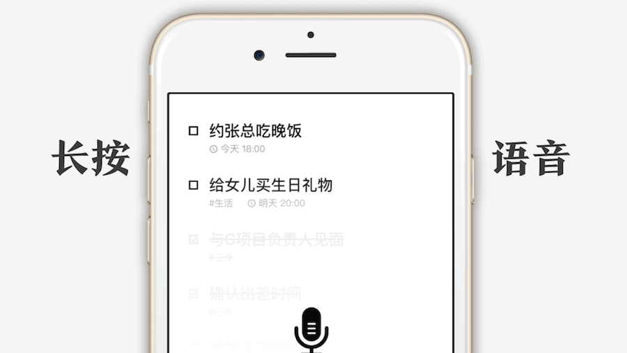
3. Judgement on user experience: it’s Create by Voice function follows the two functions of Long Press to Speak and Up glide to Cancel which are well-known by Chinese users.
4. Zero cost of learning speech input for users. Create by Voice function is also easy to use. Slightly press the button by your thumb, and the operation will be triggered without any other skip and wait.
"First one is fragmentization: knowledge fragmentization and time fragmentization. In this information explosion age, the content of the information we are searching for and the way we get them is increasingly fragmented. The information users can collect is more and more fragmented, too. It can be simply a text, a picture or even a word. Knowledge fragmentization we face now to a big degree results from time fragmentization which makes so many tasks, such as working and living in daily life, be implemented fragmentedly. Tasks recorded in our lists are usually some fragmented issues.
"Second one is immaturity. That is,users haven't developed the habit of managing their knowledge and time. It'snot difficult for a user to gain some information every day, but it's difficult to transform these information and develop a knowledge system of his or her own. In our interviews with users, we found that they didn't know how to establish a knowledge base of their own. The information was just left behindhand after being collected, and added value during knowledge transmission was not made.
"At the early stage of Drop's birth,we found from the back end data that many users had the habit of using Funp.Into write their task list. Why didn't they use a calendar or other backlog tools? The feedback we received the most told us: it's inconvenient!
"Users are not willing to spend much time and energy learning GTD and other management tools. The original reason to use tools to make plans and get reminded is that time is limited and efficient is required, but many time management tools have complex operating interfaces and steep learning curves. Based on it, we realize that users need a concise and efficient tool to make lists."

Many users tend to compare Funp.In with the products of this kind out of China. Actually, every products has their own traits, but they also overlap in some functions. How to differentiate oneself and increase product's user viscosity is the issue all developers should contemplate.
"Evernote is one of the best knowledge-collecting and management tools. I am also a loyal user of it. If it is considered as a big information processing factory whose jobs covers every parts, that is, clipping, collecting and reorganizing, then Funp.In is a transfer station focusing on collecting and recording.
"We finally determined to make collection the core function of Funp.In. As a lightweight collecting tool, only the functions related to recording remain and tags are used to classify and manage those fragmented information. Keeping focused on collecting function and continuously strengthen it to form the special characteristic of our product,which is what we distinguish from Evernote.
"However, I always believe that Funp.In and Evernote are supplementary to each other. Users can collect a large amount of information by Funp.In, and then classify and reorganize these information by Evernote, so as to make full use of these fragmented knowledge.
Whether a product can achieve long-term development, attract new users continuously and keep existing users is determined not only by the changes in design and newly added functions, but also by its exploration in different areas. As mentioned above, in our researches we found that many users don't know how to establish their knowledge base. Therefore, in the future, Funp.In will devote itself to create and develop an open community with reliance on its core competence.
"In the near future, we will keep focusing on fragmented information collecting era, to help filing and sorting the information collected by users. But collection is not the final goal. To reorganize the information and form a knowledge base is what users want.Therefore, we support users to synchronize their resources to LookBook or other bigger platforms, to make it convenient for people to further reorganize thei rthings.
"In the remote future, we hope to develop new usage scenarios based on user's potential core needs. Our product will not be limited to a tool level. It will penetrate to user's social domain.People will be allowed to find groups of common interest and profession through the platform behind this tool; people will be able to observe and explore what their counterparts are collecting, reading and sharing. Though it, knowledge will be broadly circulated and values will be highly created."
"Entering a new market is full of challenges and fun, especially for Chinese market, a rapidly rising and changing market overseas. Keeping an open mind and seizing the momentum is vital to maintaining the sustained vitality of your products.
1. The Chinese market is growing up at a rapid speed, whose users have a high requirements on efficiency; Here a new generation of users own higher aesthetic requirements and have strong demands for new things.
2. Keep open: it on one hand, it means that your group should receive diversified ideas and new things with an open mind.Only a curious and innovative group can create a interesting product. On the other, it means that your product should extend to usage scenarios as many as possible in an open form, to reach a sound expansion and ecological closed-loop.
3. Follow the trend: on the rapidly changing land of Chinese internet market, to dynamically layout the developing direction of a product is its critical strategic for surviving. So you should follow the trend and adopt a flexible way to develop your product, to quickly respond to external changes and keep your product cutting-edge.
Introduction of Funp.In: http://funp.in/

INSIGHTS OF THE INDUSTRY-LEADING UXERS AND PMS IN CHINA
 Mockplus RP
A free prototyping tool to create wireframes or interactive prototypes in minutes.
 Mockplus DT
A free UI design tool to design, animate, collaborate and handoff right in the browser.
