Need help understanding how these new features and improvements work? Let's see them in detail.
Let's take a look at the new features of Mockplus RP.
Mockplus RP adds a lot of new, ready-to-use components that make prototyping web and mobile apps easier and save you a lot of time.
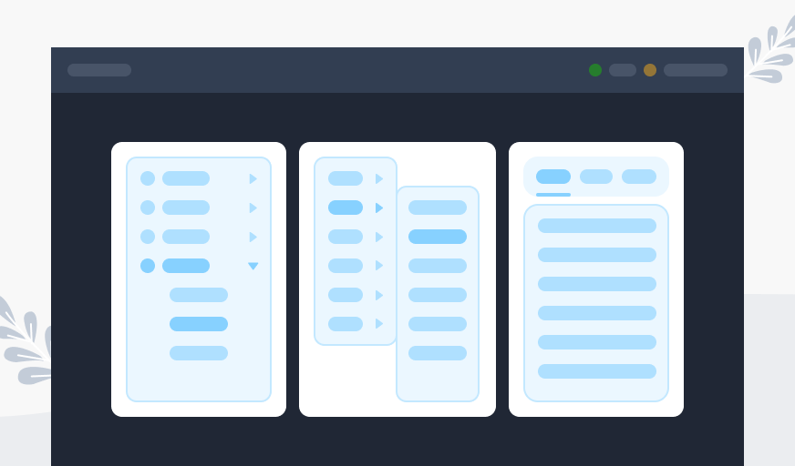
Building a responsive, interactive navigation bar is an important part of prototyping a website, but it can take a lot of time. To make this easier, new navigation tools like the Navigation Menu, Vertical Menu, and Horizontal Menu have been made available.
They all come with prebuilt interactions, so you can simply hover over them to show the secondary menu. Most importantly, you will never have to create anything from scratch with them.
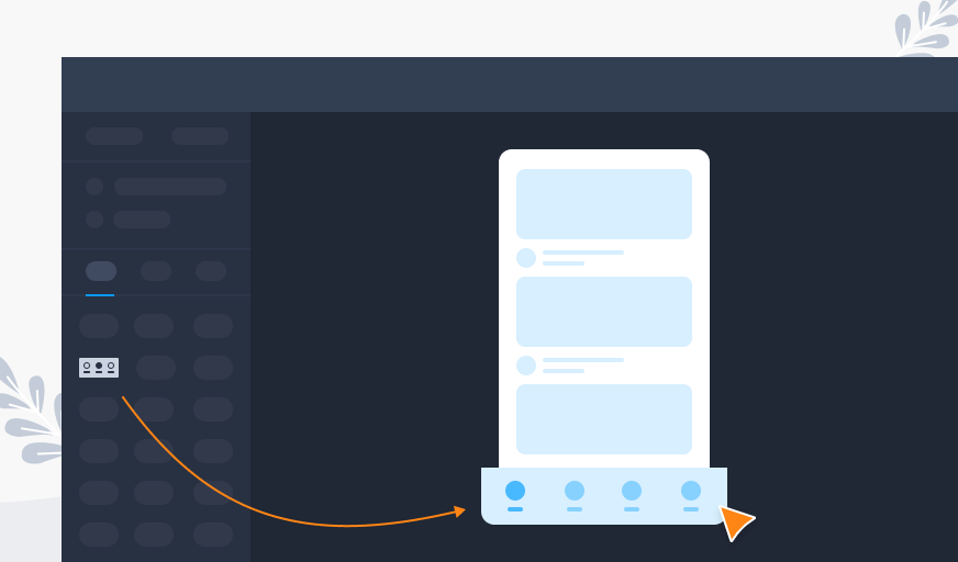
Want to quickly create a tab bar with both labels and icons? Use our new feature, the App Navbar. You can create a tab bar or a bottom navigation bar for mobile apps much faster with simple drag-and-drop. It's also simple to change the default icons.
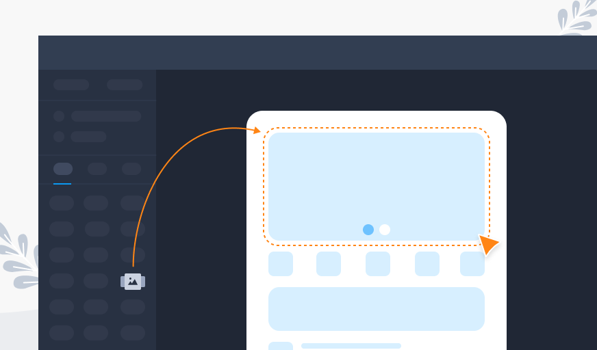
In this update, we also have another new component, Image Carousel, which allows you to quickly create a swipeable carousel-style gallery for multiple images. You can change the settings to match your design needs, like the indicator, indicator types, arrow buttons, animations, etc.
While changing your component's settings, you can now add a tooltip to it on the right Properties panel, whether it's texts, a button, or another component. Preview it, and the tooltip will display when you hover over it.
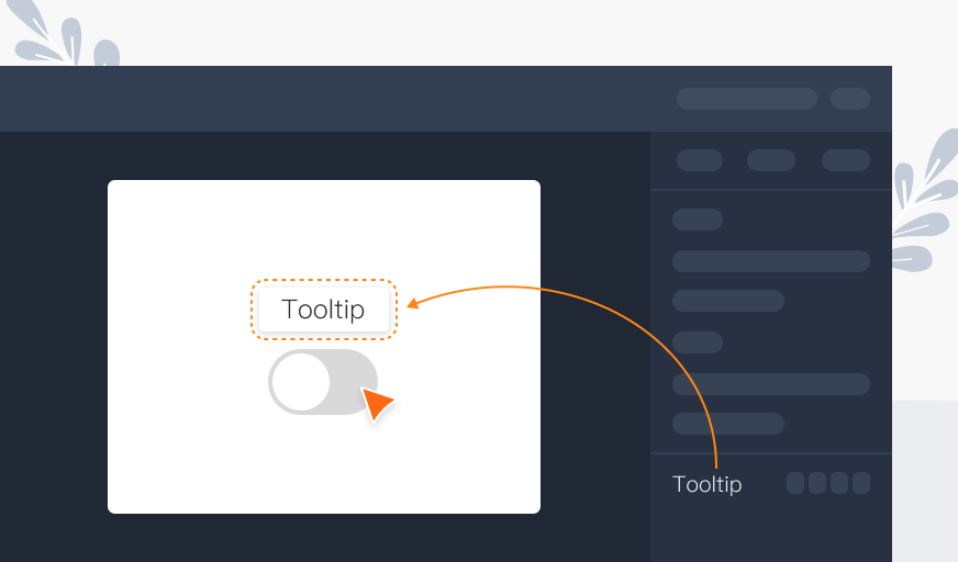
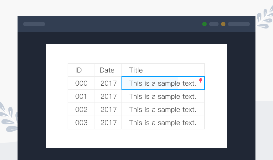
Table components are more powerful in this update. To make interactive prototypes, you can now add interactions to a single cell of a table component.
During this update, some of the shortcut keys were changed to make the whole experience easier to use.
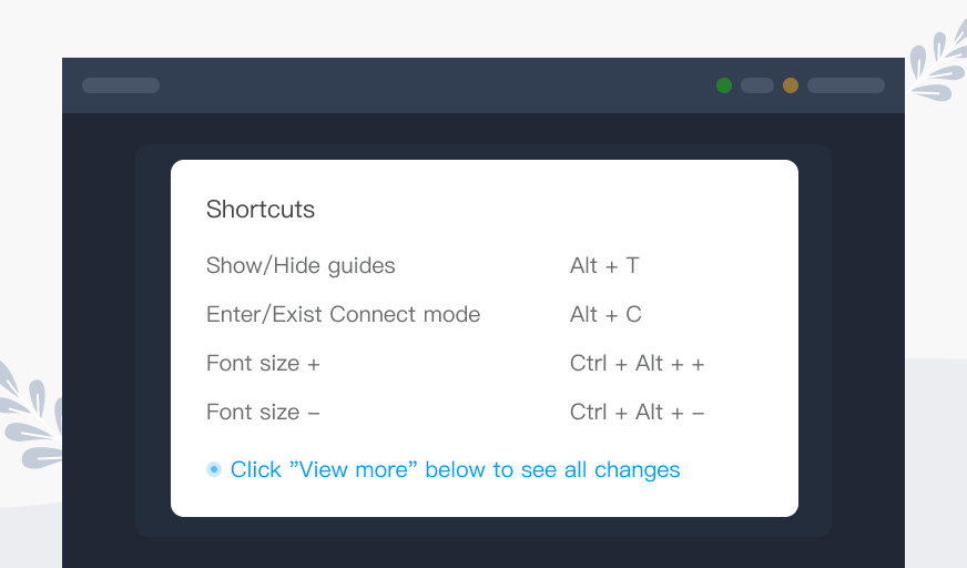
You may check this tutorial to see all shortcut changes.
Now let's have a look at the new features of Mockplus Cloud.
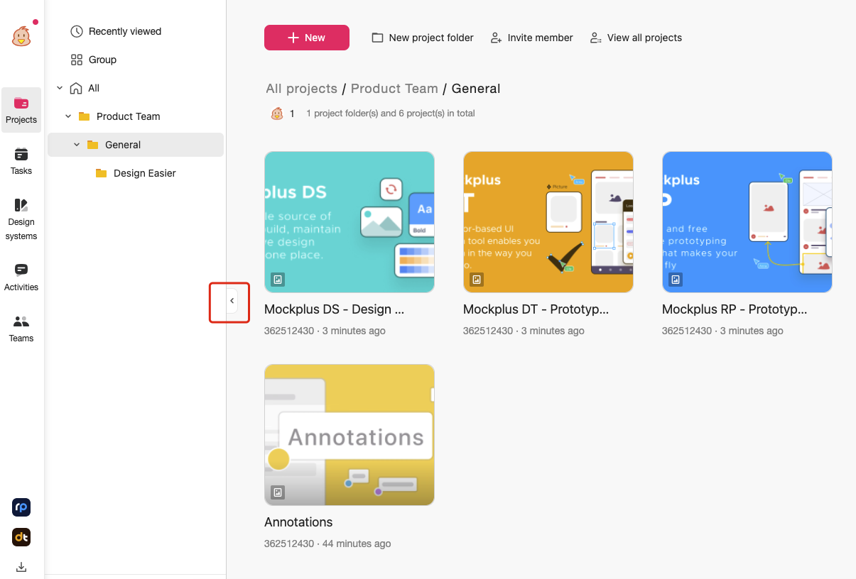
Mockplus Cloud has a new style of user interface (UI) that gives it a whole new look. Here are some primary changes:
We rearranged some visual elements that are not frequently used with accordions. All functionalities are still available, with felemwer visual eents displayed on the main interface.
We are using lighter icons with an increased corner radius to make it more modern.
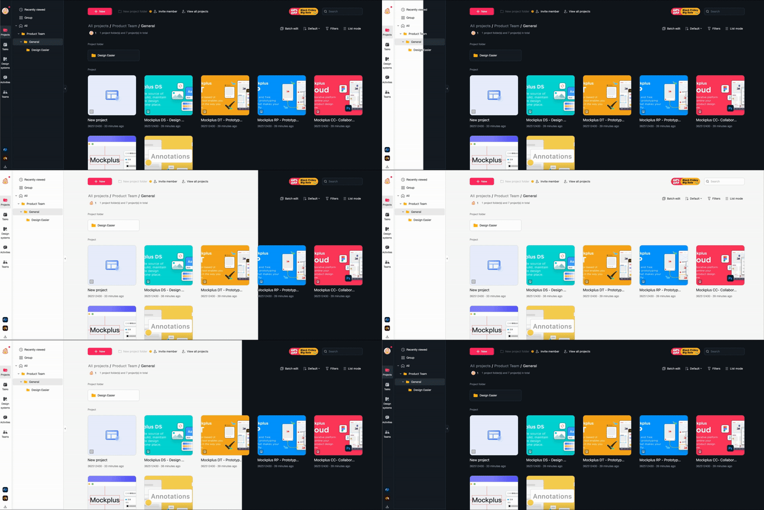
You can set your app's appearance to dark or light mode.
A new way to document your design and bring clarity to design intentions. With annotations, you can convey users' behaviors, design requirements and how the design has changed in a clearer and more efficient way, just side by side with the designs.
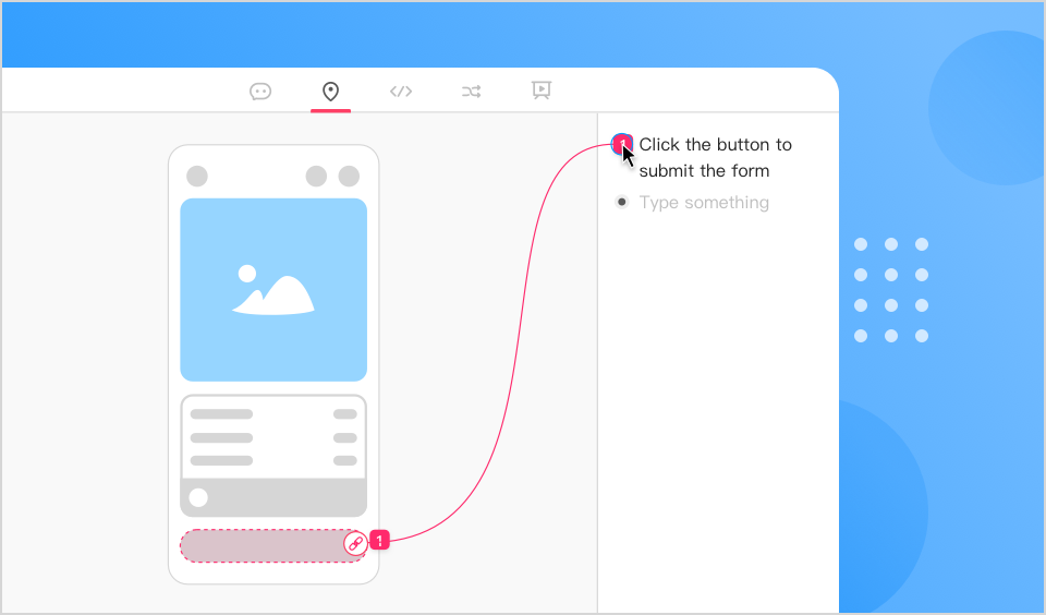
In the Review section, product managers can either write an annotation for the whole prototype/design or a specific element on the canvas. It supports rich text, including Titles, Italics, Bold and Bulleted lists. There are two ways to write an annotation for a specific element:
After that, you can also drag the list icon to change the order of the annotations.
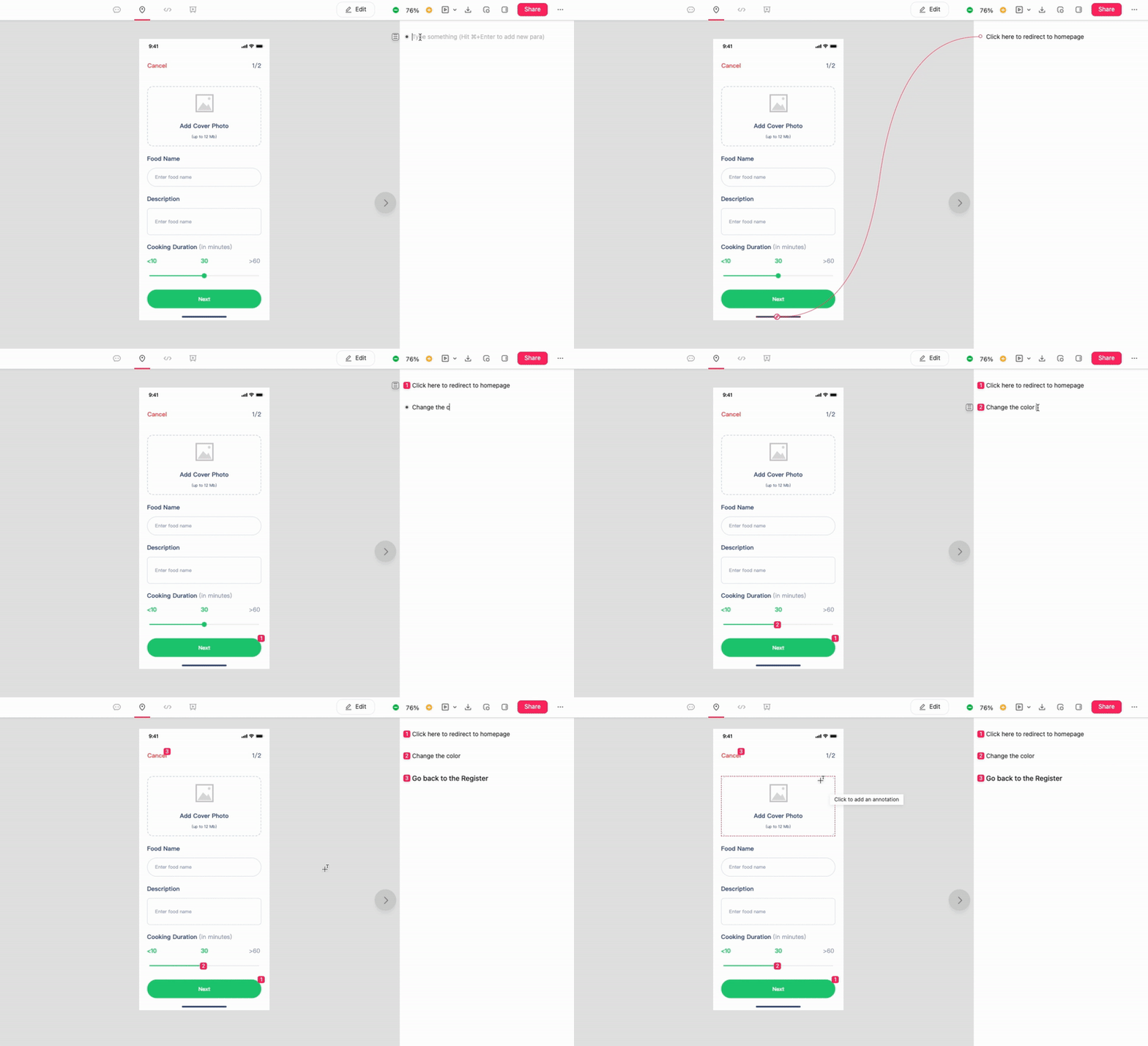
In the Development section, developers can quickly check designs along with annotations. There is no need to check a separate sheet for design requirements. Save a lot of time and remove uncertainty about design intentions.

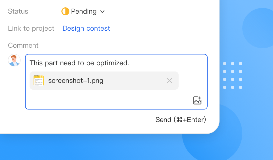
You can now add up to 10 images to a task comment to better explain your ideas or use them as references. It also lets you upload many pictures at once, and all of the pictures you upload will show up in the same order you chose them.
When it comes to adding a screenshot, we have made it even simpler. Save your time by saving and uploading it. Simply press Ctrl + V to copy and paste it into a comment.
Also visit the Mockplus website to free try all these new features!
 Mockplus RP
A free prototyping tool to create wireframes or interactive prototypes in minutes.
 Mockplus DT
A free UI design tool to design, animate, collaborate and handoff right in the browser.
