Web design has developed a lot since the 1990s. How did websites look like in the 1990s? What has changed between the 1990s and the 2000s? We have picked 15 websites from the 1990s, let’s check them out!
Even the big brands have gone through a time of having a website that included big chunks of text, inline links, sliced background images, and flash animations. You can have a look at those websites today so that you can see the differences clearly.
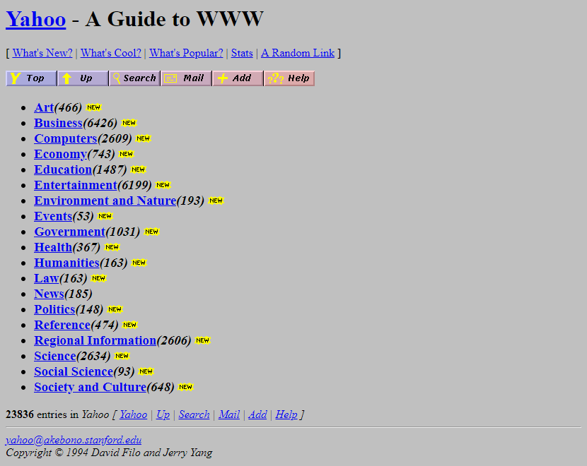
Yahoo is a website which offers news, email, and a search engine. Yahoo's website used a lot of text with inline links. This is how the Yahoo website looked like in 1994:
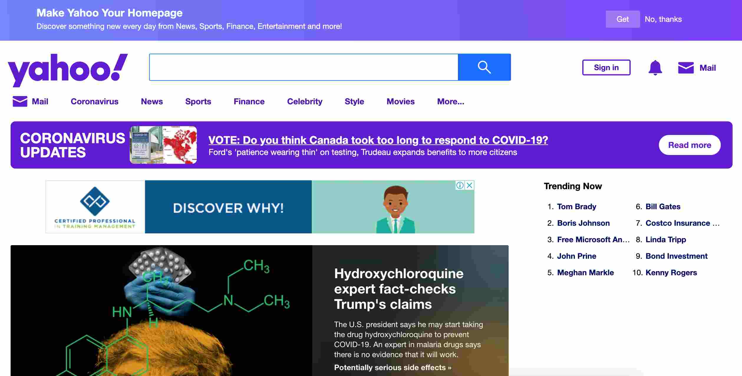
Yahoo has a new design now. It is a famous search engine and has a large search box. The home page has more layouts with structured elements.
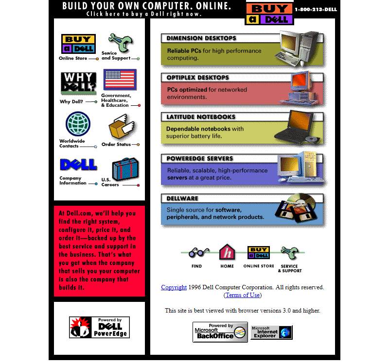
Dell provides the world's top technology solutions and services. The laptop is one of their famous products that has many fans all over the world. Its website was prettier than many other websites in the 1990s. It had two columns to present the products with images and text divided into several sections. This is how the Dell website looked like in 1996:
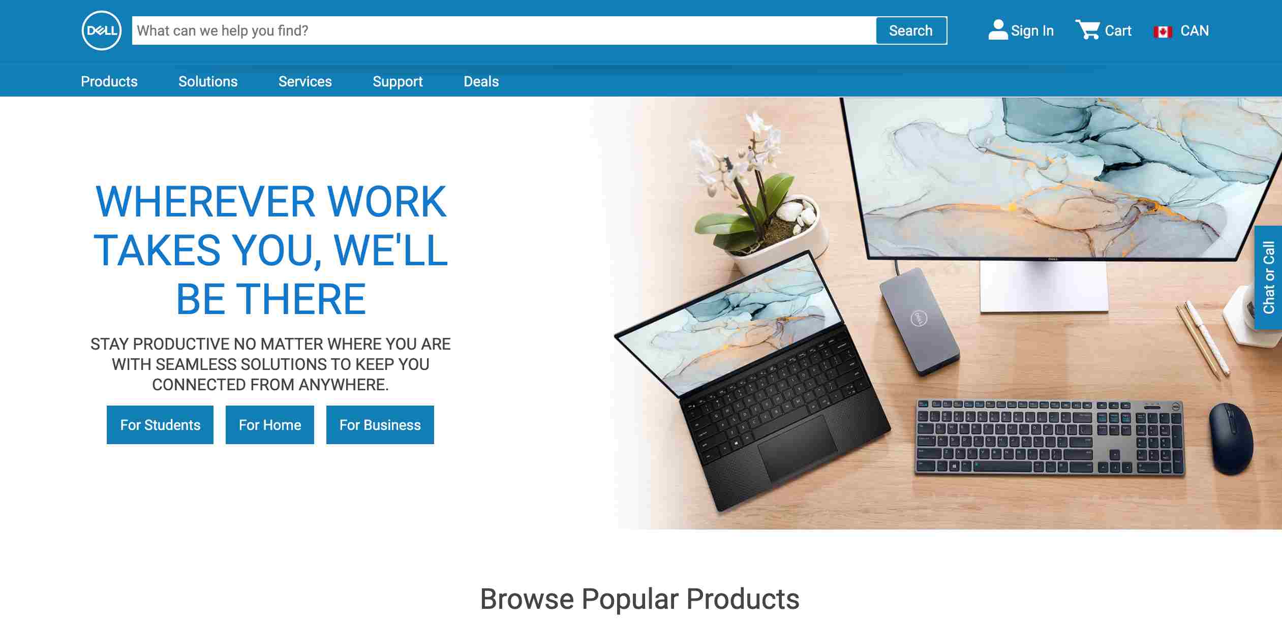
Now, Dell has a website that is uncluttered. It features a large search box on the top to guide customers to find their desired products.
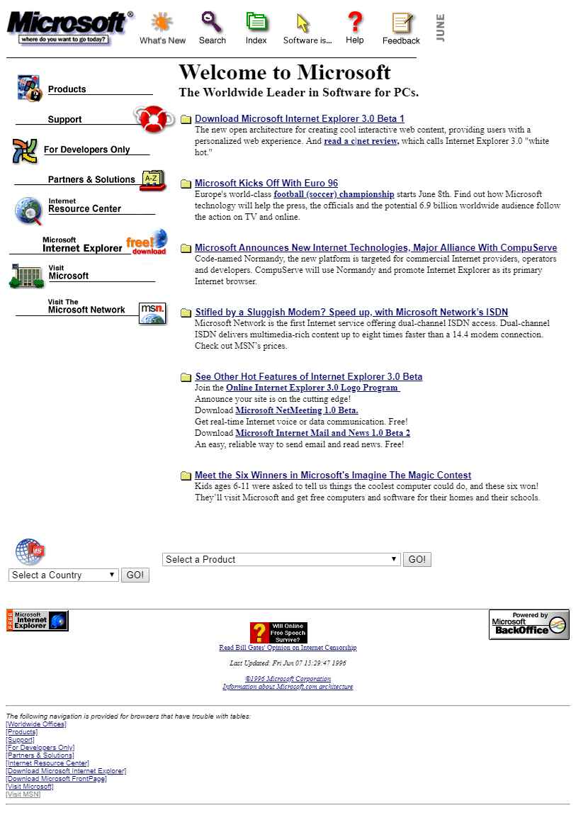
Microsoft is a multinational technology company. It has become one of the famous brands that sell computer software, consumer electronics, personal computers, and related services. Its website had a horizontal navigation bar on the top. It also used a split layout to display the main products better. This is how the Microsoft website looked like in 1996:
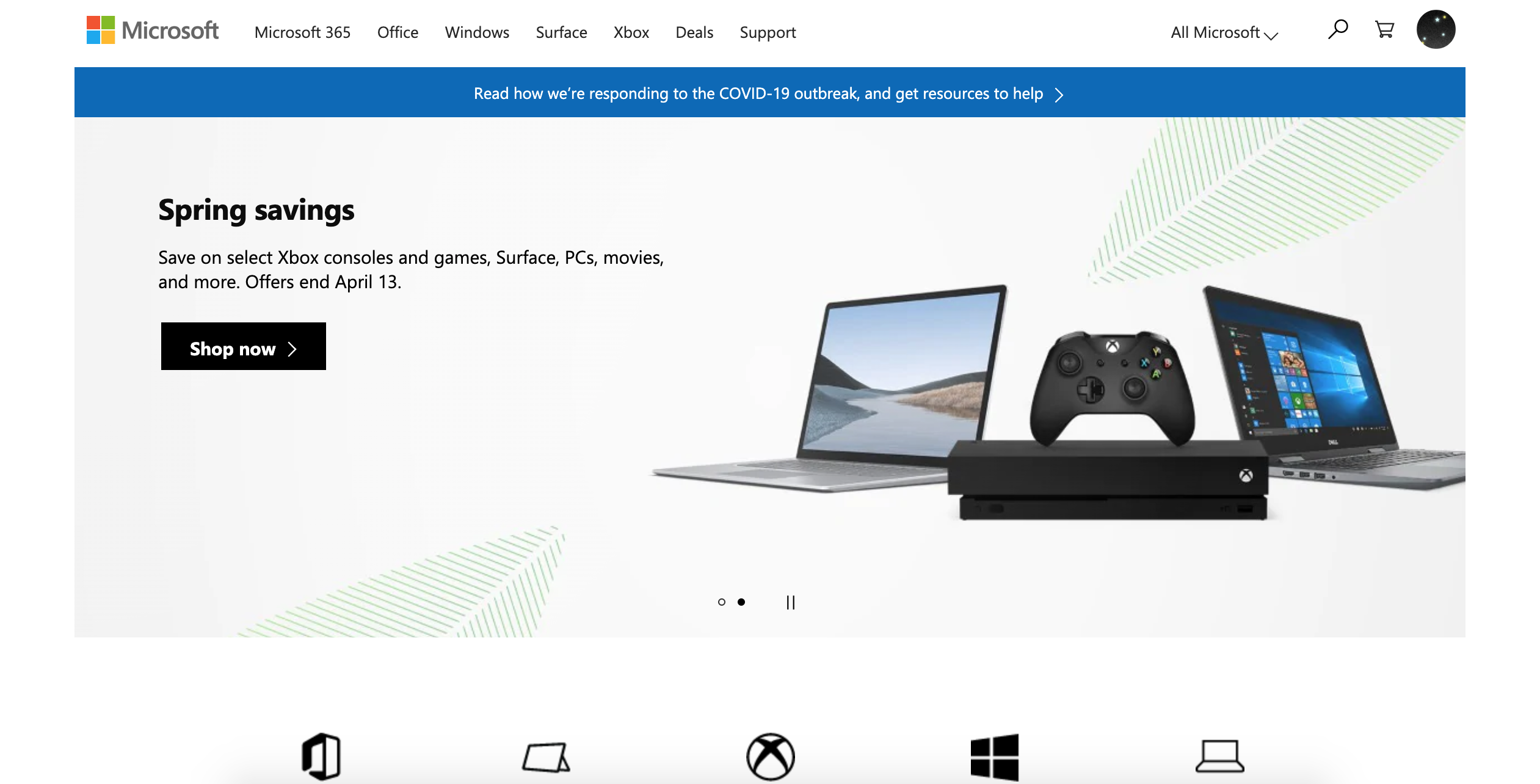
Now, Microsoft's website features a strong modern look and feel. With simple typography on the left and product images on the right, the website clearly showcases its brand identity.
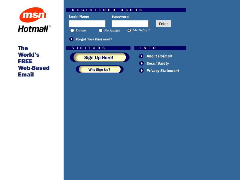
Its website in the 1990s contained a vertical bar on the left to showcase the logo and the main business. The use of blue color was also not a bad choice because blue is the safest color for web design. This is how the Hotmail website looked like in 1998:
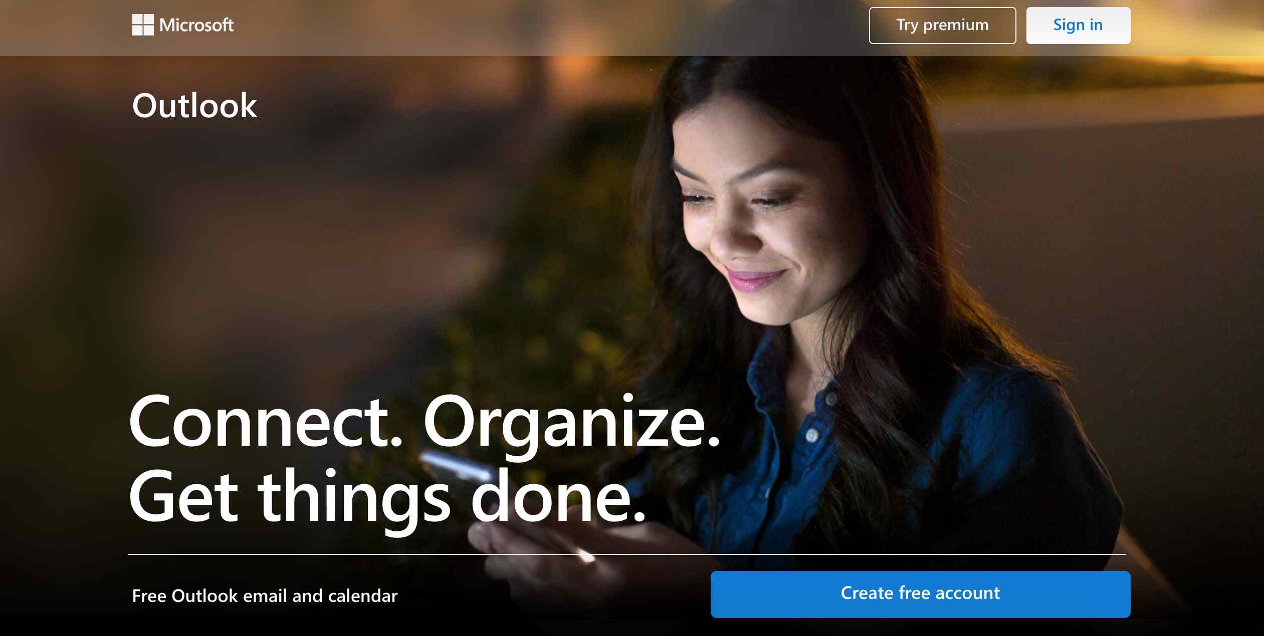
Hotmail is now with Outlook, which is a web-based suite of email, contacts, tasks, and calendar services from Microsoft. Its website features a background image that covers the entire screen with bold typography and a compelling CTA.
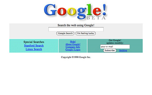
Google is helpful for searching the world's information such as web pages, images, videos, and more. Its website was in beta twenty years ago. This is how the Google website looked like in 1998:
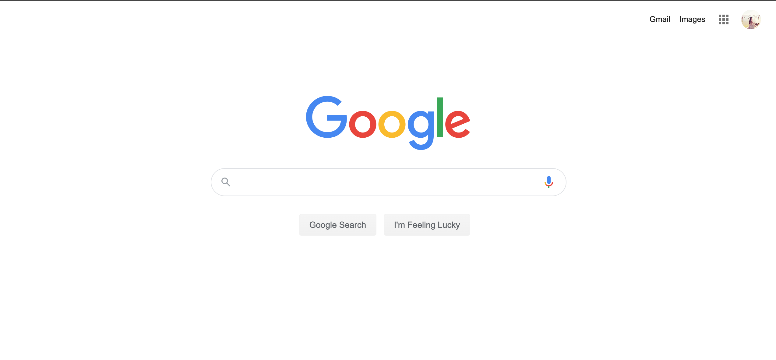
Google developed Material Design in 2014, which helped to bring simplicity to its website design. This is how the Google homepage looks like at present:
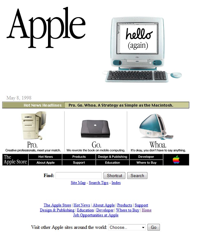
At present, Apple is one of the most innovative companies in the world. This is how the Apple website looked like in 1998:
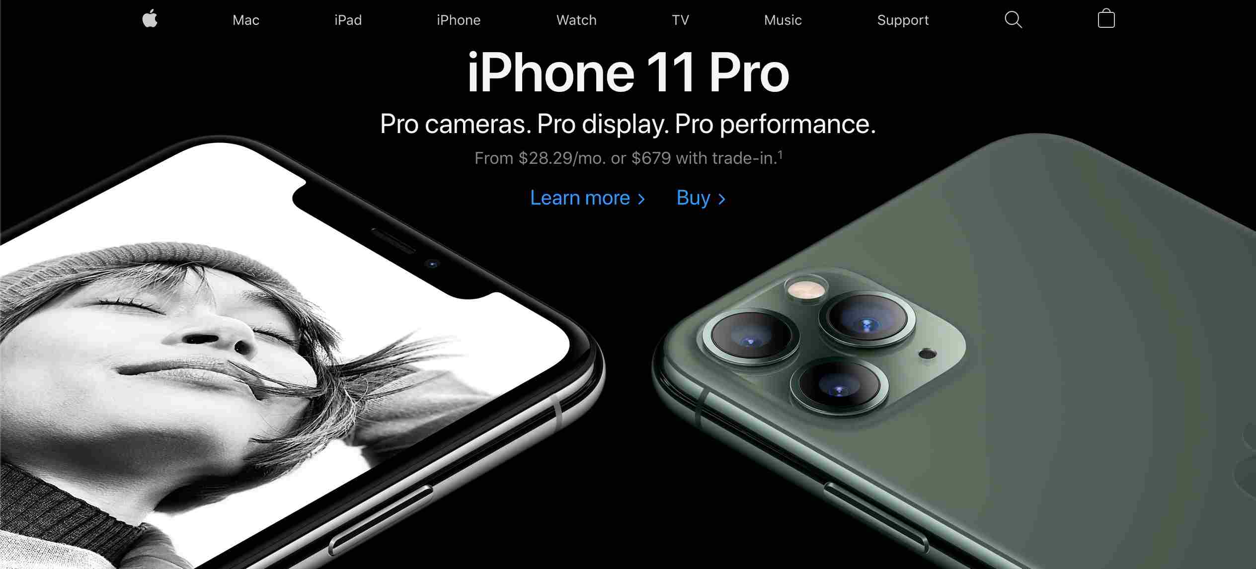
You can get inspired by how Apple’s website looks today:
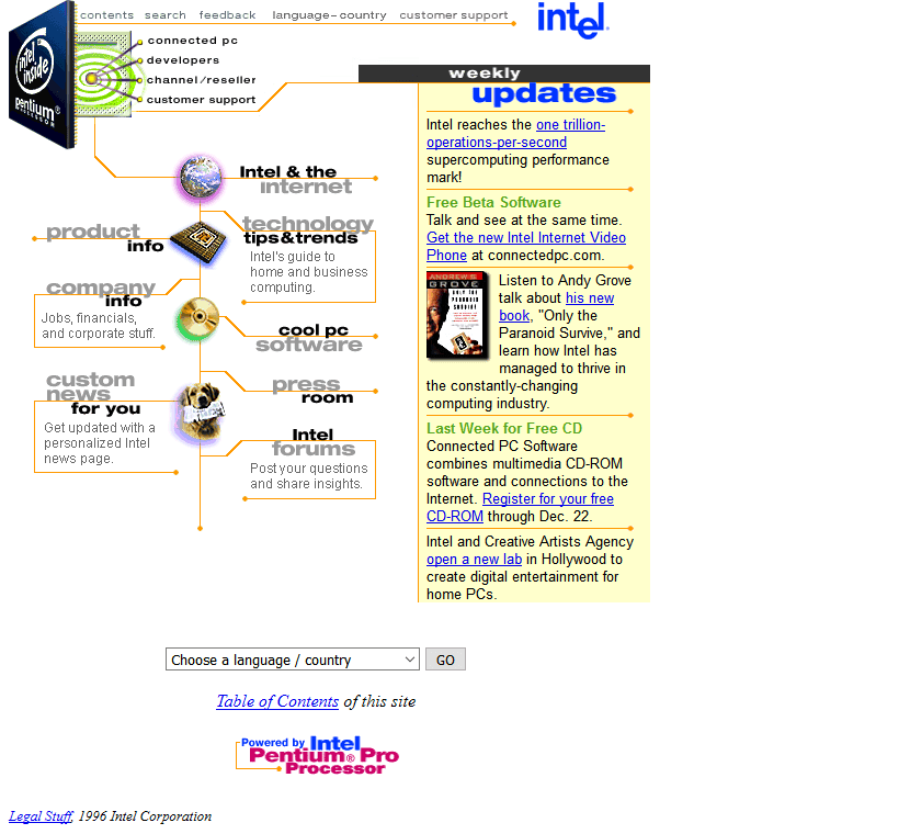
Intel provides the top data center solutions and PCs to the world. Its website in the 1990s had to repeat patterned backgrounds and layouts. This is how Intel website looked like in 1996:
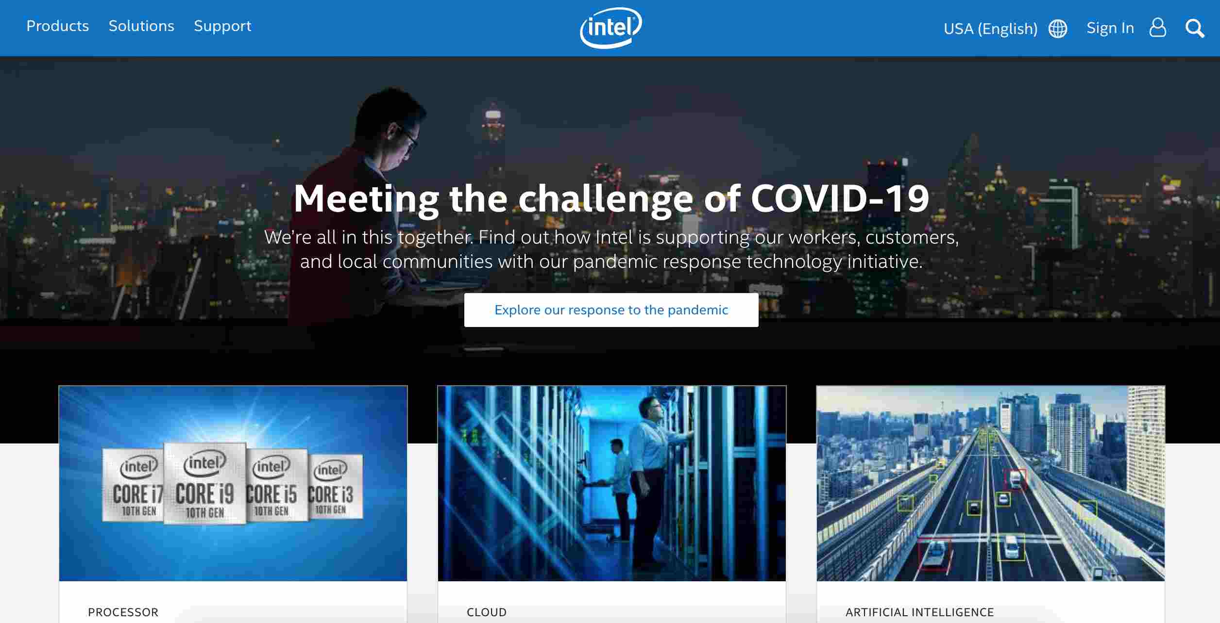
Now, Intel has a sophisticated website. It features a modern background hero image.
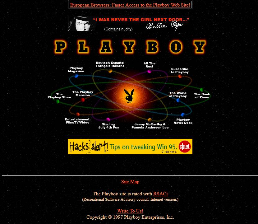
The Playboy website had a patterned background. This is how the Playboy website looked like in 1997:
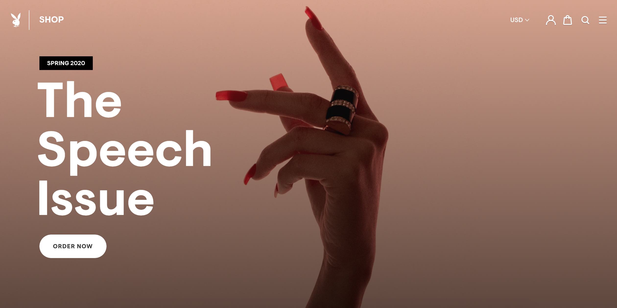
Now, Playboy has a website that is simple and appealing.
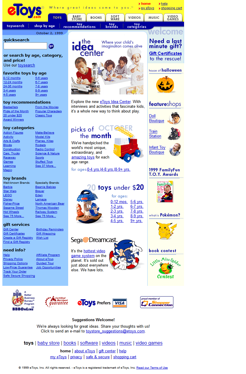
eToys was a retail website that sold toys via the Internet. It was established by a startup of the same name in 1997. The company went bankrupt in 2001 and shut down soon thereafter. This is how its website looked like in 1999:
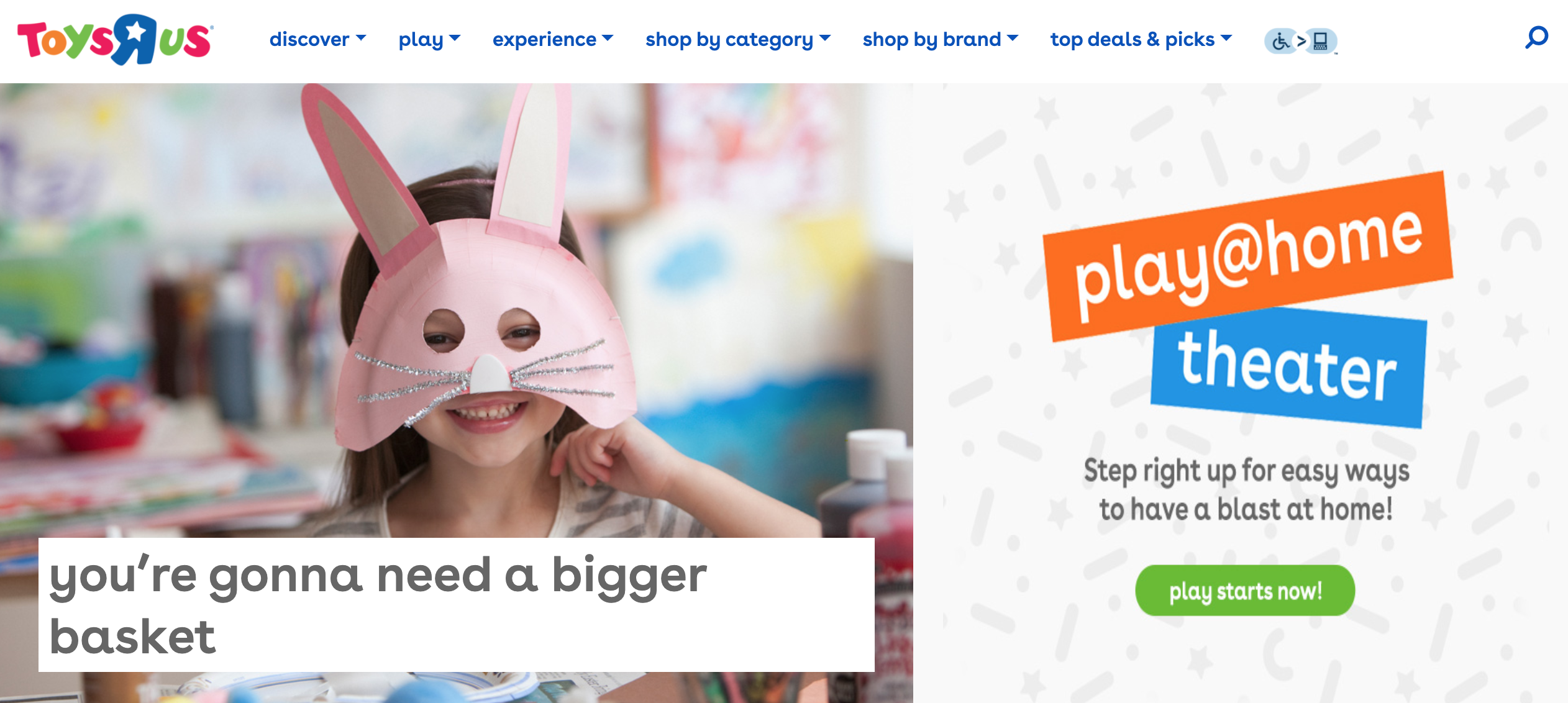
eToys was acquired by Toys "R" Us in 2009. Toys "R" Us has a colorful yet simple website:
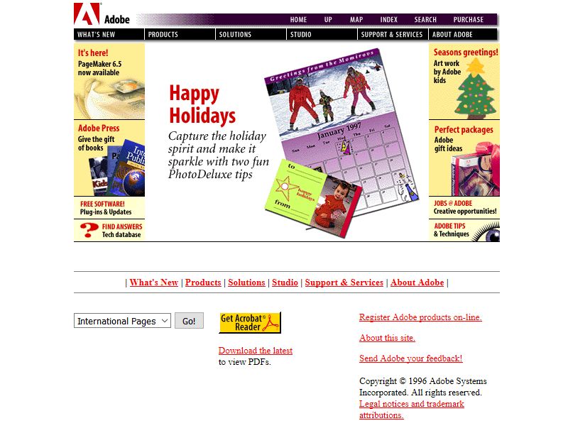
Adobe is a computer software company historically focused upon the creation of multimedia and creativity software products. Its website had a lot of background images with yellow color divided into sections.
This is how the Adobe website looked like in 1996:
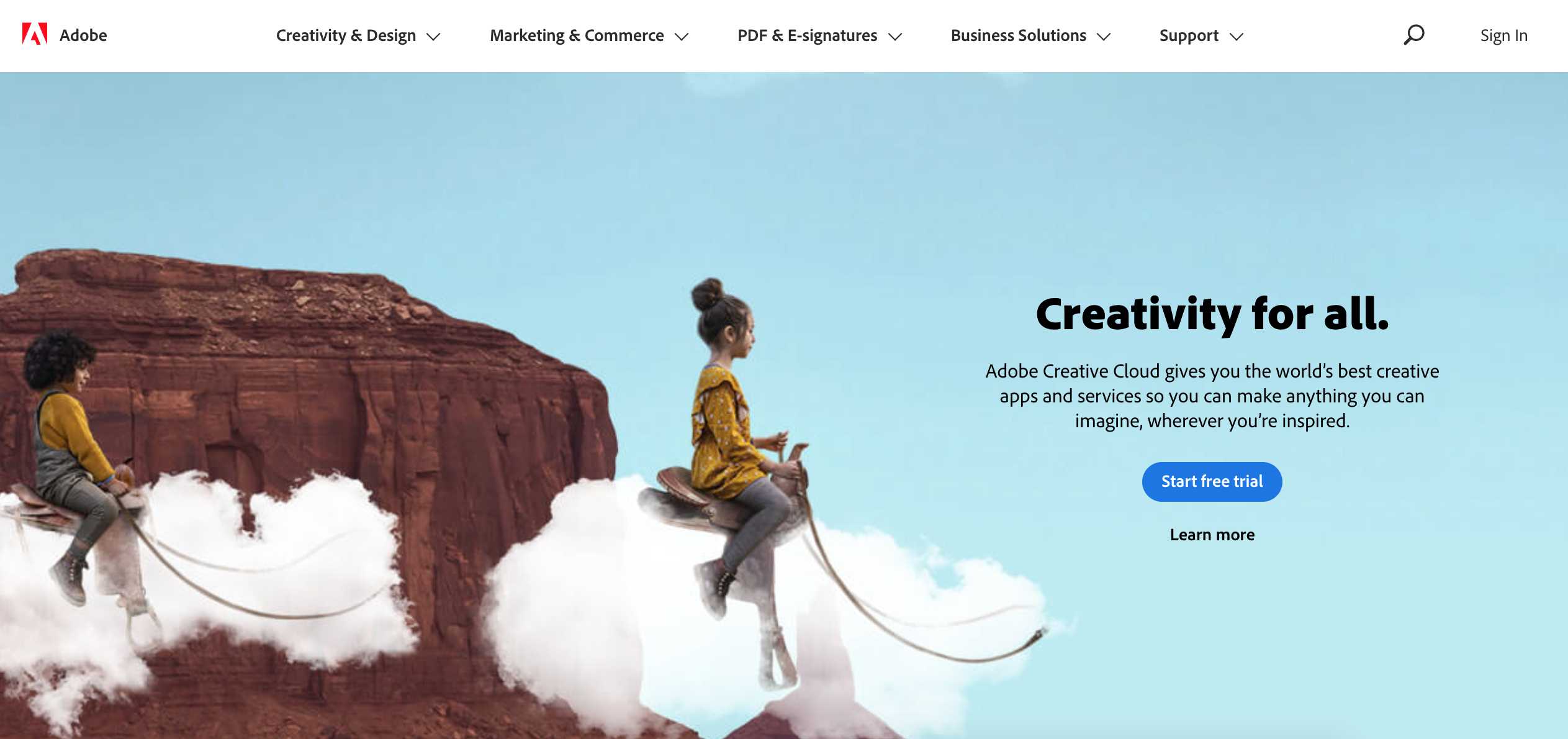
Now, Adobe has a website that showcases its identity as “Creativity for all”.
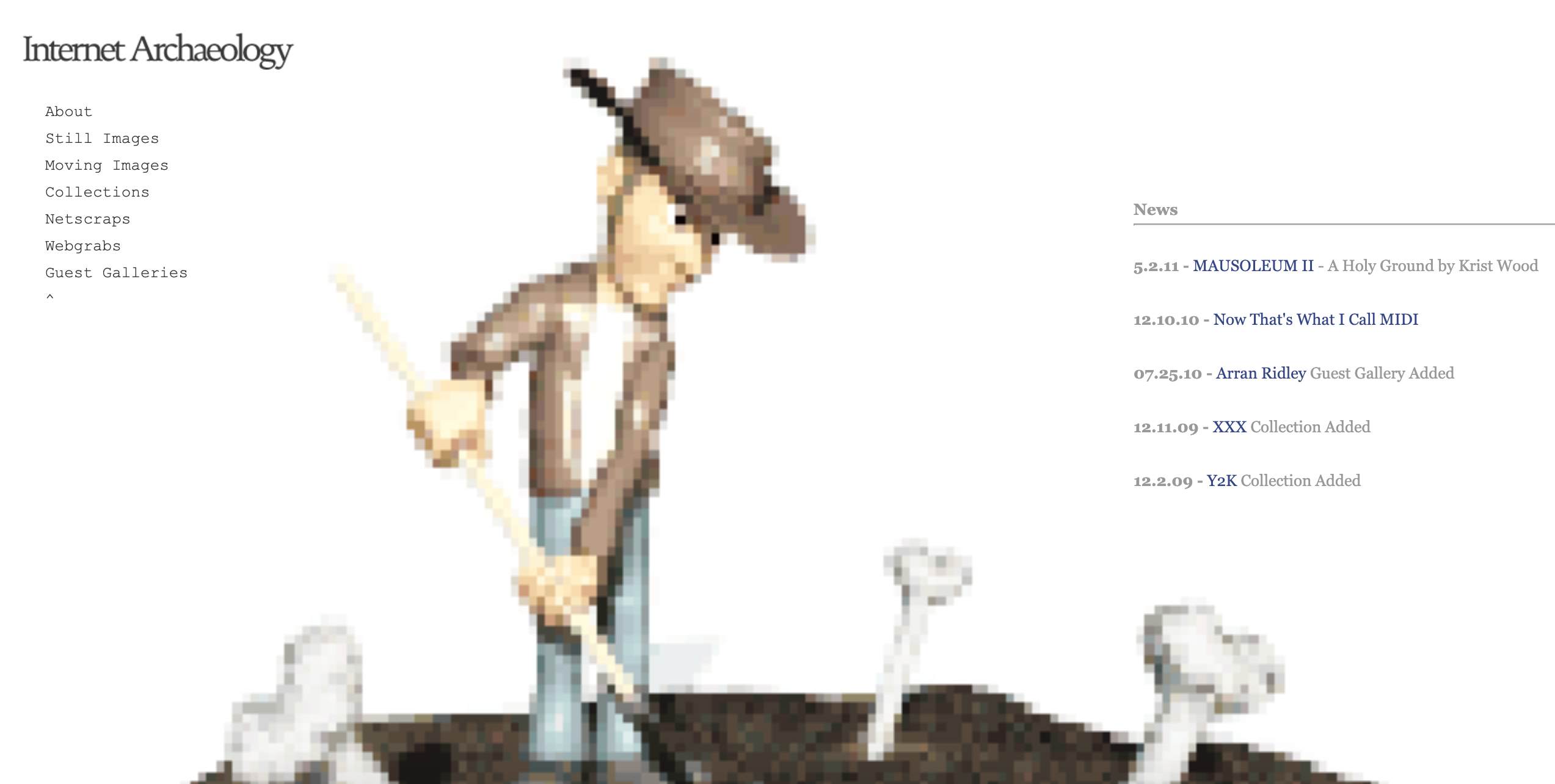
Flash animation, as well as text with inline links, were typical elements of websites in the 1990s. Internet Archaeology doesn't look as bad as some of the websites from the 1990s. It features a clean interface and clear typography.
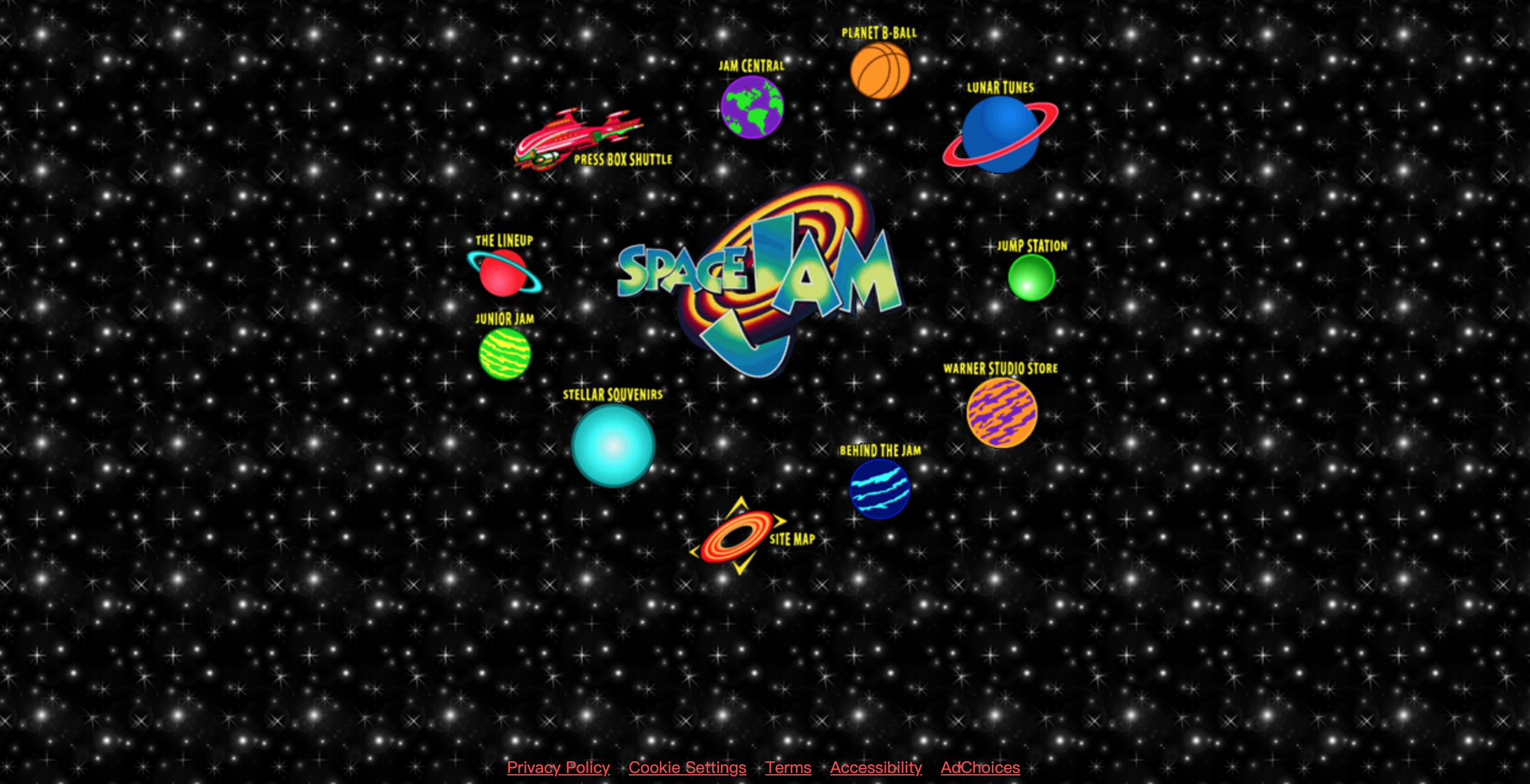
Spacejam is one of those websites from the 1990s that will dazzle you due to its dark black background with the endless light, white spots, and the repeating pattern of images.
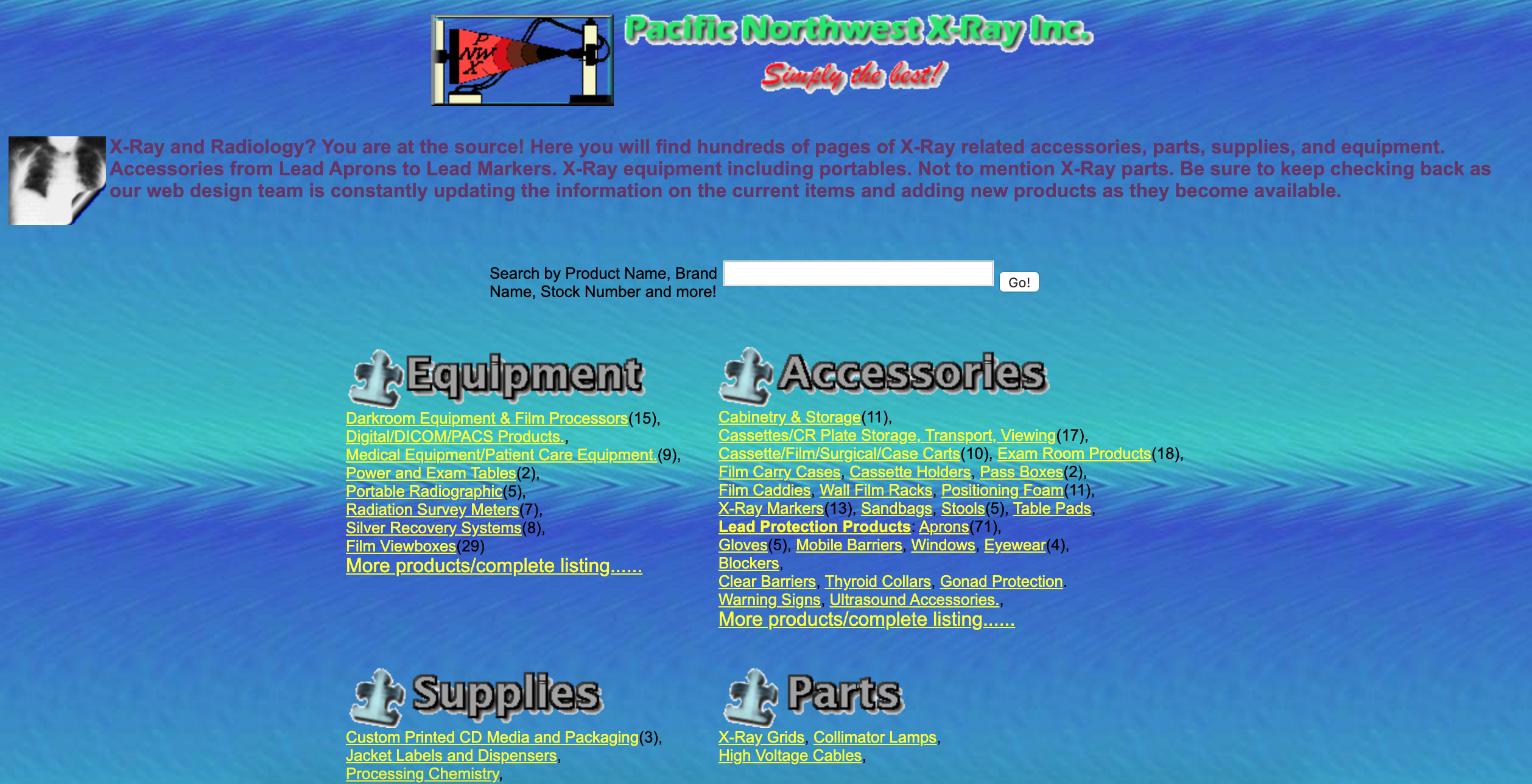
This website has a mixed color palette. It has a lot of conflicting colors and yellow hyperlinks. To find what you want is impossible on this website. The tiny typography also increases the difficulties of users who wish to read the text.
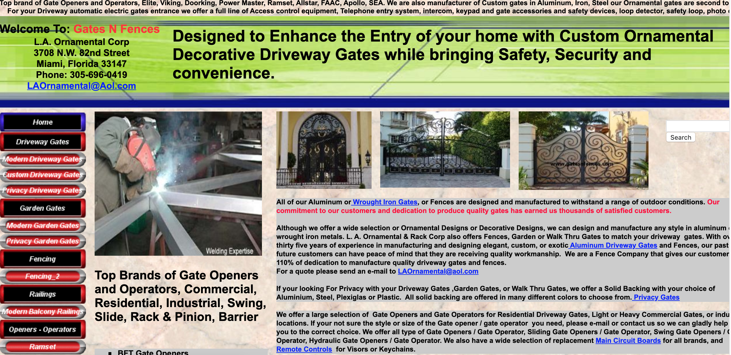
It is not easy to ignore the poor navigation of Gatesnfences. It also features a lot of tiny text with colorful hyperlinks, which makes the whole page unreadable.
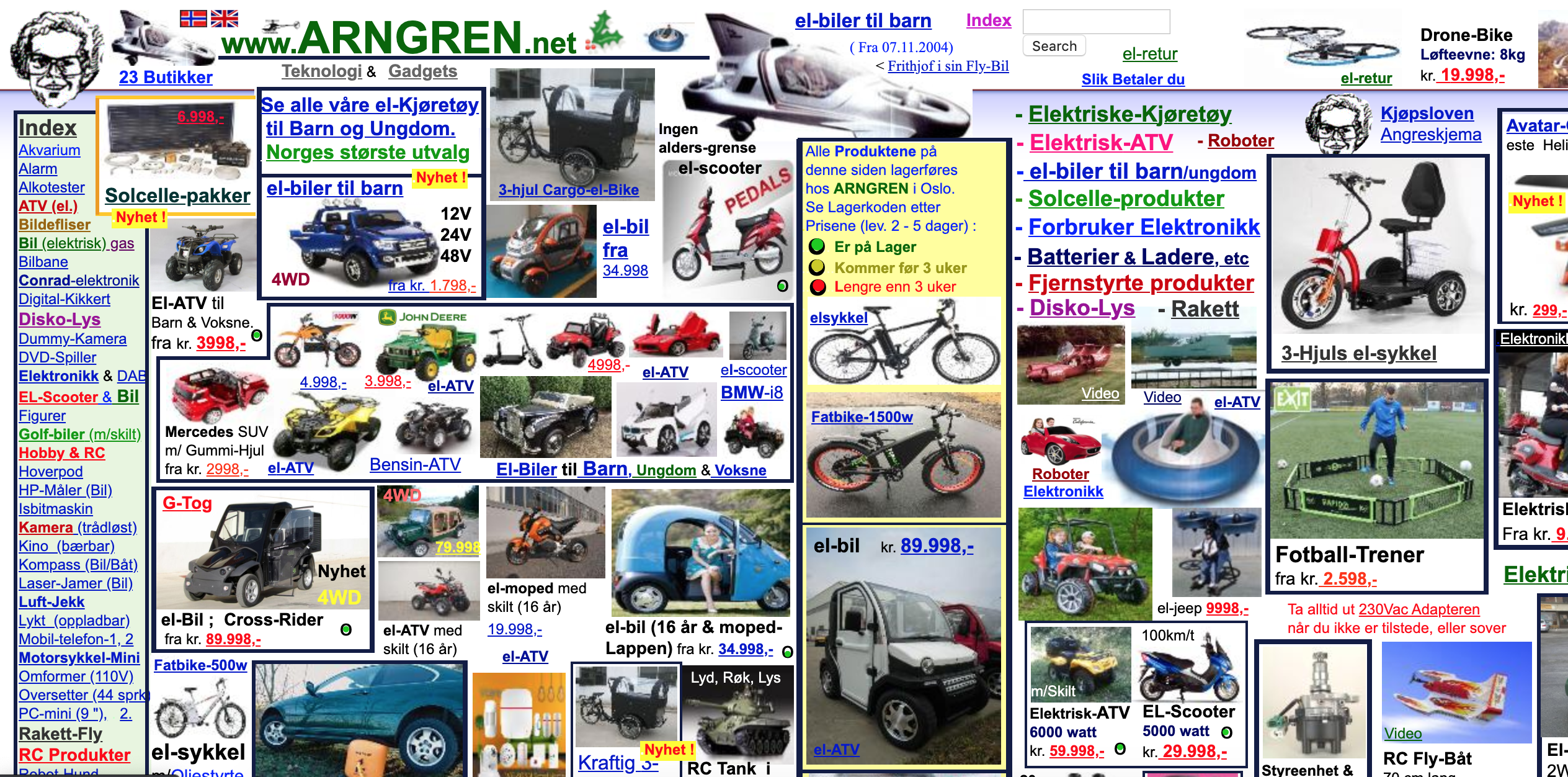
The Arngren website has a chaotic design and every aspect of it is unbelievable. The low-resolution images and text with colorful hyperlinks have created a great mess. You won't believe that this site is operating today.
What can we learn from the above 15 90s website designs? I suppose you will realize the importance of technology. Thanks to CSS and JS, we can develop more beautiful websites now with better user experience. A great website should have the following features:
If you are planning to redesign a website, you should keep these features in mind. Also, it is important to validate your website design before launching it. To do this, you may need a prototyping tool to translate your ideas into an interactive prototype and test it on all kinds of devices to obtain feedback.
 Mockplus RP
A free prototyping tool to create wireframes or interactive prototypes in minutes.
 Mockplus DT
A free UI design tool to design, animate, collaborate and handoff right in the browser.
