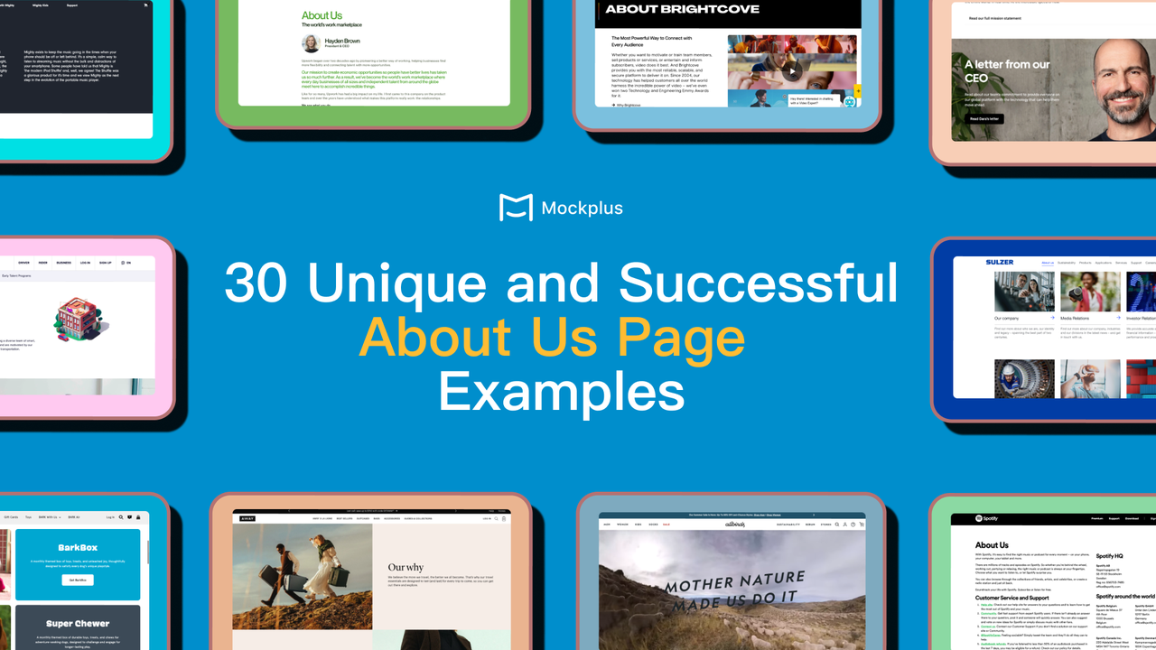
An effective “About us” page goes beyond merely showcasing your brand logo, company history, and team biographies. It's an opportunity to weave a compelling narrative that reflects your brand's essence and personality, ensuring your design lingers in the user's mind. You need to think of the team and the product as a whole in order to present a unique style imbued with personality that will set you apart from the competition.
If you’re wondering how to design an impactful “About us” page, this article is just for you! We'll explore 30 exceptional examples and discover key practical design tips that make them successful to fuel your inspiration for your own creation.
An "About Us" page is an essential part of any website, providing crucial insights into a business or individual. It narrates your brand's journey, introduces your team, showcases what sets you apart and the people you serve, and highlights your core values, mission, and achievements. The purpose of an "About Us" page is to build trust and credibility with visitors. It helps potential customers, clients, or partners understand who they are dealing with and why they should engage with you.

We have picked 30 unique and successful 'About Us' page design examples, including 22 real-life examples that have proven their exceptional creativity and effectiveness, and 8 examples from Dribbble for inspiration.
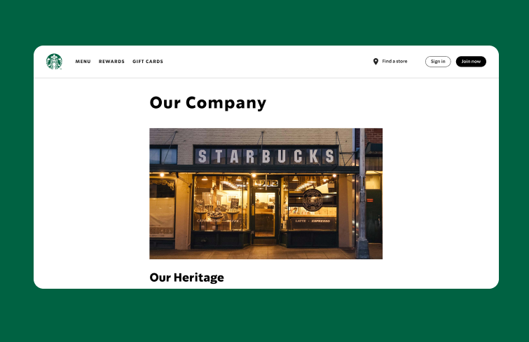
Starbucks' "About Us" page is very simple and clean. Their philosophy taps into human emotions: "We make sure everything we do honors that connection — from our commitment to the highest quality coffee in the world.”
Upon entering the page, you can see a picture of the first Starbucks store established in 1971, highlighting its long history.
Moreover, this page includes several different parts including its heritage, coffee & craft, its partners, stories & news, company timeline and more, comprehensively showcasing its history, high quality of its product, company culture to its customers.
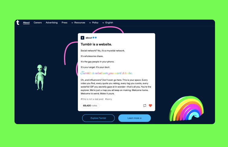
Tumblr's "about us" page is as unique as the platform itself. Recognized as a microblogging and social networking website, Tumblr uses a distinctive blog post format to present key information. The page introduces Tumblr, lists the top ten facts about the platform, and features user posts showcasing their opinions about Tumblr, all within individual blog entries. This approach not only effectively conveys essential details but also reflects the creative and dynamic spirit of the Tumblr community.
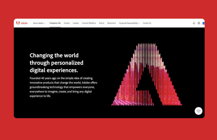
Adobe's "About Us" page highlights its forward-looking vision, emphasizing innovation with AI-driven solutions for creative teams, data analysts, and marketers. It features a comprehensive breakdown of its products and includes case studies of well-known brands like Coca-Cola, the homespot and BMW.
The page is vibrant and engaging, effectively communicating Adobe's purpose and values, and clearly demonstrating its commitment to its community of creative users and clients.
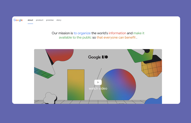
Google's "About Us" page focuses on its cultural impact and keeps things fresh with new content. For instance, in January 2024, it featured a video celebrating "25 Years In Search," and a week later, it switched to a Doodle contest for kids with scholarships and tech prizes for schools.
The page ends with stories of people using Google’s technology to help their communities, showing Google's commitment to social responsibility and global impact. It’s a great example of an "About Us" page that highlights the benefits of its products while building a sense of community among users.
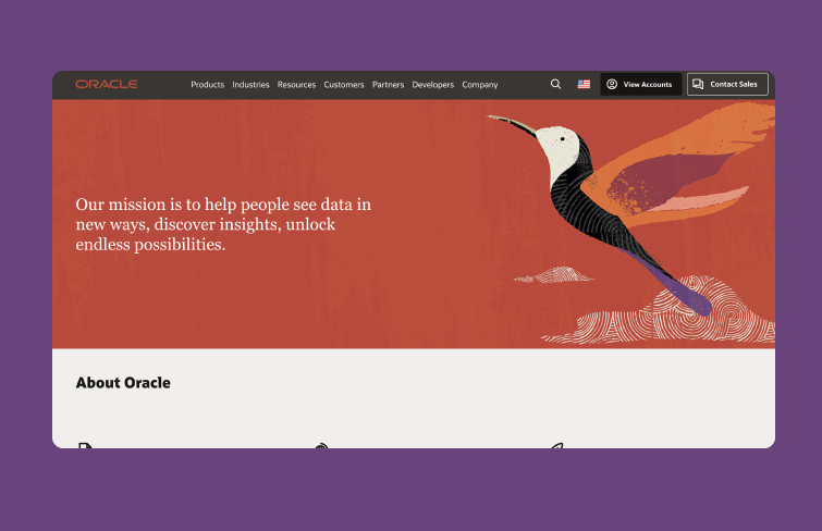
The "About us" page of Oracle presents its history in a concise timeline and provides links to additional institutional pages. By focusing on its mission, Oracle invites users to explore various sections such as analyst reports, corporate social responsibility (CSR), leadership, and investor relations.
Interestingly, Oracle's "About Us" page does not feature its products, instead highlighting its corporate initiatives. It effectively conveys trust and encourages engagement through a simple yet informative page.
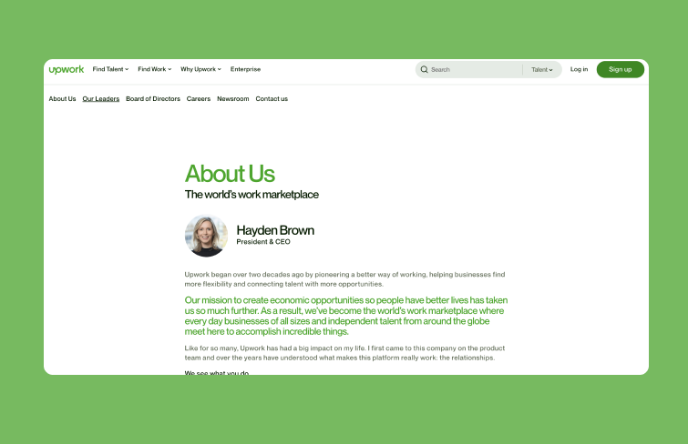
Upwork's "About Us" page features nothing but a letter from the CEO, effectively addressing both its main audiences: organizations looking for high-quality freelance help and freelancers seeking opportunities to grow their careers and earn income. The letter is succinct yet detailed, showcasing the platform's value.
It can be beneficial for positioning an executive as a thought leader, as it highlights their voice on a key page. Moreover, the top navigation allows users to learn more about Upwork’s leaders and stay updated with the latest news.
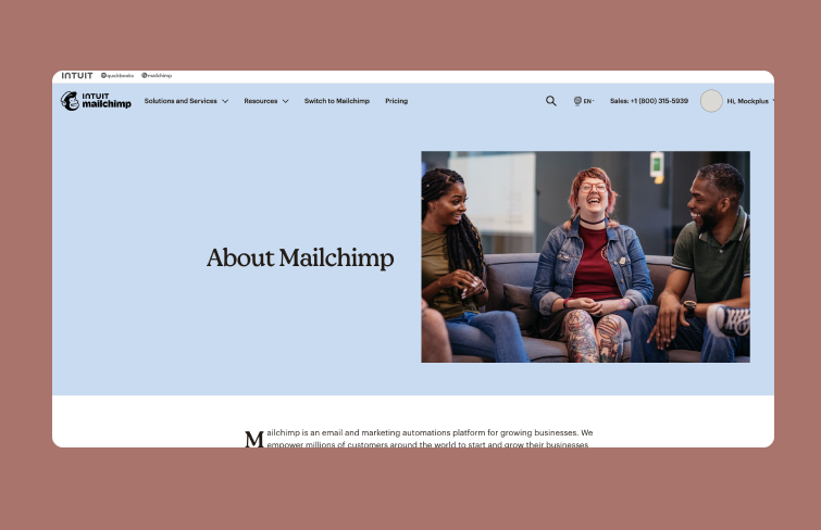
Mailchimp’s "About Us" page highlights its dedication to small businesses and community. It starts with the founders' story, showcasing their 20 years of experience in web design and email, establishing credibility and authority. The page also outlines Mailchimp’s brand values and company culture, emphasizing its commitment to learning and educating employees about small businesses, ensuring each hire is a perfect fit.
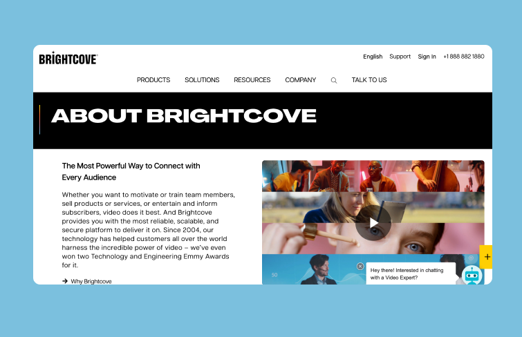
In recent years, video has become a crucial format for B2B marketing, and streaming technology platform Brightcove showcases its credibility right at the start of its "About Us" page with an Emmy award. The messaging is concise, featuring only a paragraph of text and a video, yet it effectively communicates that Brightcove is a leader in business streaming and adept at managing its complexities.
By keeping the content brief and engaging, with an "Explore more" section, client logos, CTAs, and a search bar, Brightcove’s "About Us" page swiftly conveys its message.
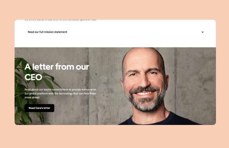
Uber's "About Us" page is dedicated to mapping out the company's future plans. It centers around a message from the CEO, prominently featuring his profile photo as the main image. Through the CEO's letter, Uber provides a peek into its ongoing developments and future directions.
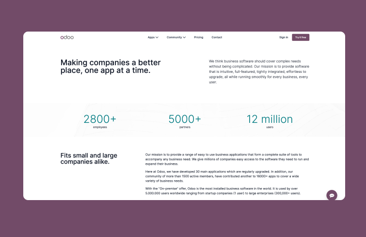
Do you want users to know more about your company? Do you want their trust? Show your accomplishments but don’t go overboard. With a low key presentation of your achievements, you encourage users to trust you, which, in turn, increases conversion rates. And this is exactly what Odoo has done with its “about us” page.
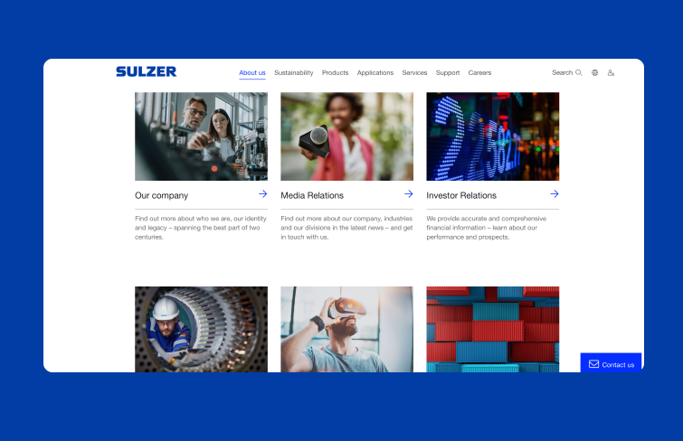
The "about us" page of Sulzer is easy to navigate. It provides useful information succinctly and contain no fluff. Sulzer does this by using a clever typesetting method which makes use of picture text links to present company information. To see details, users simply have to click. If they don’t need the information, they simply ignore it. By giving users a choice, Sulzer’s “about page” becomes more effective. .
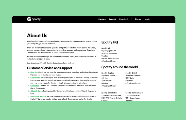
Spotify’s "About Us" page is simple, featuring just text without any images. It includes addresses, customer service emails, and a brief company description. This straightforward approach demonstrates that a globally recognized brand can effectively convey its essential information with minimal content.
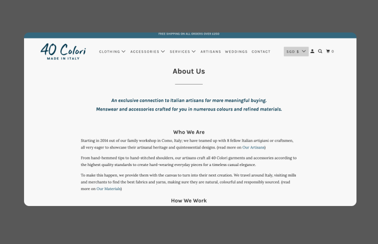
40 Colori's "About Us" page is an excellent example for small businesses. It offers a straightforward company overview and a "How We Work" section that gives customers insight into their operations. The page effectively communicates the company's identity, values, and unique qualities compared to other Italian menswear brands.
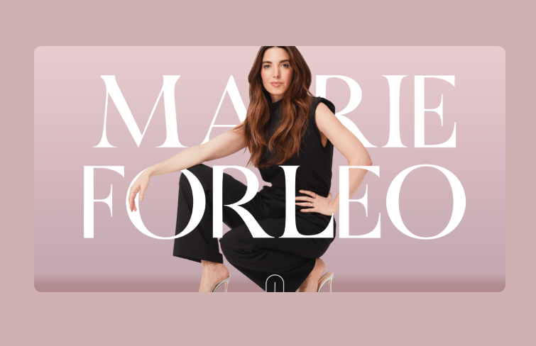
Marie Forleo's "About" page feels like a heartfelt letter, sharing her story in a warm and personal tone. It transitions to focus on the reader with a section called "Which brings me to you." To build trust, Marie includes photos with notable figures like Richard Branson and Oprah, along with links to press coverage of her work.
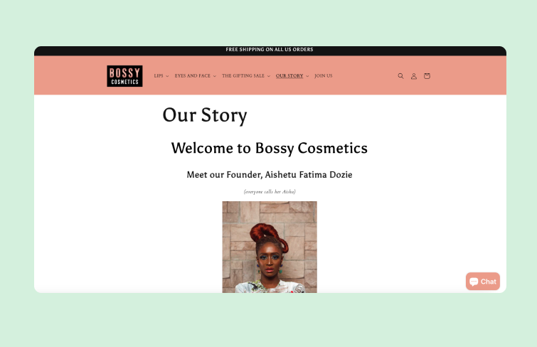
Bossy Cosmetics’ "About Us" page follows a traditional format with extensive text but highlights the founder's photo prominently. This focus works well, as the founder is central to the brand’s story. To enhance your "About Us" page, consider adding elements like Bossy Cosmetics does, such as a welcome YouTube video and links to partner charities and certifications. The key is to make your brand relatable and connect with your target audience.
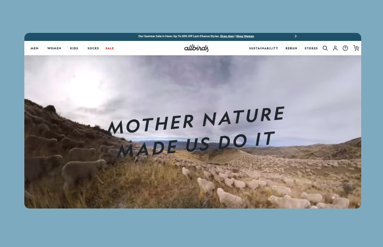
Allbirds’ "About Us" page stands out with background videos and catchy phrases, making it highly memorable. It includes a third-person founder's story, which can sometimes come off as formal, but Allbirds balances this with simple language and images of the founders, adding a personal touch. This combination ensures the page remains engaging and relatable.
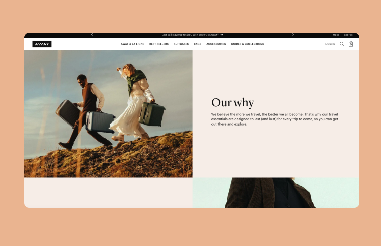
As a travel company, Away’s "About Us" page focuses on the company’s core beliefs, similar to other value-driven brands. It effectively communicates what the business stands for through high-quality imagery and sharp, memorable copy.
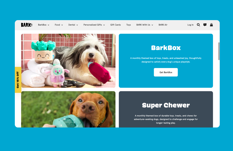
BarkBox’s "About Us" page features engaging dog imagery and keeps things straightforward by highlighting its various business verticals. Each section has its own text and images, ensuring customers clearly understand what’s offered. This approach demonstrates that an in-depth company story isn't always necessary, especially when you have multiple offerings to showcase.
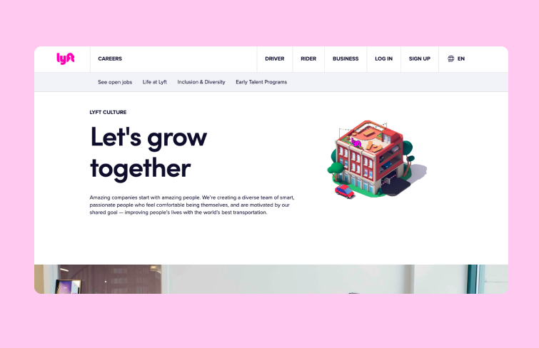
Lyft’s "About Us" page highlights the team behind the company and encourages new drivers and internal team members to join. Unlike typical "About Us" pages, this approach is tailored for larger organizations like Lyft, which are constantly hiring. By focusing on the team, Lyft effectively aligns with its ongoing recruitment efforts.
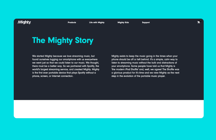
Mighty Audio's "About Us" page tells its story through two sections of block text, followed by an introduction to the team. The use of a dark background with light blue header text creates a striking contrast that makes key information stand out. Consider using contrasting colors on your page to highlight the most important details effectively.
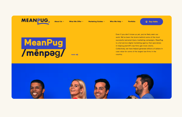
MeanPug’s "About Us" page captures attention with its vibrant and playful design, setting it apart in the typically serious legal marketing space. The page kicks off with an audio clip of MeanPug’s name accompanied by barks, followed by colorful headers and creative team bios, including their CPO (Chief Pug Officer). Despite the fun approach, MeanPug showcases its effectiveness by highlighting impressive results, such as growing law firms from startup to $100 million in ARR within three years and quadrupling clients' digital sales.
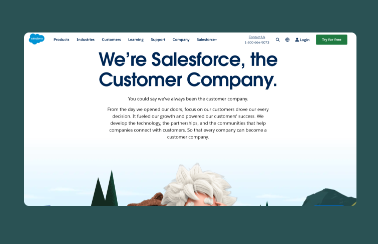
Salesforce, a SaaS pioneer, emphasizes its customer-first approach through a strong cultural and historical narrative. Its "About Us" page effectively communicates this with cohesive branding, including product names, mascots, and videos highlighting its legacy and CSR efforts. The story unfolds by addressing consumer challenges, presenting Salesforce's solution, and emphasizing its core values and culture. This page exemplifies how a company with a rich culture and community can build credibility in an engaging and fresh manner.
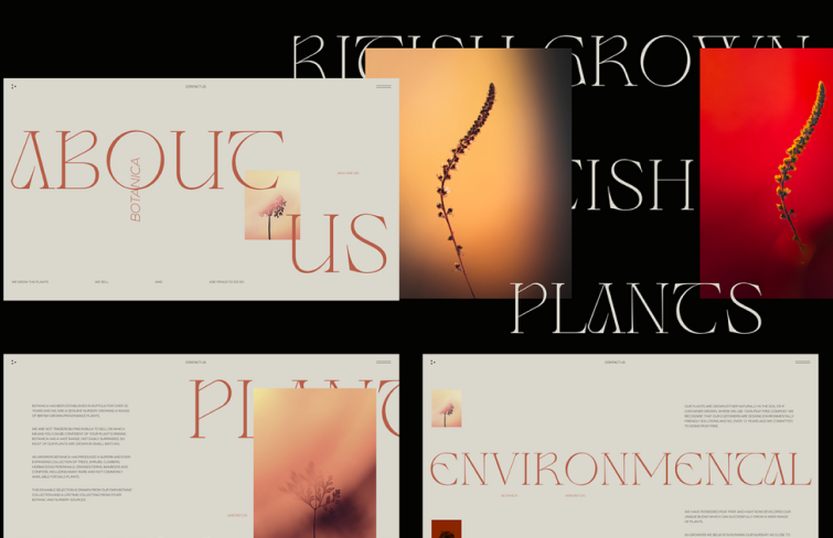
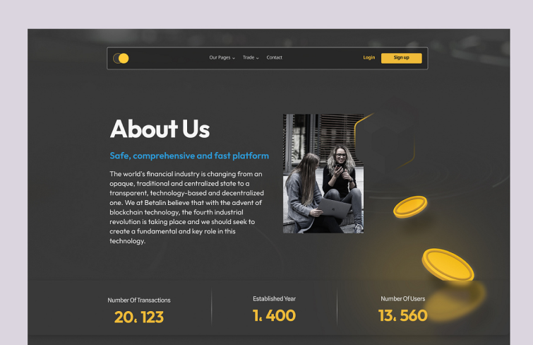
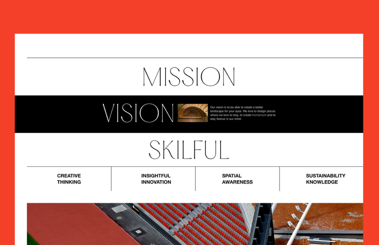
As we already know, designing an engaging "About Us" page is crucial for building trust and connection with your audience. Here are 10 practical tips to help you create a page that effectively communicates your brand’s story and value:
Clearly state what your company does right at the beginning of your "About Us" page. This straightforward introduction helps visitors quickly understand your business and services, setting the stage for the rest of the content.
Organize your information in a logical, easy-to-follow layout. Use headings, subheadings, and bullet points to break down content into manageable sections, ensuring that visitors can easily find and digest key information. Besides, avoid clutter and ensure that your design elements support, rather than distract from, the content.
Include your company's location and relevant data, such as founding year and major milestones. These details add authenticity and credibility, helping to build trust with your audience.
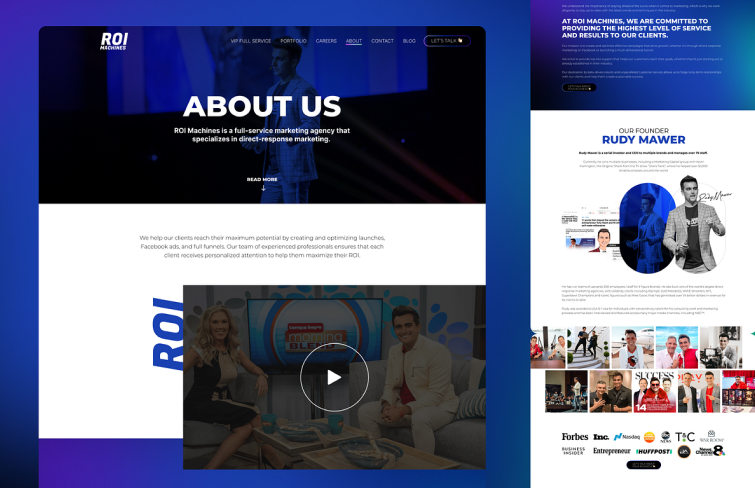
Highlight your company's accomplishments, such as awards, certifications, and major projects. This showcases your expertise and reliability, encouraging potential customers to trust your brand.
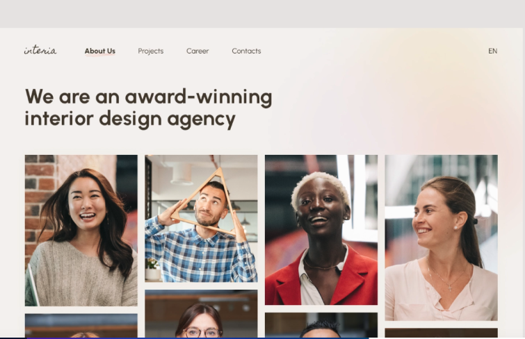
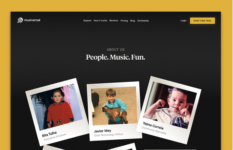
Feature real photos of your team members to humanize your brand. Including individual profiles with brief bios helps visitors connect with the people behind the company, fostering a sense of trust and relatability.
Incorporate clear, prominent calls to action (CTAs) throughout your page. Whether it’s to contact you, learn more about your services, or sign up for a newsletter, make it easy for users to take the next step.
Avoid lengthy, irrelevant information that doesn’t serve a practical purpose. Focus on concise, valuable content that informs and engages visitors without overwhelming them.
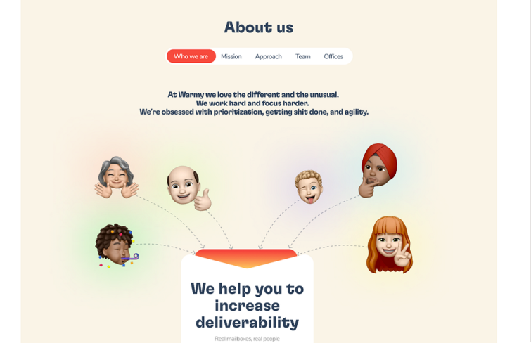
Use creative elements to present your information, such as infographics, videos, or interactive features. A unique presentation can make your page more engaging and memorable.
Ensure your page has a stylish, professional design that reflects your brand’s identity. A well-designed page can create a positive first impression, encouraging visitors to explore further.
Designing an effective "About Us" page involves thoughtful planning, engaging content creation, and careful design execution. Here are 4 key steps to guide you through the process:
Step 1: Plan and create your content
Begin by defining the purpose of your "About Us" page. You should decide whether your goal is to build trust, showcase your team, or highlight your company's history and values. Then, accordingly, identify and create the essential content to include, such as your mission, values, history, key team members, and accomplishments.

Step 2: Design the layout and content structure
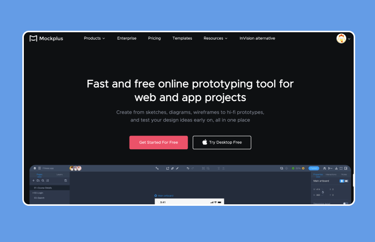
Then it's time to design the layout by organizing content logically with a clean layout using headings, subheadings or bullet points to make information easy to navigate. In this process, you will need a simple and easy-to-use prototyping tool to help you get it done faster and easier. Mockplus RP it is! Mockplus RP is a simple and easy-to-learn web prototyping tool for creating web projects, free projects, custom projects, APP projects, and more.
Step 3: Visual design
Once the layout and structure is done, it's time for visual design. This step enhances the aesthetic appeal and effectiveness of your "About Us" page. You can incorporate high-quality images, videos, and infographics to engage visitors, and ensure a clear visual hierarchy using font sizes, bold text, and spacing to guide the reader’s eye.
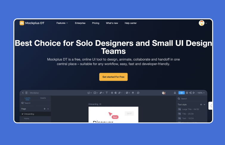
In this process, you can use professional UI design tools like Mockplus DT, a free online UI tool that allows you to design, animate, collaborate, and handoff in one central place. With Mockplus DT, you can turn your ideas into testable UIs quickly and easily.
Step 4: Test & iterate
Finally, testing and iterating are crucial steps in optimizing your "About Us" page for usability and effectiveness. You can gather feedback from real users through usability testing and analytics to identify areas for improvement, and continuously refine content and design elements based on insights gained, aiming to enhance user engagement and achieve your page's objectives effectively.
An effective "About Us" page not only informs but also engages and builds a trustworthy relationship with your audience. It is crucial because it provides potential customers with an insightful glimpse into your company. It tells them who you serve and how you meet their needs, offering a clear picture of your products or services. Besides, by sharing your brand’s story and history, you create a narrative that fosters connection and build transparency and credibility.
An "About Us" page can include various sections to provide a comprehensive overview of your company, but the most common sections to include are:
In conclusion, an "About Us" page can significantly impact the success of a business website. To make a lasting impression on users, it's crucial to approach its design with care and consideration. Hopefully, this guide and the best examples can help you create an outstanding "About Us" page that achieves the results you're aiming for.
 Mockplus RP
A free prototyping tool to create wireframes or interactive prototypes in minutes.
 Mockplus DT
A free UI design tool to design, animate, collaborate and handoff right in the browser.
