The app splash screen, also referred to as a launch screen/page, was originally created to reduce user frustration when waiting for web/iOS/Android app data to load.
As time went by, wise designers began making use of the splash screen to showcase their apps' products, features, and services, etc.
Splash screens may simply consist of an image, logo and button, however, can evoke many different feelings and experiences.
As a UX/UI designer, how can you use common elements, such as logos, photos, icons, and texts, to create beautiful and attractive launching screens for your web/mobile app? Or are there any practical design tips to make outstanding splash screens?
Below, for your inspiration, is a collection of 12 Android/iOS app splash screen best practices. And to help you prototype an excellent launch screen, some useful design tips will also be introduced making use of easier, faster and smarter APP prototyping tool- Mockplus
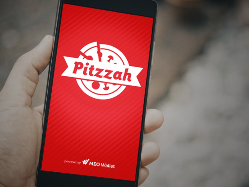
Designer: Luis Alves
Highlights: Displaying the app logo directly to impress users
Directly displaying the app logo on the splash screen is one of the most commonly-used methods for designers to help users with brand recognition. The design above uses a red & white color scheme, matching the colors of the app logo and make a pleasant and eye-catching experience for users.
What can you learn:
*Impress users with the app logos or brands
In your splash page designs, you too can also display the app logo or brand to impress users. If possible, it is best to choose a color scheme that matches perfectly with the logo/brand.
Designer: Ashish Chauhan
Highlights: Displaying the app logo dynamically
In comparison to a static app logo, a dynamic logo that incorporates movements is far more attractive to users. And this launch screen widely adds dynamic effects, making the entire design far more appealing.
What can you learn:
*Optimize your splash screens with special effects
It is better for your launching page to stand out with special effects.
For example, you can add dynamic effects, including jumping, shaking, rotating effects, and so on. Ripple, fluid and glowing effects can also be very eye-catching. Of course, if possible, you can also improve your designs in combination with the changes of colors, shapes, icons and more elements.
Fluid effects can make your launching screen distinctive.

Enrich your splash screen animation with rotating effects and the changes of colors, shapes and icons.
Glowing effects can also help stand out your splash screen.
Prototyping Design tips:
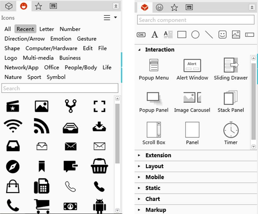
In this aspect, Mockplus offers you a very powerful icon library (including 3000 SVG icons in all walks of life) to help you customize your app logo easily and quickly.
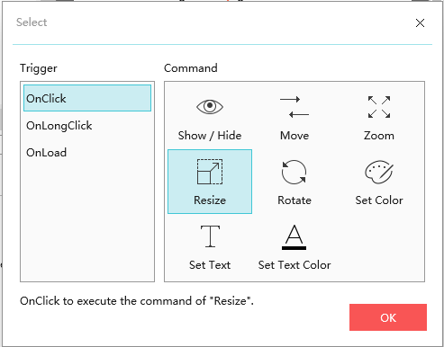
Moreover, with Mockplus, you can also freely add smart interactions/animations to the logo and launching page. Mockplus offers users many interaction commands, including “Show/Hide”, “Move”, “Zoom”, “Resize”, “Rotate”, “Set Color”, “Set Text”, “Set Text Color”, etc.
These interaction commands are very useful for you to create an interactive splash screen which can interact with users, helping you keep more users stay on your app longer unintentionally.
Designer: Cuberto
Highlights: Showcasing the app functions dynamically
The splash screen can also be used to showcase the app or product features, services, activities or even advertisements dynamically.
This design has creatively combined the dynamic logo and app function carousel together to make the entire design unique and distinctive. And this strategy also allows users to become familiar with the app features more quickly and naturally.
What can you learn:
*Display the app/product functions/services/activities dynamically
In your designs, you can also follow this design strategy and directly showcase the app/product functions, services, activities and advertisements, etc. on your splash screen. This could be really useful to help users use and master the app more quickly and easily.
*Simplify your splash screens with intuitive “Photo + Text” pairs
While designing the app/product function page, you can try to simplify it with an intuitive “photo + text” pair as below:
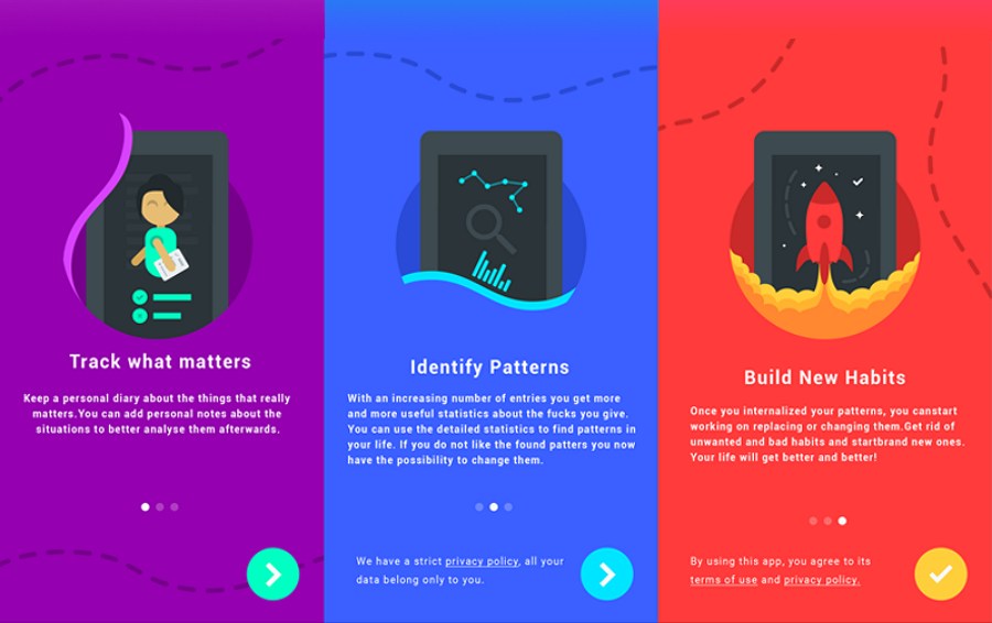
Explain the function introduction with photos.
Prototyping Design tips:
To pair your function introduction with proper photos, you can freely and easily use an “Image” or “GIF” component to import static/dynamic photos and add proper introduction texts with the “Label” or “Text Area” component in Mockplus.
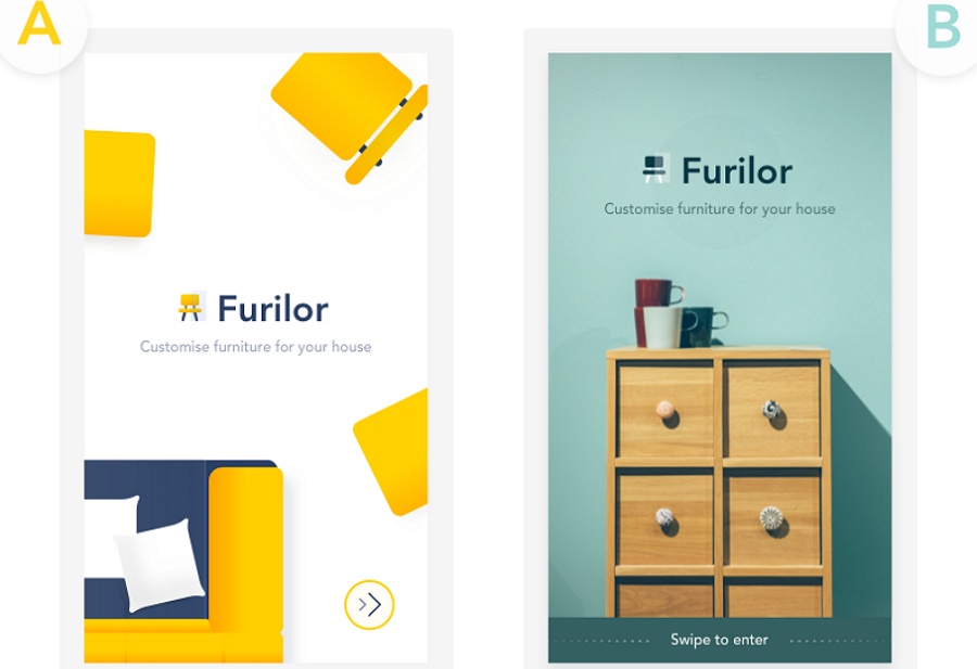
Designer: Dru
Highlights: Showing the app products directly to increase sales
This furniture app directly shows some furniture photos on its splash screen to stimulate the purchase desire of users and increase product sales.
What can you learn:
*Present products on the app launch screen to stimulate buying
The launching page is a perfect platform to showcase app products and help increase sales. So, add some hot or star product photos to the screen page to stimulate buying.
Prototyping design tips:
To showcase the star or hot products dynamically and easily on your splash screen, you can use the “Image Carousel” component of Mockplus to dynamically display all product photos.
If you tend to dynamically showcase some product introduction pages, you can also easily use the “Image”, “Label”, “Text Area” and “Button” components to create an easy-to-understand product introduction page:
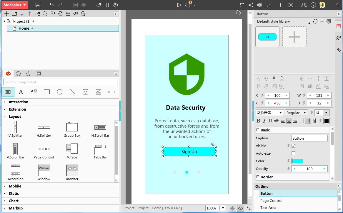
Mockplus can help you create a product introduction page with “Image”, “Label”, “Text Area” and “Button” components easily.
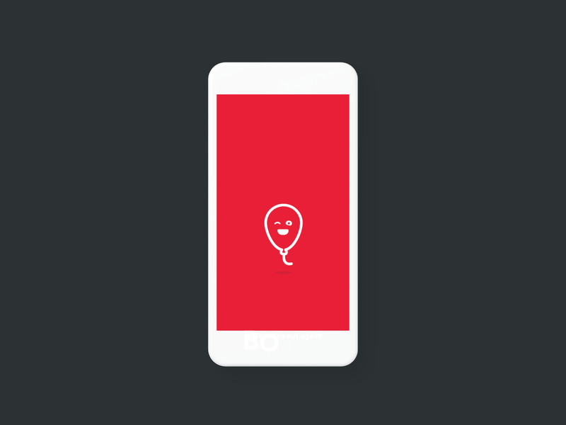
Designer: Purple Bunny
Highlights: Creatively explaining the page texts with vivid animations
The most outstanding part of this splash screen design is that it customizes a vivid animation to explain the screen text. To be more specific, this design adds a balloon which is very likely to break suddenly and go “boom”, vividly explaining the word “boom” in the logo text. Such creative and interesting designs could effectively impress users.
What can you learn:
*Pair your page texts with customized animations
In your launch screen designs, you can also add some customized animations to explain your screen texts more intuitively and vividly.

Designer: Nina Pereverzeva
Highlights: Wisely adding some festival elements
This splash screen is designed with festival elements, making it really unique and interesting.
What can you learn:
*Attract and retain users with splash screen series
Festival elements can add visual interests to launch screens. So, you can create splash screens for various festivals, seasons, countries, ethnic cultures, products and more.
Prototyping design tips:
As an all-in-one prototyping tool, Mockplus offers many powerful features to help you make and interate a beautiful and attractive splash screen for your Android/iOS apps.
For instance, Mockplus has a very powerful component library which enables users to easily add app elements with a simple drag-and-drop.
The team management and coloration feature of its Team and Enterprise editions also allows you to conveniently edit, improve and iterate your launching pages or app designs collaboratively and effectively.
Moreover, in Mockplus, you can also freely use 8 ways to test and share your designs to collect feedback and suggestions quickly.
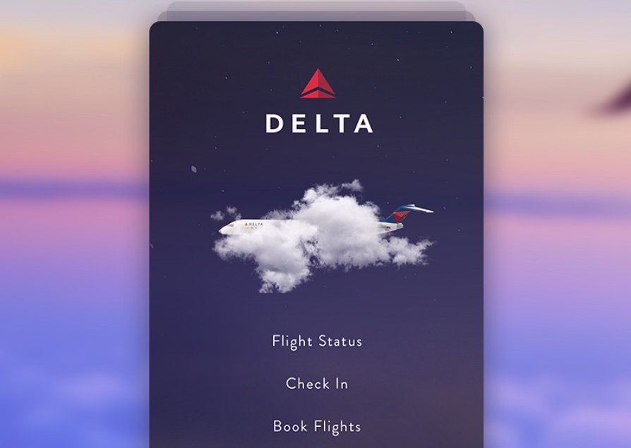
Designer: George Vasyagin
Highlights: A splash screen with rich functions
Unlike the common launch screens that present app logos, products or features directly to impress users, this page is designed with functionality.
With several interactive options, such as “Flight Status”, “Check In” and “Book Flight”, this design allows users to check their needed information and switch to other parts of this app easily. Such a design strategy can not only make the page functional for users, but also save on design resources and lower the development cost ultimately.
What can you learn:
*Create a functional launch screen to improve user experience
There are two methods to achieve this result. Firstly, you can directly add interactive options to your splash screen, just like the above example, making your design more functional and useful.
Or you can automatically forward users to the following welcome/guide/registration page of your web/mobile apps after briefly displaying the launch screen.
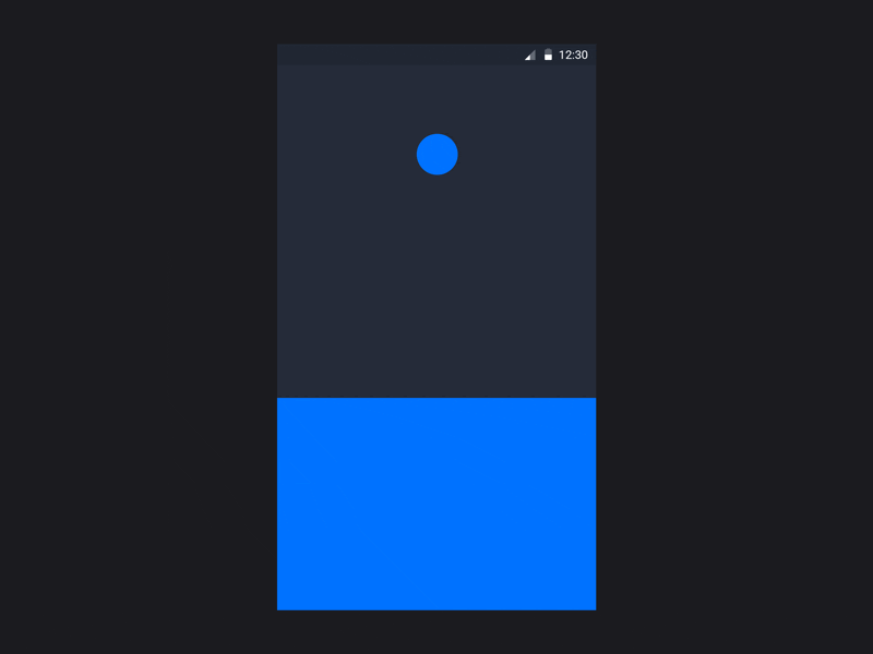
Automatic page forwarding function should be added to your Android/iOS app splash screen to improve user experience.
Prototyping design tips:
With Mockplus, you can easily use its “Timer” component to automatically forward users to different app pages, such as the welcome, guide, login, logout or other pages easily.
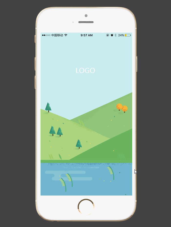
Use Timer to automatically forward users to the guide page. (Click to learn how to create this Mindmate app with Mockplus )
Designer: Nestor Ramirez
Highlights: Using enticing texts to attract users
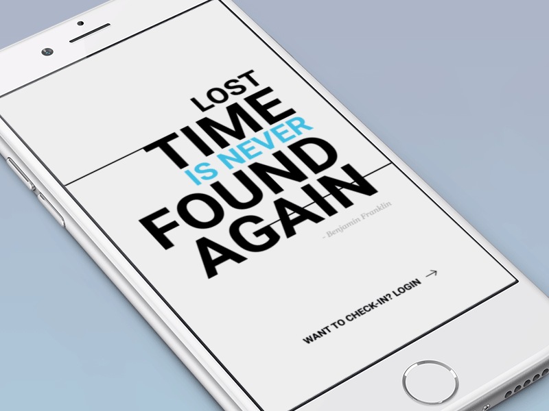
Even though this splash page uses texts only, its inspiring words in different fonts, colors and typography work together to entice users to seek more information, purchase a product or try a new feature of this app.
What can you learn:
*Optimize your splash screen with inspiring or enticing words
The inspiring or enticing words in different fonts, colors and typography can not only arouse the interests of users and encourage them to continue using your iOS/Android app, but also make your splash screen more beautiful and persuasive.
Prototype design tips:
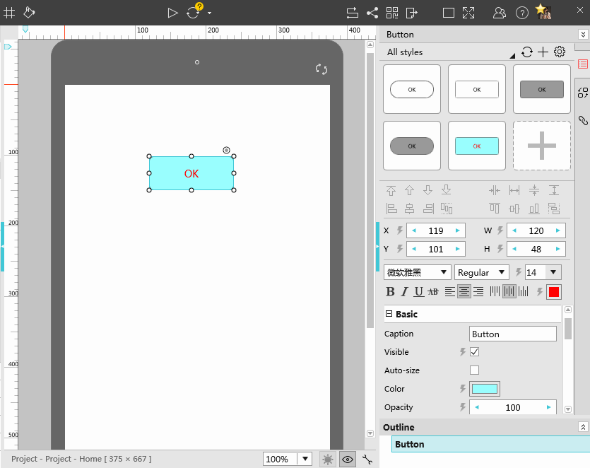
To add inspiring or enticing words to your splash screen, you can easily use the “Label” or “Text Area” components in Mockplus. With these components, it is very easy for you to edit the text fonts, colors, styles, borders and other properties.
Moreover, Mockplus has a very powerful component style library, which enables you to freely save, reuse and share the component styles, allowing you to optimize your page texts with ease. If you are looking to add a hovering effect to your page texts, also try its “Interaction State” feature.
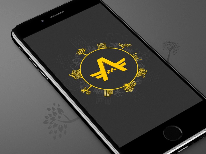
Designer: Bogdan Nikitin
Highlights: Using an animated splash screen to illustrate the app service concept
This animated splash screen for an iOS taxi app uses all its elements to intuitively and clearly illustrate its service concept. This is very impressive and distinctive.
What can you learn:
*Use all launch page elements to introduce the service/culture concept/story of your web/mobile app
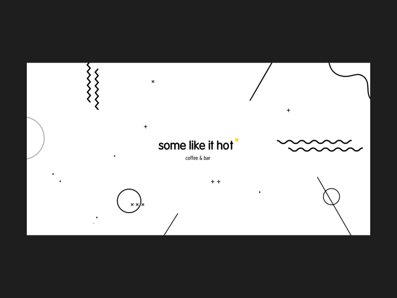
Designer: Zhenya Rynzhuk
Highlights: Minimalist design style
This design uses a minimalist design style and adds very simple lines, shapes and words to effectively distract users’ attention and ease their anxiety when they have to wait for app data to load.
What can you learn:
*Simplify your splash screen designs with minimalism
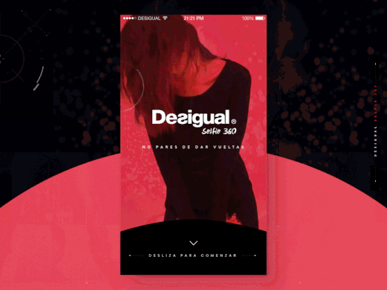
Designer: paco Jimenez diaz
Highlights: Directly displaying the excellent work from users
In addition to showing the app logo, this launch screen also uses a background animation to display some excellent work from some of its users. This can help quickly grasp the users’ attention and encourage them to try this app as well.
What can you learn:
*Enrich your launch page with excellent works from users
If you are coincidentally designing a splash screen for a photo/video app or food recipe app, etc. you can directly enrich your launch page with excellent works from your users to make it more attractive.
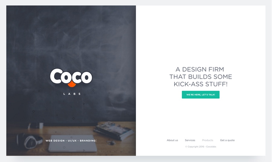
Designer: Gouthan
Highlights: Using photos to divide interface functions
This splash screen uses a background photo to intuitively divide the page into two areas. One area is used to show the app logo, which is very easy for users to remember. And the other area is designed with texts and buttons, which help explain the app features and guide users to click for more details.
What can you learn:
*Use color blocks, images and grids to divide interface functions
In comparison to some launching screens for iOS/Android apps, the ones for web apps are much larger in sizes and can display far more contents.
In order to make your web app splash screen more intuitive and informative, you can easily use color blocks, images or grids to divide the interface.
Prototyping design tips:
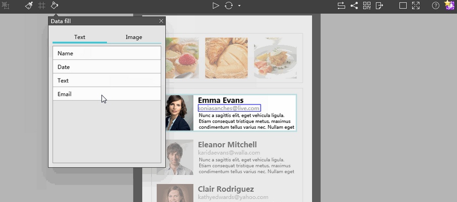
In Mockplus, you can easily use a “Shape” or “Panel” component with the change of colors or capacities to divide the app splash pages into several functional areas. Of course, you can also easily use an “Image” component to achieve the same goal. If necessary, you can also try its “Repeater” and “Auto Data Fill” features to create more intuitive grids.
In short, we hope this collection of the 12 best Android/iOS app splash screen examples and design tips will be useful to you.
Web/Android/iOS splash screen, generally consisting of windows containing images, logos and buttons, etc, is often used by UX/UI designers as a platform to display app features, products, services, advertisements and more. However, that does not mean you have to use it in this manner. Experimenting with your own creative ideas could be a good try.
Overall, we hope these fresh Android/iOS app splash screen examples and design tips will help inspire you in your design process.
 Mockplus RP
A free prototyping tool to create wireframes or interactive prototypes in minutes.
 Mockplus DT
A free UI design tool to design, animate, collaborate and handoff right in the browser.
