Trends change quickly in mobile App design. The year 2021 witnessed new challenges in app design, as well as the launch of many new great mobile apps.
In this article, we've collected 30 of the best mobile app design examples and templates for UI/UX designers to get inspiration and keep up with the hottest design trends, even in the coming 2022.
You may also check the newest design trends and our app design tool to stay creative, effective and in touch with the latest trends.
Features: VR-driven app that allows users to take a tour online
Category: Tour app
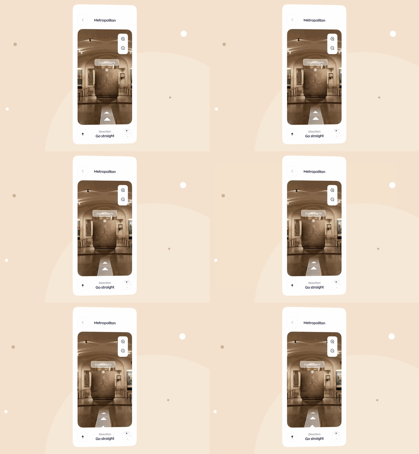
During the pandemic, people all over the world have had to stay at home because of social distancing and quarantine policies. That makes VR tours that allow people to explore new places and events online extremely popular. Museums and galleries especially had to reinvent ways to attract visitors, and VR made it possible.
This app design example follows that design trend and combines great VR and 3D technologies to help users directly visit different museums without leaving home.
It provides a very pleasant and immersive user experience by using an easy-to-use search bar with filters, minimal colors and aesthetic visuals.
Features: Use AR technology to facilitate users
Category: Flight ticket booking app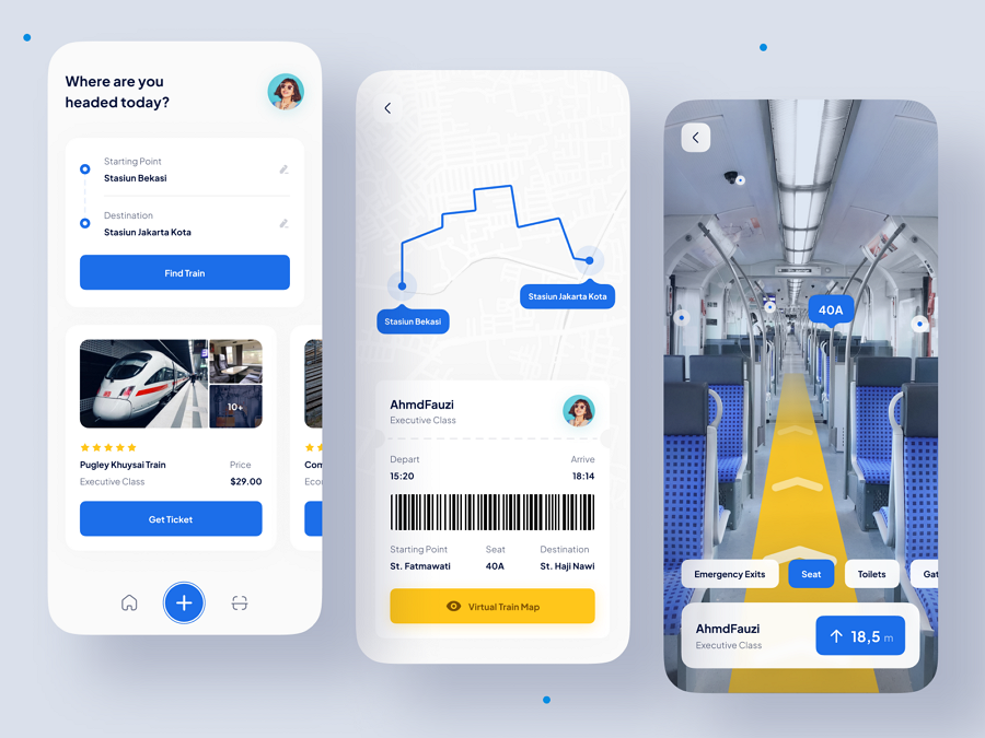
This example is a flight ticket booking app using AR technology. Users can easily input information, quickly scan all prices and select the suitable one based on the provided flight images, customer reviews and ratings. The VR interface also allows users to select their seats as they are there personally.
Features: Use unique 3D characters to level up the visual attractiveness
Category: Ecommerce app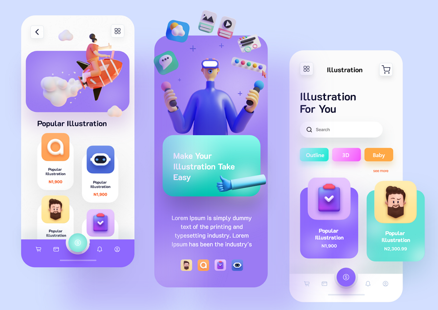
This app is an attractive ecommerce app design concept that uses 3D graphics and characters to bring life to the entire app. The unique set of illustrations, bright color schemes, eye-catching buttons and other designs level up the visual appeal of this app, and create a more fantastic shopping experience there.
Features: Use a mascot to humanize the interface
Category: Language learning app
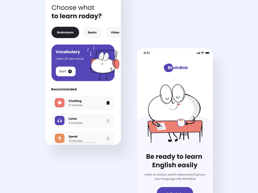
Brainbob mobile app is a minimalist language learning app that helps users learn a new language by listening to stories, watching videos and chatting with local people.
It uses a brilliant illustrated character to present all content, by using a character, the onboarding is shortened with the users, bringing a completely different user experience.
Features: cute emojis and pink colors
Category: Food app
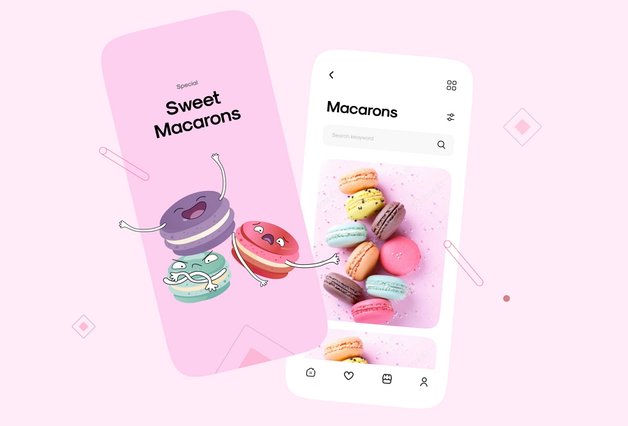
This app design is an inspiring design concept that you can copy for some online dessert shops and stores. The eye-catching pink color scheme helps leave an energetic and fashionable impression on users and also has a great appeal to the target market - the younger audience.
The most attractive part of this app design is using cute emojis to humanize the macrons on the interfaces, bringing great interest and intrigue to the user experience.
Don't know how to spice up your own app interface? This app design’s ideas would be a good inspiration.
Features: Custom illustrations help create a fantastic user experience
Category: Dating app
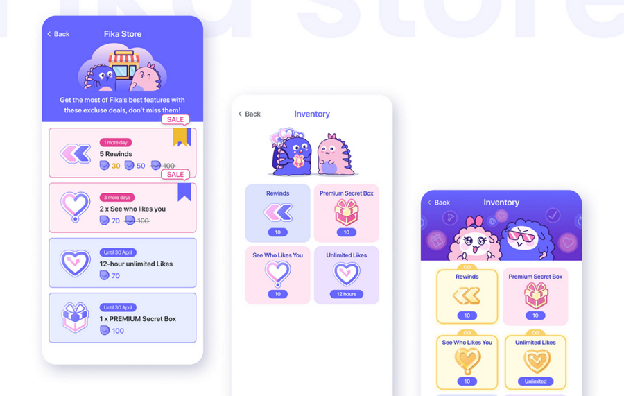
Fika is a female-focused AI-based social and dating app. It not only incorporates AI technologies to help users find friends, date and build a serious relationship but also uses a full set of unique illustrations to personalize the entire app.
Let's imagine, when using a dating app, compared with interacting with boring, or even simply an indifferent interface, the interface that delivers messages with cute illustrations and characters is much more fun and interesting, right?
Features: Inspiring dark theme and color schemes
Category: Mobile app
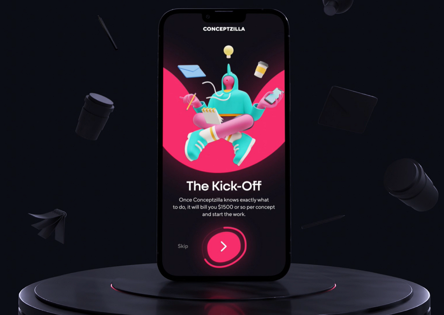
This example is an onboarding app design concept for a design studio - Conceptzilla. Even though it presents only part of the app design, it also gives many great ideas for designers to learn how to design a dark-theme mobile app. The animation design ideas further help create a better onboarding experience.
Features: Dark mode design
Category: Mobile app
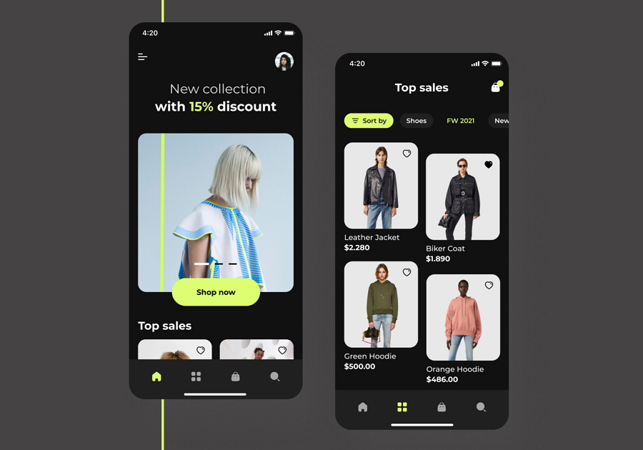
This mobile app is a concept app for the luxury brand Воttega Veneta. It features a dark mode design that is easy on the eyes. The white images and bright colors create a strong visual contrast on the black background and draw users' focus on the interface content only.
If you are working on a dark mode design for your mobile app, this app concept would be a good example for you.
Features: Dark mode design
Category: Mobile app
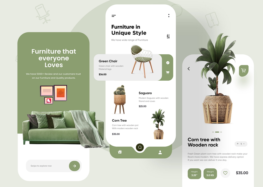
These days, many designers love to attract app users by using colorful visuals, like bright colors, images, illustrations and other eye popping elements. However, some of them also go the other way, and prefer to use some natural colors and elements to offer a more comfortable viewing experience, such as green colors, plants, and so on.
This furniture app belongs to the latter and uses green backgrounds, icon buttons, plants and even decorations to bring every user a more comfortable experience.
Features: Simple flat design
Category: Flower store app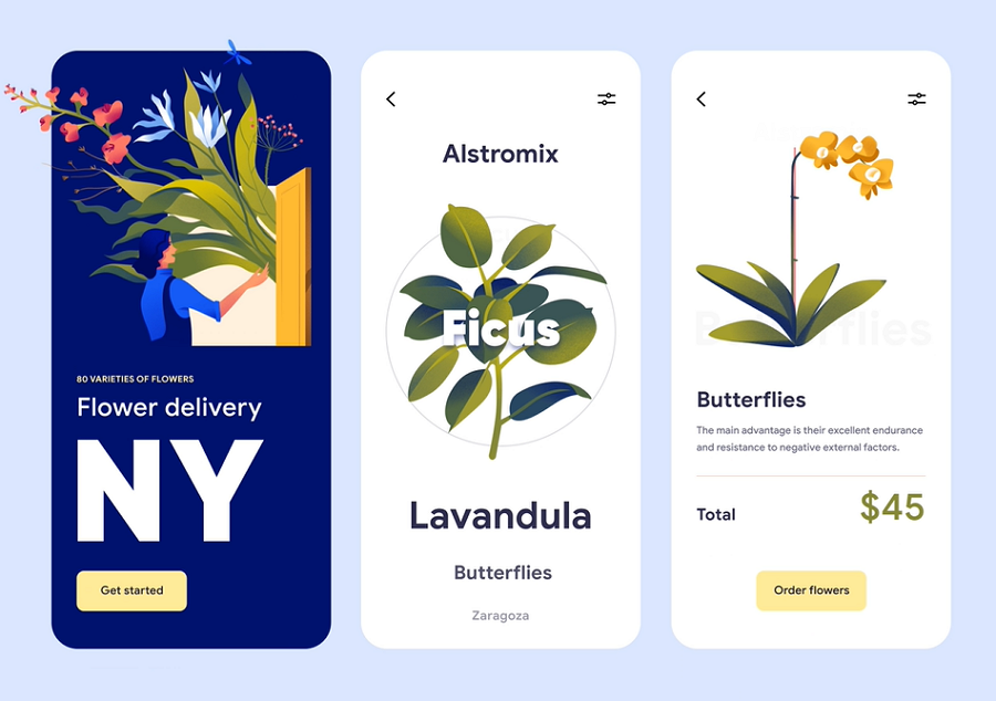
Flat design is simple and easy for users to read and scan, bringing a more pleasant and effective experience. The flat design has made a comeback in recent years.
This flower app uses a flat design style, loads faster and makes it easy for users to select their favorite flowers online. A nice app example that you should check if you also need to design a flat app project.
Features: Abstract graphics
Category: Task management app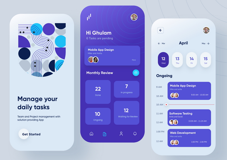
This example is a modern task manager mobile app that helps users manage their daily tasks perfectly. It has a white and blue color scheme, delivering a comfortable and trustworthy brand impression. We love its abstract graphics that make the interface look just like high-end artwork.
To level up your mobile app designs, try to add some abstract shapes, drawing, or art-like graphics.
Features: Intuitive data visualization
Category: Banking app
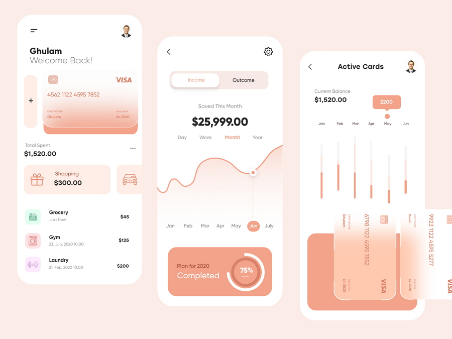
Need to present a large amount of data in your mobile app? This banking app design is a great example for you to learn how to show off your data with dynamic charts. Pie charts, line charts and bar charts are great tools to present different types of user data. This example also offers two different color versions for your reference.
Features: art-feel drawings
Category: Travel app
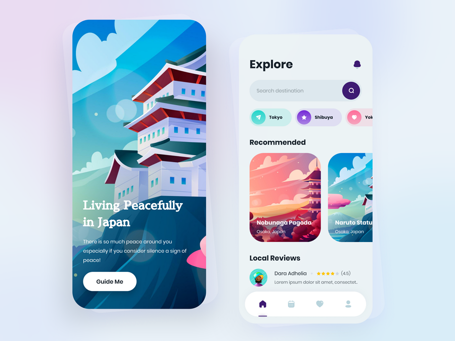
Cepirit is a beautiful Japan travel app concept that features brilliant art-like drawings.
In comparison with the real-life image, these colorful drawings create a more immersive and abstract world for users.
Features: glowing effects and dark theme
Category: Habit building app
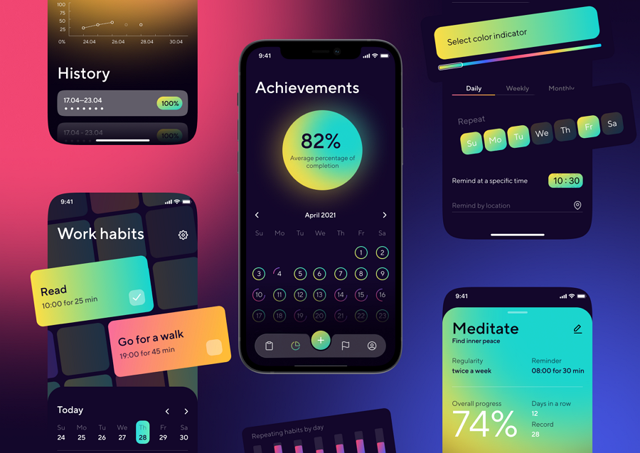
Glowing effects and elements are very trendy these days. This mobile app concept uses gradient colors to create a glowing-like effect, grabbing users' eyes as soon as they enter the app.
The comfortable dark-theme, solid visual hierarchy, and intuitive navigation make this app stand out from others easily.
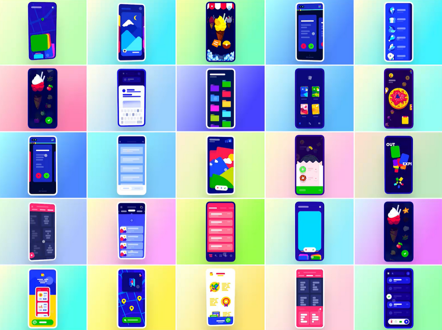
Looking for inspiration to help animate your mobile app? This example collects all trendy animations, like sliding, swiping, loading and so on. It can give you fresh ideas on how to spice up your app experience with animations.
Design feature: Simplify the user's journey by presenting all offers in one place
Category: Social Networking
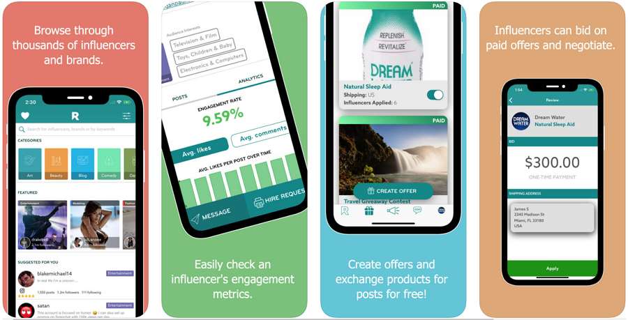
Rep is a marketplace where brands and influencers can connect and collaborate. It’s like having your own personal marketing and advertising agency.
You can present all offers in one place through Direct Offers via the Offers tool, resulting in a simplified user experience. You interact with less effort but move more directly toward your marketing goal.
Design feature: HD images directly impact user expectations
Category: Books
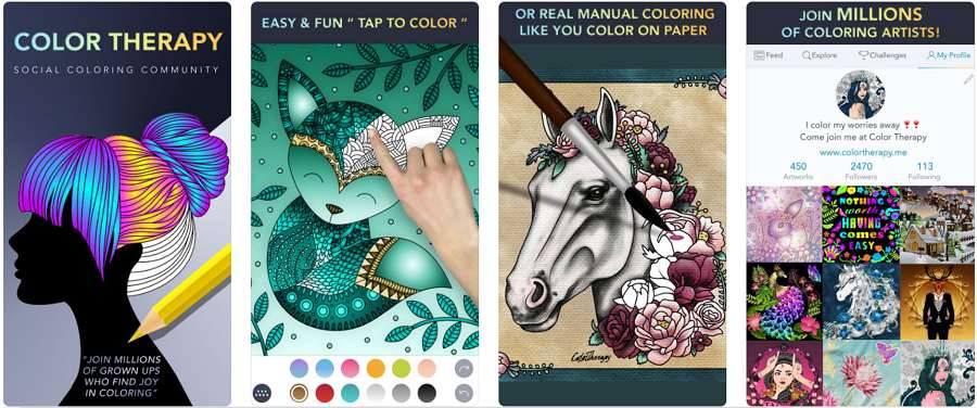
HD Images are a key factor of the interface, drawing the user’s attention to your app. A high-quality image creates a direct impact on user expectations. Gone are the days that images appear pixelated on a mobile screen and take forever to load.
Coloring Book for Adults is a gathering place for millions of dedicated coloring artists. With more than 2000+ stunning and free adult coloring pages, you will get the relaxation and mindfulness you deserve. In addition, you can enjoy coloring and connecting with millions of coloring enthusiasts from around the globe.
The main features include:
Design feature: high-contrast UI colors and interactive animations
Category: Mi Home App
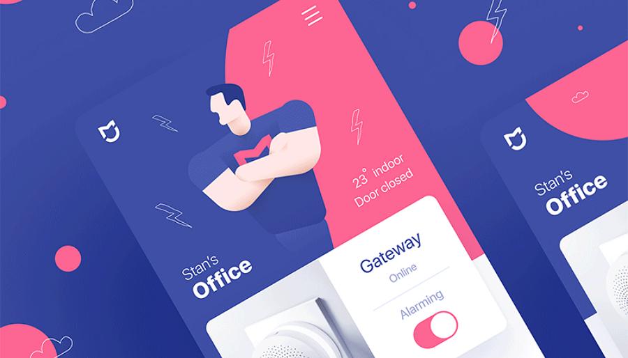
Xiaomi is an amazing phone brand from China. Mi Smart Home is a management app for Xiaomi made by designer Stan Yakusevich. It’s animations help you navigate through your quick day-to-day interactions.
Thanks to larger, brighter, higher resolution screens, mobile app designs have more room to play with visual contrast, which not only works to enhance aesthetics, but also give designers more room for creativity. The color contrast of Mi Smart Home is bold and appealing.
Design feature: Overlapping effect and opacity to create depth and layers
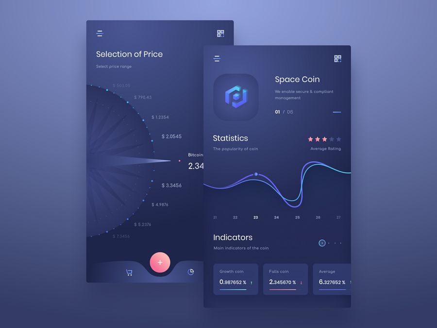
The user interface is a key focal of mobile app design. Your interface should be clean and organized. This mobile design uses depth and layers to make the UI a lot cleaner, and uses techniques like overlapping fonts, different levels of opacity, color gradients, shadow and blur and varying shades of color work to create a sense of space. Creating an eye-catching UI interface is a must requirement for UI designers in 2018.
What’s special: Micro animation
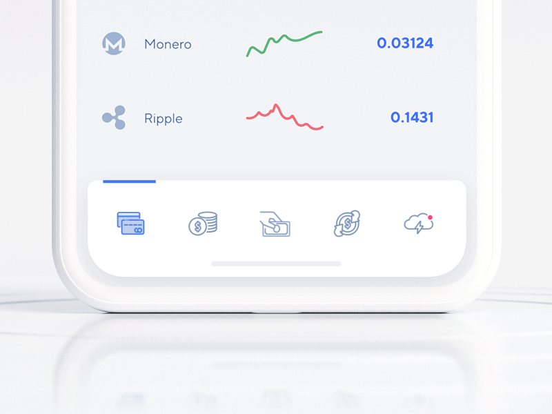
Micro interactions can bring your design to life no matter what App you are working with. When your users focus on a small mobile screen, micro animations can create interactive features that engage them in a fun way.
Tap Bar Crypto App creates perfect micro animations on the bottom navigation icons to attract and inform users.
Design feature: Vibrant colors
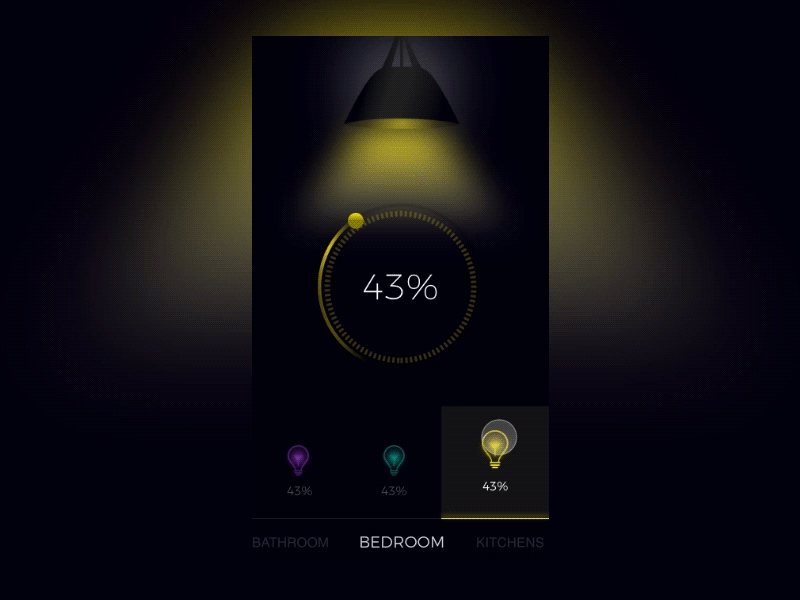
Smart House is actually the portfolio of designer Yurij Prokopchenko. The Smart Home App features simple visualization by using vibrant colors. In 2018, color definitely became a powerful tool in the designer’s toolkit. Using color wisely in UI design can create a perfect UI interface. It draws attention and influence users’ emotions and actions. That is also why the design of the remote control for the attached light is a quite good and clear option for users.
Design feature: Color gradients
Category: Music
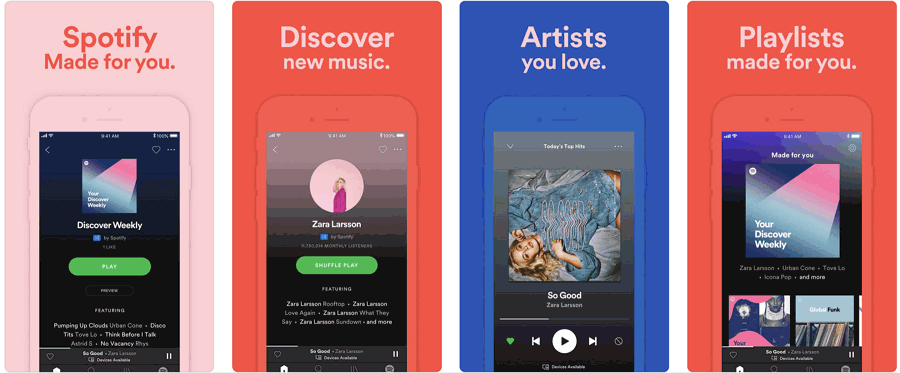
It's true that color gradients are favored by designers more than flat colors nowadays. Color gradients are more powerful when used intentionally, such as when you need to convey emotions or highlight a certain design element.
Spotify not only has the biggest, and best music collection, it also has the best UI designs. It also uses rich color gradients effectively.
Design features: Cards and simple shapes, define location, layers
Category: Shopping
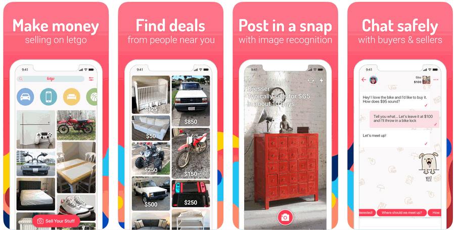
Letgo is one of the biggest and fastest growing apps for buying and selling locally. You can find great local deals on such items as second-hand phones, fashion, sneakers, games to furniture, cars, and real estate.
With such a large amount of commodities to display, Letgo abandoned complicated clunky shapes and instead uses cards and simple shapes to keep all the items in good check. The uncluttered buttons and minimalist icons allow users to navigate with ease. In 2018, mobile apps are simplifying shapes and edges to give everything a cleaner feel. So does Letgo.
Design feature: Full screen
Category: Online shop
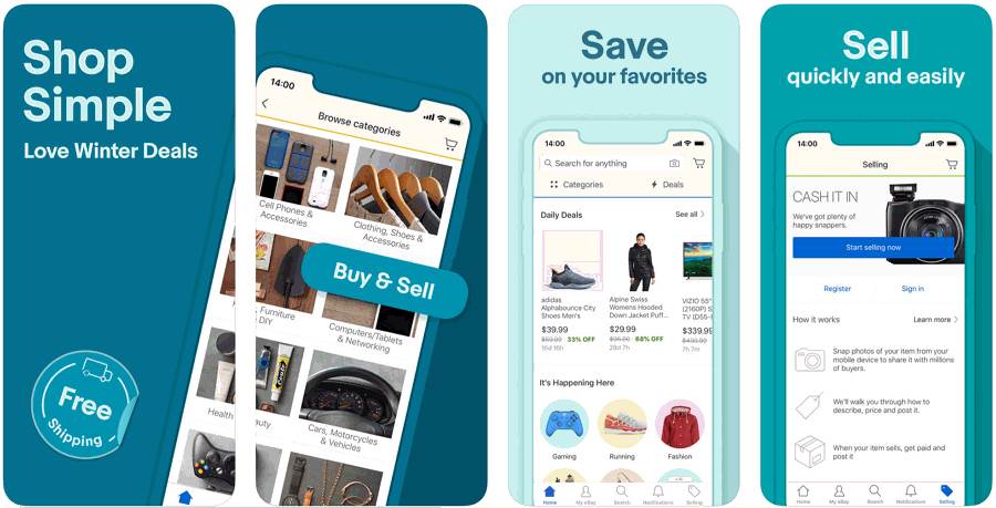
With the release of Samsung Galaxy S8 and iPhone X, frameless designs have become a trend. More screen space also means users expect to have full-screen experiences. eBay responded to this call. You can explore offers on your favorite brands frameless at eBay. In addition, this massive online marketplace gives you the freedom to buy and sell just about anything.
Design feature: Easy payment method
Category:Shopping
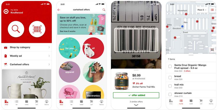
Cashless payment is waived in China and more users worldwide have turned to cashless payment. Reports indicate that the number of people who use a cashless method of payment almost doubled in 2017, which means demand will only grow in 2018 and beyond. The new Wallet feature of Target provides the fastest, easiest way to save and pay in the store without cash.
Design feature: Listen on the go with Text-to-Speech
Category: Magazines & Newspapers
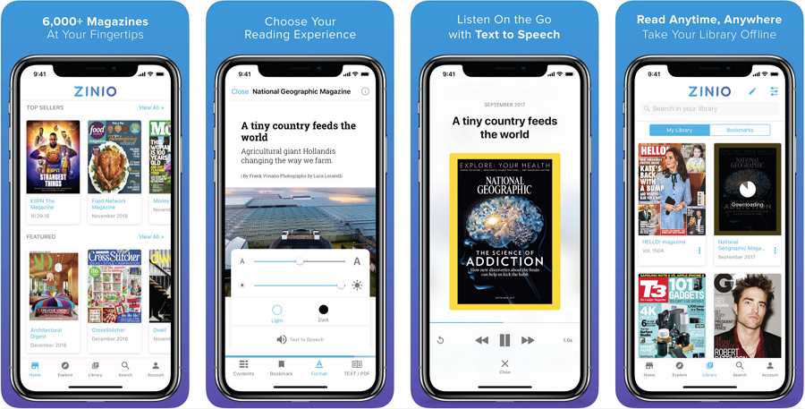
ZINIO is the world's first and largest digital newsstand, offering more than 6,000 of the best magazines from around the world. Users used to get their news by reading, but now with the latest TEXT-TO-SPEECH function, you are able to listen to your favorite articles. Listening is convenient and frees up your eyes and heads for other tasks. Isn’t it amazing?
Design feature: Interactive animations
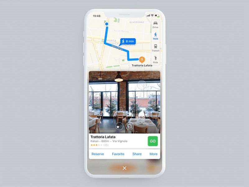
Interactive animations was a hot trend in 2018 and will not likely go away. Animation can mobilize user emotions and attract their attention. Interactive animation is an indispensable design strategy.
When it comes to this Apple Maps Concept example, my personal favorite is the zooming out while scrolling. In addition, a horizontal list across the bottom is really helpful in many different scenarios and use cases. Also, the time selector has an option to show sunset or sunrise times in that area by changing the map background color. These features enhance user experience.
Design feature: 3D Transition
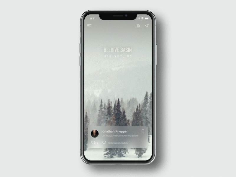
This example is a transition exploration for a travel app. The designer uses 3D transition to clarify spatial relationships between screens. It creates a sense of space for the uses.
Design feature: AR experience
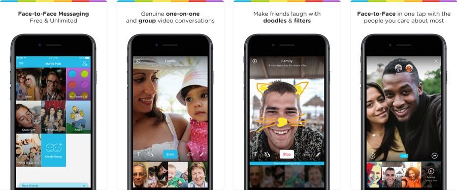
Marco Polo is a face-to-face messaging app for one-to-one and group conversations. It brings family and friends closer than ever with genuine conversations and shared moments. In addition, you can add entertainment functions to your conversations, such as doing make-up on yourself when chatting. The AR camera helps to create a more engaging user experience.
Design Features: Emotional experience feedback design
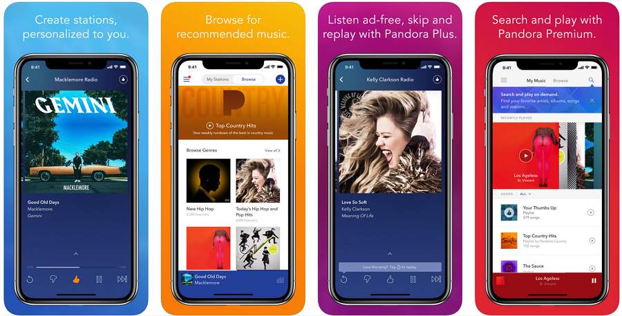
Users not only need an app to interact with them, but the app must also provide a way for users to express their user experience. In Pandora, users can tell the app what they like and don't like through the simplest choices of clicking likes and dislikes. The app then uses this feedback to provide a personalized music experience for the user.
The above is the 15 best app designs of 2018 selected by Mockplus. We hope the above designs bring you inspiration for your next project. Let us know if you have other resources to share.
Price: Free
Format: Mockplus
Features:
16 mobile app screens
Over 1000 elements
This free mobile UI kit packs nearly all of the general mobile app pages, like the login, home, shopping, search, profile and search pages, in one kit.. It has over 1000 editable components to match your design. As a completely free UI kit, you can even easily save it to your account to start editing your own.
It is a perfect fit if you are designing a shopping or ecommerce app.
Price: Free
Format: Adobe XD
Features:
50 app screens
10 categories
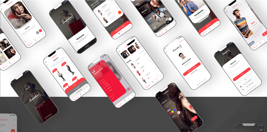
This UI kit is a minimal style app design template that helps you create great ecommerce apps. It packs 50 unique app screens and contains over 10 categories, such as splash, onboard, checkout, and many more.
Price: $25
Format: Adobe XD
Features:
30 clean screens and layouts
Light & dark versions
Blume is a stylish app UI kit that helps you create your own shopping app with ease. It contains 30 clean screens and layouts. Both light and dark versions are provided to help you create a user-friendly app project. The fully customizable fonts, colors, and layers make it even easier for you to create your own style.

Price: $38
Format: Adobe XD and Sketch
Features:
31 social app screens
Flat design style
High resolution
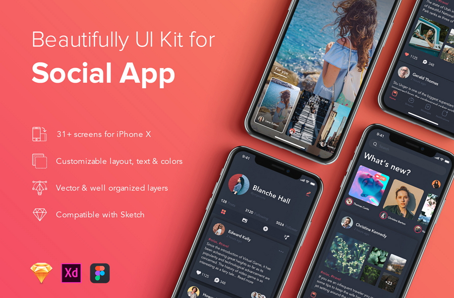
Zingo is a high-resolution social app UI kit that contains 31 app screens and well-organized layers and symbols. If you are looking for ready-made materials to build your own social apps, don't hesitate to try this one.
The above is the 34 best app design examples and templates of 2021. We hope the above designs bring you inspiration for your next project in the up and coming 2022 as well. Let us know if you have other resources to share.
 Mockplus RP
A free prototyping tool to create wireframes or interactive prototypes in minutes.
 Mockplus DT
A free UI design tool to design, animate, collaborate and handoff right in the browser.
