With website design trends change every year, in the first half of 2018, some new trends, such as broken grid layouts, typographic animations and fluid effects have emerged.
We also continue to see some web design trends from 2016 and 2017 or earlier, such as minimalist/clean web designs, flat web designs, responsive web designs and interactive web designs, etc.
Do you want to keep pace with these website design trends of 2018 and design a creative and practical website as a UX/UI designer?
You’ve come to the right place! We've found 19 of the best website design examples and templates in 2018, including some fresh and creative WordPress websites, ecommerce websites and the best clean/minimalist web examples to help boost your creativity and inspire you.
And some website prototyping design tips will also be introduced with the aid of an easier, faster and smarter prototyping tool, Mockplus.
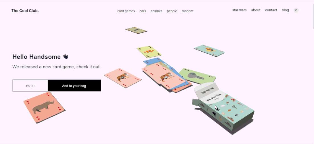
Rating: ★★★★★
Highlights: Rich micro interactions, hovering effects and white space
This Cool Club website includes many interesting micro interactions.
For example, users can easily click the card box to deal cards one by one. In addition, as you move your mouse cursor over the words located on the navigation bar, they will shake and wave correspondingly. Overall, all of these micro interactions make for an interesting and attractive website design.
Moreover, this design also makes full use of white space to highlight their products and grasp the users’ attention.
What can you learn:
Make your website design better with rich micro interactions, small games and effective use of white space
Prototyping design tips:
The micro interaction design has been widely used by UX/UI designers to create an interesting and compelling website prototype. We highly recommend you to free download and use a powerful prototyping tool with rich interaction commands.
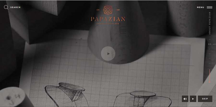
Rating: ★★★
Highlights: Inspiring full-screen video background and the minimalist web design style
This website uses a full-screen video to dynamically display the production process of its products as its background. This approach features their attentiveness to detail in every piece of jewelry they make, compelling the user to buy a high-quality product.
Moreover, the coordination of the background video with the overall design and the color scheme contributes to an overall sense of elegance and fashion.
This website is also an excellent example of minimalist website design.
What can you learn:
Optimize your website with videos
Prototyping design tips:
With Mockplus, designers can easily use its “GIF” component to import and edit a video for their web/app interface design. Moreover, Mockplus offers over 3000 vector icons which are really useful to incorporate into an amazing minimalist website/app.
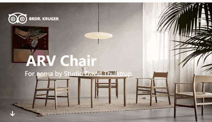
Rating: ★★★
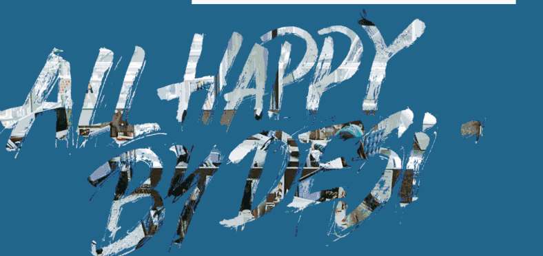
Highlights: Broken grid layouts, kinetic text animation and selection effects
This design studio website uses kinetic text animation to arouse users’ interests while loading. A broken/asymmetry grid layout is used to showcase their portfolio items one by one with a selection effect used to enhance each listing.
These design elements are effective in stimulating users’ interests and encourage site interactions.
What can you learn:
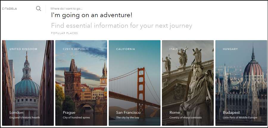
Please Note: This does not mean you have to use asymmetrical grid layouts in your web/app design. Symmetrical grid layouts can also be effective enough(see below).
Rating: ★★★★★
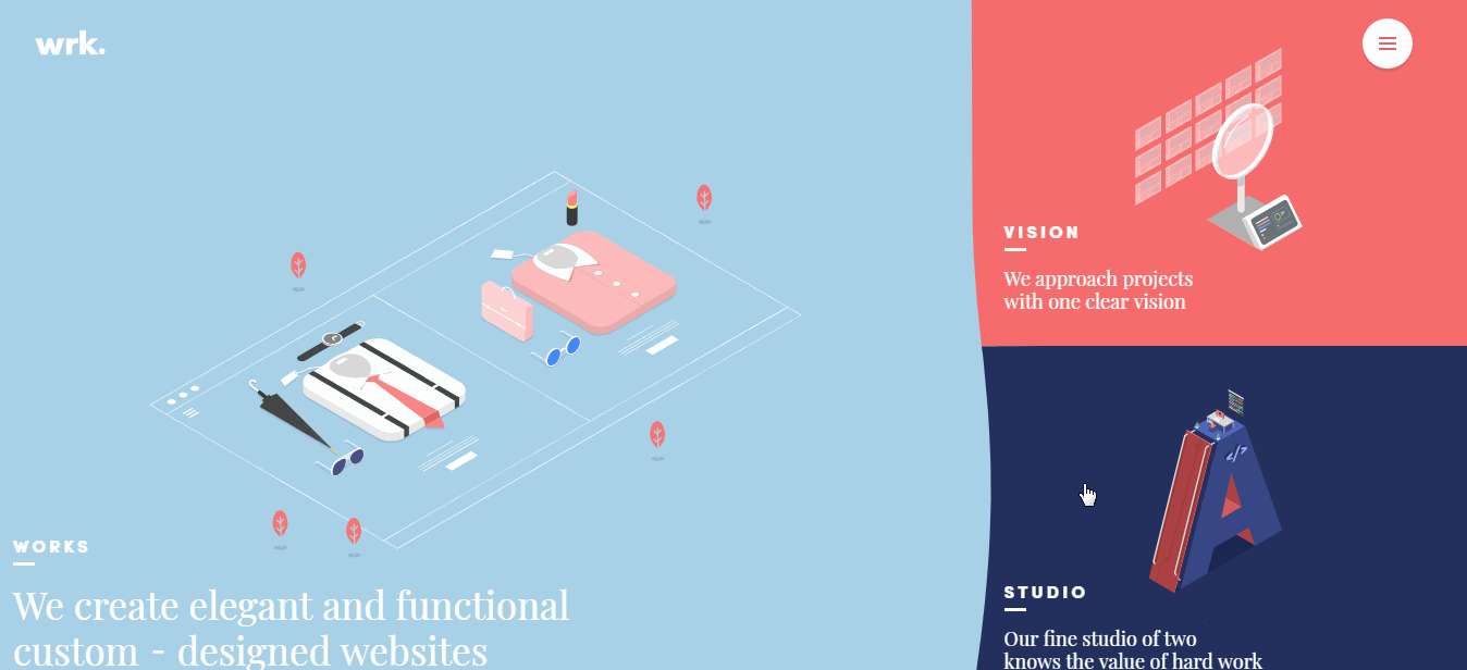
Highlights: Great fluid effects
This design studio website uses very cool fluid effects to attract and retain users. Moreover, its illustrated design style is eye-catching.
What can you learn:
Rating: ★★★★
Highlights: Perfect combination of dynamic texts and photos
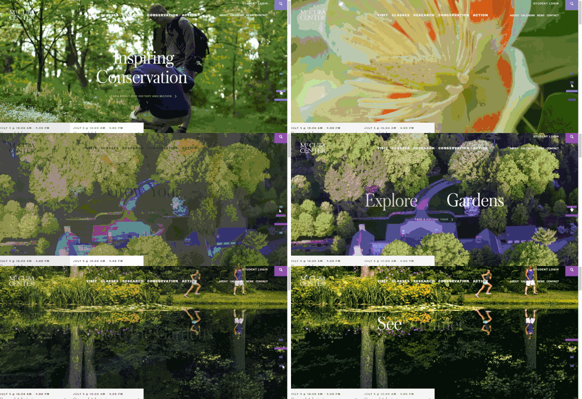
Unlike other garden websites which use static photos and texts, this botanical garden website combines dynamic texts and high-quality photos perfectly.
Users are treated to high-quality photos showing beautiful scenery paired with information about the garden as they ‘stroll’ through virtually.
What can you learn:
Use dynamic texts and photos for an intuitive interface
Moreover, in specific design cases, to make your website more beautiful and attractive, also customize some special effects for the UI texts and photos.
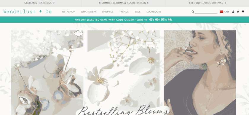
Rating: ★★★★
Highlights: Interesting mouse cursor styles
This jewelry store website stands out for its smart searching, filtering and navigating features, contributing to a fashionable and visually appealing design.
Moreover, this website also features diversified mouse cursor styles for each jewelry category. When users browse different jewelry categories, the mouse cursor style automatically changes. This creates an interactive and engaging design element.
What can you learn:
Enhance your website with more humanized design elements according to the website or product features, such as varying mouse cursor styles, fonts, colors or color schemes, etc.
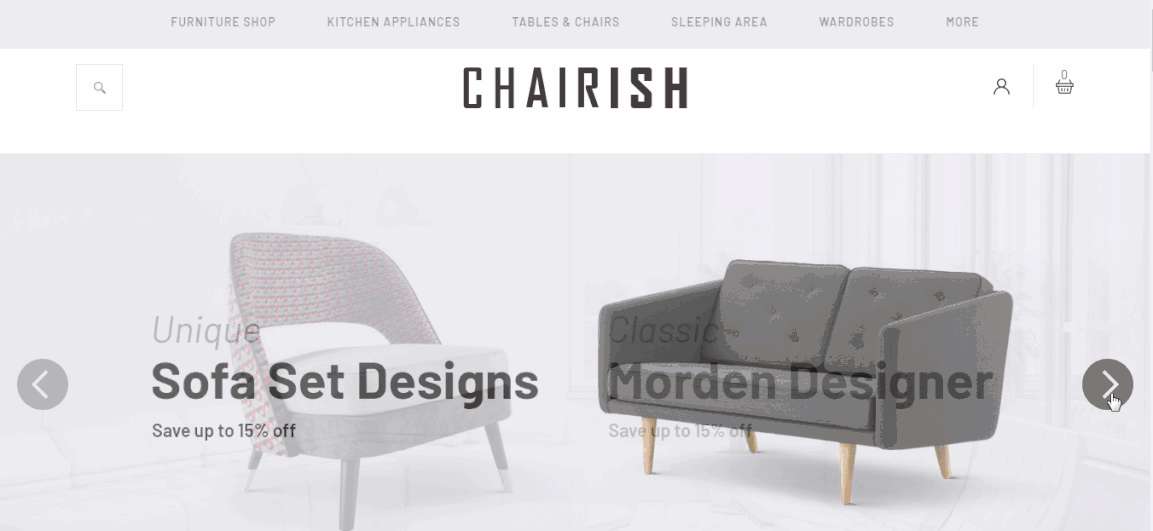
Rating: ★★★
Highlights: Promoted product carousel
This furniture website template uses a special carousel to promote hot products on its Home page. Flat icons with text help users search and check needed information quickly.
What can you learn:
Prototyping design tips:
Mockplus lets you showcase the promotion news or products intuitively. Just drag and drop the “Image Carousel” component to display different product photos. Its “Icon and Label” component is also useful in creating an icon button with texts.
Of course, you can also add interactions to these icon buttons for better performance.
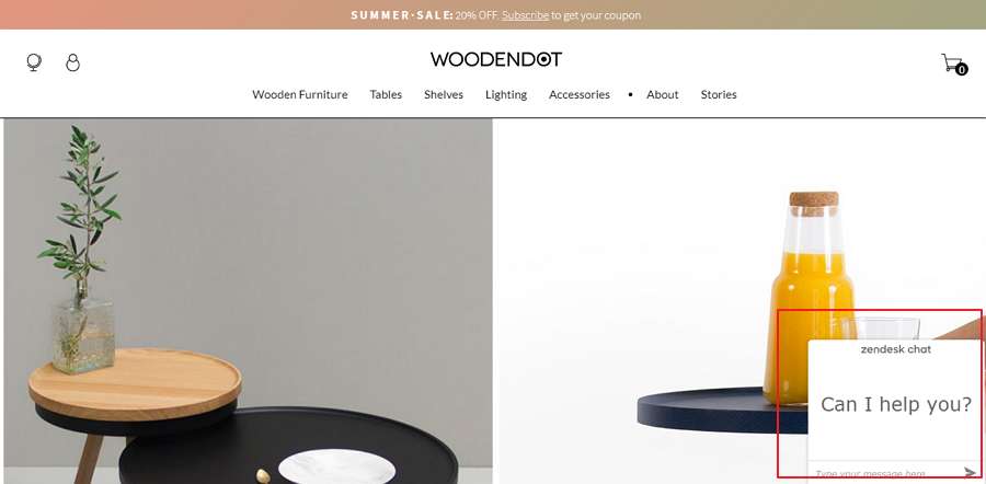
Rating: ★★★
Highlights: Thoughtful online help panel
This ecommerce website is designed with a thoughtful online help panel which allows users to ask for help at anytime. Moreover, the feature can be hidden when not in use for better UX.
What can you learn:
Add a special promotion, Q & A or help panel to improve website UX
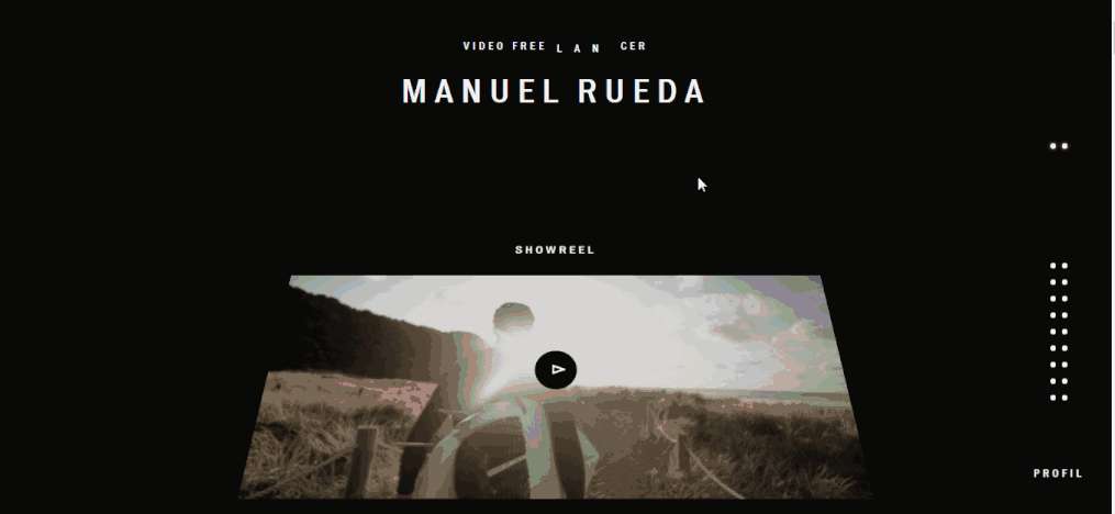
Rating: ★★★★★
Highlights: Parallax Scrolling design
This website features an amazing parallax scroll effect which enables users to navigate through a series of videos easily by scrolling the mouse wheel. The end result is a user-friendly experience that is similar to watching a movie.
What can you learn:
Use parallax scrolling design to high light the visual hierarchy, layouts and important products
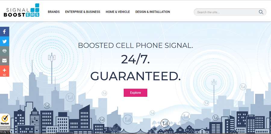
Rating: ★★★
Highlights: Beautiful illustration design style
This website uses an illustration design style to display all interface components, which make the entire design beautiful and interesting.
What can you learn:
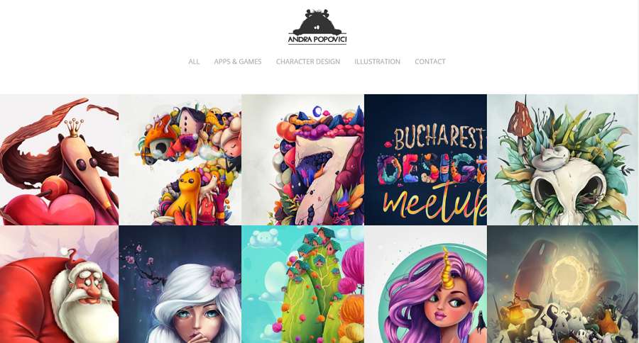
The cartoon design style can make your website UI extremely beautiful and attractive.
Clean/minimalist websites are often simple, neat and user-friendly. And in the first half of 2018, there are many excellent clean/minimalist website designs. Let’s check out a few:
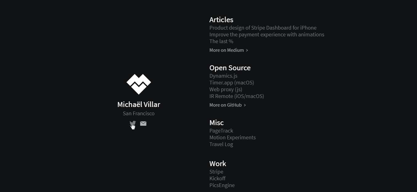
Rating: ★★★★
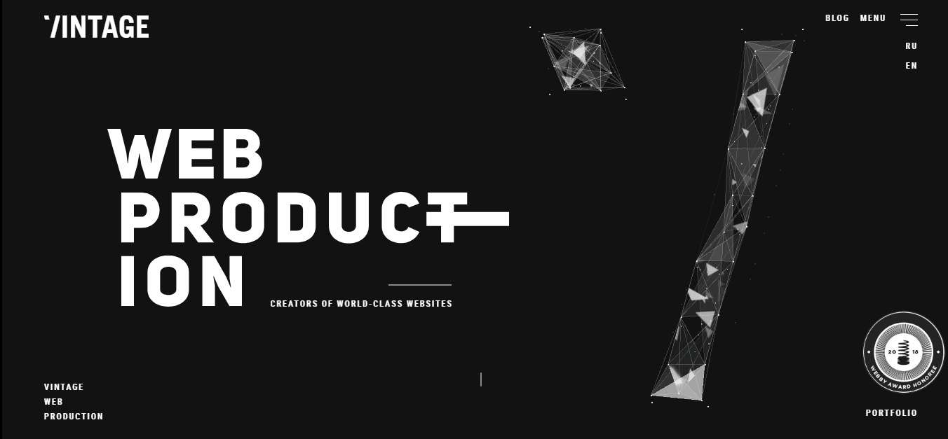
Highlights: Eye-catching selection effects
This website is an excellent minimalist website example. The black background matches perfectly with white texts and icons. Moreover, it also uses a very eye-catching selection effect, which makes the entire design more attractive and interesting.
What can you learn:
Stand out your minimalist website with special selection effects
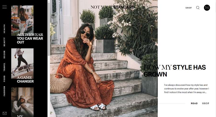
Rating: ★★★
Highlights: Useful navigation bar on the left side
The navigation system directly affects the user experience of a web/app. To improve UX, this website incorporates a left navigation bar that can be freely hidden or unhidden based on the needs of the user.
What can you learn:
Add real-time, interactive navigation elements to your webs/apps for better UX, such as hiding navigation bars, sidebars, etc.
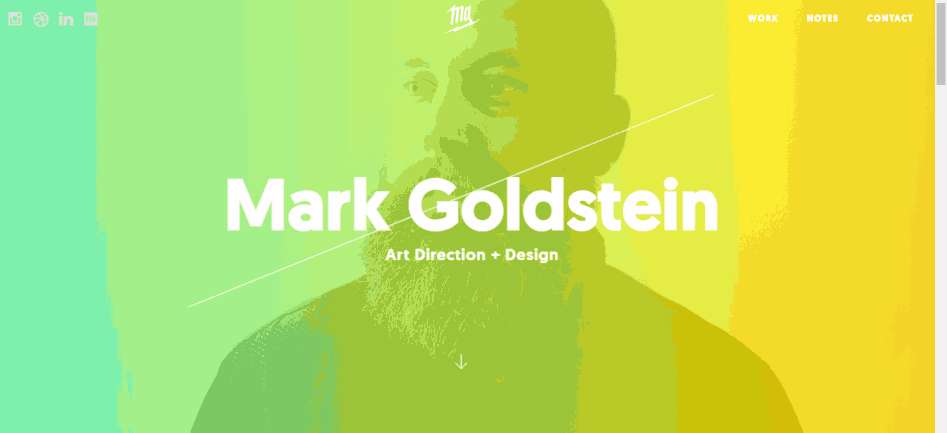
Rating: ★★★★
Highlights: Cool color gradients
This website example uses beautiful, dynamic-color gradients to attract users through high visual appeal. Very cool.
What can you learn:
Enhance the visual performance of your website with right color schemes or color gradients.
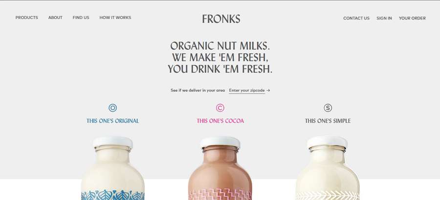
Rating: ★★★★
Highlights: Effective product promotion
This website drives higher product sales through the use of simple text with varying sizes and typography, coupled with enticing product photos, to entice users to click for details or directly purchase.
What can you learn:
Showcase products by highlighting their unique features
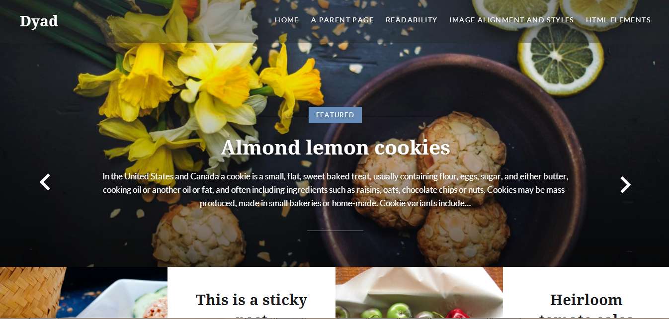
Rating: ★★★
Highlights: Responsive website, the perfect combination of high-quality photos and texts
This recipe sharing website is a responsive website that automatically renders well to different devices with different operating systems or screen sizes.
Moreover, recipes of this website are attractively featured with high-quality photos and texts.
What can you learn:
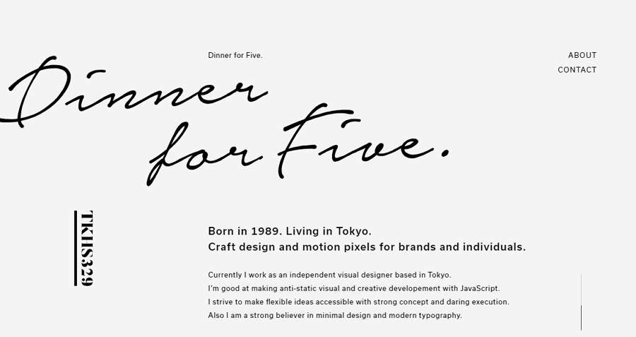
Rating: ★★★
Highlights: Clear and intuitive visual hierarchy
This website wisely organizes texts with a very clear and intuitive visual hierarchy which is very practical for users to read and find their needed information quickly.
What can you learn:
Improve your website design with clear and intuitive visual hierarchies
You can create a clear and intuitive visual hierarchy for your website design by using diverse typography, sizes, placements, colors, alignments, layouts and other approaches.
Prototyping design tips:
With Mockplus, you can easily build a clear text or visual hierarchy for your web/app prototypes by setting sizes, placements, colors, alignments and more properties of a component.

Rating: ★★★★★
Highlights: Interactive website, creative audio design
This studio website allows users to interact with the website and create music through their mouse cursor even if they know nothing about music.
What can you learn:
Nowadays, the UI designs of a web/app no longer rely on the visual performance only. An increasing number of designers add sounds or audios to their designs for better UI and UX.
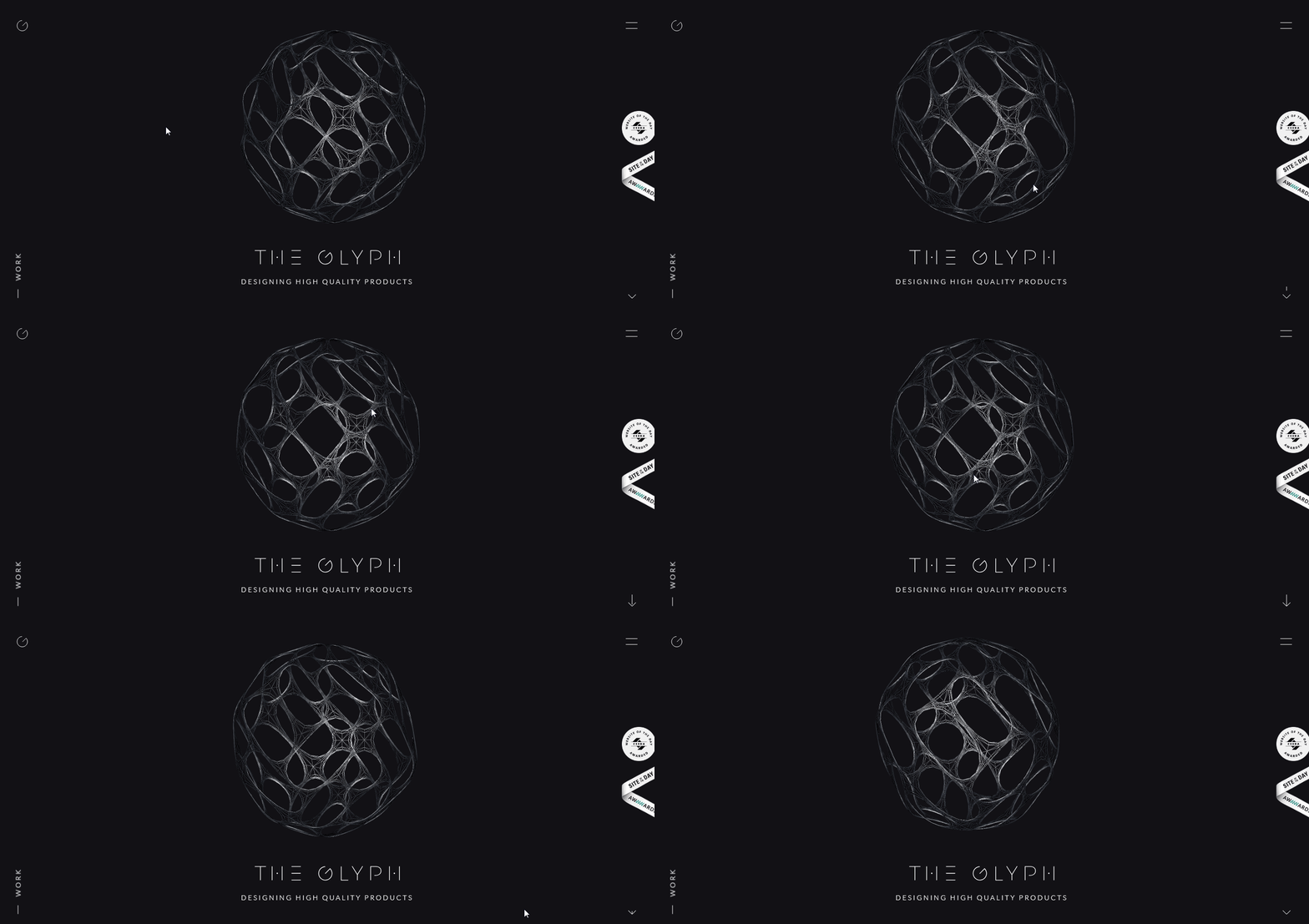
Rating: ★★★★
Highlights: 3D technologies and interesting hovering effects
This website features a 3D ball that users can rotate. In addition, the website also uses a hovering effect on several buttons.
What can you learn:
Use 3D technologies to display page contents for better visual performance
Improve websites with creative micro interactions, such as special hovering effects
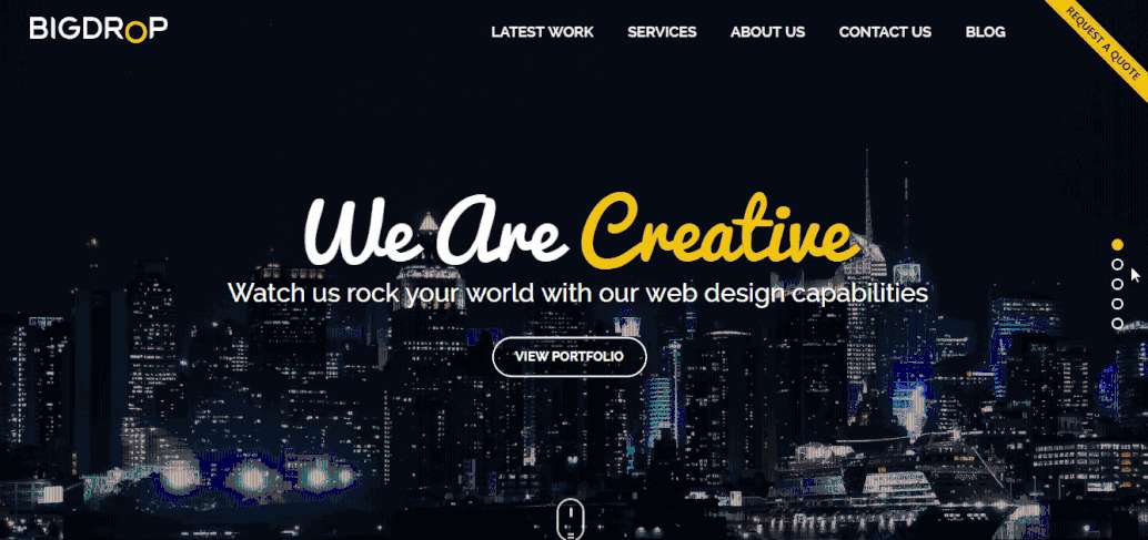
Rating: ★★★
Highlights: Vibrant color scheme
This website uses a minimalist web design style for intuitive and easier-to-understand interfaces. It couples the design with a vibrant color scheme to keep users’ attention.
What can you learn:
Customize a website color scheme
Prototyping design tips:
Mockplus offers powerful color selectors for every design component so that designers can easily edit colors and customize a color scheme for their app/web designs.
Moreover, Mockplus is also designed with many powerful features (such as the icon library, component style library and prototype sample library) for users to prototype their webs/apps quickly and effectively.
For example, Mockplus offers 8 ways to test and share a project so that designers can easily test, iterate and improve their prototypes as well as collecting feedback in real-time.
Mockplus newly introduces a team management and collaboration feature to help users collaborate more effectively.
Overall, Mockplus is really the best choice for you to prototype, test, iterate and demonstrate your website/app design easily and quickly.
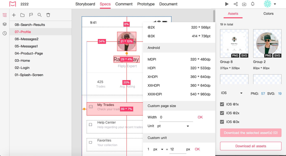
To create a wonderful website, it needs the collaboration between designers and web developers effectively. Take the new design collaboration tool Mockplus iDoc to help you improve teamwork efficiency and handoff design seamlessly. With it, designers can handoff design more easily through the powerful Adobe XD plugin,Photoshop plugin, and Sketch plugin.
The best website means all details perfect including the small UI elements and accurate positions. So just upload designs on plugins and generate specs and assets automatically. Developers could use the front-end parameters for website development.
Besides, Mockplus iDoc is not only a collaboration tool, but also a platform for hi-fi prototypes. Upload your static wireframes on it to change into the hi-fi interactive prototypes through a drag-and-drop.
No matter what type of websites they are, all of the best website design examples and templates mentioned above have applied popular website design trends, and shown web design skills more or less.
We hope these examples will inspire you to create your own creative and compelling website or app.
 Mockplus RP
A free prototyping tool to create wireframes or interactive prototypes in minutes.
 Mockplus DT
A free UI design tool to design, animate, collaborate and handoff right in the browser.
