E-commerce websites often need a more delicate design to attract users to convert and purchase. An excellent e-commerce website must consider the integrity of the product display, but also meet the user experience and UI design requirements.
Most e-commerce websites use hero images and a large background photo to catch the user’s attention. These plays an important role when designing an online business site.
Mockplus has collected 26 best e-commerce website designs for your inspiration. let’s take a look at them one by one
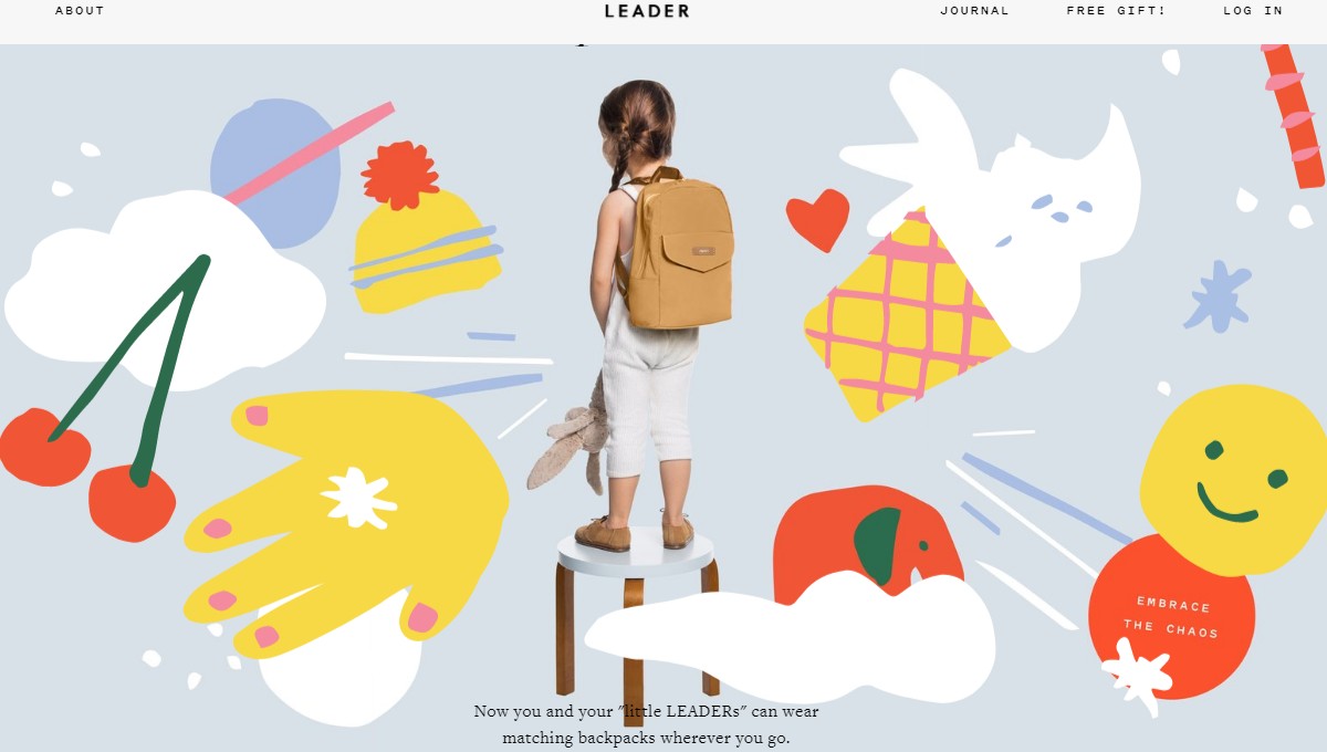
Leader is a website that sells diaper bag backpacks. The website applies a super cute children’s painting style. The website includes lots of photos of family, giving it a warm, loving feeling . In addition, the site also does a very good job with fonts, and the white space makes the products stand out.
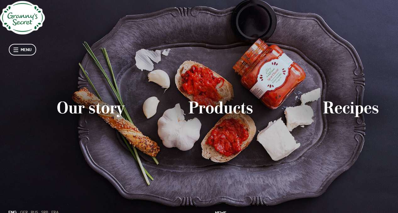
Granny’s Secret is nothing old, but is very creative and beautiful. The background photo shows a grayscale plate filled with a variety of ingredients that highlight the theme of the site. Mousing over the text displays the products and recipes, and clicking it shows more details.
The site's navigation bar uses the Hamburg navigation to allow for more space. What’s more, the fonts of this website are creative and make it stand out from traditional e-commerce websites.
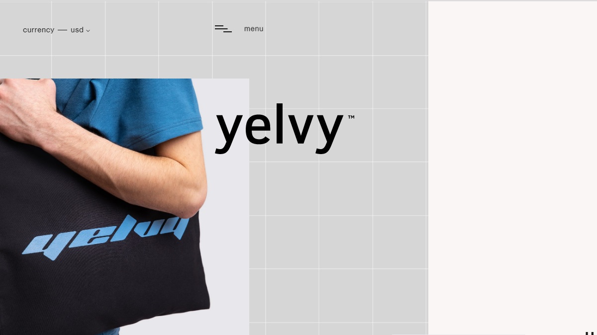
Yeley is a male clothing e-commerce website. Their website, like their clothes is simple and clean. With limited products showcased, the site is makes it easy to navigate. What makes this website stand out is its currency feature, which helps customers easily calculate the cost in their own currency.
The site shows the cart items on the right of the page to show customers what they’ve added. Additionally, the fonts of “new arrivals” is dynamic and catches users’ the attention.
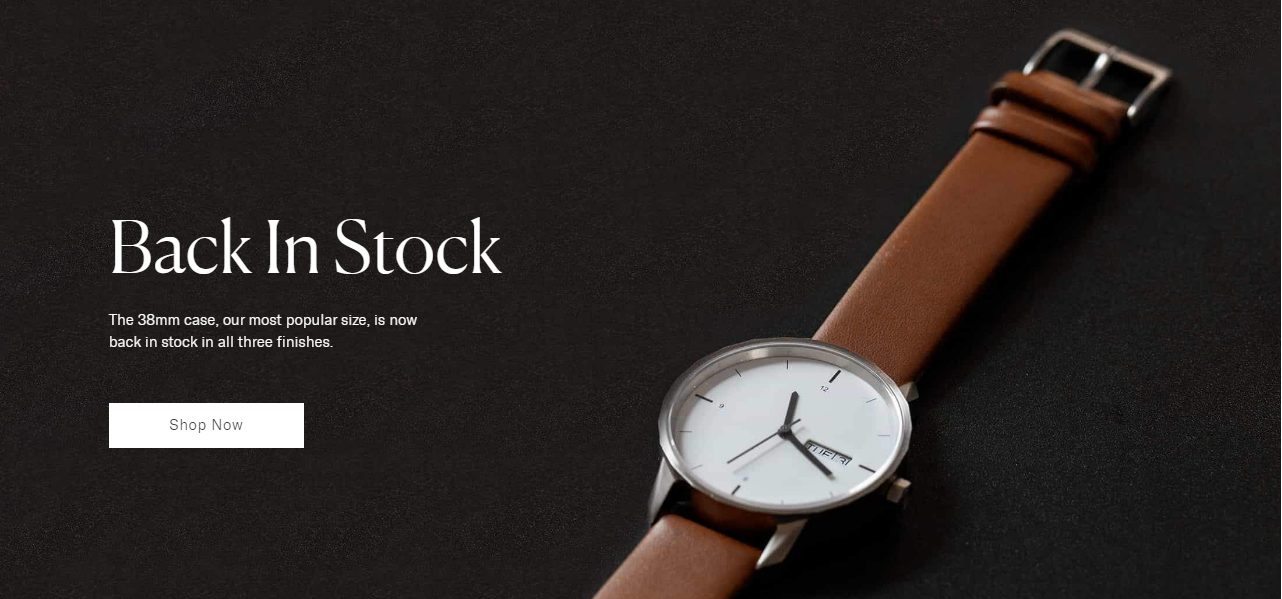
Thinker is an e-commerce website that sells watches. You can see a big photo display one of their beautiful watches when you enter the website, highlighting the sales point of the website. Scroll down to see the watch's components and materials showcasing the high-quality of their product.
They further show their watches in a different scenario, making the product more compelling and include a pop-up newsletter in the same style of the website.
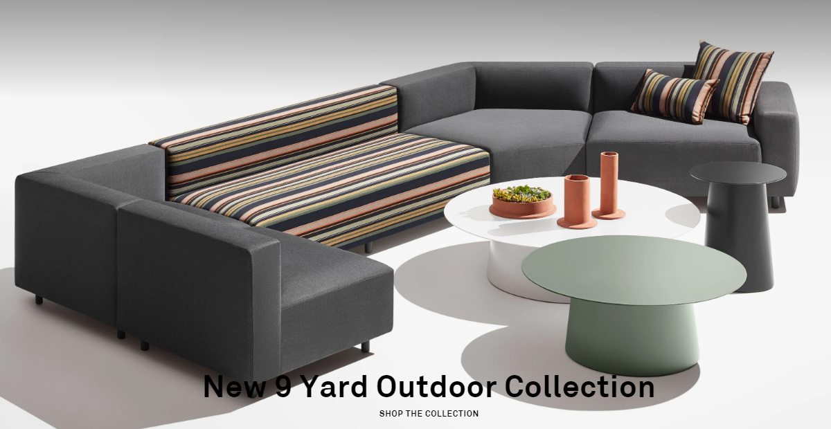
Bludot is a website for online furniture design. The website style is simple but luxurious. They not only display their best-selling products, but also their latest designs. In particular, they showcase that they’ve won the 2018 National Design Award for Product Design when you scroll down the page to the bottom. This bolsters their authority and trustworthiness.
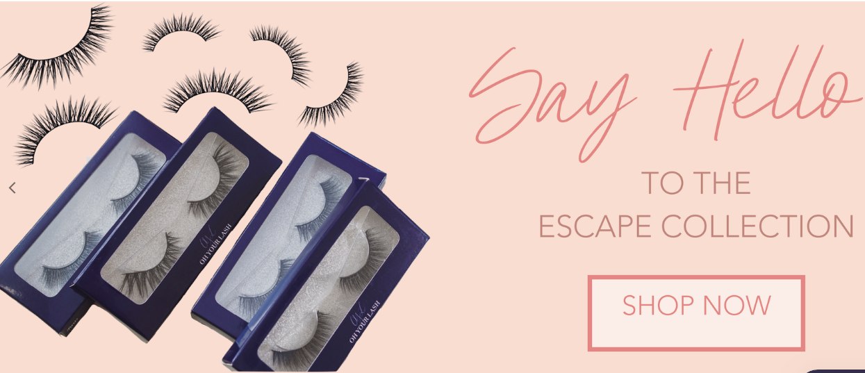
I believe that girls should know about this brand. This is a fashion e-commerce website that sells fake eyelashes. The main color of this website is a warm pink. You can see a lot of lashes displayed on the page that can help customers make their choice In addition, the fonts are super eye-catching.
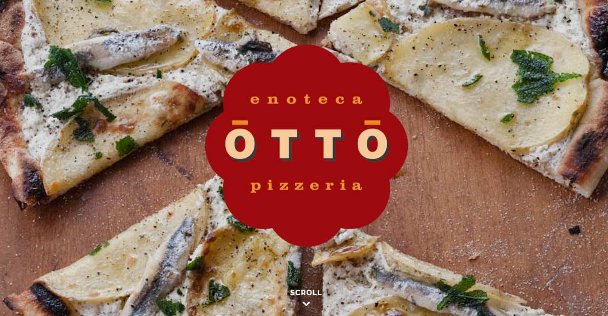
OTTO is a website that sells pizza. Using a large photo of a pizza as their background, you can click their hamburger navigation bar to learn more about their services. They use bold fonts to draw you in. Furthermore, they use the red color to emphasize the website’s most important info like CTA, reservation, etc..
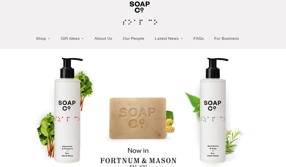
The Soap CO is a website that sells soap. The website design is neat and clean, using white space to make their product prominent. In addition, the search feature can easily help you locate what you want.
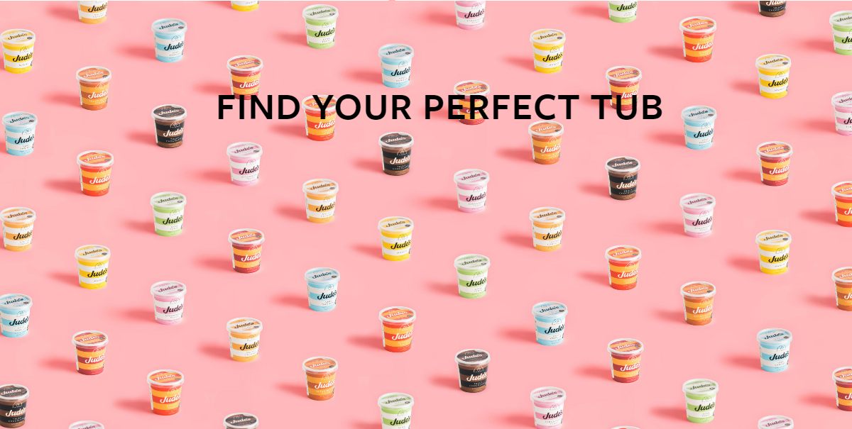
Jude’s is a company that makes ice cream. The website is colorful, with a high-quality photo making the product more appealing and attractive.
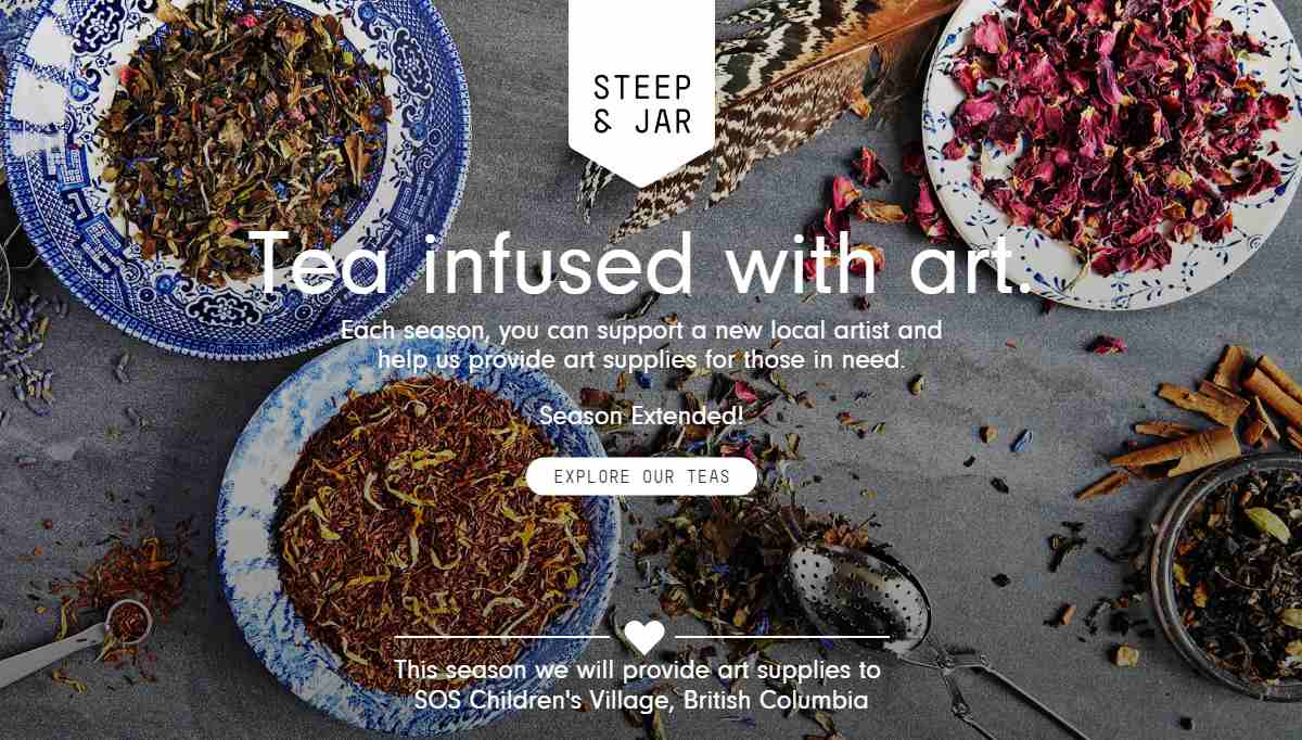
I didn't expect a website that sells tea to be so delicate, with its eye-catching background image. Click on each tea to see the detailed description. What’s more, they have a charity project that gives art supplies to SOS children’s village.
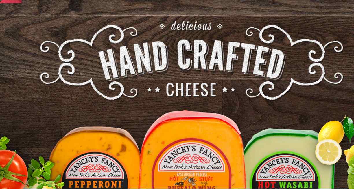
Yancey’s Fancy is a website that sells hand crafted cheese. They have an exotic and retro website style. The fonts they use are very creative, and the high-quality photo of cheese makes them stand out. If you are planning to design a creative food e-commerce website, this is one to look at.
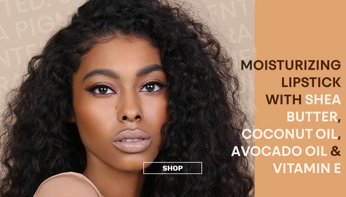
The lip bar is a beauty e-commerce website that sells lipstick. Of course, the way they display the product is very outstanding, and the best part is they have short videos to show customers how to apply the lipstick. All the photos are high-quality with models presenting the applied product.
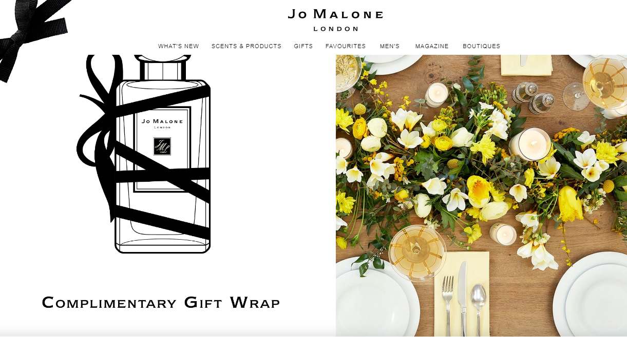
This is a well-known perfume brand. The overall style of the website is very clean and refreshing. The website layout is clear and shows off their high-quality product. And they are also doing a great job on fonts.
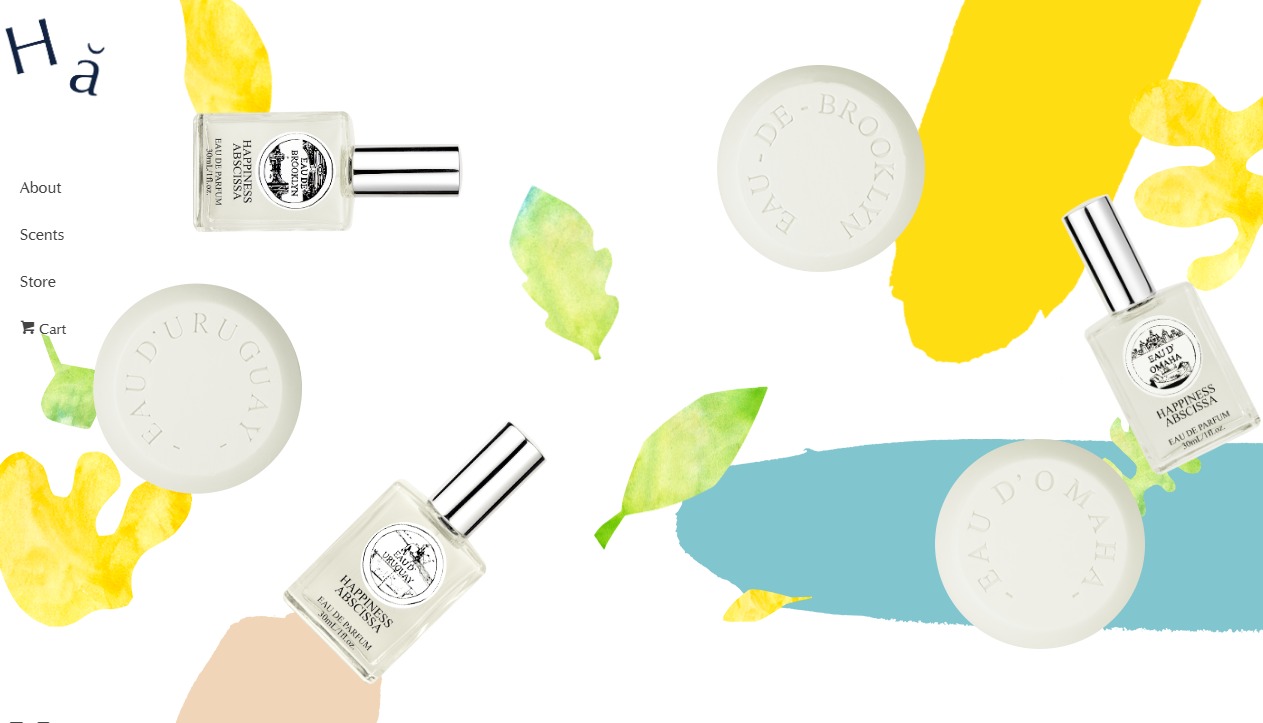
With a great color scheme and beautiful layout, this website more striking than other e-commerce websites. The style of the website makes people feel content, and with plenty of white space, the site does a great job of showcasing the product.
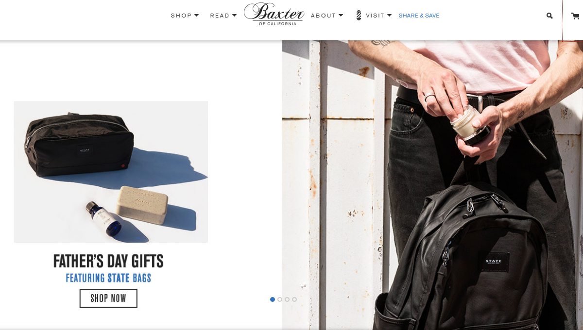
Baxter is a website for men's grooming and care products. The home page shows products via an image carousel. What’s more, with simple photos to let the product shine, every product also features a tip.
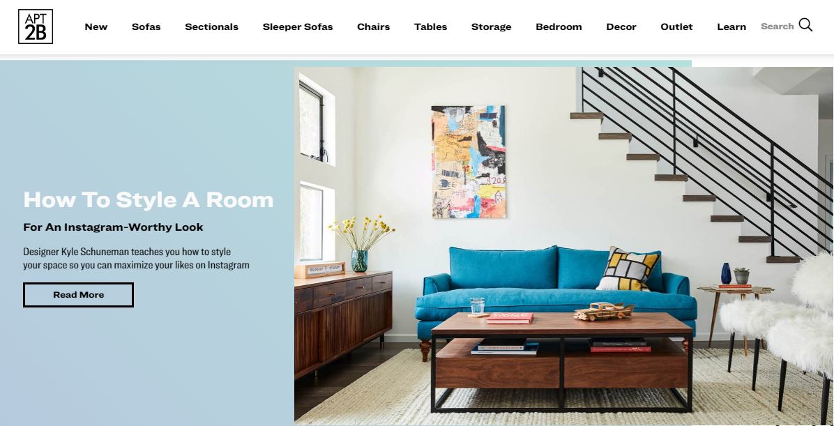
This stunning furniture website uses an image carousel to show its best-sellers. Each product has a "quick preview" feature that displays more details. The site is clean, beautiful, and memorable.
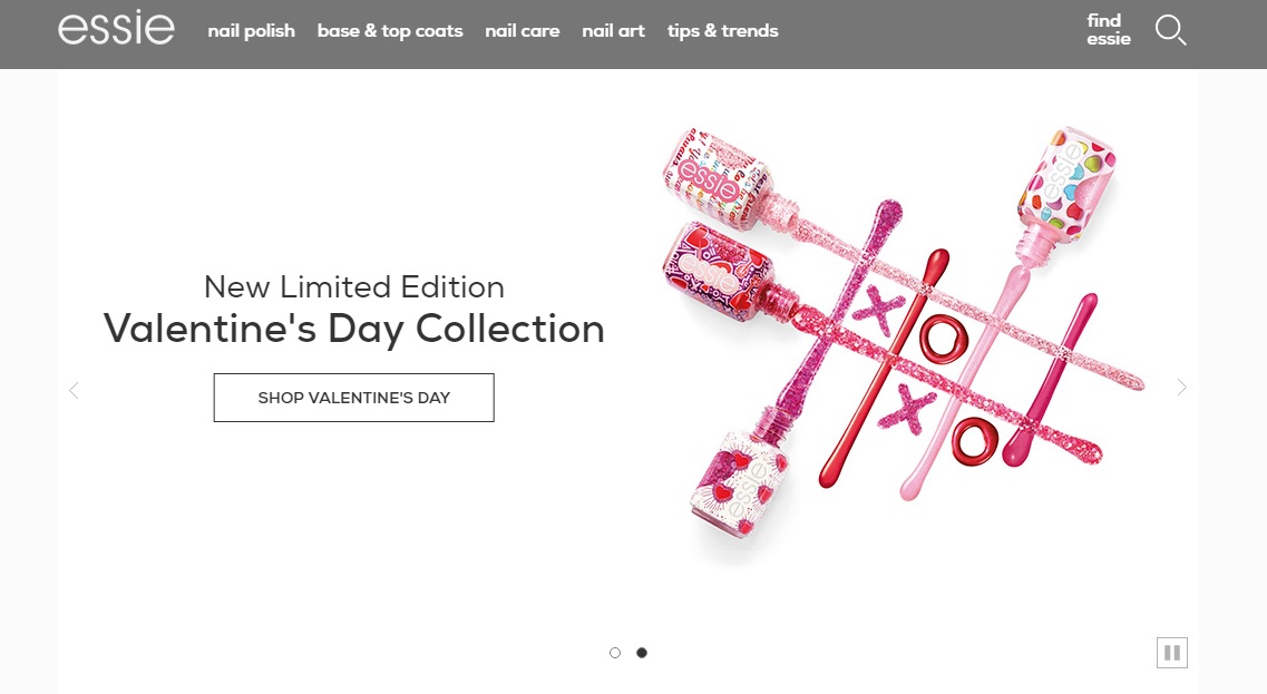
Essie is a website that sells nail polish. The simple layout highlights the professionalism of the products.
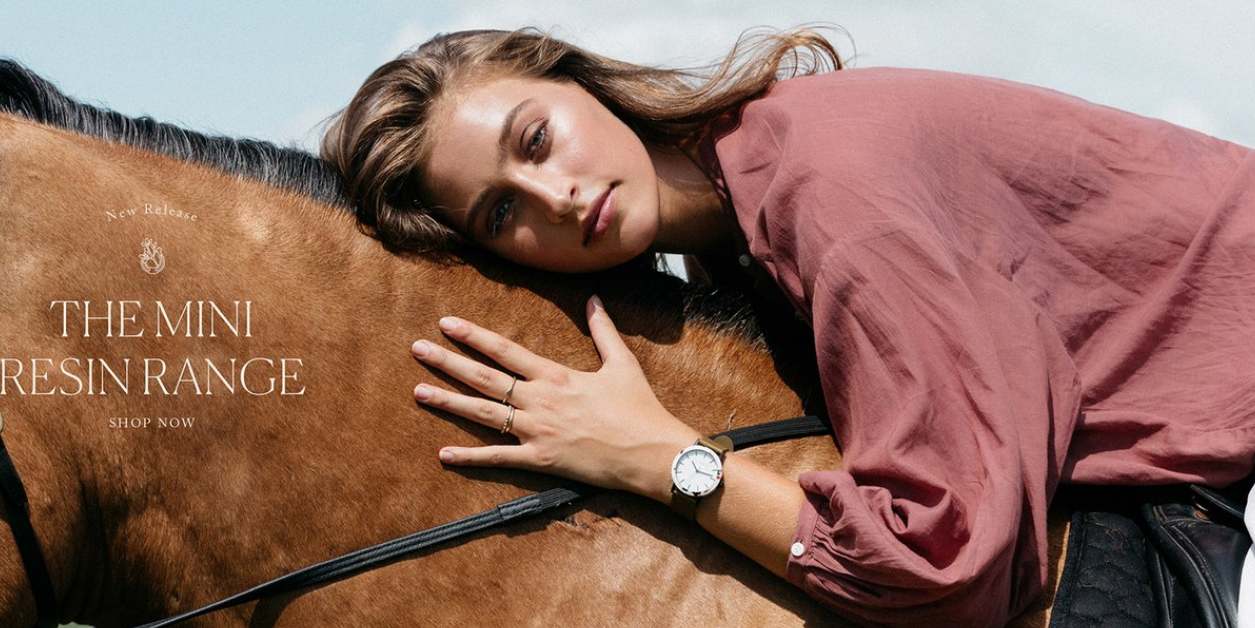
The Horse is not a website selling horses, but an online store selling watches and leather goods. The whole website is designed to be simple and clean, using a hero image to highlight their products.
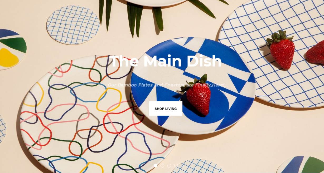
A good color scheme and great layout help this e-commerce website shine. The color is bright, and the visual effect is stunning, which makes users willing to view more information.
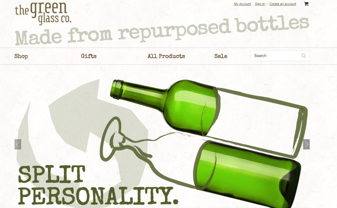
Green glass is a website that sells green bottles. With stunning fonts and a fresh layout, this website stand out of the crowd. This site displays their products in a simple way, making the site intuitive to its users.
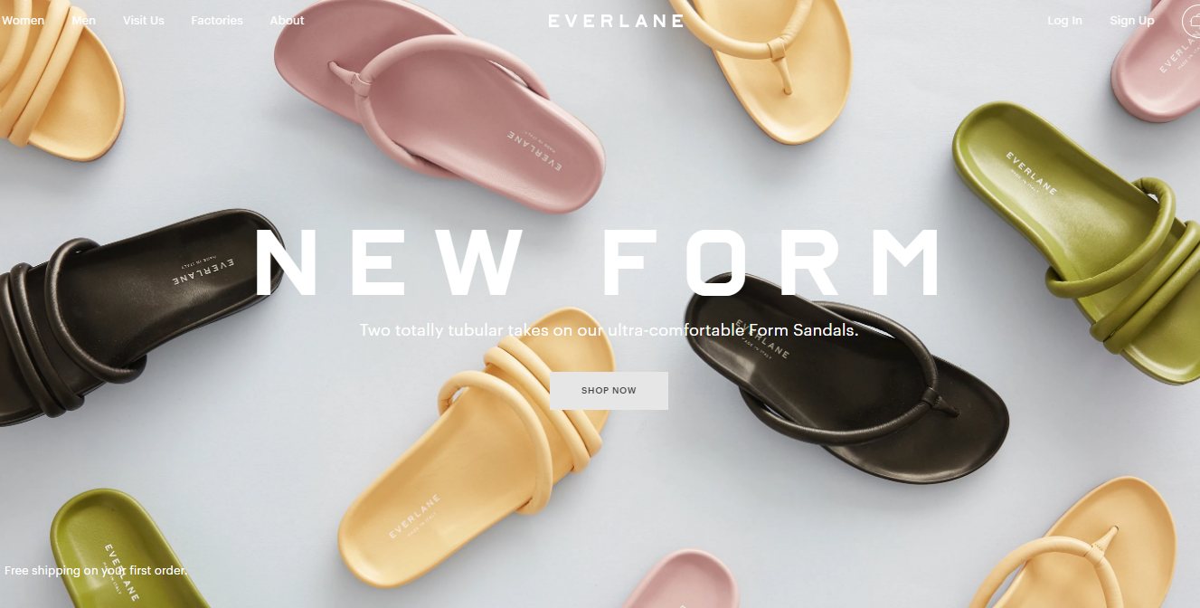
This is a clothing fashion website that’s worth checking out. The style of the website is super elegant and highlights the product. Using a colorful and stunning image as a background makes it more attractive. I would definitely buy this brand.
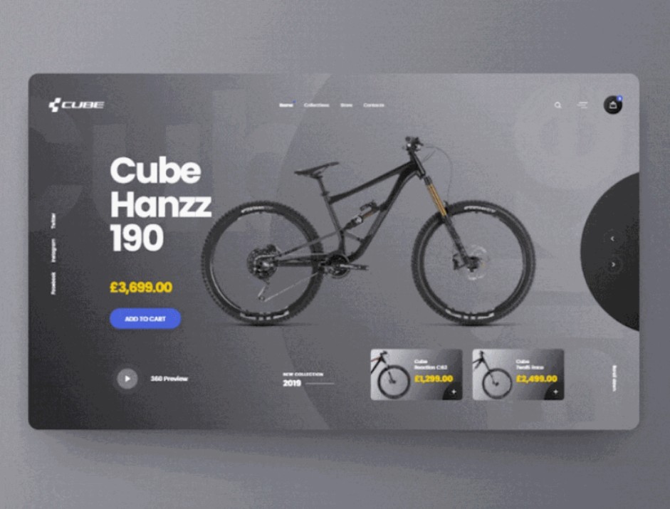
This is a UI animation concept of Cube. The whole design style is simple and the animation effect is very smooth help feature the product.
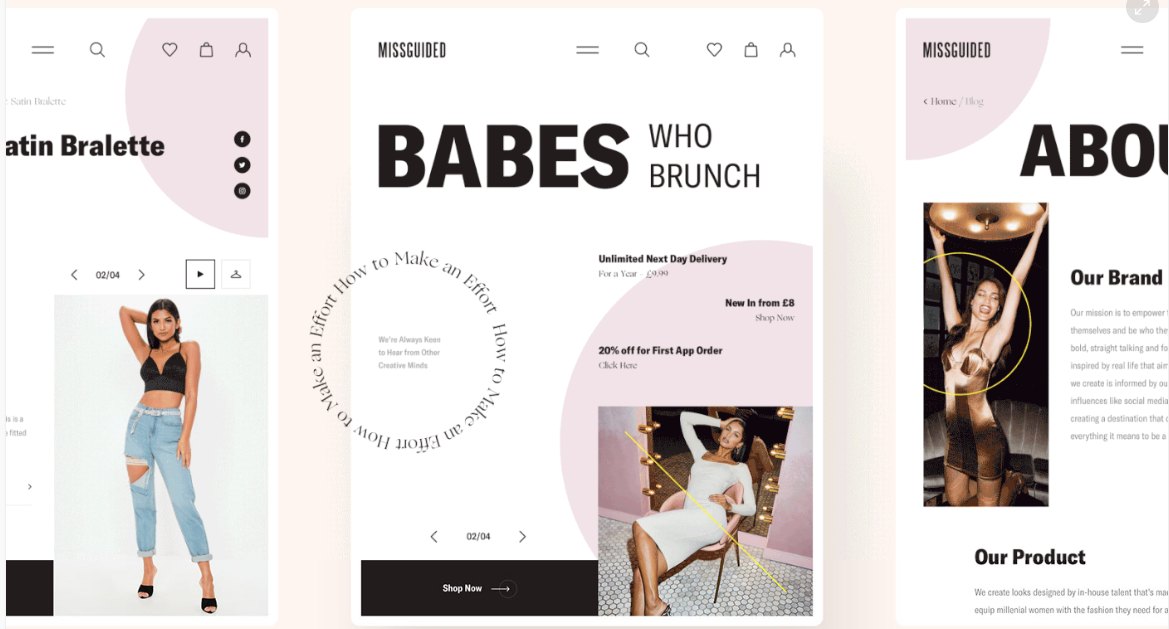
With a pink color scheme and beautiful products, this website is extremely attractive to women.
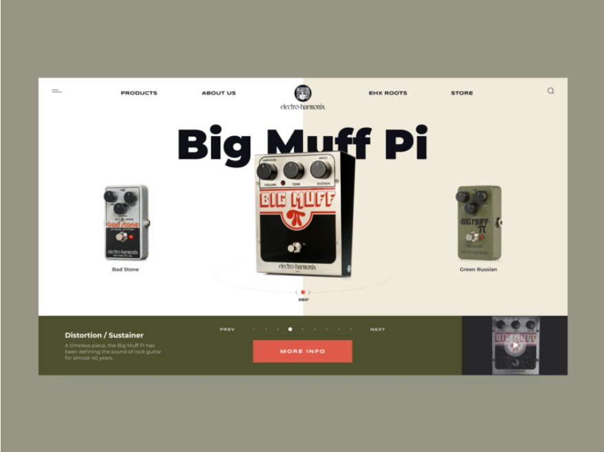
Electro-Harmonix is a company that produces high-end electronic audio processors. The promo page designed by Ivan Ivanov is very retro.
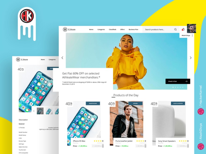
Bright colors and a simple layout make this website fresh.
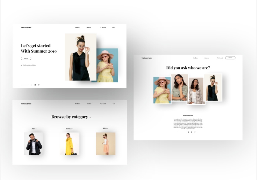
This fashion e-commerce page is extremely clean and simple, using a lot of white space makes the product more prominent.
 Mockplus RP
A free prototyping tool to create wireframes or interactive prototypes in minutes.
 Mockplus DT
A free UI design tool to design, animate, collaborate and handoff right in the browser.
