The prevailing idea is that colorful websites tend to be more eye-catching and attract users more easily and quickly. This doesn’t mean, however, that monochromatic websites are boring. The use of purely black and white in web design is not necessarily bad. In fact, if done correctly, this practice can have striking results.
Let’s take a look at 12 of the best HTML5/WordPress/CSS/responsive/interactive black and white website design examples and templates to see how to create gorgeous websites in black and white.
Check out this collection of 12 creative black and white websites for your inspiration:
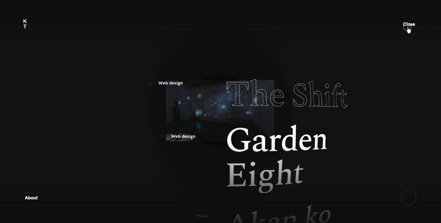
Website theme: Web designer portfolio
Highlights:
In this web designer portfolio website, black and white are applied to every corner (including the website fonts, backgrounds and hovering effects). This gives users a strong sense of calm and simplicity.
The photos and fonts presented with 3D technology in this black website design make it appealing. Additionally, its parallax scrolling effects make it easy and simple for users to navigate.
What can you learn:
Make full use of the black and white color scheme for better visual effects
Designer: CONNECT
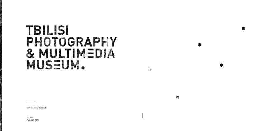
Website theme: Photography & Multimedia museum website
Highlights:
This website example is visually stunning, thanks to its use of black and white. Users can easily move the mouse cursor to hide or show the web navigation menus based on their needs. The interactive website design style attracts users quickly.
This black and white web design is really simple and clean, yet very interesting.
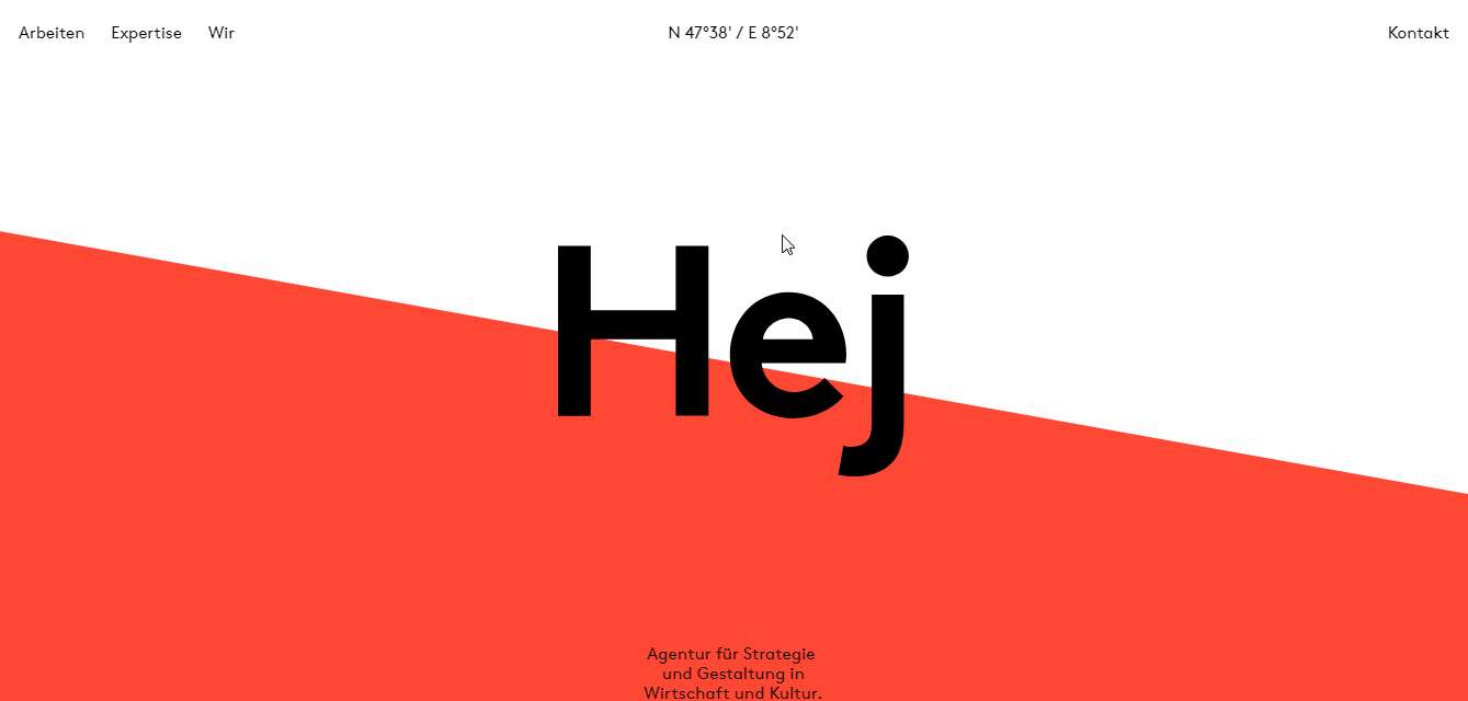
Website theme: Portfolio website
Highlights:
Just because we use the term “black and white” in web design doesn’t mean designers utilize only two colors. In fact, most website designers often add other colors in the same or different color system to create dramatically engaging and unique website UIs.
This website sample follows this strategy and creates an eye-catching black and white portfolio website simply by using some red. The minimalist website design style also makes it clean, neat and easy to use.
What can you learn:
Spice up your black and white website with color contrasts
Designer: 507 Creative
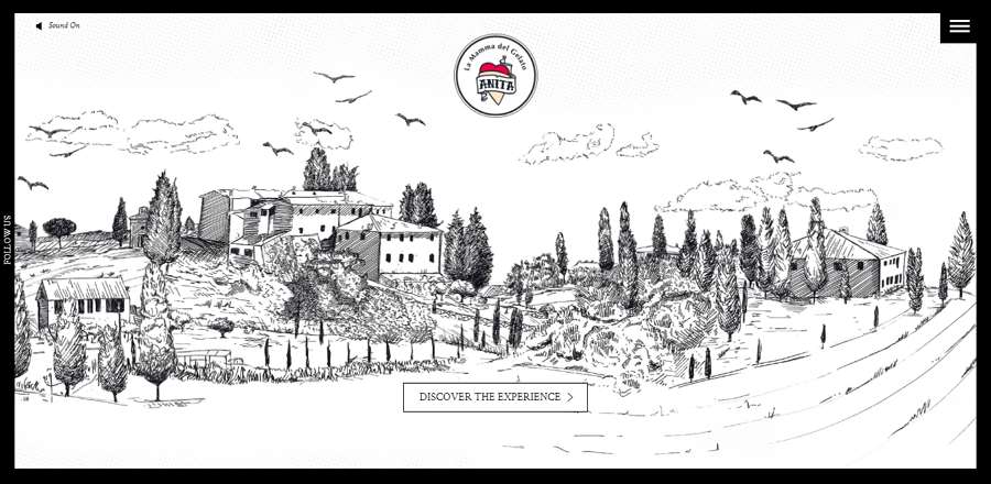
Website theme: Food & Drink website
Highlights:
This food and drink website features a distinctive black and white illustration design style. For better UX, it uses intuitive grids to display its products.
If you’re working on a black and white food website, this is an excellent model.
What can you learn:
Improve your black and white website with illustrations, cartoons and Chinese ink painting styles, etc

Chinese ink painting design style can make your black and white website beautiful and distinctive.
Designer: Browncatz
Website theme: Cosmetic website
Highlights:
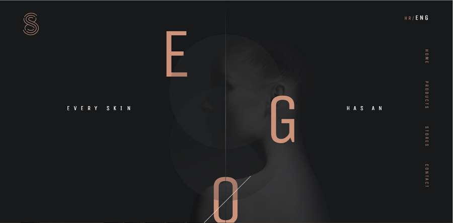
Special letter typography
Using irregular letter typography has become a prevalent web design trend in 2018. This cosmetic website follows this trend and uses special letter typography to make it fashionable and distinctive.
The black and white color scheme, the looming background photos and animations add an air of mystery as well as a touch of luxury.
What can you learn:
Follow the website design trends
Website theme: Coffee website
Highlights:
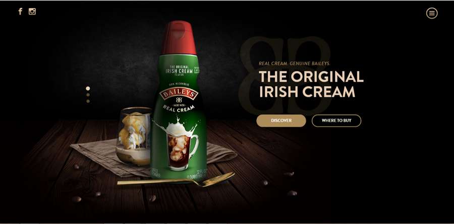
Highlight website products with completely black backgrounds
A complete black background coupled with colorful and high-quality product photos can naturally highlight products and increase sales.
This website follows this brilliant strategy by displaying many high-quality coffee photos. This results in better visual appeal and higher product sales. The excellent introduction videos, interactive animations and parallax scrolling designs also make it very user-friendly.
This website is an excellent example for designers who are looking to design beautiful ecommerce websites.
Website theme: Online design studio website
Highlights:
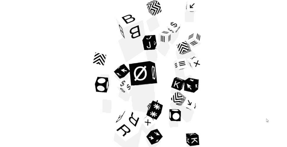
Horizontal scroll design
On top of the creative use of black and white, this online studio website template uses a novel horizontal scroll to display design works. This makes the template stand out from the pack.
What can you learn:
Use horizontal or vertical scroll design independently or jointly
Website theme: Photography & Magazine Theme website template
Highlights:
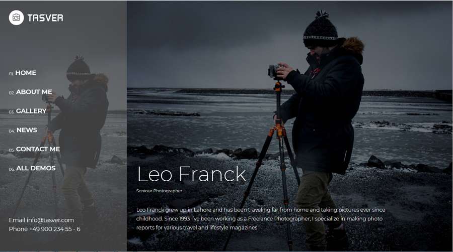
Utilizing black and white colors with other colors (in the same color system) in website design can effectively make the overall result more consistent and harmonious.
This website cleverly uses blue and gray, which are in the same color system together with black and white. The harmonious result makes for a comfortable user experience. The simple and easy-to-grasp sidebar enhances that experience as well.
What can you learn:
Enrich your black and white website with other colors in the same color system

Website theme: Car website
Highlights:
Apart from the high-end and luxury black, white and blue color scheme, this website template features a striking interactive road navigation. Users can easily follow this winding road to check various car information with quick scroll and simple clicks.
Moreover, the vivid full-screen videos that display the car information in detail are interesting and practical.
What can you learn:
Customize a way to display web products in combination with the product/brand characters
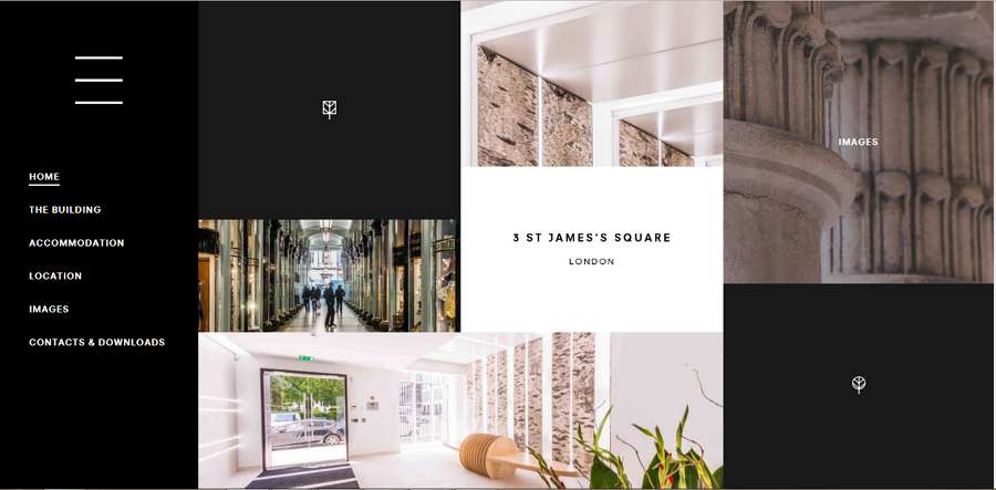
Website theme: Property & Real Estate website
Highlights:
Outstanding grid layout
This website cleverly uses black, white and gray colors, which are really gentle and comfortable to the eye. The unique grid layout gives the site a visual edge, serving to attract users better.
What can you learn:
Use unique grid layouts to improve your black and white design

Website theme: Portfolio website design
Highlights:
Black and white photo carousel
Designers use a high-quality black and white photo carousel/background to simplify the design. Simple it may be, the result is an attractive landing page.
What can you learn:
Simplify your website with black and a white photo carousel/background

Website theme: Film & TV website
Highlights:
Science fiction design style
Black color easily makes people think of night. And what better match is there for the night than colorful lights? The designer of this film website recognizes this and uses light beams to create a very cool website following a sci-fi design theme.
In short, hopefully, all these creative websites in black and white can inspire you somehow.
Black and white websites are classic, clean and easy to navigate. When they are done right, they can attract more users, create emotions, guide users through an interface and leave a strong positive impression.
Website design in black and white can be trendy and engaging - surely worth your consideration. We hope the examples we’ve shared will add to your creative arsenal.
 Mockplus RP
A free prototyping tool to create wireframes or interactive prototypes in minutes.
 Mockplus DT
A free UI design tool to design, animate, collaborate and handoff right in the browser.
