Effective dashboard design presents complex user or product data intuitively and provides key insights for quick, informed decisions. But as a UI or UX designer, how can you create an effective dashboard for your web or app project? Here, we've compiled the best practices and examples to inspire you and help you create the perfect dashboard.
And Mockplus prototyping tool will help you quickly visualize and test your dashboard ideas with its tens of data charts, tables and other diagramming elements.
A dashboard in UI/UX design usually refers to a screen that presents and monitors important data about users, products and services in a clear and direct way. It gives users a quick, global overview of key information, functions and controls, so they can use to get useful insights to simplify decision-making process and achieve their goals quickly.
Dashboards typically include features such as charts, graphs, tables, and other visual elements that help to summarize and visualize data. They are designed to be user-friendly and easily navigable, allowing users to monitor trends, track progress, and identify issues or opportunities without having to sift through large volumes of data.
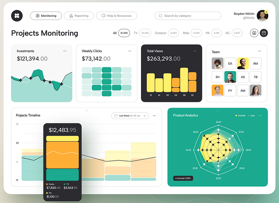
A dashboard design made by Bogdan Nikitin
Simply put, a dashboard serves as a powerful tool for data visualization and analysis, helping users to stay informed and make data-driven decisions efficiently.
When working on a data-heavy website or mobile app design project, crafting an effective dashboard to present the data clearly can determine the success of your web or app. Here are several benefits of a well-designed dashboard:
Clear information delivery - good dashboards provide a concise summary of important information, allowing users to quickly grasp key metrics and trends.
Good data visualization - good dashboards always use charts, graphs, and other visual tools to make complex data more accessible and actionable.
Real-time monitoring and updates - good dashboards often enable real-time tracking of performance and key indicators, and automatically update the changes, helping users respond quickly to changes or issues.
Easy to highlight key parts - good dashboards also allow users to highlight key data or indicators, ensuring users stay focused on what matters most for their goals.
Full customization - good dashboards also allow users to personalize their dashboard to fit their specific needs and preferences, improving overall usability.
A well-designed dashboard not only visually presents data but also significantly enhances the user experience. Designers should always aim to create a dashboard that delights users by providing clear, actionable insights and an intuitive interface.
With many factors and data to manage, designing a web or app dashboard is complex. To simplify your design process, here, we've compiled 10 best practices and tips to help you create better dashboards with ease:
As with any UX design project, creating a dashboard that truly benefits users starts with understanding their needs. You may conduct user or competitor research to gain insights into:
Who will use the dashboard
Why they need it
What kind of information they require
Which factors should be highlighted by default
What information should be customizable based on their needs
By gaining a clear understanding of your target users and their requirements, you can design a dashboard that effectively engages and supports them.
The second rule you should follow is to make your dashboard as simple and intuitive as possible.
Present only important content and elements
On the one hand, your dashboard should include only the most important content, elements and layouts, so users can quickly scan and find what they need as soon as possible even if it's their first time on the dashboard.
Present in a simple and direct way
On the other hand, you tend to present the content or elements in a simple and user-friendly way.
Avoid cluttering the dashboard screen with excessive pictures, shadows, textures, or other visual elements. Also avoid adding too much information or too many features that may distract or confuse users.
A dashboard is actually a visual display of data. Selecting a proper data visualization elements would help designers save a lot of time and effort. Here are three aspects that you should consider when focusing on the data visualization:
First, choose the right charts and graphs
There is a wide range of charts and graphs to choose from, including bar charts, line charts, column charts, pie charts, and more. Always select the one that best represents your data.For example, use bar charts for comparisons, line charts for trends, and pie charts for proportions.
Second, ensure data clarity
After choosing the right charts or graphs, also try to present the data in a clear and direct manner. Avoid complex or overly detailed charts that might confuse users.
Third, highlight key factors or data
Highlight the most important metrics and data points. Use visual elements like colors and sizes to draw attention to these key figures, ensuring that users can quickly interpret the data.
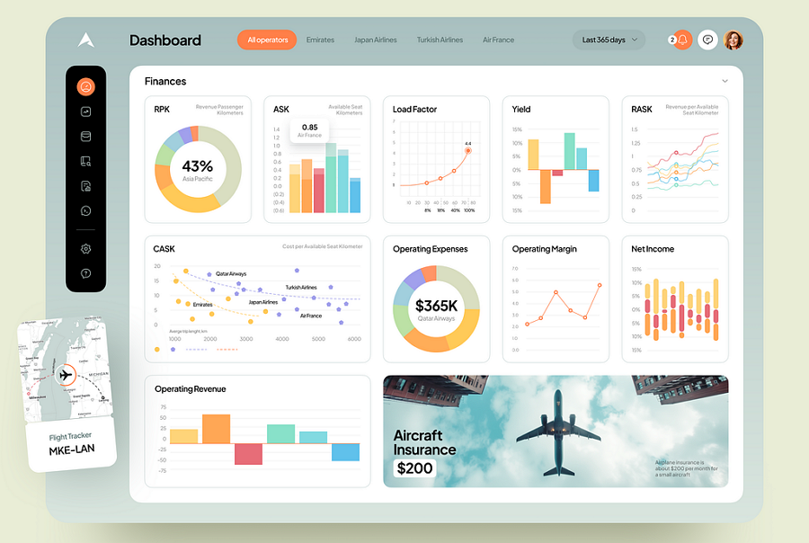
When designing a dashboard, it's crucial to present data with a clear visual hierarchy. Follow these steps:
Write down all the content you want to present
List the content based on its importance
Place the content on the screen according to their priority
Use different sizes, colors, and spacing to show hierarchy
This approach would help you create a dashboard that allows users quickly identify and focus on the most important information.
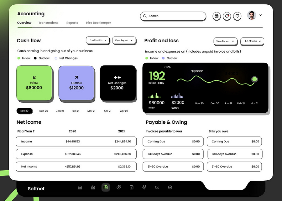
This finance dashboard design wisely use different colors, font sizes and spacing to create clear hierarchy.
Scattering all data and content randomly on the dashboard screen can make it difficult for users to find what they need quickly.To avoid this, try incorporating card UI patterns. These patterns are often minimal and responsive, allowing you to group related content in just one container. This makes it easier for users to check and navigate through the dashboard efficiently.
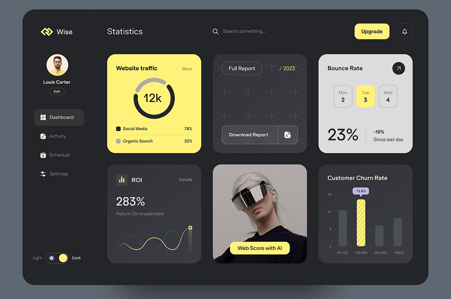
This wide admin dashboard design uses a full set of card UI patterns to organize and manage relevant content, it is much easier for users to scan the data even at a simple glance.
Interactions and animations add an extra layer of usability to your dashboard design, making it more engaging and attractive.So, when working on your dashboard project, consider adding interactive elements that allow users to interact with the data through filters, search options, and drill-down capabilities. This helps users explore and analyze data more effectively.Additionally, since people naturally respond to animated content, adding loading animations or chart animations can also highlight important information.
In addition to visualization elements like charts, graphs, and card patterns, colors play a crucial role in highlighting content, showing clear hierarchy, and delivering a consistent brand image.First, choose a theme color and then decide on complementary and saturated colors to create your brand color palette.
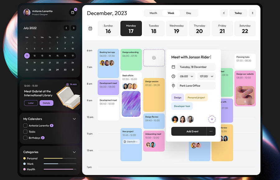
An Calendar dashboard design concept wisely use different colors to visually divide the content blocks, making it easy for users to quickly scan and locate their desired data.
Also combine your color palette with charts, graphs, and card patterns to create a cohesive and visually appealing dashboard design. This approach ensures that your dashboard is not only functional but also visually engaging.
Nowadays, over 60% of website traffic comes from mobile devices. Making sure your dashboard is responsive and looks great on different screen sizes is essential for a perfect design. Here are some tips to consider:
Use responsive layouts, like adaptive UI card layouts
Implement flexible grids and media queries
Optimize images and assets for various devices
Ensure touch-friendly navigation and controls
Most importantly, no matter what responsive solution you've chosen, remember to timely test your ideas across different devices and screen sizes by creating interactive prototypes.
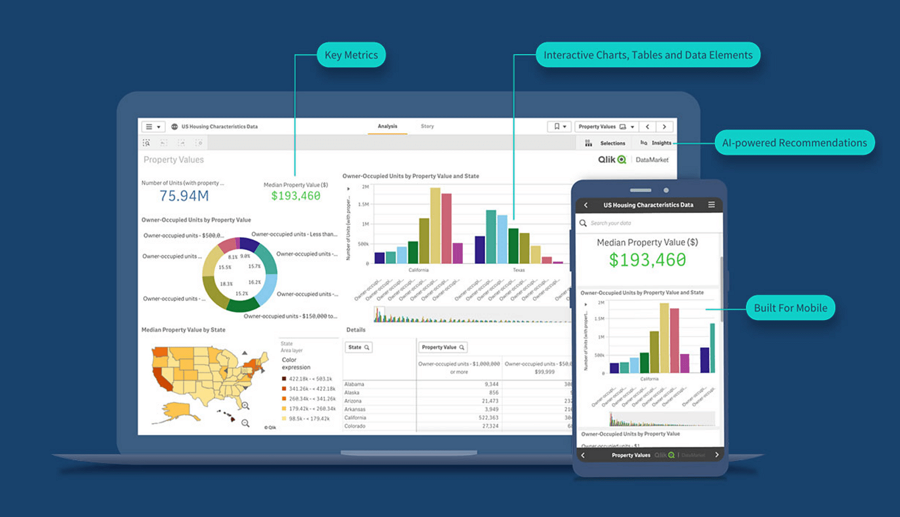
To create a user-friendly dashboard experience, professional designers should consider both general usability and personalization.
On one hand, it's essential to design a general version that meets the needs of most users. This includes providing customizable controls or settings that allow users to tailor the dashboard to their specific requirements.On the other hand, it's important to personalize the user experience based on different workflows, experiences, or preferences. Here are a few strategies to achieve this:
Offer flexible layout options to accommodate various user preferences
Include customizable widgets and modules that users can add, remove, or rearrange
Provide theme options or color schemes to enhance visual comfort
Implement adaptive elements that adjust based on user behavior and usage patterns
Ensure easy access to settings and customization tools for quick adjustments
In short, provide all possible options or features that can make users feel good and encourage them to use the dashboards.
A dashboard often contains complex charts, graphs, and data, making it crucial to address any potential errors or usability issues early on. During the design phase, it's important to use the right prototyping tools to test all potential dashboard ideas thoroughly.
For example, Mockplus RP, which attracts users for its premade dashboard charts and templates, easy-to-use interactions and real device testing, would help you to quickly visualize any dashboard ideas and test them out on real devices, all with just drag-and-drop actions.
Even after your dashboard is live, what works today might become outdated and problematic for users. To stay ahead, continuously monitor the latest trends, gather user feedback, and regularly update your dashboard. This will ensure it remains user-friendly, effective, and up-to-date.
As a UI/UX designer, your dashboard designs are creative assets. But once published online, they become vulnerable to unauthorized use, replication, or resale.
With many dashboards sharing similar visual components, like icon sets, card patterns, layouts, and graphs, it's surprisingly easy for others to duplicate your work, either knowingly or unknowingly.
A reverse image search helps you verify whether your original dashboard design (or any of its elements) has been reused elsewhere without permission. Simply upload a screenshot, and the tool will scan the web for visually similar matches.
Websites using your design without credit
Freelancers or agencies reselling your UI kit
Modified versions of your layout on other apps or themes
Cloned designs appearing in online marketplaces or template stores
Now, let's take a look at 10 of the best dashboard design examples and learn from the best:
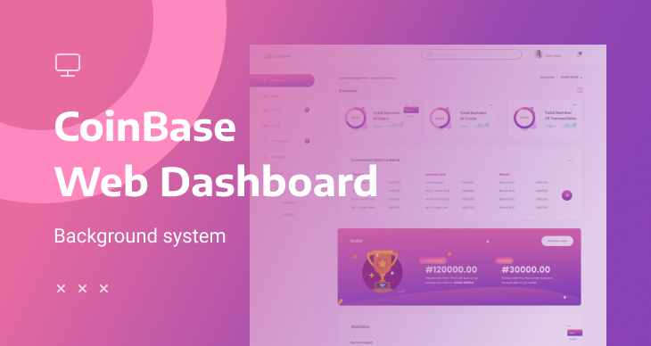
CoinBase is a free modern and clean dashboard UI kit that provides premade dashboard design pages for both agents and users. It covers all charts, graphs, tables and more components that you can reuse to create your own with just copy-and-paste actions. It comes with over 9 types of themes to match your dash design needs.
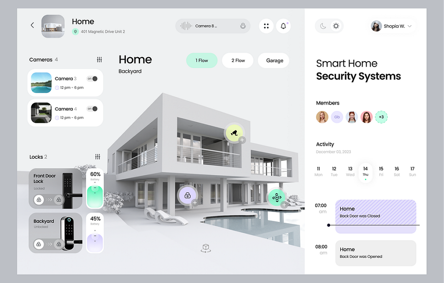
The Smart Home Dashboard is a design concept tailored for house or rental websites. In addition to intuitive charts and graphs, it features 3D-style images that enhance user immersion. This clean and easy-to-navigate dashboard design is worth checking out for inspiration.
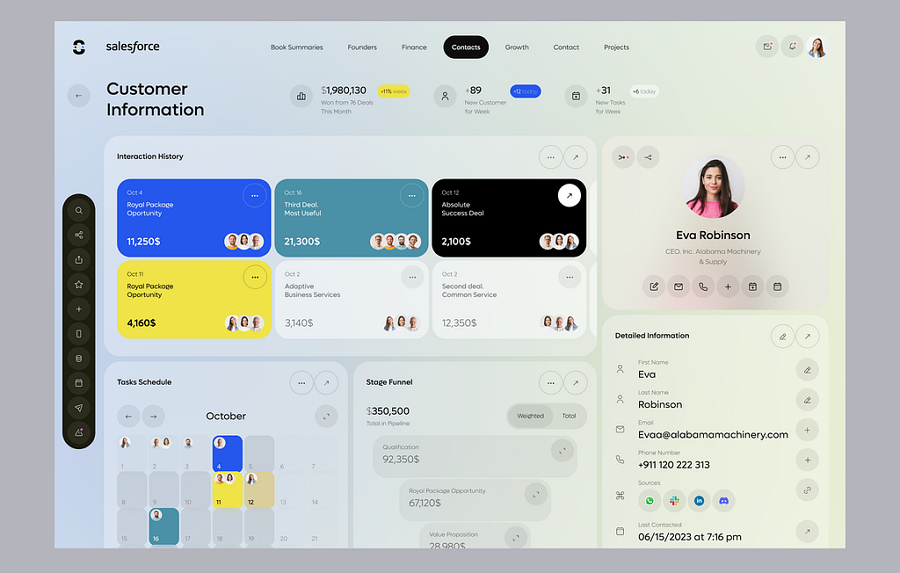
Looking for inspiration for CRM dashboard design? This Salesforce CRM example offers valuable insights.It features a clear navigation bar to guide users, and smartly uses various card blocks to divide the dashboard into distinct functional sections. Bright colors are employed to highlight key data, ensuring important information stands out.
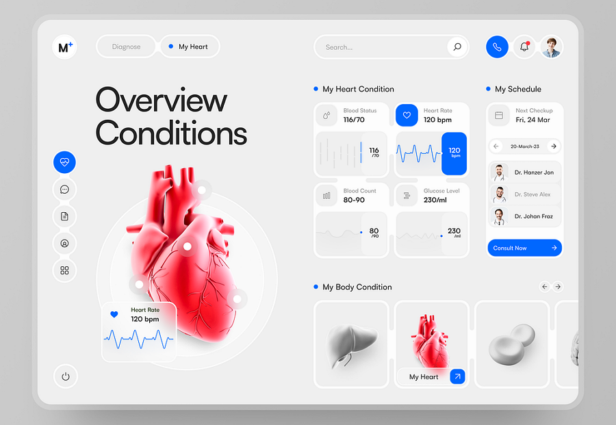
Medizinisch offers an inspiring example of how to design a user dashboard UI for healthcare websites. Its overview pages utilize a variety of card designs to present diverse healthcare data. The simple icon navigation bar, top search bar, and interactive organ images enhance the user experience, making it easy and immersive to explore the data and functions there.
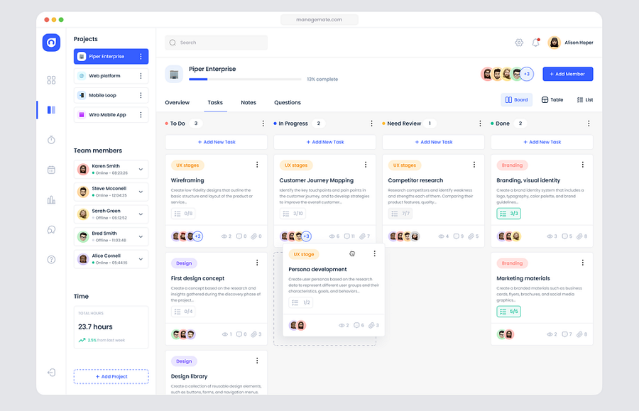
Managemate is a stellar example of dashboard design for task management tools. It boasts a smart navigation sidebar, organized task cards, and a clear visual layout with well-defined hierarchies.If you're working on a task management tool like Asana, this dashboard design is an essential reference.
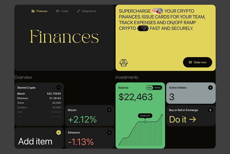
This example showcases a minimal dashboard design with asymmetric grids. It avoids extensive use of charts, graphs, and text, relying instead on numbers, grids, and lines to achieve a clear and clean layout.The dark theme design serves as a strong example of how to effectively combine colors in a dark-themed dashboard.
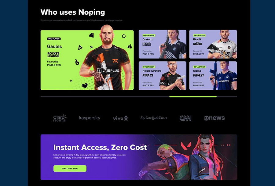
NoPing explores dashboard design for website games with a vibrant and engaging approach. It effectively uses bright color combinations, dynamic figures, and extensive data visualization. Beyond the dashboard design, it also provides insights on creating a website or management platform for online games, making it a valuable reference for game developers and designers
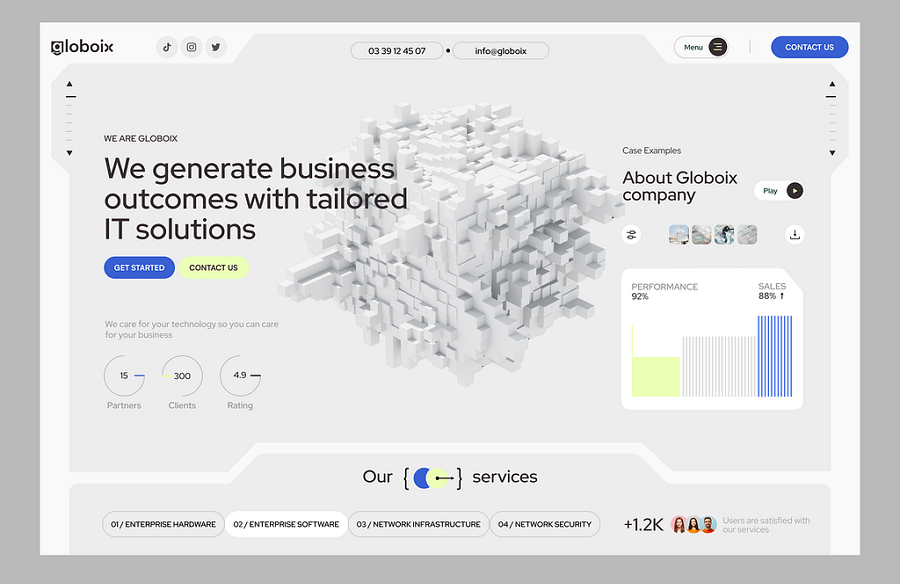
SaaS Dashboard provides a design example tailored for SaaS platforms, featuring a modern and minimalistic style. Unlike other dashboards that may be cluttered with various elements, this design utilizes ample white space to achieve a clear and clean layout. This clarity is achieved through the use of minimalist elements and design principles.
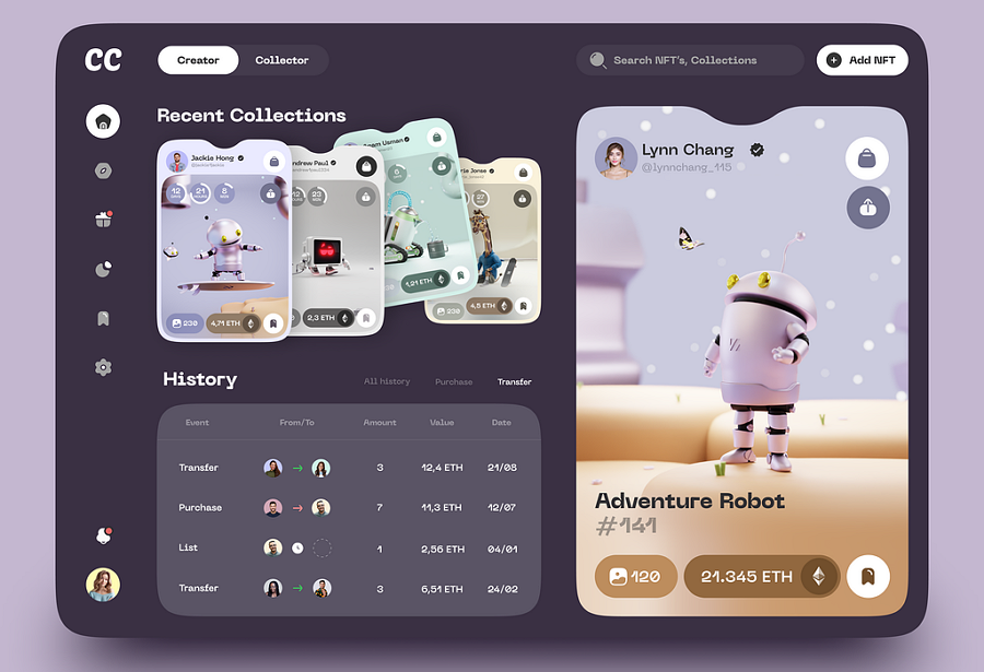
This dashboard design concept stands out with its NFT-inspired style. Despite its minimal interface, it encompasses all the essential features of an effective dashboard. The most striking element is its unique card design, which displays different information for various users in an engaging way.
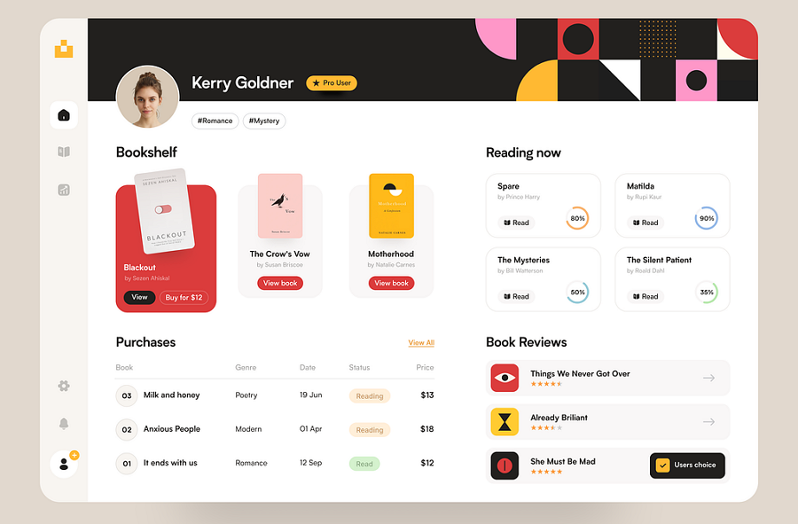
Booker Admin is a dashboard design concept tailored for book or bookstore websites. It features a prominent bookshelf displaying the hottest books and includes various sections for users to review and manage their activities, providing a comprehensive and user-friendly experience.
Operational dashboard - this dashboard type focuses on real-time data and are used to monitor day-to-day operations. This type is also one of the most widely used type for web or app design.
Strategic dashboard - this type provides a high-level overview of key performance indicators and strategic goals.
Analytical dashboard - this type is often used for in-depth analysis and data exploration. They often include historical data, trends, and advanced analytics to help users understand patterns, make forecasts, and derive insights.
Here are the key components that a good dashboard should contain:
Charts and graphs - To monitor and present data about users, functions, or controls, charts and graphs are essential components.
Tables - To better demonstrate changing data, tables are often used. They provide detailed information in a structured format that is easy to read and analyze.
Search and filter controls - To enable users to quickly find the data they want, including a search bar and filter controls is necessary.
Navigation - A well-designed dashboard not only allows users to quickly locate the desired data but also helps them navigate easily. Ensure smooth and intuitive navigation to enhance user experience.
These components together ensure that a dashboard is both functional and user-friendly, making it easier for users to interact with and interpret the data presented.3.How do you design a dashboard? Here are the steps that you can take as references:
Step 1. Research your audience
Step 2. Define your goals
Step 3. List all types of content and group them
Step 4. Choose the right dashboard type
Step 5.Wireframe and prototype
Step 6. Share, test and iterate
Step 7. Develop and publish
Step 8. Keep testing and evolving
Dashboards are powerful tools for designers to deliver important data or information to users in a clear and direct way. However, achieving clarity and directness in a dashboard is the key challenge. We hope these 10 best practices and 10 best examples will inspire you and help you create an even better dashboard for your next web or app project.
 Mockplus RP
A free prototyping tool to create wireframes or interactive prototypes in minutes.
 Mockplus DT
A free UI design tool to design, animate, collaborate and handoff right in the browser.
