UX design combines artistry with usability, giving visitors everything they need to take action and feel good about their time spent on a website. If you’ve ever wanted to understand what UX is, why it matters to the success of a website, and how it’s used to meet the needs of visitors we’re going to cover everything you’ll need to know.
User experience is comprised of numerous elements, including project management, user research, usability evaluation, UI design, interaction design, etc. Even though the user experience is a subjective feeling of users, there is a criterion for determining whether a designer, product, service, etc., has provided a good user experience.UX designers should follow UX principles to meet users' expectations, and these are named below;
In a word, UX design is centered on satisfying visitors and making sure that they leave a website with a positive experience. Let’s dive a bit deeper into the process behind UX design. Jesse James Garrett in his piece The Elements of User Experience Design takes a microscopic look at UX design, dividing it into five distinct layers.
The surface plane: The surface plane is the end product that visitors engage with. In simple terms, the surface plane is just a website and all of its obvious elements.
The skeleton plane: This is the layer beneath the surface plane that specifies the placement of elements like buttons, images, text, and other features of the design.
The structure plane: Where the skeleton lays out the arrangement of design elements in a web design, the structure plane refers to the pathways that users take to get to the different pages or sections that compose it.
The scope plane: This plane consists of the required features and actions that a website or app needs to offer its users. Something like a checkout page for an eCommerce website or a contact form would be a part of the scope plane.
The strategy plane: These are the underlying marketing objectives or goals of a website or app. These can be actions like selling products, building brand awareness, or educating visitors about given topics. Effective UX design means having a clear idea of what you want your end users to take away or do.

When you step through the automatic doors of any major retailer like Target, Walgreens, or Home Depot, a quick glance at your surroundings will tell you right away where you are. You’ll see signage with a brand’s colors and favored typography. The in-store messaging you come across will be in a familiar voice. There will be signs and other indicators telling you what’s in each aisle and pointing you to where you want to go. Everything that you see will be consistent with a company’s brand identity.
UX design works in much the same way as store design. It’s intertwined with a brand’s identity, with a website offering content, visuals, and functionality that conveys the essence of who they are. Much like a retail space that feels familiar and welcoming, a website with a well-developed user experience makes visitors want to stay and explore all that it has to offer.
Let’s take a look at branding in action.
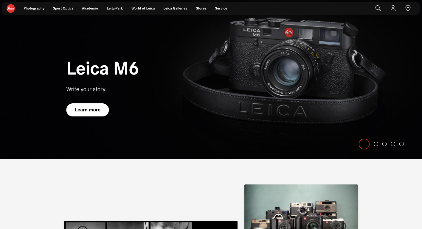
Founded in 1869, the german based camera company Leica specializes in high-end photography gear. Leica’s brand identity is one of artsy sophistication and their website offers a user experience right in line with who they are. Leica’s user experience is full of brilliant photos showing off the polished minimalism of their cameras, a distinguished color palette of greys and black, and concise text. It’s an uncomplicated design, yet offers a user experience that has the same sense of elegant simplicity as their namesake cameras.
The organization of the content, navigational options, and the order of interactions work together in shuttling visitors through a website. UX design puts into place the structure and guideposts that help users in taking action. Instead of fumbling through and wondering what they need to do next, all of the controls in moving through a design are put right in front of them.
Airbnb puts at the top of their user experiences an organized search form. From a usability standpoint, this makes perfect sense as this is the main action visitors want to take when landing on their website.
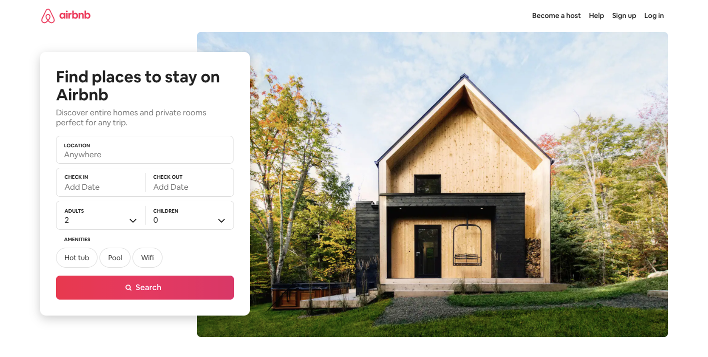
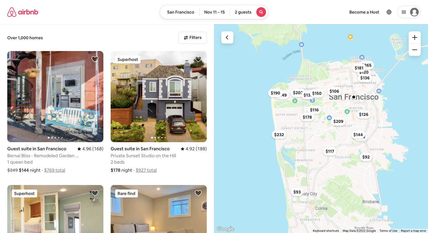
The opening screen with its simple input form and drop-downs makes finding accommodations quick and easy. The results generated from a search query are displayed along with an interactive map. This combination of interactive visuals gives visitors plenty of information in deciding where they may want to stay. Airbnb focuses its user experience on meeting the needs of its visitors in booking vacation rentals, with each step being clear.
Effective UX design focuses on the real ways that visitors are going to engage with a product. Instead of an idealized vision of how they should use it, the behaviors and psychology of users are taken into consideration in delivering an experience that meets their actual wants and needs.
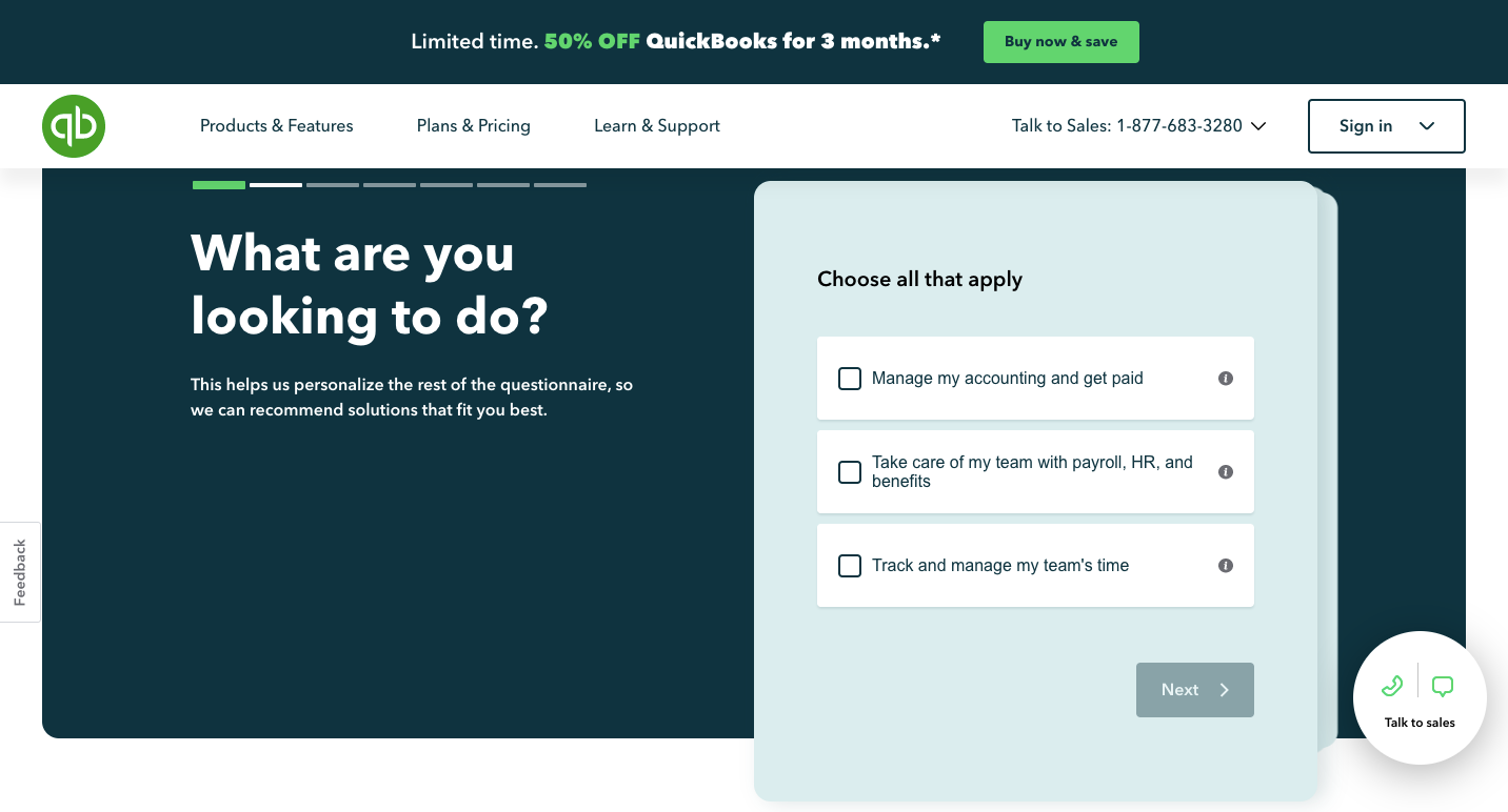
UX design formulates solutions that take into account a specific audience. In this example from Quickbooks, they break down the complexities of accounting into a simple quiz. Those who are looking for accounting software will find out fairly quickly what Quickbooks products will meet their requirements. Along with this quiz is straight-to-the-point content that communicates all of the features of Quickbooks and how using it can benefit businesses. Throughout Quickbooks’ website, you’ll also find numerous calls to action to speak or chat with someone about their products. The entire user experience has been designed to answer visitors’ questions about accounting and how Quickbooks is the solution.
UX design shapes how people perceive and interact with your brand. If what you’re offering is overly complicated, or inconsistent with your brand’s identity it’s only going to frustrate and confuse people. You want to deliver a user experience that communicates who you are and shows off the best of what you do in a manner that’s simple to navigate and understand.
Gathering quantitative data and qualitative data gathered from user research and testing results in websites that are better designed and easier to move through.
UX design is centered on what visitors need and want to do. This makes it possible to develop more effective calls to action and other conversions that are focused on what visitors came to accomplish.
UX design is important in personally connecting with people. Without it, websites lack personality and keep visitors at a distance. Features like the color palette, typography, brand voice, animations, and micro-interactions give a website a distinct look reflecting the essence of a brand.
“The design is not just what it looks like and feels like. The design is how it works.” – Steve Jobs, Apple.
Even the flashiest of designs are meaningless if they don’t serve any practical purpose. All of the creative choices, including structure, interactions, animations, typography, and other features should inform not only its visual aesthetic but how visitors engage with it. Steve Jobs knew the value of good design, with Apple having a well-defined visual identity for both their physical and digital products, as well as a focus on usability.
“At the core of UX design, before you get to methods, tools, and processes, the first thing you need to know is that it’s about the user.”– Dee Scarano, UX Design Consultant.
UX design focuses on the needs of users. It considers their motivations in landing on a website and provides them with what they’ll require to achieve their goals. UX designers identify the main actions visitors may want to take as well as do user research to understand their intended audience better.
“You can optimize everything and still fail because you have to optimize for the right things. That's where reflection and qualitative approaches come in. By asking why we can see the opportunity for something better beyond the bounds of the current best. Even math has its limits.”― Erika Hall, UX Designer.
Author of Just Enough Research User experience design is about intention. Every piece of a design should function in giving meaning to a user’s journey and enabling their success.
“Nothing important should ever be more than two clicks away.”― Steve Krug, UX designer, Author of Don't Make Me Think, Revisited:
A Common Sense Approach to Web usability design that’s stripped down to only what’s necessary, results in a smoother experience. Give visitors an intuitive way of experiencing a website. Remove excessive or confusing steps, and follow familiar user patterns.
“Content precedes design. Design in the absence of content is not design, it's decoration.”– Jeffrey Zeldman, UX Designer.
A visually stunning website fails if it doesn’t have greater meaning. Along with delivering an engaging user experience visually, make sure that there is content in place that educates and answers any questions that visitors may have.
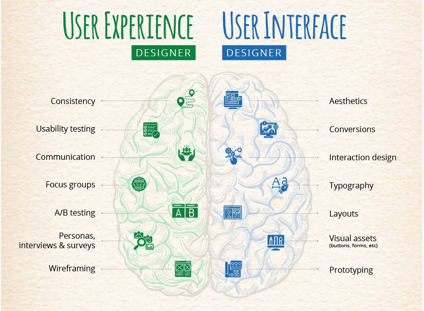
Image source: Medium
UX designers put their efforts towards the usability as well as the look and feel of digital products. Their focus is on meeting the needs of users and providing them with experiences that exceed their expectations. Any user experience designer will have their areas of expertise, but UX design as a discipline encompasses the following areas:
User research evaluates what people are looking for and what they want to do. This information makes it possible to design a website or app that’s focused on the exact needs of visitors and gives them what they need to have a positive experience.
These are graphic representations like charts or diagrams that illustrate how users will move through an app or website in accomplishing tasks or taking actions. User flows are an important part of the design process in making these pathways as efficient as possible.
A website is often a piece of a company’s broader marketing efforts. A UX designer makes sure that it’s aligned with its business goals as well as delivering an experience in line with a brand’s identity.
UX designers create wireframes, which are blueprints showing the arrangement of visuals, content, UI elements, and other design features.
Prototypes are created early in the web design process and are often based on wireframes. They contain the basic functionality and capture the look and feel of what will be in the end product.
Usability testing puts a design into users’ hands and documents how they engage with it. This is an essential part of the design process, that can bring to light unforeseen issues. It’s concerned with identifying problems and complexities that will need to be smoothed out in the end product.
There are quite a few different moving parts to the web design process and multiple voices involved in contributing to it. One of the most important parts of the success of any design project is having a prototype that accurately represents the visuals and functionality that will be in the end product.
Mockplus is a free online UX design tool, that makes it possible to build everything from simple lo-fi wireframes to detailed prototypes with ready-made components, UI kits, icons, templates, and other assets. Every facet of the design process is held within our design ecosystem making it possible for every team member, client, or stakeholder to access them in one space and stay up to date with its progress.