A clean and well-structured drop-down menu helps navigate visitors through a website/app, narrow their choices and save screen space easily. So, it is widely used to website/app navigation bars, search bars or tab bars for enhancing UX.
However, for UI/UX designers, the real challenge is how to keep them simple, effective and attractive enough.
In this article, Mockplus has rounded up top 40 clickable and hover drop-down menu design examples and best practices for you to get inspiration and create distinctive drop down menus for your websites/apps with ease.
Many drop-down menu designs for navigation bars, search bars, tab bars, and even floating buttons or icons are included for your inspiration.
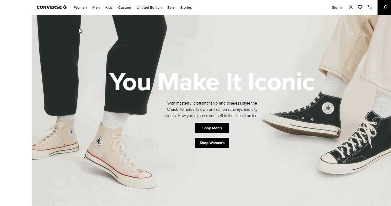
Converse is an online fashion website that sells shoes, clothing, and gears. Its clickable drop-down navigation menu has an awesome 2-column drop-down submenu to guide users. Rich hover effects are provided to help users select their desired menu options easily.
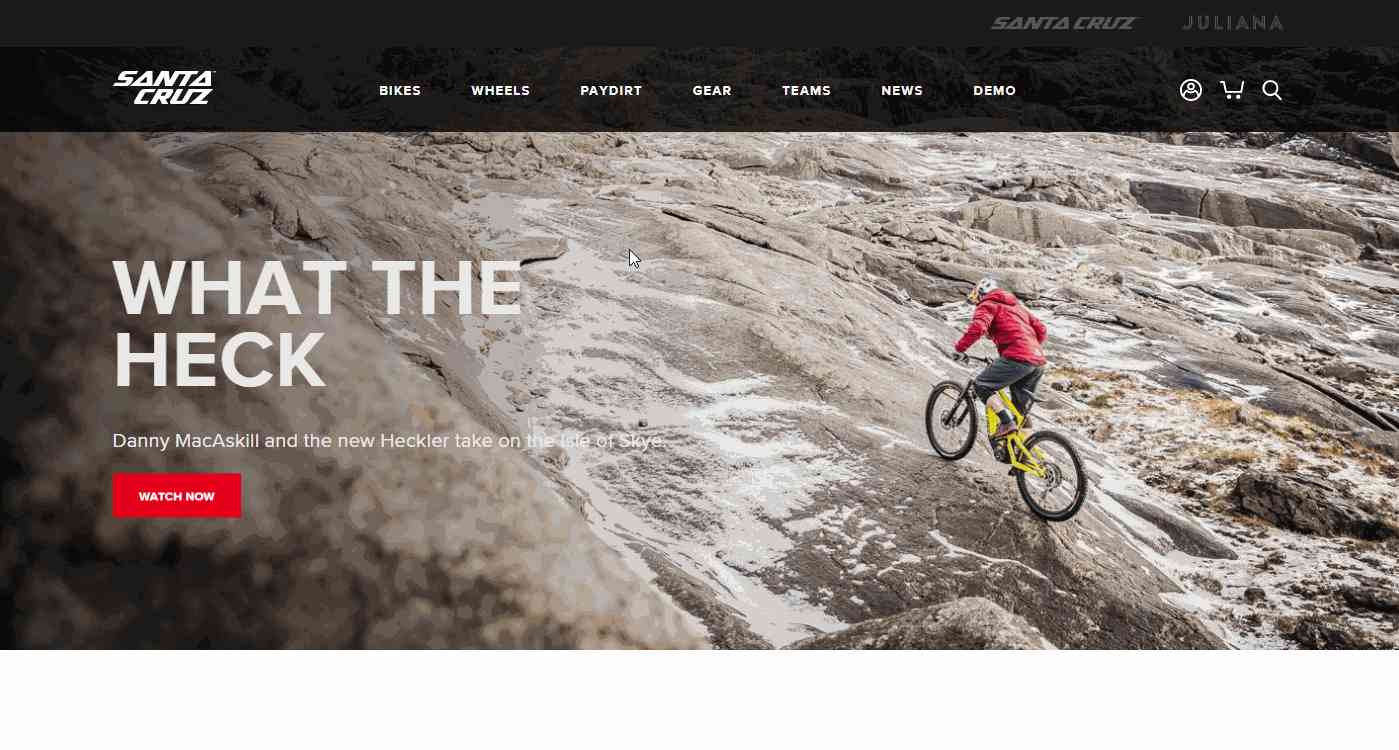
Santa Cruz is an online bike shop that has a quite creative drop-down navigation menus which display different bikes with images. Website visitors can easily have a small insight into what they will see in this shop. That's a good idea for all online shopping websites to follow to improve ux.
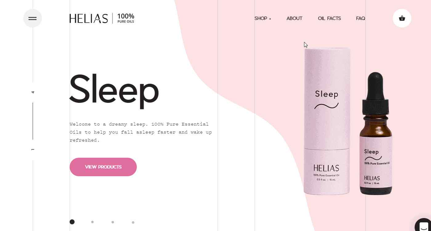
Helias Oils is a pure essential oil website that also has a compelling drop-down navigation menus paired with product images. It also uses nice hover effects and wavy transitions to attract users.
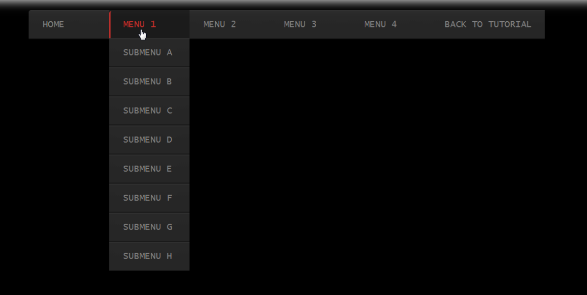
Whirling CSS3 Drop Down Menu is a unique drop-down menu template easily created with CSS. When you hover on the upper menu items, the submenu items will appear with a cool whirling effect. If you are interested, just click the tutorial link to read more.

Lion Burger has a very eye-catching button-like drop-down menu bar. The Submenu items are made with distinctive hover effects. Moreover, the red button items and white texts really work perfectly on the dark page background.
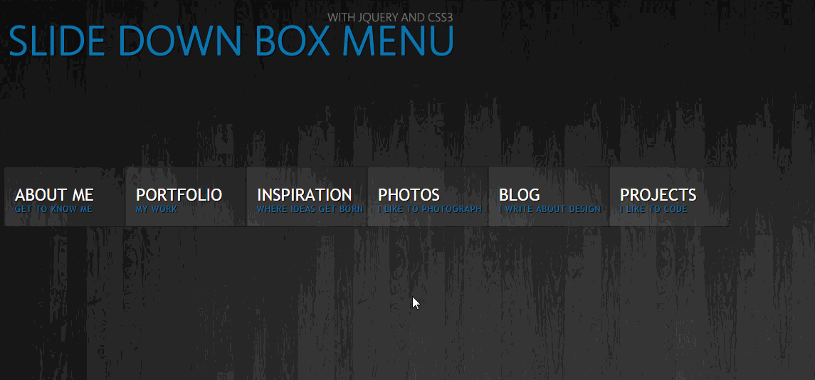
CSS3 Slide Drop Down Box Menu is another nice drop-down navigation menu template that has a very cool sliding effect. When hovering on a menu item, a thumbnail image will pop up and the related submenus will slide out to right/left smoothly. You can also click the bottom link to view its CSS tutorial.
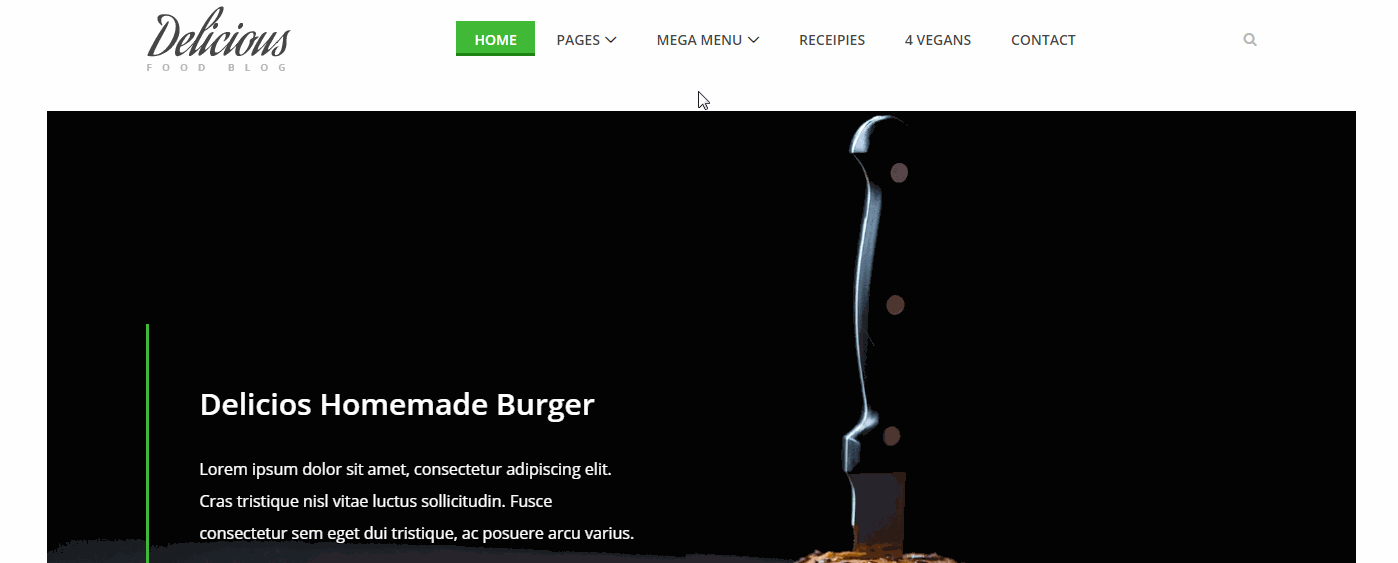
Responsive drop down navigation menu comes from a Bootstrap recipe website template. Its drop-down menu consists of three column submenus to showcase recipe categories. A considerable image slider on the right side also helps users select the right recipe quickly.

Drop Down Menu Bryan is a smart multi-level drop-down menu. Users can easily hover on an upper item to show up all the submenu items step by step. It is perfect for websites that have very complex navigation systems.
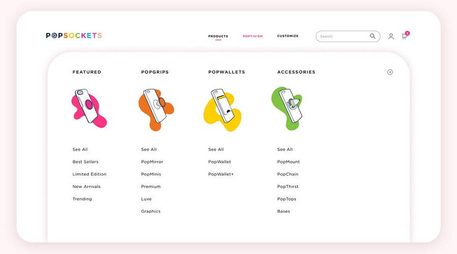
PopSockets is a beautiful online phone shopping website and its drop-down navigation menu uses colorful illustrations to present its products, making an impressive visual appeal.

Minimal Drop Down Menu Exploration is a cool, minimalistic drop-down navigation menu. All its main menu items have been simplified into very slim color bars. When hovering on them, the submenu items will pop up to guide users around. A perfect example for you to build a minimalistic website.
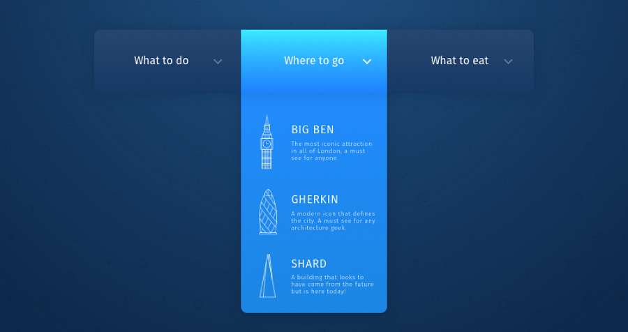
Creative Drop Down Menu with Icons is a clean and well-crafted drop-down navigation menu. It has a very trendy blue & white color scheme. And each submenus item is well-structured and has very striking stroke icons.

Zenith Arena De Lille Drop Down Menu is specially made for a multi-purpose indoor arena. Since all their events are scheduled by months, users can easily click to show or hide the full month event list and choose their desired one to view details.
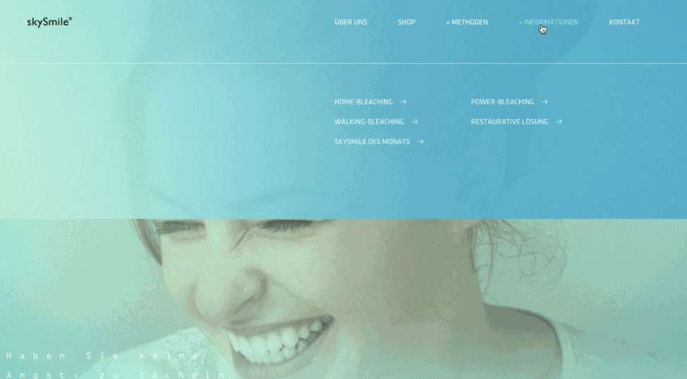
SkySmile Drop Down Menu uses a gradient color background to stand out the drop-down menus. And the blue color scheme also works perfectly with the home page background.
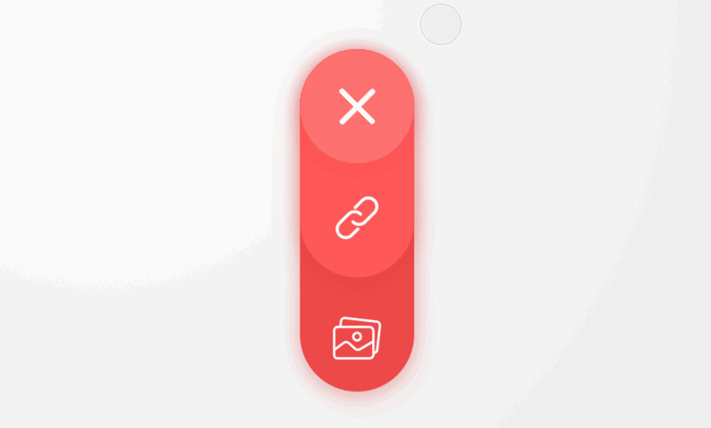
Minimal Drop Down Menu Interaction is a very classic drop-down menu for a floating icon button. When hover on the button, a drop-down menu consisted of icons will pop up to offer your different navigation choices. It is perfect to help you create a minimal mobile app.
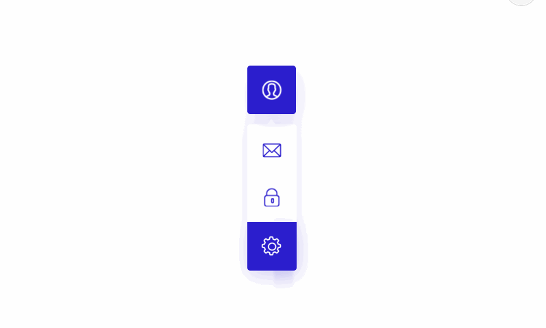
Mobile App Drop Down Menu is another good example that designers can follow to create a great drop-down menu for minimal mobile apps. It uses not only the icon submenu items but also has a very creative sliding effect to display options vividly.
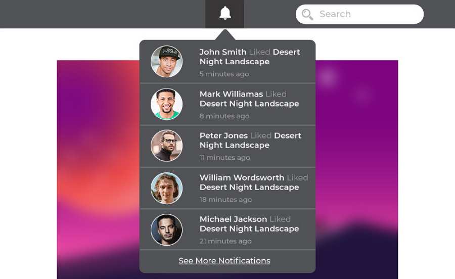
Notification Drop Down Box Design is an excellent drop-down menu design for minimalist websites to showcase notification news. When users hover on the upper notification icon, a drop-down box will instantly show up to display different notification news. The related times, persons and news keywords will also be shown for them to scan quickly.
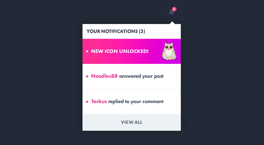
Notification Drop Down Menu is another beautiful drop-down menu made for notification icon buttons. Unlike the previous example filled with images and information, this notification drop-down menu has a very minimalist look and uses cute cat illustrations and bright pink colors to grasp visitors' eyes.

HTML Drop Down Menu Animation is specially made for minimalist websites to show/hide its navigation menus. It features a unique slowly dropping animation. It also provides users with HTML/CSS/JS codes. If you are interested, you can directly copy and paste these codes to your design for faster and easier development.

About Us Drop Down Menu Animation is a drop-down menu made for the "About Us" section. It features a smart popping out animation. And every submenu item is designed with a flat icon to help users catch item information easily.
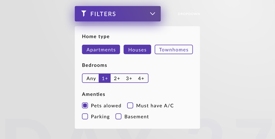
Interactive Drop Down Menus is a drop-down menu made for a filter bar. After popping out, users can easily select filter options, such as the home type, bedrooms, and amenities, etc, to search for their desired results. It is a nice example of how to design interactive drop-down menus for search/filter bars.
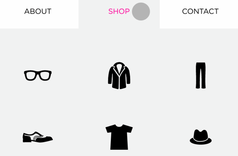
Shop Drop Down Menu uses icons only to present different product categories.
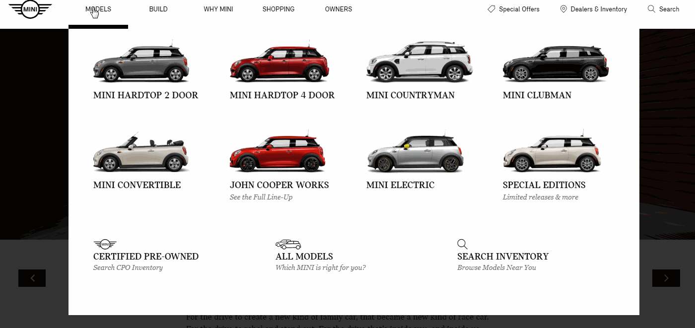
Mini Cooper is a cool car website that uses a well-designed drop-down navigation menu. It has rich submenus styles and hovers effects.
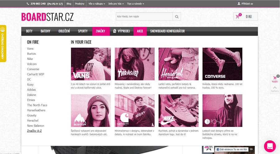
Board Star is an online snowboard shop. Its drop-down navigation menu has a distinctive retro design style and uses intuitive list and card designs to provide different product options.
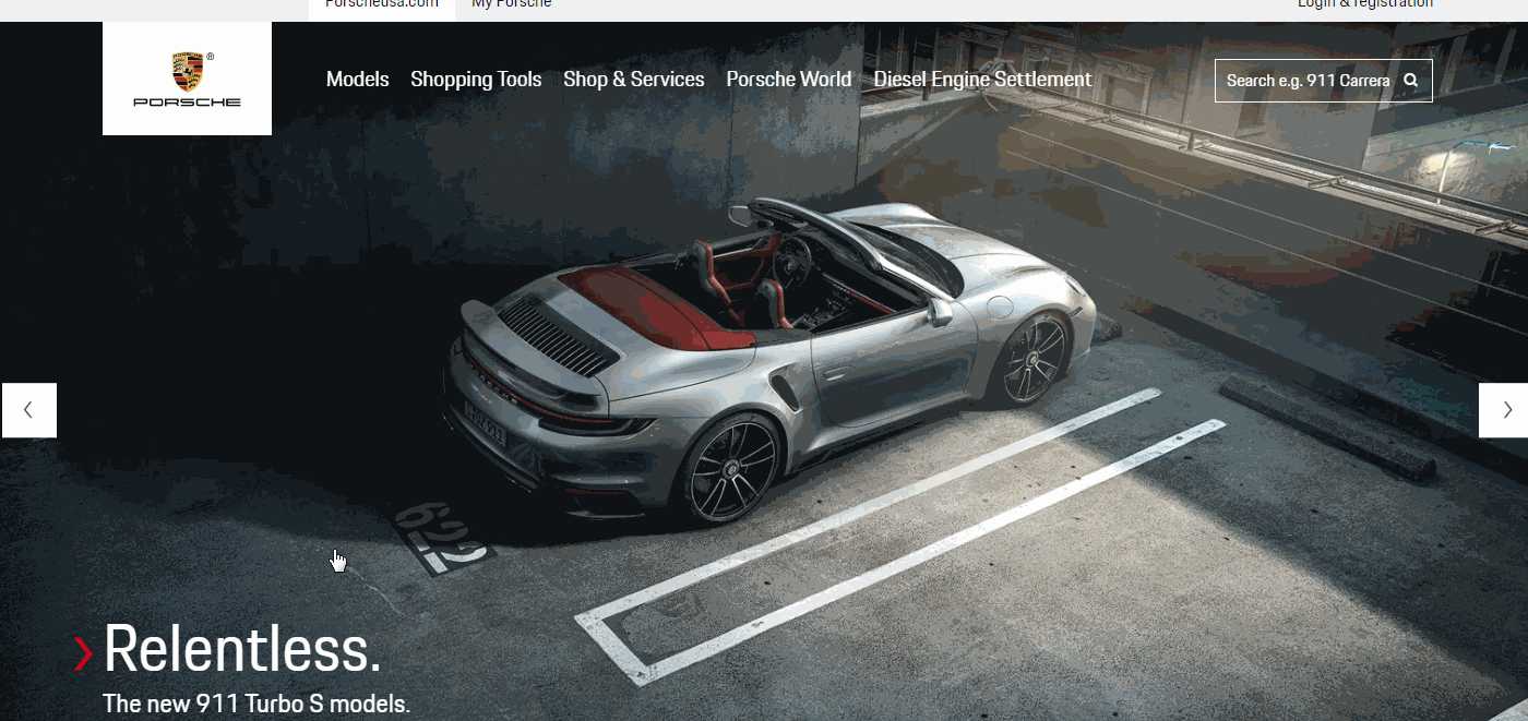
Porsche is another stylish car website that uses a brilliant drop-down navigation menu. When hovering on a car, the relevant image will show up on the right side, allowing you to have a quick view of the car in advance.
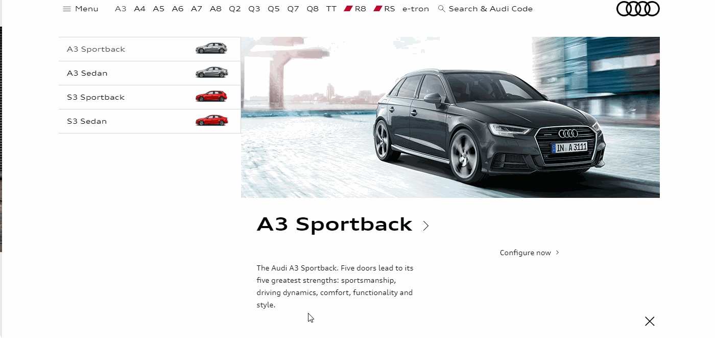
Audi is a well-known car website that uses an intuitive drop-down navigation menu. Like Porsche, its drop-down submenus use car images. However, it also has a very different and effective layout to present car details.
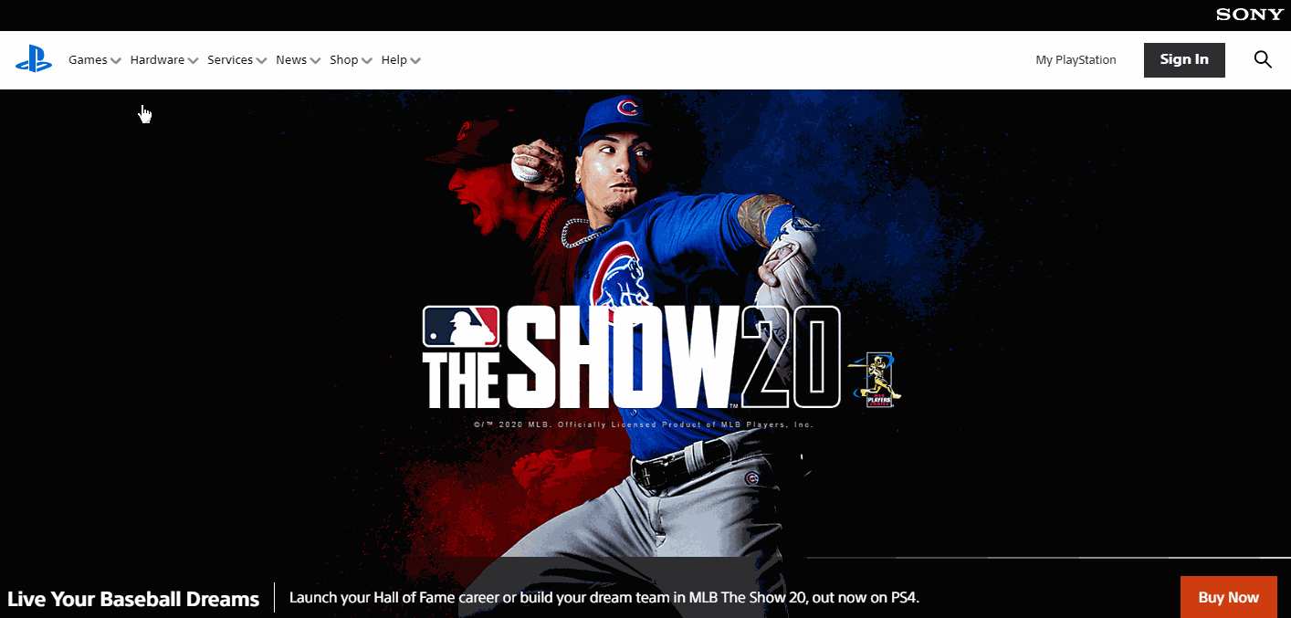
Sony Play Station has an excellent clickable drop-down navigation menu and all of its submenus are made with creative bold icons. A perfect example to create a compelling icon menu.
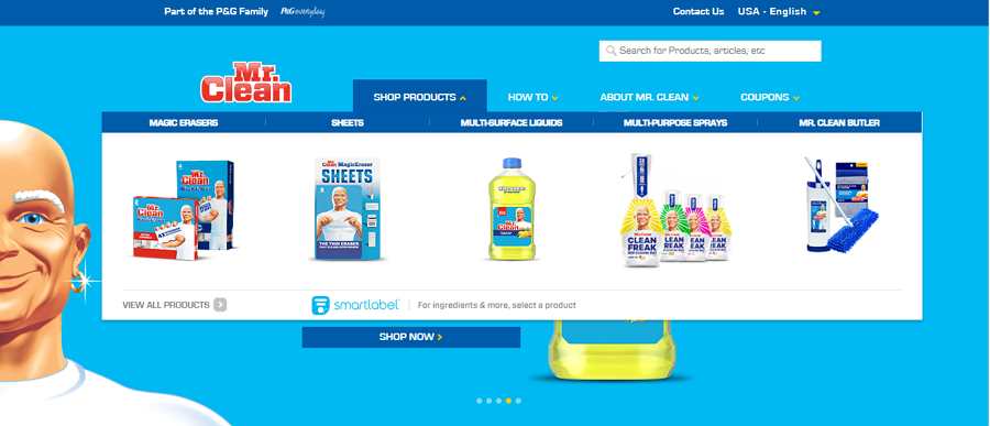
Mr Clean offers different clean products and solutions. Its official website uses a gorgeous drop-down navigation menu that consists of product images and short labels.
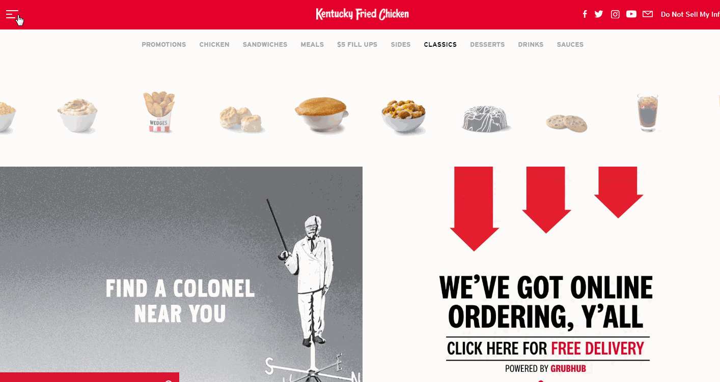
KFC uses a vertical drop-down menu to help you navigate around. Submenu animation is also very cool.
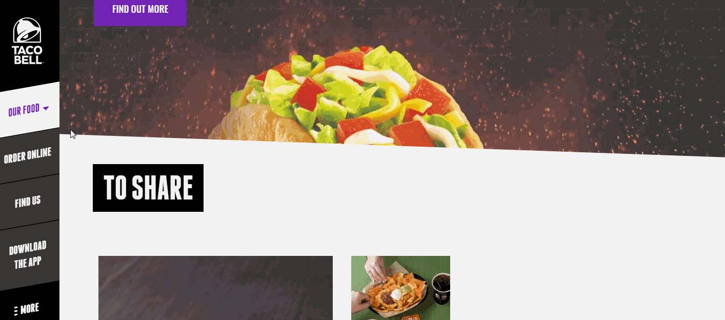
Taco Bell can help users find delicious menus or nearby shopping stores quickly online. Its website has a stunning side navigation bar that uses vertical drop-down menus.

Bern Tourism is a travel website that can help visitors find top events, attractions, and activities in Switzerland. It uses a multi-level drop-down navigation menu with a smart tab bar.
After viewing all these drop-down menu examples, you may want to know what on earth makes a good drop-down menu and what tips you should follow to create a good drop-down menu.
So, we've also collected 10 of the best practices for drop-down menu designs to explain what tips you should follow to create a more useful, effective drop-down menu design quickly:
Too long or complicated drop-down menus can be troublesome to users, and sometimes even make them lose focus of the menu. So, you should always keep the drop-down menus under two levels deep.
Take the Slack website as an example, it uses a two-level drop-down menu to present the resource information clearly and intuitively.
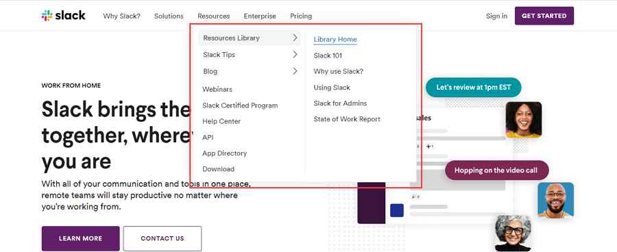
Of course, if you really need a menu with more than two levels, a hover or selection effect can help you guide users' focus, allowing them to find the desired menus options quickly.
For example, WooCommerce uses smart hover effects to display the menu items step by step.

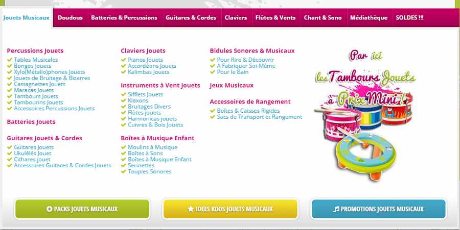
When designing a drop-down menu, having a clean, well-structured and readable item list is very important. To achieve this, you should consider many factors, such as a readable font, clear typography, enough spacing, and even a neat structure/layout, etc.
The Music equipment website below shows you how to create a well-structured horizontal drop down menu using diverse fonts, font sizes, colors, icons and layouts:
To create an effective drop-down menu, you should add one, two or more hover or selection effects to guide users.
For example, when hovering on the below football drop-down menu, a bright blue background and the white icon will show up to highlight your focused menu item. It helps you find the desired menu options quickly.

Also, note that you should always focus on the closing time of a hover effect. Too long or short both can cause troubles to users.
There is no fixed way to design a drop-down menu. Aside from using different fonts, typographies, and colors, you can still add custom icons and images to enrich your menus.
As the below JetBlue website does, you can still use rich images, icons and texts to create a more appealing and effective drop-down menu.

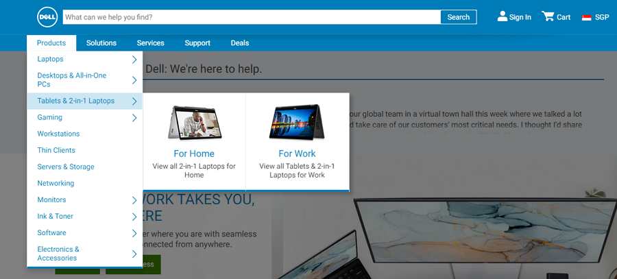
When designing a drop-down menu, you should use similar menu styles, backgrounds, and images so as to make the entire menu work as a single unit.
Take the below Dell computer website as an example. It uses two-level drop-down menus with the same text and image styles to engage visitors.
When some products or services are out of stock or unavailable temporarily, blindly deleting the relevant menu items can break the entire layout, making it worse for users to view and navigate. At this moment, you can grey out them directly to avoid any troubles.
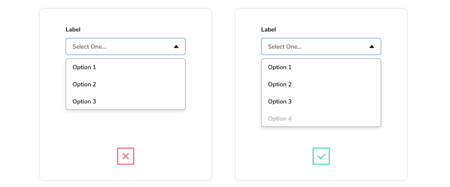
Directly graying out menu items will not affect the entire layout, sparing you more time to process the unavailable options.
You can also add quick dropdown animations (like a sliding, fading, jumping, or whirling animation) to engage users.
For instance, the below Mediate Template website uses an eye-catching sliding animation to engage users:

To stand out from your drop-down menu, you can use a semi-transparent background.
The below Econsultancy website uses a semi-transparent background to highlight the entire drop-down menu easily:

Instead of semi-parent backgrounds, a colored menu background also helps keep the drop-down menus different from the background.
And this Furniture website gives a good example of how to highlight your drop-down menu with a different background color:
Whatever happens, you should also always test the drop-down menus regularly to ensure that it goes well all the time.
Overall, we hope these creative examples and best practices can inspire you.
If you still don't know how to make a drop-down menu from scratch, here are two ways available:
For UI/UX designers, the fastest way is to use a drop-down menu design template. There are many HTML/CSS templates available online. You can freely search for one based on your own needs.
However, if you don't need a template, you can use a design tool to visualize your menu ideas instead. Mockplus, an all-in-one product design platform, is a good option for you. It allows you to prototype your drop-down menus, add interactions, test, share, and handoff with ease online.
A well-crafted drop-down menu helps enhance UX effectively. We hope these best drop-down menu design examples, best practices, and design tips can help you create a great website/app easily.
 Mockplus RP
A free prototyping tool to create wireframes or interactive prototypes in minutes.
 Mockplus DT
A free UI design tool to design, animate, collaborate and handoff right in the browser.
