Does an empty state have to be empty? When and why should you use one? What makes a good empty state, and how can you create an informative one? Don't worry—we've got you covered. In this article, we've compiled all the basics, best practices, and inspiring examples to help you understand and create better empty state designs and UX for your next project.
By definition, an empty state or an empty screen generally refers to the page states of a website or mobile app where there is no any data or content to display when users are interacting with the interfaces. It often pops out to minimize the confusion of users and guide them to do the next every time they perform a research that returns no results or when there is something wrong when they interact with the interface.
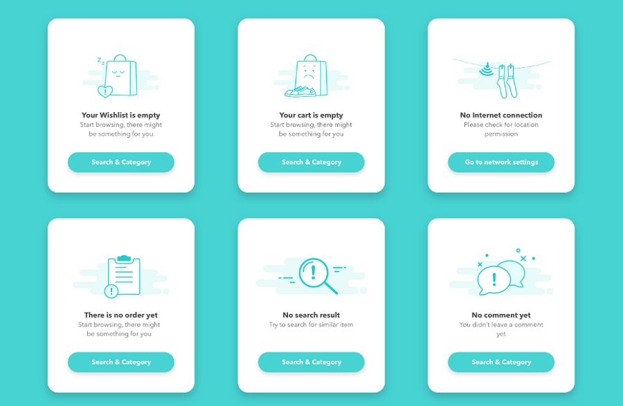
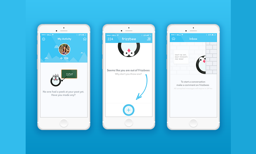
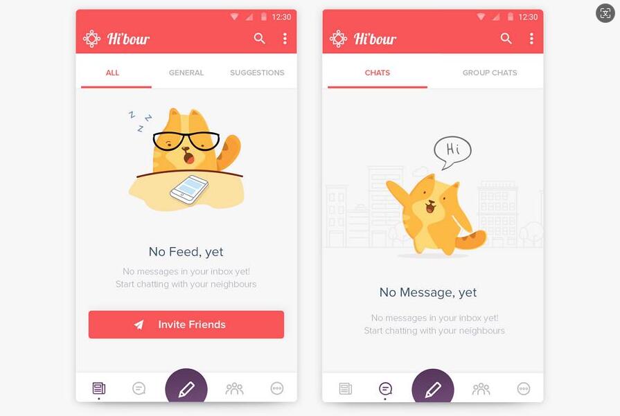
Empty states made by Elham Salemian
When designing empty states for web or app projects, consider including the following elements to ensure they effectively inform and guide users:
By thoughtfully incorporating these elements, you can design empty states that effectively inform and guide users, improving their overall experience with your application.
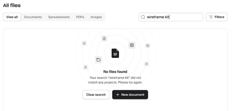
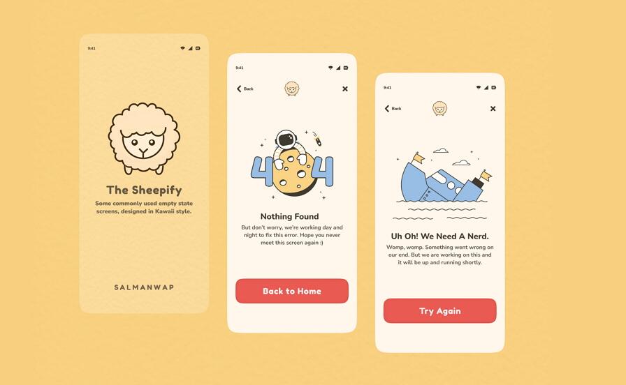
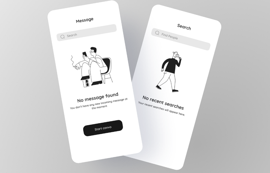
This no files found empty state includes nearly all the essential elements of an effective empty state, and also wisely utilizes a black concrete button alongside a ghost button, visually encouraging users to click the black concrete button.
Empty states are generally used in the following cases:
Here are some real-world examples where users might encounter an empty state:
There are more situations that empty states are given to inform users about what's happening and guide them through the next steps.
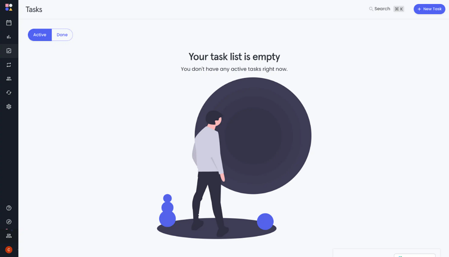
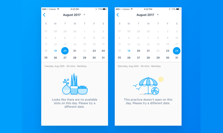
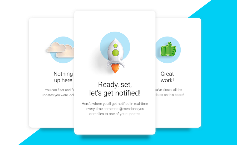
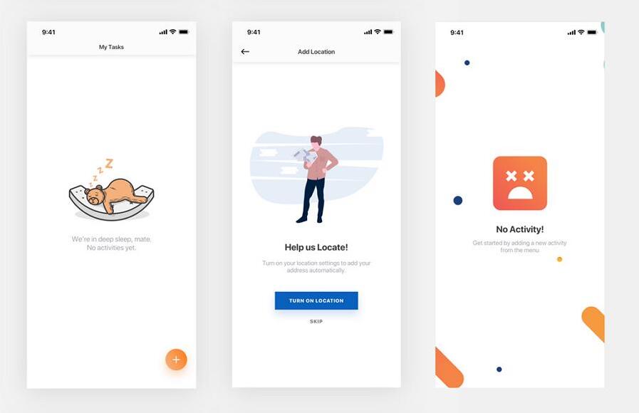
This empty state from an agile project management tool shows how to inform users that no tasks have been created yet when they first start using the tool.
Empty states are often overlooked by designers and teams who focus more on functionalities than on user emotions. However, with the rise of mobile devices as primary tools for accessing websites and apps, the importance of a good user experience has become clear. This wave of improving user experience drives designers and product teams to realize the significance of empty states.
Here are the main reasons or benefits of using them:
Simply put, a well-designed empty state helps remove confusion, engage users, and guide them smoothly go to the next step, finally delivering a better user experience.
In web or app design, there are five typical types of empty states you should be familiar with:
This type of empty state appears when users first sign up or visit the website or app. At this stage, user data, files, or projects have not been created. Examples include the profile page, project management page, or dashboard page where there is nothing to show yet.
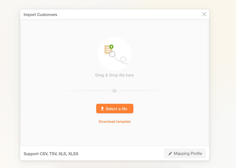
The empty state guiding users to add the file for the first-time when there is no any files created yet.
This occurs when a search yields no matching results. The empty state informs users that their search did not return any items and often suggests alternative search terms or actions.
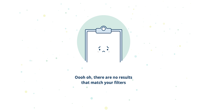
Search results empty page state made by Jorge Jager
This type appears when there is no data available to display, such as an empty inbox or a calendar with no events. It typically includes messaging to inform users why there is no data and what they can do to populate the page.
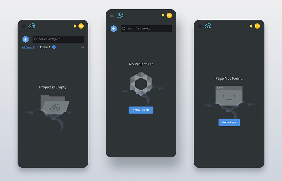
Examples from Emily Tang demonstrate empty states that appear when there is no any related project detected.
This occurs when a user's action does not produce any results, such as attempting to access premium features without a subscription or not receiving a success confirmation after completing a process or set of tasks. In these situations, the empty state serves as a guide for users, directing them on what steps they need to take next.
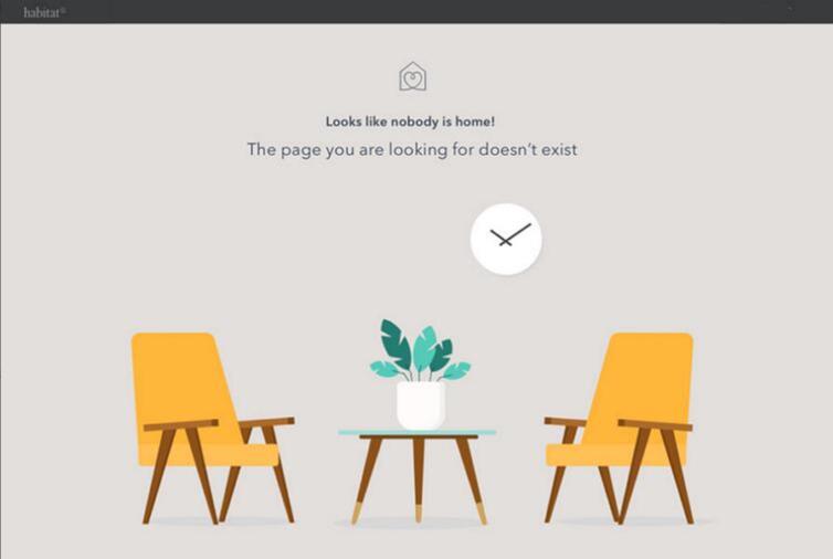
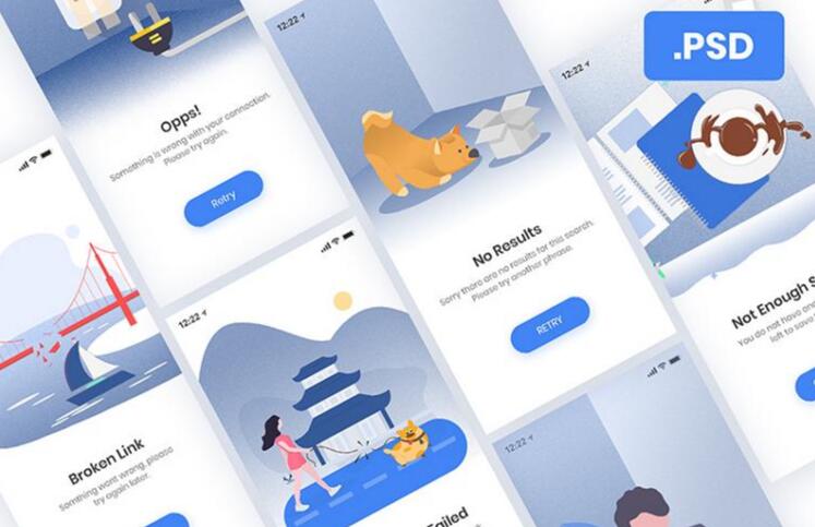
This type appears when an error occurs, such as a network failure, a system error, a network error, a 404 error or a configuration error. It provides users with information about what went wrong and how to fix or mitigate the issue.
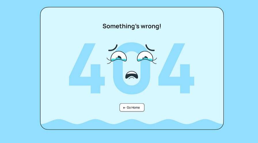
A error message empty state made by Alex Tanashkin
A good empty state helps to enhance user experience and plays a vital role in increasing revenues. Here are some design tips and tricks that you should follow for better UX:
To ensure that your empty state can actually convey your meaning and engage users, remember to utilize striking visuals, such as icons, illustrations, image or relevant graphics, especially when there is a large amount of free page space.
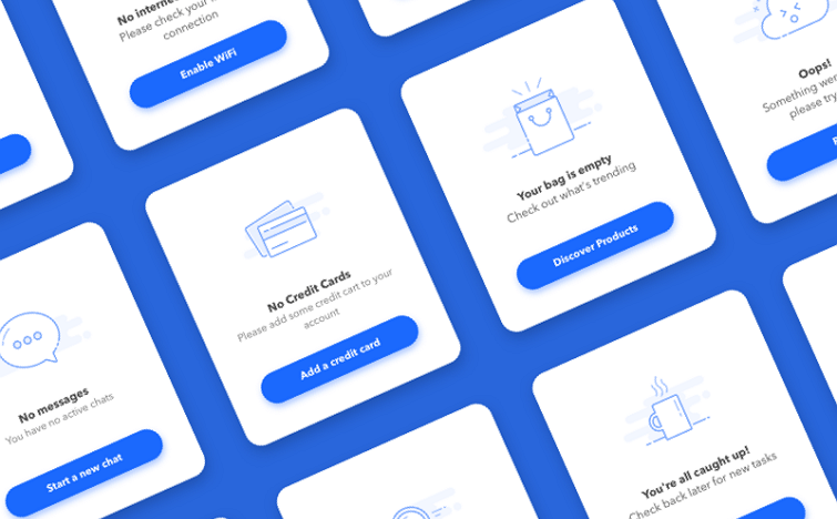
Empty state examples from Galaxy UX Studio
Colorful and striking illustrations help to quickly capture users' attention.
When designing your empty state, pay attention to the text copies as well as the visual elements. The text copies plays a vital role in explaining the context, guiding users, and leaving a lasting brand impression. Choose a consistent text tone or style that aligns with your brand image, whether it's hilarious, humorous, cute, or vocal.
As this mobile example shows, it choose a cute tone to make the explanation and direction much lovely, a good example for some children-them websites or apps.
Furthermore, if possible, it's beneficial to ensure that the chosen text tone or style is echoed in the accompanying images or illustrations. This consistency between the texts and visuals helps to create a cohesive and harmonious user experience, reinforcing the overall message and brand identity.
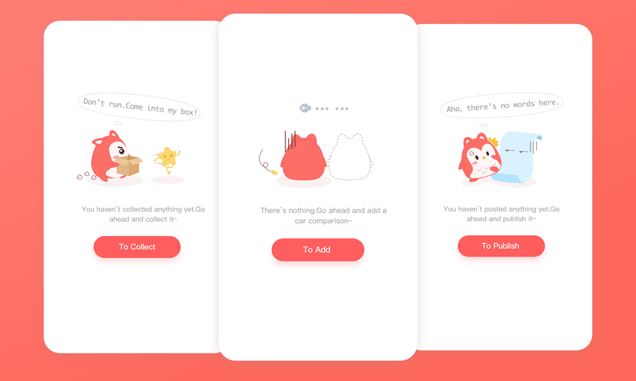
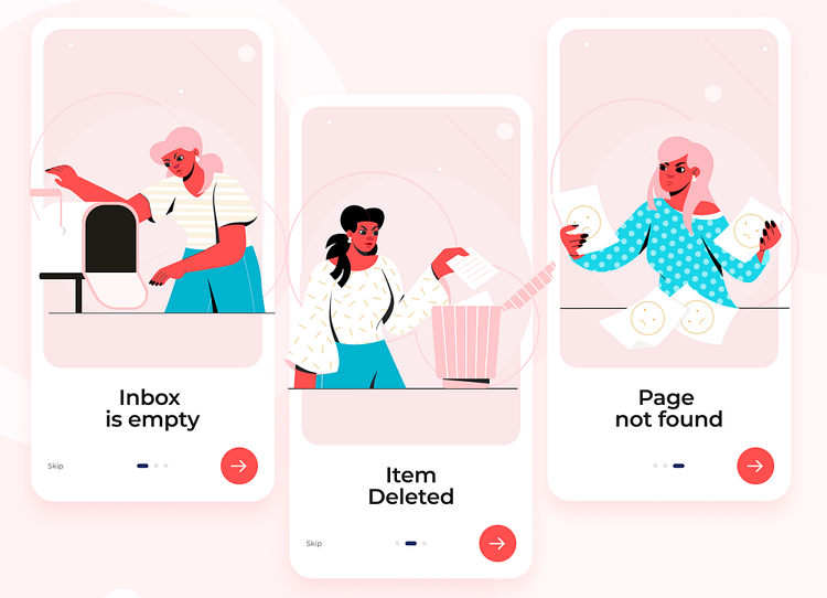
Both the text and images in this empty state set adopt a humorous style that will make you laugh when you see them.
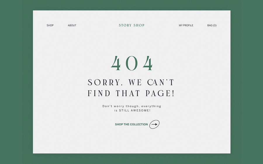
While your empty state is made to present an error message, such as a 404 error, it is helpful to include a CTA button that allows users to navigate to elsewhere of your page upon clicks, rather than just leaving the website.
Actually, the inclusion of a "Back to home" or "Go home" button specifically helps guide users to navigate around your website seamlessly, even when encountering a 404 error.
Empty states are an integral part of web and app design projects. When designing empty states, it's crucial to follow the principles of visual hierarchy. This involves creating a clear visual hierarchy for the content within the empty state, ensuring that users can quickly grasp and understand the important information, even at a quick glance.
This empty state concept design uses different font sizes and a two-column layout to create a clear visual hierarchy, clean and efficient.
Empty state design provides an opportunity for personalization by incorporating tailored text and visuals based on the user's past interactions and preferences.
For instance, if a user had previously logged in but cleared all data and left, when they return to the website, the empty state can display messages like "Welcome back" or "Happy to see you again" to delight users and provide a more considerate experience, ensuring they feel recognized and valued.
While designing the empty state UIs, it is also vital for you and your team to timely test with the real users and iterate it to the best state.
During the testing and iterating process, a free wireframing and prototyping tool that helps you to quickly create an interactive empty state designs would help you and your team save not just hours. A simple link is all you need to share it with the users and get feedback from them with on-screen comments.
Anyway, while incorporating the design tips explained here, do not forget to ensure that it aligns with the common principles of UI/UX design.
Now, let's take a look at 20 best empty state UI design examples we've handpicked for your inspiration:
This example showcases a set of empty state design concepts for mobile apps that use high-end 3D icons to elevate the overall design quality.
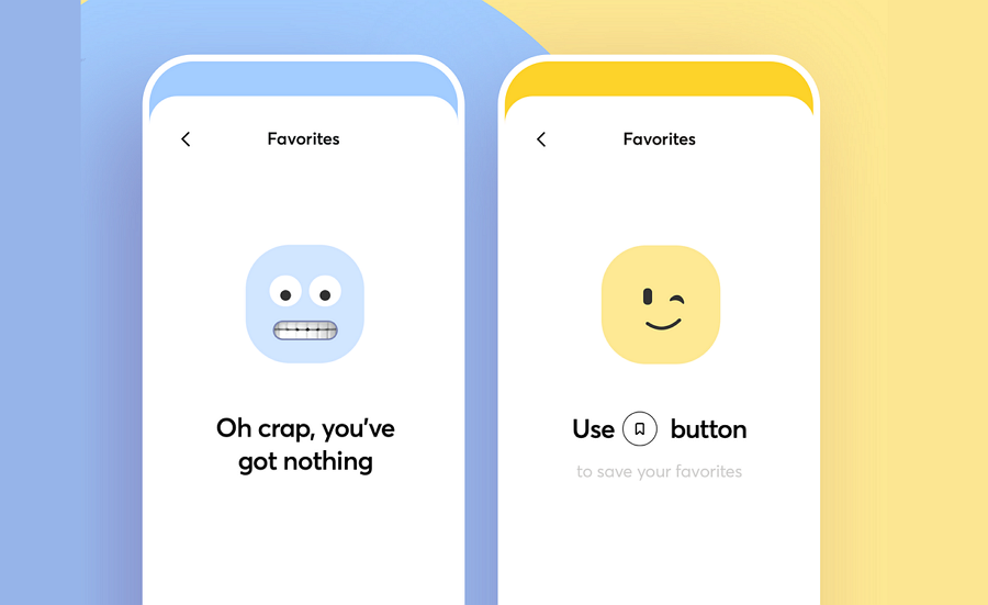
This empty state design concept from the renowned Cuberto team uses perfect face emojis that complement the text, helping to show empathy and making it easier for users to quickly accept the situation, even when no data is shown.
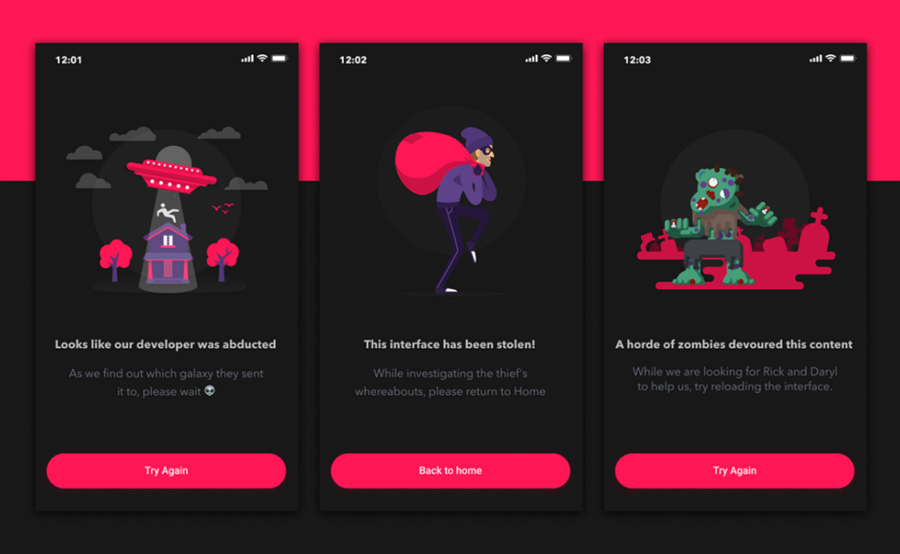
This set of error case empty state designs uses humorous text and playful illustrations to add a touch of fun to the user experience, making it more engaging and enjoyable.
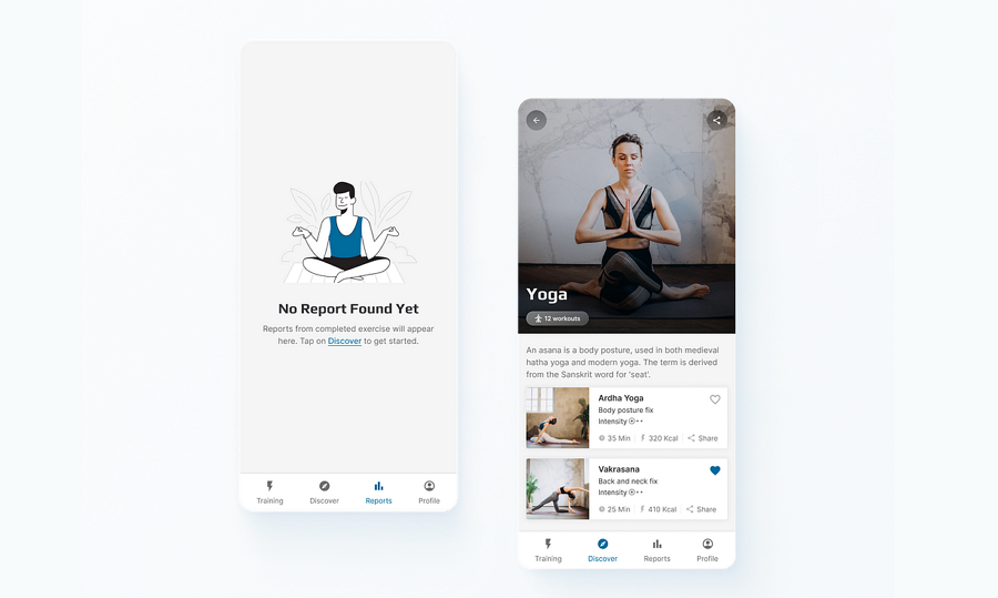
Simpl Yoga is another excellent try for yoga or meditation mobile apps. It also incorporates hyperlinked text to encourage users to explore other areas of the app
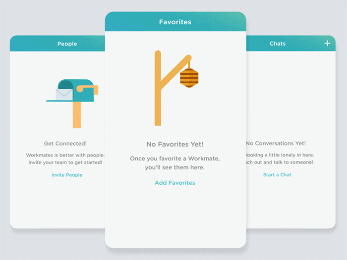
Workmates presents a series of empty state designs with animations, enhancing the user onboarding process. The charming greeting animals add a delightful touch. Why not trying adding animations to your empty states?
This design concept seamlessly integrates the mascot of the mobile app, injecting a playful element into the user experience. In fact, the mascot can be utilized not only in empty states but also on other prominent pages of your web or mobile app.
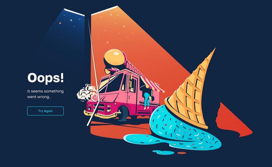
This web empty state for presenting errors features a brilliant illustration. The eye-catching color combination also helps to immerse users unconsciously, diverting attention from potential frustration or emotional reactions.
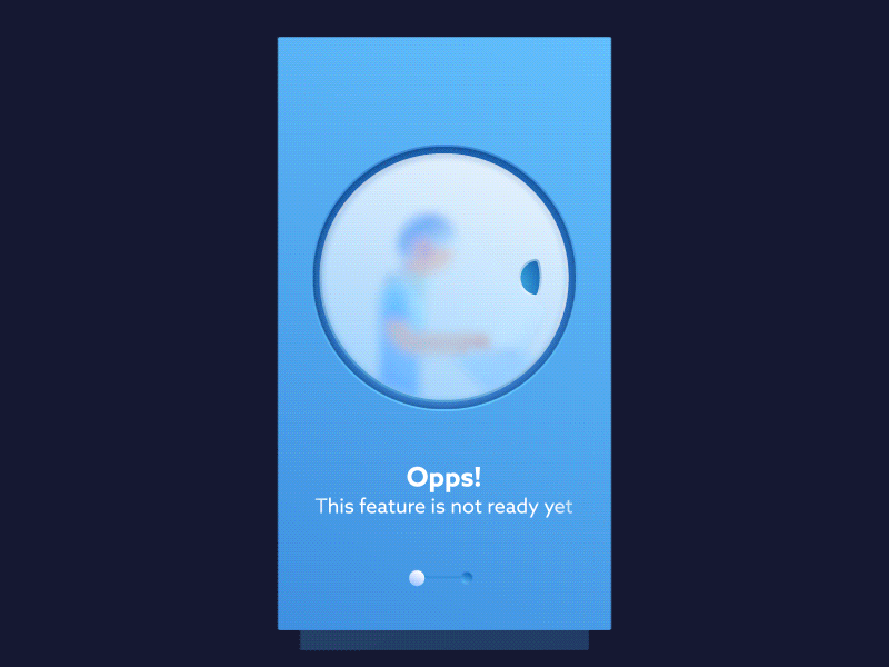
Nguyen Empty State is another example of an animated empty state. It depicts a playful scene when a feature is not yet ready. Also consider incorporating animations into your empty state design to showcase a fun scene or tell your brand story.
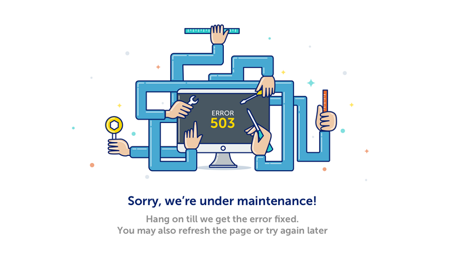
Maintenance Example, as the name suggests, is an empty state design intended for use when a page is undergoing maintenance. It serves as a useful example of how to effectively handle similar situations in your design cases.
An empty state example for a calendar-related mobile app features a clean interface and simple illustration.
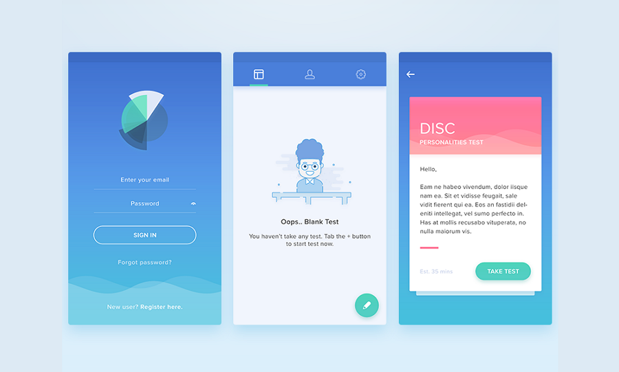
This empty state is designed to enhance user onboarding by guiding users through the process of creating their first test and navigating subsequent steps seamlessly.
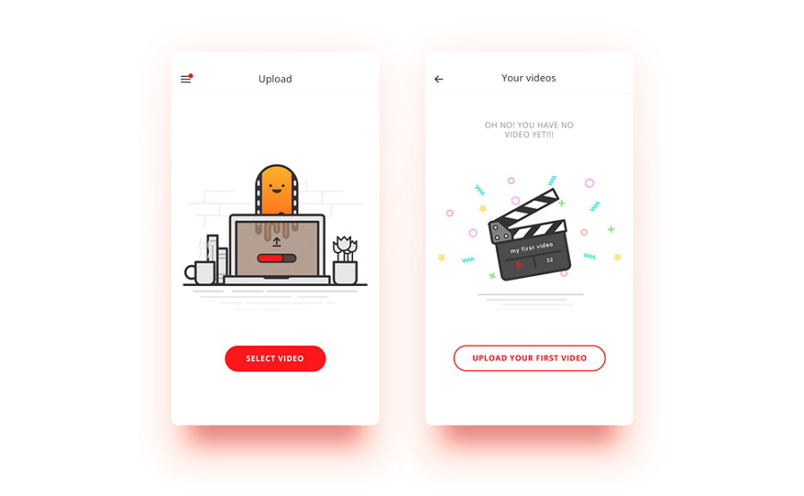
Another excellent empty state example aimed at guiding users onboard more easily and quickly. It serves as valuable inspiration, particularly if you're developing a video editing or generating mobile app.
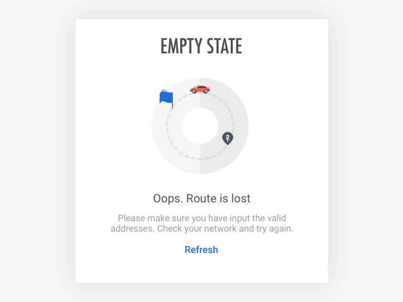
Another good example when route is lost. However, this empty state example focuses more on the text, and discuss about avoid using some user-unfriendly words, like "cannot", "unable", "falil" or "error". How do you think of this?
Sumit Empty State also incorporates an animal character to deliver different prompts, making it more comforting for users to accept the content, even when errors occur.
A modern empty state presenting the 404 "page not found" error. It retains the top navigation bar, enabling users to freely navigate around even when a page cannot be found.
A full series of empty states designed to onboard first-time users seamlessly. Some designers opt to list out the key features of the mobile app to enhance the onboarding experience. You might want to consider incorporating this approach into your own design process.
This is a mobile design concept when there is no internet connection. The GIF image adds a playful touch to the page, creating a pleasantly interesting experience for users.
This design concept showcases a "no search result" template state for social mobile apps. It's a fresh example to inspire you in creating your own search bar empty state.
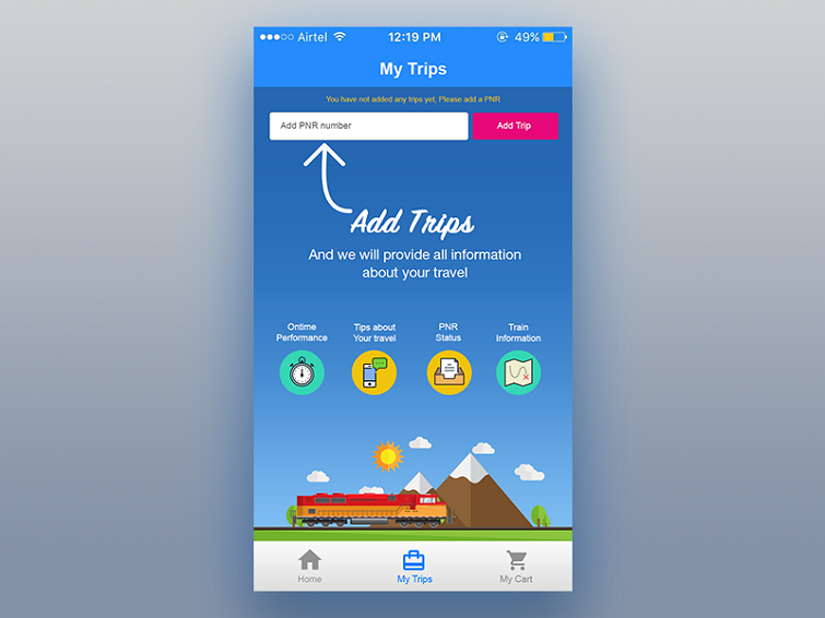
iOS empty state concepts are employed when first-time users sign up and have not yet added any trips. Unlike other pages that merely provide directions, these pages offer rich content to facilitate trip creation and easy navigation, granting users full freedom to personalize their experience.
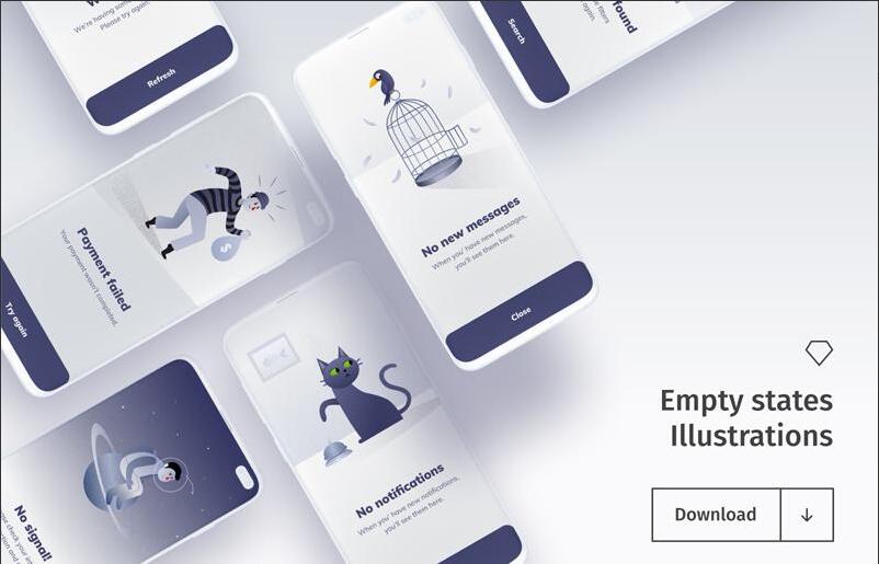
This resource includes a set of 12 empty states for your mobile or web projects. It is was designed by Boris Kozelev and now available in Sketch format.
This collection gathers a set of empty states with illustrations and is perfect for your next mobile app. It is now only available in Sketch file format.
Free download
A free empty resource shared by Loannis Nousis, and it provides a fully customizable template for creating a 404 error page directly.
This is a free error and empty state freebie offered by Teksmobile, which is well organized and fully editable to match your design needs. Available in PSD format, it's perfect for both personal and business use.
This freebie includes a set of commonly-used empty state templates that you can easily edit to create your own. Offered by Kishore, this template pack is now available exclusively in Sketch format.
An error state, as the name implies, is a page state specifically designed to present and explain errors, such as system errors, network errors, loading errors, and more.
An empty state appears when there is no data available to display. In some cases, an empty state may be triggered by an error that prevents data from being retrieved or loaded. Therefore, an empty state can include the error state, as it serves to communicate the absence of data due to an error condition.
No. Empty states are not the most overlooked aspect of UX.
Actually, they may have been overlooked in the early days of computing and graphical user interface design due to limited technology development and a lack of awareness about UX.
However, as technologies advance, user-centric design become more important. Designers and design teams now understand the significance of empty states in providing a positive user experience. Empty states are now considered an essential component of UX design, helping to guide users, provide context, and improve overall usability.
A good empty state often including the following:
Crafting an efficient empty state can involve the following steps:
Step 1. Identify the needs and define the purpose
Step 2. Choose the right empty state type
Step 3. Wireframe, prototype and design
Step 4. Add interactions and motions
Step 5. Share, test and iterate
You may also adjust these steps based on your specific case.
Empty states may not receive as much attention as other prominent web pages like home pages, pricing pages, or product pages. However, their importance should not be underestimated. In fact, the design of empty states plays a crucial role in engaging and retaining users during error or absence of data situations. Ignoring empty states can lead to a poor user experience and missed opportunities.
By following the best practices, examples, and basic principles explained earlier, you can gain useful insights to create better empty states for your next web or app design project.
 Mockplus RP
A free prototyping tool to create wireframes or interactive prototypes in minutes.
 Mockplus DT
A free UI design tool to design, animate, collaborate and handoff right in the browser.


 Sign up with Google