Efficiency is one of the top priorities for businesses, as higher efficiency often translates to greater profitability. One of the key drivers of enhanced efficiency in the workplace is effective enterprise UI, or enterprise User interface. A well-designed enterprise UI can significantly boost human productivity by providing intuitive, easy-to-navigate, and visually appealing interfaces that streamline workflows and reduce the learning curve for employees.
This article provides an in-depth look at what enterprise UI is, how it differs from the broader category of enterprise applications and the key design strategies that can lead to success. Moreover, we will also address the unique challenges for enterprise UI design that designers are facing, and showcase 21 exemplary UI designs that illustrate how top companies are setting new standards in enterprise applications.
What is enterprise UI?
First, let's get to know what enterprise UI is. Enterprise UI, or Enterprise User Interface, refers to the design and layout of interfaces used in enterprise software. Enterprise software are designed to satisfy the needs of teams, companies or organizations, which may include businesses, governments, or non-profits. These software and applications are typically complex and robust, handling multiple facets of an organization's operations such as human resources, supply chain management, customer relationship management, and more.
Historically, enterprise UI were designed with a focus only on functionality, often neglecting user experience and efficiency. It seemed that few developers prioritized making these interfaces user-friendly. However, in recent years, there has been a significant shift towards prioritizing user experience in enterprise UI design. Products like Slack, SAP, and QuickBooks demonstrated that enterprise interfaces can be both efficient and pleasant to use, revolutionizing the industry.
Enterprise UI design challenges
Enterprise UI design have unique challenges due to the complexity of the systems involved, the diverse needs of users, and the importance of efficiency and productivity in business contexts. Here are some common challenges faced in enterprise UI design:
1.Integration with legacy systems
To minimize disruption to existing workflows, enterprises often choose to integrate with legacy systems. But these legacy systems often lack compatibility with contemporary UI/UX principles, resulting in disjointed user experiences. Achieving seamless integration can be a challenging process requiring careful consideration of the legacy system's architecture and limitations.
2.High-volume information
Enterprise applications typically handle vast amounts of data. Displaying this data in a comprehensible and accessible manner without overwhelming the user is a significant challenge.
3.Complex user roles and workflow
Enterprise applications often cater to multiple user roles, each with distinct needs and workflows. Designing an interface that effectively organize and accommodates these varying requirements can be complex and challenging.
4.Balancing design excellence and efficiency
Designers often face significant resource constraints, which present a challenging balancing between design excellence and efficiency. Designers aim to create optimal solutions that provide the best user experience, but resource constraints may force them to settle for feasible solutions that fit within budget and time limits.
Enterprise UI vs Enterprise application
Both Enterprise UI and Enterprise application are critical to the success of modern businesses, but they serve different roles within the software ecosystem.
As we already know, Enterprise UI refers to the design and layout of the visual and interactive elements that users directly interact with in enterprise software. It prioritizes enhancing the user experience and improving efficiency through better design, aiming to make the software intuitive, user-friendly, and accessible.
Enterprise applications, on the other hand, are comprehensive software systems designed to meet the needs of teams, companies or large organizations.
These applications support a wide range of business modules and systems for different business processes and functions, such as resource planning, customer relationship management (CRM), human resource management (HRM) and more.
Overall, Enterprise UI is a component of enterprise applications, focusing specifically on the user experience aspect, while enterprise applications encompass the entire software system that supports and optimizes business operations.
Enterprise UI design tips
Designing user interfaces for enterprise applications involves unique challenges compared to consumer applications. Enterprise users often require more complex functionalities, deeper data insights, and seamless integration with existing workflows. Here are some key tips for creating effective enterprise UI designs.
1.Simplify workflows
Enterprise applications often involve complex processes and workflows. When design enterprise UI, designer should minimizes the steps required to complete tasks, automates repetitive actions, and highlights key areas, thereby saving time and reducing user errors.
2. Use clear navigation
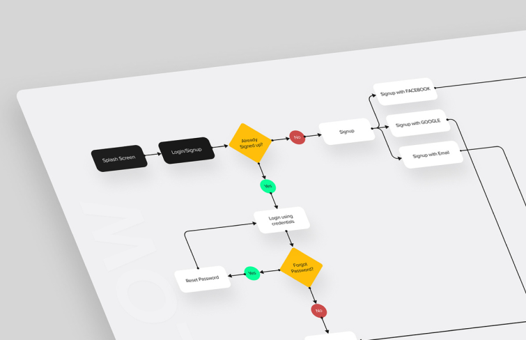
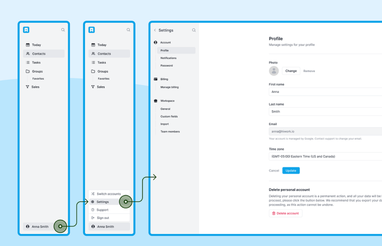
In enterprise UI design, clear navigation systems play a critical role due to the complexity and functionality demands of these applications. Enterprise applications typically manage vast amounts of data and numerous features, requiring users to efficiently navigate and process information. A well-designed navigation system enables users to move through different sections of the application effortlessly. Clear labels, logical grouping, and intuitive navigation patterns such as menus, breadcrumbs, and search functionalities, enhanced by a search intelligence platform, are often used for helping users find what they need quickly and efficiently.
3.Make use of the design system
Incorporating a comprehensive design system not only help users navigate the application more easily and reduce cognitive load but also streamlines development. It provides a framework that ensures consistency, improves scalability, and facilitates easier updates and maintenance. By adhering to these principles, enterprises can create intuitive and efficient applications that supports both user needs and business goals.
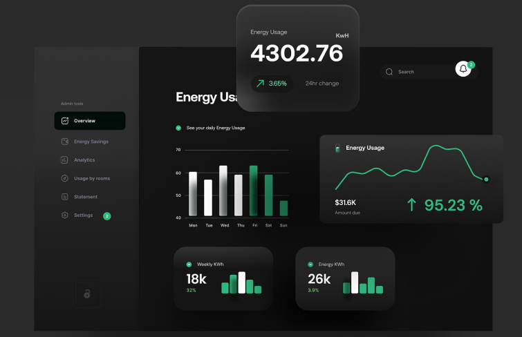
4. Incorporate data visualization
Enterprise applications often deal with vast amounts of data, and presenting this data in a clear and concise manner is essential for effective decision-making. Use data visualization techniques such as charts, graphs, and dashboards to present complex data in an easily understandable format. Effective data visualization helps users quickly grasp insights and make informed decisions, which is essential in an enterprise context.
20 Enterprise UI design examples
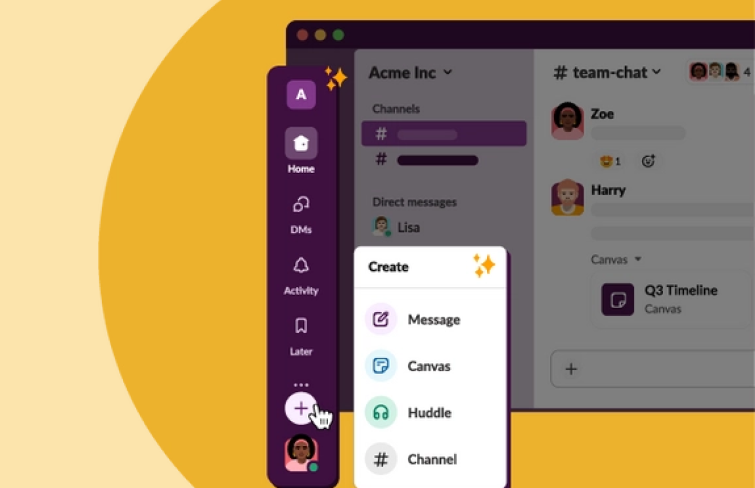
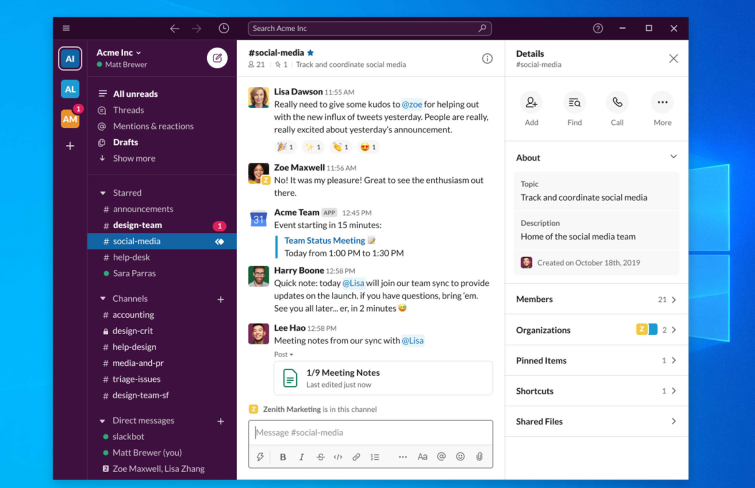
The design principles that make Slack's interface successful include a well-thought-out visual hierarchy and clear differentiation between tabs or sections, ensuring users can navigate the app intuitively, finding the information they need quickly and without confusion. Besides, one of the key features of Slack is its ability to support multiple tabs, allowing users to have, for instance, one tab open with dialogues and another with threads.
This feature is particularly valuable in environments where constant communication and reference to previous conversations are essential. This split-view functionality enhances user productivity by enabling them to multitask efficiently without losing context. The simplicity and versatility of Slack's design make it adaptable to various workflows.
Mockplus Cloud is a robust online platform for design handoff and collaboration, tailored for product design teams of all sizes. Mockplus Cloud offers a wide range of functionalities, including project management, task management, design systems, role-based access control, and more. Despite its comprehensive feature set, Mockplus Cloud maintains a clean, well-organized interface that is easy to navigate.
Moreover, it also allows you to easily switch between Light and Dark mode, providing a more personalized user experience.
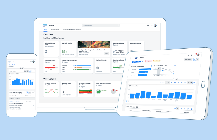
As one of the leading providers of enterprise software, SAP offers solutions that cater to a wide range of business functions, including finance, logistics, human resources, and more. One of the hallmarks of SAP's UI design is its Fiori design system. Fiori provides a cohesive and responsive user experience across all SAP applications. It is built on modern design principles, emphasizing simplicity, consistency, and ease of use.
The use of clear icons, intuitive navigation, and a clean layout helps users to perform tasks with minimal effort, reducing the learning curve associated with complex enterprise software. SAP's UI also focuses on personalization and adaptability. Users can customize their dashboards and interfaces to fit their specific roles and preferences, allowing for a more tailored and efficient workflow.
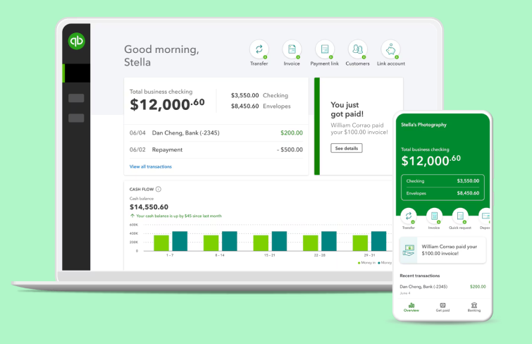
Quickbooks's intuitive and user-friendly interface makes complex accounting tasks accessible to a wide range of users. One of the key strengths of QuickBooks' UI design is its simplicity. The dashboard is clean and well-organized, presenting critical financial information at a glance. Users can easily track income, expenses, and profits, and the use of clear charts and graphs helps to visualize financial data effectively.
This straightforward layout reduces the complexity often associated with accounting software, making it accessible even to users without an accounting background.
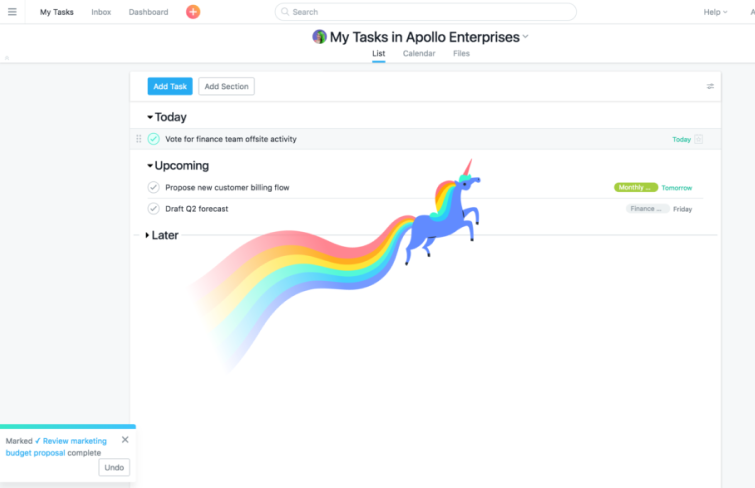
Asana serves as an exemplary case of enterprise UI design due to its thoughtful integration of user engagement features that enhance the overall user experience. A standout element in Asana's design is the celebration creatures—animated characters such as a unicorn, yeti, narwhal, and phoenix that appear randomly to congratulate users on task completion.
This feature, activated through the Profile Settings, is not only unique but also optional, allowing users to customize their experience. The inclusion of these celebration creatures makes routine task management more enjoyable, turning mundane activities into moments of delight. Incorporating such innovative and playful features into an enterprise tool showcases Asana's commitment to user-centric design. It proves that professional software can be both functional and enjoyable.
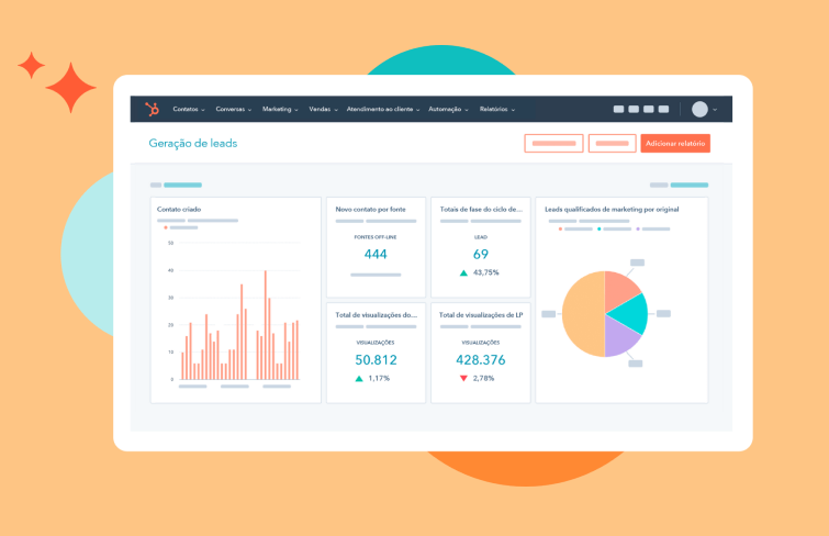
HubSpot is a customer relationship management (CRM) platform that helps businesses attract, engage, and delight customers. The design of HubSpot's UI is both intuitive and efficient, making it accessible to users of varying technical expertise. Its dashboard provides a clear overview of all essential metrics and activities, enabling users to quickly assess their performance and make informed decisions. The use of well-defined sections and visual cues helps in navigating the software effortlessly, ensuring that users can find and use features without unnecessary complexity.
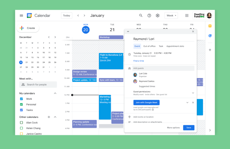
Google Calendar exemplifies excellent enterprise UI design, effectively serving both personal and business users. The app provides a simple yet powerful virtual calendar that helps users track important events, tasks, and reminders. Its intuitive user interface is clean and user-friendly, consistent with the Google brand, making it easy for users to navigate and manage their schedules.
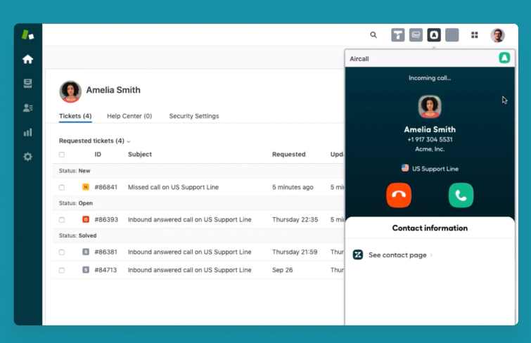
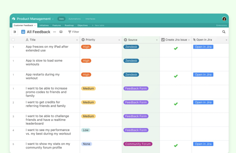
Zendesk provides a range of tools, including ticketing systems, live chat, and a knowledge base, all designed with an intuitive and clean UI that enables customer service agents to resolve issues quickly and efficiently. Moreover, zendesk offers great customizability, allowing teams to white-label the software with their own branding, logos, and color schemes, ensuring a seamless brand experience.
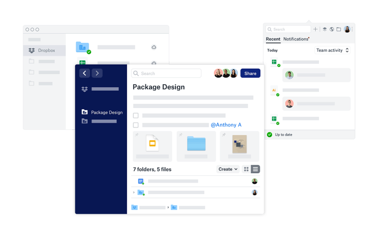
The platform boasts a user-friendly design with straightforward drag-and-drop functionality, making file management effortless for even the least tech-savvy users. Its sleek and uncluttered layout enhances productivity by prioritizing essential features and minimizing distractions. Moreover, Dropbox's UI design ensures accessibility across devices, enabling users to access their data anytime, anywhere.
Whether on desktop or mobile, the consistent design language and layout make for a seamless transition between platforms, ensuring a consistent user experience across the board
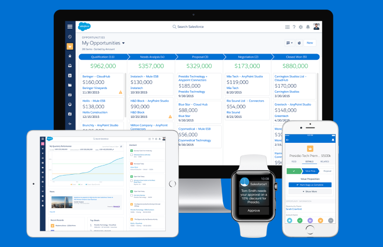
Saleforce's UI design facilitates easy customization to tailor the platform to the specific needs of any business. From layout to functionality, users have the flexibility to create a workspace that aligns precisely with their workflow, enhancing efficiency and user satisfaction. Scalability is another hallmark of Salesforce's UI design. The platform can adapt quickly to accommodate the changing needs of businesses, whether they are small startups or large enterprises.
The UI's scalability ensures a consistent user experience regardless of the organization's size, promoting seamless growth and expansion.
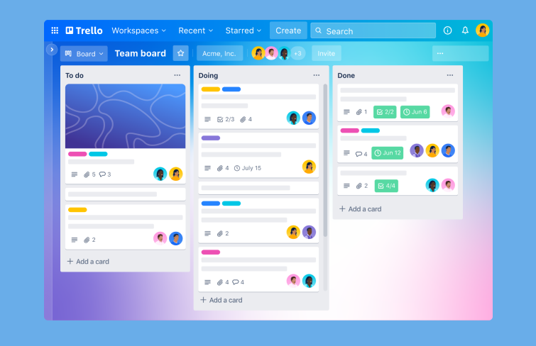
Trello's intuitive UI features a clean and minimalist design, making it easy for users to navigate and understand the platform's functionalities quickly. One of Trello's key strengths lies in its flexibility. It enables users to customize boards and workflows according to their specific needs and preferences, fostering a personalized user experience. The platform's mobile app further enhances accessibility, enabling users to stay connected and productive while on the go.
Freshworks is a customer engagement software company that provides businesses with a suite of cloud-based tools to manage customer relationships effectively. Freshworks excels in enterprise UI design, offering a seamless user experience tailored for efficient organization and collaboration. Its intuitive interface empowers users with easy navigation and swift onboarding, ensuring both novice and experienced users can leverage its features effectively.
Basecamp is a business application that helps teams stay organized and efficient. One standout aspect of Basecamp's UI design is its thoughtful use of whitespace and typography. The interface is uncluttered, allowing content to breathe and ensuring clarity of information. Fonts are carefully chosen for readability, enhancing the overall user experience and reducing cognitive load. Its use of color is purposeful, helping to differentiate between various elements and draw attention to important information without overwhelming the user.
Airtable stands out as an exemplary case of excellent enterprise UI design, primarily due to its skillful management of information density and prioritization of functionality over aesthetics. With a clean and intuitive interface, Airtable adeptly presents vast amounts of data without overwhelming users. Its carefully crafted layout and visual hierarchy ensure that users can efficiently navigate and interact with the platform, enhancing their productivity.
Coda stands out as an exemplary case of Enterprise UI design, particularly for its adaptability. With a dedicated native mobile app and a responsive design, Coda ensures a seamless user experience across various devices. Its interface adapts effortlessly to different screen sizes, guaranteeing consistency and usability regardless of the device used. The mobile app offers all the functionalities of the desktop version, maintaining feature parity and ensuring users can work efficiently on the go.
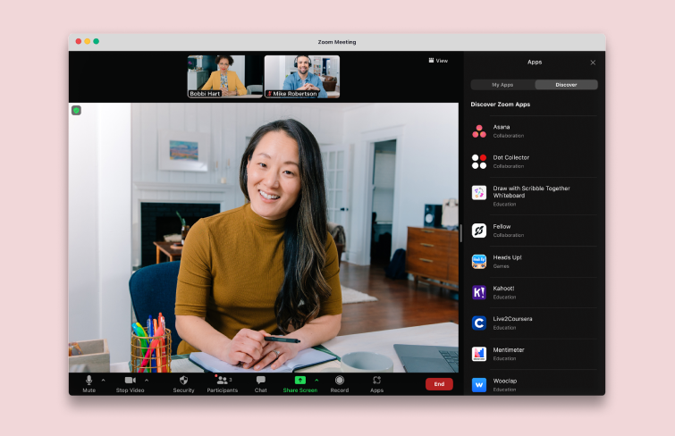
Zoom's interface is streamlined and uncluttered, focusing on essential features like starting and joining meetings to minimize cognitive load. Users can easily navigate the platform without feeling overwhelmed by unnecessary complexity. Advanced settings and controls are cleverly hidden by default, only revealing themselves when users actively seek them out.
This design approach ensures that users can access more sophisticated features when needed without sacrificing the intuitive simplicity of the primary interface.
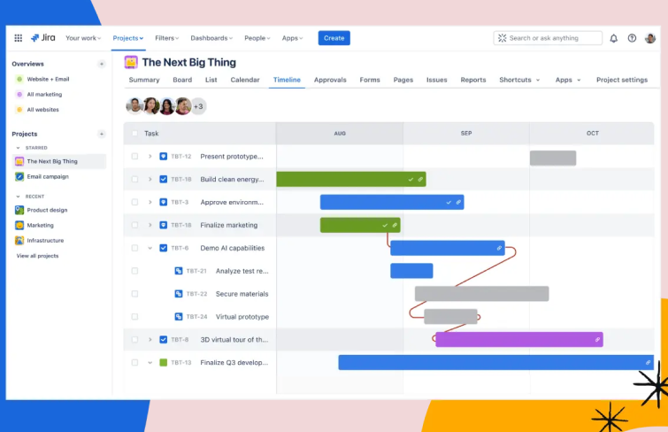
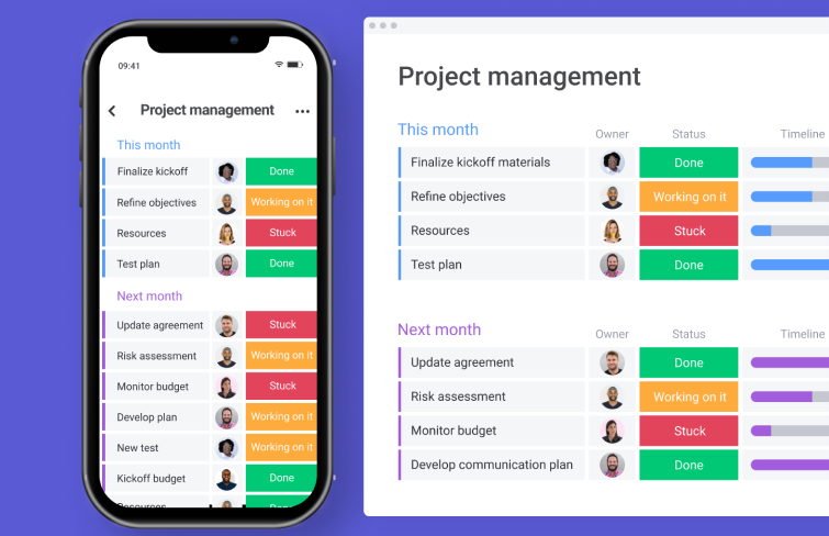
Jira is a project management and workflow mapping tool. The software employs a minimalist design that reduces visual clutter, making navigation straightforward and efficient. Its customizable dashboards allow users to tailor their workspace to their specific needs, fostering a personalized and efficient workflow. Moreover, Jira's use of consistent iconography and color schemes helps users quickly locate and understand different functions, reducing the learning curve for new users.
Additionally, the responsive design ensures that Jira is equally functional across various devices, providing a seamless experience whether on a desktop or mobile device.
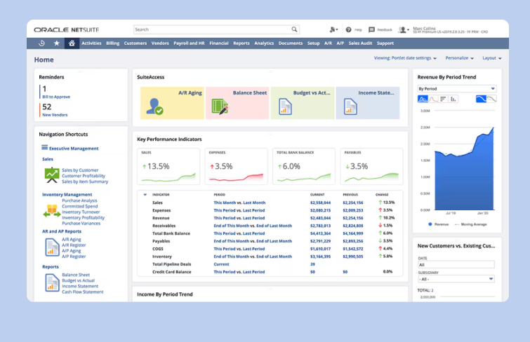
Oracle NetSuite's UI is easy to use and understand, which allows users to focus on job-specific workflow training and reduces the amount of time wasted on navigating through unintuitive ERP systems. The slim, anchored navigational header allows quick and easy access to essential tools, minimizing the time spent on navigation. Moreover, users can effortlessly personalize their experience with drag-and-drop capabilities and other user-friendly tools.
Additionally, the dashboard personalization panel makes it easy for users to tailor their dashboards to meet unique needs.
19. Monday.com
Monday.com exemplifies exceptional enterprise UI design through its visually appealing and highly customizable interface. Users can easily customize boards, columns, and cards to fit their specific workflow needs, making the interface both flexible and intuitive. Moreover, it also excels in visual data management, offering multiple views, including list, calendar, and timeline views, allowing users to visualize their tasks and projects in the most effective way for their needs.
The ability to switch between these views helps users maintain clarity and focus on their priorities.
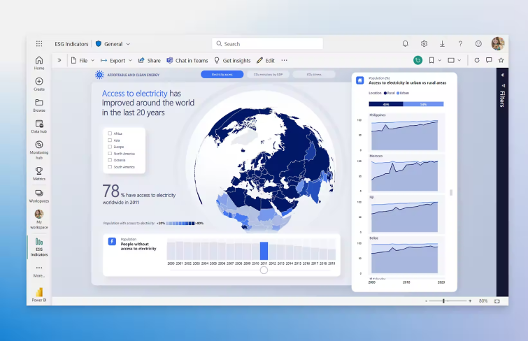
Power BI is a business analytics tool developed by Microsoft Corporation. The platform's dashboards are highly customizable, allowing users to tailor the visual presentation of data to meet specific business needs. Power BI’s design ensures that even users with minimal technical expertise can navigate and leverage complex data through clear visualizations and straightforward interactive elements.
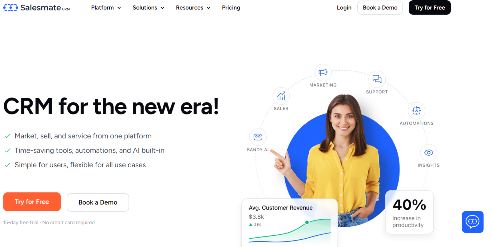
Salesmate is a powerful sales CRM software offering a sleek, user-friendly interface designed for simplicity and efficiency. Its minimalistic layout ensures that users can easily navigate between tasks without overwhelming complexity. The dashboard is customizable, allowing users to personalize their workspace to fit their workflow, enhancing productivity. With intuitive visual cues and seamless navigation, Salesmate's UI design prioritizes ease of use, making it accessible to both beginners and experienced professionals.
Conclusion
Today, we took an in-depth exploration of enterprise UI and examined 21 examples of successful enterprise UI designs. The examples provided offer a glimpse into the diverse approaches taken by organizations to create interfaces that empower users to interact with complex systems effortlessly.
Whether it's through innovative data visualization techniques, intuitive navigation structures, or personalized customization options, these designs prioritize user-centricity to enhance productivity and decision-making within the enterprise context. Hopefully, by learning from these examples and applying the lessons learned, you can elevate your enterprise design to meet the demands of modern users and achieve similar success.
 Mockplus RP
 Mockplus DT


 Sign up with Google