Building an event landing page is usually the top option for designers or product teams to hype up their coming event and convert as many potential customers as possible in advance.
However, designing an event landing page that truly converts is not an easy task. No matter whether you are a design beginner or expert, here is our collection of the best event landing page examples, templates, and ideas for you to draw inspiration from.
This guide to event landing pages will help you know more about it so you can design your own enticing event landing page.
Let's dive into the details now!
An event landing page is a web page designed to tell visitors there is an event coming soon and one that encourages visitors to attend the event. It is usually used to announce a conference, meetup, webinar, online summit, and other local or virtual events, to help get people to sign up or buy a ticket even before the event has been hosted.
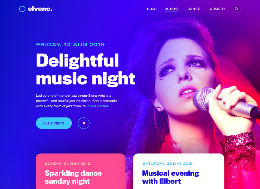
In most cases, designers, companies, and design teams create an event landing page wanting the page to do the following things:
introduce all the basic info about the coming event
collect signups or information of the potential customers
encourage visitors to buy a ticket, if there are any
persuade visitors to share the event via social media
Thanks to those goals, there are some basic elements that you should include in your event landing page:
Event description and brand introduction - introduce who is going to host the event and share some background information about your company, goal, and brand. If there is enough web space, it is also good to show some information about the sponsors, such as their logos.
Event values and benefits - clearly explain all values and benefits that web visitors can get from your event. Make sure you've targeted the right audience.
Event date, time, and locations - To help visitors decide on whether they can come to your event in person, the event details, such as the event date, time, and location should also be clearly visible.
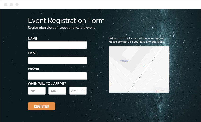
Registration form - Many designers also include a registration form to collect customer info and get people to sign up before the event. Collected customer information is an indispensable tool for companies and teams to sell more tickets or get more event revenue.
Call-to-action buttons - include at least one CTA button to encourage visitors to book a ticket or read more about your event, or call through a call widget.
Sharing media - if you want more web visitors to know your coming event, include ways for visitors to share your event with ease, such as through Twitter, Facebook sharing, or Instagram posting.
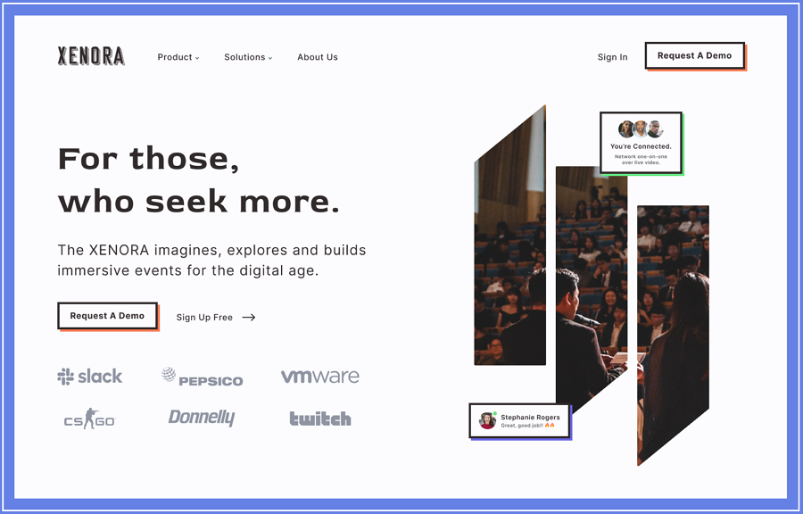
To achieve your goals successfully, you may add some custom elements to hype your event up in advance, such as a promotional video, a persuasive testimonial, or a result list of how many users had attended your event in the past.
Here are the best practices that you should copy to convert potential customers to real buyers in advance:
To encourage more visitors to attend your event, you should create the overall design based on the needs of the right target audiences. To know what your target audience wants and likes, first do some user research, select the main group of target audiences and take their needs and preferences as your design base.
People give up signing up for a website or app when the signup form is too long or too complicated to complete. To sign up more visitors, your event landing page should be designed as simple and short as possible to get attendees signed up in a quick manner.
Of course, when your event needs a ticket to attend, make the ticket buying process as simple as possible.
A clear and enticing CTA button is essential if you want your event landing page to collect more signups or sell more tickets. This means you should first pay attention to the visual design of the CTA button, like the color, border styles, and background designs, to make it easy to be found and noticed against other page content.
On the other hand, you may create a more enticing copy to encourage visitors to take any action, such as clicking the CTA button to buy a ticket, sign up or read more.
Brilliant visual designs, such as distinctive color schemes, high-quality hero images, vivid videos, fun gifs, or animations, catch visitors' eyes as soon as they come to your event landing page. In some cases, these visual designs also work as more intuitive and convincing content to encourage your visitors to quickly interact with your page.
Any change to your event landing pages, such as the change to the layout, title, subtitle, image, color, or even the form registration, leads to a different signup result. To ensure that your event landing page has been designed to be in the best state, you may select the right tools to test all your page details before you start to develop it.
Mockplus - a collaborative prototyping tool that helps you visualize event landing page details, collaborate, iterate, and test them easily and quickly with your team early on. It helps you create lifelike interactive web prototypes so you can test all details to see how they will work in the future. It is a perfect tool to help you and your team find and resolve all potential usage problems in advance.
When designing an event landing page, most designers and product teams choose to stand out only one content, such as the CTA button, message, or the design, in their own ways. No matter which one you prefer to highlight, remember to balance them all well to avoid any content and visual distractions.
Here are a small collection of the best examples and templates for your inspiration:
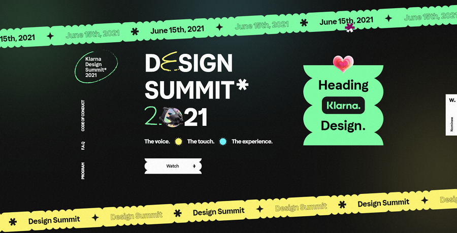
The Klarna Design team created this landing page to promote an online design summit for designers all over the world. This event landing page successfully got high volumes of sign-ups from visitors, including our team, as soon as they landed on this page.
Why? It has an amazing visual design. The green, yellow and black color scheme is eye-catching. The continuously rolling banners stand out the date and time. The fun gifs and micro-interactions make it very interesting to keep exploring the page. The embedded introduction video is also easy for them to learn more event information.
Without a traditional grids layout, this website positions elements in its own way and balances them all perfectly.
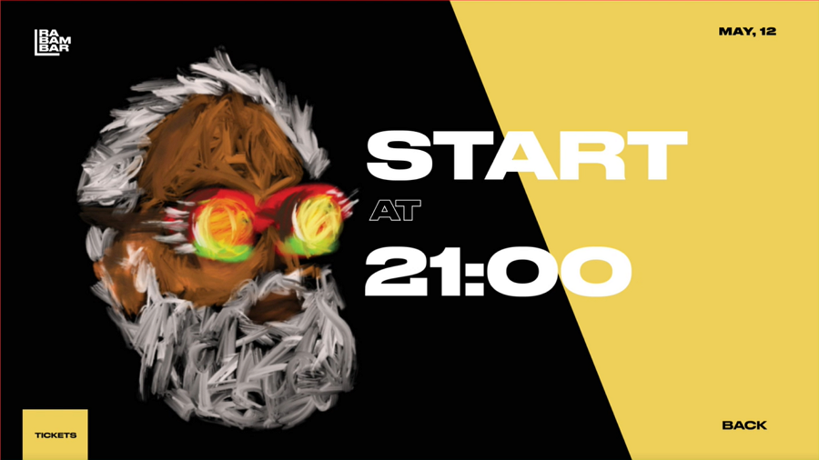
This fashion event landing page is an inspiring example shared by the Turbik team, a popular web UI/UX design team. The idea of this event landing page is to promote a fashion event and use enticing visual design. The use of high-saturated colors, unique hand-drawn illustrations, and fashionable bold fonts make it a visual feast to scroll through the website.
Finally, the smooth transitions and animations further enrich the user experience.
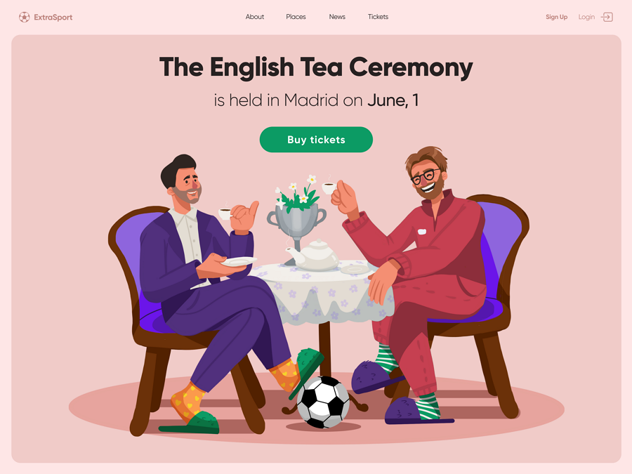
This Champions League Final Landing Page is a web design concept created to sell tickets for the final match of UEFA champion league. It uses an illustration hero image to create an interesting vibe around The English Tea Ceremony. This is a good example of how to use illustrations or images to tell your own story on your event landing page.
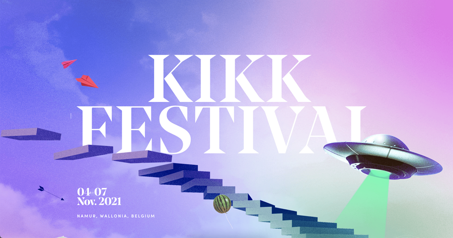
KIKK is an interactional festival for digital and creative cultures, exploring the artistic and economic implications of new technologies. This year, it takes place from 4 to 7 November.
The KIKK festival landing page is in a sci-fi style with a ladder illustration guiding users down the page. On an easy-to-read area of the page, the details of the event are clearly visible and contain the most important details - the location, time and speakers.
Fun gifs are scattered on the ladders to add interest to the scrolling user. Underlined links and interactive images of the speakers allow visitors to check and read more information about the event and speakers with a minimal amount of clicks.
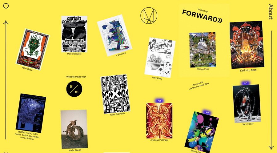
The Moon Exhibition is designed to give creatives a platform to share their works with a broader audience. Its landing page first uses simple words to introduce the background and valuable information of this website. The website then uses nearly all the rest of the page space to directly present design works from designers around the world. When you scroll down, users can just click on any one of the projects to check for more details.
To encourage visitors to subscribe to this event, a subscription popup is presented as soon as you enter this website.
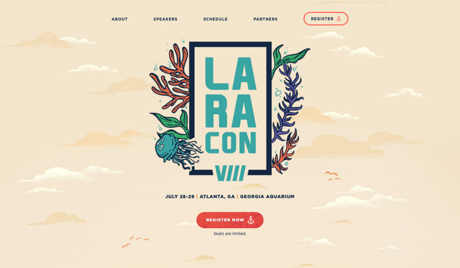
Alt: Laracon VIII
Laracon VIII is the event landing page for the annual two-day online conference in Atlanta, Georgia. The event uses a storytelling style to introduce all details step by step, giving visitors a very immersive experience thereby presenting the story in an easy to read, digestible manner. The excellent speaker slideshow, clear time schedule, and eye-catching CTA buttons all create a professional vibe, making the content convincing to visitors.
Its landing page for 2021 also has a fresh look and is a good inspiration for a summer event.
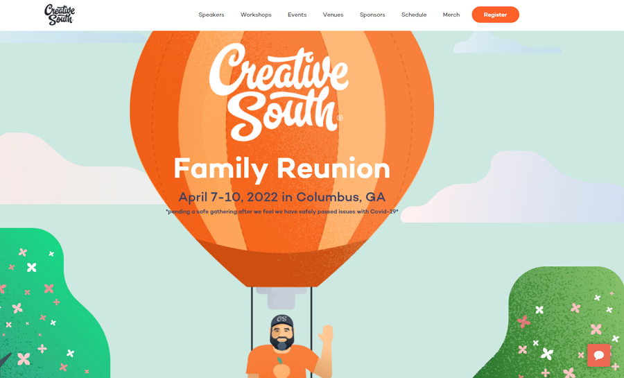
Creative South Landing Page is made to gather people around the world to go to Creative South to celebrate creatives while having workshops and keynotes from various speakers. Even though this year, this event has been prolonged due to the COVID-19, its illustrated page design is still worth checking and copying.
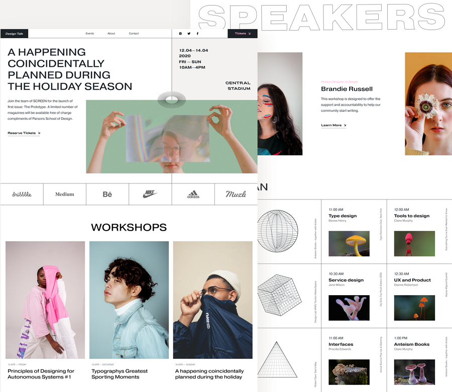
This Design Event Landing Page is a web design exploration that integrates brutalism, punk style, geometric elements, and grid layouts. The entire page has an interesting and fresh look. There is also a mobile version to help you get inspiration to create your own responsive event page.
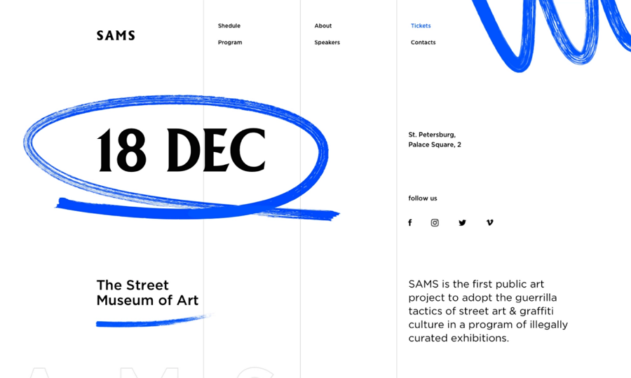
SAMS Culture Event Page has a simple but effective minimal design. Without any eye-catching colors, high-quality hero images, or vivid videos, this page uses a clear layout to present the page content with plenty of whitespaces. The blue hand-drawn stroke seems to be drawn casually, successfully highlighting the event date while keeping the design in line with its minimal principles.
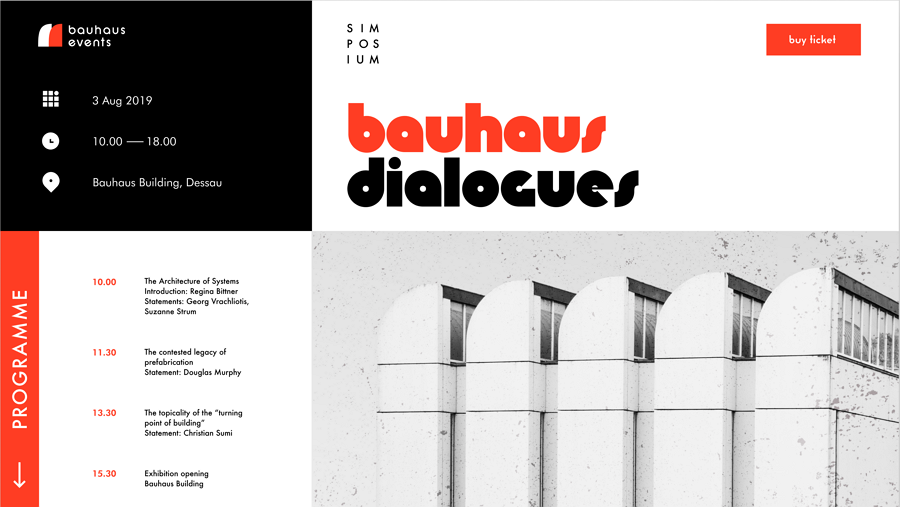
Bauhaus Event Landing Page is a promotional event for fine artworks and functional designs. Their web page uses a grid layout to divide the page into four blocks. Each block has different usages. The bold and thin font contrast, along with the black, white and red color contrast, and the minimal look, all help create a simple, clean, professional and effective event page.
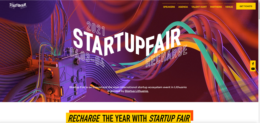
The Startup Fair Recharge 2021 is a landing page designed for an annual startup event. Visitors can easily go in, view details and buy a ticket to discuss the startup ecosystem problem.
This year, its landing page incorporates an eye-catching hero image background and uses big and bold fonts to present the event time and date. When you scroll down the page, the postboard-like designs list all speakers clearly, allowing you to first evaluate whether this event is worth attending, while presenting everything in a realistic way.
The social media button directs you to its YouTube channel and watches all videos to also give users a peek at all previous events.
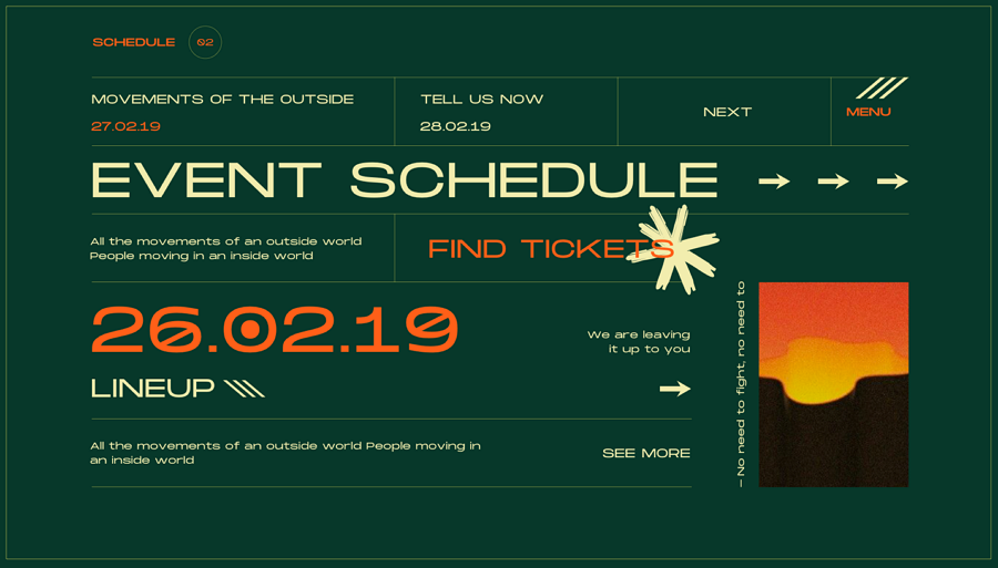
The Nino Event landing page is a landing page that perfectly uses visual contrast to quickly show off all important event details. The color contrast shows the event date, "find tickets" buttons and menus. The different font size has contrasts that move the focus to the text content with a larger size. The gridded frame also helps create a clear layout. Even without the image, you are also able to quickly find the content you want.
Our team likes the green version. How about you, do you prefer the green version or the yellow version?
Price: $13
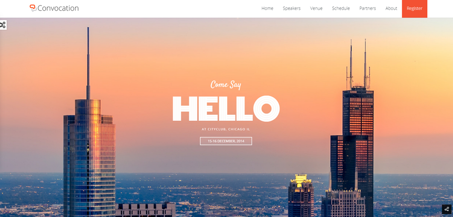
Convocation is a full-featured HTML 5 template for both online or local events and conferences. Its landing page comes with a high-quality hero image slider to grasp visitors' attention as soon as they enter the website. Pages include a full-featured registration form, a one-page navigation design, unlimited color options and many more designs that make it easy to suit your needs.
Price: $13
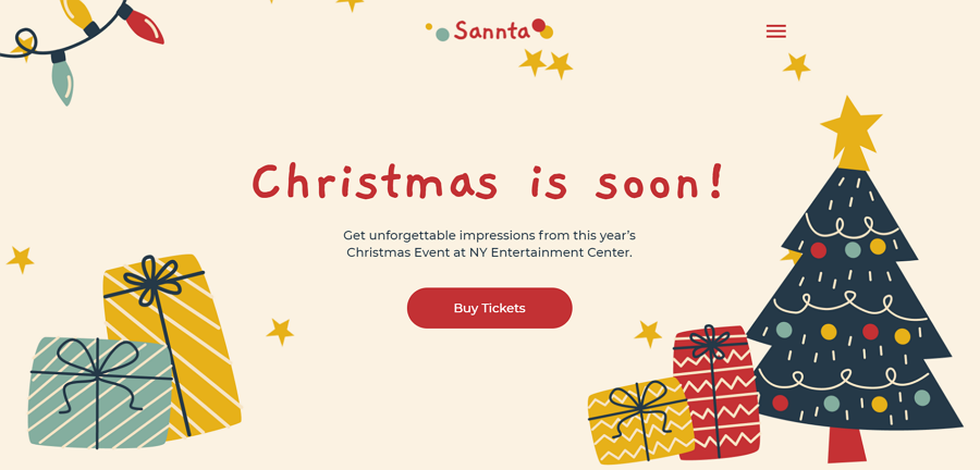
This event landing page template offers design inspiration for Christmas sales.
To create a festive mood, this template offers fabulous carousels, Christmas-themed images and a clear ticket pricing design. The ticket booking form is easy to operate. The minimal design stands out for the theme and content.
Price: $12
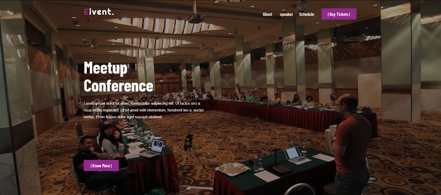
Need an event landing page to promote your meetup conference? Eivent is perfect. It is fully customizable and responsive. You can directly embed a video background to quickly show how interesting or wonderful your previous meetup conferences are. There is also a linear map to help you showcase the schedule of your meetup conference.
Price: $13
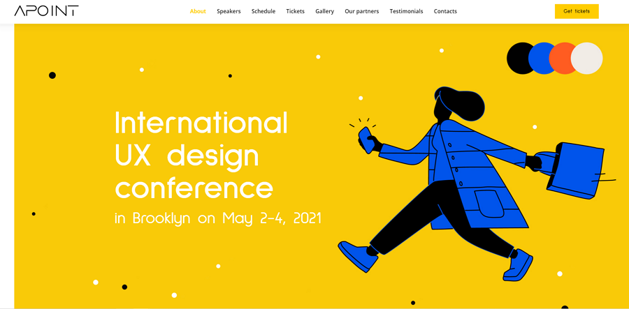
If you are looking for an illustration style template, you can try Apoint. Apart from the eye-catching illustrations scattered all over the website, this template also offers brilliant animations and transitions to improve the user experience. The modern color scheme, simple contact form, detailed schedule, eye-catching pricing and event dashboard and even more designs help to create your own killer event landing page with ease.
Price: $13
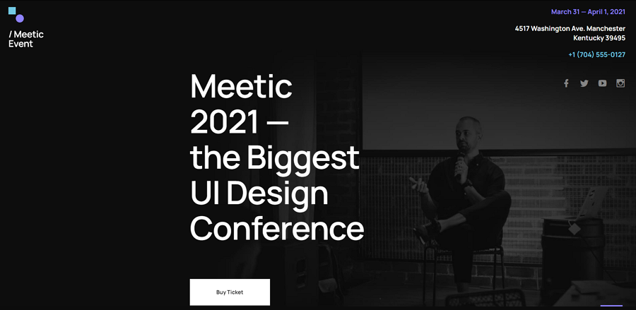
Meetic is an HTML5 event landing page that features a modern and informative layout in a more minimalistic style. It allows you to add any kind of content, such as text, images, videos, Google maps and more. There is also an image slider to showcase the images of the past events, and a testimonial section to present the voices of previous attendees. The registration form is also easy to follow and helps increase signups.
Price: $44
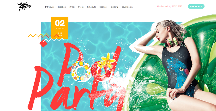
Festy Event template offers 10 demos for ladies' nights, beer festivals, outdoor camps and more. Each demo is fully responsive and editable. You can freely use the pre-made load transitions, intro sliders, along distinctive typography designs to promote your own event. The one-page navigation design is also worth a try!
Price: Free
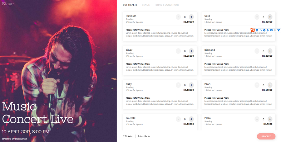
Stage is a free event landing page that helps you sell tickets for live events such as concerts. The split-screen layout divides the landing page into two sections. One section for presenting the event details with images, dates and locations. And one section for showing the ticket information. Google maps are also embedded to help visitors find the location and see how to get to the location.
Price: Free
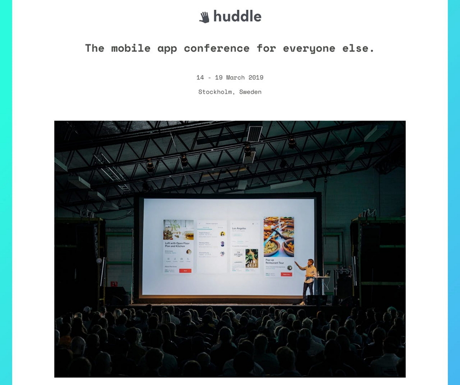
Huddle is a free HTML template for you to promote a coming event or conference. It includes all types of event page elements, such as headline images, event intro, speakers, sponsors, testimonials and booking buttons. This free template is a nice tool that helps you quickly create your own event landing page.
 Mockplus RP
A free prototyping tool to create wireframes or interactive prototypes in minutes.
 Mockplus DT
A free UI design tool to design, animate, collaborate and handoff right in the browser.
