Online traffic has become an important source of customers for banks, finance advisor/investment/insurance companies and similar organizations. However, for the website designers of these financial companies, designing or choosing a professional, trustworthy and engaging financial website is not easy.
Are there any tips or tricks for choosing or designing an appropriate and valuable online website for your financial company?
In this article, Mockplus has gathered 15 of the best and latest financial website design examples, templates and tips for you to design or choose a proper website for your bank, marketing/investment/accounting/advising company/agency. We hope they can help you come up with a great design of your own:
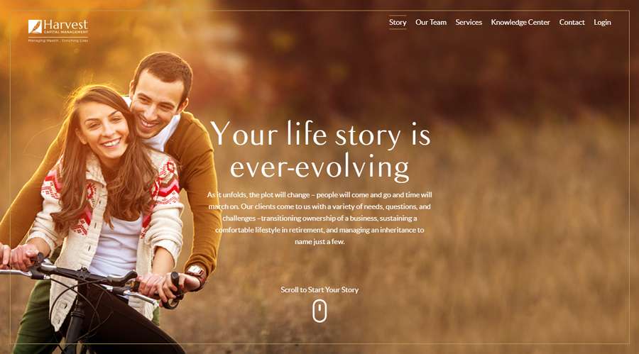
Website theme: Wealth management website
Rating: ★★★
Highlights:
“Image + Text” pairs always make a website clean and easy-to-browse. This financial website follows this idea and uses perfect “Image + Text” pairs to illustrate its capital management services clearly, offering users a more pleasant experience.
What can you learn:
Pair your web copy with photos to create the best finance websites
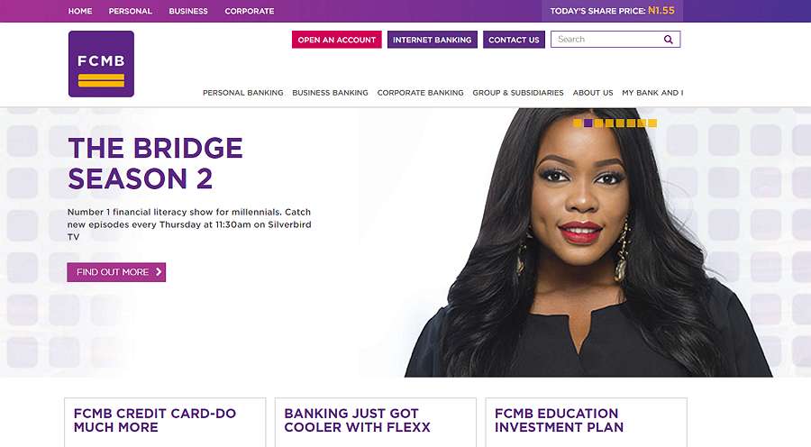
Website theme: Commercial banking website
Rating: ★★★
Highlights:
This banking website features showcases a large photo carousel featuring its products on its home page, displaying promotion news, hot products and bank information instantly.
In addition, the top navigation bars and card designs also create a clear layout, enhancing the overall UX.
What can you learn:
Create an informative and eye-catching website with product photo carousels
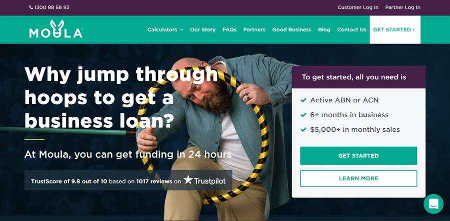
Website theme: Loan website
Rating: ★★★
Highlights: Humorous designs
Humorous words or photos always catch users’ attention easily at the first glance. This loan website follows the idea and uses a humorous “image + text” pair on its landing page to impress users.
What can you learn:
Humor always makes a website design stand out
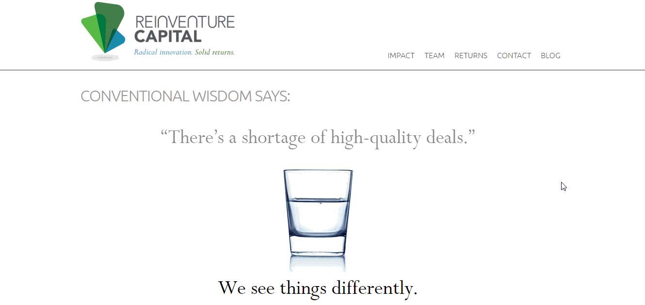
Website theme: Capital management website
Rating: ★★★★
Highlights:
Good copy designs sometimes directly affect the quality and commercial value of a website. This capital management website uses creative copy designs to show its unique investment concepts clearly – “We see things differently”.
Unlike most financial websites that use lots of words and photos to present their services and successes, this website is a good example of minimalist website designs, using simple words and a few photos to prove that it is indeed “different”.
What can you learn:
Create amazing copy designs to make your website different
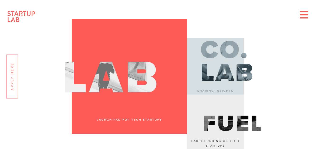
Website theme: Startup funding & investing website
Rating: ★★★★
Highlights:
Big and bold typography design is one of the hottest website design trends in 2018. This tech startup funding website follows this trend and uses an excellent typography design to attract users on its Home page.
What can you learn:
Use fashionable design trends to create a trendy finance website
Design tutorial recommendations:
17 best typography design websites & Tutorials
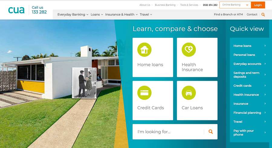
Website theme: Business banking website
Rating: ★★★★
Highlights:
Cua is an online business banking website that presents its banking, loan, insurance and health services with very clean UI card designs and powerful navigation designs.
Users can quickly find the services they seek through a top navigation bar and right-hand sidebar. For more details, one can easily click UI cards scattered across on the entire website.
What can you learn:
Optimize your website with powerful navigation designs and card designs
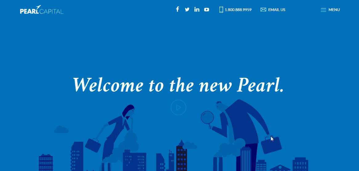
Website theme: Capital & investment website
Rating: ★★★
Highlights:
When compared to static texts, high-quality video always tells a story more clearly and vividly. The designer of this financial website has realized this and directly uses videos to introduce everything.
Its cool illustration design style is also worth considering for website designers.
What can you learn:
Videos help enrich your website design
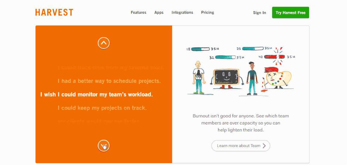
Website theme: Capital & investment website
Rating: ★★★
Highlights:
This website example features a unique carousel design to attract users. Its cute and beautiful illustration design style is also engaging.
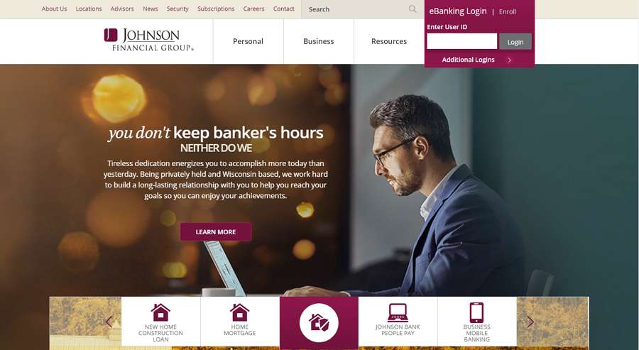
Website theme: Online banking website
Rating: ★★★
Highlights:
To offer a better UX, this online banking website uses parallax scrolling designs to enable users to browse the site smoothly. Its striking color scheme also grasps user attention and arouses their interests.
What can you learn:
Enhance website UX with parallax scrolling designs
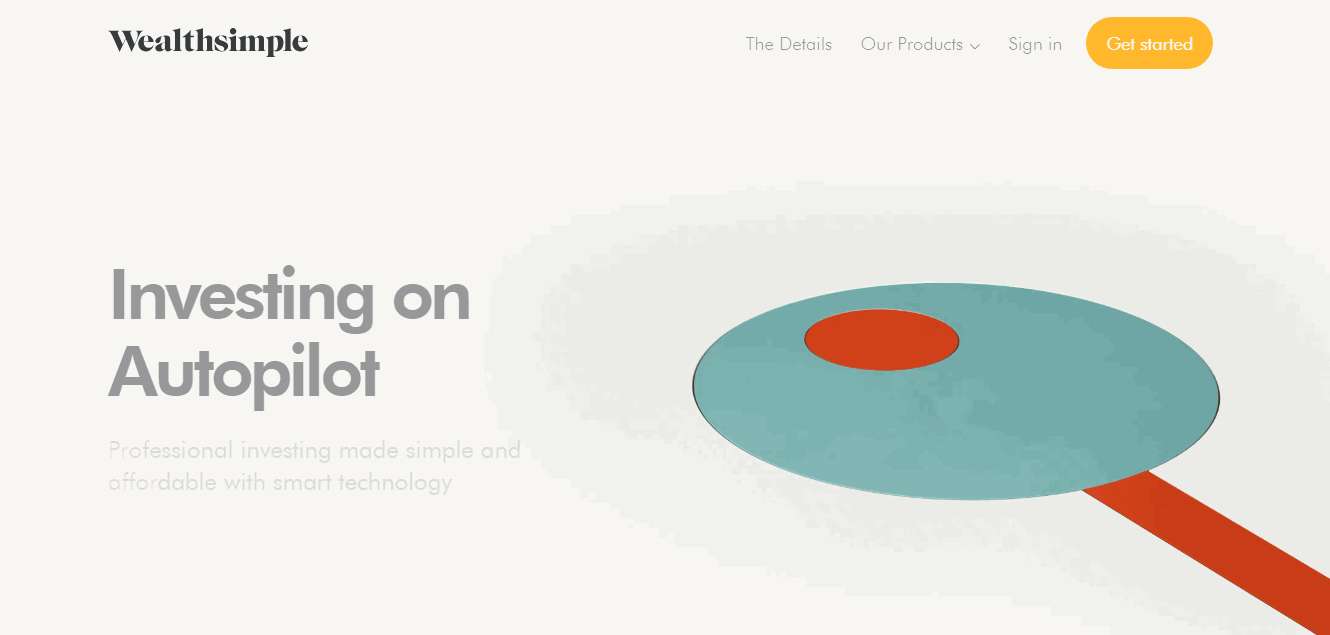
Website theme: Business & Finance website
Rating: ★★★★★
Highlights:
This illustrative finance website template is an online investment website designed with a minimalist design style. It pairs interesting animations with simple words to showcase its products and previous investing outcomes clearly, effectively persuading users and gain their trust unconsciously.
Its interactive chart encourages users to spend more time on the website.
What can you learn:
“Text + animation” pairs make your website design stand out easily
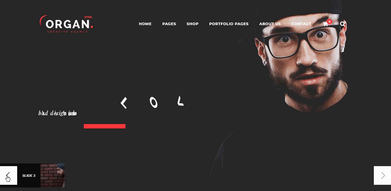
Website theme: Finance website
Rating: ★★★★★
Highlights:
This responsive HTML5 finance website template features a high-end large photo carousel that showcases its products and services. The animated texts and red accents make the entire website visually engaging.
What can you learn:
Create an engaging financial website with animated texts and photos
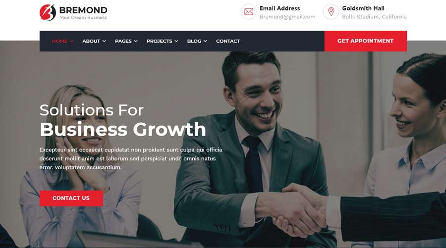
Website theme: Financial consulting website
Rating: ★★★★
Highlights:
Layout mask designs, another popular website design trend of 2018, shifts away from background photos and emphasizes the interface text and contents. This HTML finance consulting website template follows this trend to create a useful, high-end-looking website.
Website theme: Financial advisor website
Rating: ★★★★★
Highlights:
This responsive HTML5 WorldPress financial advisor website is mobile-friendly and features excellent visual designs. Its linear roadmap, full-screen layouts and customized headers and footers are worth considering for designers/financial companies.
What can you learn:
Create a remarkable finance website with gorgeous visual designs
Visual design always helps attract users. It is a good design idea to consider such elements, such as an eye-catching color palette/video/visual effect, a creative typography or layout, and humorous illustrations, etc.
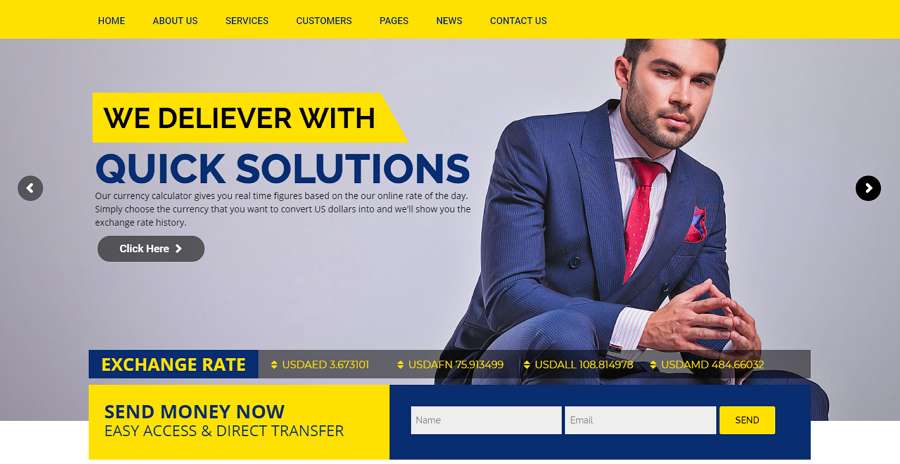
Website theme: Money exchange & finance business website
Rating: ★★★★
Highlights:
This WordPress website template uses a bright color scheme to grasp user attention. Its fixed top navigation bar allows users to locate or switch to any needed page freely regardless of their current location within the site.
What can you learn:
Make a visually appealing website with appropriate color schemes

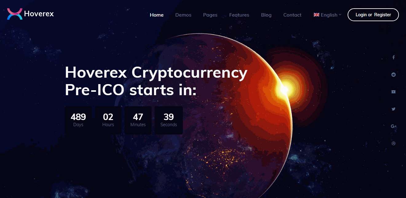
Website theme: Cryptocurrency website template
Rating: ★★★
Highlights:
Online virtual currency trading is an important part of online capital managing and investing. This responsive cryptocurrency website template is an ideal option for online digital currency trading sites/firms. Its responsive design, which is mobile-friendly, extends users effectively.
Design tutorial recommendation:
12 best responsive web design tutorials to get you started
We hope this collection of the top 15 best financial website design examples and templates will help you create or find a wonderful finance website design of your own.
Effective and handy design tools are always essential for designers or product teams to make creative and beautiful websites. To create a professional and striking financial website, you can start your design with useful web prototyping and collaborating tools as below:
Mockplus, an easier and faster prototyping tool, is a good design tool for you to quickly translate your design ideas into interactive prototypes, iterate, test and share them with ease.
Mockplus offers many powerful features for you to easily iterate and test your financial website design ideas, such as its powerful component library, icon library and component style library, rich interaction commands, various ways to test and share a prototype, etc.
iDoc is an online design collaboration and handoff design tool for designers, developers and product managers to communicate and collaborate online effectively.
iDoc offers five powerful modules (including Storyboard, Spec, Comment, Prototype and Document) for product teams to easily import designs, view and download specs and assets, create clear UI flow and interactive prototypes with simple drag-and-drop, gather design feedback and upload design documents with ease.
Its team collaboration and management function helps product team manage their team members and projects effortlessly.
Its special Photoshop/Adobe XD/Sketch plugin helps designers import designs (with spec and asset details) from Sketch/Adobe XD/Photoshop with simple clicks.
Overall, while choosing or designing financial websites, it is best for you to follow and practice these design tips outlined above based on your specific product features and company conditions.
For example, while trying to design an online banking website, which requires a large amount of texts and photos, it is the best for you to focus on the page layout and navigation system designs for better UX.
 Mockplus RP
A free prototyping tool to create wireframes or interactive prototypes in minutes.
 Mockplus DT
A free UI design tool to design, animate, collaborate and handoff right in the browser.
