Fonts are one of the essential elements of typography, which has a huge impact on the entire interface. To help designers enhance their ability to create a successful and readable interface, Mockplus has hand-picked 30 of the best free classic fonts that you can download directly.
Designer: Paul Renner
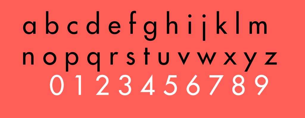
Among all of the fonts available nowadays, Futura is probably one of the best classic sans-serif fonts that designers use most frequently. It was released in 1927 and has an excellent blend of geometry, minimalism, and modern style. That makes Futura one of the best fonts for screen design, typography, and printing of all time.
Designers: Eduard Hoffmann and Max Miedinger
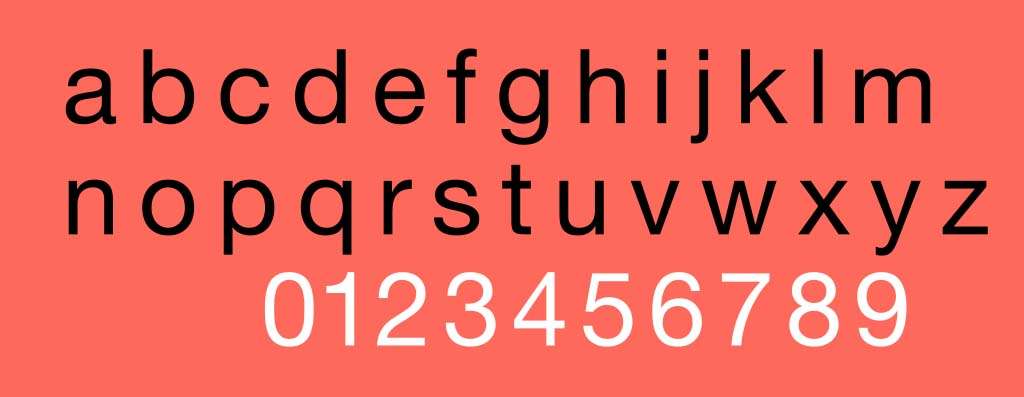
Helvetica is one of the most famous and popular sans-serif typefaces released by the Haas Type Foundry. Since it was released in 1957, Helvetica has become the most used classic font on all kinds of typographic projects because of its excellent support for a smooth reading process. The US government and brands such as 3M, BMW, Microsoft use Helvetica for logo designs and government documents.
Designer: Robert Slimbach
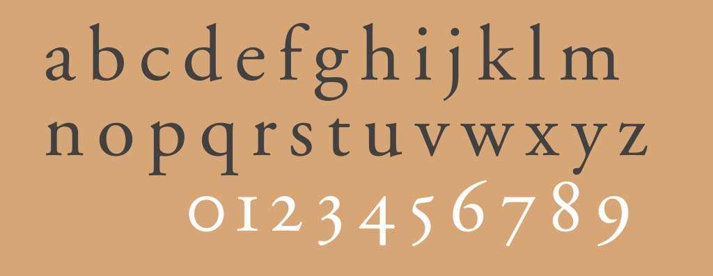
Adobe Garamond is probably one of the most famous classic serif fonts. It was released in 1989 and has been widely used for body text in books. Adobe Garamond also has a number of different variations that were designed by other designers. Robert Granjon is one of the designers who has contributed to the evolution of Adobe Garamond.
Designer: Adrian Frutiger
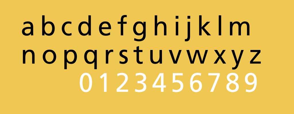
Frutiger is a classic font that is among the most widely used sans-serif typefaces and has been a top choice for sign system design and other visual design fields. Frutiger was designed by Adrian Frutiger in 1968. It is very interesting that the font is named after the person who designed it.
Designer: Caslon Classico
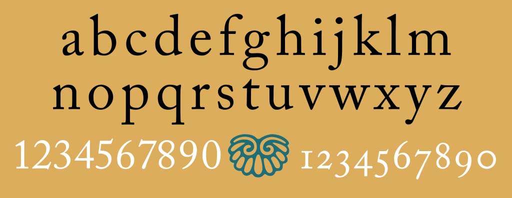
Caslon is a very classic and sophisticated serif typeface designed by William Caslon. Like Frutiger, the designer named the font after himself. Caslon retains a strong old-school look, elegance, and graceful style. In 1993, the designer Franko Luin created a widely used font Caslon Classico based on Caslon.
Designer: Hermann Zapf
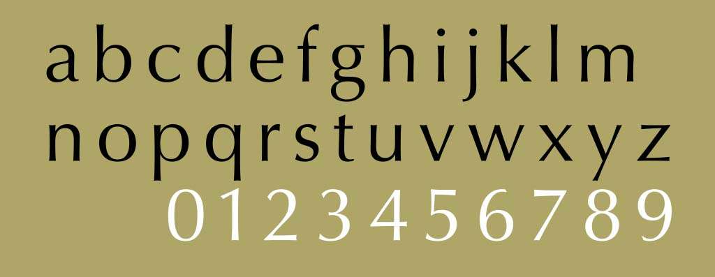
Optima is another famous classic font that has been widely used by brands and designers for expressive typography in print and on-screen. Both Optima and Helvetica belong to the award-winning Monotype Library which was created by the Monotype company. Over the years, Monotype has created several distinct typefaces and has won many awards. Optima is one of their famous classic fonts.
Designer: Albert-Jan Pool
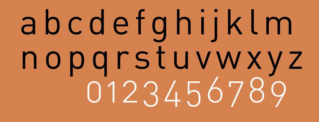
Din is one of the most popular fonts that has been widely used for traffic signs and other public places, especially in Germany. Although it is relatively new compared to other classic fonts, Din has become one of the fonts that designers love the most. The biggest reason for its popularity is that it was created based on GIRF, so it can be used to create the most excellent typography.
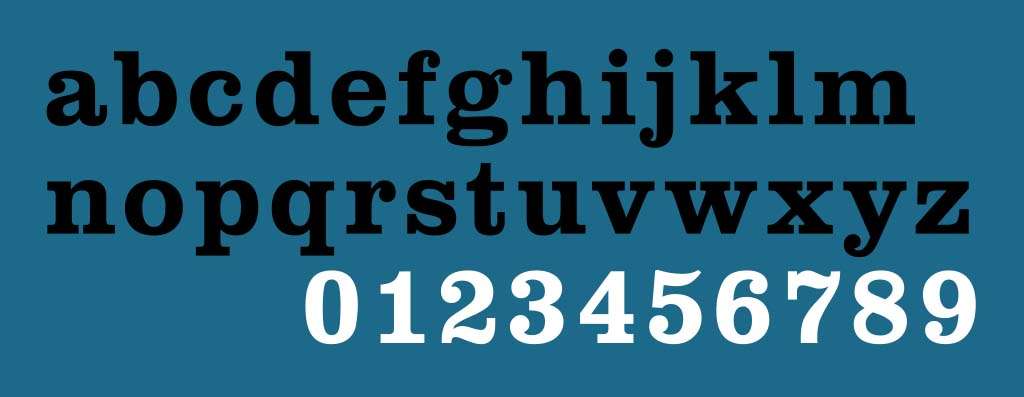
Another classic font that has been widely used for lettering, printing, and signage is Clarendon. It is a serif font released in 1845 and features a bold and solid style. This unique feel and look made it popular in a very short time, and also inspired many other designers to create a number of different varieties of this font.
Designer: Matt Carter
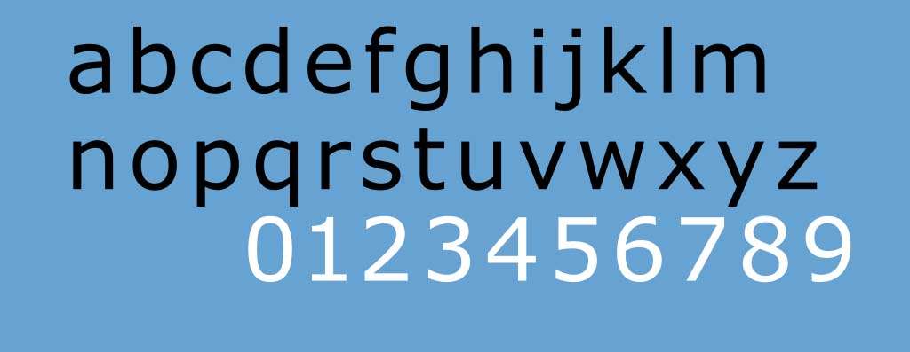
Verdant is one of the classic fonts that are specially designed for web design and UI design. It is actually a variation of the Frutiger font, which is primarily a print font, so Matt Carter made some changes so that it can work properly on digital screens. Verdant is quite popular in the digital design area and there are a number of web designers, UI designers and UX designers using it to design websites or apps regularly.
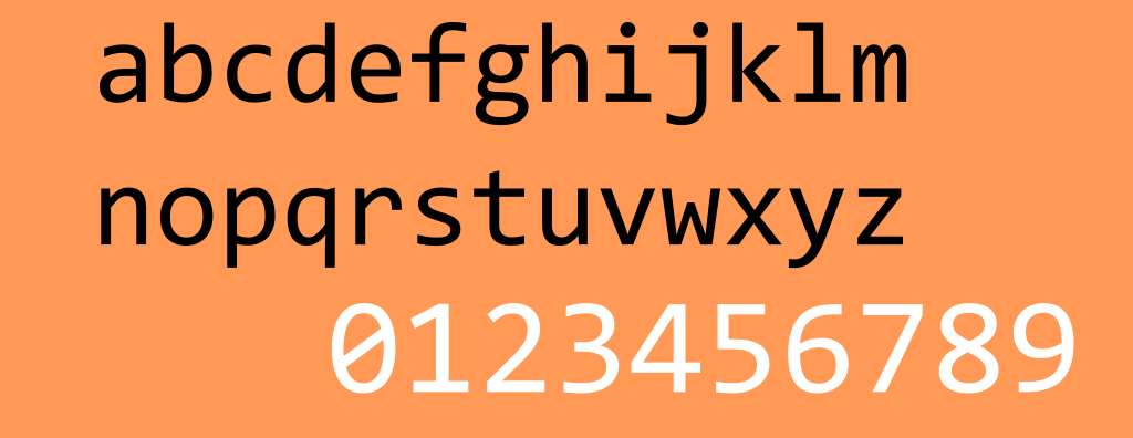
Consoles is a classic font designed for a specific reason. It has been widely used for programming because it has great readability and recognition no matter how much the font size is reduced. This unique feature allows developers to view and read their code quickly and effortlessly. But Consoles is rarely used in design or print.
Designer:Giambattista Bodoni
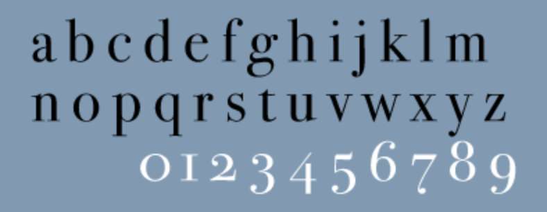
Bodoni is a very classic and romantic serif typeface that has been widely used for magazines, posters, and books. It has a long history of interpretations since it was created in 1798. In the 20th century, Morris Fuller particularly revived it for ATF. Bodoni features a cutting edge style and has a strong contrast between different weights.
Designer: Aldus Manutius, Frank Hinman Pierpont, and Francesco Griffo
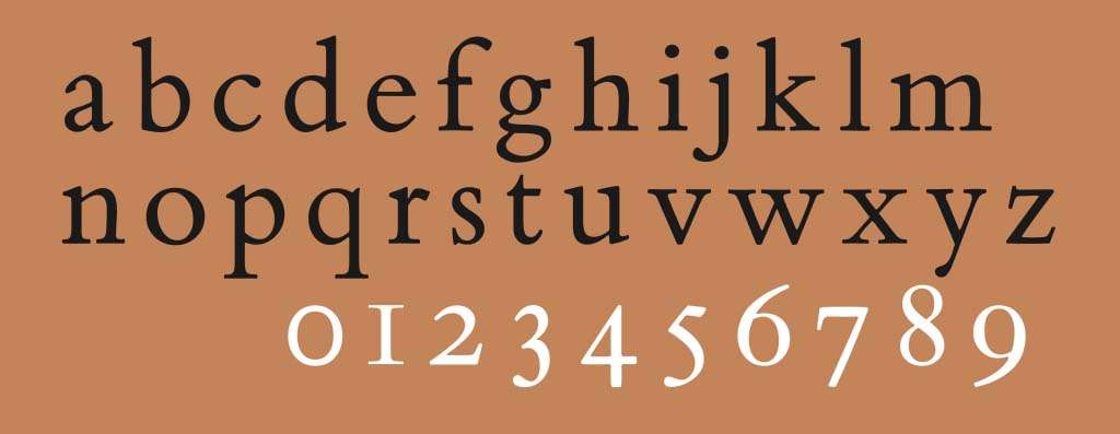
Bembo is one of the most popular typefaces for printing. Since it was released in 1929, Bembo has been widely used in books, newspapers, and other printed material. It comes with a number of different cuts, symbols, and numbers, and has detailed emphasis on many excellent font weights.
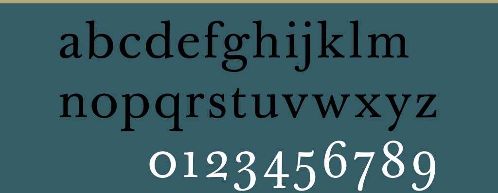
Baskerville was designed by John Baskerville and George William Jones. It comes in 4 different font weights - Bold, Italic, Roman and Bold Italic. This makes it one of the best fonts that can be used in text, headline and other occasions. Even if designers use only this typeface, they can create excellent designs with different levels of layers.
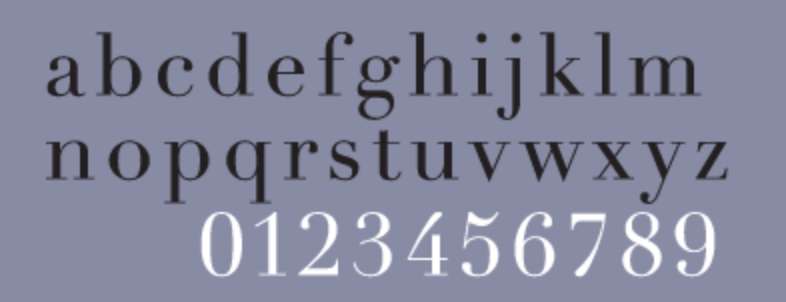
Didot is a sans-serif classic font named after the famous French printers. It features a strong sense of contrast with increased stress on different weights and has a feel that is romantic, modern, and neoclassical.
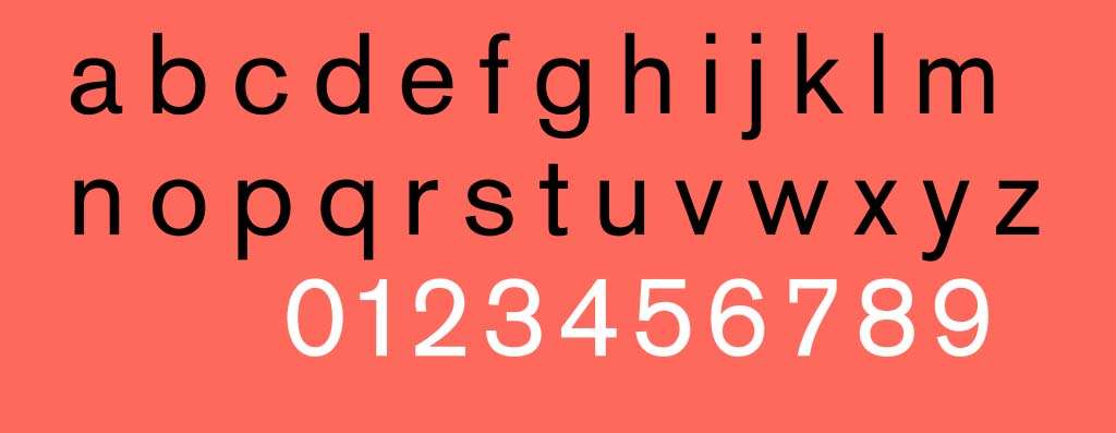
Akzidenz Grotesk is one of the most famous classic sans-serif typefaces released by the Berlin-based Berthold Type Foundry in 1898. Some classic fonts such as Helvetica were even created based on Akzidenz Grotesk.
Designer: Herman Zapf
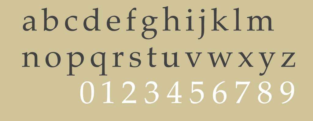
Palatino is an old-style serif typeface that was designed based on the calligraphic design in 1986. It soon became popular in body text because of its solid structure that can be read clearly on even poor-quality paper and printing.
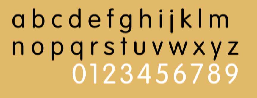
VAG Rounded, also known as VAG Rundschrift, is a geometric sans-serif typeface designed in 1979. It features rounded terminals on all strokes. It is one of the most used fonts on the website of Rede Globo, in its logo design and many in-store elements.
Designer: Mark Simonson
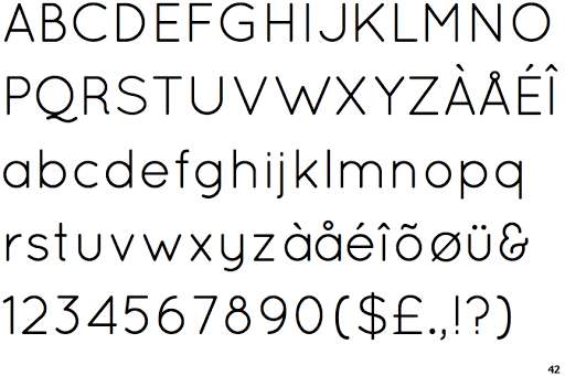
Proxima Nova is one of the famous classic typefaces that designers use very frequently because of its versatility. It has 7 different weights and each of them matches well with other elements. Proxima Nova has been widely used in web design for headlines, body text, and even logos.
Designer: Carol Twombly
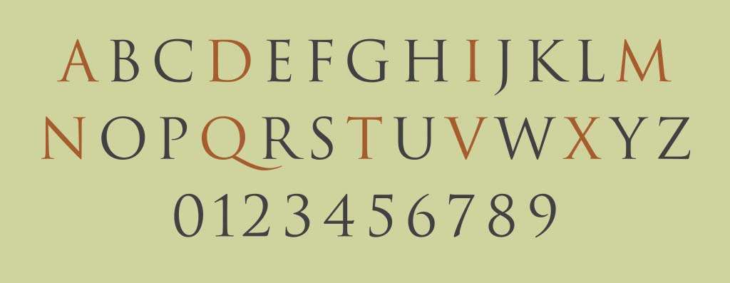
Trajan is one of the popular serif typefaces designed in 1989. Carol Twombly has been designed especially for Adobe. It is based on the letterforms of capitalis monumentalis or Roman square capitals. Trajan has been widely used in film posters.
Designer:Claude Garamond
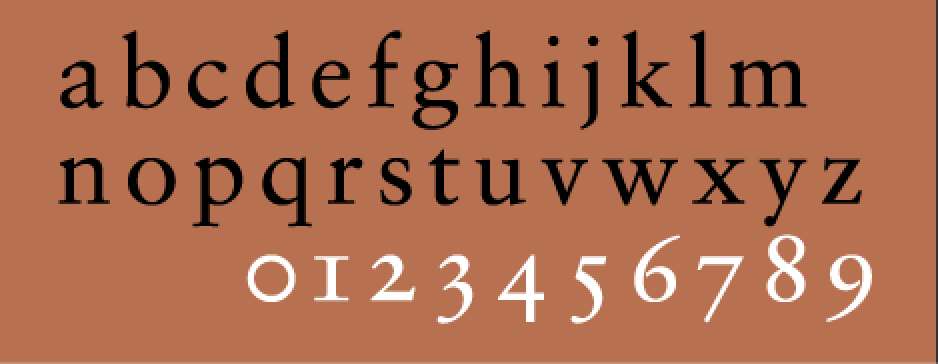
Sabon was actually designed by multiple designers - Claude Garamond, Jan Tschichold, Hecto Haralambous, and Alexei Chekulayev. It was released in 1967 and has become quite popular over the years. It has a number of different weights and all of them come with semi-sharp edges that can make the typography more vivid.
Designer: Adrian Frutiger
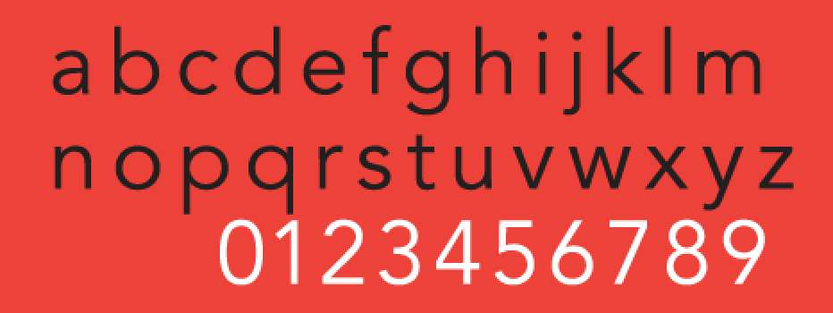
Among all of the geometric sans-serif typefaces, Avenir is probably the one that you must have heard of or even used. It has several weights that can bring more levels of depth to a design.
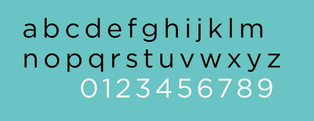
Gotham was released in 2000. And over the years it has become one of the most popular sans-serif fonts that designers love. It features a clean and modern look and can be used on-screen and in print.
Designer: Erik Spiekermann
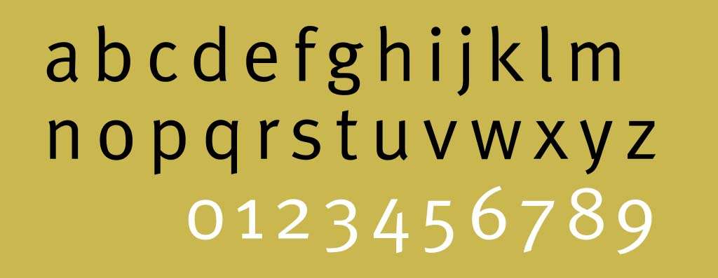
Meta is a well-known modern classic typeface. It was designed by Erik Spiekermann in 1986.
Designer: Matthew Carter
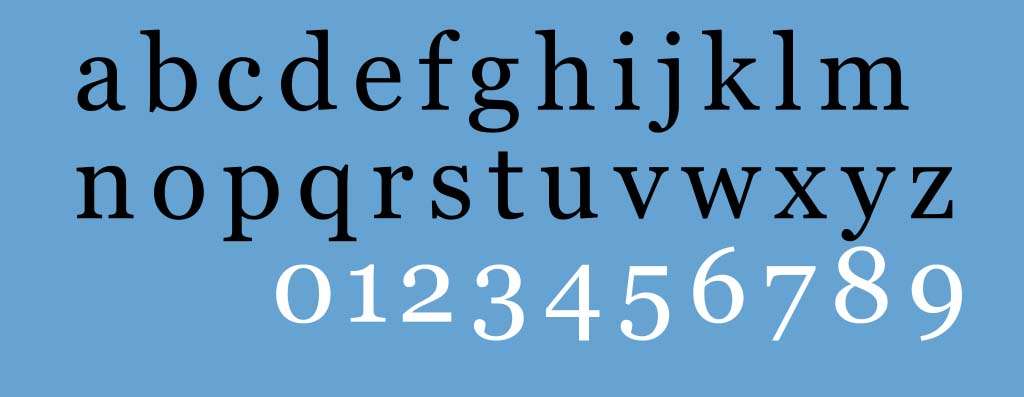
Georgia is a very traditional serif typeface. It was designed in 1993 by Matthew Carter. It was designed with the intention of making the typography more elegant and remain legible on small printed material or low-resolution screens. It shows a number of traditional features such as thick and thin strokes, ball terminals, and a vertical axis.
Designer: Danilo De Marco
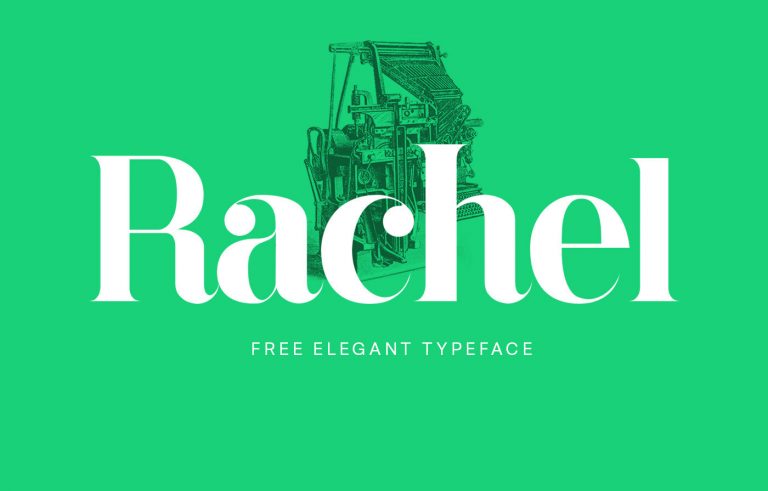
Rachel is a very classic serif typeface. Although it was designed in 2015 and only has a very short history compared to other famous fonts, it has enjoyed increasing popularity over the years. It was inspired by the Bodoniano and Lapidale fonts. It comes with elegant details so it would look impeccable on both headings and paragraphs.
Designer: Jelle Bosma
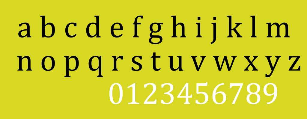
Cambria is a very typical classic font that is designed for letterforms. It was actually designed by 3 of the best typeface designers of the 20th century - Jelle Bosma, Steve Matteson, and Robin Nicholas for the Microsoft font collection.
Designer: Hannes von Döhren
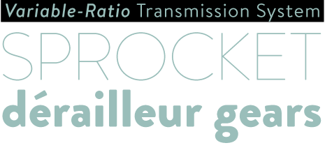
Brandon Grotesque is a classic sans-serif font that features elegant, functional, and slightly rounded corners. All these features make Brandon Grotesque one of the most versatile fonts for headlines and body text. It also comes with a diverse range of weights. The designer is also the owner of a famous type foundry HvD Fonts.
Designer: Iván Núñez
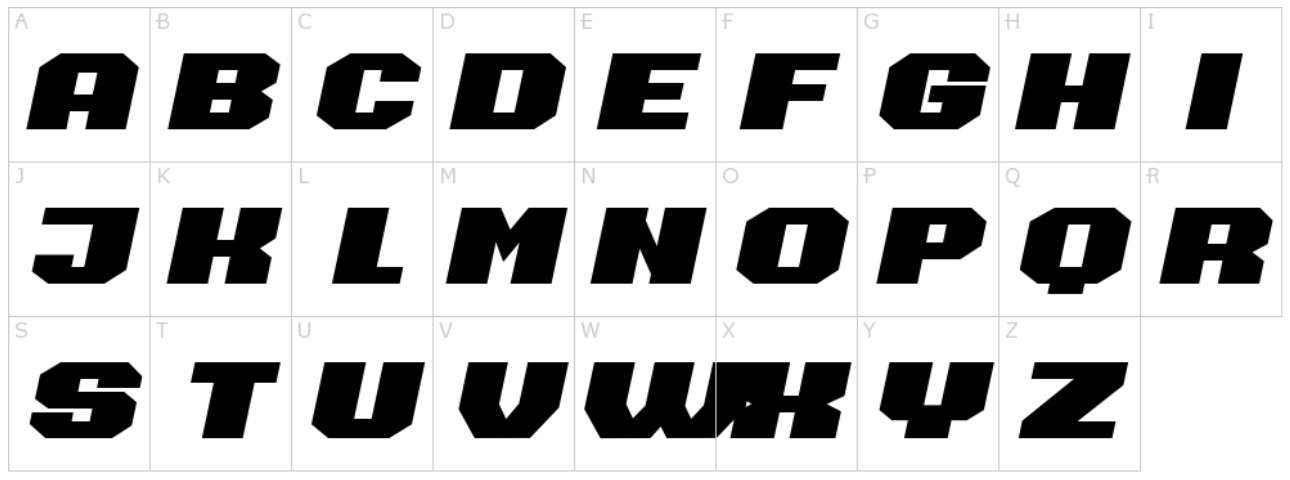
Barbara has a very warm touch because of its beautiful, traditional, and classical style. It was designed by the typographer Iván Núñezand who was dedicated to adding a strong vintage look to the font. Over the years, Barbara became more popular and has been widely used in both print and digital projects.
Designer: Bruno Sáez López
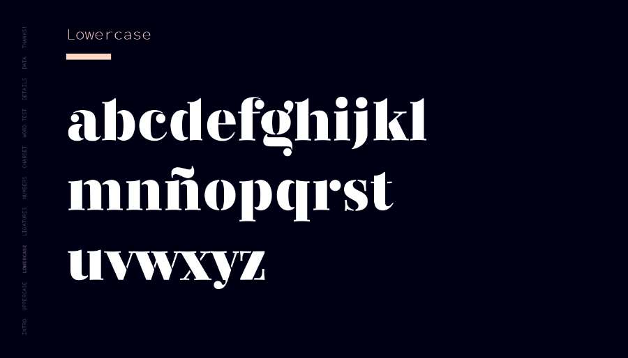
Among all the fonts, Regattia is one of my favorites. It has a very beautiful look, and even the details are quite appealing. Also, it has high functionality because it supports a number of different languages and is perfect with headlines, logos, websites, and posters. Nowadays, many graphic designers also use it for packaging and branding design.
Designer: Dala Floda
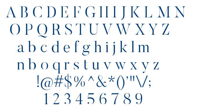
Butler is one of the best free classic serif fonts available nowadays. Due to its modern look and feel, it became very popular in both printed material and digital projects. Its design was inspired by the Dala Floda font family and the Bodoni font family.
We have listed 30 of the best classic fonts above. If you have any other suggestions that should be listed on this post, please feel free to let us know. We hope that the 30 fonts bring you some inspiration in typography design.
 Mockplus RP
A free prototyping tool to create wireframes or interactive prototypes in minutes.
 Mockplus DT
A free UI design tool to design, animate, collaborate and handoff right in the browser.
