Ghost buttons, characterized by a transparent rectangular background and simple text, are frequently used alongside solid buttons to signify secondary or less urgent call-to-actions. They play a pivotal role in crafting clean, accessible, and sophisticated interfaces.
But how familiar are you with ghost button design? What key principles or tips should you follow to create an effective ghost button for your web or app design? Is it necessary to pair every solid button in your interface with a ghost button?
This ultimate guide will walk you through everything you need to know about ghost button design. You'll discover actionable best practices, learn essential design rules, and explore 16 inspiring examples to spark your creativity.
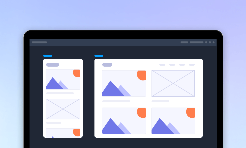
Plus, you can test all the tips and best practices shared here using our free prototyping tool.
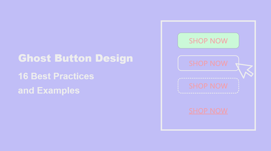
Ghost buttons are transparent or semi-transparent buttons outlined with a thin border and contain simple text. Because of its special "appearance", people also call it as “empty”, “naked” or “hollow” buttons. They’re often used in modern UI/UX designs to create a clean and minimalistic look. Their unobtrusive appearance makes them ideal for secondary actions where the focus needs to remain on the primary content.
What are ghost buttons
Before incorporating ghost buttons into your design, it’s essential to understand their advantages and potential drawbacks.
Solid Buttons are some buttons with a solid background color that stand out prominently, which is perfect for primary CTAs like “Buy Now” or “Sign Up” where visibility and urgency are critical, strongly encouraging users to take actions immediately.
Outlined Buttons are some buttons with a visible border and no background fill, offering a balance between subtlety and emphasis. It is suitable for secondary actions requiring moderate emphasis, such as “Cancel” or “More Options”, all without distracting from the primary focus.
Ghost Buttons are some transparent buttons with a thin outline, blending into the background for an elegant look. It is best for secondary actions in minimalistic designs, such as “Learn More” or “View Portfolio.”
Ghost buttons are ideal in specific contexts where their subtle design complements the user interface and enhances usability without overwhelming the layout. Here are the key scenarios where ghost buttons work best:
Ghost buttons are perfect for secondary actions that are less critical compared to primary CTAs. For instance, in a form submission, the "Submit" button might be solid, while the "Reset" or "Cancel" button is a ghost button.
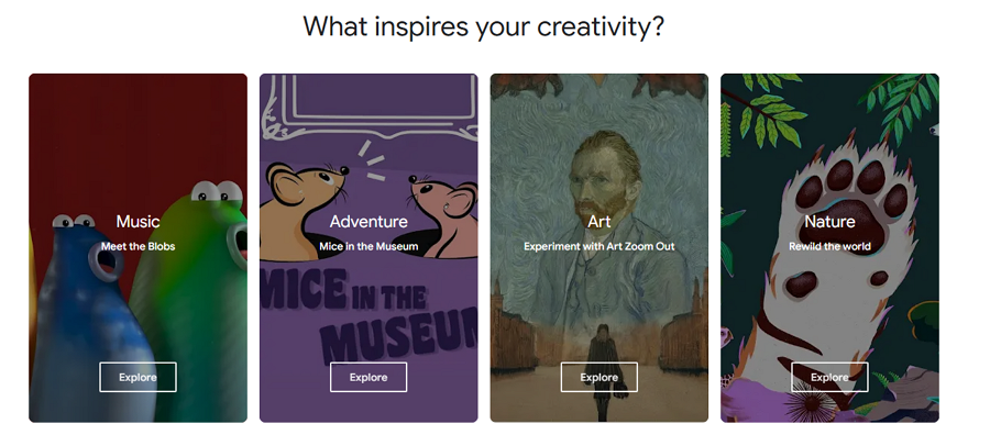
When designing a minimalist interface, ghost buttons can help maintain a clean and modern look by blending seamlessly into the background while still being functional.
Ghost buttons can perfectly blend with minimal style websites
Ghost buttons can accompany solid buttons, offering users additional but less emphasized choices. For example, a "Learn More" ghost button paired with a solid "Sign Up" button allows for hierarchy in decision-making.
Ghost buttons without solid background colors have less visual appeal than primary buttons, subtly guiding visitors to click the primary buttons for more details.
If the interface heavily relies on engaging visuals like hero images or video backgrounds, ghost buttons can stand out without detracting from the visual content.
Ghost buttons never distracts users' attention from the hero image background
Ghost buttons work well for actions that guide users through the interface, such as "Skip," "Preview," or "View Demo." These actions are important but not as urgent as others.
For example, the below storytelling website adopts a dashed "Skip" ghost button while telling a story, and allows users to skip if they are in a hurry or don't want to hear about the story:
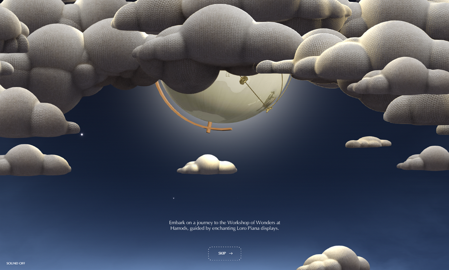
Loro Piana Workshop of Wonders
In onboarding sequences or walkthroughs, ghost buttons can emphasize optional steps or less critical actions like "Skip Tutorial" while keeping the focus on primary steps.
Ghost buttons for CTAs are strategically placed in areas with lower visual emphasis, such as footers, sidebars, or overlays. By being less visually dominant, they subtly guide users' attention toward the solid button, making the primary call-to-action more compelling and likely to be clicked.
When designing ghost buttons, always test how they appear against different backgrounds. Ensure the border and text colors stand out clearly to avoid blending in too much.
For example, against a white background, using a dark gray border with bold text can create a clean and balanced look.
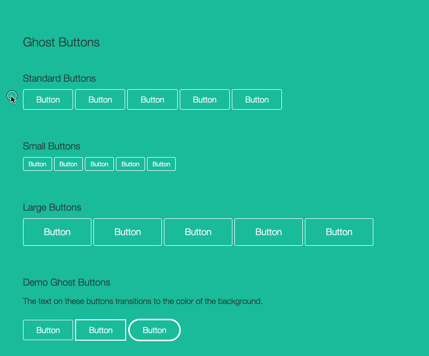
Ghost buttons are less visually prominent, so providing clear visual feedback with different button states helps users easily recognize them as interactive elements and decide whether to click. Ghost buttons can provide different visual feedback through the following states:
Different states with varying visual styles help users identify the button's functionality and interactivity.
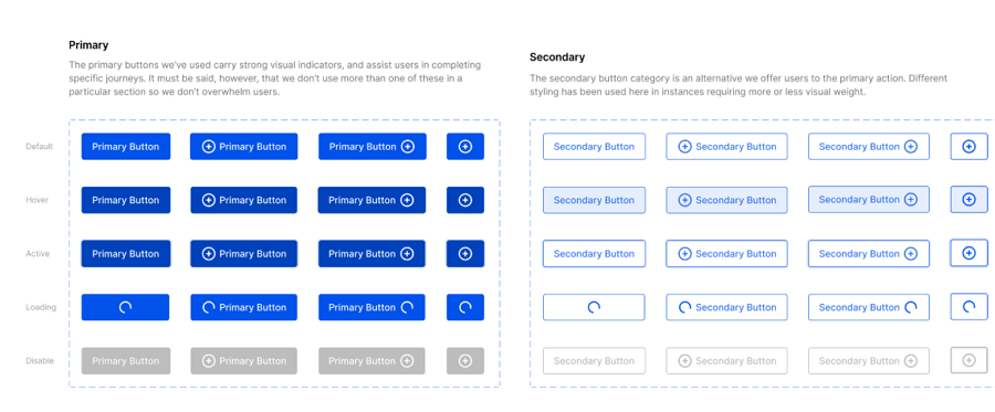
Design with different button states
When used alongside solid buttons, ghost buttons should complement rather than compete. Assign ghost buttons to secondary actions and use visual hierarchy (e.g., size, color intensity) to distinguish between primary and secondary CTAs.
Try pairing a ghost button with a solid button to create clear visual contrast, helping the solid button stand out as the primary call to action.
Using too many ghost buttons can dilute their impact and confuse users. Limit their use to appropriate scenarios, such as in secondary CTAs or minimalist designs.
Test ghost buttons on different devices and screen sizes to ensure they remain functional and visually effective across all platforms.
Ensure that ghost buttons are large enough to be easily clickable, especially on mobile devices. Adequate spacing around the buttons prevents accidental clicks and improves the overall user experience.
Incorporate ghost buttons into the overall visual hierarchy. Use size, spacing, and positioning to ensure they contribute to a seamless user experience without overshadowing the main actions.
Customize ghost buttons to align with the overall design language of your brand. For example, a luxury brand might use metallic or subtle gradient borders to evoke sophistication, while a tech startup could employ a sleek monochrome look.
If appropriate, consider pairing ghost buttons with subtle icons to clarify their purpose or make them more engaging. Icons can give users an immediate visual cue of the action they are about to take.
Ghost buttons work exceptionally well with flat design, as their minimalist style complements the clean, simple aesthetics typical of flat design.
The minimal ghost buttons seem to work perfectly with flat design
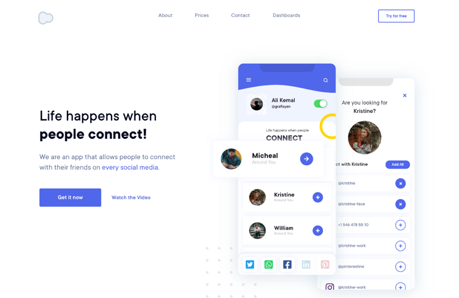
Landing Page Hero UI Design
This landing page example uses a ghost button, even without the commonly-used "outlined rectangle," to highlight the primary button, "Get it now." If users are interested, they can still notice the "Watch the Video" button beside it and click for a video tutorial.
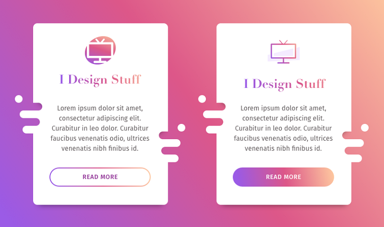
Gradient Button
This design concept showcases how to effectively incorporate trendy purple gradients into web button design. Both the solid and ghost buttons feature distinct styles, offering valuable design practices for your consideration.

Shoe store
This shoe store website uses a large number of ghost buttons, some for navigation and others for purchasing and more. You can explore its pages one by one to gain inspiration and learn design rules in action.
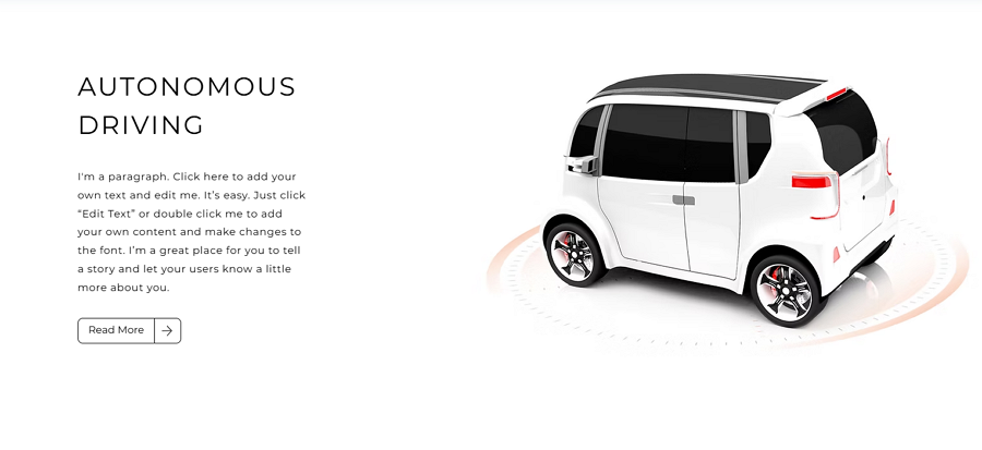
Automo
This online website for self-driving vehicles features a minimalist design style and incorporates a series of ghost buttons to encourage user interaction.
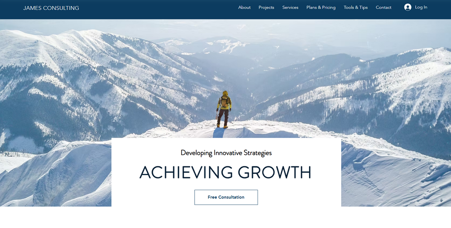
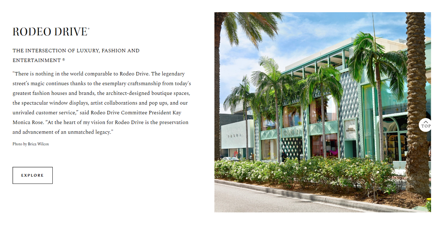
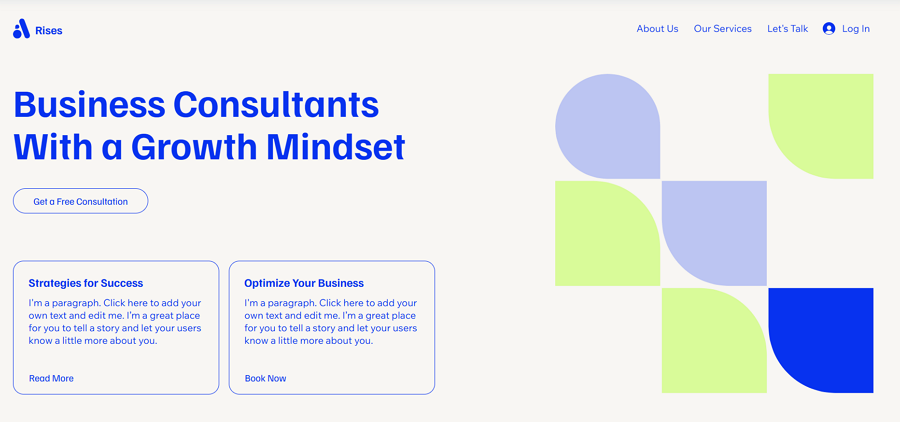
James Consulting
This consulting website is another example of how to use a ghost button on the landing page to highlight the text and button content against a large hero image background.
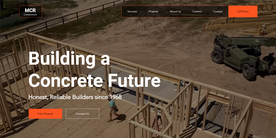
MCR Construction
Ghost buttons are also used over a video background to maintain a clean, non-intrusive design while providing clear calls to action that don’t overpower the visual content. Paired with a solid button, this web example offers two call-to-action options to cater to different user needs.
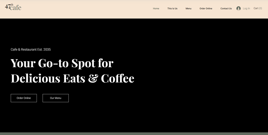
47th cafe
When your website features only ghost buttons, placing two on the same line can give them equal visual focus and importance, creating a dynamic, balanced look that sparks interest and enhances user engagement. So, open this website to confirm how it achieves this.
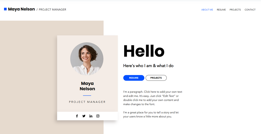
Maya Nelso
Maya Nelson's portfolio website demonstrates how solid and ghost buttons can be used together to guide users, visually encouraging them to first click one and then click the other, creating a clear, intuitive flow for interactions.
Grid website
The trendy grid-style website also incorporates ghost buttons to present the navigation system, offering a clean, minimalist way to guide users through the content while maintaining a modern aesthetic.
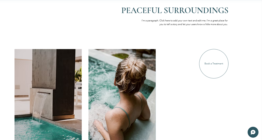
Serenity Health Spa
This health spa website also demonstrates the rule that a ghost button doesn't have to be rectangular; if possible, it can also take on a circular shape, adding a unique touch to the design while maintaining its minimalist appeal.
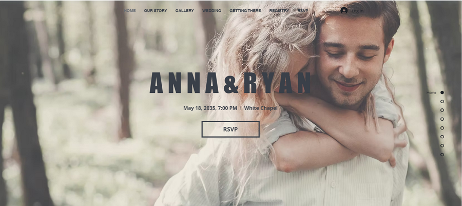
Anna Ryan
Websites with slider landing pages often use ghost buttons to encourage users to click for more details or make a purchase, providing a subtle yet stylish way to drive interaction without overshadowing the main content.
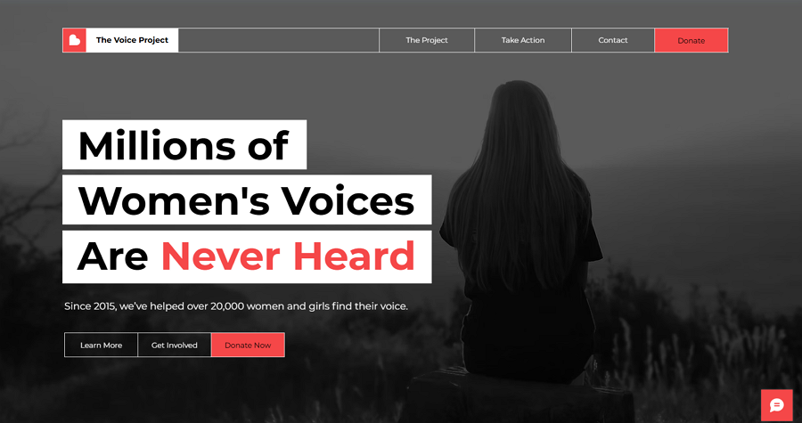
The voice project
This voice project demonstrates that multiple ghost buttons can be used simultaneously when offering several options or actions. Just remember to make the most important option stand out by using a solid button.
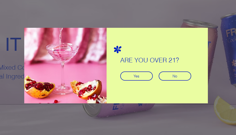
Cocktail Website
This popup design example for a cocktail website uses two ghost buttons with no visual emphasis, allowing visitors to make a choice based solely on their actual facts without being influenced by visual hierarchy.
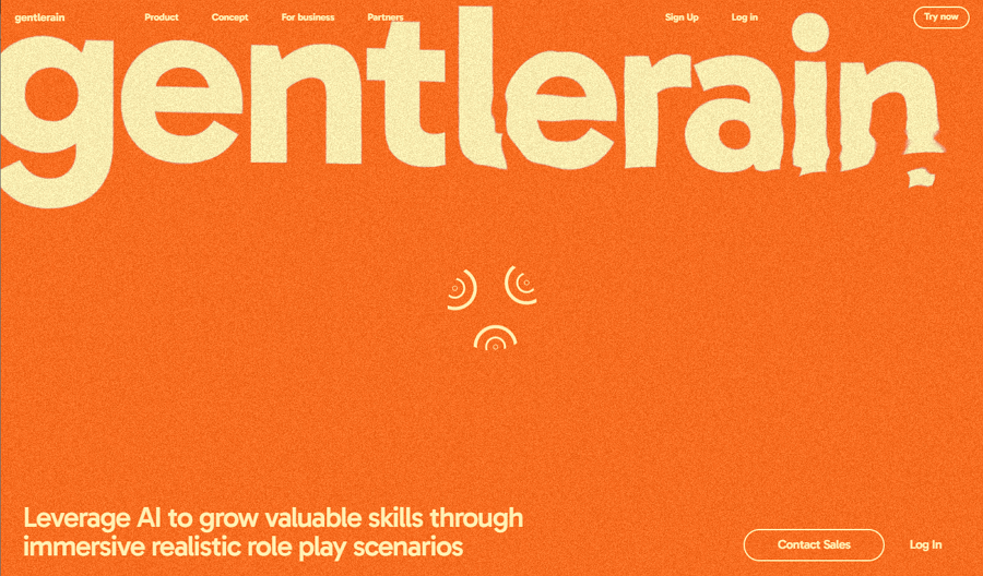
Gentlerain AI
Gentlerain AI is an award-winning website featuring brilliant water-inspired interaction effects, an interactive footer, unique logo animations, and a bright, optimistic color palette. It smartly combines a ghost button with a text-only button to establish clear visual hierarchy, encouraging users to interact with the intended button.
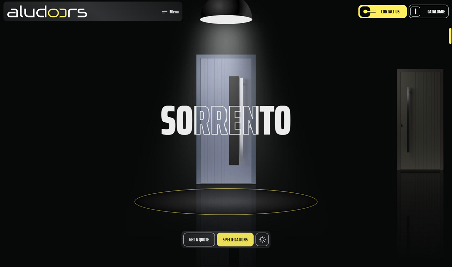
Aludoors
Aludoors, true to its name, is an online store specializing in doors. Its button designs mimic the look of doorknobs and feature door-opening animations, creating an immersive and unique user experience—even for the ghost buttons.
The site is filled with brilliant design details that captivate visitors from the moment they enter. Be sure to check it out for inspiration and ideas for your own projects.
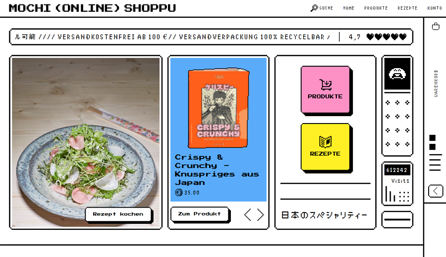
Mochi Online Shoppu
Mochi Online Shoppu is another stylish grid-layout website that combines clean, neat grid arrangements with an eye-catching 80s and 90s vintage design style. Its ghost buttons, featuring zigzagged borders and text, add a unique touch, creating a distinctive and memorable user experience.
Give it a check if you are thinking of creating such a vintage style website for your project.
Ghost buttons provide a subtle way to guide users without overwhelming the interface. However, their effectiveness depends on proper contrast, placement, and usability.
Icons: Enhance visual clarity.
Hover Effects: Indicate interactivity.
Contrasting Borders: Improve visibility on complex backgrounds.
While they work well for minimalistic and creative designs, ghost buttons may not suit action-heavy or accessibility-focused websites without additional adjustments.
Ghost buttons are a versatile and elegant addition to any designer’s toolkit. By understanding their strengths, limitations, and best practices, you can integrate them seamlessly into your projects. Whether for secondary CTAs, hero sections, or creative portfolios, ghost buttons offer a balance of functionality and aesthetics when used thoughtfully.
We hope this ultimate guide to ghost buttons—featuring definitions, pros and cons, best practices, and examples—has inspired you to craft more effective buttons for your next design projects.
 Mockplus RP
A free prototyping tool to create wireframes or interactive prototypes in minutes.
 Mockplus DT
A free UI design tool to design, animate, collaborate and handoff right in the browser.


 Sign up with Google
 Join our Discord community
 support@mockplusapp.com