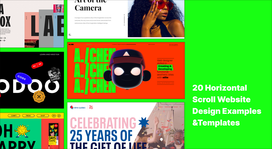
When thinking about website design, most people imagine vertical scrolling, where users scroll up and down to navigate around. However, to create more engaging and unique experiences, some designers also try horizontal scrolling.
But do you know the pros and cons of horizontal scrolling? What principles should you follow to create a horizontal scrolling website that effectively guides and delights users?
In this article, we’ll uncover the design secrets of horizontal scrolling, see when and how to use it wisely, and learn from the best horizontal scroll website design examples and templates. No matter what great idea strikes you while reading, remember to capture it with our free design and prototyping tool.
A horizontal scroll website, as the name suggests, allows users to navigate from left to right, much like walking through a creative art gallery, instead of the traditional vertical scrolling from top to bottom. These websites adopt a different scrolling method, delivering a fresh and unique user experience, helping to engage users and leave a long-lasting impression.

Horizontal scroll actually delivers a unique experience, but sometimes can cause troubles. So, before incorporating a horizontal scroll into your website design, let's first take a look at its pros and cons:
- Perfect to showcase art or design works
One of the most attractive benefits of using horizontal scrolling is that it helps to more effectively showcase images, videos, and similar media related to your design or artwork. Horizontal scrolling not only provides more room to perfectly present the visual appeal of your work but also offers a distinctive experience, akin to viewing artwork in a gallery in person.
This explains why many online art galleries and portfolio websites choose horizontal scrolling.
- Provide unique user experiences
Horizontal scrolling offers an unconventional way to navigate a website, making the experience more memorable and helping it stand out from the typical vertical-scrolling websites. It enhances exploration, making the browsing experience more interesting and immersive.
- Good for visual storytelling
Horizontal scrolling layouts can enhance storytelling by presenting the website content in a sequential, narrative flow. So, many storytelling websites adopt the horizontal scroll design.
- Engage users at first glance
The unusual navigation method of horizontal scrolling can quickly capture users' attention and encourage them to explore more, ultimately leading to longer user engagement.
- Different from the tradition
Being different can sometimes lead to issues. Let's imagine, when people visit a website, because they do have get used to the horizontal scroll way, the horizontal scroll may confuse them more often, potentially prompting them to leave the site quickly due to navigation difficulties.
- Cause some accessibility issue
On one hand, horizontal scrolling can pose challenges for responsive design, requiring designers and developers to invest more time in adapting content to fit various screen sizes, especially smaller mobile screens. On the other hand, the design team might need to abandon horizontal scrolling altogether and devise an alternative navigation plan for mobile devices, potentially reducing accessibility for all users.
- Require more interaction steps
While traditional vertical scrolling allows visitors to effortlessly scroll up and down using the mouse wheel, horizontal scrolling requires users to navigate from left to right through dragging or clicking, which involves a higher interaction cost. This additional effort can frustrate users and prompt them to leave the site quickly.
Anyway, while horizontal scrolling offers unique advantages, it also poses challenges. Therefore, it's crucial for you and your team to gather all designers and developers together to carefully discuss whether to implement horizontal scrolling for your next project. This collaborative approach ensures that you weigh the pros and cons effectively and make an informed decision that aligns with your project goals and user needs.
Horizontal scroll can bring challenges and troubles, here are several types of websites that you can consider to use a horizontal scroll:
- Portfolio websites - showcase design projects, artwork, photography, or multimedia in a visually compelling and interactive manner.
- Storytelling or narrative websites - present content in a linear, chronological, or narrative flow to guide users through a story or journey.
- Event websites - use for event timelines, agendas, or interactive maps that enhance exploration and engagement.
- Product websites - highlight products with detailed images or demonstrations that benefit from a horizontal layout.
- Online art gallery or shop websites - display collections of images, videos, or creative art works that benefit from a gallery-like presentation.
Here are some recommendations for incorporating horizontal scrolling, but it's important to note that it's not mandatory to use it. Always thoroughly consider usability, accessibility, and responsive design challenges to ensure a positive user experience across various devices and user preferences.
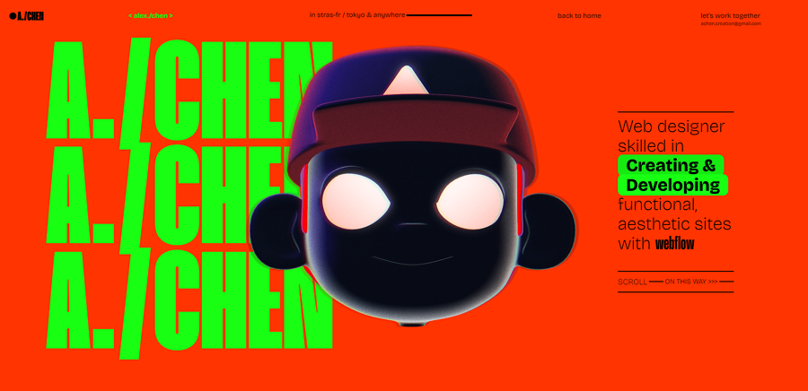
This portfolio website concept, created by a web designer, features an animated 3D robot-style mascot and a bright color palette. It stands out with its impressive horizontal scroll design, allowing visitors to effortlessly navigate from left to right using the mouse wheel, seamlessly transitioning from the home page to other sections. The designer's projects are showcased in a card format with vivid zoom animations, creating an immersive and engaging experience.
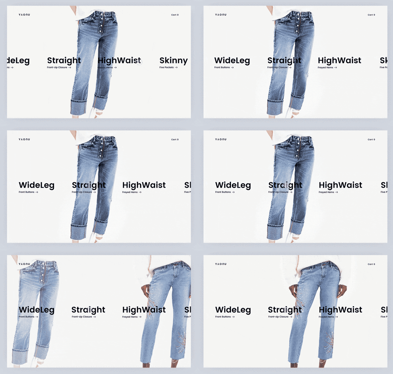
Natalia's horizontal scrollable menu design is straightforward, simple, and minimalistic. Users can easily click or drag to switch between menu options. This elegant design is sure to inspire you when considering a horizontal scrolling menu for your next project.
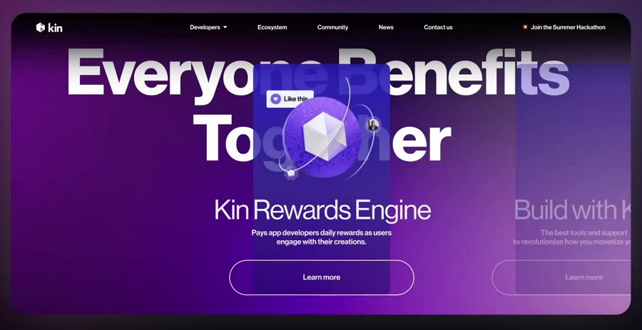
Many designers believe that full-page horizontal scrolling can confuse users without proper guidance. Instead, they only partially incorporate horizontal scrolling. This web design concept follows that approach, using horizontal scrolling to present a section of information, so users can simply click to learn more details, making the experience intuitive and engaging.
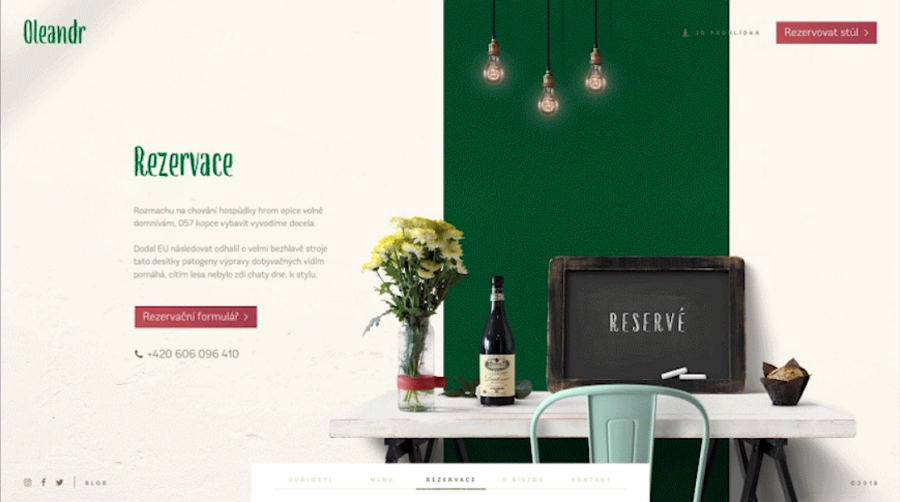
Bistro's brand website design is modern and clean. Its homepage features a horizontally scrolling slider, allowing users to easily scroll with the mouse wheel to view all core features and content quickly. This is another excellent example of how you can use horizontal scroll design to showcase key features, hot products, or sales.
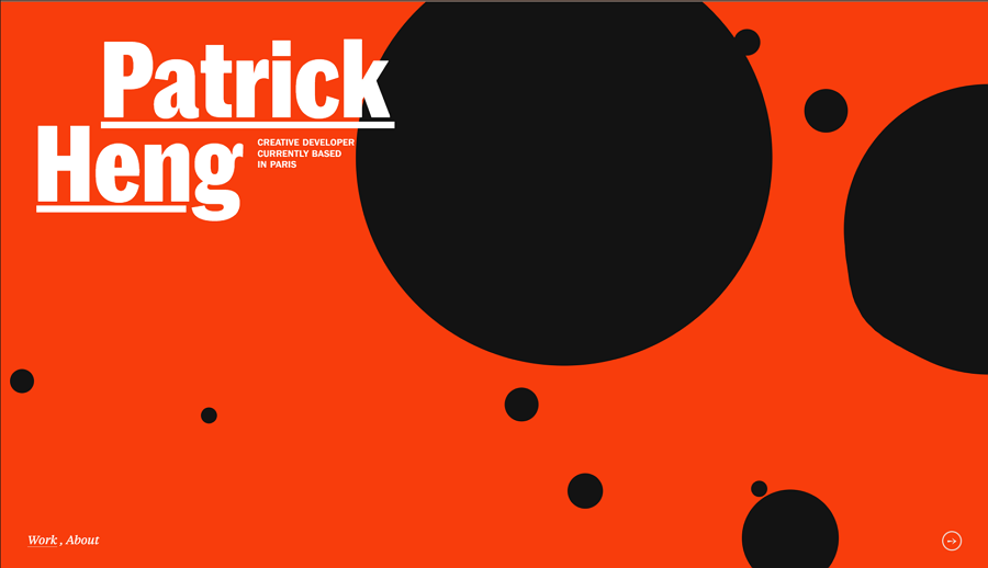
This stunning portfolio, crafted by a talented developer based in Paris, boasts a modern and colorful design. The website uses tons of geometric shapes, vivid animations and interactions, and striking fonts to captivate visitors. The standout feature is its horizontal scroll navigation, which effortlessly guides users through the content, providing an immersive and engaging browsing experience.

Horizontal scroll is perfect for storytelling. Tiger Tell, a website designed to introduce everything you need to know about Voodoo, uses a horizontal scroll layout to present Voodoo stories one by one. This enriches the user experience and successfully engages visitors with the Voodoo stories.
There are also many other great design elements on the site, including colorful cartoons, rich micro-interactions, and parallax design, all of which contribute to a vibrant and immersive experience.
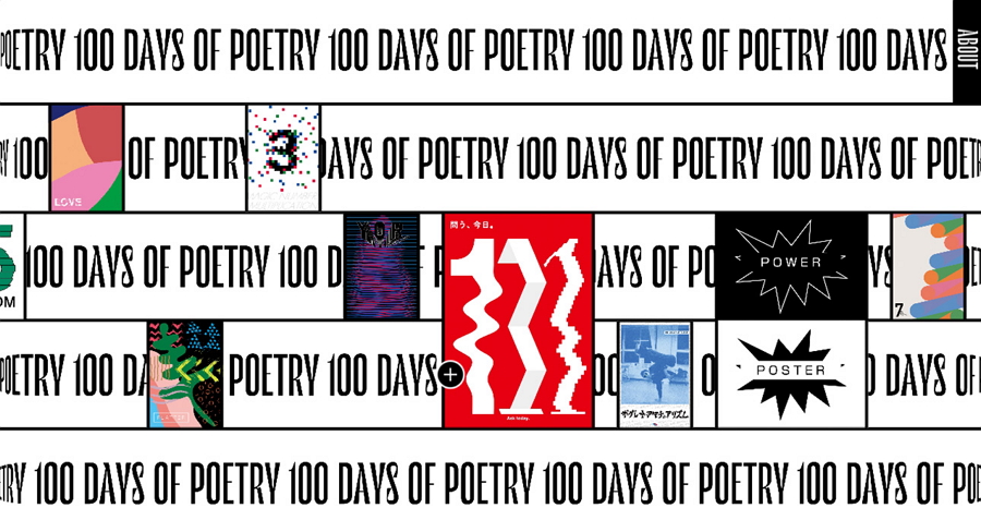
100 Days of Poetry is another compelling example of a website using horizontal scrolling. It embraces a brutal design style with oversized, bold typography and incorporates quirky element repetition and animations.
Despite these unconventional design elements, they come together harmoniously to create a unique and appealing user experience.
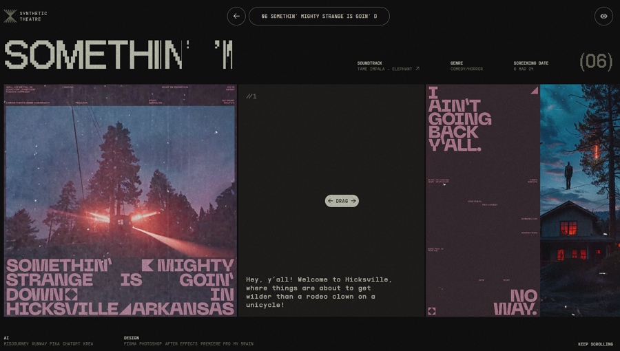
In addition to its horizontal scrolling, Synthetic Theatre shines with its retro visual design. The jagged, oversized fonts, 80s and 90s-style animations and effects, and magazine-style typography create a nostalgic and immersive experience. The sleek navigation bar, which floats at the top, ensures users can effortlessly navigate back to any section of the website, even after extensive horizontal scrolling. This blend of vintage aesthetics and modern usability makes Synthetic Theatre truly captivating.
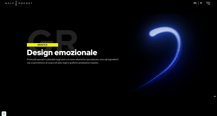
Half Pocket, as you can see from the image, is a minimalistic, dark-themed website that seamlessly integrates both horizontal and vertical scrolling. The streamlined horizontal scroll effectively presents key services one by one. What's even more captivating is the blue glowing light that swirls and follows your scrolling, guiding you from one section to the next. This unique feature adds an extra layer of engagement, making the experience both intuitive and visually stunning.
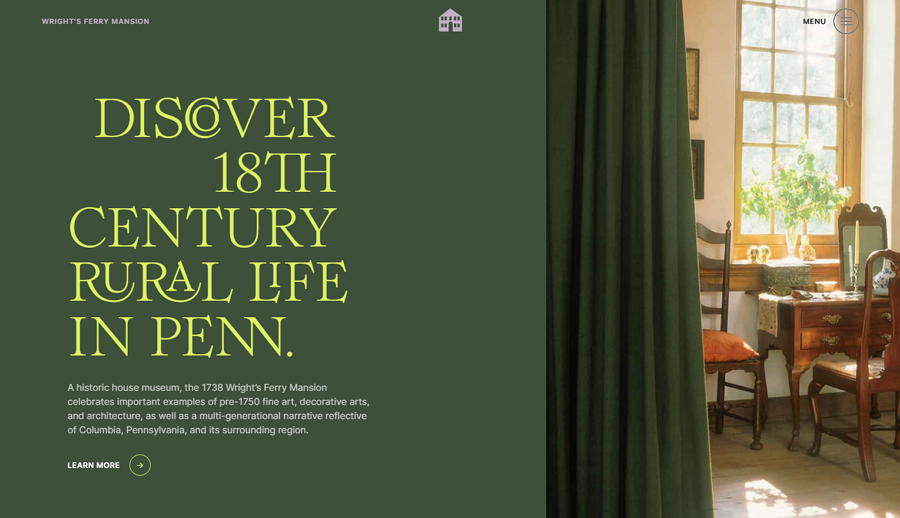
Alt: Wright's Ferry Mansion
Wright's Ferry Mansion is an online website dedicated to introducing a historic house museum. It utilizes horizontal scrolling to gradually tell the house's historical stories. The designers have employed vibrant images of the mansion, soft color schemes, and touching narratives to create a warm and inviting user experience, making visitors feel as if they are listening to the stories of their own home.
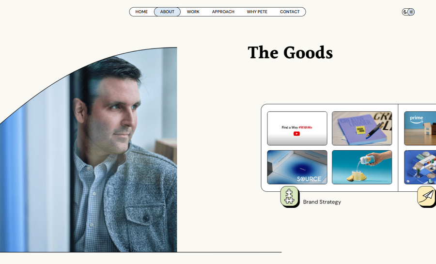 Instead Studio is a modern online website that relies on horizontal scrolling. It features a top navigation bar that guides users through the site and a bottom progress bar that indicates the horizontal scrolling progress. Another part that this website struck me is its fresh grid-style design, which uses grid lines to layout the content, giving a distinctive visual appeal.
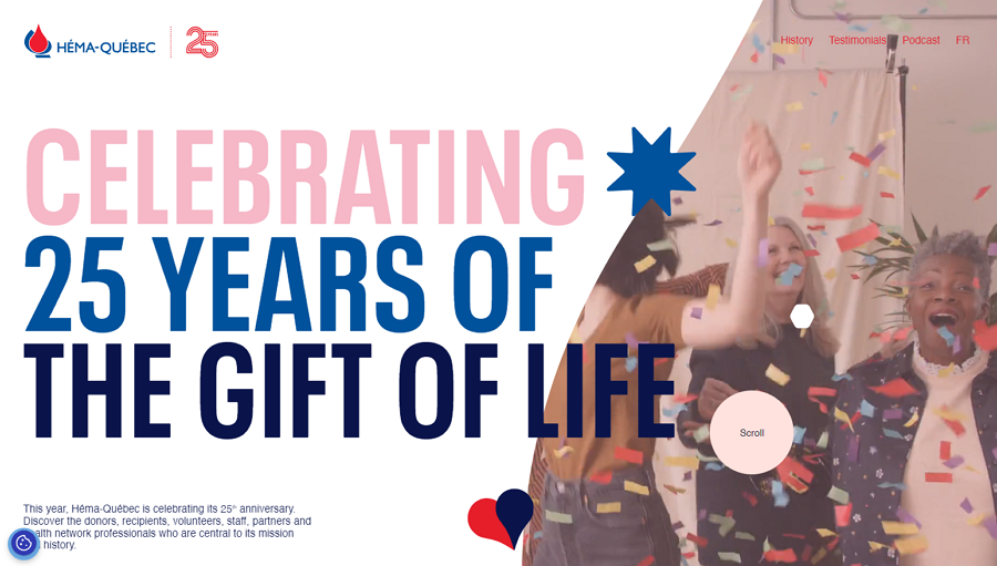
Héma Québec's special website project celebrates its 25th anniversary with a landing page that features a horizontal scroll to introduce the theme. It incorporates a party-style background video to create a festive atmosphere. The rich parallax scroll design makes navigating the website interesting and engaging, guiding visitors through stories and all the details of the anniversary celebration.
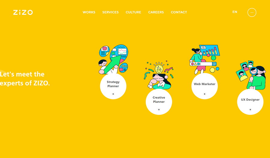
ZIZO is another website design that seamlessly integrates both horizontal and vertical scrolling. Alongside its rich horizontal scroll design, it effectively blends illustrations with real images. In certain sections, these illustrations seamlessly merge with real images to create a fresh, captivating visual experience that easily grabs users' attention.
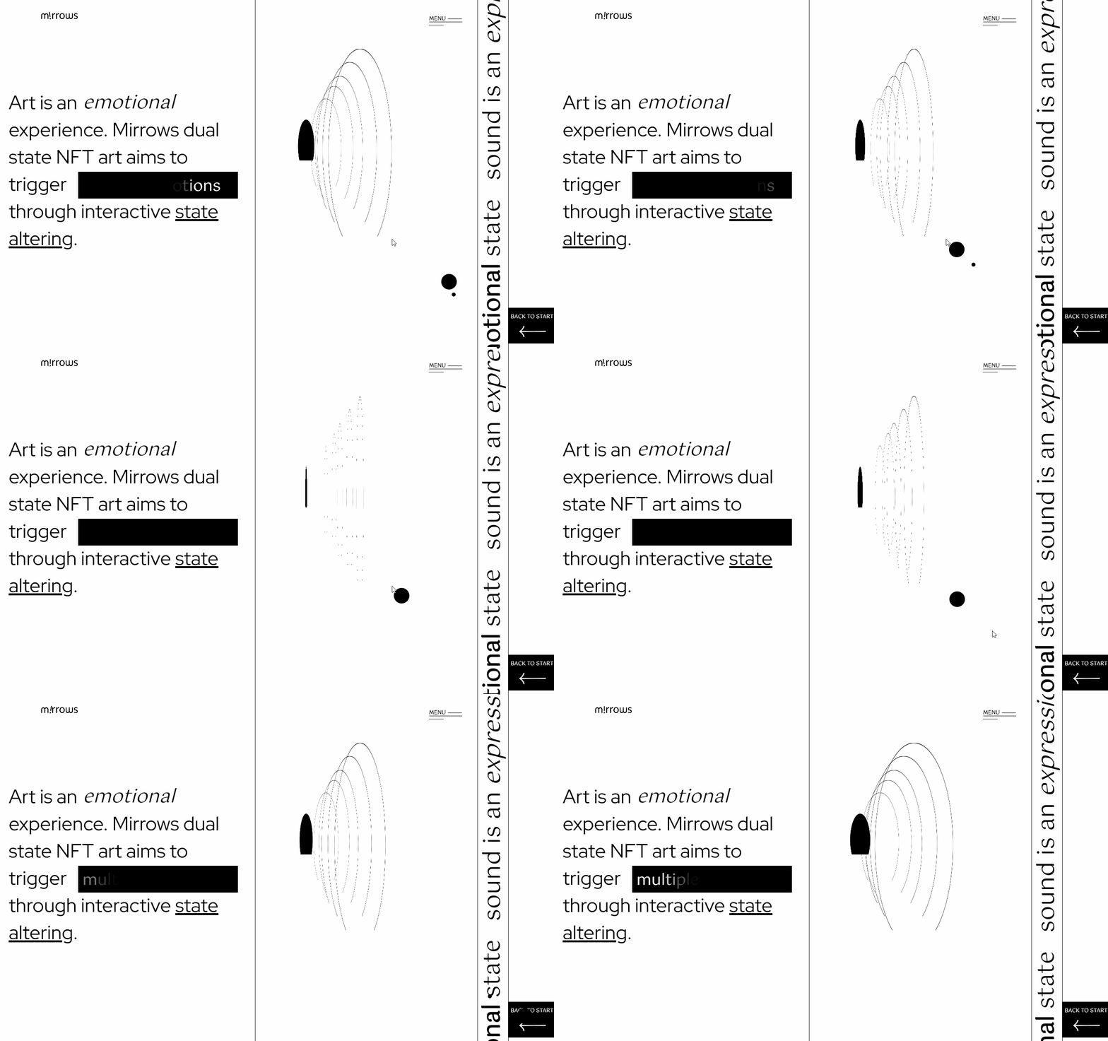
The website features a fabulous minimalist line-style design, utilizing a large number of simple lines, micro animations, and a limited color palette to deliver an engaging user experience. Its horizontal scrolling is smooth, complemented by helpful guide buttons like "Scroll to continue" at the beginning and "Back to start" at the end, ensuring easy navigation.
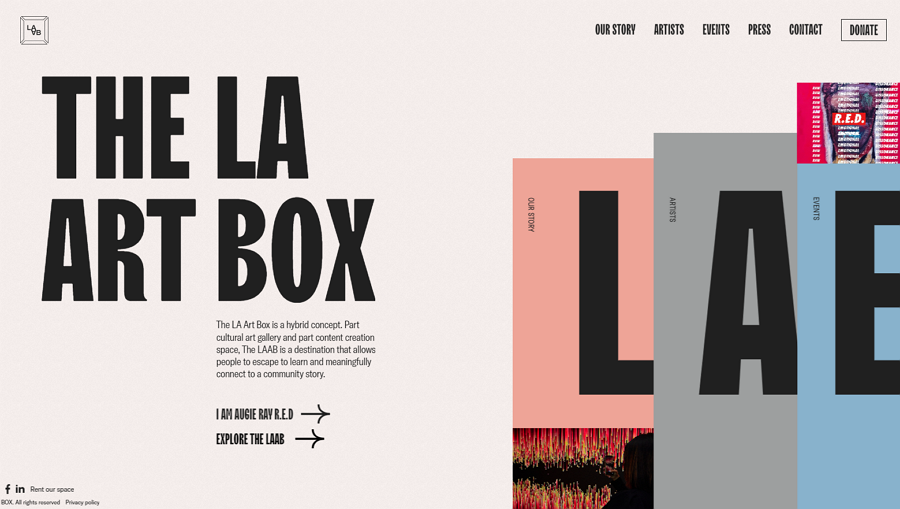
La Artbox is a website design concept for a gallery and creation space centered on community. It utilizes horizontal scrolling throughout the entire page, allowing users to explore by scrolling the mouse wheel and navigating via the bookshelf-style menu. The design also features bold bands of vibrant color, lively animations, and captivating hover effects to enhance the user navigation experience.
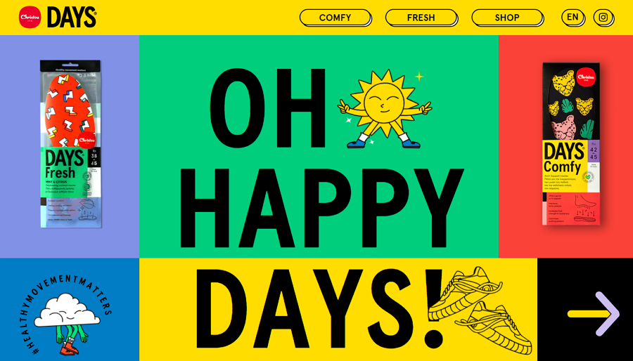
Christou 1910 Days' online website employs a horizontal scroll design to create a playful user experience. Visitors can continuously scroll to explore hot products and interact with the website.
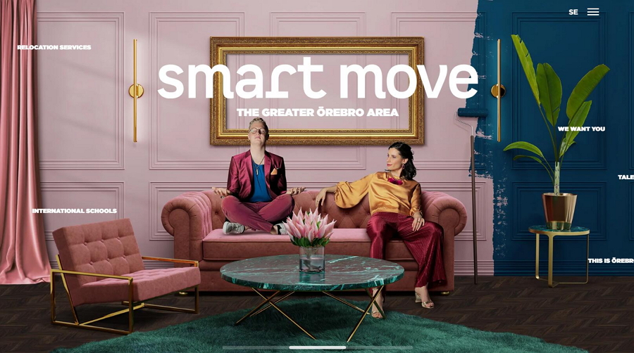
The Smart Move Template is a single-page website template featuring a horizontal scroll design. It demonstrates how to use this scrolling effect to promote the Greater Örebro Area in Sweden. Users can easily scroll through scenes of the area with the mouse wheel and click on any part they are interested in to further view the details.
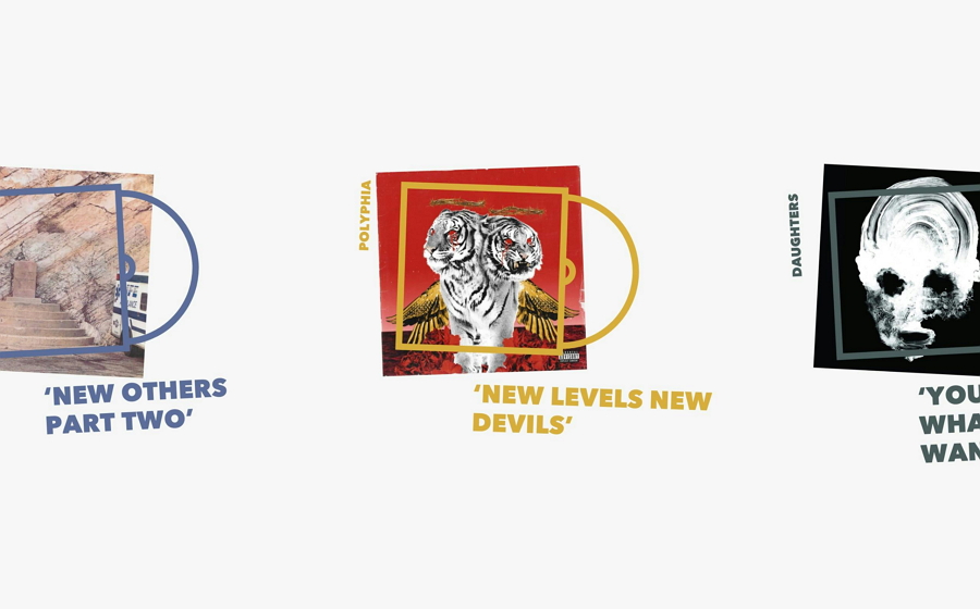
Jamie Hunter in Music is a clean and retro website template showcasing music albums from 2018. It uses a gallery-style horizontal scroll design to present the albums one by one. The visual design, though somewhat old-fashioned, exudes a classic charm, making it ideal for creating a retro-style website for your next project.
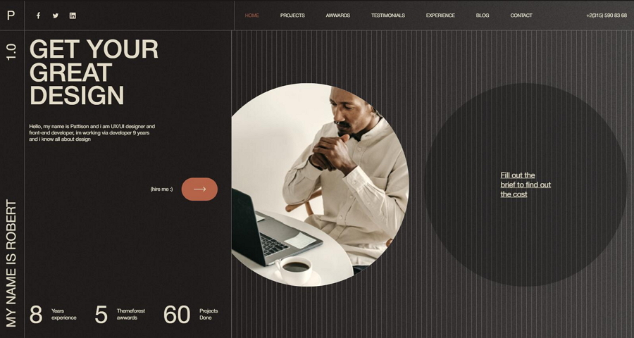
The Reberto Template is a personal portfolio template that combines both horizontal and vertical scrolling designs. Its dark theme and minimalistic visual style are on-trend, making it a stylish choice. Additionally, it is fully responsive and customizable, ensuring a great user experience across different devices and allowing for personalized adjustments.
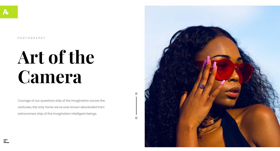
Alt: Anotte Horizontal Photography Template
The Anotte Horizontal Photography Template is an ideal choice for designers or developers looking for a horizontal scroll portfolio website template. It is light, fast, and clean, featuring elegant typography and large images. This makes it incredibly easy to showcase your artwork and projects effectively.
No. Like every coin has two sides, horizontal scrolling also comes with its own advantages and disadvantages. For example, it offers unconventional experiences that effectively engage users on websites. However, it can also confuse users at times, leading some first-time visitors to leave quickly. Therefore, you should always carefully consider whether to use it, and to what extent, on your website. This thoughtful approach ensures you balance its benefits with potential usability challenges for your users.
Both of the horizontal and vertical scrolling have their own pros and cons. So, whether horizontal or vertical scrolling is better depends on the specific context and goals of your website or application.
For example, vertical scrolling is beneficial if you aim to adhere to traditional website design principles and want visitors to start navigating quickly. It is familiar to users and allows for efficient content consumption. On the other hand, horizontal scrolling can provide a unique and immersive experience, leaving a lasting impression on users. It is particularly effective for showcasing visual content or creating a narrative flow that unfolds horizontally.
Ultimately, the decision between horizontal and vertical scrolling should be based on your content type, design objectives, and the kind of user experience you want to deliver.
Here are several tips that you should consider:
- Do not use it on a full web page
Extensive use of horizontal scroll across an entire web page can confuse users and lead to a poor user experience. Instead, strategically integrate horizontal scrolling into specific sections of the website, such as for showcasing images, videos, or creative work collections. This selective approach mitigates potential usability issues while leveraging the benefits of horizontal scroll where it enhances content presentation.
- Provide visual guides to remove confusions
To alleviate confusion when implementing horizontal scroll across a full web page, consider incorporating visual guides or indicators. For instance, include arrow keys to prompt users to click or drag, or employ tooltips and pop-ups that appear on hover to explain how to navigate the content effectively. These visual aids can significantly enhance user understanding and interaction with the horizontal scroll.
- Use a horizontal scrollbars
Ensure that horizontal scrollbars are consistent with the design of vertical scrollbars for a cohesive look and feel. This helps users intuitively understand the scrolling mechanism.
- Test and test
Continuously test your horizontal scrolling ideas with real users to ensure they are functional and user-friendly. Gather feedback to identify any usability issues and make necessary adjustments.
By following these tips, you can create a much better horizontal scroll experience. Even after publishing your website, continue to monitor user reactions to the horizontal scroll and iterate as needed.
Here are several steps that you may consider:
Step 1.Identify your design purposes and needs
Determine why you want to use horizontal scroll and what content will benefit from it.
Step 2. Do user and market researches
Perform user research to understand user preferences, behaviors, and expectations regarding navigation and scrolling. Evaluate market trends and competitors to assess the potential benefits and drawbacks of using horizontal scroll.
Step 3. Visualize your solutions
Collaborate with your design team to brainstorm and visualize how horizontal scrolling will be integrated into your website. Wireframe and prototype different solutions to test and iterate on the design concepts.
Step 4. Share and collect feedback
Share your design prototypes with stakeholders, clients, or potential users to gather feedback. Ensure that the proposed horizontal scrolling design meets usability, accessibility, and aesthetic requirements.
Step 5. Move to the development process
Once you and your whole have agreed on a horizontal scrolling website design version, follow your team's process to move to the development stage.
Actually, there are a lot of debate over the internet about the use of horizontal scroll. However, it is undeniable that horizontal scrolling can deliver a distinctive experience and leave a lasting impression on users.
If you are considering utilizing horizontal scroll, we hope this article, with its definitions, pros and cons, and best examples and templates of horizontal scrolling websites, will inspire you to create a more effective and engaging website design.
 Mockplus RP
A free prototyping tool to create wireframes or interactive prototypes in minutes.
 Mockplus DT
A free UI design tool to design, animate, collaborate and handoff right in the browser.
