Location: France
Website features:
Minimalistic design style
High-quality hero image carousel
Cool animation to expand navigation menus
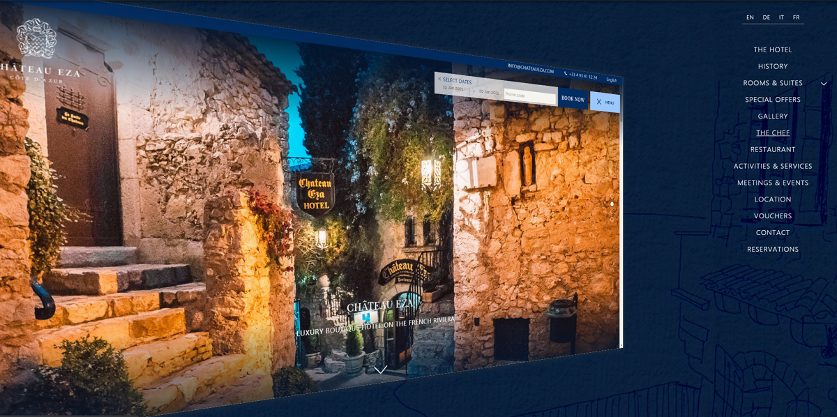
Chateau Eza, known as the Prince of Sweden's Castle, is an ancient hotel with flawless services, stylish rooms and outstanding sea views.
The design of the hotel’s website is clean and minimalist. Its homepage uses a high-quality hero image carousel to showcase its qualities and the views it offers.
While the navigation menus stick to the top of the website, making it easy for visitors to view details and book rooms from anywhere on the site, it is also possible to hide all the menus. When clicking the menu buttons, all options are displayed with eye-catching animation.
This is a great example for designers of how to create a hotel website, in a minimalist style, and offer an amazing user experience.
Location: France
Website features:
Video background
Parallax scrolling
Floating navigation bar
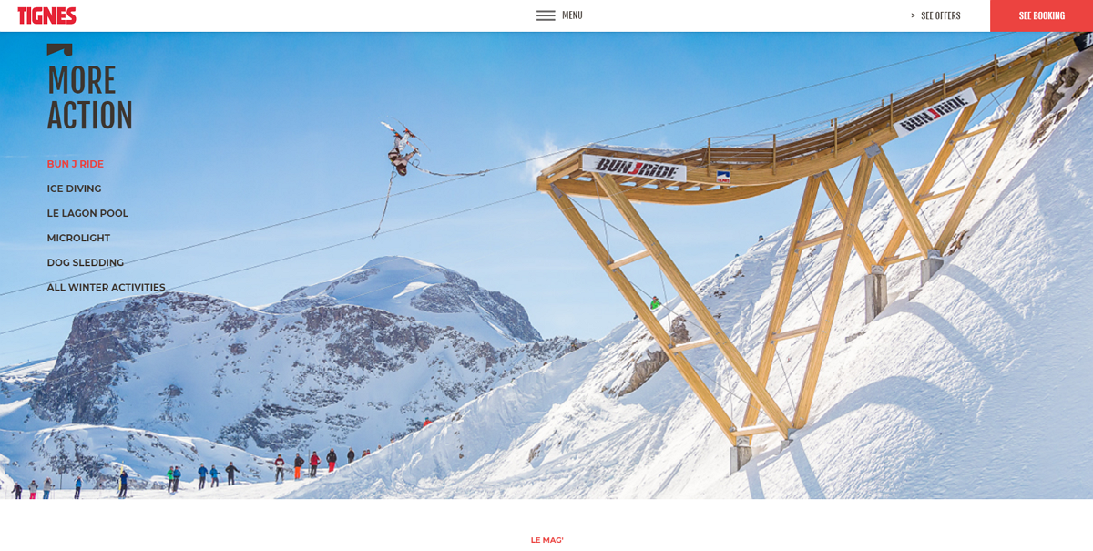
Tignes is a leading Alpine ski resort in France that boasts an indoor slope. To grab the attention of skiers from around the world, the landing page of this resort website uses stunning video backgrounds to give a quick impression of the exciting skiing experience that hotel guests can look forward to.
Parallax scrolling creates an immersive experience and encourages web visitors to scroll up and down for more resort information. The simple navigation bar floating at the top of the screen makes it easy for website visitors to switch between different sections. Booking information can also be accessed with one click.
Location: The United Kingdom
Website features:
Promotion landing page
Navigation bar with drop-down sliders
Icon tab bar
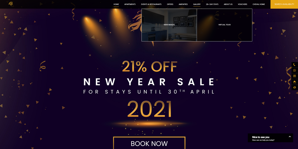
Cheval Okd Town Chambers is a luxury department hotel located in the heart of Edinburgh's old town. To celebrate 'Hogmanay' (the traditional Scottish new year) and attract more visitors, the hotel offered a 21% discount which it showcased directly on its homepage. So, everyone visiting the site would see this offer straight away and, hopefully, be tempted by it!
To engage website visitors and convert them into paying guests, the website design also uses a cool navigation bar with drop-down sliders. when you hover over an item on the navigation bar, all related options will be expanded immediately. It is easy to slide these options left or right to select the one you want.
The icon bar on the right edge also makes it easy to explore other features or sections of the website such as contacts, blogs, maps, and more.
Location: Switzerland
Website features:
High-quality hero image carousel
Big, elegant font
Powerful room booking bar
Instagram integration
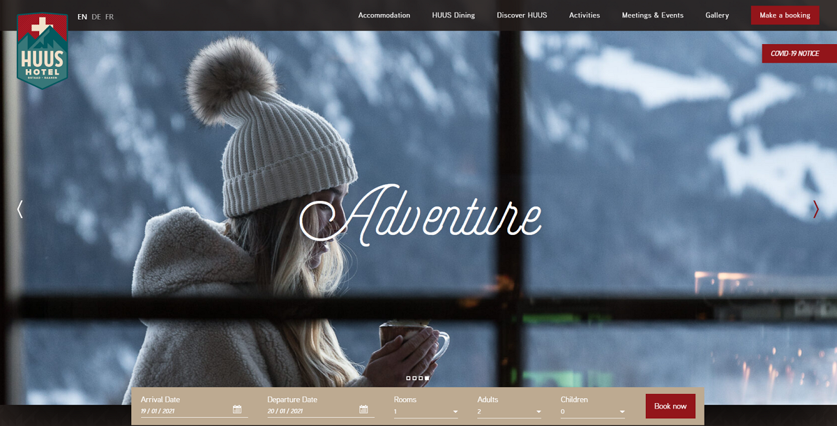
HUUS Hotel Gstaad is a modern luxury hotel, located in the Alps. The hotel's website gives visitors a comfortable and elegant feel.
Its homepage uses an eye-catching hero image carousel to showcase the rooms, the natural views, and restaurants. The large font helps convey the website themes and creates a unique and elegant visual experience for visitors.
Most importantly, the website adds a special section to display all images and videos that have been shared on Instagram, giving visitors a clear sense of what they can expect as a guest at the hotel.
Location: Japan
Website features:
Map Search
Rich language options
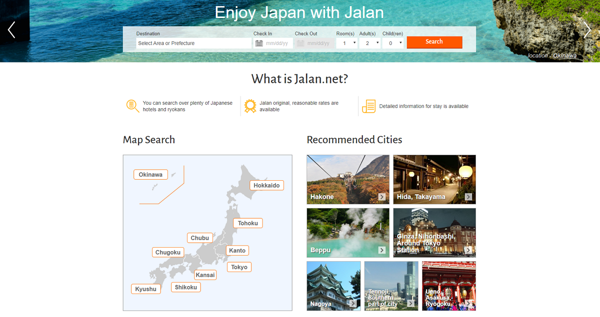
Japan Ryokan is a simple hotel website where you can search, compare and book hotels in Japan. Like other hotel websites, this home page uses an image carousel and a powerful room searching bar.
However, unlike other sites, if you have yet to decide on your destination, you may not be able to find the hotel you want using the search bar since it requires you to enter information such as destination and check-in date. The map search below can help with this. Just select the region you prefer and a range of recommendations from that region will appear to help you make a decision.
The rich language options also make the site accessible to visitors from different countries.
Location: France
Website features:
Video background
Parallax scrolling
Expandable price panel
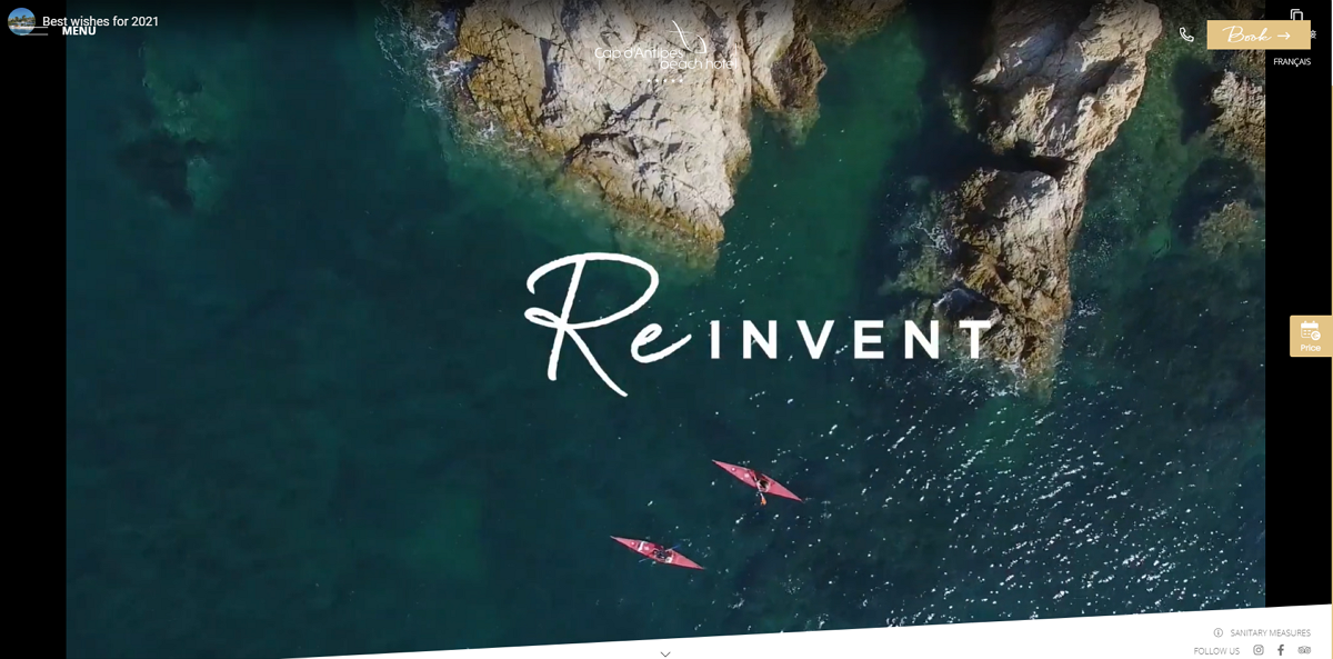
Cap D'Antibes Beach Hotel is a 5-star beach hotel located on French Riviera. Its online website gives you a fresh, minimalistic feel.
When you arrive at the homepage, a film-like video grabs your attention immediately and brings you to a wonderful beach land. The parallax scrolling and storytelling design style also encourage you to view all page content completely.
Furthermore, there is also a price panel set like an icon button on the right edge. Whenever you want to choose a date and check the room price, hover over the icon button and the detailed price panel will be expanded to show you all information.
Location: Korea
Website features:
High-quality image carousel
Complete navigation bar
Expandable icon sidebar
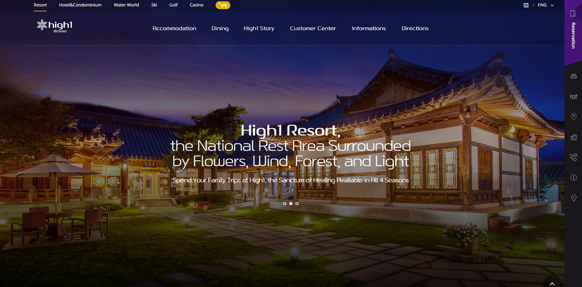
High1 Resort is a luxury resort website that uses a brilliant carousel slideshow of all hotel rooms, grounds and landscapes around to showcase its unique charm. The compete navigation bar consisted of tree-structured drop-down menus helps website visitors find the desired information as soon as possible.
The icon sidebar that can be expanded when hovering over any icon button there also creates a stronger navigation system, allowing visitors to navigate around easily.
This is a good example of how to create an attractive and user-friendly luxury hotel website.
Location: Japan
Website features:
Dynamic weather icons
Hotel interior background
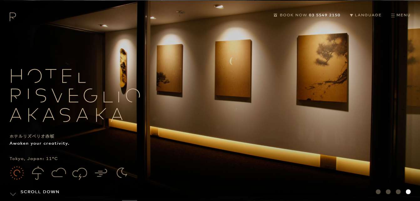
Hotel Risveglio Akasaka is a hotel that opened in 2015. It has based its design of furniture and interior décor on user feedback. Both the design of the hotel room and the hotel lobby has won praise from visitors.
The overall UI design style of the website is concise and clear. The homepage uses the hotel's interior decoration as a background. With simple fonts and icons, the interface is clean and elegant.
The carousel diagram display provides the user with a multi-dimensional sense of the space and the experience it provides. The colors of the architectural design and lighting create a very comfortable atmosphere without being monotonous.
A dynamic weather icon at the bottom of the website is eye-catching and is a key part of the site’s user experience. The scroll navigation leads the user naturally on to the booking page, improving the site's page conversion rate.
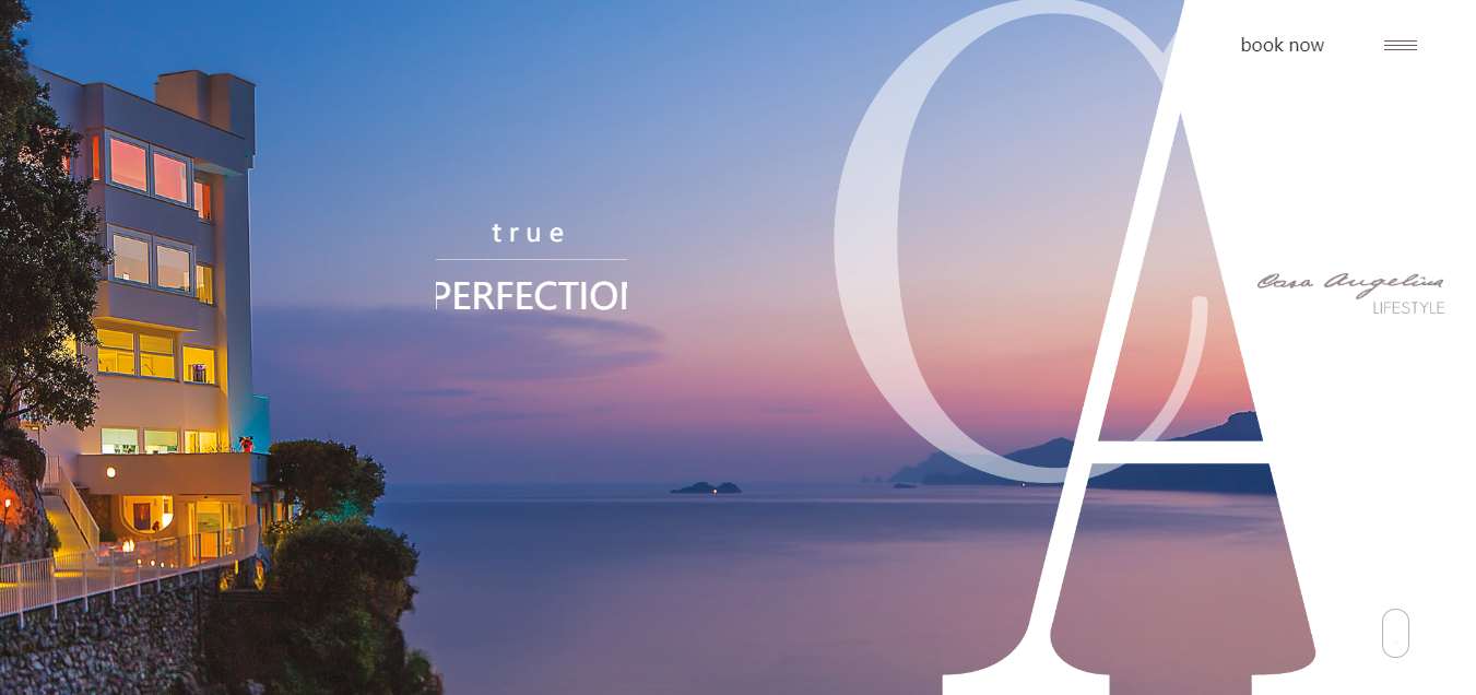
Location: Italy
Website features:
Page animation
Page background music
Hotel Casangelina, one of the top-ten cliff hotels in the world, is located on the cliffs of the Amalfi Coast. Guests can relax in the panoramic outdoor pool on the hotel’s terrace. There is a Moroccan-style bar where guests can enjoy a glass of champagne. It goes without saying that private kitchen and butler services are included. The elevator descends 200 steps to the beach. Guests can take a private cruise from the hotel to other islands to enjoy the sunshine and the scenery.
With a minimalist UI design, the fusion of the pictures and fonts in the scrolling area enhances the site’s immersive quality. This site is a good example of how to combine UI and UX design effectively. The background music and dynamic hotel panorama videos add to the visual reality, giving users a clear sense of the elegance of the entire hotel.
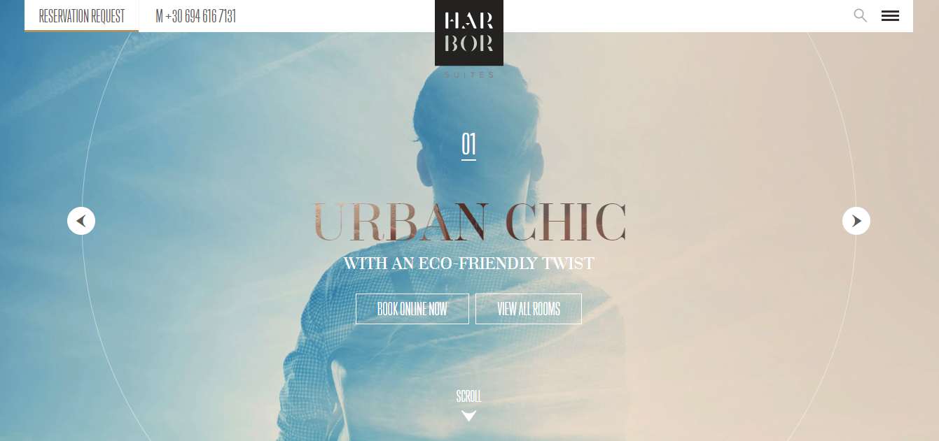
Location: Greece
Website features:
Responsive design
The navigation design of this website reflects the fact that it is a hotel designed for both business and leisure travelers, its excellent location being a great selling point for both categories of visitor.
The responsive layout of the website keeps the CTA firmly in the user’s eye-line on both PC and mobile devices. The online booking, room preview, and site navigation are always easily accessible, so that users can find what they are looking for quickly and easily.
The evolutionary page animation and the card design are good examples of a website introduction and how to increase conversions.
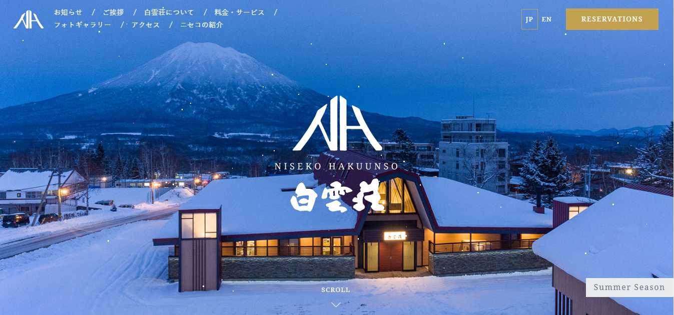
Location: Japan
Website features:
UI design for seasons
One creative approach for hotels is to have different UI design sets for winter and summer. The wafting snowflakes with Mount Fuji in the distance embody the hotel's theme of ‘white clouds.’ Although the dynamic UI design is eye-catching, it does not distract users from seeing the white navigation bar set against a dark background.
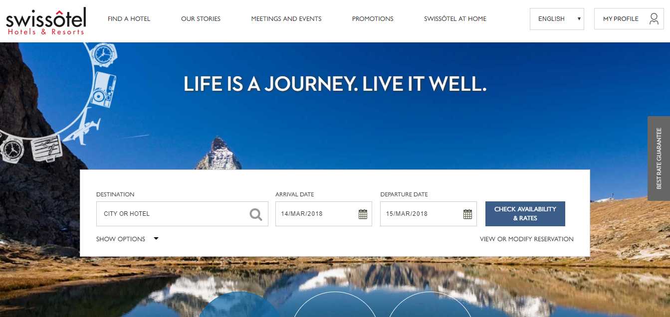
Location: Swiss
Website features:
Banner design
Swissotel is an international hotel chain whose site uses white backgrounds and dark shades. Banners are neatly separated, making the site as a whole look neat and clean. Note how the blankness of the CTA position gives a clear contrast to the page layout; it is a good way to accommodate different users' reading habits.
Location: Switzerland
Website features:
Illustration style
Amazing navigation system
Full-screen image carousel slideshow
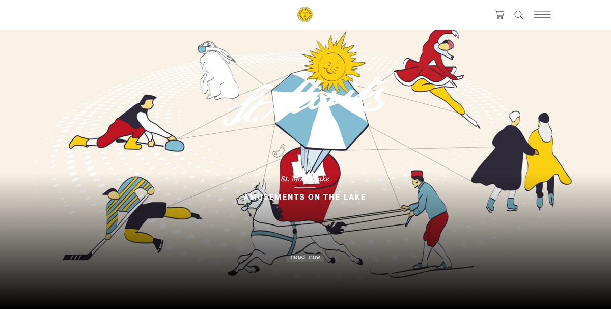
St Moritz is a modern resort located in the beautiful Swiss mountains. To give website visitors a real feel for how wonderful the resort is, its website uses a full-screen image slideshow on the homepage to grab their attention. An illustration style for the images and logos also makes it irresistible to most visitors.
Location: The United Kingdom
Website features:
Navigation bar with drop-down sliders
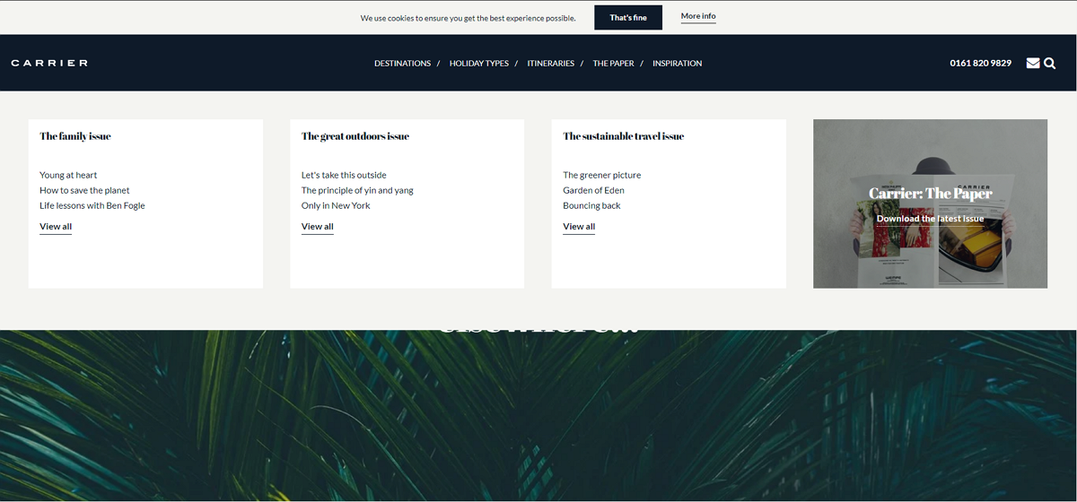
Carrier is a 5-star luxury resort website that has a gorgeous navigation bar. Hover on the item, all options will be displayed immediately in a clear drop-down slider. The white background also makes the navigation options stand out easily from the homepage, allowing website visitors to focus on them only.
Alt: Weslaco
Location: USA
Website features:
Magazin-like typography
Broken grid layout
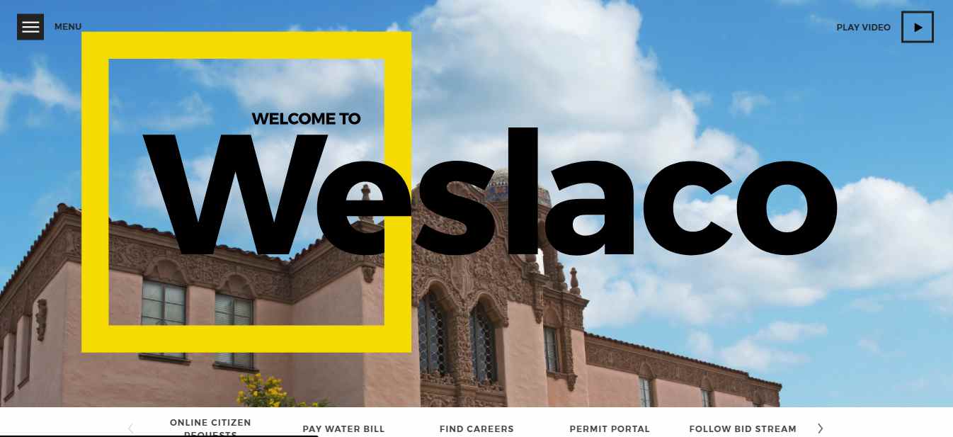
Weslaco is a modern online hotel website with a magazine-like style. The powerful navigation system and trendy broken grid layouts create a unique scrolling experience for website visitors.
Location: France
Website features:
Circular navigation bar
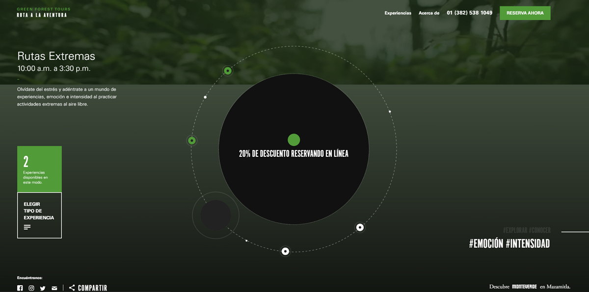
This forest tour website features a circular navigation bar. All page options are embeded in this circular element. Clicking one of these options, the background and page content will change correspondlingly to show different services, landscapes and other information.
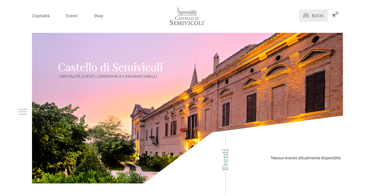
Website features:
Minimatistic design style
Symmetric grid layouts
Parallax scrolling
Rich hover effects
Castello di Semivicoli is a luxury hotel in a 17th-century castle. Its website homepage is modern and minimalist. Images of the hotel are shown in different shapes and grab the user's attention. The parallax scrolling illustrates the castle's history in an engaging way. There a many hidden hover effects on this site that are worth exploring.
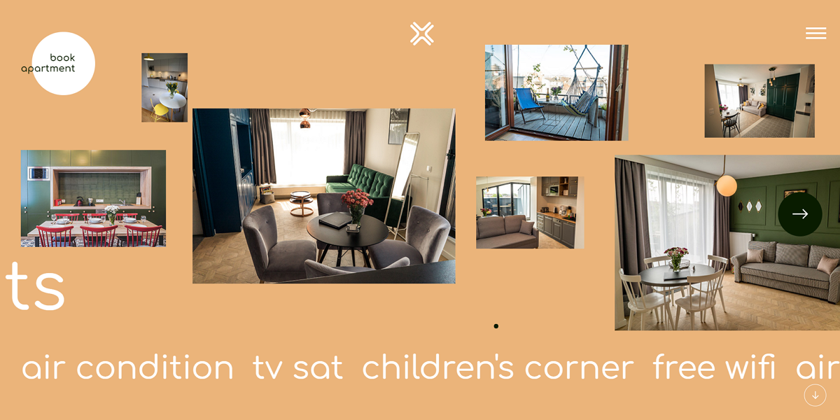
Website features:
Image gallery
Horizontal scrolling
Tich hover effects, transitions and animations
Krakow is a comfortable, modern apartment website concept that features a cool horizontal image gallery. Using your mouse wheel, it is easy to scroll along all the interior images one by one, just like watching a movie. Rich hover effects, transitions,and animations make it exciting for visitors to navigate the site.
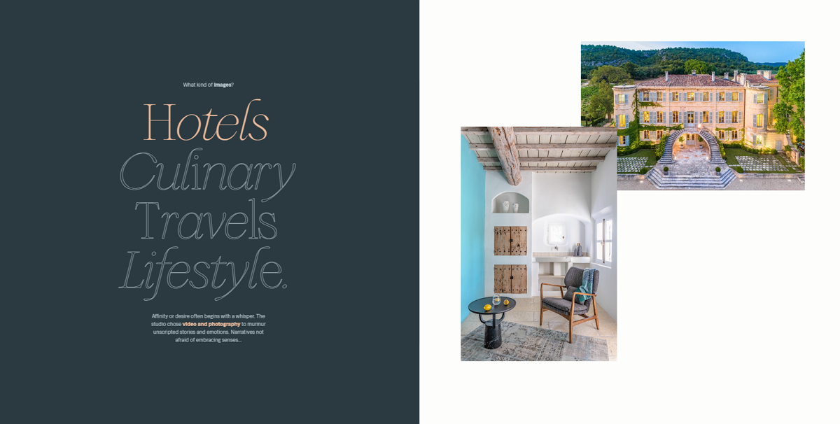
Website features:
Image gallery
Horizontal scrolling
Studio Chevojon is a modern website concept created for luxury hotels and restaurants. The website template also uses an image gallery to show you all the hotel photos, views and services. The horizontal scrolling also makes it stand out from other hotel or resort websites.
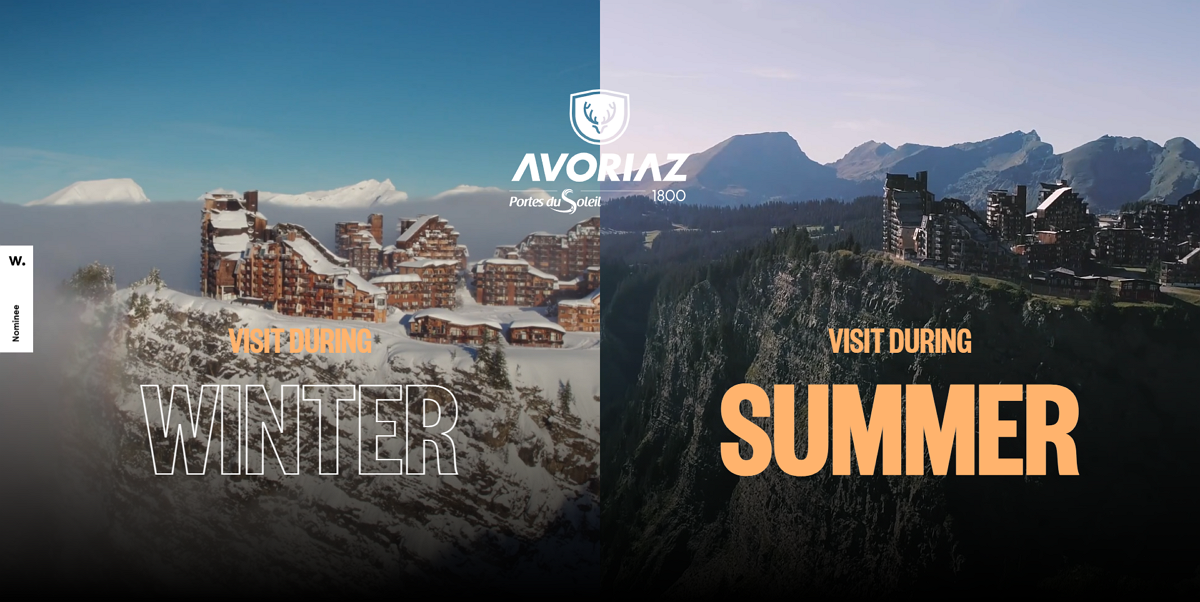
Website features:
Two column landing page
Video background
VR technologies
Avoriaz is a website concept suitable for resorts, snow parks and apartments and much more. The landing page of this website uses a two-column interface to provide winter and summer options with different video backgrounds.
When choosing an option, stunning panoramic images and videos presented in RP technologies help you find different locations and view the landscapes around in 360 degrees.
Website features:
Full-screen image carousel
Hidden sidebar
Video background
Parallax scrolling
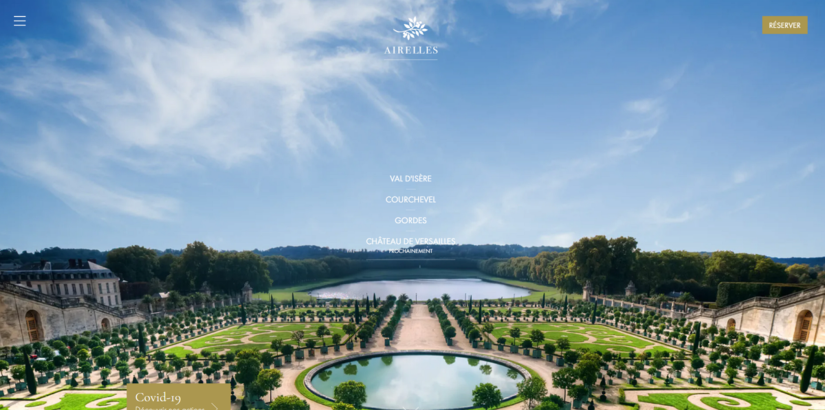
Airelles is a luxury hotel brand with a modern online website. The homepage of this hotel uses a full-screen image carousel to showcase all hotel images and views. Clicking the hamburger menus in the upper left corner, a sidebar will slide out from the left and help website visitors navigate around with ease.
Website features:
Brutalism design style
Rich animations and transitions
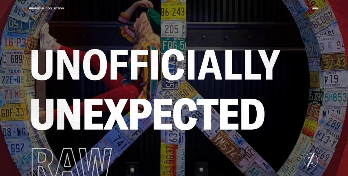
The Unofficial Z Collection is a modern website that collects personalized hotels. The homepage of this website features a brutalism design style and uses oversized typography, raw transitions and rocking animations to create a unique user experience.
Website features:
Retro design style
3D videos and fonts
Flat logos and icons
Clean and neat grid layout
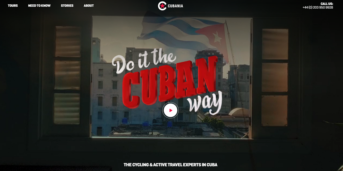
Cubania Travel shares a good idea of how to create a retro-style hotel website. The old-fashioned videos, colors and fonts create an immersive and old-style world for everyone.
Website features:
Room search bar
Image slider and carousel
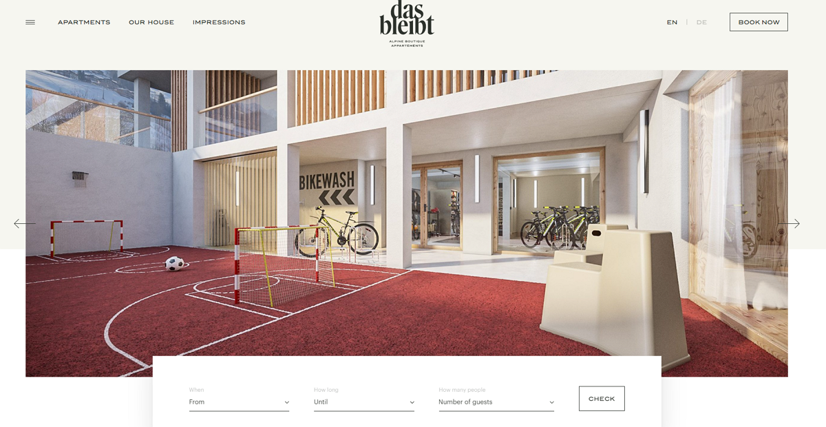
Das Bleibt is a classic and stylish apartment hotel with a simple and minimalistic look. Like other hotel or resort websites, this website provides uses image carousels and sliders, a powerful room search bar and high-quality images to attract users and showcase the hotel information.
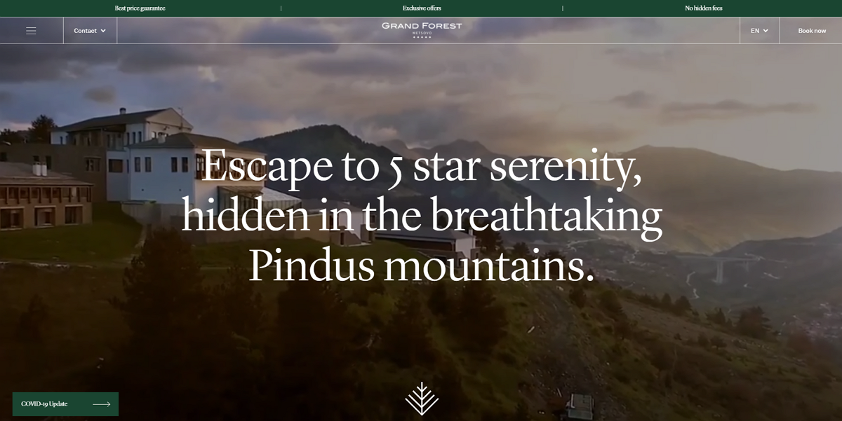
Website features:
Grid layouts
Video background
Image slider
Grand Forest Hotel is a 5-star hotel on top of a private mountain. This website uses a grid layout to create a clean and neat homepage. Video backgrounds and image sliders attract visitors' attention quickly, making it easy for them to know how wonderful this hotel is.
Here are five best practices for you to follow:
1). Responsive design: The hotel websites should be well supported on all devices.
2). Excellent user experience: Simplified website browsing process can bring a good user experience. Because if it is difficult to find a common page or arrive at the reservation page to complete the purchase, it is likely to lose many potential users.
3). Storytelling: Does your website understand what a guest expects once they have checked in? Is it able to guide the visitor along the path? Remember to display all your hotel information in a clear storytelling style, step by step.
4). Convenient booking: Make the booking process as simple as possible for a maximum return. The tedious user information and payment information filling may result in the loss of users.
5. Visual reality: The best and most effective website is a website that attracts visitors to spend time exploring. Professional photography and video are great media for storytelling, especially for hotels and resorts.
The molding of a hotel website design generally goes through a lot of design processes. From the very beginning, at the stage of prototyping design, it decides the page layout of the site. Good tools will help you to do more with less. I'll take the example of a website prototype produced by Mockplus as an example to show you the charm of this rapid prototyping tool.
Before getting started, let’s see what in common of the 9 best hotel website design examples and templates listed above:
Large picture background
Hotel Name or Hotel Theme Logo Centered
Navigation bar information is displayed on the edge of the site
Feature icons
GIF dynamic pictures
After summing up these common points, we can start to make the hotel website design or other types of website design with Mockplus.
Tips: If you are an individual user who likes to prototype freely and quickly, you can choose the Mockplus Individual plan. If you are in a small team - between10 and 30 people - the Mockplus Team plan is perfect. If you are working with more than 30 people, the Enterprise plan is worth a try. (New in Mockplus, experience team management and all professional features for free!)
Okay, let’s do it! Oops, we forgot—you have to set up a Mockplus account and download the software first. (If you have an account, log in. If not, you can register an account for free.)
Step 1. Open the software and choose to create a web project.
Step 2. Familiarize with the software interface:
From left to right, the left side is the common tools menu bar, hidden project tree, icon library, component library, and its subdivisions.
The middle area of the software is the prototype design interface
On the right, it is a combined panel of component properties, the interactive parameter properties, and the page properties.
Step 3: Use the "Image" component to import the logo image and the large page image as the background of the web page
Step 4: Use the Mockplus Quick Functions to make a fast design:
Grid and AutoFill functions to quickly create pages in similar formats.
The component style function can simultaneously set styles for multiple components of the same type, saving time and convenience
Step 5: Add interactions: Interactions between pages, or interactions between components. (How to set interactions in Mockplus)
Step 6: Click F5 to preview or export demo package preview in real-time.
Conclusion:
We hope these website design examples and templates above will motivate you to make more great designs. Practice makes perfect and there is no better place to practice than Mockplus, whether you are creating a design for a website or a mobile app.
 Mockplus RP
A free prototyping tool to create wireframes or interactive prototypes in minutes.
 Mockplus DT
A free UI design tool to design, animate, collaborate and handoff right in the browser.
