"Small things sometimes mean a whole lot!" - by DanTDM.
App icons are such small things for a website or mobile app project but yet contribute so much to a project's success. When being used in an app store, a good app icon can reflect the core values of the app and entices more target users to download it. When being used in app interfaces, a good icon encourages users to purchase an item or entices them to linger on the site for a longer time.
In this article, we'll walk you through the basics of apps icon design and show you how to create an icon for your project step by step. The related best practices, examples, tools, and free download sites are also included to help you create irresistibly beautiful icons to boost the app conversation.
An app icon is a small pictogram or ideogram element especially created to represent a software program, file, or function on a website or mobile app interface.
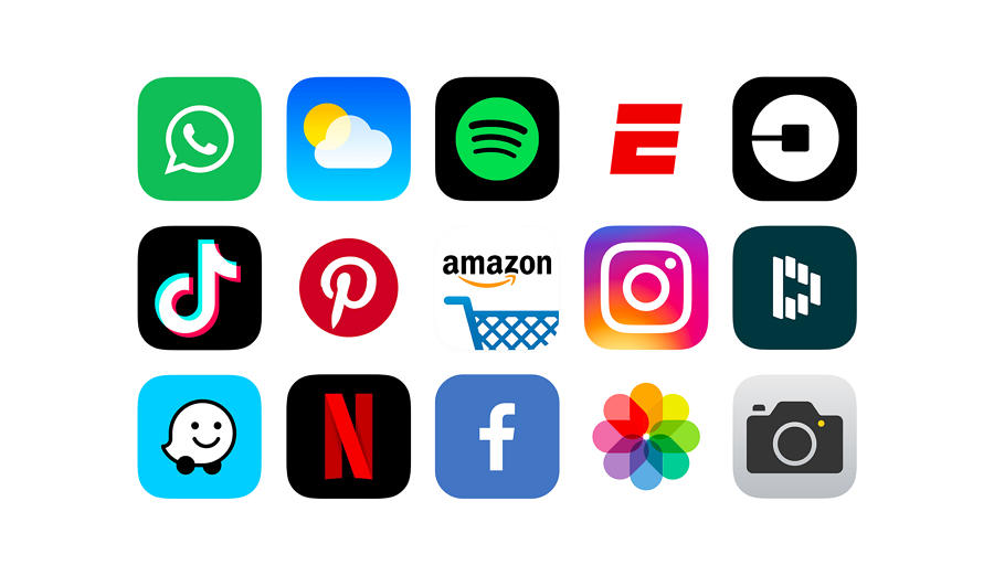
Many big brands use easily recognizable app icons to impress users and increase downloads.
It is usually an eye-catching but abstract image or symbol design that is used to increase downloads and sales or navigate users to learn more about the app. It conveys the core ideas of the app and promotes the brand effectively.
To better guide users, designers always use icons with CTA buttons, toolbars, menus, or small texts and try to create a full set of icons to fit in with the app's different needs and scenarios.
The download icon of your app in an app store is the first thing that users will see. So it is vital that it conveys an idea of your app's functions and purpose. That first impression is very important. A great icon will not just make your app stand out from the crowd of other apps, it will convey something of what your app is about, enough to encourage users to download the app.
Despite their size, good icons can combine images, colors,and brand elements in a clever way to explain your product's core values. An app can work in a much more intuitive way than simple text.
Icon buttons used in app interfaces, such as the "Buy now" or "Learn more," express their functions clearly and guide the user to follow up with a purchase, offer feedback, or follow some other user flow of the app. This makes a better UX.
A clear app icon, which is memorable and recognizable, can sometimes work rather like a logo, advertising your app and encouraging users to download it, or to place an order. The unique colors, shapes, and illustrations that the icon uses, and the ideas it conveys need to impress users and help build a unique brand identity.
The needs of your target audience can vary depending on the type of app you are using, meaning that the type of icon that will work to grab users' attention will also vary between different types of websites or mobile app.
So, to create a truly attractive app icon, you need to do your research to really understand your audience. This is the first step to identifying the type and style of icons that will work best for you.
To make your app stand out from the crowd, you need something unique and original for each project. So, before you start, look at what your competitors have done. You are bound to learn a lot from studying their approach. You will not want to copy them—you need to be differentiated from the crowd—but studying them will give you ideas and inform your own creativity.
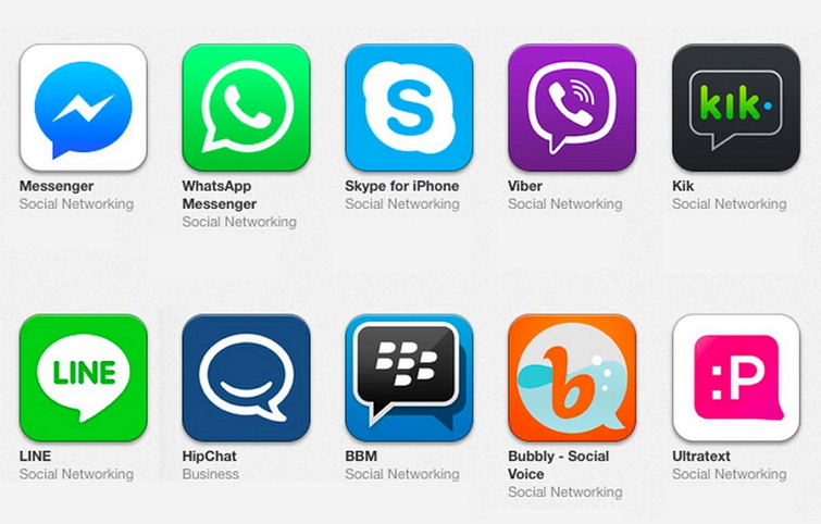
For example, look at all these popular messaging app icons and you will find nearly all of these competitors use a chat bubble. Greens and blues are comfortable colors and are thus used a lot to attract users attention. Something for you to think about when designing an icon for your own messaging app.
Next, talk to your team. Work together to figure out what you need your app icon to do, what its main functions will be, what problems it will solve. All this will inform your work on design.
For example, if you are just planning a download app, you need an icon that will convince users to download it. If your focus is on selling, an icon that will entice people to place an order will be needed.
Remember: you need different icons for different purposes.
There are a number of app icon styles that you should consider: outline, glyph, colored, flat, hand-drawn, illustration,and so on. Remember to choose the one that best suits your project.
There are a number of app icon styles that you should consider: outline, glyph, colored, flat, hand-drawn, illustration,and so on. Remember to choose the one that best suits your project.
Whether iterating ideas on your own or collaborating with your team, remember to keep several backup versions or variations so that you and your team have all the options to choose from when picking the one that best suits your brand.
To create a truly practical app icon, you will also need a good app icon design tool, such as Iconizer, Icon Maker, Design Icon Online, or Make App Icon. Even though there are many free apps available, if you want a professional and original app icon for your project, we recommended you go for a paid tool since the free ones may only offer limited images, templates,and features.
App icons are only part of your website or mobile app design. To see whether they work in the way you intend, it is best to visualize your entire project with a handy design tool like Photoshop or Sketch. Make sure that you keep testing the app icons throughout the entire product design process.
If you are designing a website or mobile app icon with your team, you can use a product design collaboration tool like Mockplus. This will allow you and your team to prototype your app and fully test the inner icons or other details. There are hundreds of pre-installed icons in both bold and thin styles which will save you a lot of searching and designing time.
Also, don't forget to involve real users. Their feedback will be a big help in improving your icon and app.
Icons are small in size, but still, require your entire team to work together and follow a complete design process. Let's check 8 of the best practices you should know to streamline the design process:
Making your app icon clear and relatively simple to users is the first thing you should keep in mind. Just take your time to craft simple, unique shapes or elements that can reflect the function of your app and promote your brand effectively.
Too complex shapes, elements or details may distract users and make it hard to understand the values or purposes of your app quickly.
In addition, when trying to use an image or illustration as an app icon, remember to avoid choosing an image or illustration with too many elements.
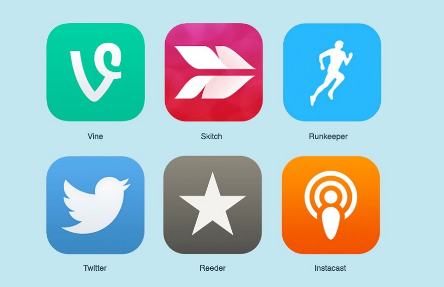
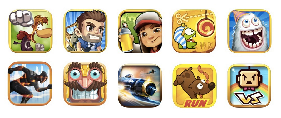
As the two images above show, the icons with less simple elements, shapes and colors are much easier for users to understand than the ones created with a more complex illustration.
The download icon of your app is not there just to create that important first impression, but also to encourage downloads. To increase downloads, you need a representative element or shape that will make your icon easily distinguishable from your competitors or other apps in the app store.
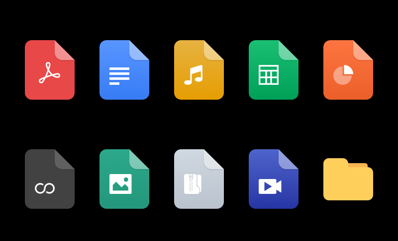
Let's take document icons as an example. Nearly all of them use a file shape and simple white icons to indicate its values and usages.
So, when designing your document icon, a file shape would be useful, but make sure you craft it with different inner icons or colors so that it stands out from the others.
Scalability is important to ensure that your app icon can fit and be user-friendly in different device resolutions and sizes. To achieve this, try to prepare several versions of your app icons in different resolutions and sizes to make sure they look good on any computer or mobile device.
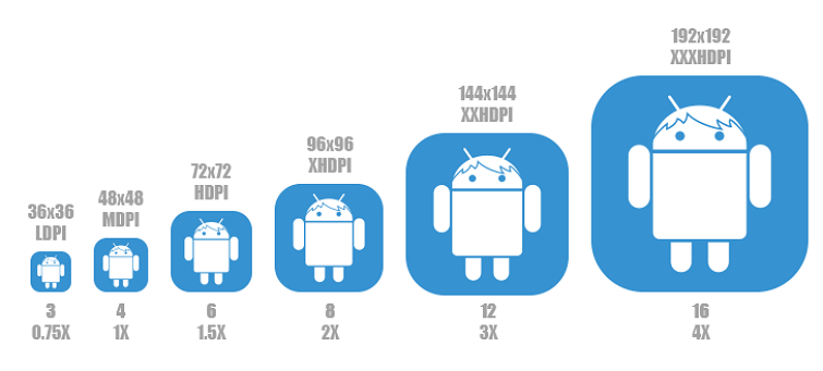
To make your app icon look good on both iOS and Android mobile devices, you should also read and follow the iOS and Android guidelines.
Here are the details:
Read on iOS guidelines
Read on Android guidelines
Along with logos, UI, and other design patterns, app icons are an integral part of your website or mobile app. It is important to keep all your products and designs consistent. So, when designing the app icon, make sure you follow the same brand guidelines so that the icon fits into a consistent brand identity.
Words that are too long or complex can prove hard to read and make the app icon more difficult to recognize and understand. So, when designing the app icon, think very carefully about including words. If you can, avoid words altogether. If you have to, only use essential words that will stand out along with clear representations of your services or values.
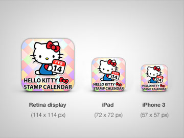
Too many words may make your app icon hard to recognize especially when it is has been displayed in a smaller screen size.
Words that are too long or complex can prove hard to read and make the app icon more difficult to recognize and understand. So, when designing the app icon, think very carefully about including words. If you can, avoid words altogether. If you have to, only use essential words that will stand out along with clear representations of your services or values.
Design trends are changing all the time. The app icons that you've created for a project can be updated regularly to keep them current and to make sure they continue to stand out from the competition.
In the run-up to special events like a festival season, Christmas, Halloween, orBlack Friday, it is a good idea to update your icons and decorate them with elements appropriate to the upcoming event.
For example, here are some Christmas-themed examples of icons that show what you can achieve:
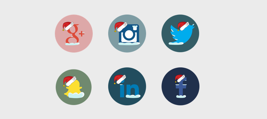

Don't know where to find the best free app icons for your website or mobile app project? We've compiled 10 of the best websites to help you search and download desired app icons:
Dribbble is always the top option for designers to find all design-related resources like icons, logos, UI templates, UI kits and so on. It is also the must-go place to search for both the best free or paid icons or icon sets for your next application.
At Icons8, you can find and download thousands of icons in various design styles for websites and mobile app projects. Many free icon sets come in PNG, SVG or PDF formats. Feel free to search for your desired ones by icon styles and colors.
Flat icon is the most popular place to download free vector icons. With the largest database of free vector icons in SVG, PNG or EPS formats, you can easily select a filter and search for desired icons or icon packs with ease.
Icon Finder offers millions of free and premium icons in SVG or PNG format. Designers can easily search for their needed icons according to design styles, categories and authors. The brand-new free 3D Chritmas icons would be great tools for you to get inspiration for your Christmas sales.
Freepick is a well-known free design resource website that offers nearly all kinds of digital content, including app icons, graphics, stock photos and other types visual files. Over 20,000 vector icons and design resources are free for personal or commercial use.
At the bottom of every icon page, you will find similar features or styles, making it easy to find the resources you are looking for quickly.
Freeicons is a perfect platform to find and download the best free and trendy icon packs. Each icon pack there provides up to 100 icons in the same style or color and would be a good fit to meet different needs or scenarios of your app design.
Material Icons is a professional platform to help designers find and download material icons for their Android, iOS, and web applications. Many beautiful icons and symbols in different styles like Filled, Outlined, Rounded and Sharp are provided to simplify your icon design process.
Iconscount offers an ever-growing collection of royalty-free icons for commercial use. You can find over 135, 000 icons in PNG, SVG, EPS, AI, and other formats for your Android, iOS or website projects with clicks. Also do not forget to share the icon or icon pack that you like with your team to collect their feedback if needed.
If you are looking for the latest design resources like icons, mockups, UI kits,and website templates, Freebies Bug comes highly recommended. Designers and developers alike will be able to find free and high-quality icon packs to suit their needs.
Icon Artchive gives you access to over 735, 000 icons and icon sets around the world. You can freely browse and search for desired icons or icon sets by category, artist, popularity and date.
Alt: Best Websites to Free Download Icons
Wrap Up
Even though app icons are small, they can impress users and increase app downloads and sales. It is, therefore, vital that you and your product team invest time and effort in creating the best set of icons possible for your mobile or website applications.
 Mockplus RP
A free prototyping tool to create wireframes or interactive prototypes in minutes.
 Mockplus DT
A free UI design tool to design, animate, collaborate and handoff right in the browser.
