As one of the largest standalone instant messaging apps, WeChat has announced its release of Mini App with full confidence and ambition to shake the changing tech world. It’s been a hot topic of discussion among UX/UI designers, PM and developers in Asia, though this app is still in the testing period thus far.
With the support of WeChat, having 700 million active users as of May 2016, will the Mini App have far-reaching impact on app market, eCommerce providers, enterprise and other cross-field platform? Will it overpass the major App system - Google Play and App Store? Will it work the same as the motto “Go After Use” and be a killer for tremendous number of traditional applications? Let’s give it a go and see how it look like indeed.

Background Information - What Is Mini App Exactly?
As the name indicates, it is a kind of application that can be used without downloading and installation. This is a great leap forward to realize Touching At Your Fingers, and users will be able to open an app by simply sweeping or searching within WeChat client. This is the very way of “Go After Use”, and no more worries about installing too many apps and eating up the mobile storage. Applications will be everywhere and ready-to-use, with no installation required any more.
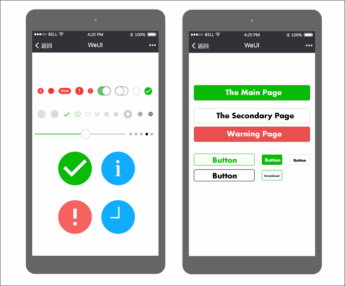
The Official Account of WebChat is very much like the App Store, and it’s meant for app promotion. To help users build and use such a light-weight app, the Wechat official design team has introduced a UI library - WeUI, including the most useful widgets/modules in mobile web applications. Those UI elements deliver the same visual experience of WeChat, offering quite a few components for Mini App development, such as Button, Cell, Dialog, Progress, Toast, Article, Navbar and so on.
Although the pursuit of WeChat Mini App are in droves, there are many insightful minds hold neutral attitude toward that. Whatever the final result turns out to be, the thought of giving it a test trial could be an initiative idea for sensitive PM and UX designers like myself. Make big dream is the thing of bigwigs and let’s do something practical. Work cannot get started without a tool, and here I’ve chosen Mockplus as my assistance.
Notes: Mockplus is a rapid prototyping tool for UX/UI designers to make mobile, web and desktop prototypes and wireframes with a short learning curve. The fully-visualized interaction is my favorite, making it a popular choice among designers of any level especially in China.

How to Make WeUI Components by Using Mockplus?
After a rough intro to WeChat Mini App and WeUI, let’s try making some basic interface elements from scratch. Thankfully those elements are not that much, and I find myself getting it done quickly with the ready-made components and vector icons of Mockplus. This will facilitate the design work a lot by giving a standard and functional example.

In the Prompt and Upload page, I find the place to use interactive command. Let’s say we want to:
1. Click “Successful Notification” button to trigger a prompt window on the screen.
2. Click “Loading Notification” button to trigger a prompt window on the screen.
3. Click “Upload” button to make all the progress bars reach 100%.
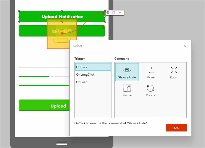
This is not an uphill task. At Mockplus, just select the button and drag the upper-right link point to the needed prompt box. Meanwhile, set “Show/Hide” interaction command, and make “Delay” in Params for disappearing. Remember to set the default state of the prompt box to “Invisible” at the first.

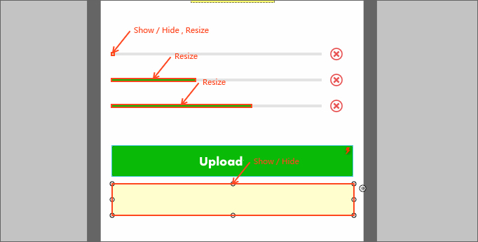
As for the movement of progress bar, just add the “Resize” interaction on each “Progress” component and adjusts the “Widen” values from the bottom interaction panel. Try dragging the mouse to set the interactive link for each component.

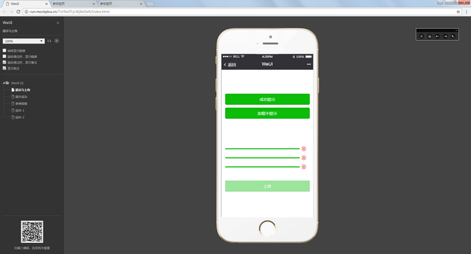
Well, let’s have a look at the completed project which has been exported to HTML webpage.

Wrap Up
During the process of exploring WeChat and WeUI components, I gradually grasp its design essence -Simplicity, Accuracy and Ease of Use. This could be the reason why this great product gains growing popularity and support from tens of millions of users especially in Asia countries. I will share more hands-on experience in UX/UI design field and please comment below if you have any opinion.
More Posts You May Like:
11 of the Best UX Prototyping and Wireframing Tools for Designers in 2016
Comparison of Creating Interactive Prototypes with Mockplus and Axure
10 Questions You’ll Be Asked in a UX Interview
How To Be Successful On Dribbble
 Mockplus RP
A free prototyping tool to create wireframes or interactive prototypes in minutes.
 Mockplus DT
A free UI design tool to design, animate, collaborate and handoff right in the browser.
