Landing pages are perhaps the most important part of a website. Well-designed and effective landing pages draw the visitor's attention to your call to action and give them the information they need to make the decision to act. Landing pages are the pages that can greatly increase conversions for your pay-per-click (PPC) or email marketing campaigns.
In this article, we’ll explore a step-by-step guide to building a high-converting landing page with 20 best examples and templates.

To put it simply, a landing page is usually a web page that exists apart from your main website. It isn't about any page; it's a page that serves to convince visitors to take the desired action you want them to take.
The landing page can be “landed" on after clicking through from an email, ad, or marketing promotion and it is very often a follow up to what you have offered and communicated, taking the visitor to the next step towards becoming a customer.
An effective landing page can help you convert page visitors into followers, sign-ups, or customers. It can be the difference between success and failure for your entire online venture.
A landing page can be a great way to drive traffic, improve your SEO and build your brand. It can guide customers to use specific products, services and encourage them to take action. This is one of your best opportunities to create conversion rates and build a customer base.
A landing page allows marketers to guide their lead transitions by strategically targeting action elements such as links, forms, buttons, and other site elements;
It focuses on specific, short-term goals with high yield results;
It enhances your credibility and shows your customers that you have their best interests at heart through simple messaging and elements of social validation;
It helps to reinforce your brand, with a consistent appearance, tone, style, and text, so as to leave a great impression on the visitors even if they don't convert the first time.
It can be learned from the above information that landing pages are so important, but there is a misconception that they are hard to create and maintain. Fortunately, this is not the case. Creating an effective landing page is not about showing off what you have, it's about giving consumers what they want.
Well, you now might have one burning question that needs to be answered: How to build a landing page? Don't worry, follow these step-by-step guidelines and your question will be answered.
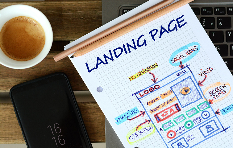
The most fundamental step in this process is setting a goal for your landing page. Your goal determines the requirements for the design and function of your website. A clear goal helps you figure out what design elements are needed from the outset. This includes what layout, what templates you should use and what content might be included. This is commonly designed for encouraging sales, newsletter sign ups, white paper downloads, software trials and more.
Visual hierarchy is defined as the arrangement of elements in a design so that there is a difference between the elements, and the difference has a visual order. Visual hierarchy makes a design look well-organized and has better aesthetics, it also helps to improve information design. When creating a landing page, you need to decide which elements are the most important and make them stand out. Always bear in mind that a design with a clear visual hierarchy is simply easier to understand.
It has been proven that good landing page text is twice as important to conversion rates as design. As for this part, you need to take the following three factors into consideration: the headline, the benefits of your site and the simplicity of information.
As for the headline, you need to make sure it's memorable, clear, and solves the problem your visitors care about most because you only have less than 15 seconds to grab a visitor's attention on a landing page. You need to show the benefits of your site, tell your visitors how you'll solve their problems, how your product will help make their lives easier, and why this will benefit them. Last but not least, you need to avoid complicated business jargon, keep your sentences short, and try to cut out any unnecessary bits that don't need on the page.

The call to action is the primary purpose of the page. It is what you want visitors to actually do on your landing page. The rest of your landing page is supporting information to lead your visitors to the CTA and give them the information they need to make an informed decision. No matter what you want visitors to do - buy, download, join, click, or try for free, you need to make it specific, simple and singular. Try to be more specific and descriptive to get better results by using“See Pricing” or “Start Your Free Trial" instead of “Learn More” or “Get Started“
As you have got your text written and a clear CTA built, it's time to select what images you want to feature - whether those are product images, stock photos, or custom illustrations. We all know that photos and videos bring your work and product to life, so you can try to include real photographs of people using or enjoying the product on your landing page if possible. Doing this can help visitors connect with your offer on a more personal and emotional level - also helping to increase the conversion rate.
It has been shown by studies that centered, single-column landing pages convert best. You can start your design by using a template, and then drag and drop your text and visuals onto the landing page. Here, you can find out what it looks like and which sections you might need to trim. Also, remember to give your landing page the same look and feel as the rest of your website and make it match your brand colors precisely.
Here's a mind-blowing statistic: there are now officially more mobile devices than people in the world. Therefore, it is imperative for you to do page optimization for mobile devices because people will 100 percent look for your website on their smartphones. Keep in mind that a proper mobile web page will not have the same design as your desktop web page. It should be minimized and formatted for easy reading on handheld devices.
If you use a design tool like Mockplus, you can select an artboard size you want to start your prototyping and also have it previewed on devices like iPhone, Android or iPad, all of them can help to make your landing page more mobile-friendly.
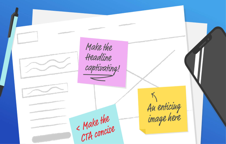
Before you hit publish on your landing page, do not forget to give it one more look-over to make sure you're ready for a world debut. At this phase, you need to do a quick spot-check to make sure there are no typos or grammar issues on your page. Also, check the SEO and make sure you select what you want on your page to be visible to search engines and optimize it by writing a keyword-focused page title and meta description. What's more, just act as a new visitor, and go through the page to see if there's anything you missed, see if there is anything missing.
Everyone knows that creating effective landing pages isn't a one-size-fits-all project. What works for one site might not work for another. For this reason, you have to keep experimenting - or to be precise, A/B test - with different ideas to see what works and what doesn't. You can take the following features into consideration when you conduct testing: headline, CTA, button size and placement, number of form fields, images, right/left/center column design, and colors. But also test each variant one at a time - if you change five different elements, you won’t know which element impacted conversions.
With the above guide in hand, you may find that creating landing pages from scratch is easier than you thought. Now I am going to share some of the best landing page examples I've found online, which can help to inspire your design.
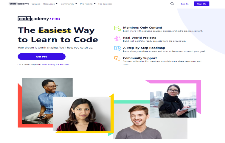
This example of a landing page from Codecademy shows that using white space throughout your design can help to draw the visitor's attention to crucial page elements. Codecademy has kept its design simple with bold pops of color instead of filling the page with distracting imagery, gradients, and full-screen backgrounds, which is appealing to visitors' eyes and easy to get their message across.
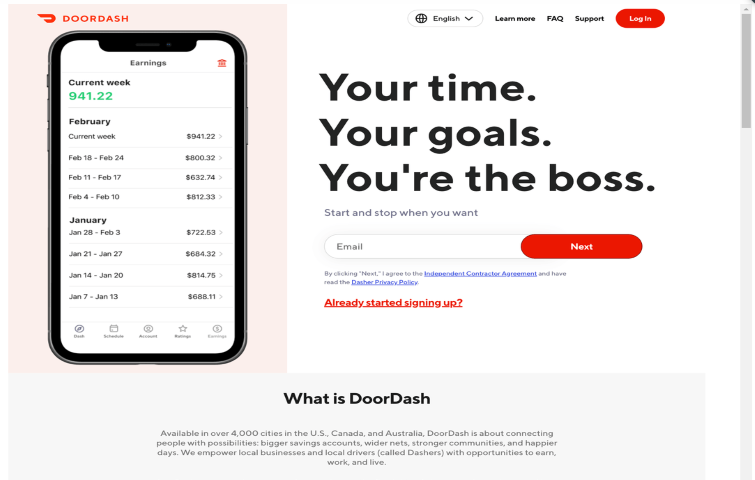
Food delivery is big business, and companies like DoorDash are using landing pages to get more drivers to sign up for their service. The message they want to get across is simple and obvious, with bold headings highlighting the benefits you can get from being a new full-time gig or side-hustle. The benefits and headline hook in visitors and use a simple CTA button to quickly onboard drivers.
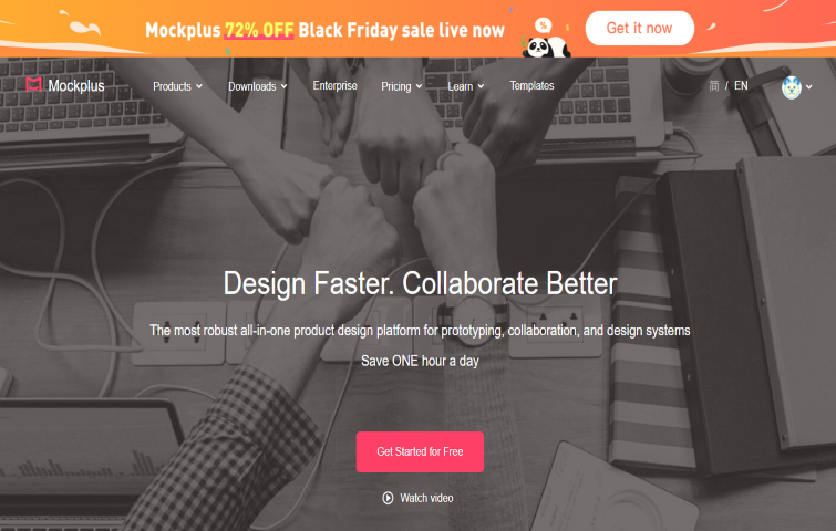
If you're looking for a landing page design from a SaaS business, you'll love this example from Mockplus. The headlines describe all the benefits of Mockplus at a glance. Multiple CTAs work together to convince prospects to convert. The video case study at the bottom of the page shows how you could use Mockplus to achieve your business success, the combination of bold headlines, video and images is far more engaging than simply using words and text.
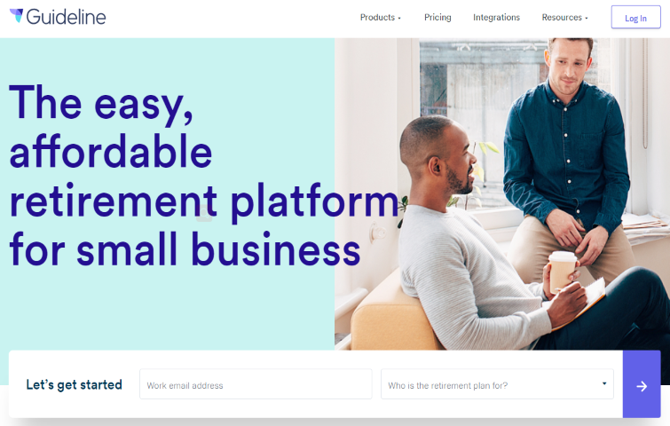
This example of a landing page from Guideline highlights its service, and the form is short and only asks for the most needed information, not adding unnecessary fields in the process. The white space throughout the page makes the page aesthetically pleasing and likely won't create anxiety for prospective customers. The form headline and the CTA button copy maintain a consistent message.
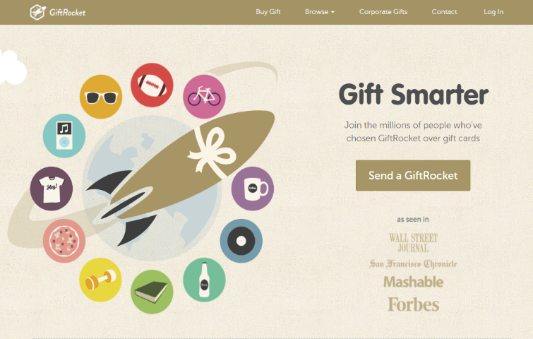
Here is another site with a strong landing page, Gift Rocket. It has a strong graphic element that grabs attention and the Header explains, in a few short words, what Gift Rocket is all about. The CTA button is clear and easy to click, the page also has smaller bulleted information pieces below the header that can be easily scanned.
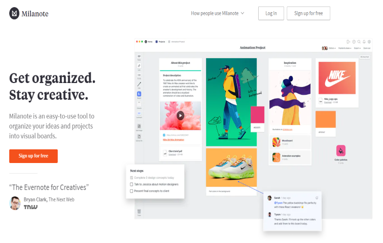
This visual organization platform Milanote offers an easy-to-navigate LP as their main website's homepage. This landing page has a clean and white background, which allows the product description and CTA to stand out. A colorful, collaborative product example is placed on the right side. The page also shows various tools and features that display the product's capabilities in a fun, engaging way. The whole page has very bright colors that add to the whole experience.
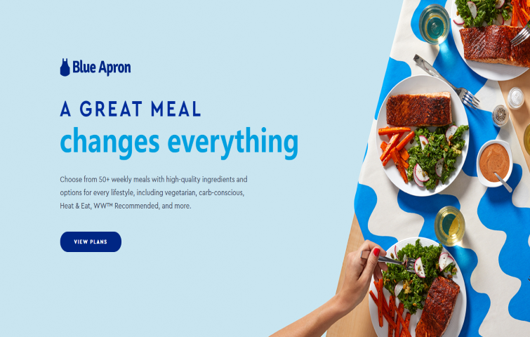
This landing page of Blue Apron is another great landing page example. Their logo, headline and CTA can be found front and center. The layout is a huge bonus to the design hierarchy, ensuring the image is working in addition to the text, while not taking over the visitor's attention. The sub-headings serve as an explanation of how their service works. More importantly, their CTA remains consistent throughout their page. It appears several times, ensuring that when a visitor is sold and has made the decision to claim their offer, they won't need to scroll at all to click on that all-important CTA.
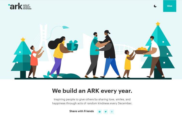
ARK is Dedicated to spreading acts of random kindness, and it's heartwarming mission is successfully conveyed in its landing page. Accurately reflecting their values and messaging are the heart-shaped cursor and adorable animated vector art at the top of the site. There's also the option of changing the display to dark mode, enabling site visitors to adjust the design according to their preferences. As you scroll, the menu at the top stays put, inviting you to click the CTA Give button at any point during your browsing.
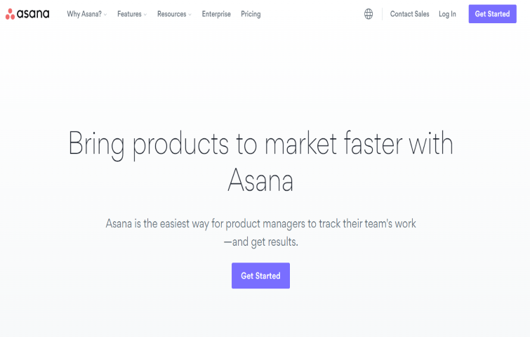
In this landing page design, Asana targets product managers, offering a product management software solution. The page is completely tailored to this audience, simply explaining why their product is the best choice in a few seconds. The headlines describe all the benefits of Asana at a glance, and the CTA button color draws prospect attention. What's more, the final CTA offers a free trial, which is less scary than diving in and buying the product right away.
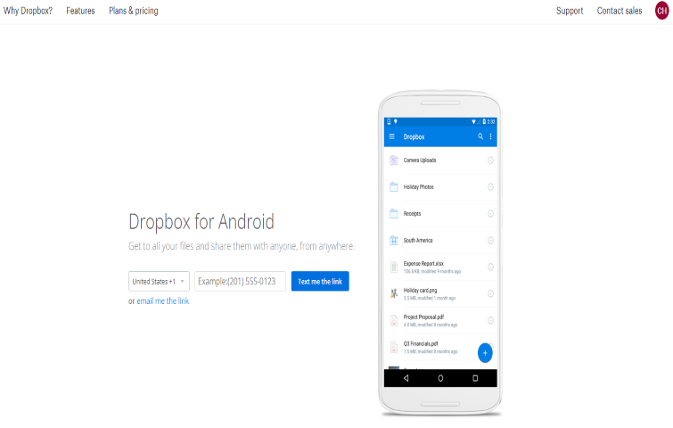
If you want people to use your product, the best solution is to make getting it as easy as possible. That's what Dropbox did with their Dropbox Android app landing page.
The headline and description have no unnecessary information, a simple 3 second skim read and before seeing the CTA button.. On the right side, a preview of the app is shown, giving users an idea of how it'll look on their device. The form on the left does not require unnecessary information, just enter your phone number, and they'll text you the link.
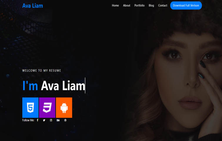
Ava– Creative Resume Free Landing Page Template is best suited for doctors, engineers, nurses, architecture, programmers, coders, web developers, graphic designers, JS developers, freelancers, or any other professions. The page is simple and grabs visitors' attention with your name standing out.
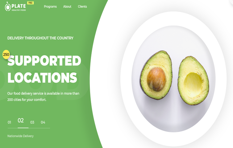
Plate Food Delivery Free Landing Page allows you to easily get a good website for your food delivery service. You can adjust this template to satisfy your own needs to make your website engaging and profitable. It is an HTML Template developed to satisfy these exact purposes.
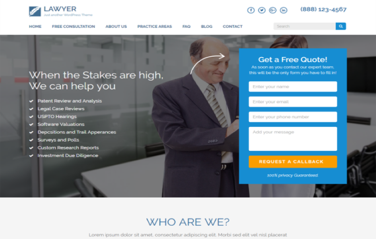
Lawyer Landing page is a sophisticated, elegant and professional theme for Lawyers, Law Firms and other professionals. The theme is very versatile and can also be customized to fit other brands and industries.
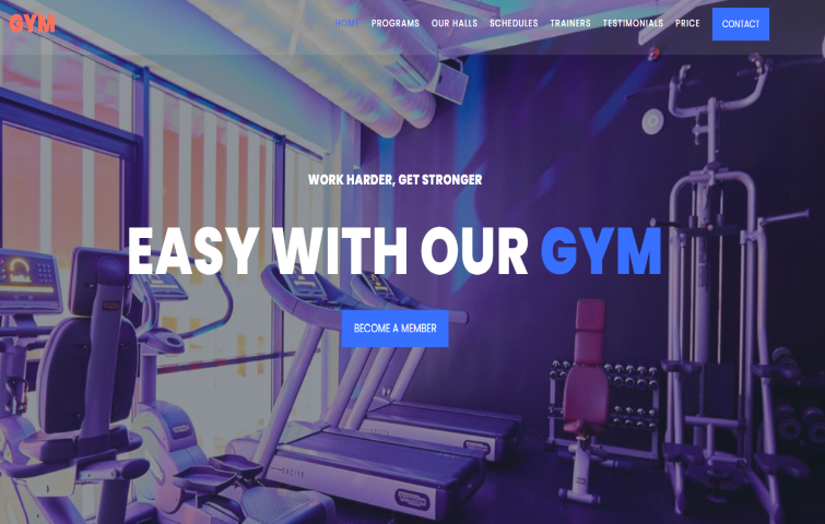
Nowadays, almost every establishment of sports facilities has its own website. Gym is helping accelerate this trend with a great template. It is quite easy to use and it will help you not only speed up the creation of your website but also give you the opportunity to stand out from the rest.
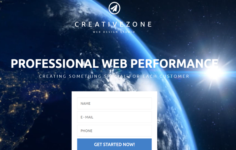
This professional CreativeZone freebie with great potential will work perfectly for presenting design studio, art & photography, architecture, interior, exterior, or business projects online. Its clean contemporary layout will not overshadow your business ideas, but bring them in to be the focus of attention.
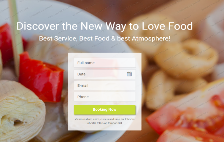
This is a free, mobile-friendly HTML sample developed for food-related sites. This eye-catching item will help you present your business on the Internet in the most beneficial way.
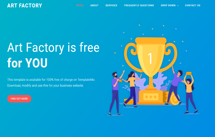
This is a Bootstrap 4 website template with vector graphics. This layout can be fit as an HTML landing page for your digital marketing. The main menu on this page has a drop-down sub-menu option and the carousel boxes can be used for multiple purposes. In total, a flexible and high-quality landing page template that your brand can use to get the most out of your landing page.
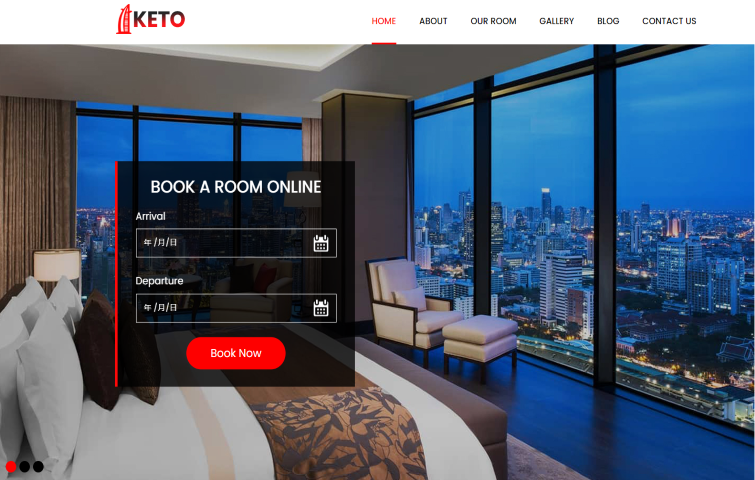
Keto is a free Bootstrap 4 HTML5 template for hotel businesses. It is a stunning theme for hotels, resorts, and other websites that are linked to travel and booking. It has a modern, clean, and minimal design, so your users will have a great user experience with it going from knowing what your page is about to quickly starting a booking.
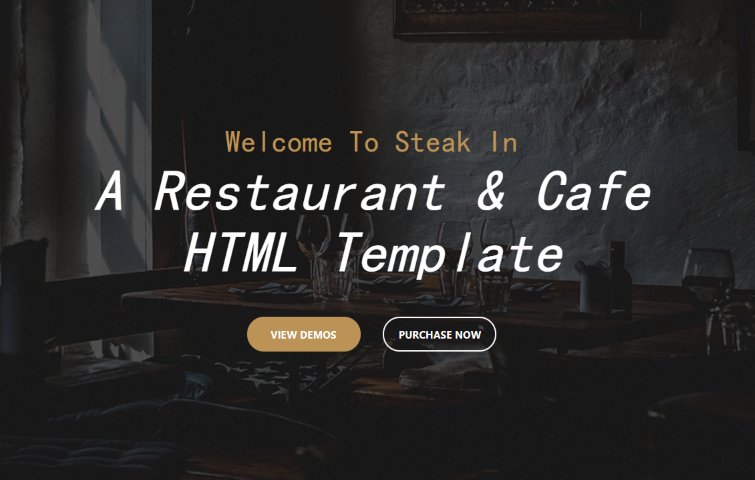
Steak In is a restaurant Html5 Template suitable for any business operating in the Restaurant industry. Based on Bootstrap & designed with great attention to details, flexibility and performance, it is ultra professional, smooth and sleek, with a clean modern layout.
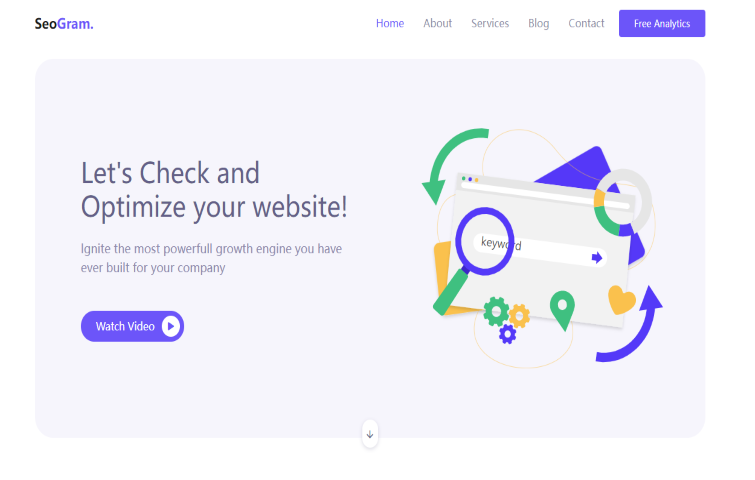
SeoGram is a free Bootstrap 4 landing page template. It is mainly for SEO content strategy and search engine marketing consulting websites. This versatile HTML website template is a great solution to building an attractive website quickly and efficiently.
Landing pages are crucial for conversions, so it's important to make sure they're well planned, designed, and implemented. A well-optimized landing page can transform prospects into leads by gathering information that can help you better understand, market to, and delight visitors.
Fortunately, creating a powerful and high-converting landing page isn't rocket science. Just get started by implementing this step-by-step guide and refer to the best examples and templates above, and you'll be well on your way to engaging your visitors and converting them into customers.
 Mockplus RP
A free prototyping tool to create wireframes or interactive prototypes in minutes.
 Mockplus DT
A free UI design tool to design, animate, collaborate and handoff right in the browser.
