Lists in UI design come with multiple images or text options to save interface space and integrate UI interactions effectively. They help designers add on to the visual appeal of a project and bring users a unique experience.
In this guide, we will present the basics of list UI design, the best examples, principles, tools, patterns, and other free resources are also covered to make your own list design faster and easier.
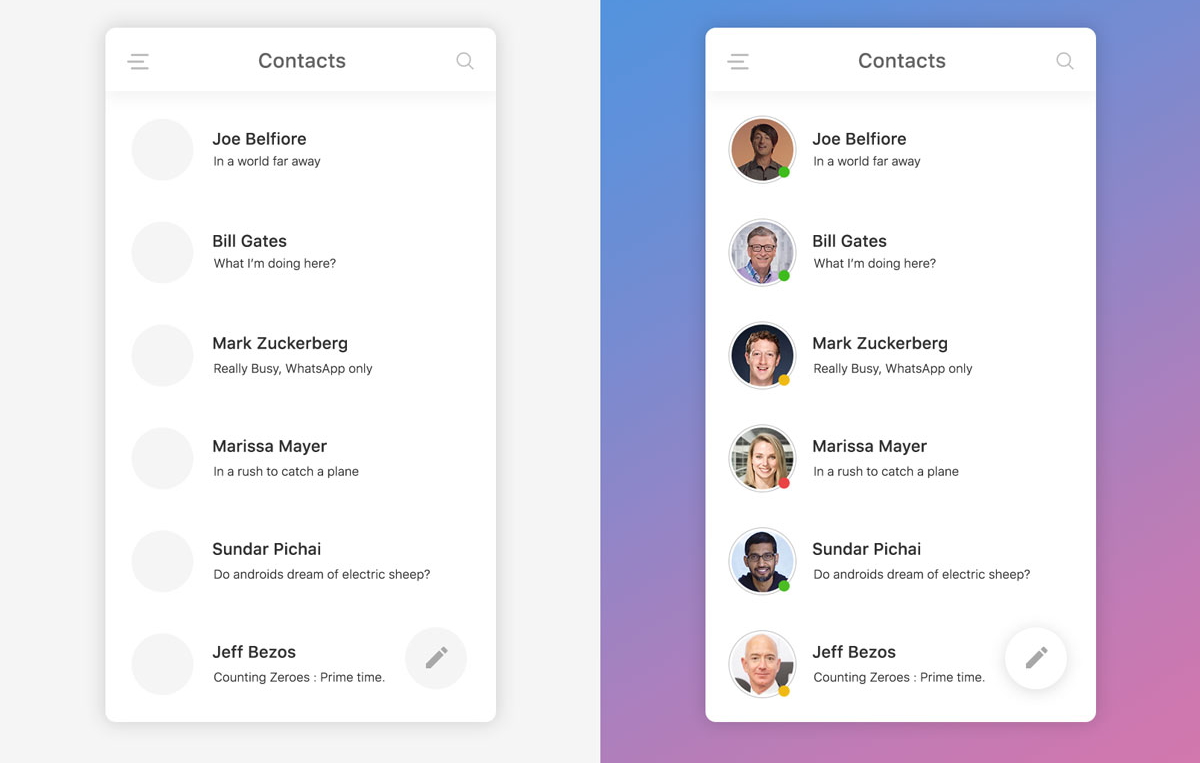
Lists in web/mobile app UI design are galleries of text, images, or card options that can help users choose one or more options to achieve their goals effortlessly. Many common elements such as drop-down menus, list boxes, checkboxes, and radio button groups are typical examples of list UI design. They are often shown vertically, horizontally, or even floating in free space. This is an example of a list:
UI lists often consist of three parts: supporting visuals, text content, and metadata.
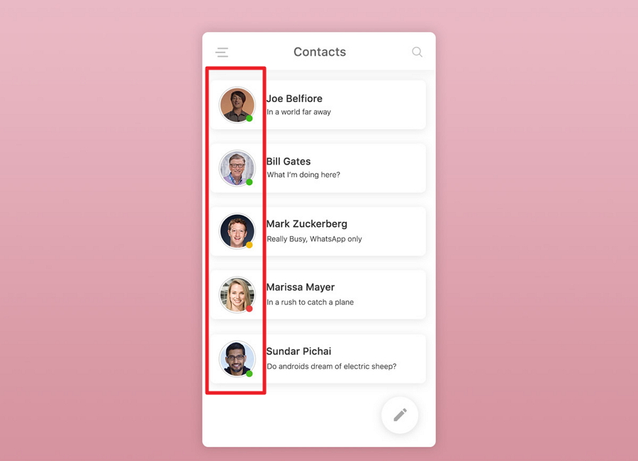
Supporting visuals are a series of icons, images, avatars, and thumbnails that are often located in front of every list item. They help to draw users' attention quickly, make the entire list UI design scannable, and align items better.
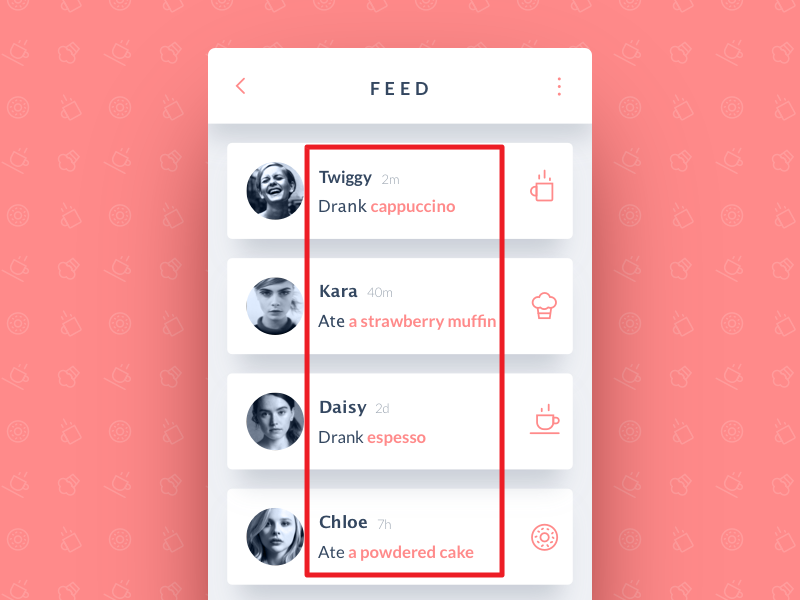
Text content, as the name suggests, is the main text content of each list item. It describes the options clearly and guides users to choose their desired solutions smoothly. So, no matter why you add a list to your user interface, you should pay a lot of attention to the item text and present your information clearly.
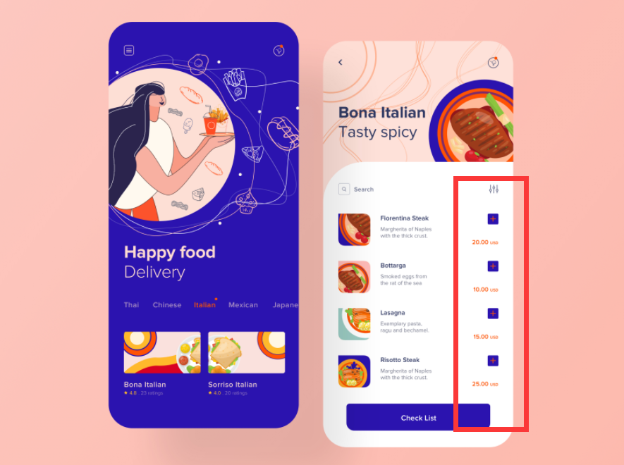
Metadata is often placed at the end of each list item and helps deliver second-tier information about your list item. It can be a star rating, CTA button, number rating, product price, item order, and other extra item information that designers want you to know.
While designing the UI of a website or mobile app, three types of lists are commonly used:
Text lists UI design are list elements that use only text to present different options. According to the number of lines of text in every item, they can be divided into three groups.
Single-line list is a list that uses only one line of text to present item options in a short and clear description. It is easy for users to scan and understand because the text is short and simple.
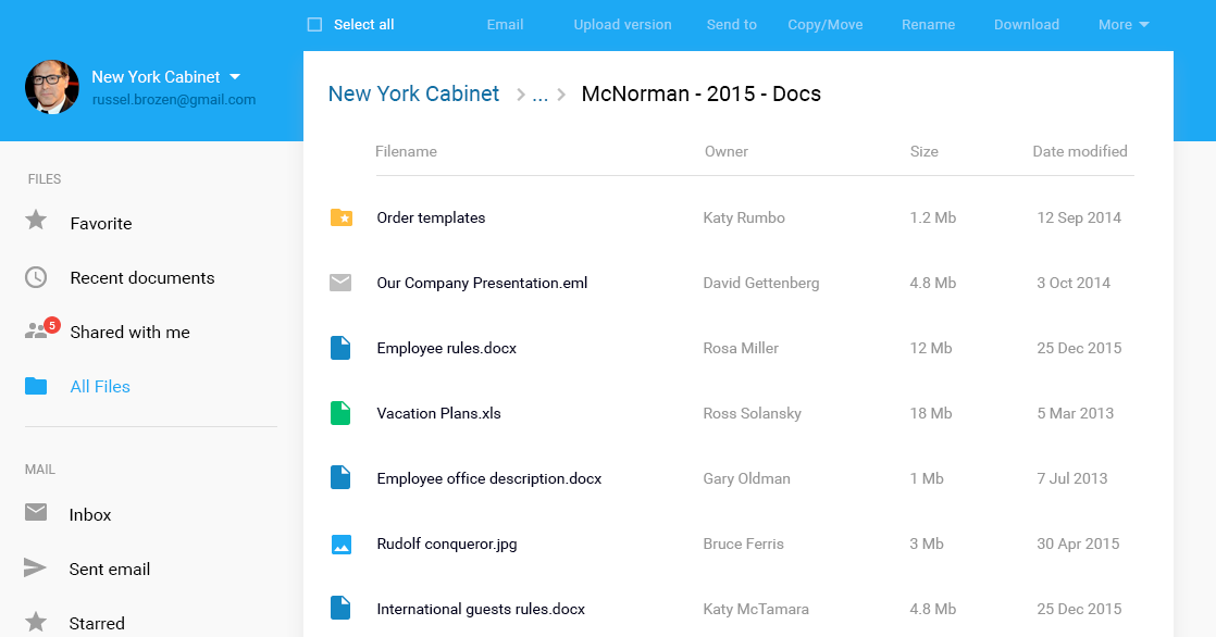
Two-line list is a list that has two lines of text that is used to present item options in two levels. It resembles titles and subtitles, providing users with more detailed information.
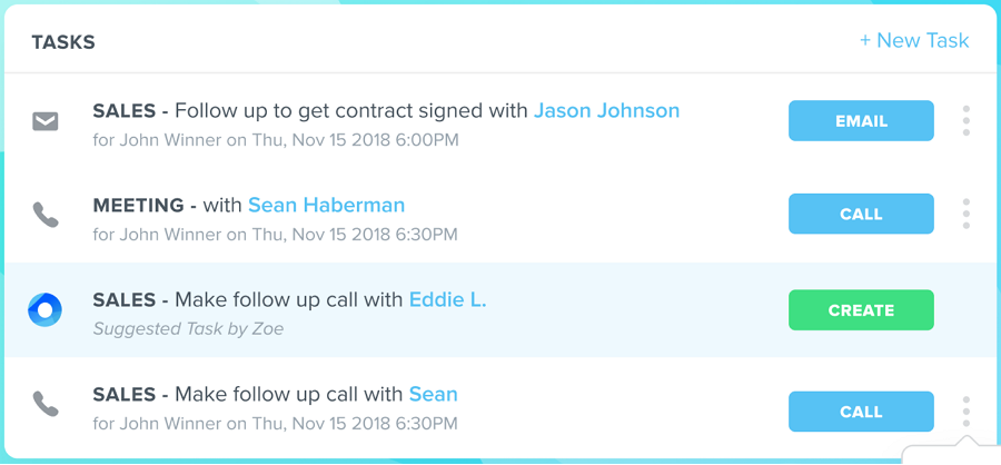
Three-line list is a two-line list with extra information, such as file downloads, star rating, likes, and so on. Since it takes up a lot of space, it is not used very often in user interfaces.
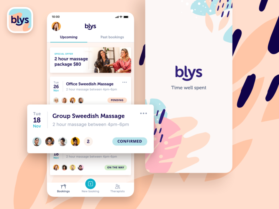
Image list UI design are list elements that present options with images. Since images speak louder than words, image list UI design often works better than text list UI design. However, they may also take more screen space and affect the entire page layout. So, it is much better to be used in the navigation bar or system of your website projects.

Card lists showcase options with images, text, and even CTA buttons. They attract users' attention quickly and help them navigate different parts of your website or mobile apps with ease.
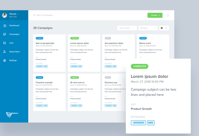
When you need to provide users with a variety of options or solutions, in comparison to showcasing everything in a whole paragraph, using a list to present them separately with a clear hierarchy and proper spacing helps in attracting users' attention easily. An intuitive and scannable list makes it easy for you to organize interface information better.
For designers, showcasing everything in a list is very simple. You can easily write down all your ideas or options line by line. There is no need for any complicated sentences or paragraphs. For website or mobile app users, lists are easy to read, scan, and understand. It simplifies the design work of your team and delights users.
A successful list UI design integrates multiple interactions and guides users to achieve their goals easily. This helps you to save screen space, load pages faster, and reduce design cost-effectively.
Some list UI designs, especially the intuitive image or card lists mentioned above, can not only deliver the page content better, but also help you increase the visual appeal of your project easily. They can also leave a huge impact on the usability of your project in a good way.
In short, UI lists are good elements to create the best UX and UI for your projects.
To create a scannable and eye-catching list design, you should keep all list items connected, logical, actionable, and consistent.
Connected and logical - Lists are created to deliver page information or provide user action options/solutions. All items provided also need to be related to each other logically, making it easier for users to follow and understand.
Actionable - All items need to be designed such that they are easy to identify, select, and interact with.
Consistent - All items should have consistent formats or styles of icons, texts, and other actions.
In short, make your entire lists easy for users to scan, identify, and operate.
While designing a list, you should pay attention to some details like:
Visual style - The overall visual style of your lists should be in accordance with your website or mobile app, making it easy on the eyes.
Alignment - To make a scannable and easy-to-follow list, you should focus on item alignment. No matter whether you are trying to list your options horizontally or vertically, left-aligned items can help you create comfortable design.
Spacing - White spaces between different elements inside an item or between different items affect the user experience. Too crowded lists or items are hard to read and discourage users easily.
Dividers - Dividers like a gray line separate items visually, making it easy for users to grasp the information about each item. You should not forget to use a separator line when designing.
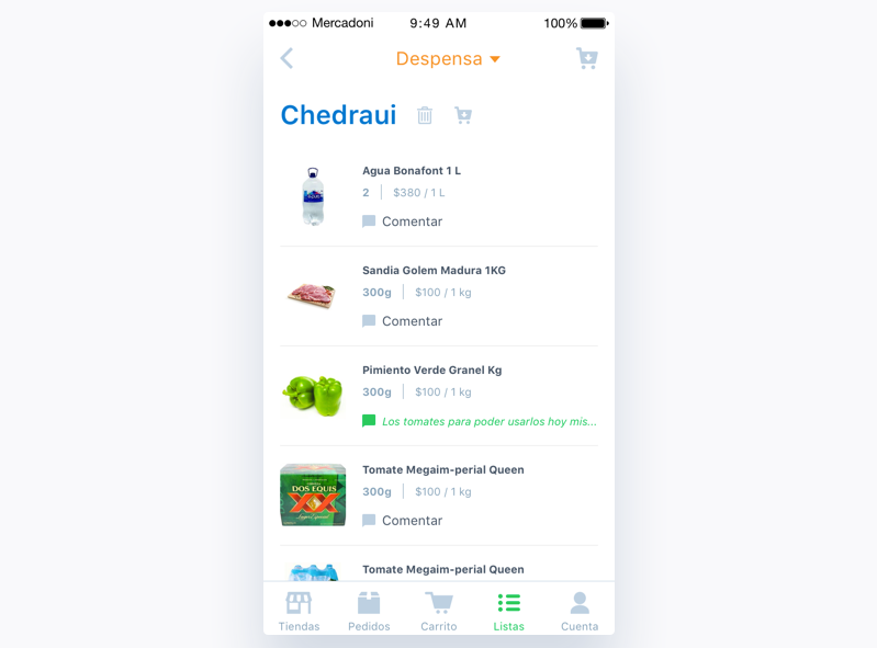
Color schemes - A good color scheme helps designers engage users and convey an emotion or spirit easily. While designing a list UI design, the color scheme, which includes the color of icons, text, and rating buttons, etc, helps you attract users and make your interface stand out easily.
Others - Other details such as checkboxes, radio buttons, icons, images, and so on should be discussed and iterated to get the best UX.
To create a user-friendly list UI design, you should also consider interactions, animations, and transitions. Selection interactions for list items help users know which items they've selected. Animated lists help in attracting users' attention and provide them an interesting experience. Transitions for lists items, especially for an image or card list items, guide users to the next item in an intriguing way. They all are good ways to create a distinctive list.
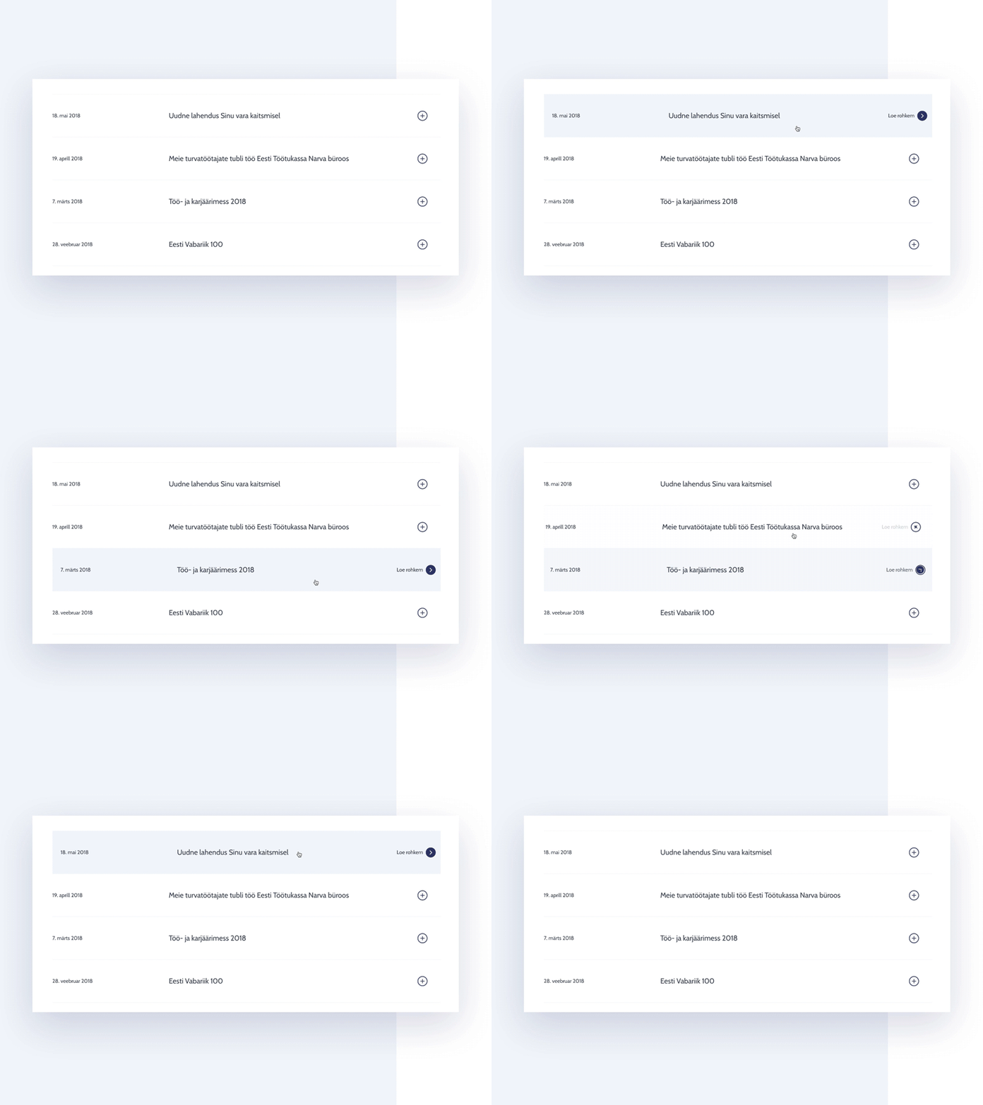
To create the best UX, not all list designs are presented directly. Some designers often use drop-down menus or navigation bars to show or hide their lists. In this way, users can easily choose to expand or collapse the list options according to their needs.
As a part of the website or mobile app design, list UI design should be visualized and tested out on time when you and your team are working on it. You will surely need a handy prototyping tool to translate all list design ideas into prototypes and test every detail completely in your web/mobile app UIs. It will help you a lot in testing your entire design project to the fullest.
To help you understand the list UI design better, let's then check some list design examples and templates in web:
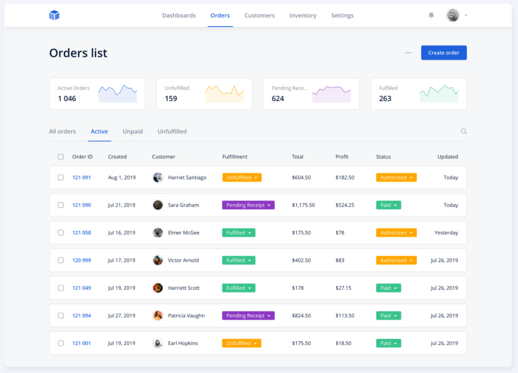
Orders List is a typical one-line list design for an e-commerce website. All items present rich order information such as order ID, creation time, customer, status, etc, and allows users to easily scan them. It is a good example for you to learn how to create a one-line list.
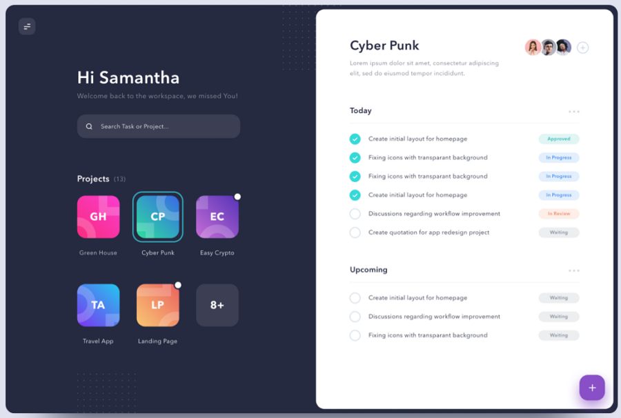
Dashboard for Task Management is a good example of how to list and manage tasks. The one-line list on the right side consists of icons, task information, and task statuses, which users can scan easily. The buttons that present task statuses in different colors highlight the information and make it easy for users to understand.
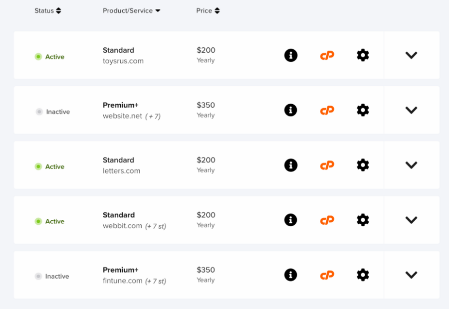
Modern List UI Design is a two-line list design for website projects. The green status buttons on the left let users know the status of each item clearly. Similarly, you should not forget to choose the right color to highlight the desired item information when you are working on a two-line list.
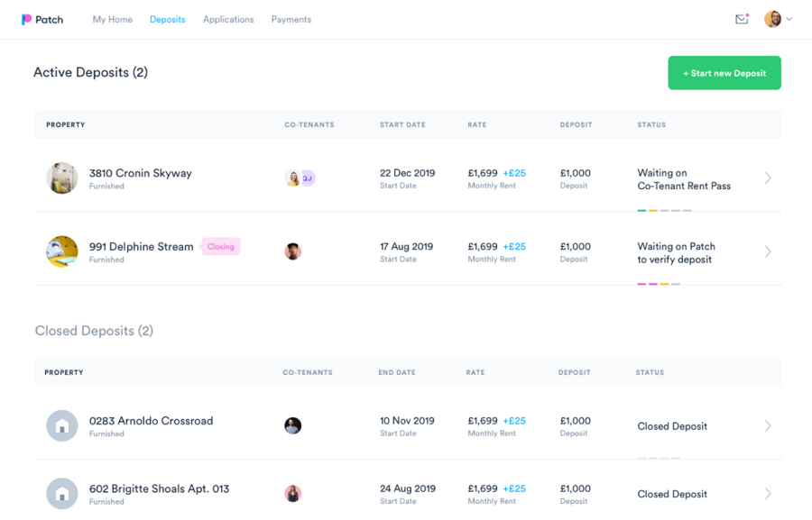
Patch Dashboard Deposits Listing is a list UI design for Patch dashboard and has two subheadings for deposits. Each item has deposit history, current status, and other information displayed clearly. It is a good example of how you can create a two-line list with consistent visual language.
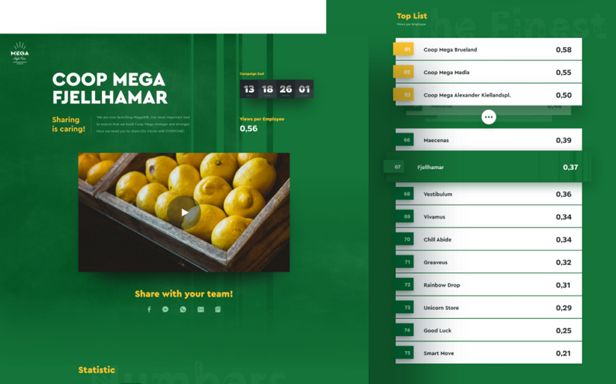
Mega High Five is an example of a list made for a supermarket store Coop Mega. Its UI design stands out from other packs for eye-catching color schemes. It is a good example of how to keep your lists consistent with the entire website style, especially the color scheme.
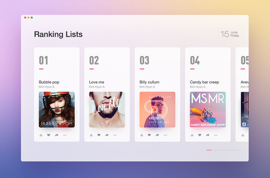
Card List Example is a ranking list design that consists of different cards. It is a good example of how to create a card ranking list for a music or e-commerce website or app.
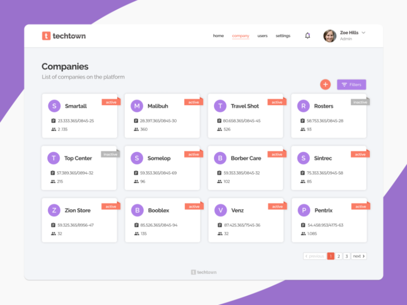
Techtown List Design is a company list designed for a business center Techtown. It displays all company information using cards in three columns, resulting in a really clean and neat interface.
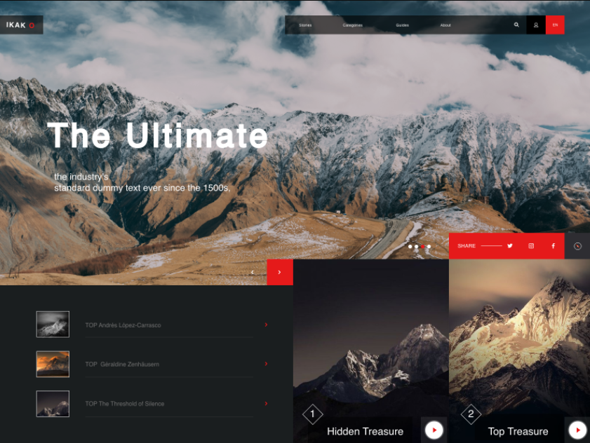
Mountains UI List is a typical example of an image list UI design. The right image preview in combination with the left thumbnail list makes it easier for users to understand the web menus.
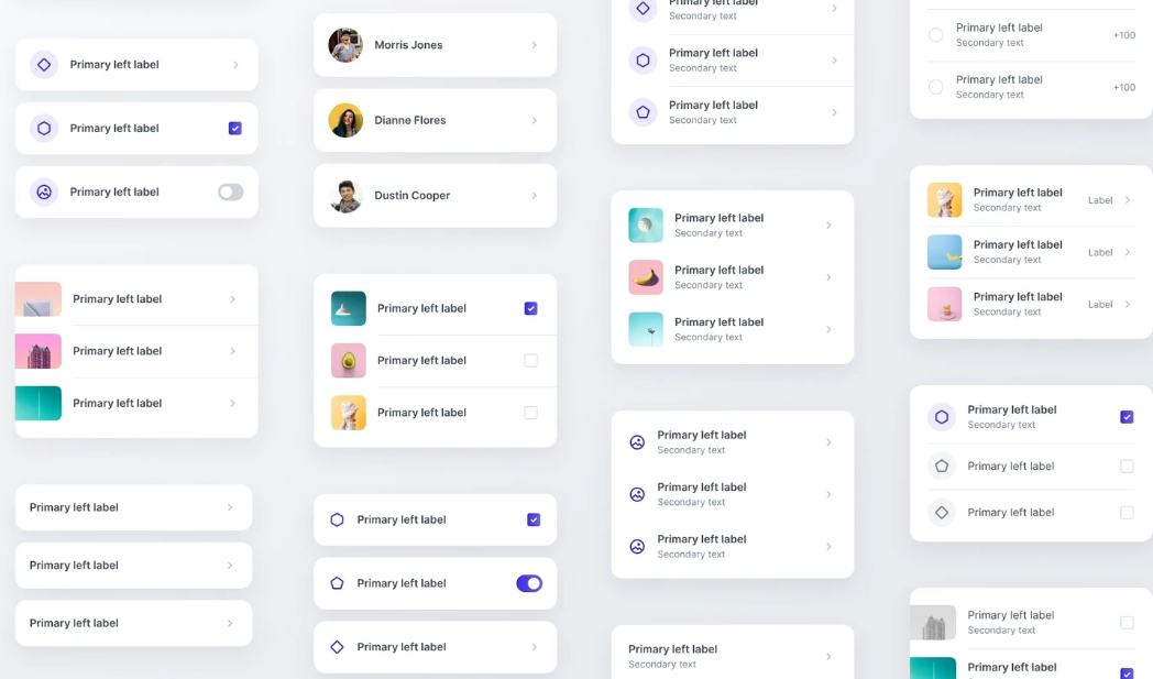
Leverege Design System Lists is a design system collection for list UI design. It includes lists with different icons, images, and buttons. It is a good tool for learning how to create different types of lists for your website project.
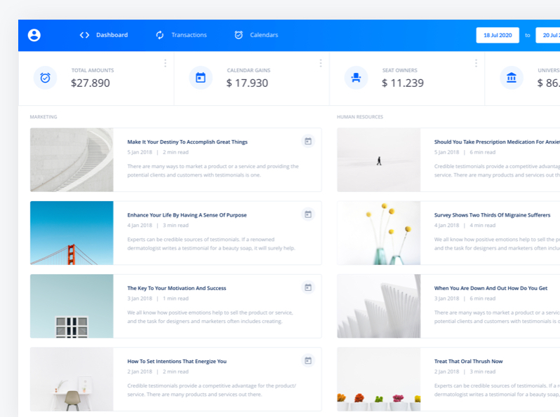
Item List UI Kit is a UI kit resource for SaaS Admin Dashboards which uses an image list design to present all interface information clearly.
These list UI design examples and templates for mobile apps can also give you some inspiration.
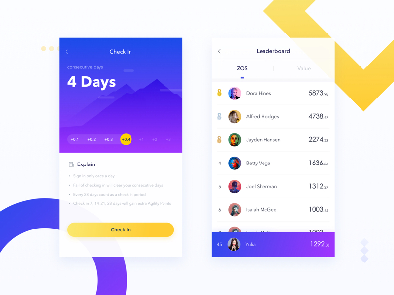
In comparison to PCs, the screen size of mobiles is much smaller. Thus they can display less information. So, while designing a list UI, designers should pay attention to the screen size and add less content. This App list design deals with such problems perfectly and is a good example of one-line list design.
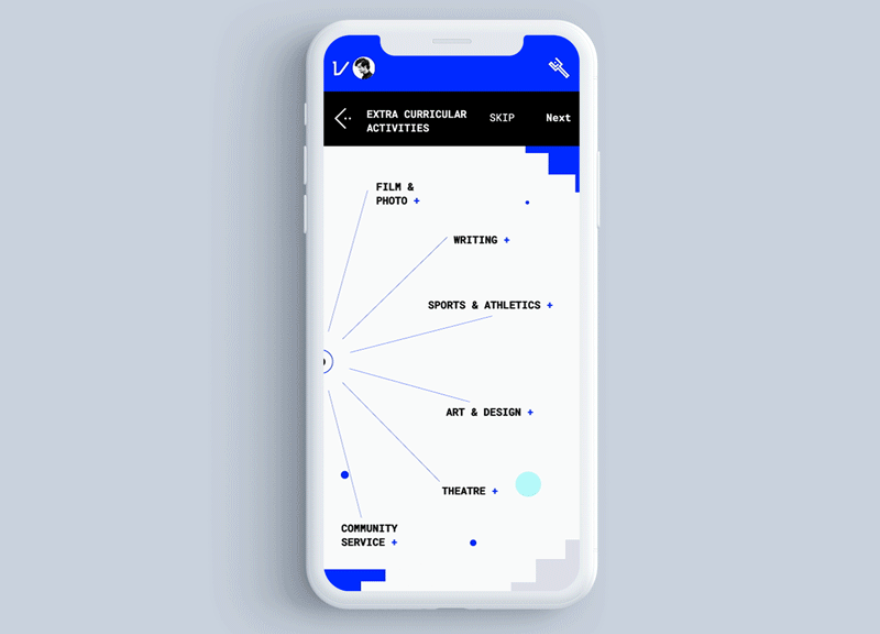
Unlike other list UI designs that display different options vertically or horizontally, Student Registration uses a special circular layout to showcase all options vividly. Users can easily scroll through the circular list to select their desired option quickly.
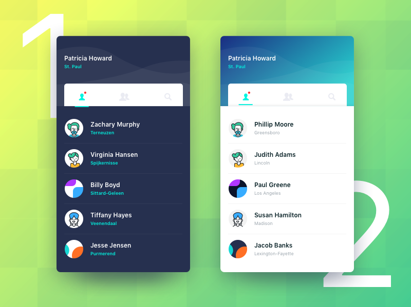
Chat List UI is a beautiful two-line list design with an illustration style. The eye-catching color schemes, the cute avatar illustrations and clear dividers create a really delightful and comfortable user experience.
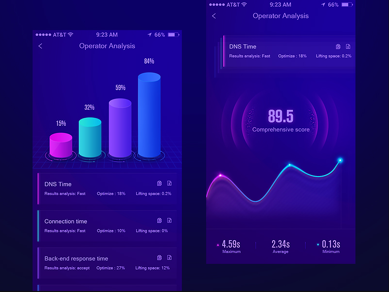
App Data Graph Interface List Design is a cool list UI design with two-line text. You can use it as a guide to creating the perfect color scheme for your mobile apps.
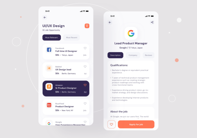
Job finder Mobile UI Job list is a wonderful list example that uses three-line text. The designers use different text styles and font sizes to create a clear hierarchy for each item, making it easy for users to scan and find their desired information.
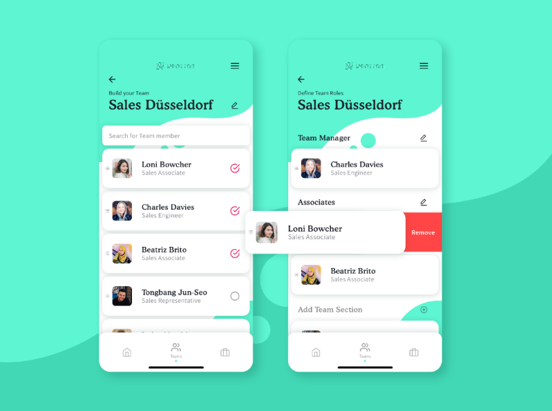
Team Configuration Page showcases a list design for a team configuration screen. The items that display the client details are contained in a card design. It is a good example of how to create a card list design for your mobile apps.
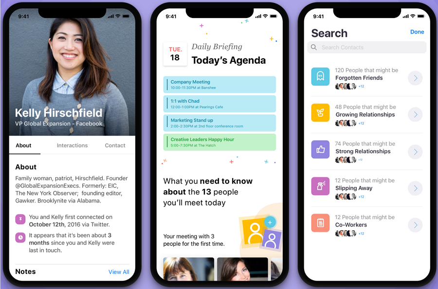
Relationship Improvement App has a creative three-line list on its Search page. You can check this example to learn how to create a filter list design for your search page.
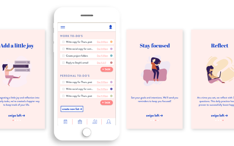
International List Example is the UI design of a to-do list mobile app. It has a very modern design with illustrations.
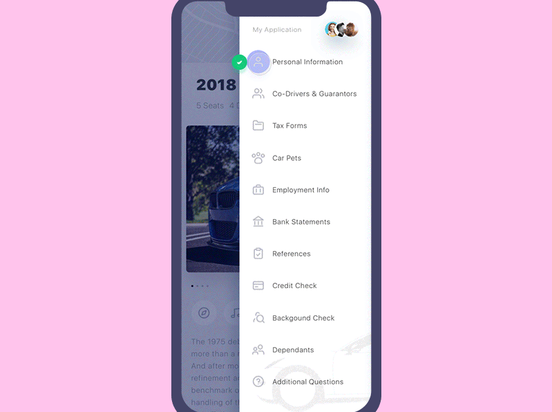
Get Wheels List is a drop-down menu list for a vehicle renting app Get Wheels. This list UI design is the perfect example of how to present list items with icons. It is a good inspiration for designers to create a minimalistic list or interface design.
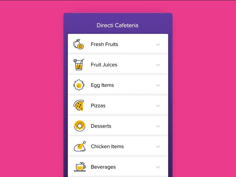
Remote Food Ordering List has been made for a remote food delivery app. It has a very beautiful appearance. The list transition animations present different dishes in a very cool way, engaging users effectively.
We’ve picked more UI design resources that you can use to make your own list designs with ease. You can check them out.
This website includes many mobile list UI designs from different platforms like Instagram, Peach, and more. It is a good place for getting inspiration before starting to design mobile lists.
25 Great To-Do List App UI Designs includes 25 of the best mobile UIs for to-do list apps from Dribbble. Most of these apps have brilliant designs. It is a good design collection for you to get inspiration.
Drop-down menus are one of the most common list types that designers use to improve their UIs. This top 40 drop down menu list examples presents 40 drop down menu list examples and the tips that you can follow to create your own lists with ease.
List UI designs integrate interactions, reduce cost, and load faster. They simplify the user experience and provide more chances to increase sales.
We hope that these basics, examples, tools, design principles, and resources of list UI design can help you learn it better, and create an excellent user interface quickly.
 Mockplus RP
A free prototyping tool to create wireframes or interactive prototypes in minutes.
 Mockplus DT
A free UI design tool to design, animate, collaborate and handoff right in the browser.
