As Google's Material Design is utilized on many websites and apps, inevitably, designers used material design principles with the prominent color schemes to distinguish their brand. Notably, Material Design colors are bold and bright.
According to the official documents of Material Design:
“Color in Material Design is inspired by bold hues juxtaposed with muted environments, deep shadows, and bright highlights."
Color is one of the most important elements of brand identity. For example, the black and white theme in UBER or blue and white on Facebook. How to use color in UI design wisely to create a brand identity? Are there colors that are more effective than others? What tools are the most helpful? I have put together a list of useful material design color tools that will help answer these questions.
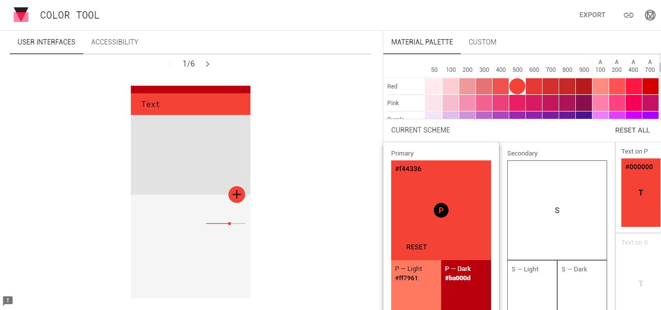
Features: Complete Color Scheme
Material.io is Google's official material design color matching tool. The users need only select their favorite color in the palette and it will immediately display on the App interface. Use the color scheme palette, found in the lower right, to apply the current primary color, secondary color, and the color number of the text color.
Tips:
(1) In Material Design, the main color is the color that most often appears in your application. A secondary color is a color used to emphasize the key parts of your UI.
(2) The secondary colors are best used for:
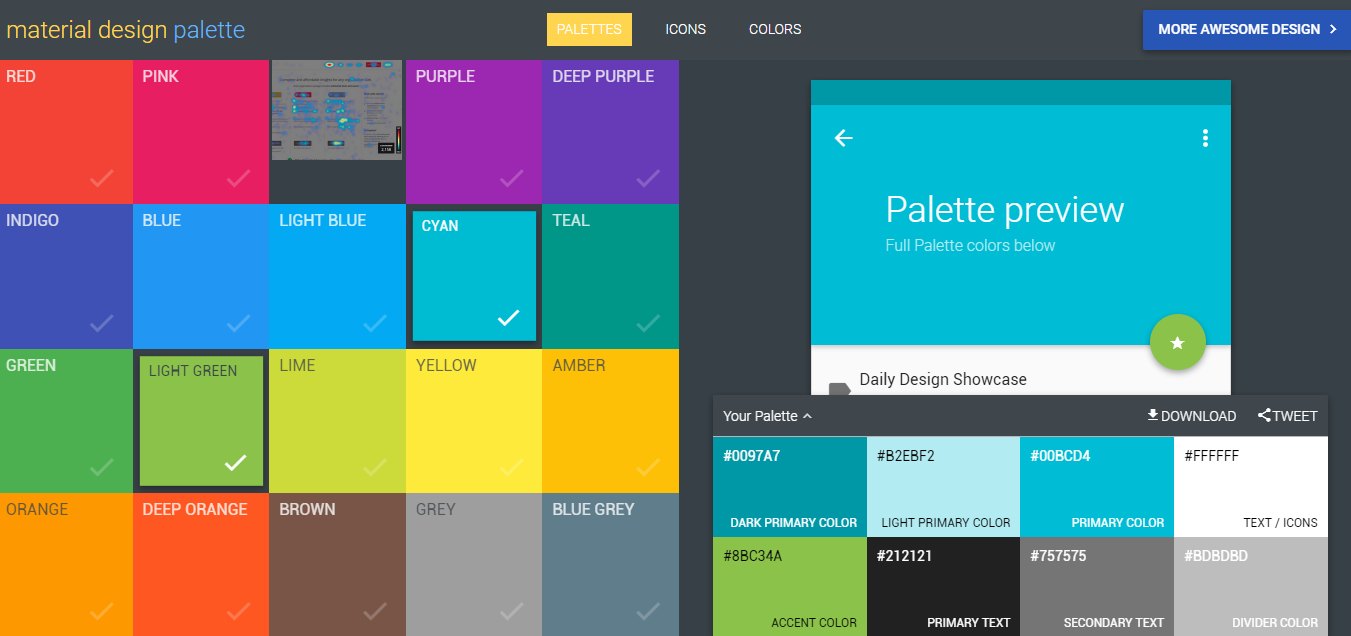
Features:
Material Colors is not only a palette but also an icon tool and a color tool. The main feature of Material Colors is that it allows the user to select the color and preview the color effect in real time. It’s simple and easy to operate. You only need to select 1 or 2 colors, and the system will match a set of APP UI color schemes. It is worth mentioning that this site provides online sharing and downloads in a variety of formats.
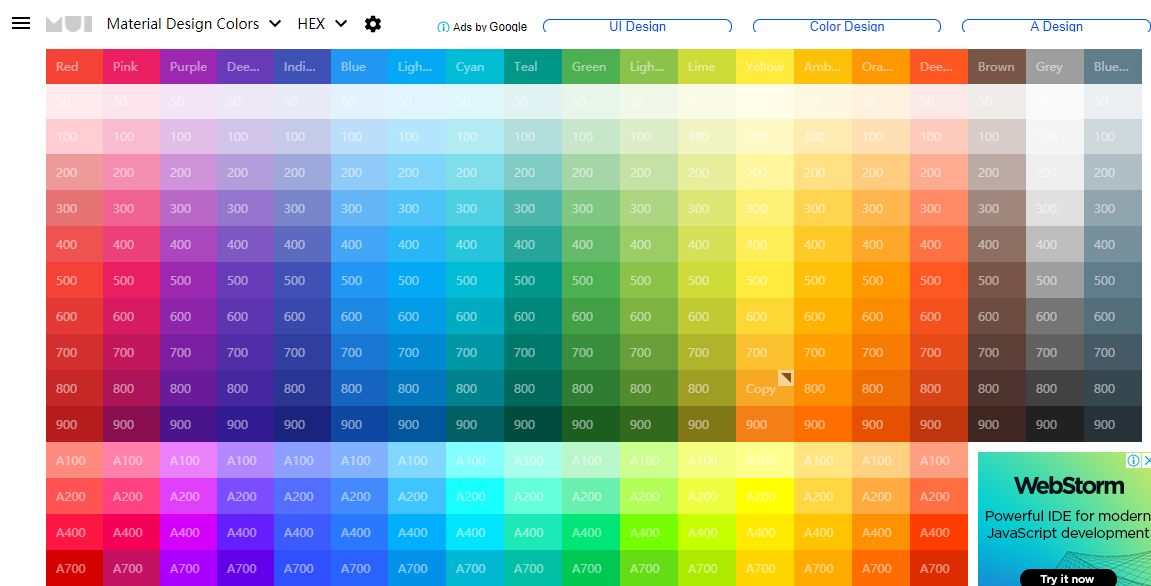
Features:
This tool is primarily for developers and designers who want to quickly design a color code that meets Material Design standards. The user can click on the color box and it will automatically copy the corresponding color code to the clipboard. This site is also known as the color "cheat sheet," which brings all available colors together on one page for the user to choose from.
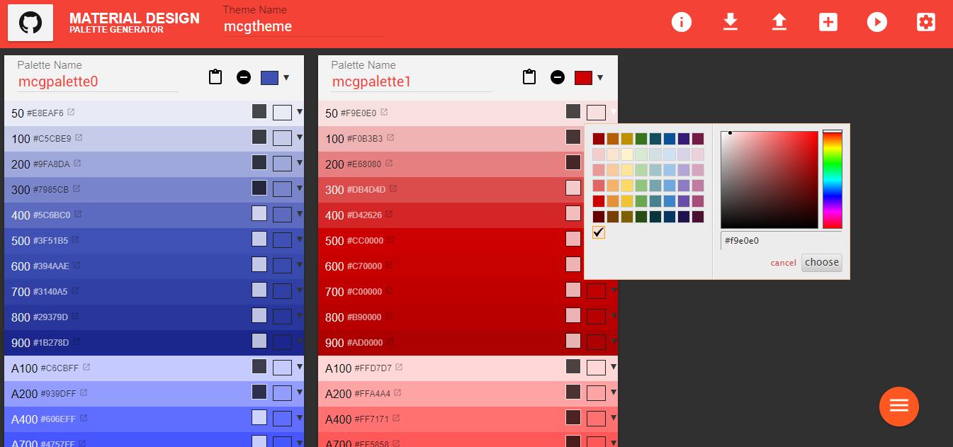
Features: Custom Swatches
If you are interested in custom swatches, try the Material Design Palette Generator. To set a color manually, either type in a color code or select a color from the color palette in the color dialog box that can be opened by clicking on a color box in the open palette. The Material Design Panel Builder will generate your swatches based on the color you choose.
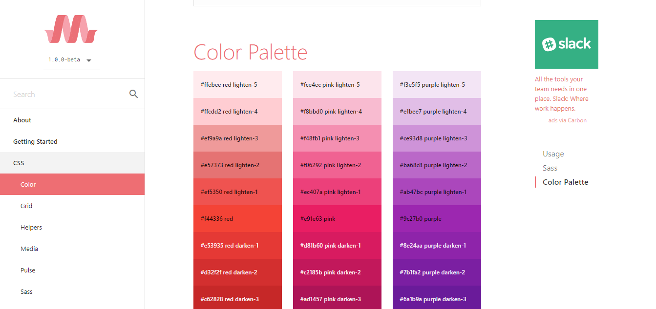
Features: Supports color shading adjustment
This is a color palette based on the material design base color. Each color is defined with a basic color class and an optional brightening or darkening class.
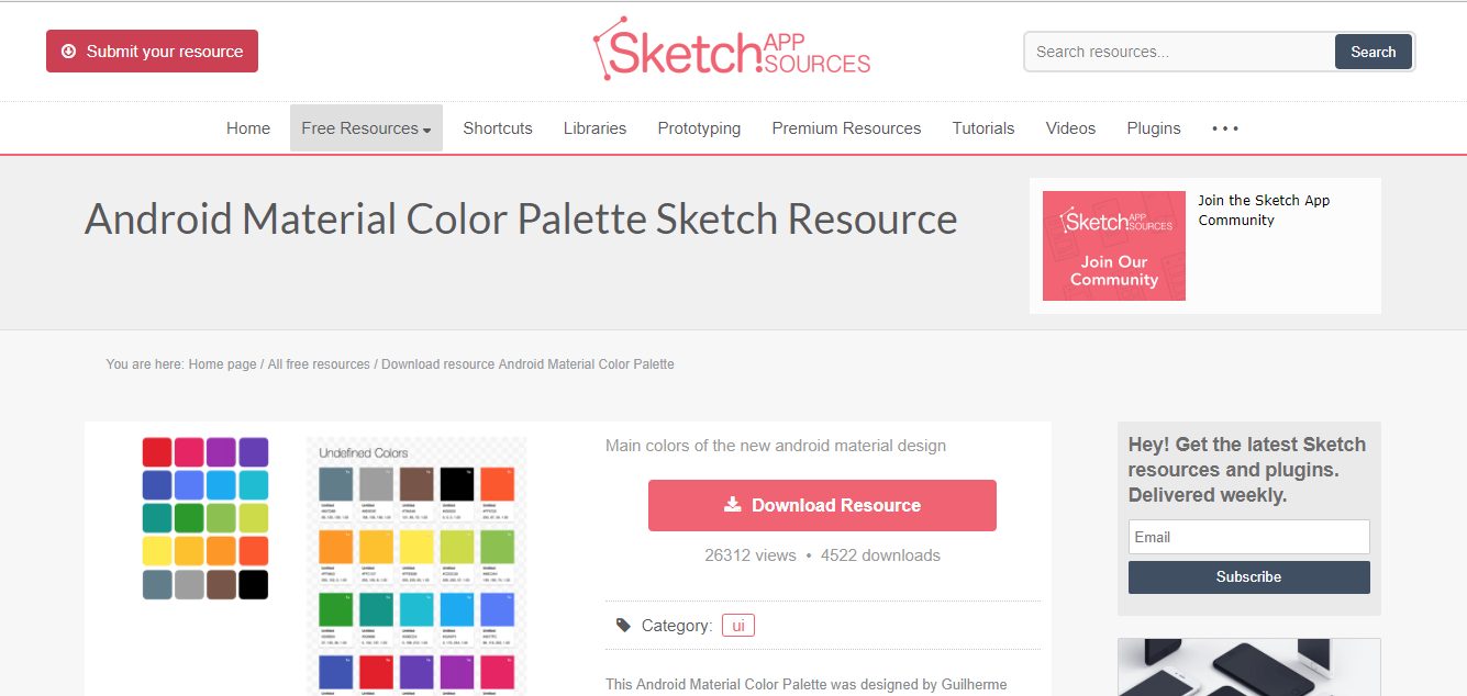
This site offers a variety of design-related free resources to download. You can find palette resources for Android material design here and download it for free.
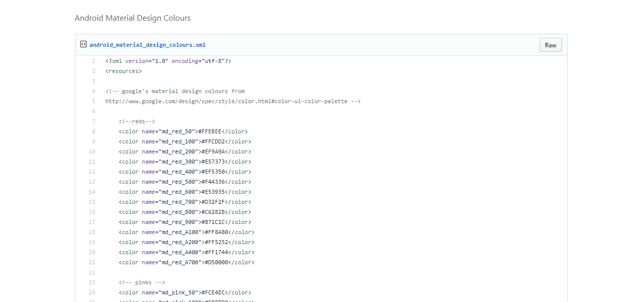
This is the Android material color code provided by the users on Github. Each color covers a variety of different color codes. The direct copy and paste mode saves a lot of time for designers.
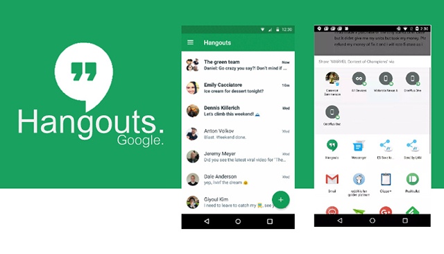
Google Hangouts is one of Google's products which follows the design principles and color scheme of Material Design. It’s a typical case study of Google material design and effectively applies the material design color scheme.
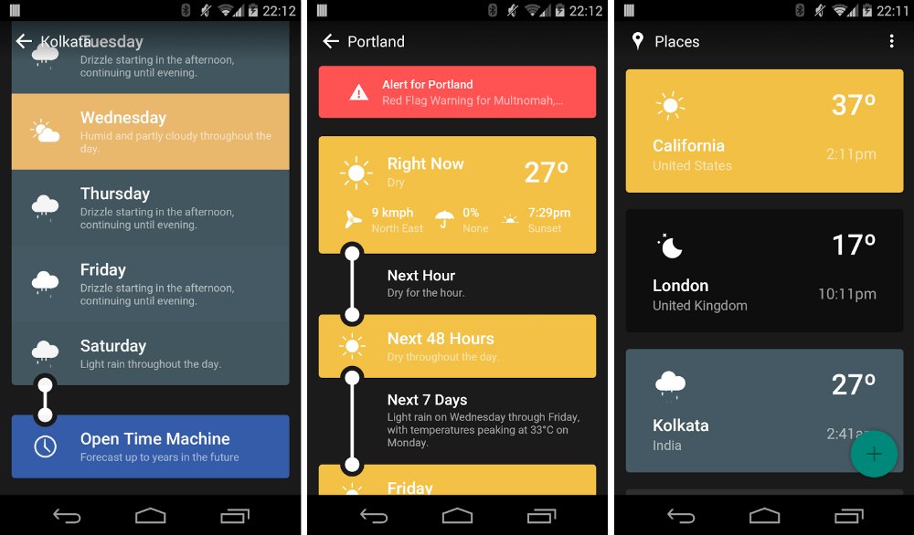
The color matching of this application is very consistent with the color matching principle of the material design color tool mentioned above. The combination of the main color, secondary color, text color, as well as button color, is very distinctive and bold.
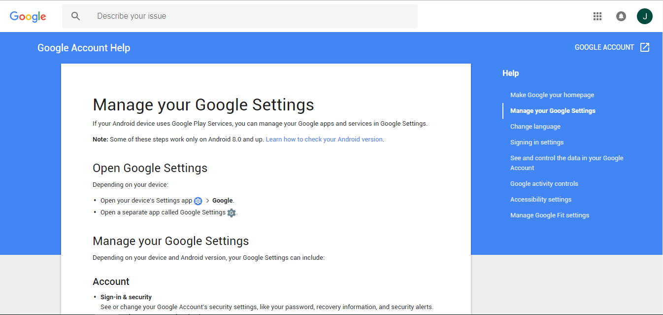
When it comes to Material Design, how can we not mention Google? It’s the best practice of its own material design guidelines. The material design style is characterized by the clean typography and simple layout that is easy to understand so the user can focus on content.
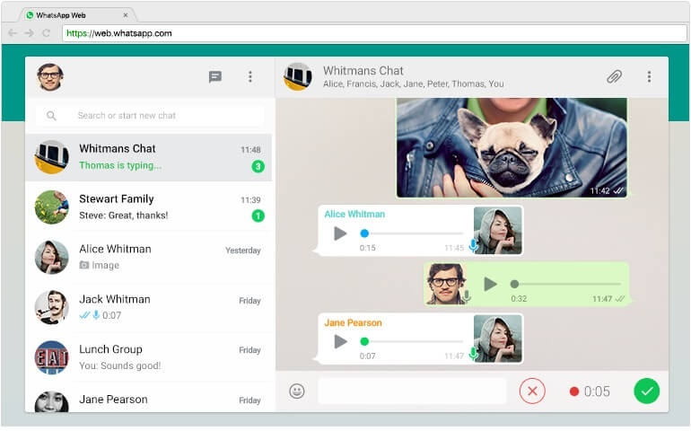
WhatsApp is a timely communication tool loved by people around the world, implements the concept of material design in its web design and mobile App design very well. In terms of colors, WhatsApp did not use a very colorful palette for its main colors, opting for a more serene mix of gray and green.
These Material Design color tools and resources will help you move to the next step in practicing building your website or App.
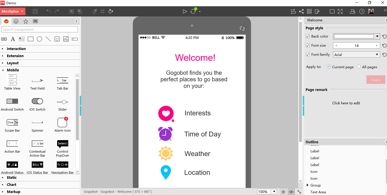
Actually, it’s not that hard. To create a website or App that incorporates Material Design, you only need a material design style prototyping tool. Here I give my vote to Mockplus as it has the unique advantage of both in website prototype design and mobile App prototype design. Combining the built-in material design components of Mockplus with the material design color scheme I summarized for you above, designing a Material design style application or website is no longer a difficult task.
Color, as the most important element in brand identity, needs careful consideration when it is actually used. How to use color collocation correctly can be tricky, but is simplified using the Material Design color tools and resources I summarized above.
 Mockplus RP
A free prototyping tool to create wireframes or interactive prototypes in minutes.
 Mockplus DT
A free UI design tool to design, animate, collaborate and handoff right in the browser.
