Medical services and medical website design are becoming more standardized with increased awareness of health care. From the point of view of web design, a medical website is the information highway that connects the hospital and patients who need medical care. For patients, excellent standardized design can better guide them to obtain medical information accurately and quickly.
How do you design a good medical website? Take a look at the excellent examples below, and give the possibility to avoid the common errors of website design from them.
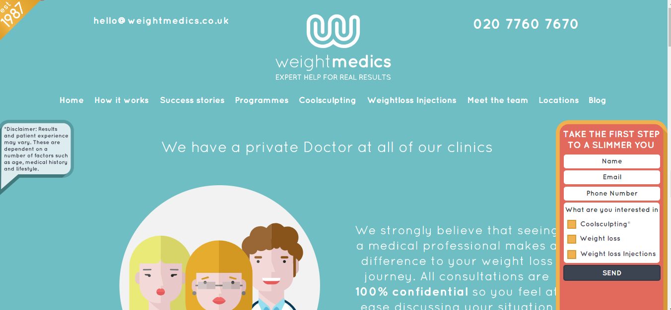
Features: cartoon style, flat design, lively and elegant colors
Unlike usual weight loss websites, it has no dense weight loss plans recommended and no exaggerated "before and after" weight loss comparisons. The overall website design is presented in cartoon style, lovely and adorable. The light blue background color matched with the white font makes the site simple and elegant. Moreover, the partially coordinated orange tone makes the site lively and not monotonous.
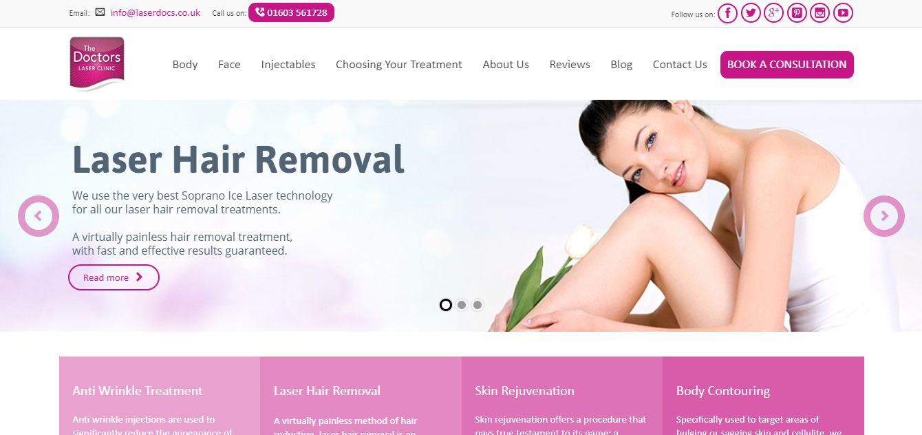
Features: women's aesthetics, card design, elegant purple color
The majority of the visitors to medical cosmetology websites are female. Therefore, an effective medical cosmetology website should cater to women's aesthetics not only through product services but also through design. In this template, the card design above the purple website looks elegant and generous, and it provides guidance for the customers to make a choice as the color burn. The design of the CTA section is highlighted in deep purple, a good method to attract clicks and increase conversions.
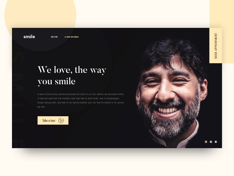
Features: black background, black and white collocation, color contrast
Healthy and beautiful teeth are the foundation of a brilliant smile, and that’s what this website is all about. What is special about this dental website design is that it does not make use of the usual “doctor in a white” and anthropomorphic tooth pattern to highlight the theme. Instead, it focuses on a uniquely attractive smile to show the design concept. It more than a dental website, but also a good advertisement for the service itself. The black ground is not boring but brilliant because of the clever color combination.
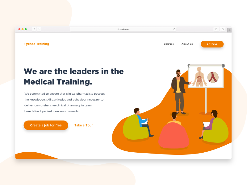
Features: Lively orange, illustration, flat design
The background colors of the website are orange and white, making the entire page look fresh and vibrant. This is perfectly in line with modern people's pursuit of a healthy life. The homepage uses the popular illustration style, combined with flat web design, conveying a warm and lively feeling.
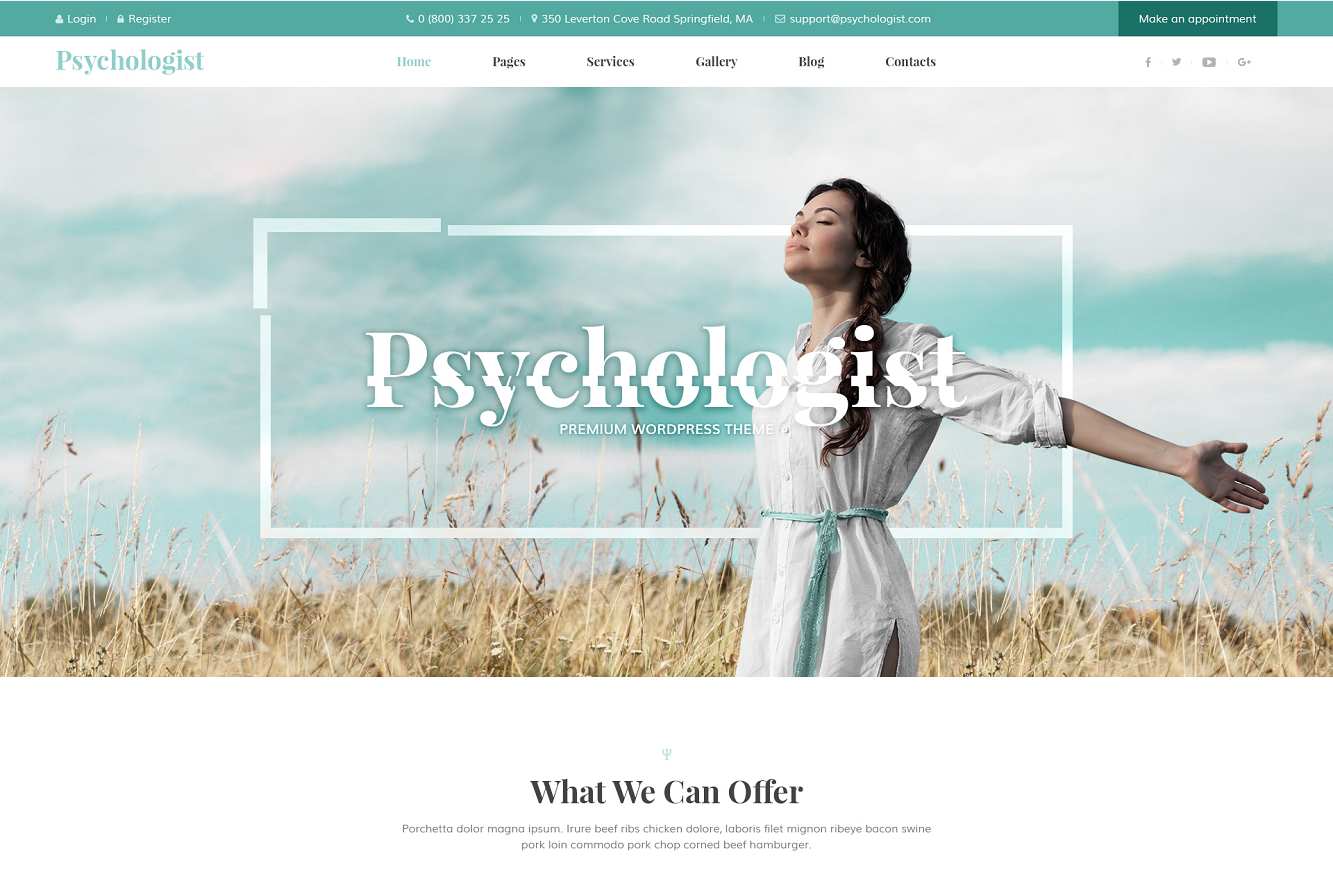
Features: Responsive design, HTML5, fresh light green
Dominated by light green tones, the overall website design gives off a fresh and vibrant vibe. The color of the navigation bar, fonts, and the colors of the sky blend into one. The website's responsiveness and superior performance are elements that promote conversion. Based on this point, the free responsive HTML5 web template will be a good example for reference. This template for mental health web design can also serve as a good reference for novices.
As you may surmise from the analysis above, we are not solely focused on choosing the best health website design. Instead, we prefer to focus on design principles, especially the use of colors in web design.
For mental health practices, integrating the best EHR for mental health private practice can complement the design, providing seamless patient record management and enhancing the user experience.
Website color is an important factor affecting the whole design. Different colors produce different effects.
So, what should you pay attention to when it comes to color choice when designing a website?
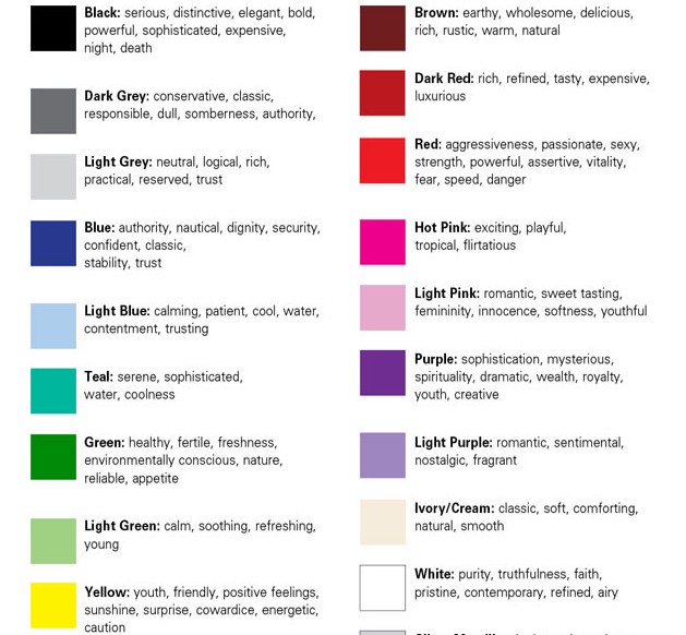
(1) Red: Red makes people excited and nervous. Therefore, it should not be used as the primary color in medical websites design.
Collocation: The pink shade in red is more suitable for use in medical beauty websites. It helps to create a feminine and pure ambiance that caters to women.
(2) Black: Black a solemn color reminiscent of death. We recommend avoiding using too much black in website design.
Collocation: Black and bright yellow can result in clear and tidy effect. It is a color scheme that is suitable for achieving a lively look.
(3) Blue: Blue is suitable for building a page of peace and cleanliness. As such, blue is an appropriate color to use in hospital websites
Collocation: Light blue is elegant, fresh, romantic and noble. It is often used in the design of cosmetics, women beauty, and medical websites.
(4) Green: It represents hope, growth, and the ideal. As such, green is a good color for industries like service, medical and health, education, and agriculture.
Collocation: Green can be combined with multiple colors to achieve a harmonious effect. It is also one of the most widely used colors in hospital websites.
(5) Purple: Purple symbolizes feminity, nobility, elegance, and luxury. It also represents the mysterious, dignified, sacred, and romantic.
Collocation: Purple combined with light white transforms into a very beautiful, soft color.
(6) Orange: Orange has the symbolic meanings of health, vitality, bravery, and freedom. It gives people the feeling of solemn honor and mystery. Its use creates a warm atmosphere in hospital website design.
Collocation: Orange cannot be used in large areas but only a small patch collocating with other colors.
(7) White: White is the color most commonly used in web design.
Collocation: Combining white with black creates a modern, urban look, but it is not suitable as the main color for medical website design.
(8) Yellow: In many designs, yellow is used to express a festive atmosphere and highlight gorgeous products.
Collocation: Yellow is a neutral color, so it can be used with almost any color in website design.
The right use of color in a high-fidelity web prototype is also a bonus. Properly color-matched prototype projects help to gain investment and win customers. What you need, then, is to choose a prototyping tool that supports a wide color database rather than a monochrome wireframe tool. Mockplus is a prototype design tool that can directly set the color of components and icons using the color number or a color picker. This makes web and app design much easier.
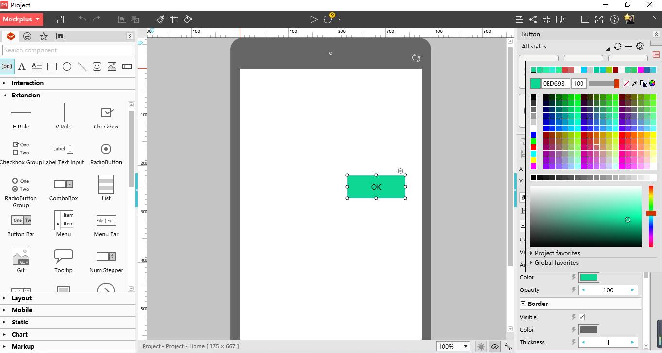
The importance of color is not only applicable to medical website design. The use of proper colors is critical in web design in general. When designing any website, creativity is key. Designers have to avoid falling into a routine that results in boring creations. Continue to learn and improve your craft by seeking inspiration from others.
Free Design Materials - Package of 1,208 Google Fonts for Designers
Free Design Materials - 24 Flat Fonts for Free Download
Free Design Materials - 2000+ Free Cute Icon Package in Four Formats
 Mockplus RP
A free prototyping tool to create wireframes or interactive prototypes in minutes.
 Mockplus DT
A free UI design tool to design, animate, collaborate and handoff right in the browser.
