When it comes to product design, the ultimate goal is to create a product that satisfies user needs. However, in every segment of the market, users have an option to choose from a range of competitive products. How to make the task easier for users? The answer is simple—focus on details.
The little things make a big difference in the success of your product. When it comes to UI design, UI microinteractions are those little details.
In 2013, Dan Saffer published the book Microinteractions, which defined this concept and outlined a model for designing microinteractions. UI microinteractions are trigger-feedback combinations in which the trigger can be a user action, and the feedback is a visual or audio response to the trigger from the system. You might ask, “But what is the difference between UI microinteractions and regular system feedback?” The word ‘micro’ implies that feedback is communicated through small and highly contextual visual changes in the user interface.

Dan Saffer’s model of microinteractions.
One thing that makes microinteractions so powerful is the sense of delight that well-crafted microinteractions provide. Aaron Walter, the author of Designing for Emotion, rethought Maslow’s hierarchy of needs to explain the needs of users. He puts pleasure at the top of his pyramid of emotional design. Designers should have the goal to please their users and make them feel happy when they use the product, and microinteractions can help them with that.
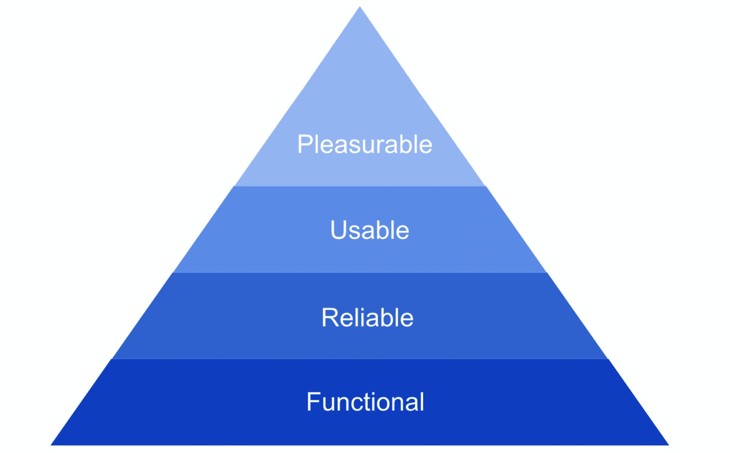
Aaron Walter’s pyramid of user needs.
The pyramid of user needs makes it evident that good user experience is more than good usability. Enjoyable user experience makes the interaction with product fun, and this ultimately drives user engagement. But what is the role of microinteractions in creating pleasure? Those micro elements play a huge role. They can:
The last point is especially important for user retention. Let’s see how it will work for task management tools. When it comes to choosing a task management tool, there are a lot of options available on the market — Asana, Jira, Trello, to name a few. But only one tool creates a truly memorable experience. A task-management tool called Asana celebrates success with users by showing one of our four celebration creatures (a unicorn, yeti, narwhal, or phoenix) that fly across the user screen like a shooting star as they complete tasks. This interaction is an example of a microinteraction focussed both on encourage engagement and comminate brand. It feels genuinely human and immediately creates a memorable experience.
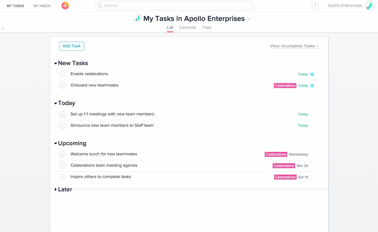
Asana celebrates success with users. When a user marks a task as complete, a unicorn flies across the bottom left quadrant of the screen in celebration of a job well done.
Many of our everyday interactions with digital devices fall under the large umbrella of microinteractions. Here are the most common cases:
Here are some examples of how UI microinteractions can contribute positively to the look-and-feel of a product or service.
UI microinteractions are commonly used to communicate the state of a UI component. One notable example is Twitter. The service allows users to like the tweets—users can do it by clicking a heart icon in the tweets contextual actions. The microinteraction uses a pumping-heart animation to communicate that you like something. This action is reversible—you can undo it by clicking again on the heart icon, which will then revert the brightly colored heart back to its original grey state.

Twitter like effect
Microinteractions can help designers improve in-app navigation experience. For example, many mobile apps use hamburger navigation—the user taps on the hamburger icon and sees a menu with navigation options. It’s possible to communicate the status change more evidently by using a simple transition for a hamburger icon on tap.

Menu toggle close animation by Aaron Iker
Pull-to-refresh is a content refresh operation used in many mobile apps. The user triggers the content refresh by swiping up, and the system shows some sort of visual feedback on that action, and this feedback remains visible until the user sees an updated content. The better visual feedback is designed, the more the user is willing to wait for something to happen.
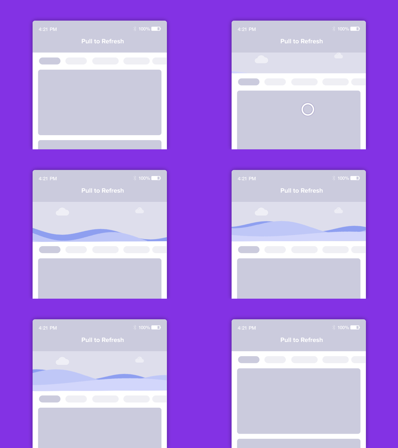
Pull to refresh animation by Sujeet Mishra
Everyone makes mistakes and, no matter what caused the errors (incorrect user input or system errors), the way errors are handled plays a crucial role in how users feel about the interaction. Sometimes systems need to communicate that users provided incorrect data. After the user provides the data, visual shaking microinteractions notify the user that the data is not valid and encourages the user to continue interacting with a form.
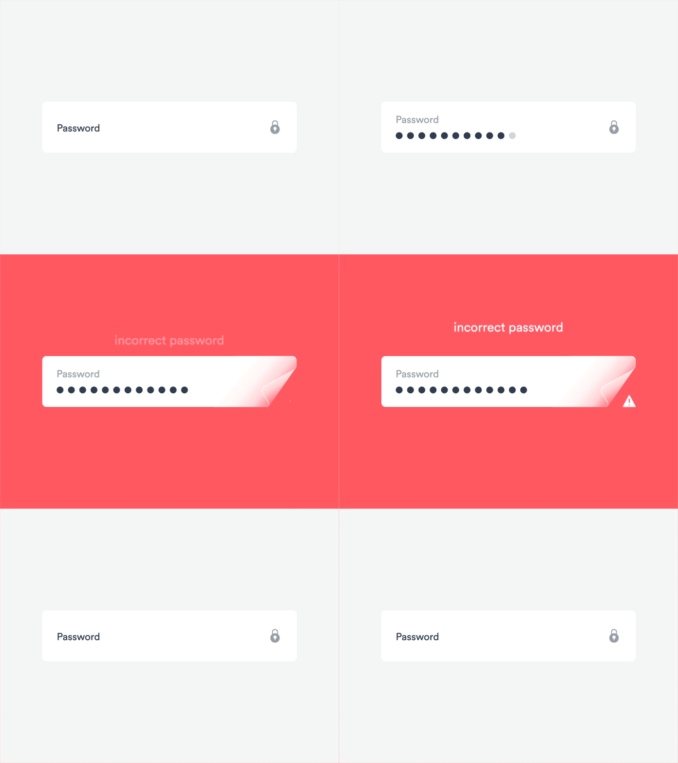
Error Form by Hoang Nguyen
UI microinteractions aren’t limited to websites and mobile apps. Voice-based digital devices such as Google Home use microinteractions to communicate their current mode. For example, Google Home displays a circular animation of dots to tell the user that it listens to the command.
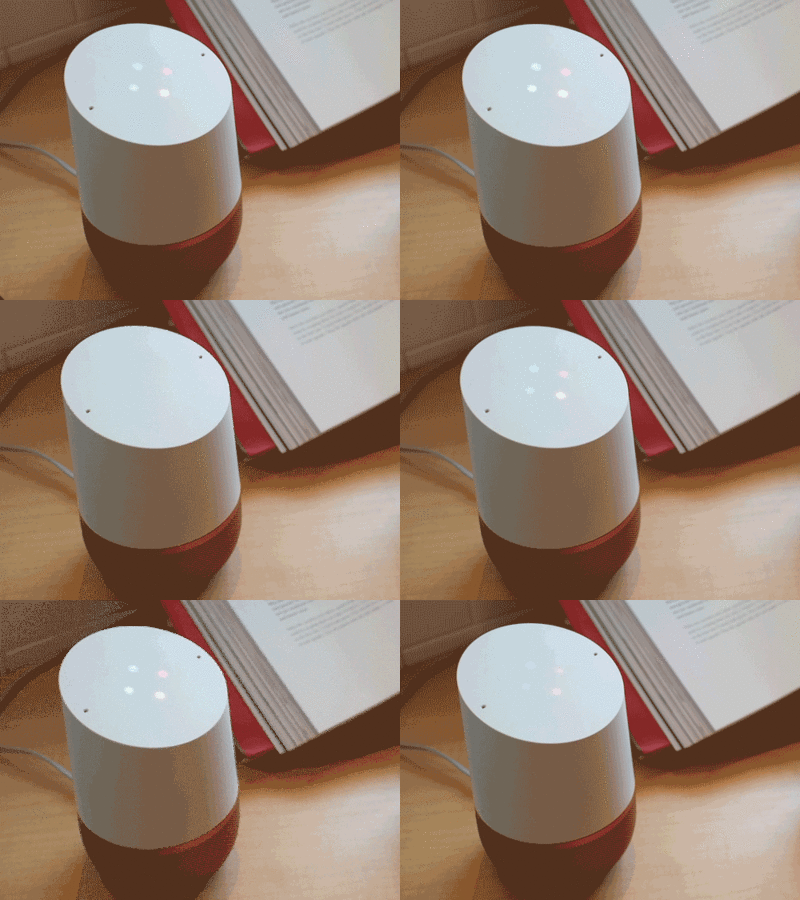
Google Home lights up upon hearing the trigger Hey Google. Image by Kslib
Many products rely on visuals to communicate with their users, but sound can be just as powerful. Microinteractions can involve auditory responses as well. Most of us remember the sound of Apple Mac during startup. This microinteraction became a signature element of the interaction with the Mac products as well as the Apple brand. It means that we can empower the effect of interactions by pairing the UI microinteractions with the audio feedback.
As the old idiom says, “The devil is in the detail." When users select a product, they typically have a lot of options to choose from. However, the differences between these products become quite evident when analyzing the small details—microinteractions embedded throughout the experience. Design is all about communication, and microinteractions serve as a vehicle to communicate with the user. They can enrich your product and make the experience delightful.
 Mockplus RP
A free prototyping tool to create wireframes or interactive prototypes in minutes.
 Mockplus DT
A free UI design tool to design, animate, collaborate and handoff right in the browser.
